Mbarara University ofScience and Technology
Faculty of Medicine, Department of Pharmacy
P.O. Box 1410, Mbarara, Uganda, http://www.must.ac.ug
1
Biostatistics
&
Demography
Summarizing and presenting data
Edward .J. LUKYAMUZI (MPS)
2.
Formulating researchable questions
•EXERCISE: WORKING IN GROUPS OF 5 STUDENTS:
1. IDENTIFY A PROBLEM WHICH YOU THINK SHOULD BE
INVESTIGATED FURTHER OR WHICH NEEDS TO BE
SOLVED.
2. DESCRIBE THE PROBLEM USING THE 5 Ws Technique
3. USING ONE OF THE GUIDELINES, FORMULATE A
RESEARCH QUESTION
4. IDENTIFY THE MAIN VARIABLES FOR YOUR RESEARCH
5. IDENTIFY DATA SOURCES
6. CHOOSE THE APPROPRIATE DATA COLLECTION
METHOD(S)
Note: This exercise will continue to feed into future class discussions and assignments,
therefore individual participation is good for learning and teamwork .
3.
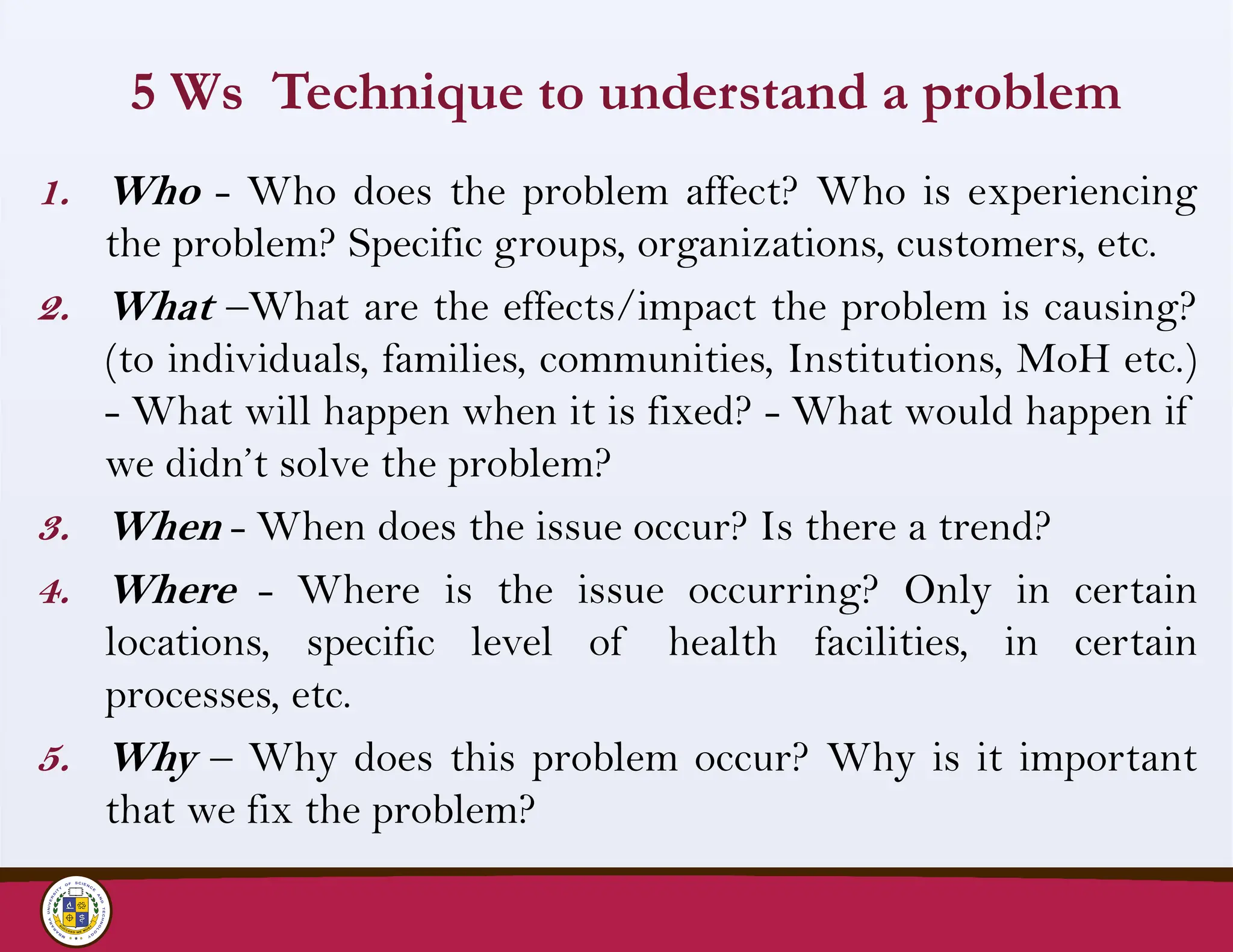
5 Ws Techniqueto understand a problem
1. Who - Who does the problem affect? Who is experiencing
the problem? Specific groups, organizations, customers, etc.
2. What –What are the effects/impact the problem is causing?
(to individuals, families, communities, Institutions, MoH etc.)
- What will happen when it is fixed? - What would happen if
we didn’t solve the problem?
3. When - When does the issue occur? Is there a trend?
4. Where - Where is the issue occurring? Only in certain
locations, specific level of health facilities, in certain
processes, etc.
5. Why – Why does this problem occur? Why is it important
that we fix the problem?
4.
Objectives…
• Explain howproportions and percentages are
calculated
• Explain two methods for graphically displaying the
distribution of categorical data.
• Explain the method of construction of a histogram;
describe the shape, centre, and spread
• Define a percentile, name the 3 important percentiles
and derive their values from a frequency table
• Define and describe the characteristics of the mean,
median, and mode, and identify when to use each.
• Define and describe the characteristics of standard
deviation, interquartile range and identify when to
use each
4
Introduction…
• In publichealth and health research we are interested in describing
a group (of people or things e.t.c.) rather than an individual
person.
• We have noted the inherent variability in biological, socio-
economic, or behavioral processes.
• Knowledge and application of appropriate statistical methods
enable us to describe groups of people with varying experiences.
7
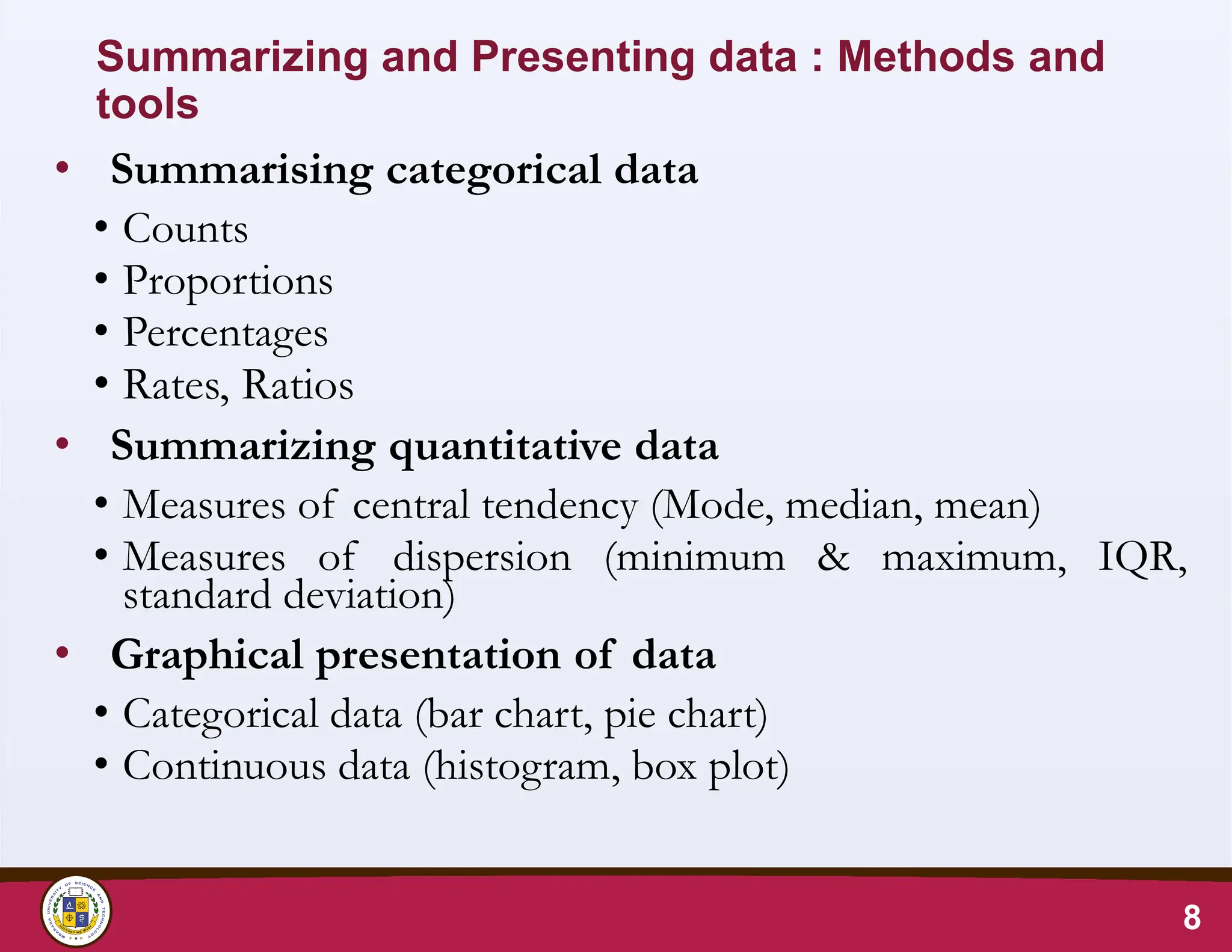
8.
Summarizing and Presentingdata : Methods and
tools
• Summarising categorical data
• Counts
• Proportions
• Percentages
• Rates, Ratios
• Summarizing quantitative data
• Measures of central tendency (Mode, median, mean)
• Measures of dispersion (minimum & maximum, IQR,
standard deviation)
• Graphical presentation of data
• Categorical data (bar chart, pie chart)
• Continuous data (histogram, box plot)
8
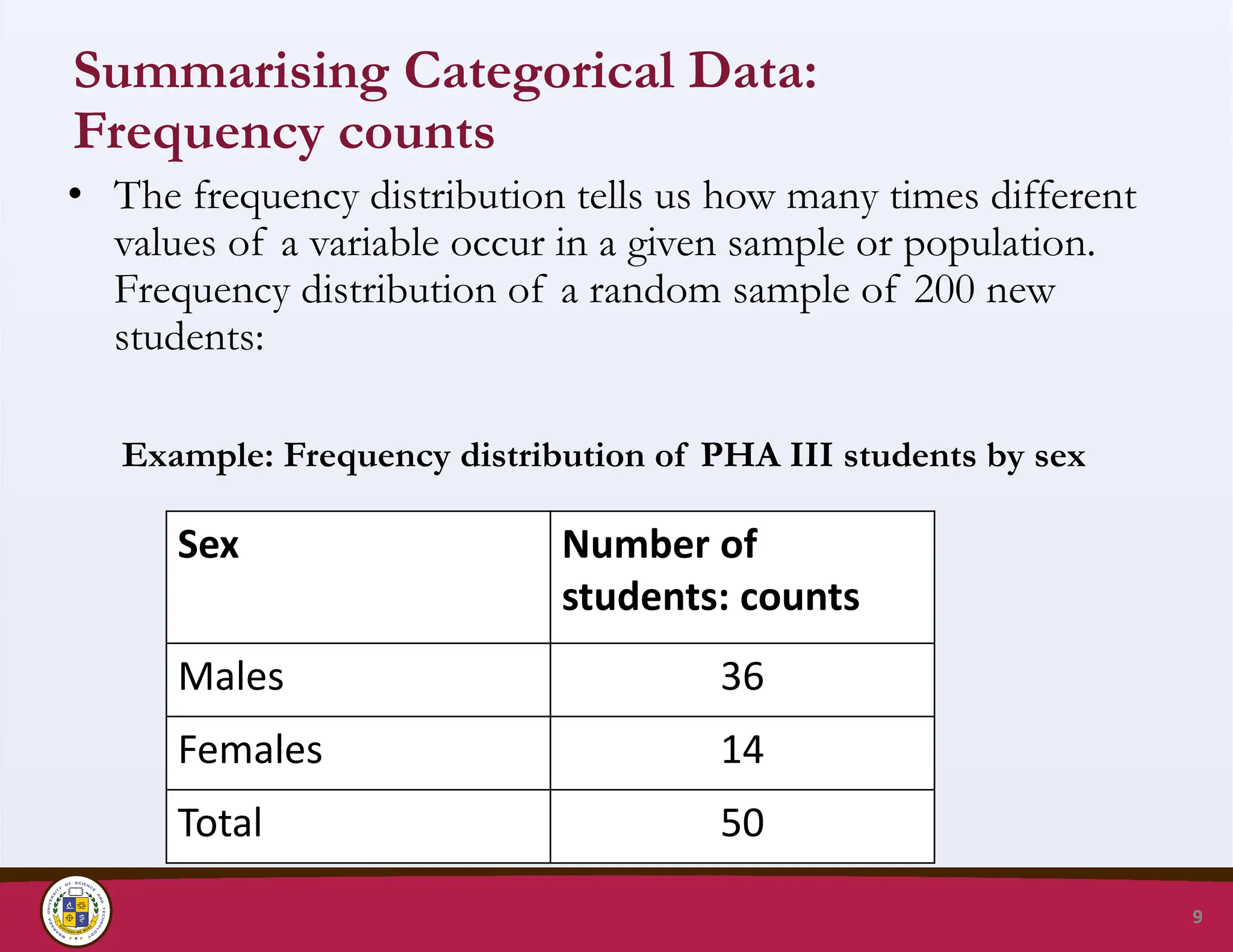
9.
Summarising Categorical Data:
Frequencycounts
• The frequency distribution tells us how many times different
values of a variable occur in a given sample or population.
Frequency distribution of a random sample of 200 new
students:
Example: Frequency distribution of PHA III students by sex
9
Sex Number of
students: counts
Males 36
Females 14
Total 50
10.
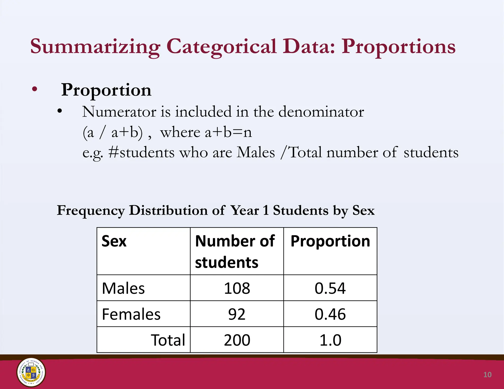
Summarizing Categorical Data:Proportions
• Proportion
• Numerator is included in the denominator
(a / a+b) , where a+b=n
e.g. #students who are Males /Total number of students
Frequency Distribution of Year 1 Students by Sex
10
Sex Number of
students
Proportion
Males 108 0.54
Females 92 0.46
Total 200 1.0
11.
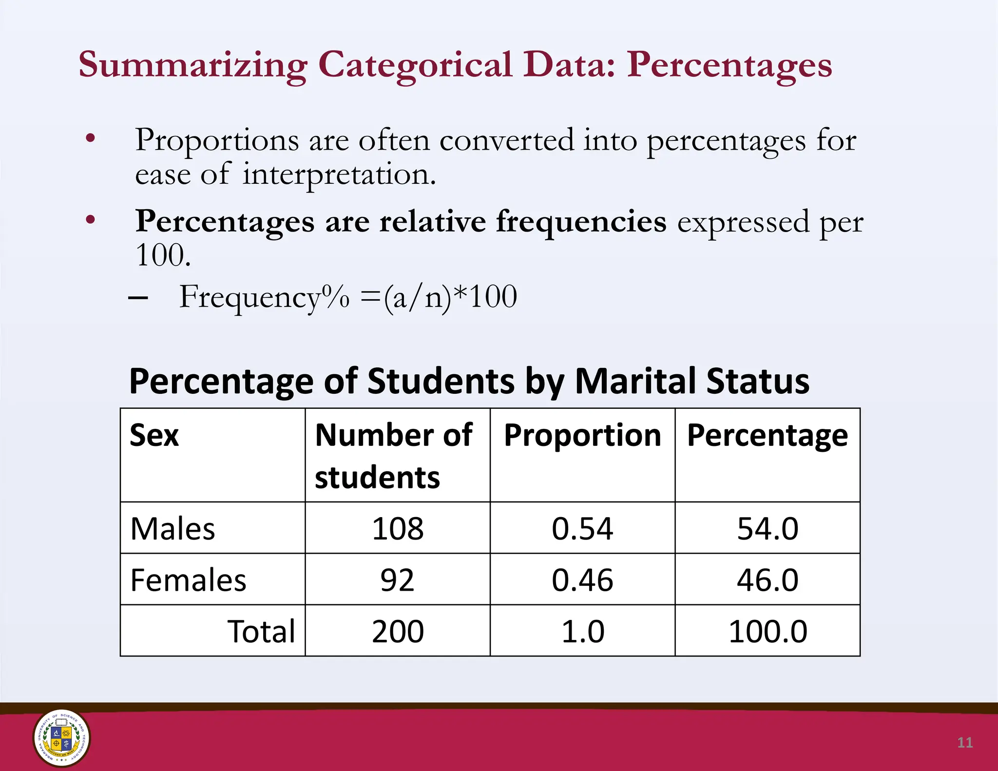
Summarizing Categorical Data:Percentages
• Proportions are often converted into percentages for
ease of interpretation.
• Percentages are relative frequencies expressed per
100.
– Frequency% =(a/n)*100
Percentage of Students by Marital Status
11
Sex Number of
students
Proportion Percentage
Males 108 0.54 54.0
Females 92 0.46 46.0
Total 200 1.0 100.0
12.
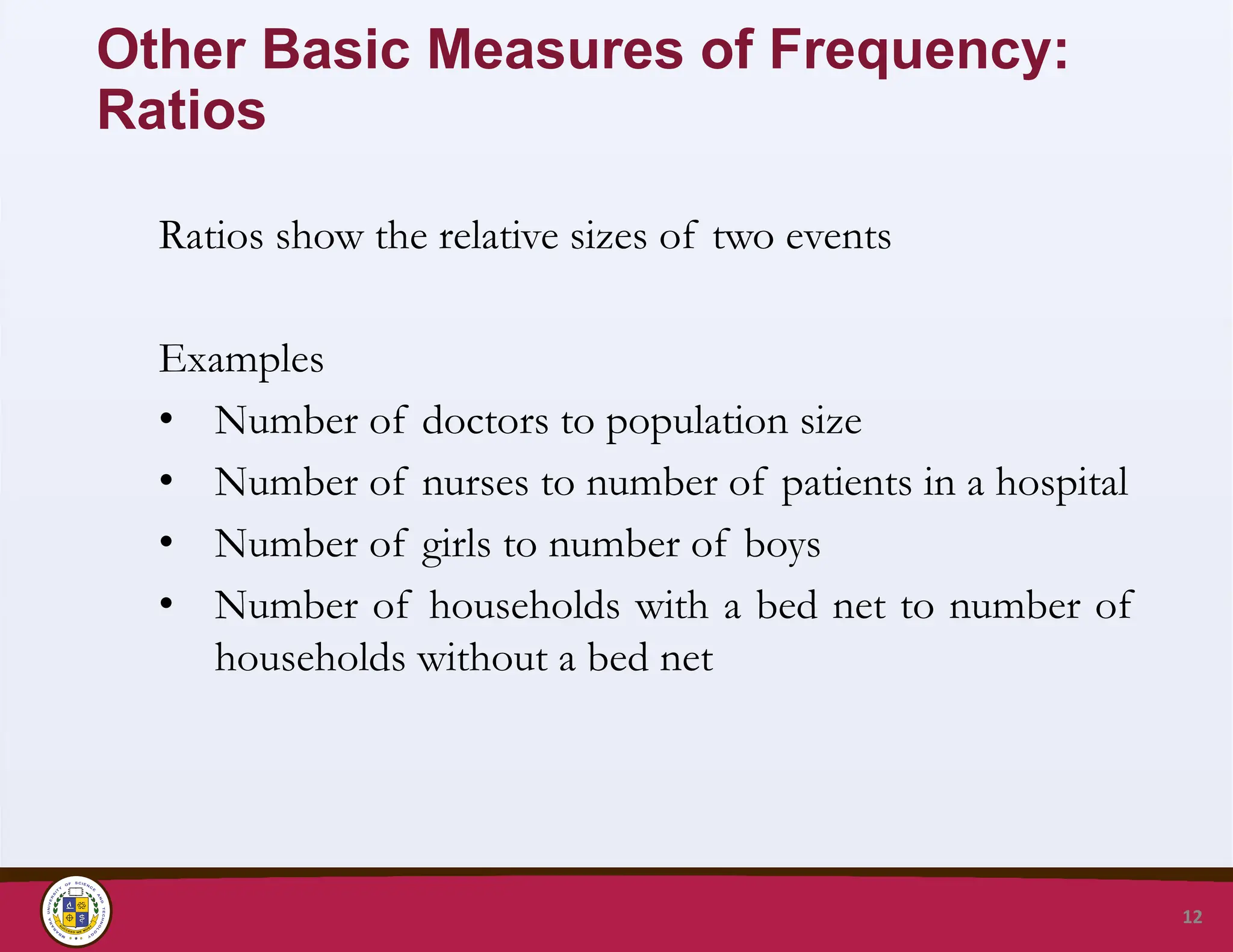
Other Basic Measuresof Frequency:
Ratios
Ratios show the relative sizes of two events
Examples
• Number of doctors to population size
• Number of nurses to number of patients in a hospital
• Number of girls to number of boys
• Number of households with a bed net to number of
households without a bed net
12
13.
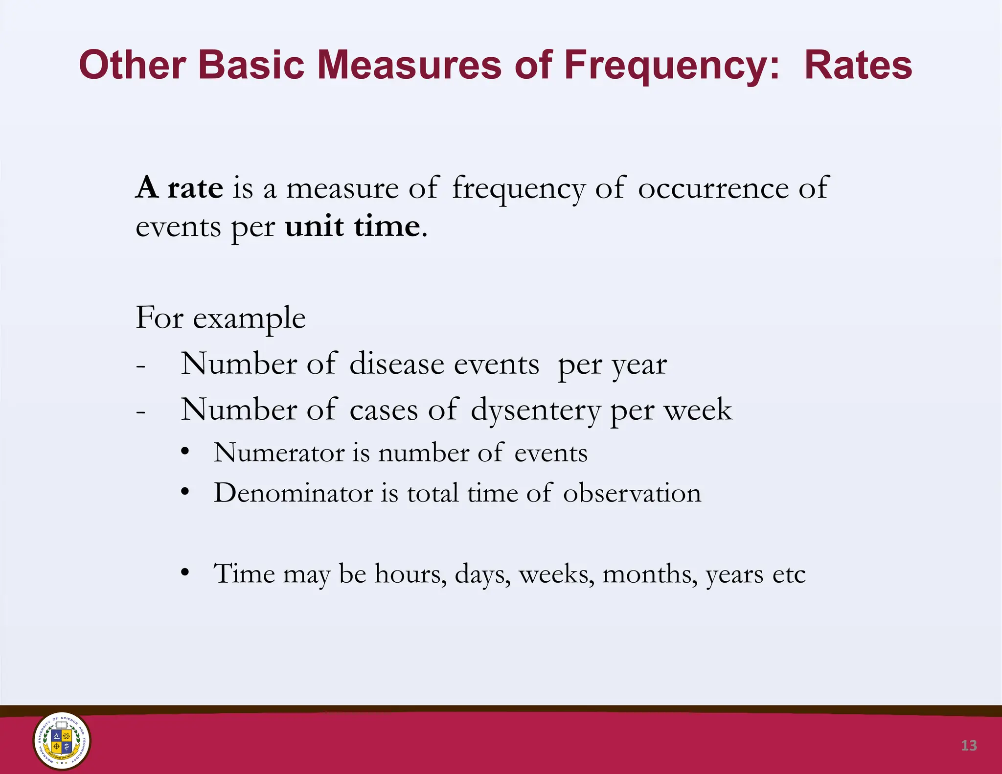
Other Basic Measuresof Frequency: Rates
A rate is a measure of frequency of occurrence of
events per unit time.
For example
- Number of disease events per year
- Number of cases of dysentery per week
• Numerator is number of events
• Denominator is total time of observation
• Time may be hours, days, weeks, months, years etc
13
14.
Mbarara University ofScience and Technology
Faculty of Medicine, Department of Pharmacy
P.O. Box 1410, Mbarara, Uganda, http://www.must.ac.ug
14
SUMMARIZING CONTINUOUS DATA
15.
Distribution of continuousdata
• Values of continuous data exist on a continuum.
• As the sample size increases, the number of unique values
are so large, that it is difficult to summarise such data by
making frequency counts of individual values
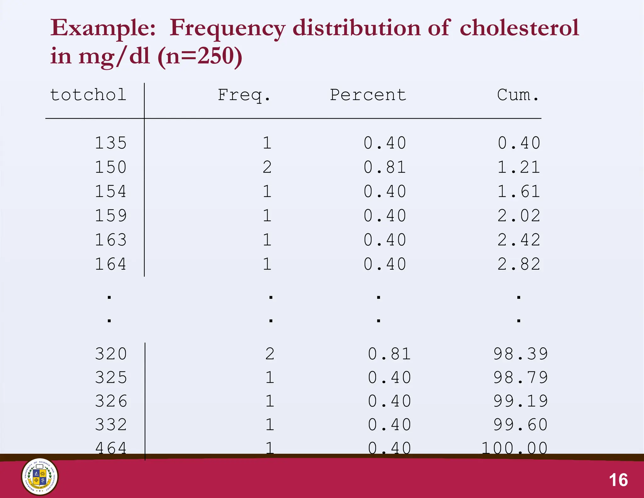
• See example of frequency distribution of total cholesterol
of 250 people.
15
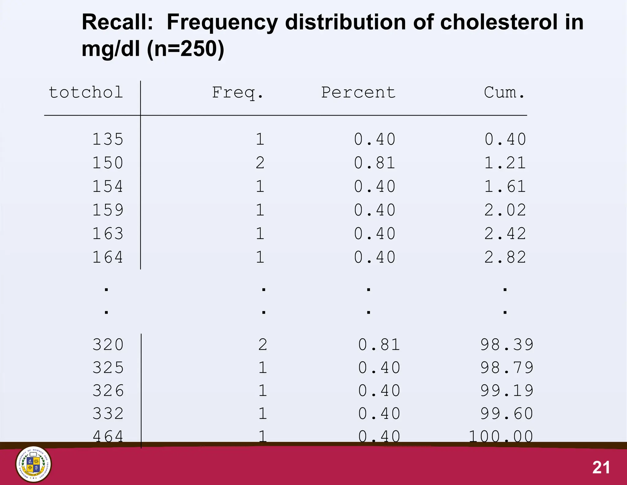
Distribution of Continuousdata
• Continuous data is first grouped into classes
comprising of successive ranges of values of the
variable of interest
• In each class/group, frequency counts are
determined
• Frequency distributions of continuous data have a
shape
17
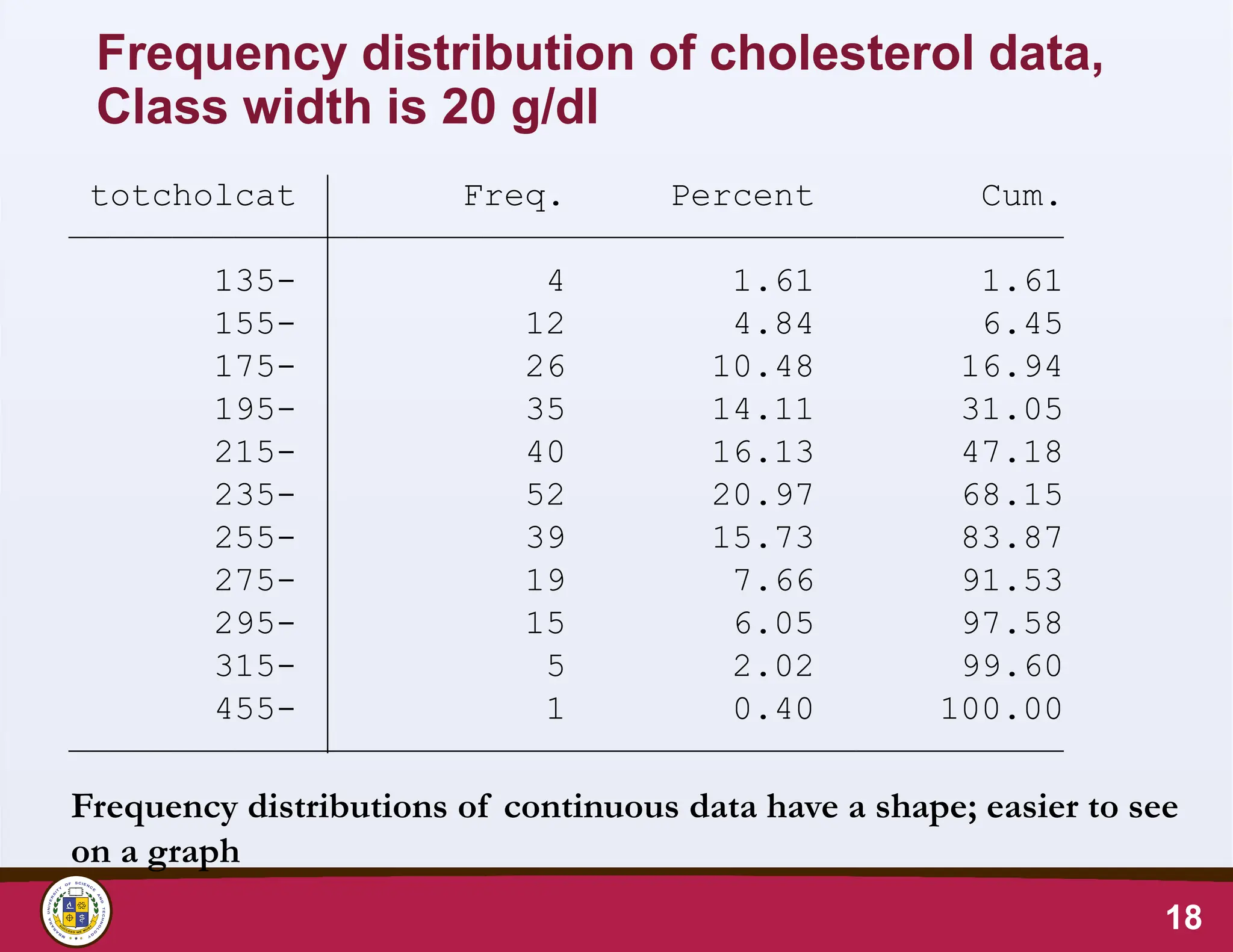
18.
Frequency distribution ofcholesterol data,
Class width is 20 g/dl
18
Frequency distributions of continuous data have a shape; easier to see
on a graph
Total 248 100.00
455- 1 0.40 100.00
315- 5 2.02 99.60
295- 15 6.05 97.58
275- 19 7.66 91.53
255- 39 15.73 83.87
235- 52 20.97 68.15
215- 40 16.13 47.18
195- 35 14.11 31.05
175- 26 10.48 16.94
155- 12 4.84 6.45
135- 4 1.61 1.61
totcholcat Freq. Percent Cum.
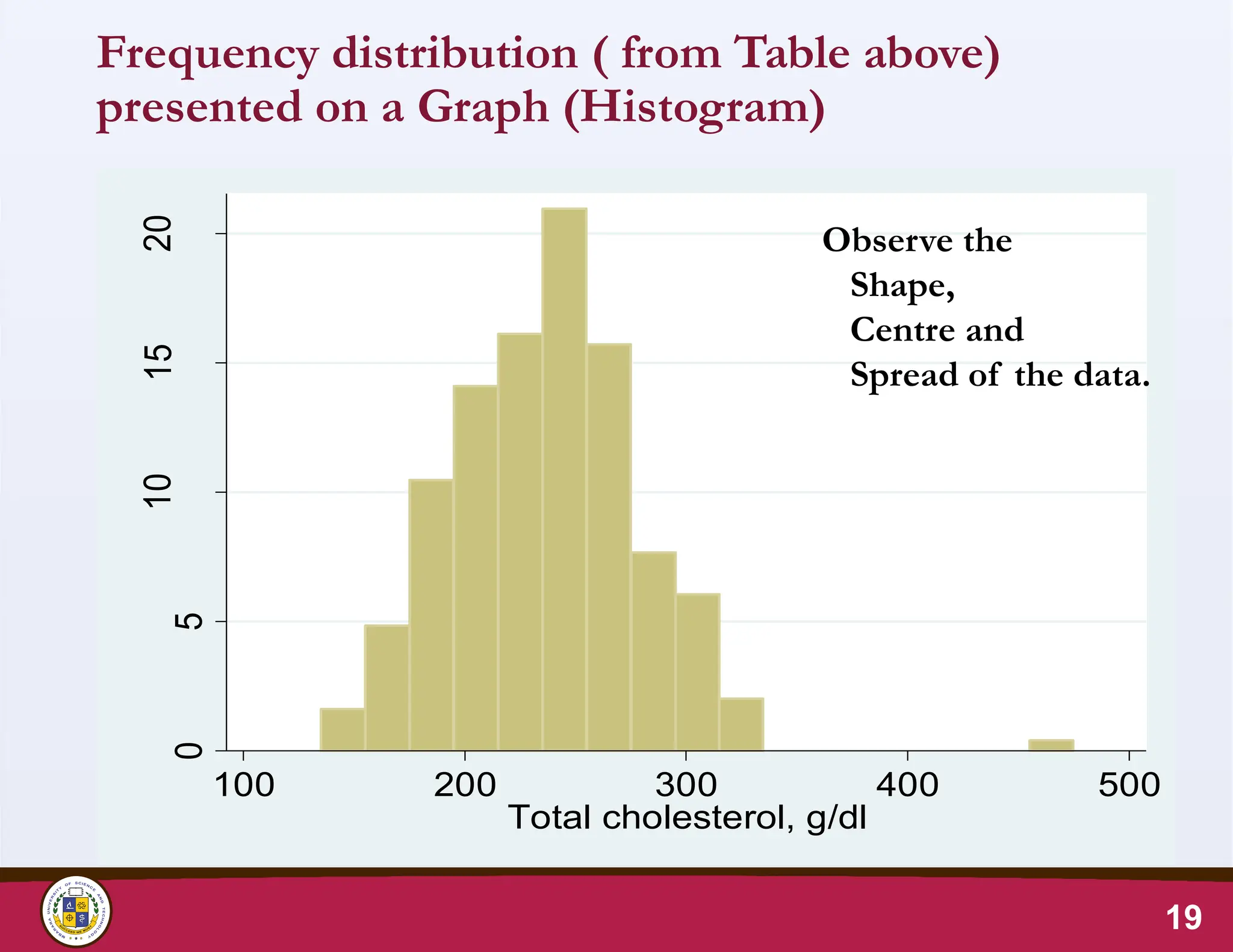
19.
Frequency distribution (from Table above)
presented on a Graph (Histogram)
19
0
5
10
15
20
100 200 300 400 500
Total cholesterol, g/dl
Observe the
Shape,
Centre and
Spread of the data.
20.
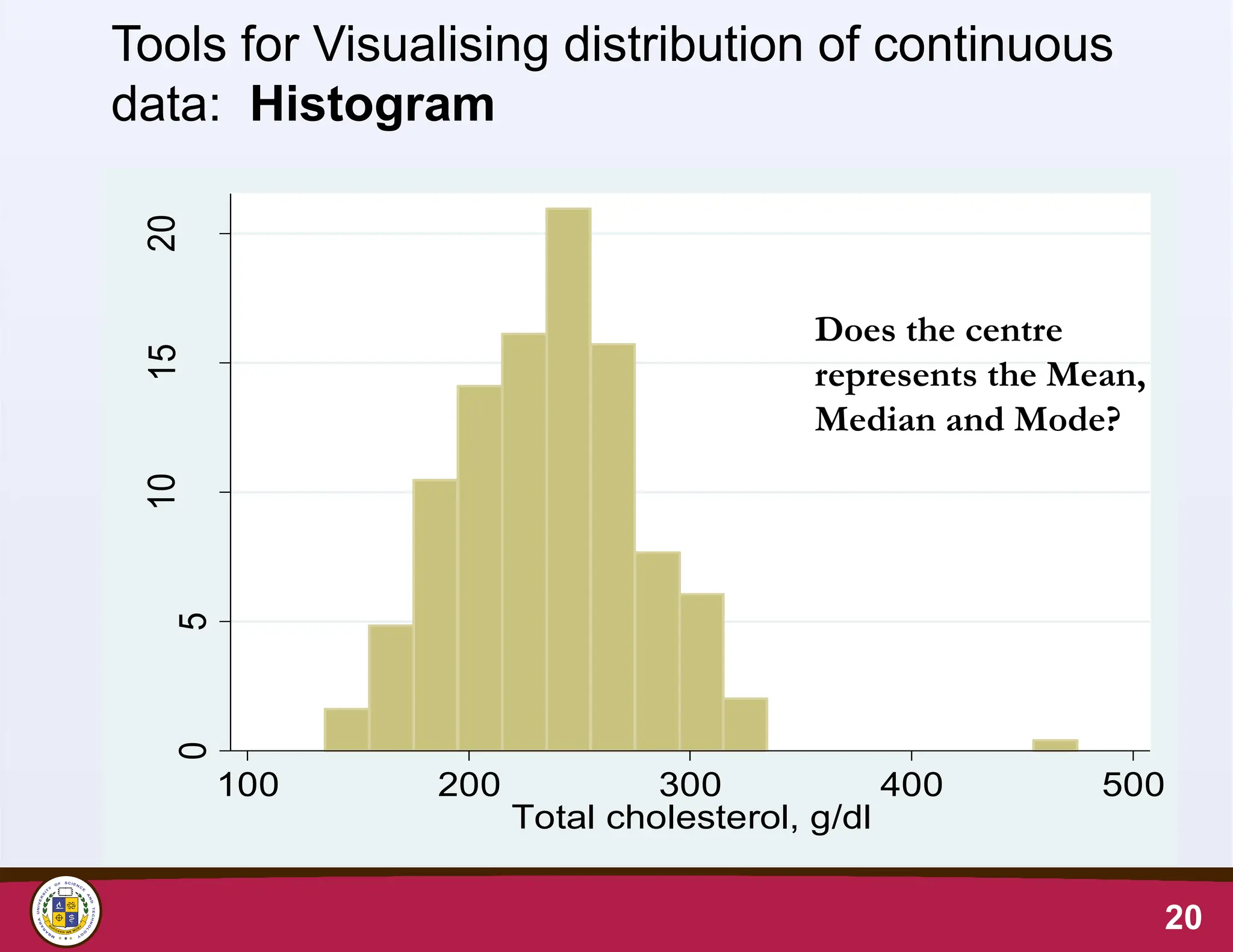
20
Tools for Visualisingdistribution of continuous
data: Histogram
0
5
10
15
20
100 200 300 400 500
Total cholesterol, g/dl
Does the centre
represents the Mean,
Median and Mode?
Summarising the distributionof total
cholesterol data (Continuous data)
• Minimum is 135 mg/dl
• Maximum is 464 mg/dl
• Sample size is 250
• The complete frequency table is too long, making it
difficult to make meaning out of the frequency list.
• A histogram can help visualise the distribution
22
23.
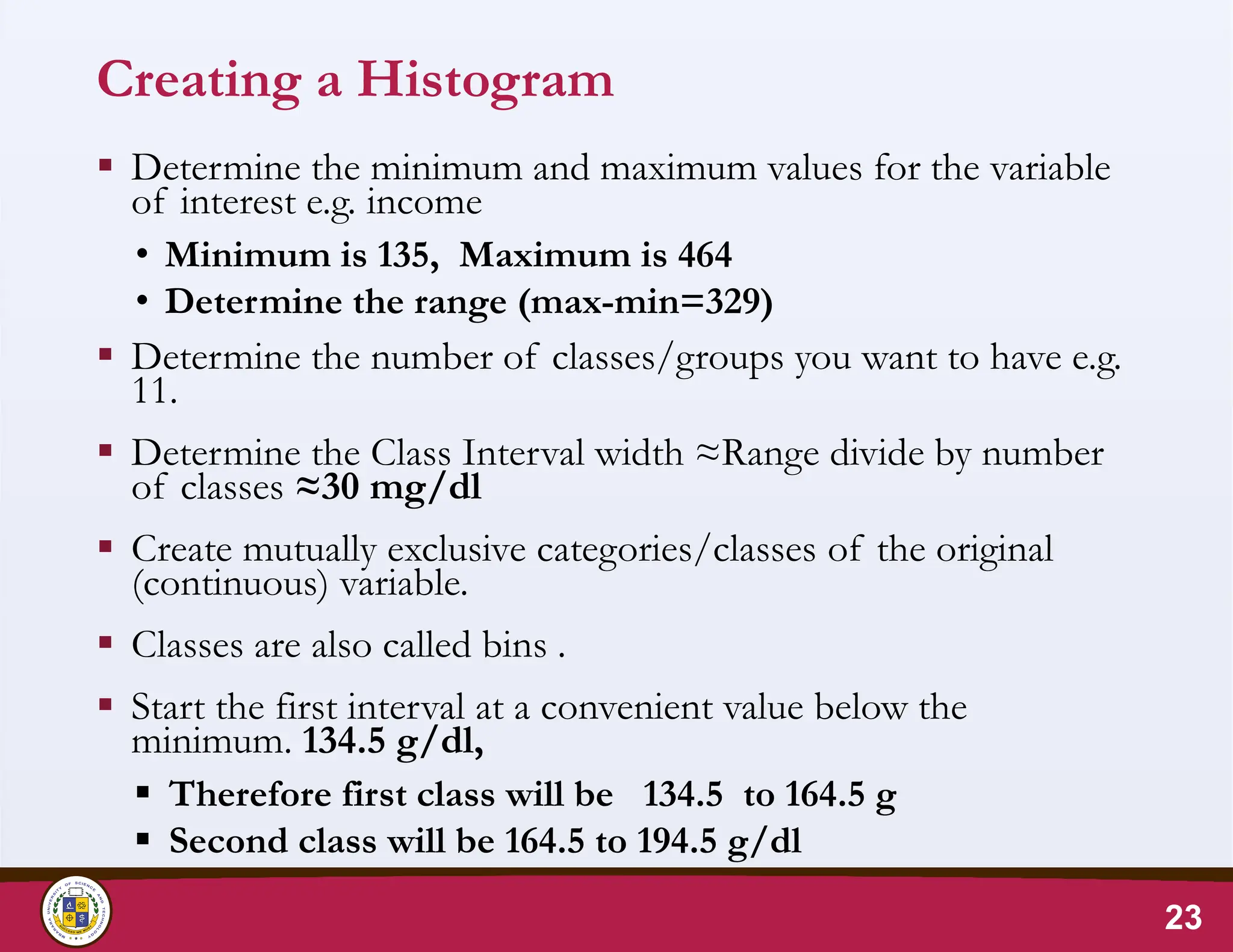
Creating a Histogram
Determine the minimum and maximum values for the variable
of interest e.g. income
• Minimum is 135, Maximum is 464
• Determine the range (max-min=329)
Determine the number of classes/groups you want to have e.g.
11.
Determine the Class Interval width ≈Range divide by number
of classes ≈30 mg/dl
Create mutually exclusive categories/classes of the original
(continuous) variable.
Classes are also called bins .
Start the first interval at a convenient value below the
minimum. 134.5 g/dl,
Therefore first class will be 134.5 to 164.5 g
Second class will be 164.5 to 194.5 g/dl
23
24.
Creating a Histogram
Determine the frequency counts and relative frequency
for each category/class
To plot the graph:
• On the horizontal axis mark equally spaced values of the
lower boundary of each class
• On the vertical axis, the length represents the frequency
• Plot the frequencies for each class as bars.
• The height of the bar will be proportional to the
frequency of that class.
• The width of the bars is the same.
24
25.
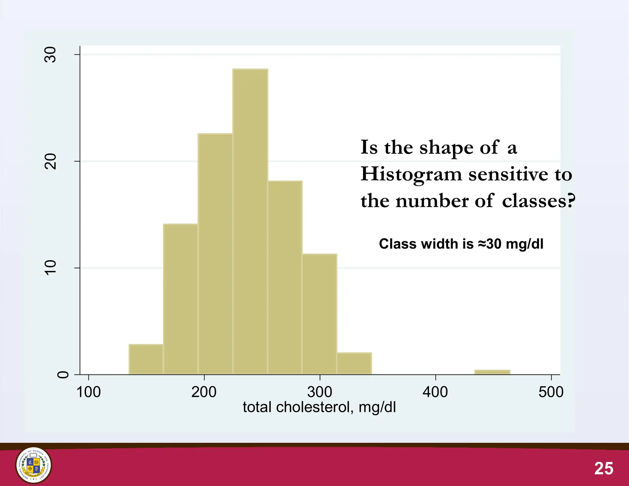
0
10
20
30
100 200 300400 500
total cholesterol, mg/dl
25
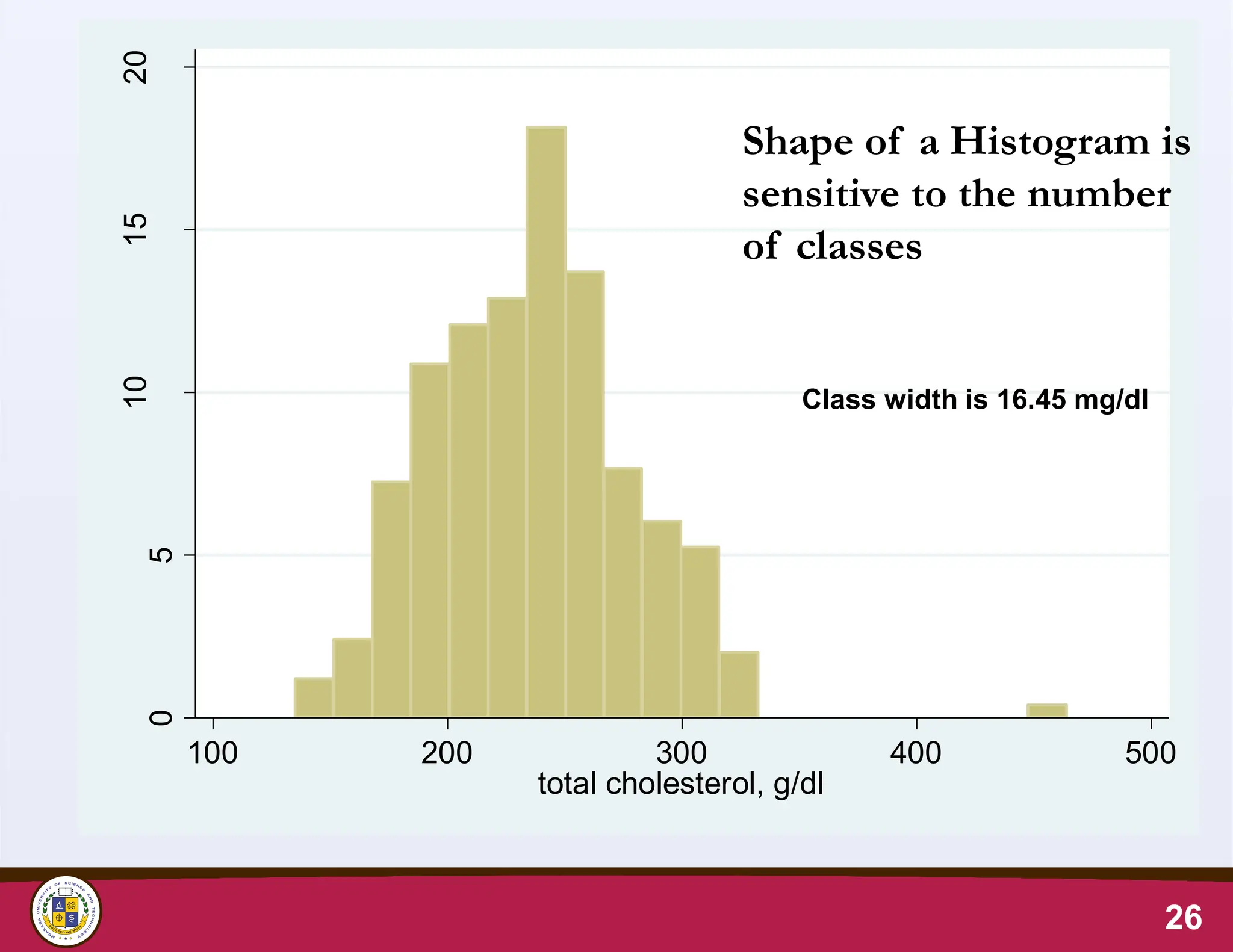
Class width is ≈30 mg/dl
Is the shape of a
Histogram sensitive to
the number of classes?
26.
26
0
5
10
15
20
Percent
100 200 300400 500
total cholesterol, g/dl
Shape of a Histogram is
sensitive to the number
of classes
Class width is 16.45 mg/dl
27.
Distribution of continuousdata
• The shape of the frequency distribution can be
symmetrical or asymmetrical
• A symmetric distribution has the same shape on
both sides of the mean (the centre)
• If outlying values occur only in one direction, the
distribution is said to be skewed
• Normally distributed data has zero skewness
27
28.
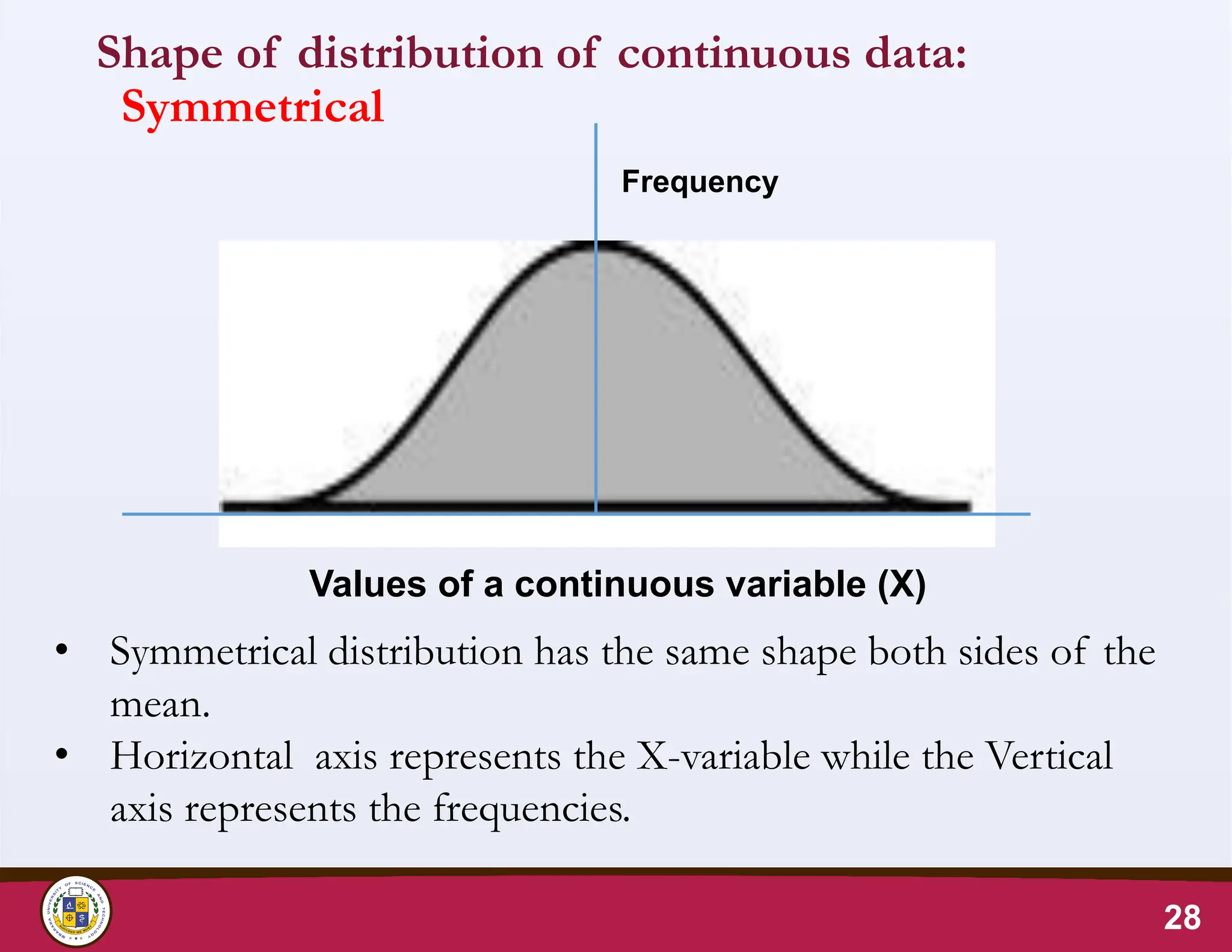
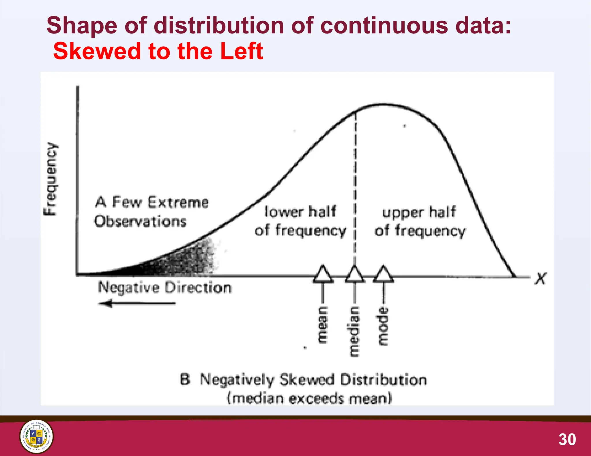
Shape of distributionof continuous data:
Symmetrical
28
• Symmetrical distribution has the same shape both sides of the
mean.
• Horizontal axis represents the X-variable while the Vertical
axis represents the frequencies.
Values of a continuous variable (X)
Frequency
Mbarara University ofScience and Technology
Faculty of Medicine, Department of Pharmacy
P.O. Box 1410, Mbarara, Uganda, http://www.must.ac.ug
31
MEASURES OF CENTRAL TENDENCY
32.
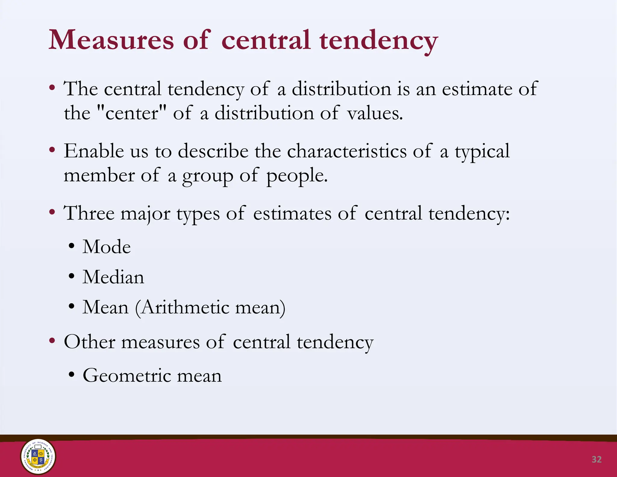
Measures of centraltendency
• The central tendency of a distribution is an estimate of
the "center" of a distribution of values.
• Enable us to describe the characteristics of a typical
member of a group of people.
• Three major types of estimates of central tendency:
• Mode
• Median
• Mean (Arithmetic mean)
• Other measures of central tendency
• Geometric mean
32
33.
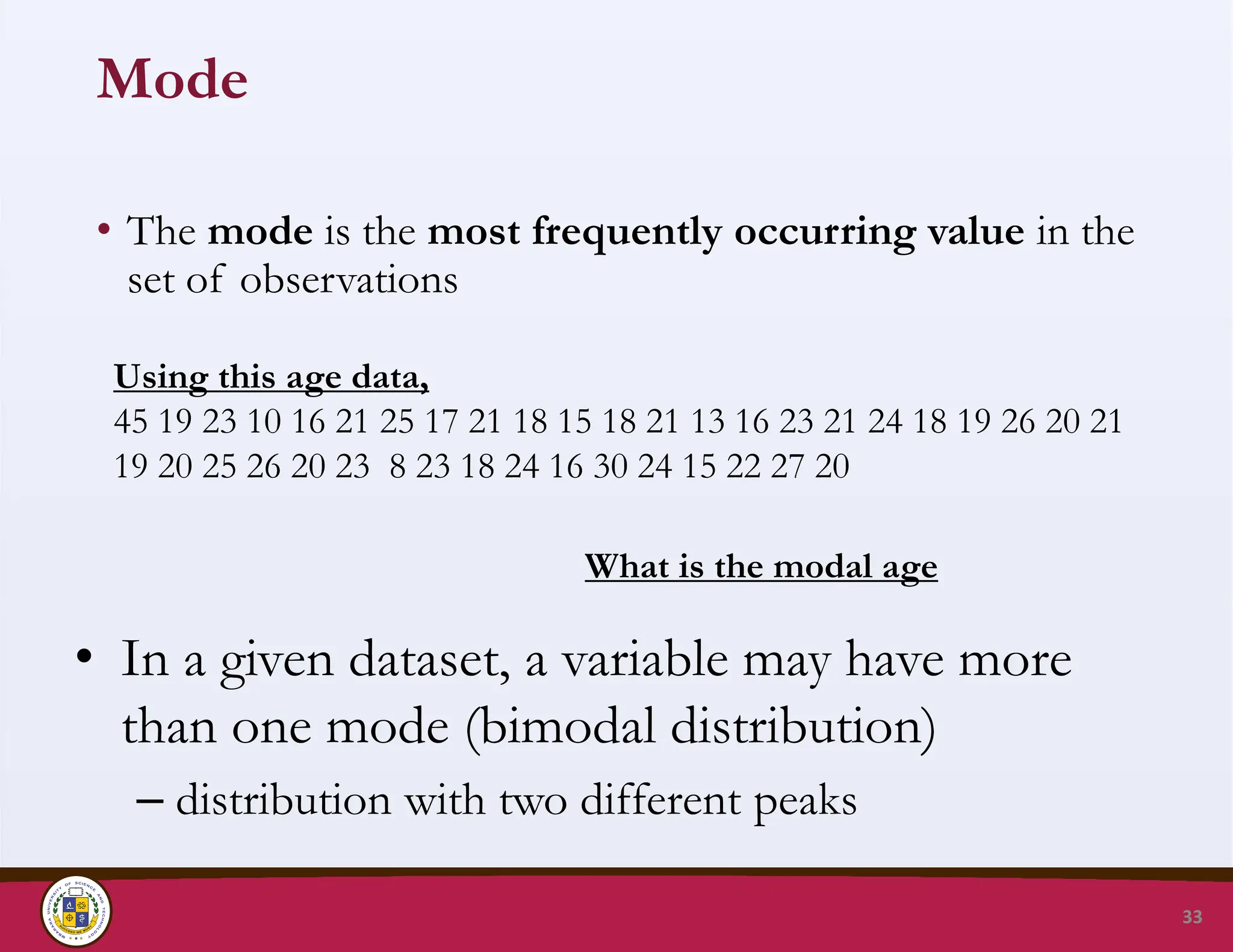
Mode
• The modeis the most frequently occurring value in the
set of observations
33
Using this age data,
45 19 23 10 16 21 25 17 21 18 15 18 21 13 16 23 21 24 18 19 26 20 21
19 20 25 26 20 23 8 23 18 24 16 30 24 15 22 27 20
What is the modal age
• In a given dataset, a variable may have more
than one mode (bimodal distribution)
– distribution with two different peaks
34.
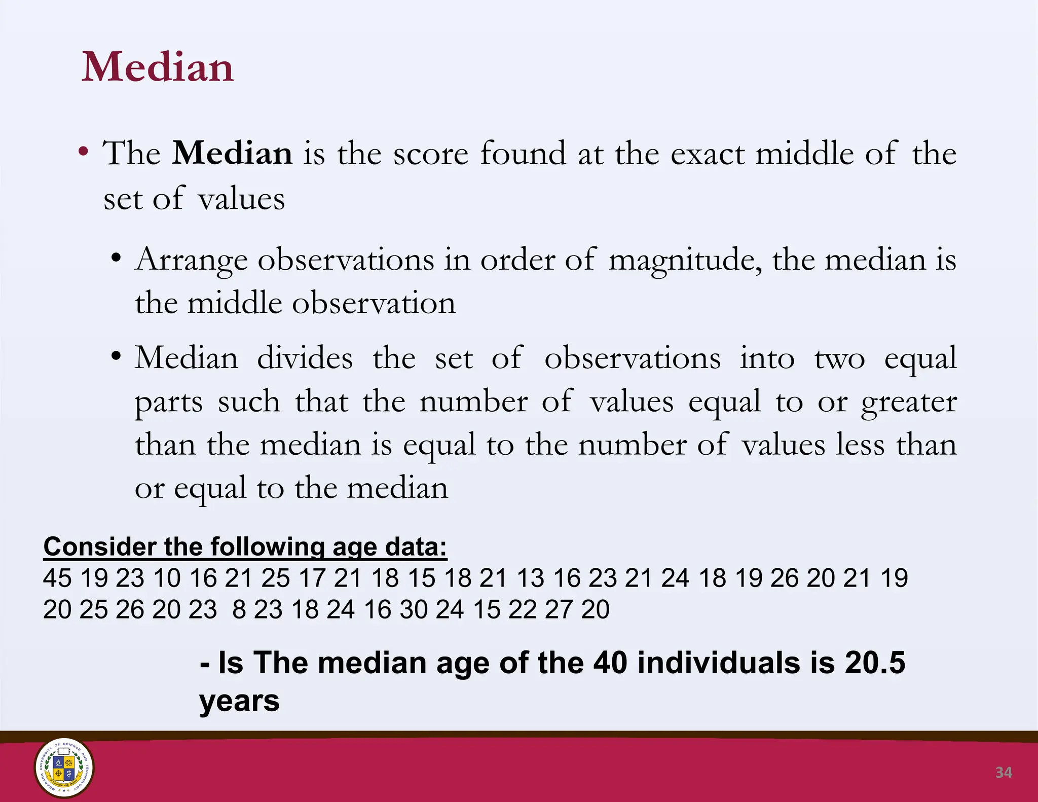
Median
• The Medianis the score found at the exact middle of the
set of values
• Arrange observations in order of magnitude, the median is
the middle observation
• Median divides the set of observations into two equal
parts such that the number of values equal to or greater
than the median is equal to the number of values less than
or equal to the median
34
Consider the following age data:
45 19 23 10 16 21 25 17 21 18 15 18 21 13 16 23 21 24 18 19 26 20 21 19
20 25 26 20 23 8 23 18 24 16 30 24 15 22 27 20
- Is The median age of the 40 individuals is 20.5
years
35.
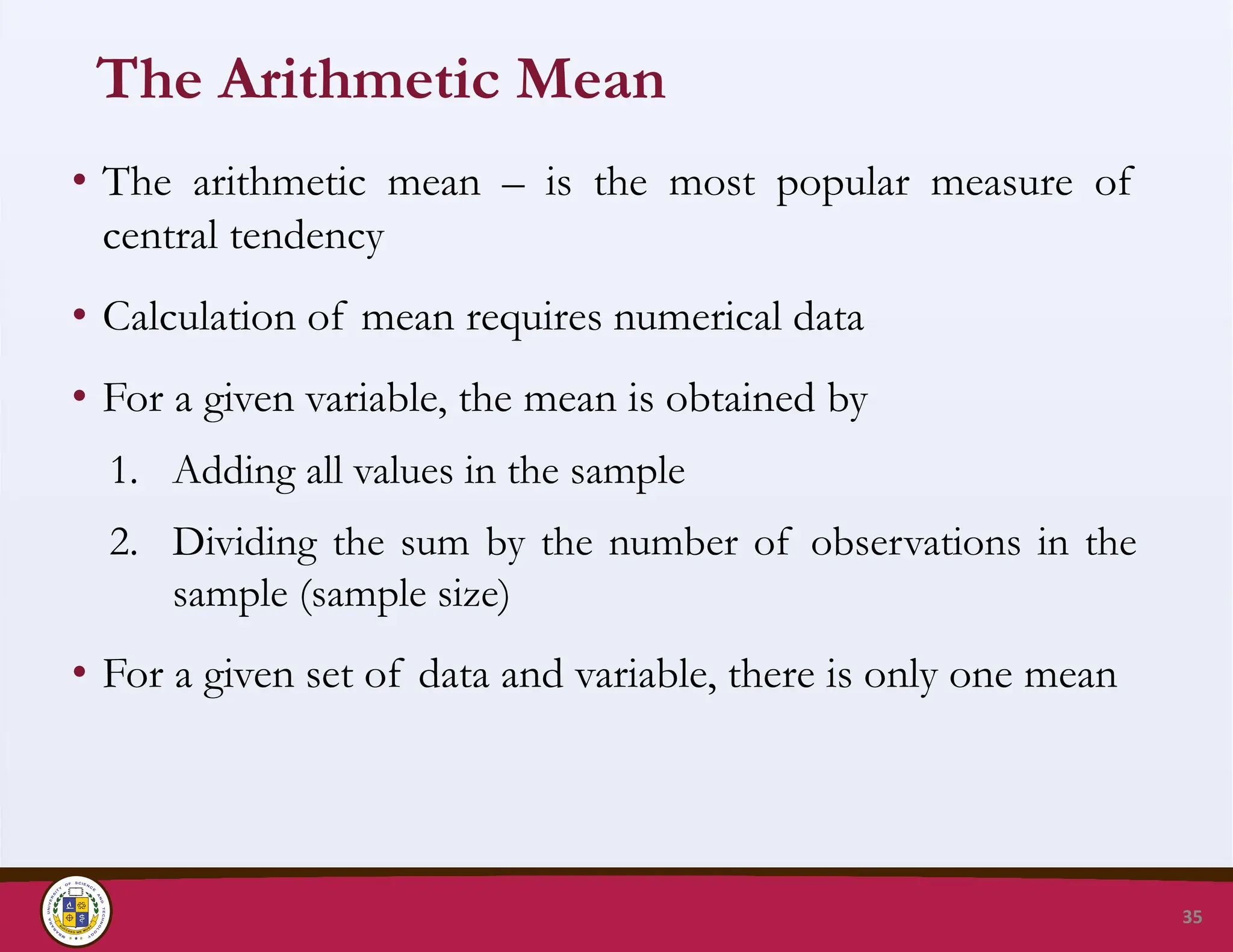
The Arithmetic Mean
•The arithmetic mean – is the most popular measure of
central tendency
• Calculation of mean requires numerical data
• For a given variable, the mean is obtained by
1. Adding all values in the sample
2. Dividing the sum by the number of observations in the
sample (sample size)
• For a given set of data and variable, there is only one mean
35
36.
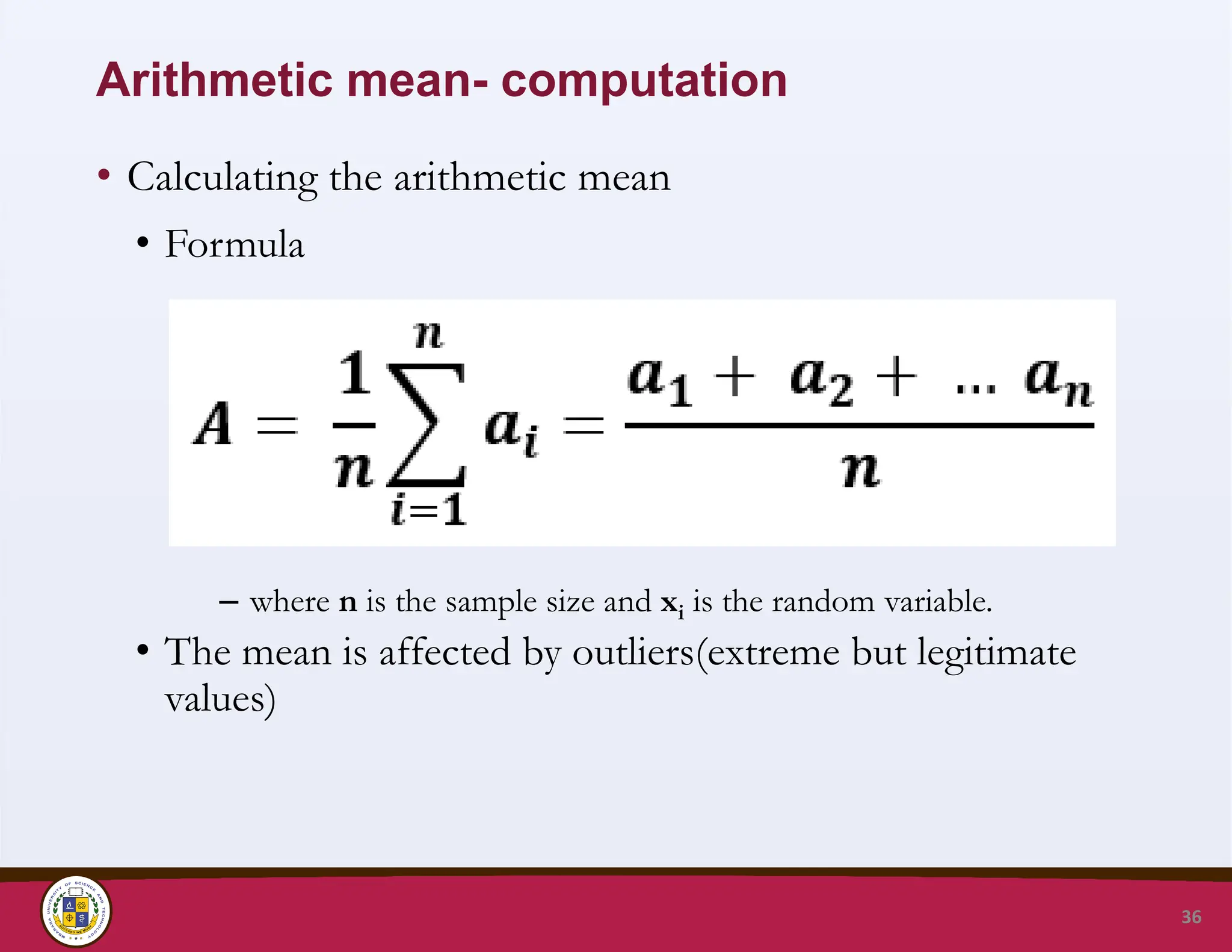
Arithmetic mean- computation
•Calculating the arithmetic mean
• Formula
– where n is the sample size and xi is the random variable.
• The mean is affected by outliers(extreme but legitimate
values)
36
37.
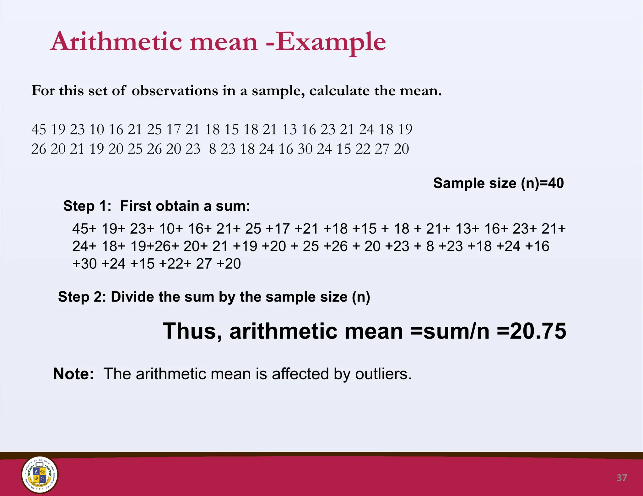
Arithmetic mean -Example
37
Forthis set of observations in a sample, calculate the mean.
45 19 23 10 16 21 25 17 21 18 15 18 21 13 16 23 21 24 18 19
26 20 21 19 20 25 26 20 23 8 23 18 24 16 30 24 15 22 27 20
Step 1: First obtain a sum:
45+ 19+ 23+ 10+ 16+ 21+ 25 +17 +21 +18 +15 + 18 + 21+ 13+ 16+ 23+ 21+
24+ 18+ 19+26+ 20+ 21 +19 +20 + 25 +26 + 20 +23 + 8 +23 +18 +24 +16
+30 +24 +15 +22+ 27 +20
Sample size (n)=40
Thus, arithmetic mean =sum/n =20.75
Step 2: Divide the sum by the sample size (n)
Note: The arithmetic mean is affected by outliers.
38.
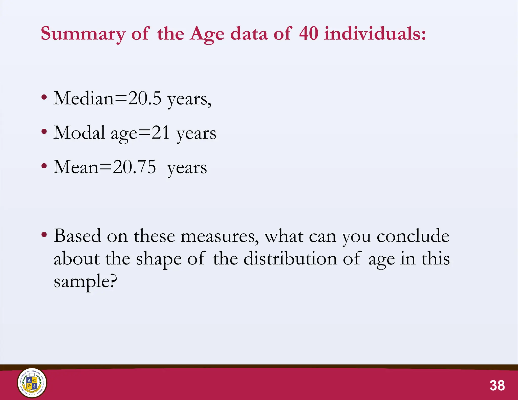
Summary of theAge data of 40 individuals:
• Median=20.5 years,
• Modal age=21 years
• Mean=20.75 years
• Based on these measures, what can you conclude
about the shape of the distribution of age in this
sample?
38
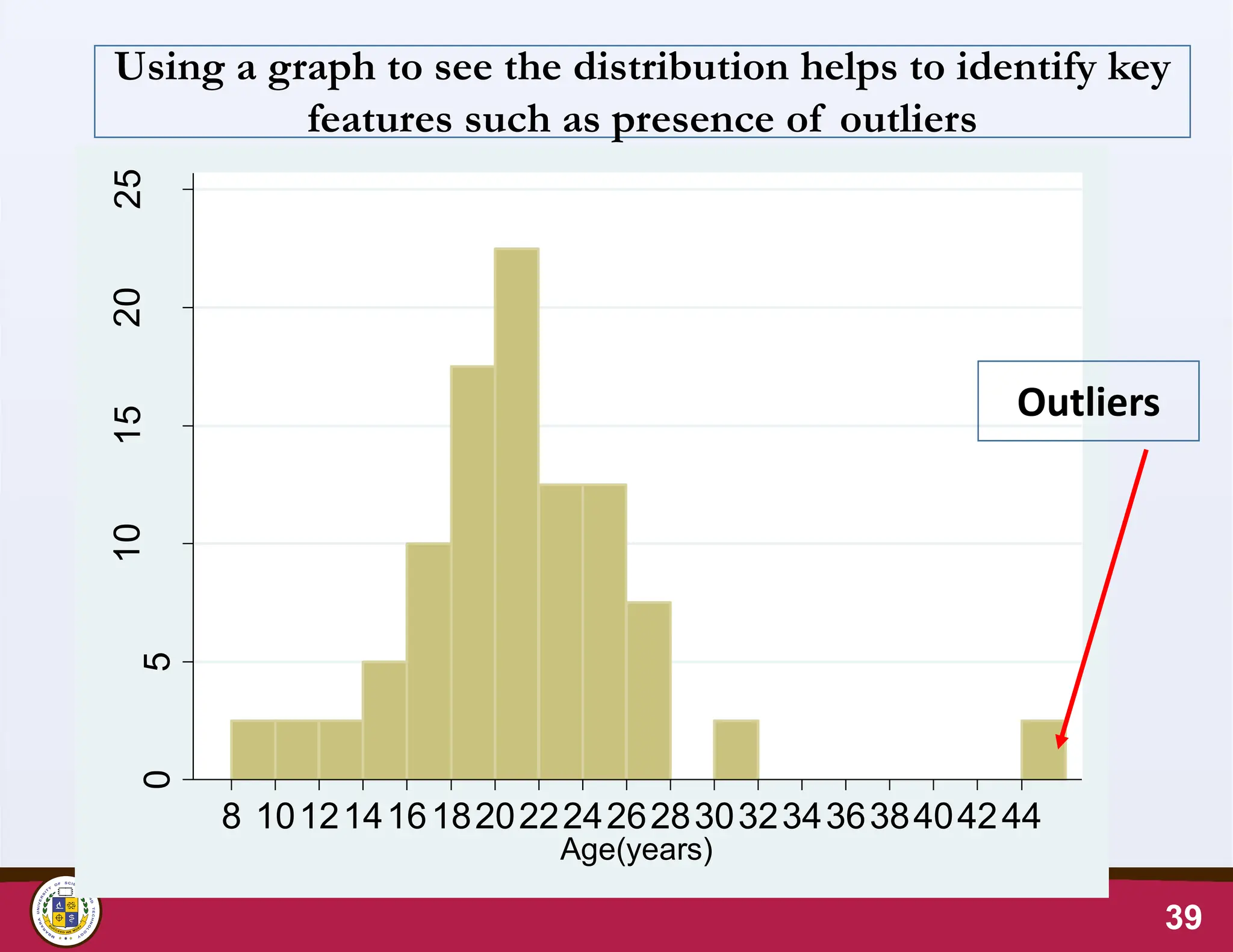
Outliers & ArithmeticMean
• Outliers fall outside the general pattern of the distribution.
• The value of the arithmetic mean is sensitive to/affected by
outliers
• If the data contains outliers-
1. Find out if there is a problem with data entry.
2. Assess the extent to which the outlier affects the results:
for example calculate the mean with and without the
outlier
40
41.
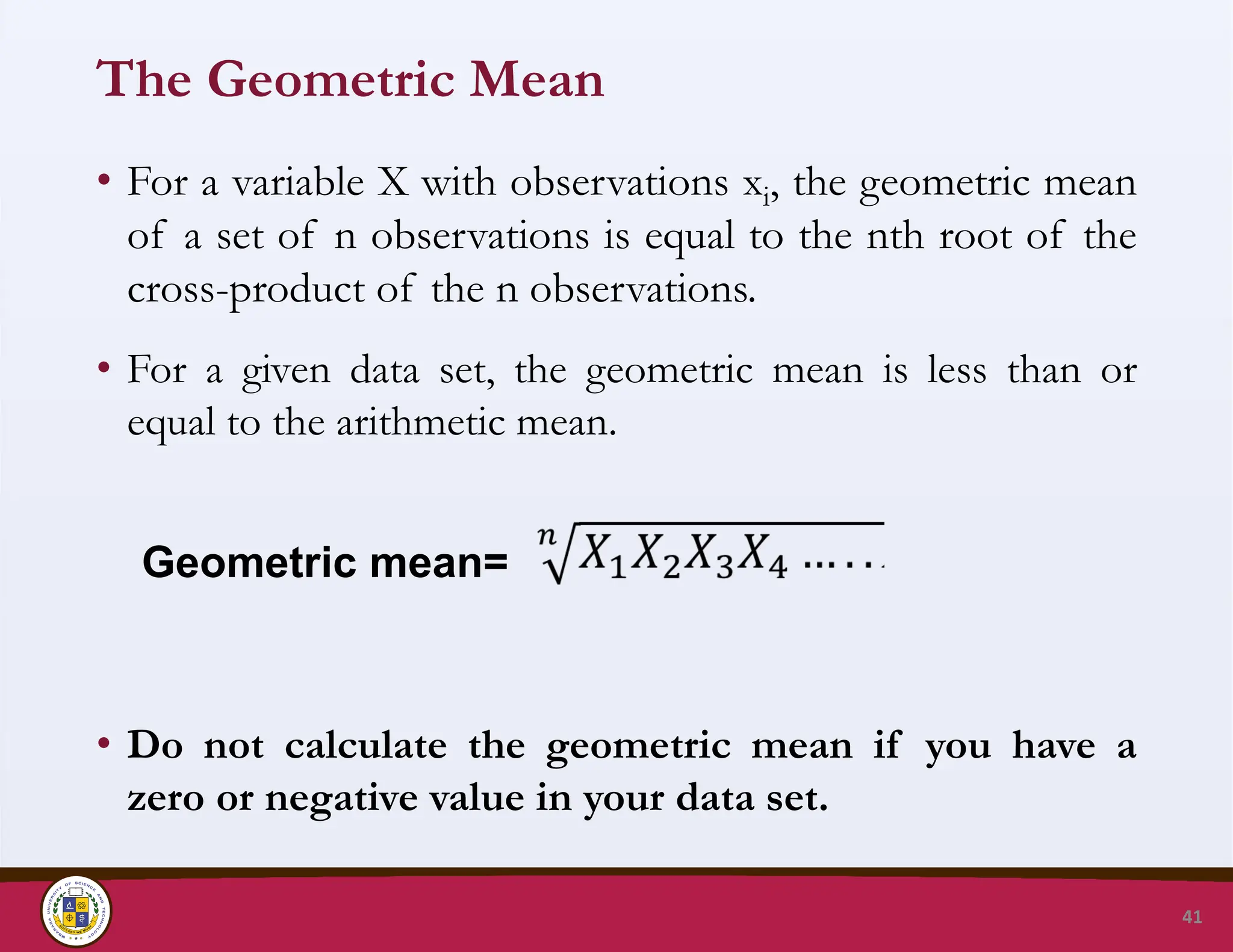
The Geometric Mean
•For a variable X with observations xi, the geometric mean
of a set of n observations is equal to the nth root of the
cross-product of the n observations.
• For a given data set, the geometric mean is less than or
equal to the arithmetic mean.
• Do not calculate the geometric mean if you have a
zero or negative value in your data set.
41
Geometric mean=
42.
Application of GeometricMean
• The geometric mean is a useful measure of central tendency
for highly skewed data e.g. gametocyte density, antibody
titers;
• Geometric mean is used to describe the central tendency of
data which is basically skewed BUT normally distributed on
a log-scale.
• Compared to the arithmetic mean, the geometric mean is
less affected by extreme values.
• The GM is appropriate for describing proportional growth,
e.g. annual population growth, average rate of return on
investment over a period of time.
42
43.
Choice of appropriatemeasure of central
tendency
• The arithmetic mean is calculated for numerical data and for
symmetric or ≈ symmetric distributions
• The median is suitable for ordinal data or numerical data if
the distribution is skewed
• The mode is used to describe bimodal distributions (esp. in
disease-age/time distributions) e.g. seasonal
distribution of malaria
• For a symmetric distribution, the mean ≈ median ≈ mode
43
44.
Mbarara University ofScience and Technology
Faculty of Medicine, Department of Pharmacy
P.O. Box 1410, Mbarara, Uganda, http://www.must.ac.ug
45.
Mbarara University ofScience and Technology
Faculty of Medicine, Department of Pharmacy
P.O. Box 1410, Mbarara, Uganda, http://www.must.ac.ug
MEASURES OF VARIATION
45
46.
Assessing Variation/Dispersion inData
Variation of data is also commonly referred to as dispersion.
Dispersion refers to the spread of the values around the central
point.
The starting point when assessing dispersion in a set of data is
to use visualisation tools such as the Histogram, the Box Plot,
Symmetry Plot, and Quantile plot.
These tools enable the researcher to make a qualitative
description of the extent of variation observed in the data.
Data variation is often quantified using measures such as the
range, percentiles, inter-quartile range, the standard deviation,
coefficient of variation , and standard error.
46
47.
47
0
5
10
15
20
100 200 300400 500
Total Cholesterol, mg/dl
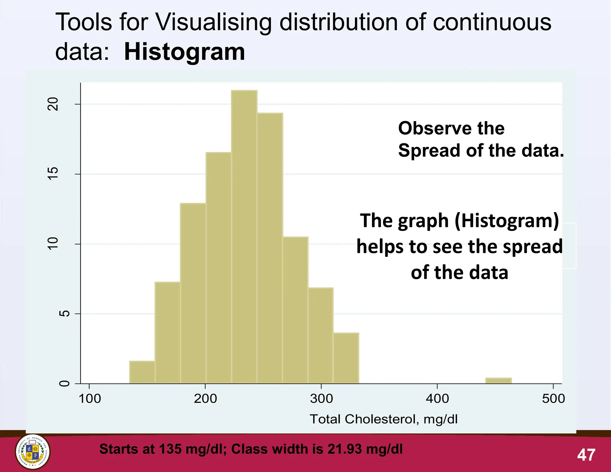
Observe the
Spread of the data.
Tools for Visualising distribution of continuous
data: Histogram
Starts at 135 mg/dl; Class width is 21.93 mg/dl
The graph (Histogram)
helps to see the spread
of the data
48.
Alternative methods forviewing the
distribution of continuous data
• Although the histogram is a popular tool for displaying
visualising the distribution of continuous data, histograms are
sensitive to the number of bins used in their construction.
• They can be inaccurate in informing researchers about the
nature of the distribution of data.
• Other approaches to understanding the distribution of
continuous data include: Box Plot, Symmetry Plot, Quantile
plot etc
48
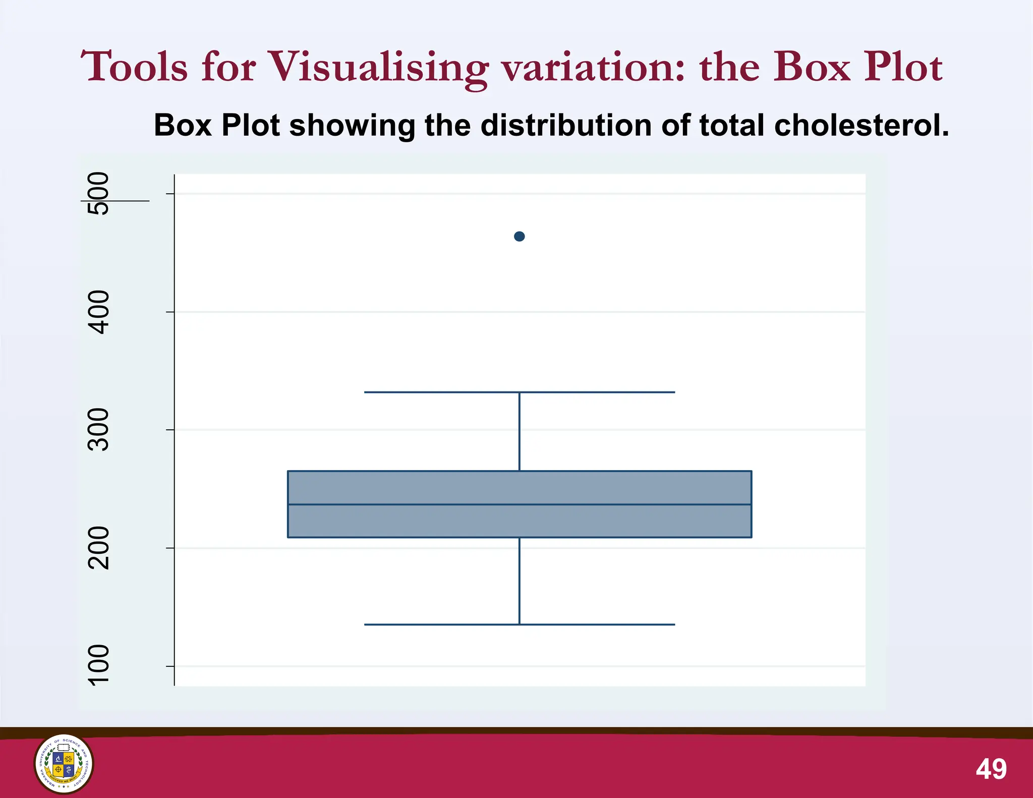
49.
Tools for Visualisingvariation: the Box Plot
49
Box Plot showing the distribution of total cholesterol.
100
200
300
400
500
50.
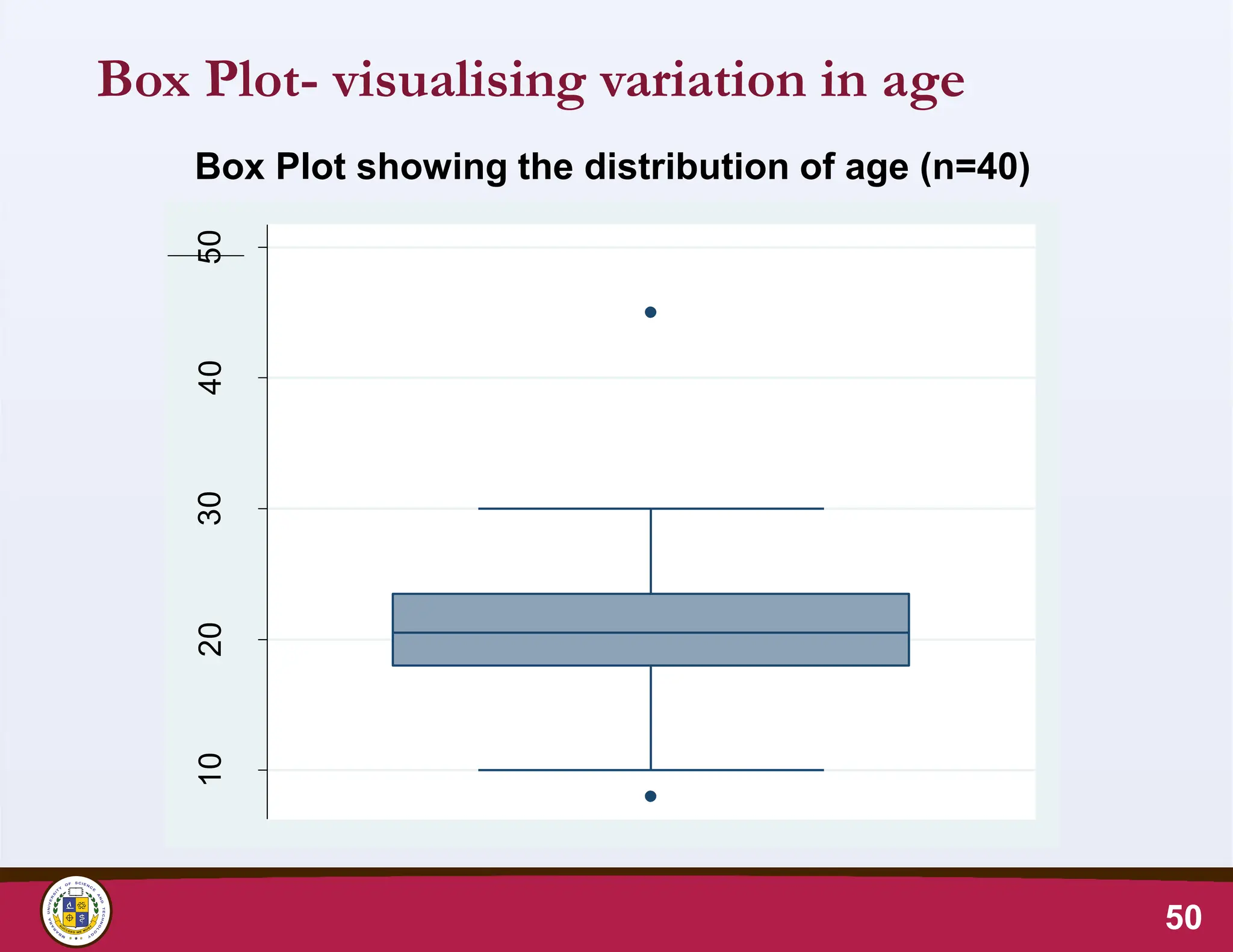
Box Plot- visualisingvariation in age
50
Box Plot showing the distribution of age (n=40)
10
20
30
40
50
Age
(years)
51.
Box plot…
• Standardizedway of displaying data.
• Based on five number summary;
1. Minimum
2. First quartile (Q1)
3. Median
4. Third quartile (Q3)
5. Maximum
51
52.
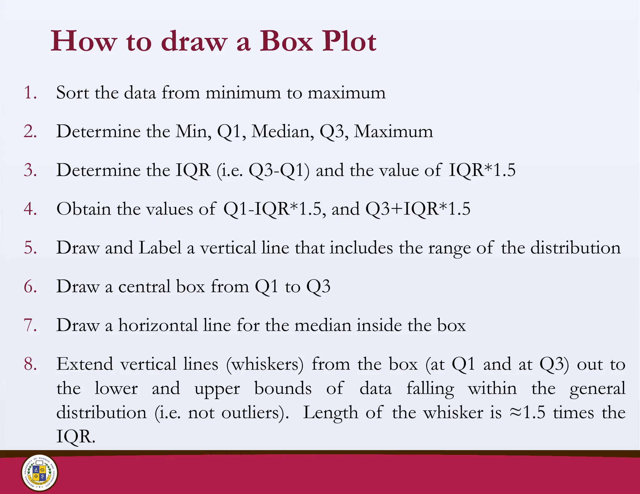
How to drawa Box Plot
1. Sort the data from minimum to maximum
2. Determine the Min, Q1, Median, Q3, Maximum
3. Determine the IQR (i.e. Q3-Q1) and the value of IQR*1.5
4. Obtain the values of Q1-IQR*1.5, and Q3+IQR*1.5
5. Draw and Label a vertical line that includes the range of the distribution
6. Draw a central box from Q1 to Q3
7. Draw a horizontal line for the median inside the box
8. Extend vertical lines (whiskers) from the box (at Q1 and at Q3) out to
the lower and upper bounds of data falling within the general
distribution (i.e. not outliers). Length of the whisker is ≈1.5 times the
IQR.
53.
Determining Q1 &Q3
• These are known as the lower and upper quartiles
1. Arrange the data set in numerical order
2. If your data set has an odd number of observations, Q1 is the
median of the lower half of the data set.
3. If your data set has an even number of observations, Q1 is
the average of the middle two values of the lower half of
the data set.
• Consider the data set {1, 3, 4, 7, 8, 9, 10, 12, 14, 15}.
• Arrange the data in numerical order: {1, 3, 4, 7, 8, 9, 10, 12, 14,
15}.
• (3+4)/2 = 3.5.
53
54.
54
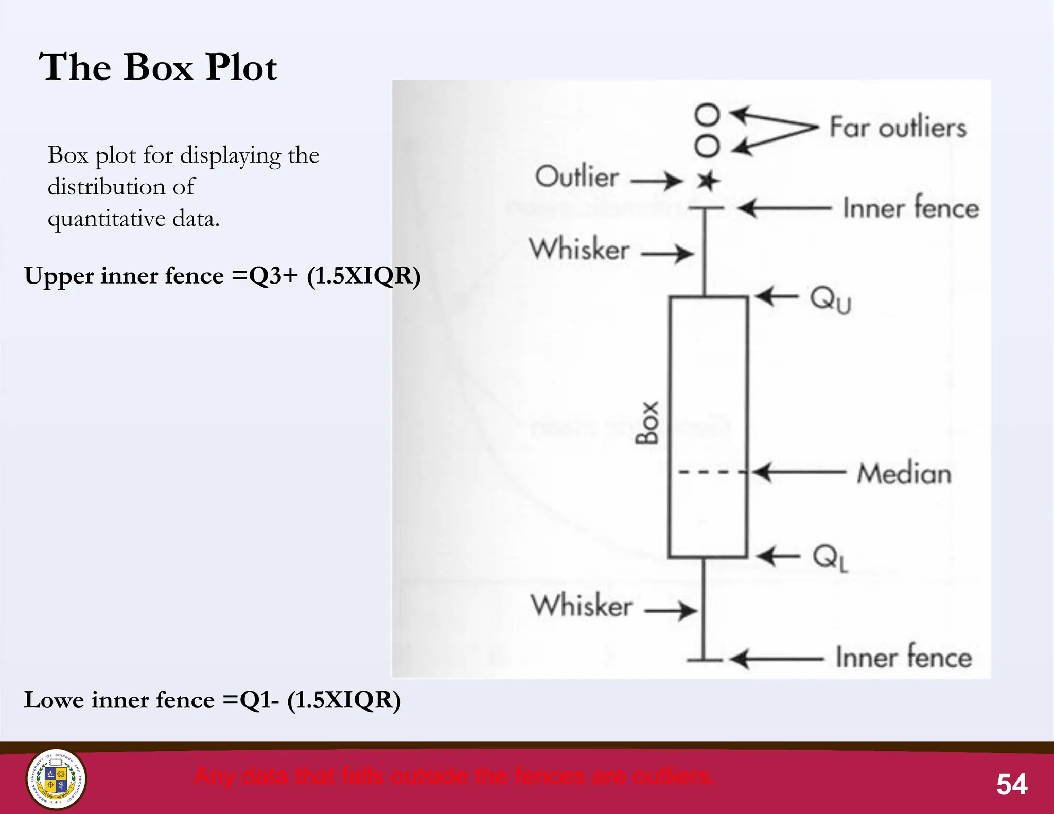
The Box Plot
Boxplot for displaying the
distribution of
quantitative data.
Upper inner fence =Q3+ (1.5XIQR)
Lowe inner fence =Q1- (1.5XIQR)
Any data that falls outside the fences are outliers.
Box Plot: Locationof fences
• When the calculated value of Upper fence is greater
than the maximum observation in the data, the
fence will be located at the observed maximum
value.
• When the calculated value of the Lower fence is
less than the minimum value in the data, the fence
will be located at the observed minimum value.
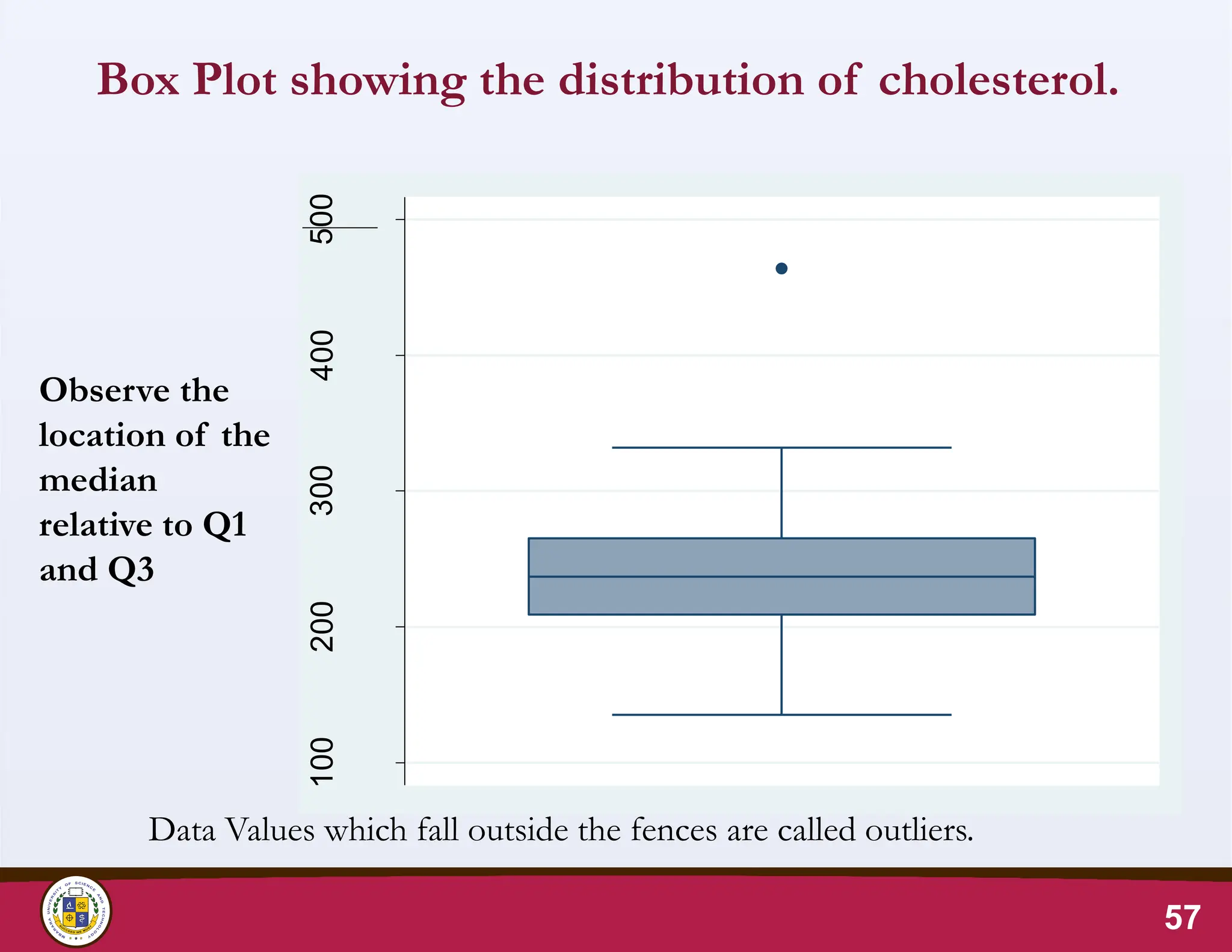
57.
Box Plot showingthe distribution of cholesterol.
57
Data Values which fall outside the fences are called outliers.
Observe the
location of the
median
relative to Q1
and Q3
100
200
300
400
500
totchol
(mg/dl)
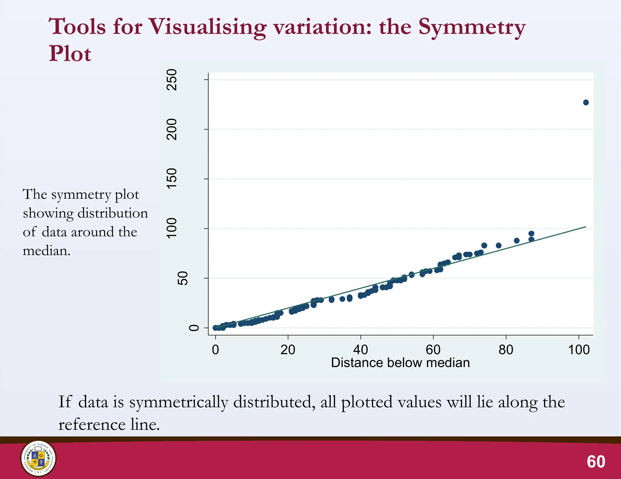
Tools for Visualisingvariation: the Symmetry Plot
• Also known as a normal probability plot or a normal plot.
• Assess whether a data set follows a normal distribution.
• Scatter plot of the data against a theoretical normal
distribution.
• If the data is symmetric and approximately bell-shaped,
the points on the plot will form a roughly straight line.
• If the data deviates significantly from normality, the
points on the plot will deviate from a straight line.
59
60.
Tools for Visualisingvariation: the Symmetry
Plot
60
The symmetry plot
showing distribution
of data around the
median.
If data is symmetrically distributed, all plotted values will lie along the
reference line.
0
50
100
150
200
250
Distance
above
median
0 20 40 60 80 100
Distance below median
61.
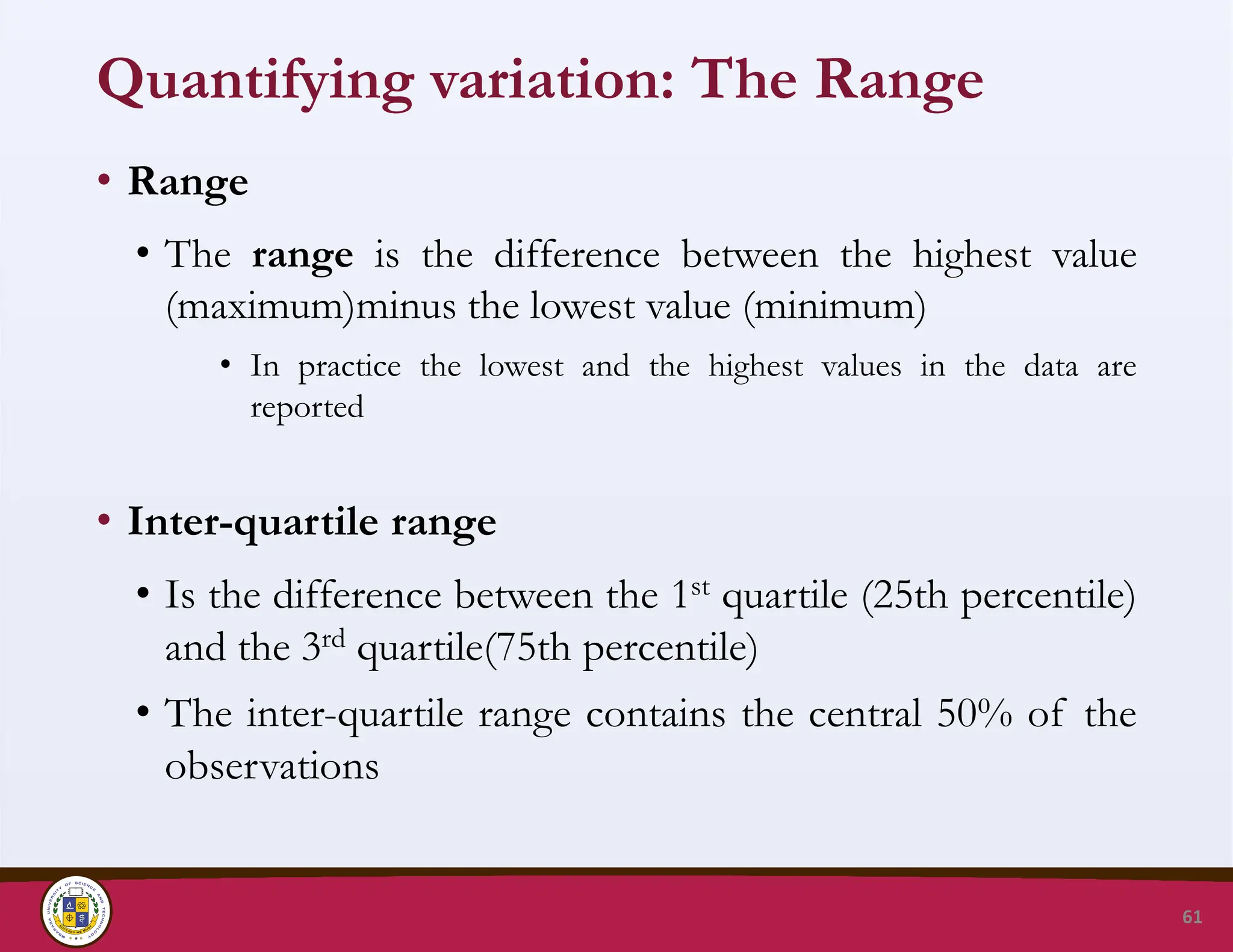
Quantifying variation: TheRange
• Range
• The range is the difference between the highest value
(maximum)minus the lowest value (minimum)
• In practice the lowest and the highest values in the data are
reported
• Inter-quartile range
• Is the difference between the 1st quartile (25th percentile)
and the 3rd quartile(75th percentile)
• The inter-quartile range contains the central 50% of the
observations
61
62.
Quantifying variation: StandardDeviation
• Standard deviation is a measure of the spread of
observations about their mean
• It is a measure of how much on average each of the
values in the distribution deviates from the mean
• Standard deviation is an essential part of many statistical
tests
• The value of the standard deviation is affected by outliers
62
63.
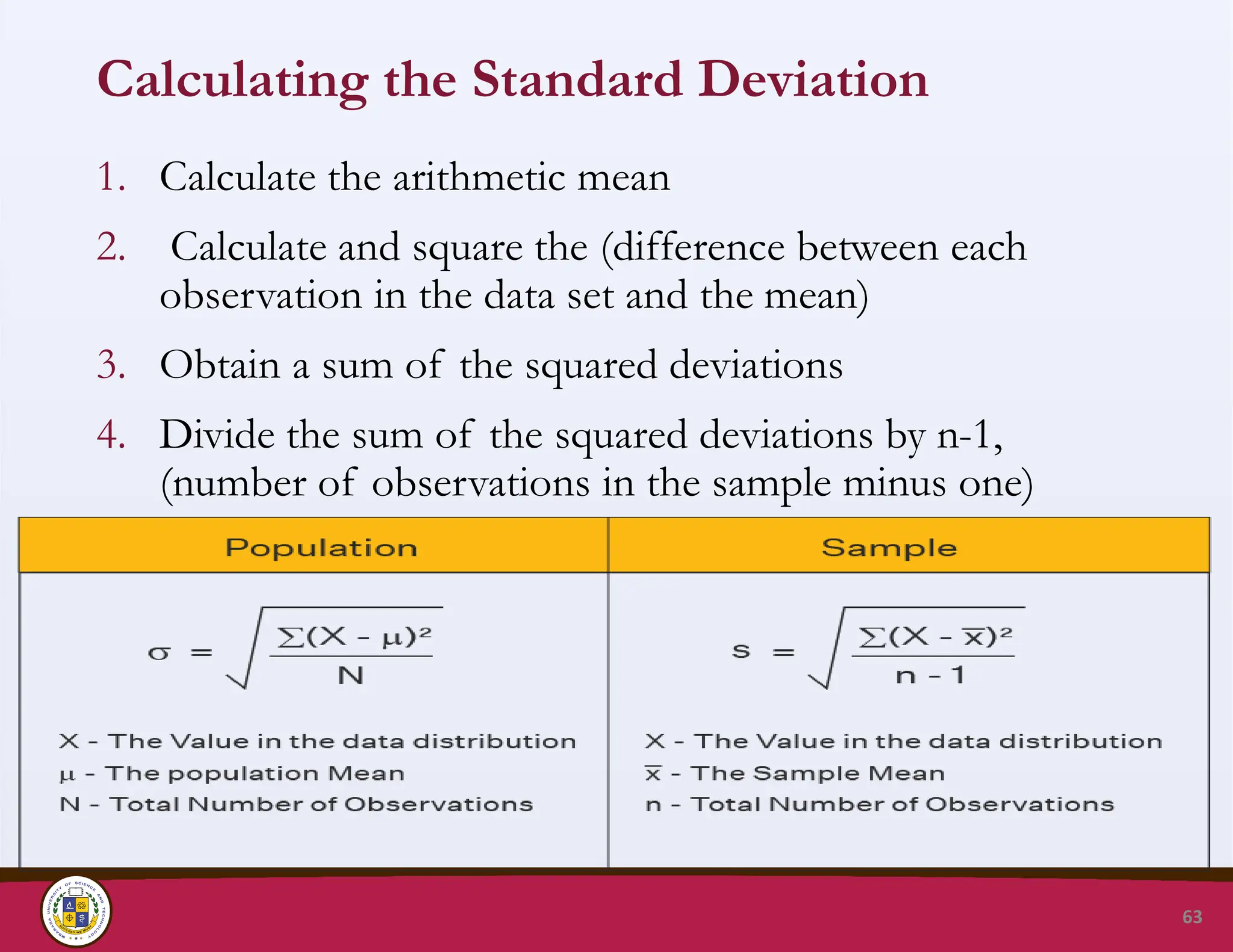
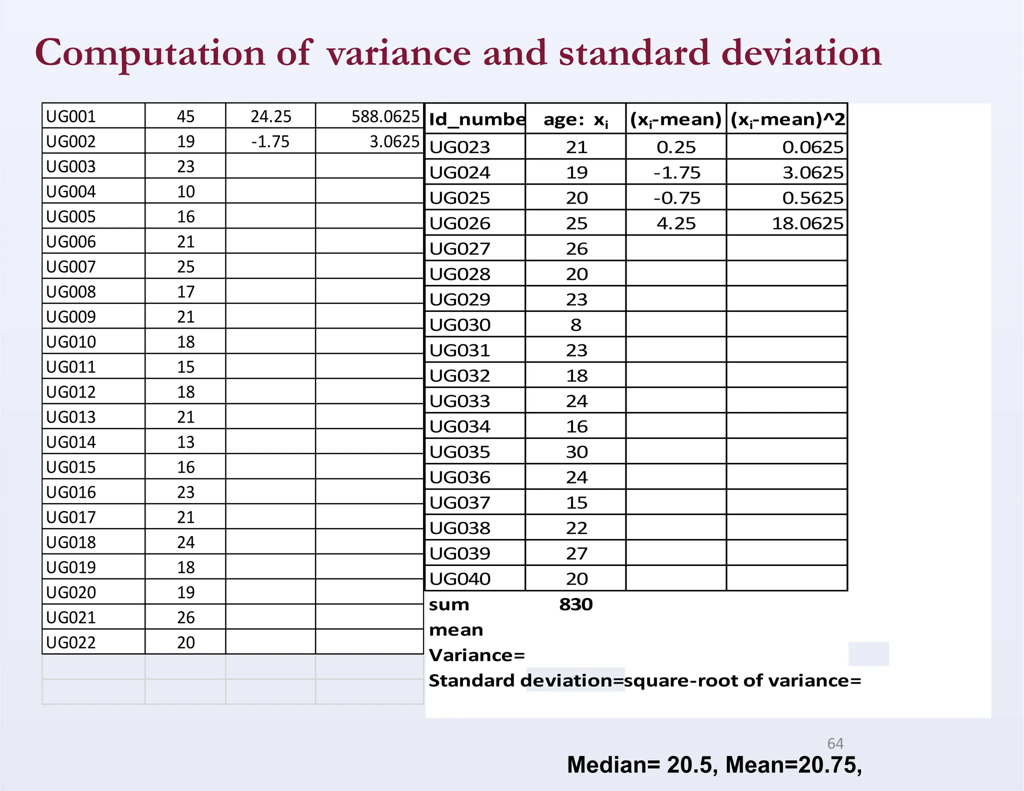
Calculating the StandardDeviation
1. Calculate the arithmetic mean
2. Calculate and square the (difference between each
observation in the data set and the mean)
3. Obtain a sum of the squared deviations
4. Divide the sum of the squared deviations by n-1,
(number of observations in the sample minus one)
63
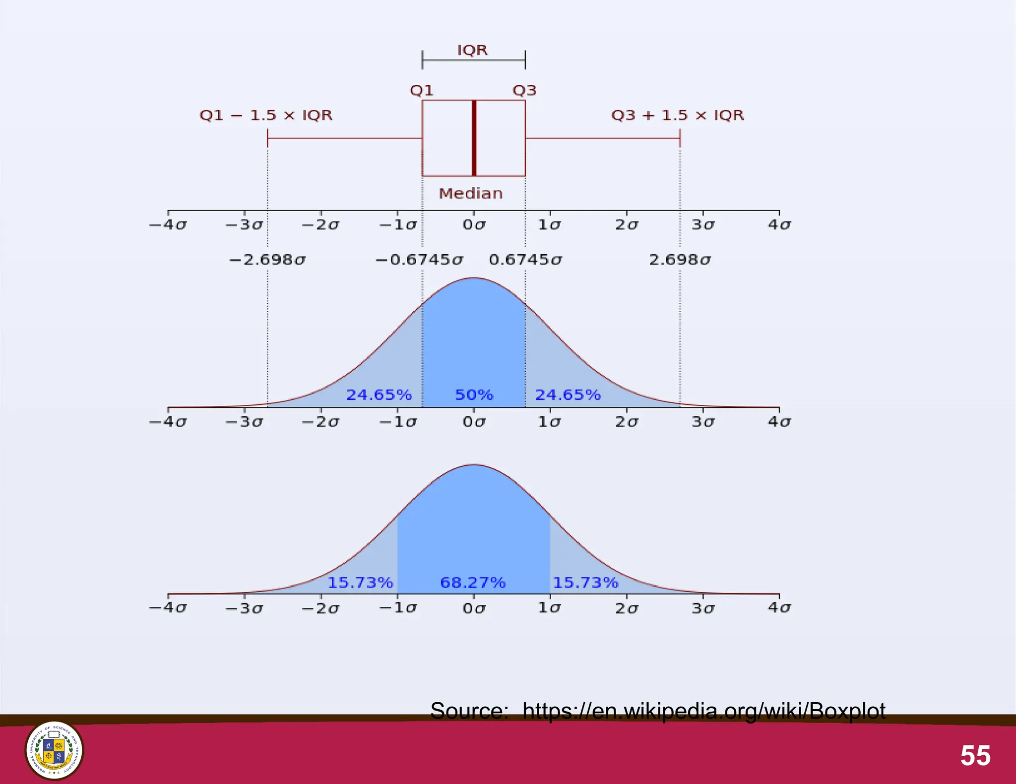
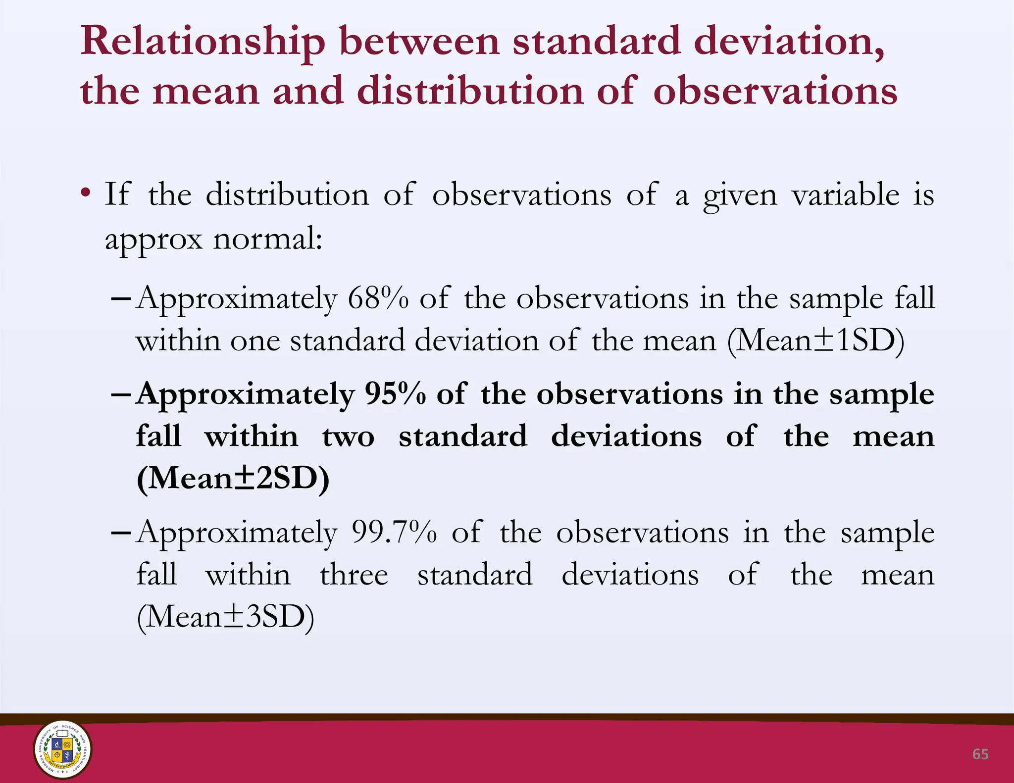
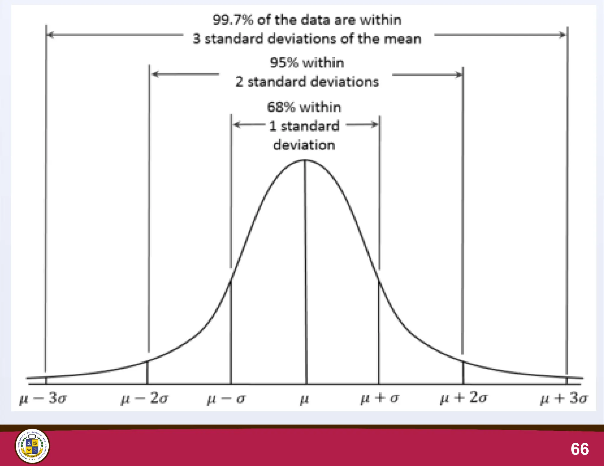
Relationship between standarddeviation,
the mean and distribution of observations
• If the distribution of observations of a given variable is
approx normal:
–Approximately 68% of the observations in the sample fall
within one standard deviation of the mean (Mean±1SD)
–Approximately 95% of the observations in the sample
fall within two standard deviations of the mean
(Mean±2SD)
–Approximately 99.7% of the observations in the sample
fall within three standard deviations of the mean
(Mean±3SD)
65
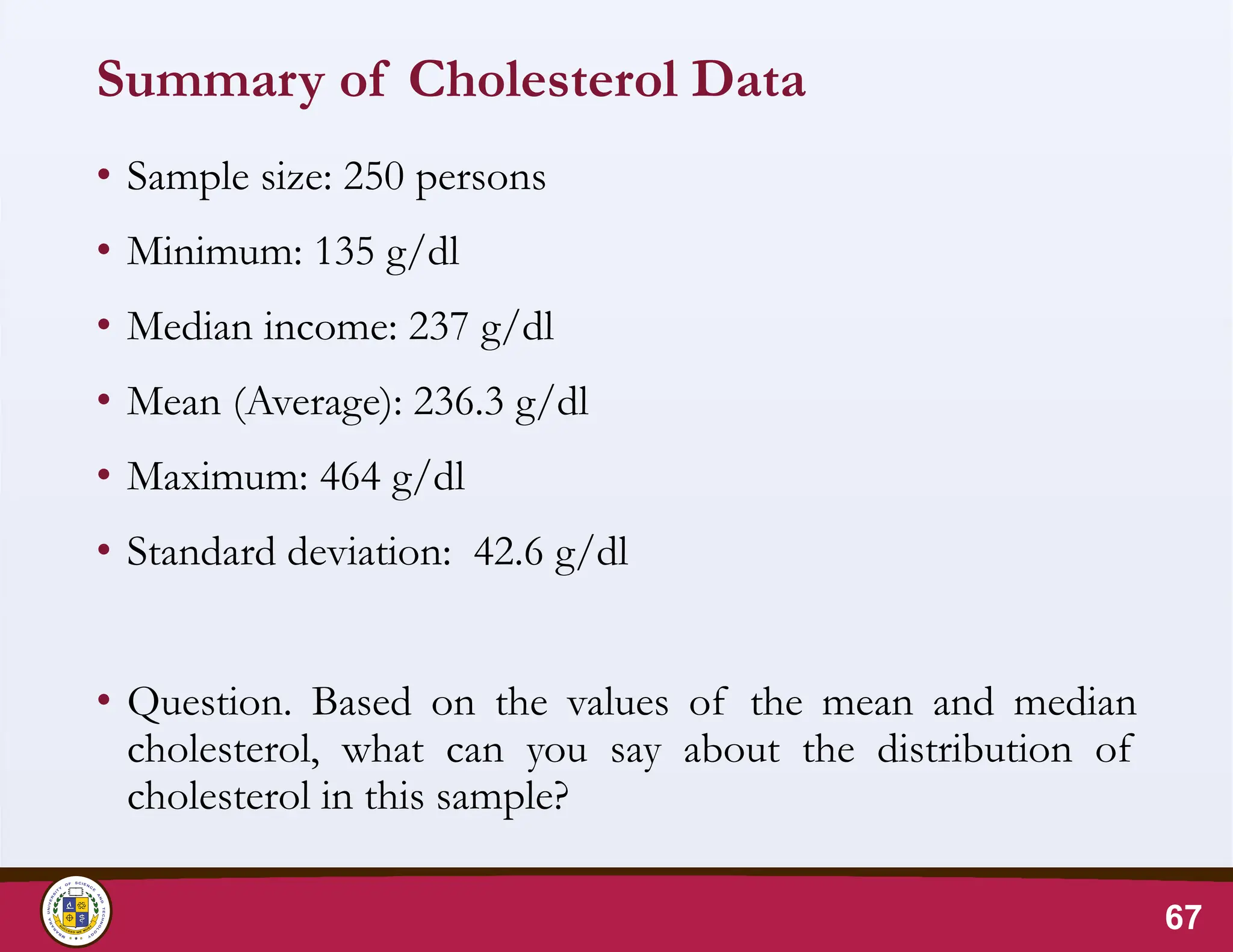
Summary of CholesterolData
• Sample size: 250 persons
• Minimum: 135 g/dl
• Median income: 237 g/dl
• Mean (Average): 236.3 g/dl
• Maximum: 464 g/dl
• Standard deviation: 42.6 g/dl
• Question. Based on the values of the mean and median
cholesterol, what can you say about the distribution of
cholesterol in this sample?
67
68.
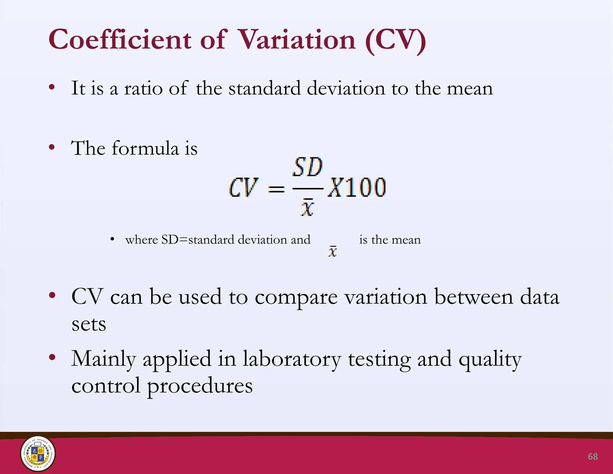
Coefficient of Variation(CV)
• It is a ratio of the standard deviation to the mean
• The formula is
• where SD=standard deviation and is the mean
• CV can be used to compare variation between data
sets
• Mainly applied in laboratory testing and quality
control procedures
68
69.
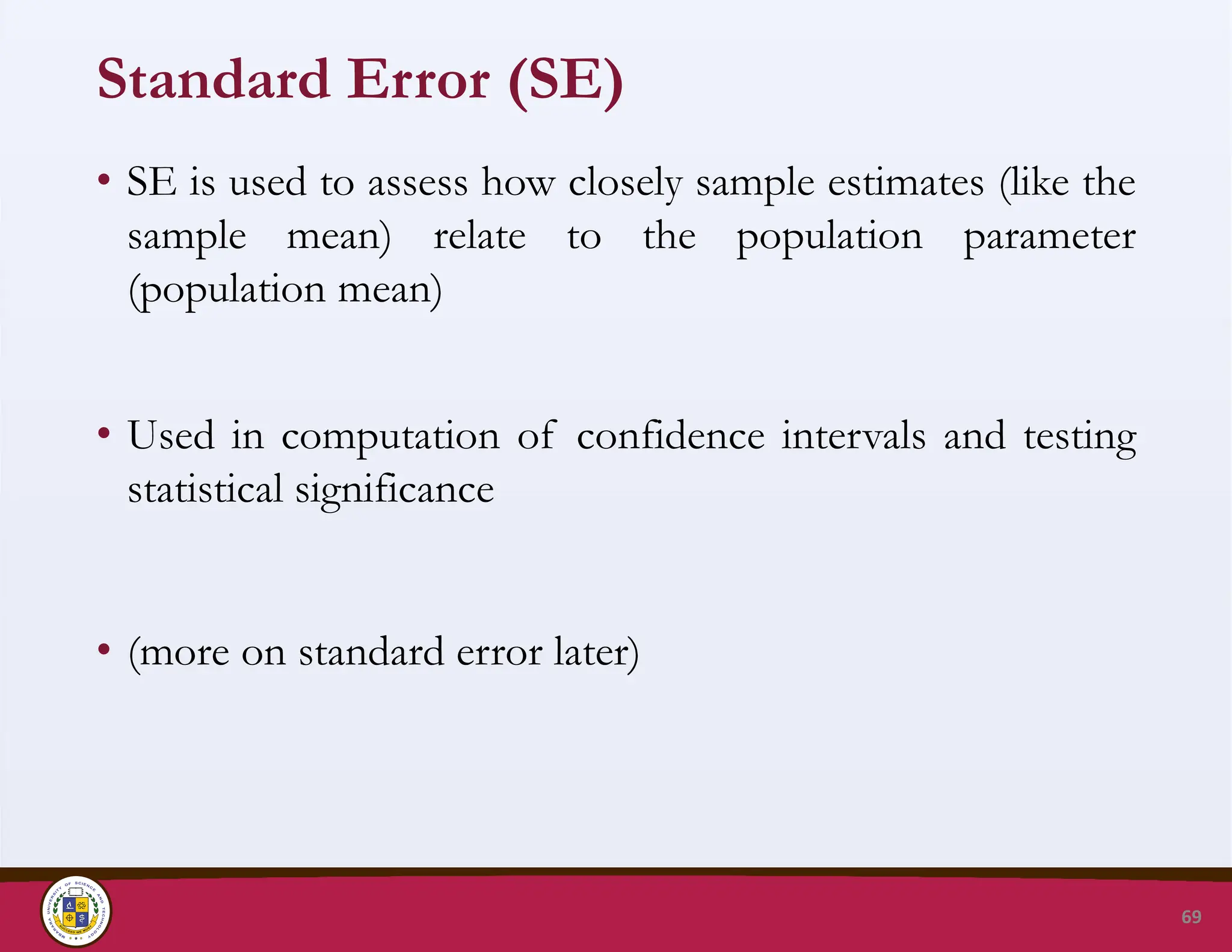
Standard Error (SE)
•SE is used to assess how closely sample estimates (like the
sample mean) relate to the population parameter
(population mean)
• Used in computation of confidence intervals and testing
statistical significance
• (more on standard error later)
69
70.
Choice of measuresof dispersion
• Standard deviation is appropriate when the mean is used to describe
central tendency (symmetric data)
• The inter-quartile range is used to describe the central 50% of a
distribution, regardless of its shape
• The percentile may also be used when the mean is used but the
objective is to compare a set of observations with the norm
• The range is used with numerical data when the purpose is to
emphasize extreme values
• Percentiles and inter-quartile range are used when the median is used
(skewed data)
• The coefficient of variation is used when the intent is to compare
distributions of variables measured on different scales
70
71.
Take home assignment
•Using dummy data from the research questions that were
pitched in class, provide a summary of the data collected as;
1. Summarize and present data on socio demographics of the
study population.
2. Present the data of your findings using the appropriate data
presentation method.
3. Comment on the spread and symmetry of your data findings
Please work in your groups to have a PowerPoint
presentation ready for a 5 minute presentation in our next
class
71