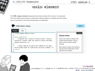
HTML module 11.6HTML/CSS Responsive
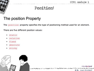
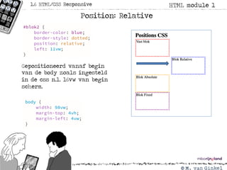
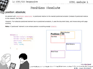
Position: Absolute
Gepositioneerd vanaf begin
van de body het 0-punt.
De box staat nu 11vw van links
en 2vh van de top.
10.
HTML module 11.6HTML/CSS Responsive
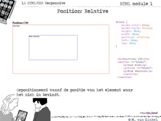
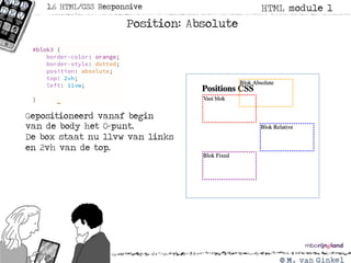
Position: Absolute
Gepositioneerd vanaf begin body 0-punt vanaf links maar
wel onder de tekst van blok 1
HTML module 11.6HTML/CSS Responsive
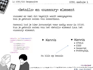
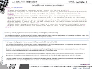
<details> en <summary> element
Wanneer er veel dat tegelijk wordt weergegeven
kan je gebruik maken van accordions.
Normaal had je hier javascript voor nodig maar in HTLM5.
Kun je gebruik maken van het <details> element i.c.m. het
<summary> element.
Na klik op kennis
14.
HTML module 11.6HTML/CSS Responsive
<details> en <summary> element
HTML module 11.6HTML/CSS Responsive
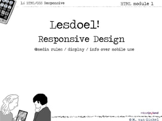
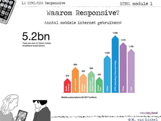
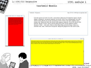
Waarom Responsive?
Aantal mobiele internet gebruikers!
17.
HTML module 11.6HTML/CSS Responsive
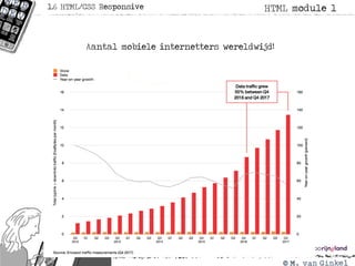
Aantal mobiele internetters wereldwijd!
18.
HTML module 11.6HTML/CSS Responsive
Aantal mobiele internetters in Nederland!
19.
HTML module 11.6HTML/CSS Responsive
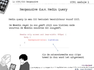
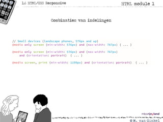
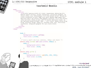
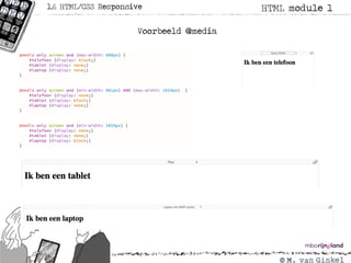
Responsive d.m.v. Media Query
Media query is een CSS techniek beschikbaar vanaf CSS3.
De @media regel in css geeft stijl aan blokken code
waarvan de @media conditie dit aangeeft.
Als de schermbreedte max 600px
breed is dan word het uitgevoerd.
20.
HTML module 11.6HTML/CSS Responsive
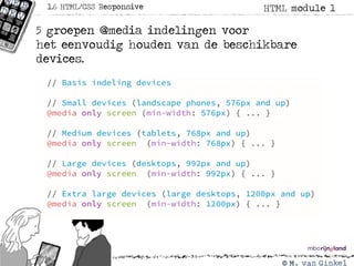
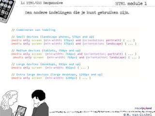
5 groepen @media indelingen voor
het eenvoudig houden van de beschikbare
devices.
21.
HTML module 11.6HTML/CSS Responsive
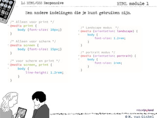
Een andere indelingen die je kunt gebruiken zijn.
22.
HTML module 11.6HTML/CSS Responsive
Een andere indelingen die je kunt gebruiken zijn.
HTML module 11.6HTML/CSS Responsive
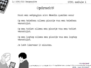
Opdracht!
Maak een webpagina m.b.v. @media queries waar
Op een telefoon alleen plaatje van een telefoon
verschijnt.
Op een tablet alleen een plaatje van een tablet
verschijnt.
Op een laptop alleen een plaatje van een laptop
verschijnt.
Je hebt hiervoor 15 minuten.
29.
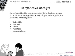
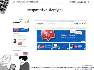
HTML module 11.6HTML/CSS Responsive
Responsive design!
De webapplicatie kan op de meerdere devices anders
zijn dan de webapplicatie voor bigscreen apparaten.
Hou wel rekening met:
• Huisstijl
• Kleuren
• Font’s
• Plaatjes
• Leesbaarheid
HTML module 11.6HTML/CSS Responsive
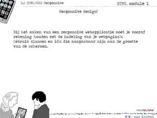
Responsive design!
Bij het maken van een responsive webapplicatie moet je vooraf
rekening houden met de indeling van je webpagina’s.
Gebruik classes en id’s die aanpasbaar zijn aan de grootte
van de schermen.
32.
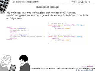
HTML module 11.6HTML/CSS Responsive
Responsive design!
Bij coderen van een webpagina met onderscheid tussen
mobiel en groot scherm kan je ook de code ook indelen in mobile
en bigscreen.
33.
HTML module 11.6HTML/CSS Responsive
Huiswerk !
Pas de gemaakte website over jou zelf aan voor mobile en
normaal scherm. Zorg ervoor dat de mobile site en anders
uitziet dan de webpagina voor het normale scherm.
Lever het geheel als zipfile in op teams in opdracht
HTML les 1.6.