2. Branding and Brand Image.
According to mudvalley.com there are eight elements that create brand identity. Brand
identity is the presentation of a product to its consumer.
‘Get Millie Get Mad’, In relation to Mudvalley.com's theory of brand identity our brand
consists of the following elements:-
Brand Essence - It represents minorities as it is an 'up & coming underground' music and
the genre itself is a minority as it is not classed as mainstream music.
Brand Slogan - 'Bring On The Bass'.
Brand Personality - It is fast paced, upbeat and something to rave to and for everyone to
enjoy.
Brand Values - It is a representation of many things including Love, Youth, Pride of
Hometowns and much more.
Brand Appearance - As it is an auditoria product it has no visual appearance however the
music is shared between Mc, Instrumental and Vocals (Singing).
Brand Heritage - It is a mixture of all traditions and cultures but the genre originated in the
early 2000s.
Emotional Benefits - It offers a release from worldly affairs and gets you in a hype as it is
highly energetic and the beat is forceful.
Hard Benefits - It is cheaper because there is no manufacturer costs, printing and
publishing costs as albums are made on request. The 'real' quantifiable benefits to the
consumer are that it is easily accessible and is cheaper to purchase as it is not sold at a
music store.
3. Branding and Brand Image.
Example of Brand identity that were inspirational:
http://www.youtube.com/watch?v=8lOB0my97SA
An institute that would distribute ‘Get Millie Get Mad’ would be
‘Speedy Dubz’ it is an independent label, one which is known for
media texts such as ‘Get Millie Get Mad’, they promote and create
music for individuals, people who according to Young and
Rubicon's cross cultural consumer characteristics belong to the
‘individuals’ these are people who respond to advertising and
marketing that emphasises quirkiness and individualism, these
people don’t come under any specific category because they don’t
want to fit in any box. Below are examples of their work.
http://www.youtube.com/watch?v=8jdLpsP_9l4
http://www.youtube.com/watch?v=GSXNrHxregU&feature=related
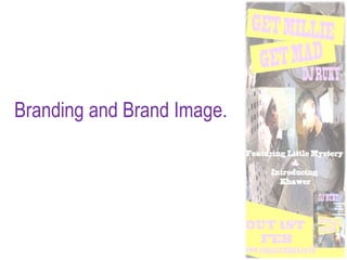
4. Branding and Brand Image.
To maintain the brand image for our artist (Ruky) we decided to create a recurrent theme
throughout all the products. We decided we wanted to keep our ancillary task looking
traditional, yet promote our ideologies thoroughly, we decided to keep a colour scheme
which would be recurrent through all ancillary products, the colours we chose were yellow
and purple, these were additional colours applied to the background. I created the
background using many effects on Photoshop, the original image was found on
http://i.ehow.com/images/GlobalPhoto/Articles/4590863/TallBuildings2-main_Full.jpg I then
applied many effects to it and used it as a background, the effects I applied are hard light,
over lay, exclusion and a few others. I used this background as the bass of all the products
to show a theme and colour consistency. After this I added images of the artist and text and
added effects to these so they blend in and it all blends in as one product and not different
products merged into one. To the background i added brushes which also look effective.
We kept the same text throughout, this was a deliberate choice, the font we used was
Blackoak Std, we chose this as it is a strong font, with sharp edges, it is also very rounded
which adds quirkiness to the font, reflecting energy and enthusiasm. The colours we used
for the texts are purple, white and blue, this was also a deliberate choice as purple connotes
energy, yet mystery, two elements very traditional, within the Bassline genre hence the
colour purple, blue and white as they stand out on the background. I backed the text with a
yellow box, this added depth and made the two clashing colours look effective together, the
yellow is very bright and playful, reflective of the genre which is targeted at fun loving
people, also we used pictures of the artist and used the over lay effect to blend them in.
5. Branding and Brand Image.
The logo of our product, was RUKY, this is Ruky's personal music as he is a DJ,
the logo is purple, again a colour used throughout our products, which shows
colour consistency, which makes the products appear very authentic. The font of
the logo is also very quirky which again reflects the genre thoroughly. Keeping
this consistency throughout the products made them look professional and of a
high standard.
There is also additional images applied to the ancillary tasks, those of the main
two performers, this was done to create verisimilitude and to inform the audience
as to what they should expect from the product.
The colour consistency was commented on by the audience as ‘very consistent’.
Logo.