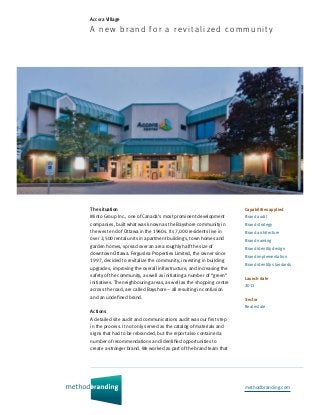
Accora Village (Case study)

Minto Group Inc., one of Canada’s most prominent development companies, built what was known as the Bayshore community in the west end of Ottawa in the 1960s. Its 7,000 residents live in over 2,500 rental units in apartment buildings, town homes and garden homes, spread over an area roughly half the size of downtown Ottawa. Ferguslea Properties Limited, the owner since 1997, decided to revitalize the community, investing in building upgrades, improving the overall infrastructure, and increasing the safety of the community, as well as initiating a number of “green” initiatives. The neighbouring areas, as well as the shopping centre across the road, are called Bayshore – all resulting in confusion and an undefined brand. This case study describes the brand identity we created for Accora Village.

Recommended
More Related Content
Viewers also liked
Viewers also liked (17)
More from Philip Unger
More from Philip Unger (13)
Accora Village (Case study)
- 1. methodbranding.com Accora Village A new bran d for a revi ta li zed com m un i t y Capabilities applied Brand audit Brand strategy Brand architecture Brand naming Brand identity design Brand implementation Brand identity standards Launch date 2011 Sector Real estate The situation Minto Group Inc., one of Canada’s most prominent development companies, built what was known as the Bayshore community in the west end of Ottawa in the 1960s. Its 7,000 residents live in over 2,500 rental units in apartment buildings, town homes and garden homes, spread over an area roughly half the size of downtown Ottawa. Ferguslea Properties Limited, the owner since 1997, decided to revitalize the community, investing in building upgrades, improving the overall infrastructure, and increasing the safety of the community, as well as initiating a number of “green” initiatives. The neighbouring areas, as well as the shopping centre across the road, are called Bayshore – all resulting in confusion and an undefined brand. Actions A detailed site audit and communications audit was our first step in the process. It not only served as the catalog of materials and signs that had to be rebranded, but the report also contained a number of recommendations and identified opportunities to create a stronger brand. We worked as part of the brand team that
- 2. reviewed everything from service standards to signage, from web site designs to uniforms. Other members of the brand team included the owners, property managers, a former Minto executive, a brand coach, a senior member of a global public relations firm, as well a local design firm. We created a logo for the new community name, and extended the logo to the recreation centre, and building names. Town home and garden home clusters were named, as were a number of pedestrian pathways. Signage has been designed to create a sense of community and also to delineate a unique space for Accora Village. The signs not only identify buildings, they create a sense of place and a unique community. Recognizing the diverse nature of the community, a series of over 80 safety and
- 3. information icons have been developed as part of the signage system. These icons help ensure that residents and visitors enjoy the community safely, even if their first language is not English or French. The identity system covered all marketing communications, advertising, stationery and promotional materials. As part of the launch activities, a brochure package, banners, an event tent and a variety of promotional gifts were produced. Results Residents embraced the new brand, sensing that they were not just renting a dwelling, but were part of a community with a real spirit and identity. Staff became enthusiastic brand champions, sharing the Accora Village brand story to residents and non-residents alike. The vacancy rate is lower than in other Ottawa properties.
- 4. 366 Adelaide Street West Suite 207 Toronto, Ontario Canada M5V 1R9 © Method Branding, 2014 info@methodbranding.com 416.597.1114 tel 416.596.0807 fax