Bit Inspector
7
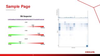
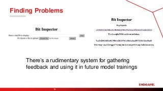
Bit Inspectoris an internal tool for
communicating progress, soliciting
feedback, and identifying errors
related to MalwareScore.
8.
Bit Inspector
8
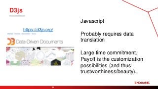
Built with
Flask(http://flask.pocoo.org/)
D3.js (https://d3js.org/)
matplotlib (https://matplotlib.org/)
seaborn (https://seaborn.pydata.org/)
Connects to multiple internal data and
processing resources
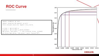
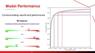
ROC Curve
12
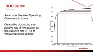
Area UnderReceiver Operating
Characteristic Curve
Created by plotting the true
positive rate (TPR) against the
false positive rate (FPR) at
various threshold settings.
Yourself
27
The purpose ofthe visualization is to
convince yourself you’ve done
something useful.
Explainability
Trustworthiness
Beauty Less Time More Time
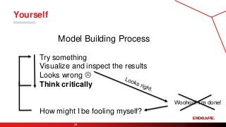
Yourself
29
Try something
Visualize andinspect the results
Looks wrong
Think critically
Woohoo! I’m done!
Model Building Process
How might I be fooling myself?
30.
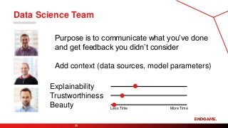
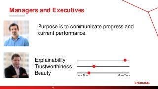
Data Science Team
30
Purposeis to communicate what you’ve done
and get feedback you didn’t consider
Add context (data sources, model parameters)
Explainability
Trustworthiness
Beauty Less Time More Time
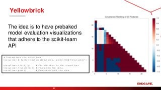
Yellowbrick
41
# Instantiate thevisualizer
visualizer = Rank2D(features=features, algorithm='covariance')
visualizer.fit(X, y) # Fit the data to the visualizer
visualizer.transform(X) # Transform the data
visualizer.poof() # Draw/show/poof the data
The idea is to have prebaked
model evaluation visualizations
that adhere to the scikit-learn
API