Improve the legibility of your type on the web
•Download as PPT, PDF•
1 like•300 views

Don't make these typographic mistakes

Recommended
Recommended
More Related Content
More from John Macpherson
More from John Macpherson (9)
Recently uploaded
Recently uploaded (20)
Improve the legibility of your type on the web
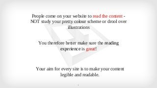
- 1. People come on your website to read the content - NOT study your pretty colour scheme or drool over illustrations You therefore better make sure the reading experience is great! Your aim for every site is to make your content legible and readable. 1
- 2. Episode 26: Don’t make these typography mistakes - make your content easier to read and more legible Full video at www.webpayload.com 2
- 3. Overview 95% of the information on the web is written language. It is only logical to say that a web designer should get good training in the main discipline of shaping written information, in other words: Typography. 3 Written in 2006 but still holds true
- 4. 1.) Leading (Line Height in CSS) 4
- 5. 1.) Leading (Line Height in CSS) p{ Line height: 24px} OR p{ Line height: 1.5em} Full video at www.webpayload.com 5
- 6. 2.) Contrast ✓ The most contrast that is possible is white text on a black ground or black text on a 6 white background. ✓ Black text on a white background is too much contrast and is actually harder to read according to some studies. ✓ Try having a dark grey. ✓ My own little twist to that is add in a very slight colour variation with brand colours. Hardly noticeable.
- 7. 3.) Typeface ✓ There are literally thousands of type faces available. ✓ Jason Santa Maria’s advice is to learn a few and know them well ✓ When choosing a typeface the absolute first question is - Can i read this well and is 7 it legible. ✓ That question comes way before nonsense like “Is it pretty?” “Does it suit our style?” Functionality comes before form every time. ✓ My personal favourite web fonts are Adelle, Jubilat, Museo all from Typekit.
- 8. 4.) Not enough space - cramped 8
- 9. 5.) General sizing 9
- 10. 5.) General sizing 10
- 11. 6.) How many character per line? ✓ Contradicting studies on this but certainly no more than 100 characters per line is 11 my advice. ✓ Any more than it makes hard to read ✓ For very large monitors you can easily restrict length by using max-width property. Full video at www.webpayload.com
- 12. 7.) Justified text? ✓ Maybe for page titles, maybe ✓ Never for body content - it’s hard to read! 12
- 13. Pro Tip ✓ Custom fonts may have a harsh edge ✓ Sort by using either : h1{ -webkit-font-smoothing: antialiased;} h1 { text-shadow:0 0 1px transparent;} h1 { text-shadow:1px 1px 1px #f5f5f5, 0 0 1px transparent;} You can have multiple text shadow properties, not restricted to one 13