
Recommended
More Related Content
Viewers also liked
Recently uploaded
Recently uploaded (20)
double page
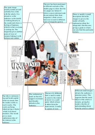
- 1. The title is written in big and boald capital letters to ensure that the reader is able to read it easily. The words are being linked giving a rhyme which will attract attention. The words give a more sophisticate idea of the trainers to the audience. The exclamation mark on the title suggest excitment and friendly attitude to the audience. The use of a different font is used to make it easier to the reader to know it is a pull- quote which always is taken from the main article. Usually is a point of view. The main image usually stands out and certainly has a link with the article. It is attractive to the audience as the model is looking directly to the reader and shows a feeling of hapiness, which is what everyone is aiming for. The magazine gives another point of view of trainers linking it with fashion and confort. There is usually a small description about the images to give to the reader a breafly explenation about the image and, like this one, giving a guide to where can you find this particular trainers. The text has been positioned in different sections of the double page to show that the two pages are linked. It folows a more informal code & convention form from magazine´s front covers, however is used in different types of magazine genres. Different small images attracts the audience´s attention easier. This sugeests that the main object of the article is trainers, giving the reader a facility of understanding about what the article is about.