1. 1
1
6
4 4
2 2 5
3 3
5
6
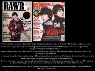
1. In the masthead i have used a drop shadow to get the title to stand this is similar to the one in NME they have used a white outline.
2. I have used a plug to draw in my audience and grab there attention this is similar to NME they have also used a plug and a black
background with yellow writing to stand out.
3. I have used the artists name who is featured on the front cover. this is similar to NME they have used the main group names. To get
you to pick up and read more.
4. I have used text under the the masthead using a different coloured box so it stands out. NMe has done the same but with some writing
rather than the date. this helps to make the magazine look more interesting.
5. For my main image i have used a guy dressed rockstar like looking away which makes a strong image this is similar to NME image they
are dressed like rockstars aswell. However they are looking towards the audience which is different to mine .
6. I have used a barcode on my front cover at the top of the page because it looks better there this is different to NME because they
have there’s at the bottom.