
Recommended
More Related Content
Viewers also liked
Viewers also liked (16)
Colour scheme
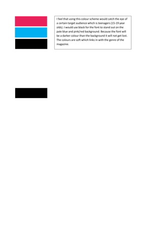
- 1. I feel that using this colour scheme would catch the eye of a certain target audience which is teenagers (15-19 year olds). I would use black for the font to stand out on the pale blue and pink/red background. Because the font will be a darker colour than the background it will not get lost. The colours are soft which links in with the genre of the magazine.