Example 1
Front Cover
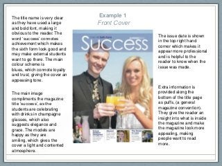
Themain image
compliments the magazine
title ‘success’, as the
students are celebrating
with drinks in champagne
glasses, which also
suggests elegance and
grace. The models are
happy as they are
smiling, which gives the
cover a light and contented
atmosphere.
The issue date is shown
in the top right hand
corner which makes it
appear more professional
and is helpful to the
reader to know when the
issue was made.
The title name is very clear
as they have used a large
and bold font, making it
obvious to the reader. The
word ‘success’ connotes
achievement which makes
the sixth form look good and
may make external students
want to go there. The main
colour scheme is
blues, which connote loyalty
and trust, giving the cover an
appeasing tone.
Extra information is
provided along the
bottom of the title page
as puffs, (a general
magazine convention).
They give the reader an
insight into what is inside
the magazine and make
the magazine look more
appealing, making
people want to read
more.
3.
Example 1
Contents
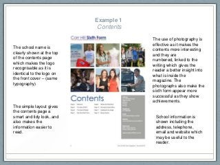
School informationis
shown including the
address, telephone,
email and website which
may be useful to the
reader.
The school name is
clearly shown at the top
of the contents page
which makes the logo
recognisable as it is
identical to the logo on
the front cover – (same
typography)
The use of photography is
effective as it makes the
contents more interesting
and they are
numbered, linked to the
writing which gives the
reader a better insight into
what is inside the
magazine. The
photographs also make the
sixth form appear more
successful as they show
achievements.
The simple layout gives
the contents page a
smart and tidy look, and
also makes the
information easier to
read.
4.
Example 2
Front Cover
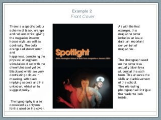
Thereis a specific colour
scheme of black, orange
and red and white, giving
the magazine its own
house style, as well as
continuity. The color
orange radiates warmth
and
happiness, combining the
physical energy and
stimulation of red with the
cheerfulness of yellow.
Black and white are very
contrasting colours in
meaning, with black
implying secrets and the
unknown, whilst white
suggest purity.
The typography is also
consistent as only one
font is used on the cover.
The photograph used
on the cover was
actually taken by a
student at the sixth
form. This ensures the
skills and achievement
of the school.
The interesting
photograph will intrigue
the reader to look
inside.
As with the first
example, this
magazine cover
includes an issue
date, an important
convention of
magazines.
5.
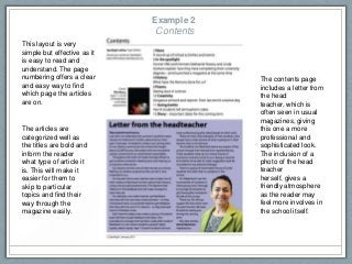
This layout isvery
simple but effective as it
is easy to read and
understand. The page
numbering offers a clear
and easy way to find
which page the articles
are on.
The contents page
includes a letter from
the head
teacher, which is
often seen in usual
magazines, giving
this one a more
professional and
sophisticated look.
The inclusion of a
photo of the head
teacher
herself, gives a
friendly atmosphere
as the reader may
feel more involves in
the school itself.
The articles are
categorized well as
the titles are bold and
inform the reader
what type of article it
is. This will make it
easier for them to
skip to particular
topics and find their
way through the
magazine easily.
Example 2
Contents
6.
Example 3
Front CoverThis sixth form magazine
did not include a separate
contents page, instead the
contents of the magazine is
displayed on the front cover
(making this page a
combination of a front cover
and a contents page).
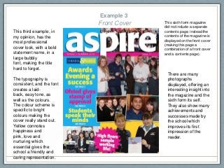
This third example, in
my opinion, has the
most professional
cover look, with a bold
statement name, in a
large bubbly
font, making the title
hard to forget.
The typography is
consistent, and the font
creates a laid-
back, easy tone, as
well as the colours.
The colour scheme is
specific to bright
colours making the
cover really stand out.
Yellow connotes
happiness and
pink, love and
nurturing which
essential gives the
school a friendly and
caring representation.
There are many
photographs
displayed, offering an
interesting insight into
the magazine and the
sixth form its self.
They also show many
achievements and
successes made by
the school which
improves its first
impression of the
reader.