1. Hip Hop1 , Hip Hop2 , Hip hop3, Hip Hop4, Hip hop5, Hip Hop6, Hip Hop7, Hip Hop8
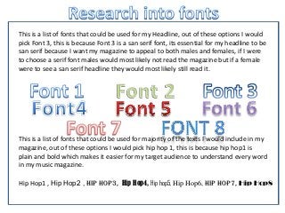
This is a list of fonts that could be used for my Headline, out of these options I would
pick Font 3, this is because Font 3 is a san serif font, its essential for my headline to be
san serif because I want my magazine to appeal to both males and females, if I were
to choose a serif font males would most likely not read the magazine but if a female
were to see a san serif headline they would most likely still read it.
This is a list of fonts that could be used for majority of the texts I would include in my
magazine, out of these options I would pick hip hop 1, this is because hip hop1 is
plain and bold which makes it easier for my target audience to understand every word
in my music magazine.