1. PRICE ISSUE NUMBER
MASTHEAD
SELL LINE
CENTRAL IMAGE
Headlines Headline for the central image
……………
……………
CONTENT IMAGES
……………
CONTENT IMAGES
……………
CONTENT IMAGES
……………
CONTENT IMAGES
……………
BANNER
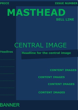
3. Text and colour research
For my first cover draft and contents draft for my music magazine, I used
the fonts Verdana for the Masthead and bigger Headlines and used Adobe
Fan HeitiStd B for the smaller headlines and taglines. Masthead is put in
bold so it stands out more and the other text is normal.
The colours I used are two shades of blue for the background; a darker
one and a lighter one, I chose them because they seemed to go well with
each other, and then for the text I put them all in green because it just
seemed to go well with the rest of it.
I used the same colour scheme for the contents draft except all of the
text in the contents is Verdana.