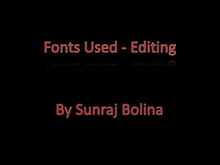
2. Font – Arial
Size – 20
Style – Bold
Alignment – Centre
Font colour – White
I chose to use the Font Arial because
it can be clearly visible. I made this
bold because I wanted it to stand
out, I made it white so it can be seen
on the black background. I adjusted
this to be in the centre so it looked
professional.
3. Font – Lucida Grande
Size – 19
Style – Bold
Alignment – Right (some were
different)
Font colour – Black
I decided to change the font to
Lucida Grande I wanted it to be
different to the previous title, I
thought that this font seemed formal
and presentable within the credits. I
made the titles black and bold
because most of the clips had light
areas on them which prevented the
titles to be clearly seen. From here
the titles font, size, style and colour
did not change. However the
alignment did.
4. Font – Bauhaus 93
Size – 60
Style – Bold
Font colour – Red and White
I edited this using Final Cut Pro’s
special effects and styles. I did this
because it was the name of the
sequence, I wanted it to stand out so
the audience will remember the
name. I also added effects such as
glow to make it look more attractive
and creative. I chose to use the
colours red and white so the text
would stand out from the black
background and seem eye catching