1. An Analysis of Pulse Shape and Evolution
Sarah Henderson & Hao Lu
Physics Department, Lafayette College
Faculty Mentor: Professor David Nice
Purpose
Using data collected from Arecibo and Green Bank, we analyzed the shape and evolution of pulses from
various millisecond pulsars. Each pulsar has a very unique pulse shape that varies over frequencies ranging
from 400 MHz to 2000 MHz. Our goal was to create a mathematical model for the variation of pulse profile
over frequency. We utilized Python and various modules therein to accomplish this. The ultimate goal of this
project and NANOGRAV as an entirety is to time these pulsars to precisions of 10 nanoseconds in order to
detect small fluctuations in the time of arrival of pulses, which could indicate the presence of a gravitational
wave. In order to attain NANOGrav's goal of detecting gravitational waves, we must measure pulse arrival times
as precisely as possible. These measurements are made by fitting the pulse shape from any given observation
against a mathematical model of the pulse shape which is shifted back and forth to find the best fit. Having the
best possible mathematical model is critical to this process.
Gaussian, Lorentzian, and Cosine Models
Initially, we attempted to model the pulse profiles using an analytical approach. We began by trying to
model certain frequency channels using Gaussian, Lorentzian, and cosine curves, which contain four
parameters each. We wrote various programs in Python that utilized matplotlib, pylab, and scipy.optimize to
fit these curves to our data sets. We started by writing programs that required a manually input initial guess
for each parameter within the various curves. We eventually determined a way to have Python compute
initial parameters, including the offset level of the profile, the full width of the peak, the value where the peak
reaches its maximum, and the standard deviation from that value. Our programs fit an indicated number of
Gaussian components to the data and plotted the results, as well as the data minus the model generated by
the superposition of these curves. The results showed us that using these types of curves was not an
effective means of modeling the profiles. Each pulse shape required at least 15 curves to efficiently represent
the data, which meant that over 60 parameters were needed, but even this was not always sufficient to
represent the pulse shape with complete accuracy.
Taylor Polynomial Model
We found that the Gaussian-component method produced complicated models that were not always fully
accurate, so we adopted a different approach, using Taylor expansions to represent the pulse profiles. More
specifically, if y(t,f) is the pulse profile at time t (where t goes from 0 to the pulse period) and radio frequency f,
then we expanded it as y(t,f) = y0(t) + y1(t) (f-f0) + (1/2)y2(t) (f-f0)2 +.... where y0(t), y1(t), y2(t), etc., are the
average profile, its linear variation, its quadratic variation, etc., and where f0 is the center frequency. We wrote
python code to perform this expansion. The program determines an average profile and then makes
corrections for each frequency channel as the pulse shape varies. Our goal was to determine if there was one
particular order that sufficiently modeled each and every profile. We concluded that for a majority of the
pulsars, first order approximations sufficed.
These models also allowed us to clearly see profile evolution over the observed radio band. In the plots
below, one can see clear stripes of red and blue, indicating differences from the average pulse shape as
frequency changes.
Dispersion Measure
Signals from pulsars must travel through the interstellar medium before
reaching Earth. The interstellar medium is comprised of electrons and other
forms of matter that disperse the pulsar signals before they reach our
telescopes. Each pulsar's signal must be "de-dispersed" to remove this affect
from the data and align pulses over different frequencies so that they appear
to arrive simultaneously. Doing this requires knowing the dispersion measure
of the pulsar, which is the integral of the electron density of the interstellar
medium between the pulsar and the Earth. We wrote a program that
determined the best dispersion measure for each data file using optimization
tools. We then used this dispersion measure to correctly align the frequency
channels and utilized these corrected data files for our pulse-shape
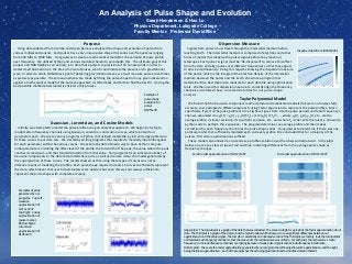
analysis.Example of
pulse shape
evolution for
pulsar
B1855+09
Examples of plots
generated by our
programs. Top Left:
Gaussian
approximation of
J1713+0747
Top Right: Cosine
approximation of
(pulsar name)
Bottom Right:
Lorentzian
approximation of
B1953+29
Dispersed data from J0030+0451
Zeroth order approximation of J1012+5307 First order approximation of J1012+5307
Upper plots: The top subplot is a graph of the data that was collected. The second subplot is a graph of the Taylor approximation of our
data. The third plot is a graph of the data minus the Taylor model, which allows us to see significant differences between our
approximation and the actual signal. The last plot is essentially an enhanced version of the third plot; we merely took the residual plot
and rescaled each frequency channel so that the area under the residual curve was uniform. For each plot, the vertical axis is radio
frequency; some radio frequency channels are missing because of weak pulsar signals and/or radio frequency interference.
Bottom plots: These are the Taylor approximations generated by our program, the left being the zeroth approximation, and the right
being the linear approximation. Each of these plots has the actual approximation and a smoothed version thereof.