1. Introduction
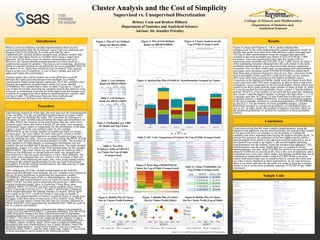
Cluster Analysis and the Cost of Simplicity
Supervised vs. Unsupervised Discretization
Britney Cook and Reuben Hilliard
Department of Statistics and Analytical Sciences
Advisor: Dr. Jennifer Priestley
Procedure
After having cleaned all of the data, the next step was the transformation
of the variables. For the user-defined transformations an equal widths
logic was used for defining the ranks. This was done by looking at a
histogram of each variable and evaluating the range and distribution of
the data. Where the majority of the observations lied, the ranks were
assigned equal values and where it tailed off, the ranks were assigned
increasingly larger values to compensate for the distribution of the data.
Figure 1 is a plot of the user-defined ranks for the variable
BRAVGMOS, or the average number of months per bank revolving
account open. The exact values for each rank can be found in Table 1.
For the SAS-defined transformations an equal frequencies logic was
used for defining the ranks. This was automated using the PROC RANK
procedure, after specifying the desired number of ranks. The number of
ranks needed to be high enough so meaningful information was not
masked, but not too high that it became cumbersome. Ten ranks seemed
appropriate. Figure 2 is a plot of the SAS-defined ranks for the variable
BRAVGMOS. The exact values for each rank can be found in Table 2.
Wherever the difference in spread between ranks was insignificant,
determined by a flat line (user-defined) or a t-test (SAS-defined), the
two ranks were collapsed into one, which is why in Figure 2 there are
only 9 ranks. After finalizing the ranks, they were given ordinal values
resulting in the ordinal transformation for the user and SAS-defined
procedures. From the ordinal transformations, the odds and log of odds
transformations were created.
After undergoing all of the variable transformations for both the
supervised and unsupervised methods, the 441 variables were reduced to
the top 50 most significant in predicting the dependent variable
GOODBAD. Then for each of the six transformations, the top five
variables for that transformation were set aside for cluster analysis.
PROC LOGIT was first used to determine the profit per 1,000 of our
original prediction model, prior to clustering. Using these same
variables, PROC CLUSTER was then used to generate three criteria:
Cubic Clustering Criterion (CCC), Pseudo-F and Pseudo T-Squared,
which helped determine the optimal number of clusters. Where there
was a peak in the CCC, a peak in Pseudo-F and a dip in Pseudo T-
Squared, the optimal number of clusters would be found. It can be seen
in Figure 3 that these three events occur at five clusters. Next, PROC
FASTCLUS was used to cluster the data into five groups, followed by
PROC REPORT which generated the profitability per 1,000 for each of
the five clusters determined.
Using the clusters constructed, a transactional dataset was merged in
using a left join and MATCHKEY, a customer identifier. The top 20 SIC
codes from each cluster were then collected and used to determine
spending behaviors of the customers that comprised each cluster, shown
in Table 5. Next these trends were compared across clusters so that a
categorization of customer characteristics for both profitable and Non-
profitable clusters could be made. There were a couple of additional
procedures that were implemented to see if some variables, much like
spending characteristics, varied across clusters. One was a two-way
frequency table, Table 4, and the other a heat map, Figure 5. The results
of these procedures can be found in the following section.
Results
Figure 4, along with Figures 6, 7 & 8, clearly indicate that
unsupervised, or the most mathematically optimal approach, results in
models that profit more than those that utilized a supervised approach.
The log of odds transformation using the unsupervised approach
resulted in the most profitable top cluster at $222,078.40 per 1,000
customers. This was significantly more than the model with no
clustering which profited only $78,690.72 per 1,000, shown in Table 3.
After evaluating customer characteristics for each cluster in the most
profitable transformation, it was discovered that clusters containing
customers who use their credit cards for automated cash disbursement
and liquor store purchases profit $70,000-$150,000 less (about half)
than those that contained customers who do not. Also, customers in the
lowest profitable cluster used their credit card inside service stations
40% more often than customers in the highest profitable cluster.
Customers in the highest profitable cluster were also found to use their
credit card more than 50% more frequently at dine-in than at fast-food
restaurants, versus customers in the lowest profitable cluster which were
found to use their credit card the same amount of times at both. In Table
4 it can be see that the least profitable cluster, cluster 5, had the highest
percent TRATE3, or the number of accounts 60 days past due. Meaning
that cluster 5 had the highest number of people who had either 1, 2, 3 or
4 accounts past due. In Figure 5 it was found that for the top two most
profitable clusters, a higher BNKINQ2, or number of banking inquires
in the past 6 months, resulted in a predicted probability of GOODBAD
as low as 0.2. For the bottom two least profitable clusters, a higher
BNKINQ2 resulted in a predicted probability of GOODBAD only as
low as 0.5. In other words, the number of inquiries had little effect on
the predicted probability of default for customers in these profitable
clusters.
Conclusion
Upon discovering that the most complex transformation, using the
unsupervised approach was the most profitable, the question that needed
to be answered next was whether or not the ability to explain the
variables was more important than having the highest possible profit. To
answer this question an evaluation of the next highest profit and the
transformation from which it was derived would be analyzed to see if
the tradeoff was worth it. In Figure 4, the second highest profiting
transformation was the ordinal, using the unsupervised approach. This
transformation was the most simple and easy to explain of all the
transformations, but had about $19,000 less profit in its top cluster and
about $122,000 less in overall profit. This is the cost of simplicity and is
sometimes not a very easy call to make. Are having variables that can be
explained in simple terms really worth $122,000? When a decision
comes with such a high cost, it would be best to consult the client and
see what is most important to their organization. In our case however,
there is no client, and thus the decision was made to keep the complex
model in favor of the most profitable outcome, $759,363.34 per 5,000
customers.
Sample Code
Table 1: User-Defined
Ranks for BRAVGMOS
Table 2: SAS-Defined
Ranks for BRAVGMOS
Figure 2: Plot of SAS-Defined
Ranks for BRAVGMOS
Figure 1: Plot of User-Defined
Ranks for BRAVGMOS
When it comes to defining variable transformations there are two
general approaches that can be utilized: supervised (user-defined) and
unsupervised (SAS-defined). It would seem that the most
mathematically optimal method, unsupervised, produces models that
profit more than those based on variables built using a supervised
approach, which allows room for human interpretation and error.
However, the most profitable transformations can often result in a
cumbersome output of variables. This leaves one wondering, should the
ability to explain variables be sacrificed for the most profitable form? If
the answer is no, where then should the line be drawn? This concept,
known as the cost of simplicity, is one of heavy debate and will be
addressed within this presentation.
Another matter that will be looked into is the difference in profit
between the supervised and unsupervised methods. In a binary
classification model using logistic regression, 50 of 441 variables were
found to be significant in generating a credit risk score, labeled
GOODBAD; this variable had a value of either 0 (good) or 1 (bad). It
was of this 50 variable pool that the variables used in this analysis were
retrieved. A comparison of profits for both supervised and unsupervised
would be investigated for three different transformations: ordinal, odds
and log of odds. The differences between these methods and
transformation are defined in the following procedure.
Table 3: Profitability per 1,000
for Model and Top Cluster
Figure 4: Stacked Bar Plot of Profit by Transformation Grouped by Cluster
Figure 6: Bubble Plot of Cluster
Size by Cluster Profit (Ordinal)
Figure 7: Bubble Plot of Cluster
Size by Cluster Profit (Odds)
Figure 8: Bubble Plot of Cluster
Size by Cluster Profit (Log of Odds)
Teal = Supervised Olive = Unsupervised Yellow = Supervised Red = Unsupervised Green = Supervised Purple = Unsupervised
Figure 3: Cluster Analysis for the
Log of Odds (Unsupervised)
Table 6: Cluster Profitability for
Log of Odds (Unsupervised)
Table 5: SIC Code Comparison of Clusters for Log of Odds (Unsupervised)
Figure 5: Heat Map of BNKINQ2 by
Cluster for Log of Odds (Unsupervised)
Table 4: Two-Way
Frequency Table of TRATE3
by Cluster for Log of Odds
(Unsupervised)
Transforma)on
Model
Top
Cluster
Ordinal
(S)
$106,873.47
$183,952.57
Ordinal
(U)
$108,180.97
$203,738.01
Odds
(S)
$69,964.89
$173,323.94
Odds
(U)
$65,514.19
$166,386.46
Log
of
Odds
(S)
$72,017.65
$204,782.40
Log
of
Odds
(U)
$78,690.72
$222,078.40
S
=
Supervised
U
=
Unsupervised
TRATE3
Cluster
0
1
2
3
4
Total
1
31856
4.23
7627
5.78
6761
0.90
16.19
5.18
2133
0.28
5.11
4.63
744
0.10
1.78
4.09
271
0.04
0.65
3.62
41765
5.55
2
173373
23.02
76.50
31.48
34990
4.65
15.44
26.81
11548
1.53
5.10
25.05
4670
0.62
2.06
25.69
2060
0.27
0.91
27.53
226641
30.10
3
65042
8.64
83.07
11.81
9736
1.29
12.43
7.46
2491
0.33
3.18
5.40
768
0.10
0.98
4.23
264
0.04
0.34
3.53
78301
10.40
4
59655
7.92
72.69
10.83
14824
1.97
18.06
11.36
5033
0.67
6.13
10.92
1855
0.25
2.26
10.21
696
0.09
0.85
9.30
82063
10.90
5
220809
29.32
68.1
40.09
64207
8.53
19.80
49.19
24896
3.31
7.68
54.00
10140
1.35
3.13
55.78
4194
0.56
1.29
56.01
324243
43.06
Total
550735
73.14
130518
17.33
46101
6.12
18177
2.41
7482
0.99
753013
100.00
Frequency
Percent
Row
Percent
Column
Percent
Average
Independent
Average
Dependent
Rank
Frequency
1
114440
10
0.25848
2
129842
20
0.20406
3
254353
31
0.181142
4
123412
44
0.17609
5
129910
51
0.16705
6
114318
59
0.16102
7
133391
69
0.15858
8
125048
81
0.15309
9
130715
111
0.12426
Average
Independent
Average
Dependent
Rank
Frequency
1
176173
13
0.24165
2
167186
24
0.18893
3
829725
58
0.16499
4
82345
120
0.11585
Figures 4, 5, 6, 7, and 8 were all generated using SAS® Visual Analytics