1. The Peter R. Gould Center for
Geography Education & Outreach
Timothy J. Johnson | tjj5009@psu.edu
Adam C. Thomas | act144@psu.edu
Mark M. Smithgall | mms5119@psu.edu
Robert E. Roth | reroth@psu.edu
Departments:
Intercollegiate Athletics
McCoy Natatorium
Facility Details
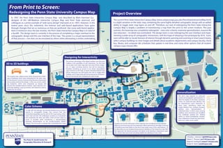
From Print to Screen:
Redesigning the Penn State University Campus Map
In 1997, the Penn State Interactive Campus Map was described by Mark Harrower (co-
designer of the UW-Madison Interactive Campus Map and Penn State alumnus) and
colleagues as a prime example of“web-savvy design” (Harrower et al. 1997). However, in the
twelve years since this statement, the Internet and web-based applications have gone
through changes that are as numerous as they are profound. Like many web-based applica-
tions in existence since the late nineties, the Penn State Interactive Campus Map is in need of
a facelift. The design team is currently in the process of completing a major overhaul to the
cartographic design and the user interface of the map. This poster is a visual representation
of that process—one that can be emulated by others when attempting a similar undertaking.
Project Overview
The current Penn State Interactive Campus Map (www.campusmaps.psu.edu/PennStateInteractiveMap.html)
is a slight variation on the static map, containing the same highly-detailed cartographic design with an added
ability to toggle static map layers on and off. Therefore, our task of redesigning the Penn State Interactive
Campus Map is largely a problem of transitioning a map from the print to the screen medium. This past
summer, the basemap was completely redesigned—new color scheme, extensive generalization, massive file
size reduction—no detail was overlooked. The design team is now redesigning the user interface and imple-
menting a wider array of cartographic interactions, with the hope of releasing a live prototype by 2010. Soon,
users will be able to: locate features of interest through dynamic panning and zooming or smart search boxes;
select campus buildings to view images and details about academic departments and campus faculty; check
bus, library, and computer lab schedules that update in real-time; and many other options that all modern
campus maps should offer.
The primary advantage of the digital medium over the print
medium is the possibility of user interaction. Our first task
was to place each static map layer into one of three catego-
ries: (1) layers including features that will be interactive,
therefore remaining as vectors to be shown immediately
upon entrance to the map, (2) layers including features that
will be interactive, but will require the user to toggle their
visibility, and (3) layers that will not be interactive, and there-
fore can be burned into a background raster image.
Designing for Interactivity
BRYCE
JORDAN
CENTER
Graphics are not the only aspect of the map that was considered during redesign-
effective use of text was also very important. When zoomed out, the tight clustering
of building and street labels on the print map masks many of the map features. As
an alternative, we are implementing semantic labeling on the interactive map. With
this approach, the density, position, and detail of the labeling is dependent upon
the current map zoom level, providing legible text labeling at every scale.
Labeling
BJC
The print map required an extensive
amount of cartographic generalization to
allow for display on the lower resolution
screen, for improved web delivery, and
for instantaneous vector interaction. In
many cases, superfluous detail was
simply deleted (e.g., medians between
parking rows, representations of
individual trees). In others cases, existing
polylines were smoothed and simplified
(e.g., buildings, parking lots, walking
paths), or, where prohibitively complex,
were collapsed to simple line representa-
tions (e.g., roads, access roads).
Generalization
The original map utilized artistic three-dimensional render-
ings of buildings which were interesting for the static map.
For the dynamic version, however, they became unnecessary
and actually cluttered the design. In the new version, build-
ing footprints, which were sharpened up linearly will
become the clickable features instead. Upon selection of a
particular building, a pop-up window will instead be used to
display the 3D version.
3D to 2D buldings
vs.
To help with the redesign, we solicited feedback from a dozen
experts in cartographic design. One concern that was
mentioned repeatedly was the lack of the map having a Penn
State 'look and feel'. We challenged ourselves to incorporate
and emphasize the blue and white colors of Penn State as
much as possible while maintaining a natural-looking
basemap representative of the heavily-forested, hillside
campus. The end result is a design that is decidedly Penn State.
Color Scheme
2. The Peter R. Gould Center for
Geography Education & Outreach
Timothy J. Johnson | tjj5009@psu.edu
Adam C. Thomas | act144@psu.edu
Mark M. Smithgall | mms5119@psu.edu
Robert E. Roth | reroth@psu.edu
Departments:
Intercollegiate Athletics
McCoy Natatorium
Facility Details
From Print to Screen:
Redesigning the Penn State University Campus Map
In 1997, the Penn State Interactive Campus Map was described by Mark Harrower (co-
designer of the UW-Madison Interactive Campus Map and Penn State alumnus) and
colleagues as a prime example of“web-savvy design” (Harrower et al. 1997). However, in the
twelve years since this statement, the Internet and web-based applications have gone
through changes that are as numerous as they are profound. Like many web-based applica-
tions in existence since the late nineties, the Penn State Interactive Campus Map is in need of
a facelift. The design team is currently in the process of completing a major overhaul to the
cartographic design and the user interface of the map. This poster is a visual representation
of that process—one that can be emulated by others when attempting a similar undertaking.
Project Overview
The current Penn State Interactive Campus Map (www.campusmaps.psu.edu/PennStateInteractiveMap.html)
is a slight variation on the static map, containing the same highly-detailed cartographic design with an added
ability to toggle static map layers on and off. Therefore, our task of redesigning the Penn State Interactive
Campus Map is largely a problem of transitioning a map from the print to the screen medium. This past
summer, the basemap was completely redesigned—new color scheme, extensive generalization, massive file
size reduction—no detail was overlooked. The design team is now redesigning the user interface and imple-
menting a wider array of cartographic interactions, with the hope of releasing a live prototype by 2010. Soon,
users will be able to: locate features of interest through dynamic panning and zooming or smart search boxes;
select campus buildings to view images and details about academic departments and campus faculty; check
bus, library, and computer lab schedules that update in real-time; and many other options that all modern
campus maps should offer.
The primary advantage of the digital medium over the print
medium is the possibility of user interaction. Our first task
was to place each static map layer into one of three catego-
ries: (1) layers including features that will be interactive,
therefore remaining as vectors to be shown immediately
upon entrance to the map, (2) layers including features that
will be interactive, but will require the user to toggle their
visibility, and (3) layers that will not be interactive, and there-
fore can be burned into a background raster image.
Designing for Interactivity
BRYCE
JORDAN
CENTER
Graphics are not the only aspect of the map that was considered during redesign-
effective use of text was also very important. When zoomed out, the tight clustering
of building and street labels on the print map masks many of the map features. As
an alternative, we are implementing semantic labeling on the interactive map. With
this approach, the density, position, and detail of the labeling is dependent upon
the current map zoom level, providing legible text labeling at every scale.
Labeling
BJC
The print map required an extensive
amount of cartographic generalization to
allow for display on the lower resolution
screen, for improved web delivery, and
for instantaneous vector interaction. In
many cases, superfluous detail was
simply deleted (e.g., medians between
parking rows, representations of
individual trees). In others cases, existing
polylines were smoothed and simplified
(e.g., buildings, parking lots, walking
paths), or, where prohibitively complex,
were collapsed to simple line representa-
tions (e.g., roads, access roads).
Generalization
The original map utilized artistic three-dimensional render-
ings of buildings which were interesting for the static map.
For the dynamic version, however, they became unnecessary
and actually cluttered the design. In the new version, build-
ing footprints, which were sharpened up linearly will
become the clickable features instead. Upon selection of a
particular building, a pop-up window will instead be used to
display the 3D version.
3D to 2D buldings
vs.
To help with the redesign, we solicited feedback from a dozen
experts in cartographic design. One concern that was
mentioned repeatedly was the lack of the map having a Penn
State 'look and feel'. We challenged ourselves to incorporate
and emphasize the blue and white colors of Penn State as
much as possible while maintaining a natural-looking
basemap representative of the heavily-forested, hillside
campus. The end result is a design that is decidedly Penn State.
Color Scheme