1. This is in a bold yellow bubble so that it attracts the eye of the reader as it is placed by the masthead which is the first thing a reader looks at. It also has an exclamation mark for emphasis. The buzzword “exclusive” has been used here to give the reader the idea that they are getting more for their money and because it is exclusive no-one else will have it . Free is also used to make the reader feel like they are getting more for their money as they are paying the same amount for the issue but getting something extra alongside everything in the magazine, it will entice the audience to buy it The word special has been used to make the audience feel like its a one off and it wont happen again, this had been used to encourage them to buy it. It has also given a list of the posters included so they know what they are getting if they buy the magazine This is the magazines website, it also forms the logo for the company and is featured on most pages inside the magazine. This has been done to show the brand. It also gives the audience contact details to find out what else they can get in addition to the magazine. This is the masthead, the masthead covers the whole width of the magazine. The font for the masthead is a unique font and only the masthead is in that font. The colour scheme is a simple one, it only has 5 colours (black, green, white and yellow and red) which all are appealing to the eye. The issue number is underneath the masthead, this is done so that it is out the way. The masthead is being covered up by the main image, this is only done on magazines which are well established, this is because the audience will still know what magazine it is even if a few letters of the title are missing. This magazine has four coverlines, the coverlines are in a different colour to the sublines. The sublines are also smaller to the coverlines as they are not as important The “youmeatsix” is all in a large font as it is the main article in the magazine. The font for this was larger than the masthead and this is to appeal to the audience of the magazine. The main image dominates most of the front cover, this is because it is the main feature article in the magazine. It is a group shot taken at a mid shot. Two subisuary images have been used, this is to anchor the stories and show the readers who else in the magazine. It is used to break up all the text. The phrase also inside has been used to show readers what else is in the magazine as well as all the other stories featured on the front cover there is more. This helps give the reader a feeling that they are getting alot for their money with this issue. This is the issue date of the magazine and also the price. This is on the barcode so it is also out the way. It is also in a small black plain font. This font is also used for the issue number which is underneath the masthead The bar code is following the codes and conventions of front covers as it is in the bottom right hand corner
2. This is the masthead. It unlike most magazine mastheads doesn’t stretch the whole way across the width of the magazine. It is in a unique bold font, this font is only used for the masthead, and is easily recognisable by the reader of the magazine. The buzzword “special” has been used to make the reader think that it is special and a one off which won't happen again so they need to buy this issue. The colour scheme on this magazine is simple 3 colours( red, white and black) This is important as the colour scheme forms the branding for the magazine and is easily identified by readers on the shelf of a shop. Subsidiary images have been used to anchor the story. They are also used to break up the text and show the reader who else is in the magazine. NME has a positioning statement, a positioning statement, is a statement which reflects the magazines ethos. NMEs positioning statement is new musical express, this unlike most positioning statements is the full name for the magazine which has been shorted for NME which is easier for people to remember. The buzzword “free” has been used to make the audience feel like they are getting something extra, and they are paying the same price for the magazine and getting extras, this will entice the reader to buy that issue of the magazine if they like the person the poster is of. This is the main article inside the magazine so the band name is in a large white font to stand out, the size of the font is nearly as big as the title for the magazine masthead, this has been done to attract the readers eye and attention. This is the main image, it is the main feature article in the magazine and is therefore the larger more noticeable image on the front cover, this is to entice the audience in. The barcode, issue number and the date the issue came out is all in the bottom right hand corner which is following the traditional codes and conventions of magazine front covers. The main image overlaps slightly on the masthead, this is okay to do because the magazine is well established. The word exclusive is a buzz word and makes the audience feel like they are getting something no one else will have if they buy this magazine This magazine has 5 cover lines which is following the codes and conventions of magazines as most magazines have 5. The coverlines on this front cover are in bold and have a background, this is so they stand out to the reader, they also give the reader clues as to what is special in this issue of the magazine The words “NME extra” makes the reader feel that they are getting more extras for their money and it is better value for money, the way it says NME extra makes the reader think that is exclusive and they can only get it with NME and no one else will have it
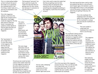
3. This is showing us what else in the magazine as extras, this is to make the reader feel that are getting a lot for their money if they buy this magazine. This is the masthead, the masthead covers the top width of the magazine. The font for the masthead is a unique font and only the masthead is in that font. On this magazine it isnt entirely following the codes and conventions of music magazines as the masthead should be stretched across the whole of the top width of the magazine however here it is only three quarters of the way across. This is the issue date of the magazine and also the price. This is on the barcode so it is also out the way. It is also in a small black plain font. The masthead of a magazine is to be in a large unique font that only the masthead is in, this is done to create the magazines brand and so the magazine is easily identifiable by their masthead The colour scheme of this magazine is simple and contains 4 colours primarily: white, blue, red and yellow. This is eye catching and draws the reader in. The bar code is following the codes and conventions of front covers as it is on the right hand side of the magazine This is the main coverline on the magazine, this is because it is about the main feature article inside the magazine Subsidiary images are used to anchor to stories inside the magazine, they may or may not be related to the coverlines and show what else is featured in the magazine and if the readers favourite bands are in the magazine they will be more likely to buy it. This is the main image on the front cover, so it is the main feature article in the magazine. The main image dominates the front cover, however here the main image doesn't overlap the masthead, this is because the magazine is not well enough known to do that. These are the coverlines, on a traditional magazine that is following the codes and conventions there are between 5 and 10. Coverlines are used to show the reader what else is in the magazine, so to persuade them to buy it.