

Recommended
More Related Content
Similar to Typography Book
Similar to Typography Book (20)
More from Hayley Corini
More from Hayley Corini (6)
Recently uploaded
Recently uploaded (20)
Typography Book
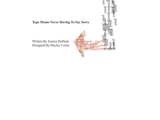
- 1. SorrySorrySorry SorrySorry Sorry Sorry Sorry Sorry Sorry Sorry SorrySorry Sorry rry ry Sorry orrySorry Sorry Sorry SorrySorry SorrySorrySorry Sorry Sorry Sorry Sorry Sorry orry Sorry Sorry Sorry Sorry SorrySorry Sorry Sorry Sorry Sorry Sorry Sorry Sorry Sorry Sorry Sorry SorrySorry Sorry Sorry Sorry Sorry Sorry Sorry Sorry Sorry Sorry Sorry SorrySorry SorrySorry Sorry Written By Jessica Helfand Designed By Hayley Corini Type Means Never Having To Say Sorry
- 2. A 1 bout a year ago, I participated in a student portfolio review involving nearly a dozen American schools, many (most?) exhibiting the classic projects that characterize all intergraduate design programs— all of which teach the students about the most essential design conceit: letter forms, and how to use them. the color studies, the poster problems, the typographic exercises.
- 3. 2 nd here, I quickly discovered that something had gone horribly wrong. One after another, bright-faced young hopefuls displayed the products of their long hours in the studio. Book after book spilled forth with content ranging from how to cook a frittata to how to understand Freud. here were personal books, commercial books, literary and poetic books, serious and silly books, childrens books, how-to books, and everything in between. A T
- 5. 4 hen Paul Renner released the typeface Furtura in 1928, he was inspired by the stream- lined geometric forms that celebrated the newly-minted wonders of the machine age. Futura was important for a number of reasons: arguably the first sans- serif font to be widely distributed, it has since its inception influenced countless other type- faces and remains, to some, the epitome of modern design. ave for a bried revival sometime in the 1970s (no doubt a reaction to the nostalgia-laden excesses of macramé, big hair and Victorian clip-art) and its dazzling persistence throughout the oeuvre of Barbara Kruger, Futura remains a typeface of its era: smooth and sleek, round and uncompromising. (Renner, and early member of the pre-Bauhaus Deutscher Werkbund— was guided by a strong belief in the union of art and industry, and was, as Futura brilliantly demonstrates, a staunch opponent of ornament.) ruger notwithstanding, I found it vexing to see what amounted to a miniature Futura-fest in all these student portfolios, and began gently questioning those responsible. W S K
- 6. 5 “What made you choose this typeface?” I inquired of a lovely young woman whose senior project involved a series of book jackets for Sigmund Freud’s Interpretation of Dreams.
- 7. 6 “I liked how modern it was,” she replied.
- 8. 7 “Did you read the book?” She blushed, shook her head no, and looked down at her lap.
- 9. 8 I tried a different approach. “Do you know what year this book was published?”
- 10. 9 gain, she shook her head, and apologized for the lapse in research. But I wasn’t so interested in the apology (a common refrain, Particularly among students) as I was concerned that she was about to graduate and had no fundamental knowledge of design history— a failure of the curriculum, and by conjecture, of the faculty. explained that when Freud’s book was published in 1899 (and in it’s first English edition the subsequent year) it’s impact was significant— that the whole notion of addressing the subconscious was seen as wholly unprecedented, even radical at the time. A I
- 11. 10 nd yes, broadly speaking, such a novel concept might be considered to be “modern”— and what might that entail, typographically? could see that an abbre- viated lecture on the rise of modernism in America would be as pointless as quoting George San- tayana— or even Harry Truman— and besides, the next student was al- ready awaiting his turn for review— but the bottom line was: Why Futura? “I just kind of liked it.” I A
- 12. C F 11 learly, designers make choices about the appro- priateness of type based on any number of criteria, and “liking it” is indeed one of them. There are an infinite number of considerations to be taken into account, from readability ollowers of the Beatrice Warde school of thought believe that typography should be invisible, while an equal argument can (and should) be made on behalf of expressive typography— type that extends and amplifies its message through more robust gestures in form, scale and composition. (Guillaume Apollinaire’s calligrammes preceded Renner’s Futura by more than a decade: might not these be considered modern too?) to copy fitting to concerns over what works on a screen to what translates into other languages.
- 13. 12 t’s not the designer’s voice that concerns me here so much as the de- signer’s understanding of history— a body of knowledge that once ac- quired, can be edited, modified, even jettisoned at will, but only after giving it a good, hard think. here are those who believe typography, like beauty, rests in the eye of the beholder. And while it is not now nor has it ever been science, there are certain typographic tenets that remain somewhat protected by, well, the vicissitudes of cultural civility. In general, we like to be able to read our typography. Organizational conceits— like headlines, bylines and pull-quotes— offer scalable options in editorial design, while book designers guide readers to different points of entry through things like chapter headings and running heads. esingers in general (and students in particular) have an overwhelming tendency to consider anything that’s been achieved in the past as a kind of “been there, done that” straitjacket, while the opposite is not only true, it’s surprisingly actionable. I T D
- 14. 1 2 13 Poster designers get to make type m o v e . BIG. Motion designers get to make type
- 15. 3 14 Branding and identitydesigners have to do it all— their task involves orchestrating visual language so that, say, the same word is recognizable whether reduced to a website icon, printed on a business card or emblazoned on the side of a truck. nd yes, the starting point for all of it-- whether it’s a student assign- ment or a massive re-branding of a corporation— is likely to be the designer who says, “I just kind of liked it.” A
- 16. 15 evertheless, one assumes that, at a certain point in the evolution of a visual idea, a certain amount of judgment intervenes, and appropriateness is questioned— even though appropriateness can be boring. (Even some of the world’s most fastidious typographers know that.) True, we live in a multi- cultural, aesthetically pluralistic world now— one where form-to-content relationships aren’t so But does that make it right? N easily identified, let alone made visually manifest. Nor, perhaps, should they be: nothing really mod- ern has ever been easy, has it? It is highly likely that the majority of the general public will never know— or, for that matter, care— that Paul Ren- ner designed Futura nearly 30 years after Sigmund Freud published his seminal book on dreams.
- 17. criticalcritical criticalcriticalcriticalcritical criticalcritical critical criticalcriticalcriticalcriticalcritical critical critical critic critical critic crit criticalcritical critical critical critical critical critical criticalcritical critical critical critical critical critical critical critical critical critical criticalcritical critical criticalcritical critical critical critical critical critical critical critical criticalcritical critical critical critical critical critical critical critical critical critical critical critical iticalcritical itical critical criticalcriticalcritical criticalitical critical critical critical criticalcriticalcritical critical critical critical critical critical critical critical criticalcritical critical critical critical critical critical critical critical critical critical criticalcritical critical critical critical critical critical critical critical critical critical critical critical criticalcritical critical critical critical critical criticalcritical criticalcriticalcritical critical critical critical critical critical critical critical critical critical critical critical critical critical critical critical critical 16 et’s begin by teaching our students what they really need to know-- not just the formal and technical conventions but the cultural, intellectual, critical and yes, historical context in which hundreds of years typographic practice preceded them. Choosing a typeface is fun, and making language visible is nothing short of enchanting; in these modern, computationally-enabled days, it’s also way too easy to wander and stumble and fall. To fail to address the degree to which design history plays a fundamental role in any typographic course of study is nothing short of tragic. Typography may well be the most critical component in the education of a young graphic designer. L