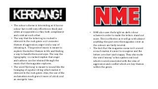
• The colourscheme is interesting as it has no
colour but is still very effective as black and
white are opposites so they both compliment
and contrast each other.
• The way that the lettering is cracked is
relevant to the rock genre as it connotes
themes of aggression, anger and a way of
releasing it. The genre of music is meant to
explore the darker themes in life and finding
a way to handle them and cope. The way the
typography is cracked implies that anger
and sadness can be released through the
music that the magazine explores.
• The word ‘Kerrang’ is meant to sound like the
twanging of a guitar string which makes it
relevant to the rock genre. Also, the use of the
exclamation mark gives it more of a kick and
an energetic tone.
• NME also uses the bright on dark colour
scheme in order to make the letters stand out
more. This is effective as it will go with almost
anything they put onto the magazine cover as
the colours are fairly neutral.
• The fact that the magazine name isn’t a word
as such makes it easier to recognise and the
letters are short and snappy. They also make
the word ‘enemy’ when spoken out loud
which is word associated with the idea of
aggression and conflict which are key themes
within the genre.
2.
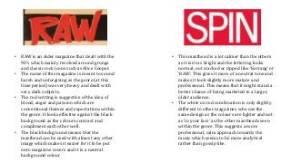
• RAW isan older magazine that dealt with the
90’s which mainly revolved around grunge
and classic rock icons such as Alice Cooper.
• The name of this magazine is meant to sound
harsh and unforgiving as the genre (at this
time period) was very heavy and dealt with
very dark subjects.
• The red writing is suggestive of the idea of
blood, anger and passion which are
conventional themes and expectations within
the genre. It looks effective against the black
background as the colours contrast and
compliment each other well.
• The black background means that the
masthead can be used with almost any other
image which makes it easier for it to be put
onto magazine covers and it is a neutral
background colour
• This masthead is a lot calmer than the others
as it isn’t as bright and the lettering looks
normal, not cracked or ripped like ‘Kerrang’ or
‘RAW’. This gives it more of a neutral tone and
makes it look slightly more mature and
professional. This means that it might stand a
better chance of being marketed to a larger,
older audience.
• The white on red combination is only slightly
different to other magazines who use the
same design as the colours are lighter and not
as ‘in your face’ as the other mastheads seen
within the genre. This suggests a more
professional, calm approach towards the
music which seems to be more analytical
rather than gossip like.


![[BROCHURE] Italy Tour Project | @SlideON](https://cdn.slidesharecdn.com/ss_thumbnails/brochure8-251215152319-2805af68-thumbnail.jpg?width=640&height=640&fit=bounds)


