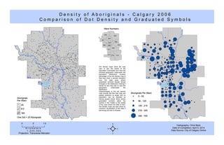
This document contains information about the density of Aboriginal populations in the city of Calgary in 2006. It includes a dot density map and graduated symbol map showing the distribution of Aboriginals across the city's 14 wards. The dot density map uses dots to represent groups of 20 Aboriginal individuals, allowing the viewer to see population boundaries and physical geography underneath. However, dots are placed randomly so areas with no population may appear occupied. The graduated symbol map more accurately depicts data by centering symbols on areas, but shows abrupt changes rather than a smooth transition.
1. AborignalsAborignals
Per WardPer Ward
Ward NumbersWard Numbers
012
003
009
002
014
001
010
013
011
004
006
005
007
008
D e n s i t y o f A b o r i g i n a l s - C a l g a r y 2 0 0 6D e n s i t y o f A b o r i g i n a l s - C a l g a r y 2 0 0 6
C o m p a r i s o n o f D o t D e n s i t y a n d G r a d u a t e d S y m b o l sC o m p a r i s o n o f D o t D e n s i t y a n d G r a d u a t e d S y m b o l s
Cartography: Chris BeckCartography: Chris Beck
Date of Completion: April 5, 2014Date of Completion: April 5, 2014
Data Source: City of Calgary OnlineData Source: City of Calgary Online
Aboriginals Per WardAboriginals Per Ward
56 - 12556 - 125
346 - 705346 - 705
216 - 345216 - 345
126 - 215126 - 215
0 - 550 - 55
00 55 1 01 0
K i l o m e t e r sK i l o m e t e r s
1 : 2 3 0 , 0 0 01 : 2 3 0 , 0 0 0
Projection: Transverse MercatorProjection: Transverse Mercator ²
One Dot = 20 AborignalsOne Dot = 20 Aborignals
160160
8 08 0
2020
Dot density maps allow the map
user to see the extent of the
population boundaries and view the
physical geography underneath the
population distribution. Another
advantage of the dot density map is
that they show a smooth transition
over the data area, where
graduated symbols display abrupt
changes in the distribution making it
harder for the map user to view the
geography underneath the
distribution.
Disadvantages to the dot density
map include the fact that dots are
placed randomly so areas with no
population can be depicted as
having people reside there, where
graduated symbols place the
symbol in the middle in the middle
of the area where the data is from.
Dot density maps can also show an
incorrect visualization of the data if
the wrong dot size is choosen