
Recommended
More Related Content
What's hot
Similar to Amandeep singh
Similar to Amandeep singh (20)
Amandeep singh
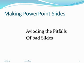
- 1. Making PowerPoint Slides Avioding the Pitfalls Of bad Slides 15/6/2015 1AmanDeep
- 2. Tips to be Covered Outlines Slide Strurture Fonts Colour Background Graphs Spelling and Grammer Conclusions Questions 15/6/2015 2AmanDeep
- 3. Outline Make your 1st or 2nd slide an outline of your presentation -Ex : previous slide Follow the order of your outline 15/6/2015 3AmanDeep
- 4. Slide structure- Good Use 1-2 Slides per minute of your presentation Write in point form not complete sentences Include 4-5 points per slides Avoid wordiness ; use keys words and phrases only 15/6/2015 4AmanDeep
- 5. Slide Structure-Bad This page contains too many words for a presentations Slide. It is not written in point from making difficult both for your audience to read and for you to present each point. In short, your audience will spend too much time trying to read this paragraph instead of listening to you 15/6/2015 5AmanDeep
- 6. Slide structure- Good Show one point at a time Will help audience concentrate on what you are saying Will Prevent audience form reading ahead Will help you keep your presentation focused 15/6/2015 6AmanDeep
- 7. Slide structure-bad Do not use distracting animation Do not go overboard with the animation Be consistent with the animation that you use 15/6/2015 7AmanDeep
- 8. Fonts-Good Use at least an 18- point font Use different size fonts for main points and secondary points This font is 24- point the main point font is 28- point and the title font is 36-point Use a standard font like times new roman or arial 15/6/2015 8AmanDeep
- 9. Fonts-Bad If you use a small font, your audience won”t be read what you have written CAPITALIZE ONLY WHEN NECESSARY IT IS DIFFCULT TO READ Do ‘t use a complicated font 15/6/2015 9AmanDeep
- 10. Colour-God Use a colour of font that contrasts sharply with the background Use colour to reinforce the logic of your structure Use colour to emphasize a point 15/6/2015 10AmanDeep
- 11. Colour-Bad Using a font colour that does not contrest with The background colour is hard to read Using colour for decaration is distracting and annoying Using a different color for each point is unnecessery Trying to be crertiaecan also be bad 15/6/2015 11AmanDeep
- 12. Background - Good Use backgrounds such as this one that are attractive but simple Use backgrounds which are light Use the same background consistently throughout your presentation 15/6/2015 12AmanDeep
- 13. Background – Bad Avoid backgrounds that are distracting or difficult to read from Always be consistent with the background that you use 15/6/2015 13AmanDeep
- 14. Graphs - Good Use graphs rather than just charts and words Data in graphs is easier to comprehend & retain than is raw data Trends are easier to visualize in graph form Always title your graphs 15/6/2015 14AmanDeep
- 15. Graphs - Bad January February March April Blue Balls 20.4 27.4 90 20.4 Red Balls 30.6 38.6 34.6 31.6 15/6/2015 15AmanDeep