SlideShare a Scribd company logo
1 of 28
Download to read offline
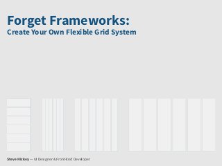
Forget Frameworks:
Create Your Own Flexible Grid System


Steve Hickey — UI Designer & Front-End Developer
Hi, I’m Steve.
I design/code applications for Fresh Tilled Soil in Watertown.
We Use Grids Because They’re Awesome
They create order from chaos.
But they can be difficult to do well on the web. This is why we
have so many frameworks, but they have issues.


 <div class="row">
     <h2 class="span4">It slices!</h2>
     <h2 class="span4">It dices!</h2>
     <h2 class="span4">It juliennes!</h2>
 </div>


 /* ================================================================== */


 .row { margin-left: -20px; }
 .row:before, .row:after { display: table; line-height: 0; content: ""; }
 .row:after { clear: both; }


 .span4 {   width: 300px; }
Let me tell you a story about Pat and Andy...
Marketing: Looks great, but it needs our partner quotes. We need
to make them feel special.
CEO: Close, but where’s my picture? I work very hard! In fact, get
all the execs on here.
But make them smaller than me.
CTO: I hear responsive design is pretty big right now. Why isn’t this
responsive, aren’t we paying you enough?
The stress has made them lunatics.
We can prevent this from happening to you.
Let’s Get SASS-y
SASS is a CSS pre-processor. It allows us to do things like:

 1. Nest selectors
 2. Use variables
 3. Extend classes with mixins
 4. Avoid repetition
We’ll use SASS to apply styles to pre-existing semantic classes
with some mixins.

These styles will be calculated with SASS functions so our
elements adjust automatically when we change variables.
First, our markup. Our class names are all semantic and clean.

 <div class="container">
     <header role="banner">...</header>
     <div role="main">
         <section class="hero">...</section>
         <section class="partner-quotes">
             <h2>Quotes From Our Partners</h2>
             <div class="cosby">...</div>
             <div class="jobs">...</div>
             <div class="wilde">...</div>
             <div class="letterman">...</div>
             <div class="franklin">...</div>
             <div class="twain">...</div>
         </section>
         <section class="executive-team">
             <h2>Our Executive Team</h2>
             <div class="ceo">...</div>
             <div class="other-executives">
                 <div class="cto">...</div>
                 <div class="cmo">...</div>
                 <div class="coo">...</div>
                 <div class="cio">...</div>
             </div>
         </section>
     </div>
     <footer role="contentinfo">...</footer>
 </div>
Next, our grid. I used this one because math is hard.
• Total width of 1000px.
• 6 columns @ 150px wide each
• 20px gutters

Percentages are calculated with target / context = result
to get flexible widths: 15% columns with 2% gutters.
We’ll store this information in some SASS variables.


 $max-width:        1000px;   // set page max-width
 $column-width:     15%;     // set column width
 $gutter-width:     2%;      // set gutter width
 $maximum-columns:   6;       // set max number of columns
Then we’ll define some helpful mixins. They have use beyond
our grid system and should be defined globally.


 @mixin clearfix {
    zoom: 1;
    &:before, &:after { content: ""; display: table; }
    &:after { clear: both; }
 }

 @mixin border-box {
    -webkit-box-sizing: border-box;
       -moz-box-sizing: border-box;
            box-sizing: border-box;
 }
Now, the fun stuff:
This function uses variables to make flexible column widths.


  @function columns($columns, $container-columns: $maximum-columns) {
     $width:
     $columns * $column-width + ($columns - 1) * $gutter-width;
     $container-width:
     $container-columns * $column-width + ($container-columns - 1) * $gutter-width;
     @return percentage($width / $container-width);
  }


* Borrowed and modified from the excellent Bourbon.io
And this function helps us get the correct width for gutters.


  @function gutter($container-columns: $maximum-columns, $gutter: $gutter-width) {
     $container-width:
     $container-columns * $column-width + ($container-columns - 1) * $gutter-width;
     @return percentage($gutter / $container-width);
  }


* Borrowed and modified from the excellent Bourbon.io
We’ll use these functions on elements like so:


 div.parent {
   width: columns(3);        // takes 1 arg: column span
   margin-right: gutter;     // no args required

   div.child {
     width: columns(1, 3);    // takes 2 args: span, span of parent
     margin-right: gutter(3); // takes 1 arg: span of parent
   }
 }
And they’ll output this:


 div.parent {
    width: 49%;                // spans 3 columns
    margin-right: 2%;          // 1 gutter width
 }

 div.parent div.child {
    width: 30.61224%;        // spans 1 column, 3 column parent
   margin-right: 4.08163%;   // 1 gutter width, 3 column parent
 }
For a full grid system we’ll need to define a few more behaviors.
This mixin helps to control nesting elements.


 @mixin nesting {
   padding: 0;                 // no padding so nested elements fit

     & > div {                 // affect only immediate children
       float: left;
       margin-right: gutter;
       @include border-box;    // math is hard. let’s use border-box
     }
 }
And this one tells elements to behave like rows.


 @mixin row {
   width: 100%;             // make sure to fill its container
   max-width: $max-width;   // but no more than our max width
   margin: 0 auto;
   @include clearfix;       // clear our floats
   @include nesting;        // add nesting styles to rows
 }
For a more advanced layout we’ll need to offset elements. This
function handles the calculations for us.


 @function offset-columns($columns) {
     $margin: $columns * $column-width + $columns * $gutter-width;
     @return $margin;
 }
And we can apply it using our offset mixin.


 @mixin offset($from-direction: left, $columns) {
     @if $from-direction == left {
         float: left;
         margin-left: offset-columns($columns);
     }
     @if $from-direction == right {
         float: right;
         margin-right: offset-columns($columns);
     }
 }
There’s one more pesky problem to deal with:
the last element in any row...


 @mixin last {
     margin-right: 0;
     float: right;
 }
Note:
I tried :last-child, :first-child and :nth-child(). They would be
good solutions, but support is bad or intent is wrong.
The Final Product
github.com/freshtilledsoil/forget-frameworks-demo-bfe
Thanks!
@stevehickeydsgn
http://stevehickeydesign.com
http://freshtilledsoil.com

More Related Content

Featured

Everything You Need To Know About ChatGPT
Everything You Need To Know About ChatGPTEverything You Need To Know About ChatGPT
Everything You Need To Know About ChatGPTExpeed Software
 
Product Design Trends in 2024 | Teenage Engineerings
Product Design Trends in 2024 | Teenage EngineeringsProduct Design Trends in 2024 | Teenage Engineerings
Product Design Trends in 2024 | Teenage EngineeringsPixeldarts
 
How Race, Age and Gender Shape Attitudes Towards Mental Health
How Race, Age and Gender Shape Attitudes Towards Mental HealthHow Race, Age and Gender Shape Attitudes Towards Mental Health
How Race, Age and Gender Shape Attitudes Towards Mental HealthThinkNow
 
AI Trends in Creative Operations 2024 by Artwork Flow.pdf
AI Trends in Creative Operations 2024 by Artwork Flow.pdfAI Trends in Creative Operations 2024 by Artwork Flow.pdf
AI Trends in Creative Operations 2024 by Artwork Flow.pdfmarketingartwork
 
PEPSICO Presentation to CAGNY Conference Feb 2024
PEPSICO Presentation to CAGNY Conference Feb 2024PEPSICO Presentation to CAGNY Conference Feb 2024
PEPSICO Presentation to CAGNY Conference Feb 2024Neil Kimberley
 
Content Methodology: A Best Practices Report (Webinar)
Content Methodology: A Best Practices Report (Webinar)Content Methodology: A Best Practices Report (Webinar)
Content Methodology: A Best Practices Report (Webinar)contently
 
How to Prepare For a Successful Job Search for 2024
How to Prepare For a Successful Job Search for 2024How to Prepare For a Successful Job Search for 2024
How to Prepare For a Successful Job Search for 2024Albert Qian
 
Social Media Marketing Trends 2024 // The Global Indie Insights
Social Media Marketing Trends 2024 // The Global Indie InsightsSocial Media Marketing Trends 2024 // The Global Indie Insights
Social Media Marketing Trends 2024 // The Global Indie InsightsKurio // The Social Media Age(ncy)
 
Trends In Paid Search: Navigating The Digital Landscape In 2024
Trends In Paid Search: Navigating The Digital Landscape In 2024Trends In Paid Search: Navigating The Digital Landscape In 2024
Trends In Paid Search: Navigating The Digital Landscape In 2024Search Engine Journal
 
5 Public speaking tips from TED - Visualized summary
5 Public speaking tips from TED - Visualized summary5 Public speaking tips from TED - Visualized summary
5 Public speaking tips from TED - Visualized summarySpeakerHub
 
ChatGPT and the Future of Work - Clark Boyd
ChatGPT and the Future of Work - Clark Boyd ChatGPT and the Future of Work - Clark Boyd
ChatGPT and the Future of Work - Clark Boyd Clark Boyd
 
Getting into the tech field. what next
Getting into the tech field. what next Getting into the tech field. what next
Getting into the tech field. what next Tessa Mero
 
Google's Just Not That Into You: Understanding Core Updates & Search Intent
Google's Just Not That Into You: Understanding Core Updates & Search IntentGoogle's Just Not That Into You: Understanding Core Updates & Search Intent
Google's Just Not That Into You: Understanding Core Updates & Search IntentLily Ray
 
Time Management & Productivity - Best Practices
Time Management & Productivity -  Best PracticesTime Management & Productivity -  Best Practices
Time Management & Productivity - Best PracticesVit Horky
 
The six step guide to practical project management
The six step guide to practical project managementThe six step guide to practical project management
The six step guide to practical project managementMindGenius
 
Beginners Guide to TikTok for Search - Rachel Pearson - We are Tilt __ Bright...
Beginners Guide to TikTok for Search - Rachel Pearson - We are Tilt __ Bright...Beginners Guide to TikTok for Search - Rachel Pearson - We are Tilt __ Bright...
Beginners Guide to TikTok for Search - Rachel Pearson - We are Tilt __ Bright...RachelPearson36
 
Unlocking the Power of ChatGPT and AI in Testing - A Real-World Look, present...
Unlocking the Power of ChatGPT and AI in Testing - A Real-World Look, present...Unlocking the Power of ChatGPT and AI in Testing - A Real-World Look, present...
Unlocking the Power of ChatGPT and AI in Testing - A Real-World Look, present...Applitools
 

Featured (20)

Everything You Need To Know About ChatGPT
Everything You Need To Know About ChatGPTEverything You Need To Know About ChatGPT
Everything You Need To Know About ChatGPT
 
Product Design Trends in 2024 | Teenage Engineerings
Product Design Trends in 2024 | Teenage EngineeringsProduct Design Trends in 2024 | Teenage Engineerings
Product Design Trends in 2024 | Teenage Engineerings
 
How Race, Age and Gender Shape Attitudes Towards Mental Health
How Race, Age and Gender Shape Attitudes Towards Mental HealthHow Race, Age and Gender Shape Attitudes Towards Mental Health
How Race, Age and Gender Shape Attitudes Towards Mental Health
 
AI Trends in Creative Operations 2024 by Artwork Flow.pdf
AI Trends in Creative Operations 2024 by Artwork Flow.pdfAI Trends in Creative Operations 2024 by Artwork Flow.pdf
AI Trends in Creative Operations 2024 by Artwork Flow.pdf
 
Skeleton Culture Code
Skeleton Culture CodeSkeleton Culture Code
Skeleton Culture Code
 
PEPSICO Presentation to CAGNY Conference Feb 2024
PEPSICO Presentation to CAGNY Conference Feb 2024PEPSICO Presentation to CAGNY Conference Feb 2024
PEPSICO Presentation to CAGNY Conference Feb 2024
 
Content Methodology: A Best Practices Report (Webinar)
Content Methodology: A Best Practices Report (Webinar)Content Methodology: A Best Practices Report (Webinar)
Content Methodology: A Best Practices Report (Webinar)
 
How to Prepare For a Successful Job Search for 2024
How to Prepare For a Successful Job Search for 2024How to Prepare For a Successful Job Search for 2024
How to Prepare For a Successful Job Search for 2024
 
Social Media Marketing Trends 2024 // The Global Indie Insights
Social Media Marketing Trends 2024 // The Global Indie InsightsSocial Media Marketing Trends 2024 // The Global Indie Insights
Social Media Marketing Trends 2024 // The Global Indie Insights
 
Trends In Paid Search: Navigating The Digital Landscape In 2024
Trends In Paid Search: Navigating The Digital Landscape In 2024Trends In Paid Search: Navigating The Digital Landscape In 2024
Trends In Paid Search: Navigating The Digital Landscape In 2024
 
5 Public speaking tips from TED - Visualized summary
5 Public speaking tips from TED - Visualized summary5 Public speaking tips from TED - Visualized summary
5 Public speaking tips from TED - Visualized summary
 
ChatGPT and the Future of Work - Clark Boyd
ChatGPT and the Future of Work - Clark Boyd ChatGPT and the Future of Work - Clark Boyd
ChatGPT and the Future of Work - Clark Boyd
 
Getting into the tech field. what next
Getting into the tech field. what next Getting into the tech field. what next
Getting into the tech field. what next
 
Google's Just Not That Into You: Understanding Core Updates & Search Intent
Google's Just Not That Into You: Understanding Core Updates & Search IntentGoogle's Just Not That Into You: Understanding Core Updates & Search Intent
Google's Just Not That Into You: Understanding Core Updates & Search Intent
 
How to have difficult conversations
How to have difficult conversations How to have difficult conversations
How to have difficult conversations
 
Introduction to Data Science
Introduction to Data ScienceIntroduction to Data Science
Introduction to Data Science
 
Time Management & Productivity - Best Practices
Time Management & Productivity -  Best PracticesTime Management & Productivity -  Best Practices
Time Management & Productivity - Best Practices
 
The six step guide to practical project management
The six step guide to practical project managementThe six step guide to practical project management
The six step guide to practical project management
 
Beginners Guide to TikTok for Search - Rachel Pearson - We are Tilt __ Bright...
Beginners Guide to TikTok for Search - Rachel Pearson - We are Tilt __ Bright...Beginners Guide to TikTok for Search - Rachel Pearson - We are Tilt __ Bright...
Beginners Guide to TikTok for Search - Rachel Pearson - We are Tilt __ Bright...
 
Unlocking the Power of ChatGPT and AI in Testing - A Real-World Look, present...
Unlocking the Power of ChatGPT and AI in Testing - A Real-World Look, present...Unlocking the Power of ChatGPT and AI in Testing - A Real-World Look, present...
Unlocking the Power of ChatGPT and AI in Testing - A Real-World Look, present...
 

Forget Frameworks: Create Your Own Flexible Grid System

  • 1. Forget Frameworks: Create Your Own Flexible Grid System Steve Hickey — UI Designer & Front-End Developer
  • 2. Hi, I’m Steve. I design/code applications for Fresh Tilled Soil in Watertown.
  • 3. We Use Grids Because They’re Awesome They create order from chaos.
  • 4. But they can be difficult to do well on the web. This is why we have so many frameworks, but they have issues. <div class="row"> <h2 class="span4">It slices!</h2> <h2 class="span4">It dices!</h2> <h2 class="span4">It juliennes!</h2> </div> /* ================================================================== */ .row { margin-left: -20px; } .row:before, .row:after { display: table; line-height: 0; content: ""; } .row:after { clear: both; } .span4 { width: 300px; }
  • 5. Let me tell you a story about Pat and Andy...
  • 6. Marketing: Looks great, but it needs our partner quotes. We need to make them feel special.
  • 7. CEO: Close, but where’s my picture? I work very hard! In fact, get all the execs on here. But make them smaller than me.
  • 8. CTO: I hear responsive design is pretty big right now. Why isn’t this responsive, aren’t we paying you enough?
  • 9. The stress has made them lunatics. We can prevent this from happening to you.
  • 10. Let’s Get SASS-y SASS is a CSS pre-processor. It allows us to do things like: 1. Nest selectors 2. Use variables 3. Extend classes with mixins 4. Avoid repetition
  • 11. We’ll use SASS to apply styles to pre-existing semantic classes with some mixins. These styles will be calculated with SASS functions so our elements adjust automatically when we change variables.
  • 12. First, our markup. Our class names are all semantic and clean. <div class="container"> <header role="banner">...</header> <div role="main"> <section class="hero">...</section> <section class="partner-quotes"> <h2>Quotes From Our Partners</h2> <div class="cosby">...</div> <div class="jobs">...</div> <div class="wilde">...</div> <div class="letterman">...</div> <div class="franklin">...</div> <div class="twain">...</div> </section> <section class="executive-team"> <h2>Our Executive Team</h2> <div class="ceo">...</div> <div class="other-executives"> <div class="cto">...</div> <div class="cmo">...</div> <div class="coo">...</div> <div class="cio">...</div> </div> </section> </div> <footer role="contentinfo">...</footer> </div>
  • 13. Next, our grid. I used this one because math is hard.
  • 14. • Total width of 1000px. • 6 columns @ 150px wide each • 20px gutters Percentages are calculated with target / context = result to get flexible widths: 15% columns with 2% gutters.
  • 15. We’ll store this information in some SASS variables. $max-width:        1000px; // set page max-width $column-width:     15%;     // set column width $gutter-width:     2%;      // set gutter width $maximum-columns: 6;       // set max number of columns
  • 16. Then we’ll define some helpful mixins. They have use beyond our grid system and should be defined globally. @mixin clearfix {  zoom: 1;  &:before, &:after { content: ""; display: table; }  &:after { clear: both; } } @mixin border-box {  -webkit-box-sizing: border-box;     -moz-box-sizing: border-box;          box-sizing: border-box; }
  • 17. Now, the fun stuff: This function uses variables to make flexible column widths. @function columns($columns, $container-columns: $maximum-columns) {  $width: $columns * $column-width + ($columns - 1) * $gutter-width;  $container-width: $container-columns * $column-width + ($container-columns - 1) * $gutter-width;  @return percentage($width / $container-width); } * Borrowed and modified from the excellent Bourbon.io
  • 18. And this function helps us get the correct width for gutters. @function gutter($container-columns: $maximum-columns, $gutter: $gutter-width) {  $container-width: $container-columns * $column-width + ($container-columns - 1) * $gutter-width;  @return percentage($gutter / $container-width); } * Borrowed and modified from the excellent Bourbon.io
  • 19. We’ll use these functions on elements like so: div.parent {  width: columns(3); // takes 1 arg: column span  margin-right: gutter; // no args required  div.child {    width: columns(1, 3); // takes 2 args: span, span of parent    margin-right: gutter(3); // takes 1 arg: span of parent  } }
  • 20. And they’ll output this: div.parent {  width: 49%; // spans 3 columns  margin-right: 2%; // 1 gutter width } div.parent div.child {  width: 30.61224%; // spans 1 column, 3 column parent   margin-right: 4.08163%; // 1 gutter width, 3 column parent }
  • 21. For a full grid system we’ll need to define a few more behaviors. This mixin helps to control nesting elements. @mixin nesting { padding: 0; // no padding so nested elements fit & > div { // affect only immediate children float: left; margin-right: gutter; @include border-box; // math is hard. let’s use border-box } }
  • 22. And this one tells elements to behave like rows. @mixin row { width: 100%; // make sure to fill its container max-width: $max-width; // but no more than our max width margin: 0 auto; @include clearfix; // clear our floats @include nesting; // add nesting styles to rows }
  • 23. For a more advanced layout we’ll need to offset elements. This function handles the calculations for us. @function offset-columns($columns) { $margin: $columns * $column-width + $columns * $gutter-width; @return $margin; }
  • 24. And we can apply it using our offset mixin. @mixin offset($from-direction: left, $columns) { @if $from-direction == left { float: left; margin-left: offset-columns($columns); } @if $from-direction == right { float: right; margin-right: offset-columns($columns); } }
  • 25. There’s one more pesky problem to deal with: the last element in any row... @mixin last { margin-right: 0; float: right; }
  • 26. Note: I tried :last-child, :first-child and :nth-child(). They would be good solutions, but support is bad or intent is wrong.