How effective is the combination on your main product and the ancillary texts
1.
How effective isthe combination of your main product
and the ancillary task?
2.
For my ancillarytask I have decided to create the Digital Digipack as well as the album advert
poster. I have decided to use these two text as I felt they were more appropriate for the artist
we have created; this is because the artist is an unknown upcoming artist and therefore is not
recognised easily, I felt by creating the album advertisement poster the artist would receive
more attention from the seeking audience allowing the project to be compared to real life
examples that use the same techniques within their industries; an example of this is Tinie
Tempah which uses advertisement on a energy drink that’s targeted at the young generation.
The step prior to creating the digipack, I researched other similar products which portray their
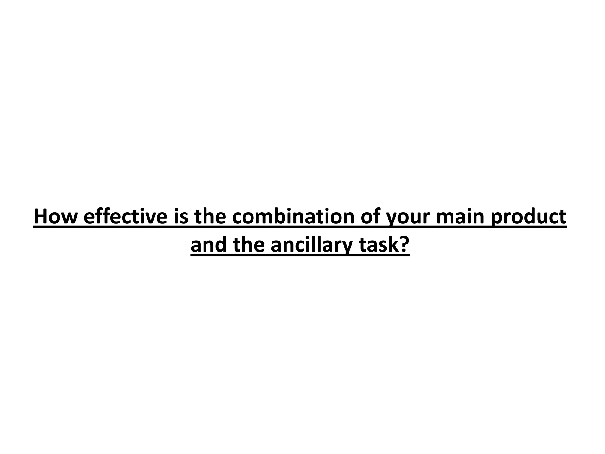
them selves to the audience trough many different ways. For example the new album by Lana
Del Ray (Born To Die) seems as if it was very subtle as well as innocent however it contrasts
when compared to the music she produces . The album artwork is simple but effective this has
inspired me to create my album artwork which is also simple but has allot of meaning behind
it. The reason for creating my cover and making it simple and innocent is to contradict the
music that the artist produces. This links to the target audience as it sucks them into buying
the CD expecting it to follow the codes and conventions where as the actual music opposes the
cover.
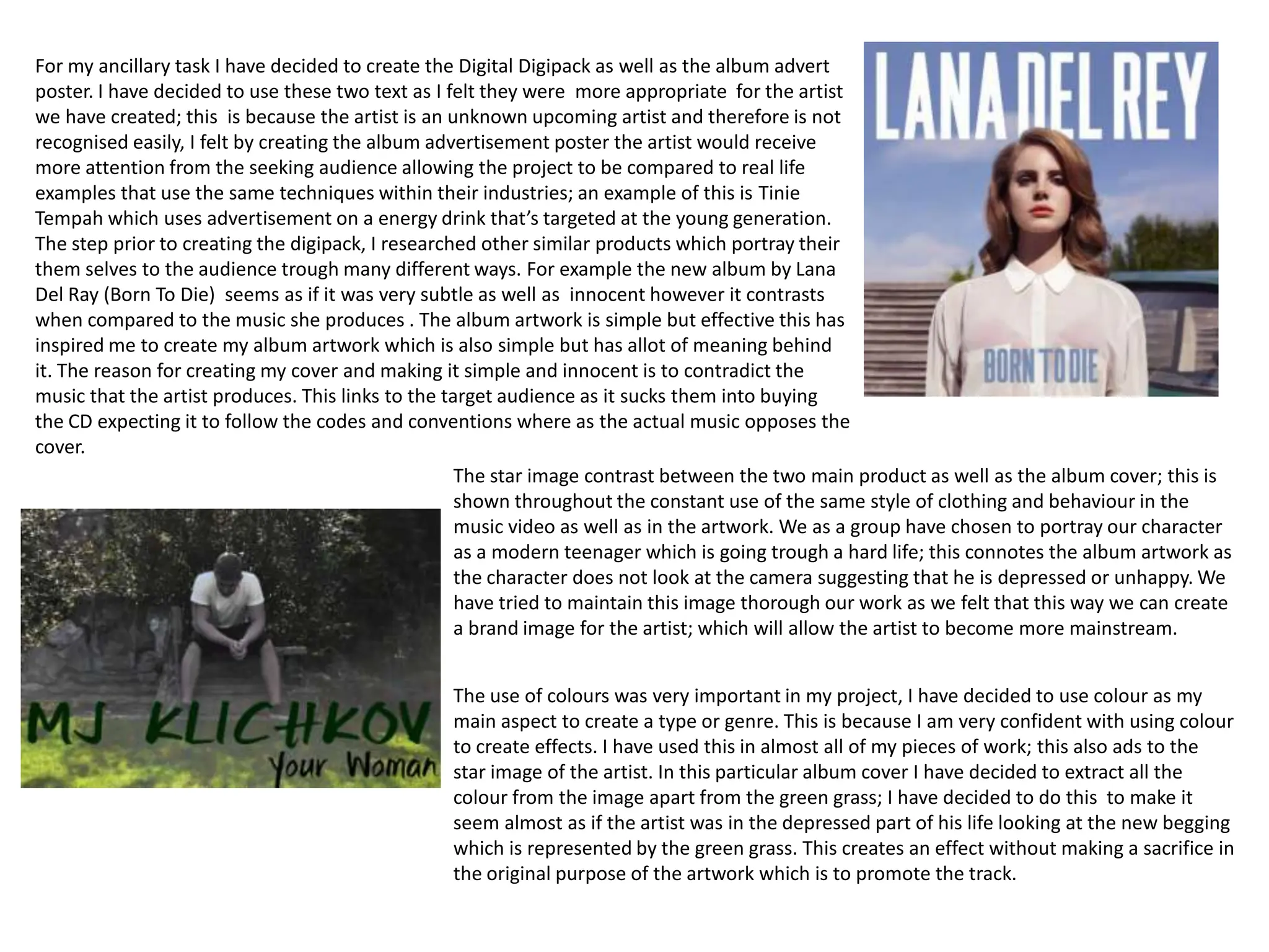
The star image contrast between the two main product as well as the album cover; this is
shown throughout the constant use of the same style of clothing and behaviour in the
music video as well as in the artwork. We as a group have chosen to portray our character
as a modern teenager which is going trough a hard life; this connotes the album artwork as
the character does not look at the camera suggesting that he is depressed or unhappy. We
have tried to maintain this image thorough our work as we felt that this way we can create
a brand image for the artist; which will allow the artist to become more mainstream.
The use of colours was very important in my project, I have decided to use colour as my
main aspect to create a type or genre. This is because I am very confident with using colour
to create effects. I have used this in almost all of my pieces of work; this also ads to the
star image of the artist. In this particular album cover I have decided to extract all the
colour from the image apart from the green grass; I have decided to do this to make it
seem almost as if the artist was in the depressed part of his life looking at the new begging
which is represented by the green grass. This creates an effect without making a sacrifice in
the original purpose of the artwork which is to promote the track.
3.
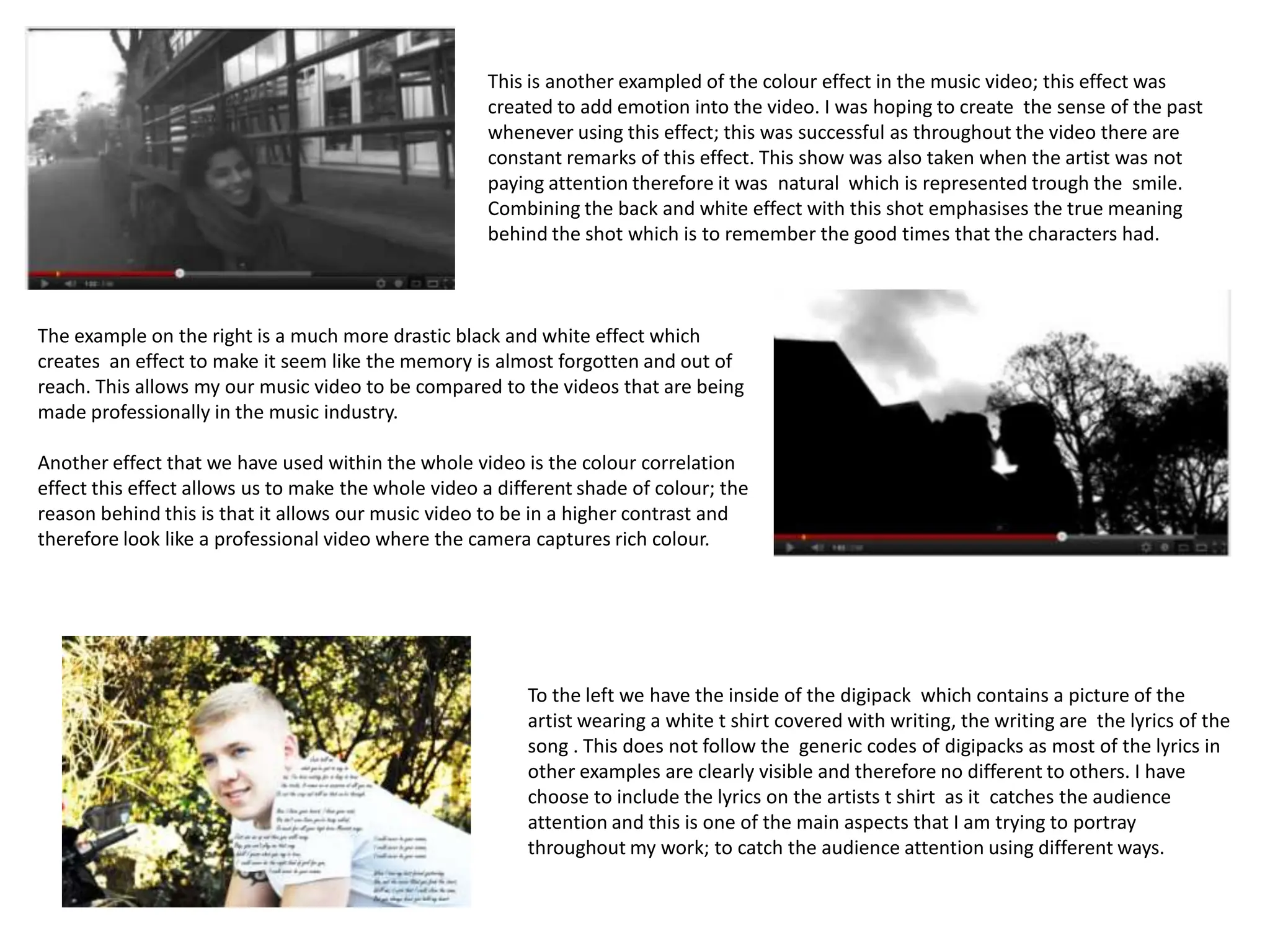
This is anotherexampled of the colour effect in the music video; this effect was
created to add emotion into the video. I was hoping to create the sense of the past
whenever using this effect; this was successful as throughout the video there are
constant remarks of this effect. This show was also taken when the artist was not
paying attention therefore it was natural which is represented trough the smile.
Combining the back and white effect with this shot emphasises the true meaning
behind the shot which is to remember the good times that the characters had.
The example on the right is a much more drastic black and white effect which
creates an effect to make it seem like the memory is almost forgotten and out of
reach. This allows my our music video to be compared to the videos that are being
made professionally in the music industry.
Another effect that we have used within the whole video is the colour correlation
effect this effect allows us to make the whole video a different shade of colour; the
reason behind this is that it allows our music video to be in a higher contrast and
therefore look like a professional video where the camera captures rich colour.
To the left we have the inside of the digipack which contains a picture of the
artist wearing a white t shirt covered with writing, the writing are the lyrics of the
song . This does not follow the generic codes of digipacks as most of the lyrics in
other examples are clearly visible and therefore no different to others. I have
choose to include the lyrics on the artists t shirt as it catches the audience
attention and this is one of the main aspects that I am trying to portray
throughout my work; to catch the audience attention using different ways.
4.
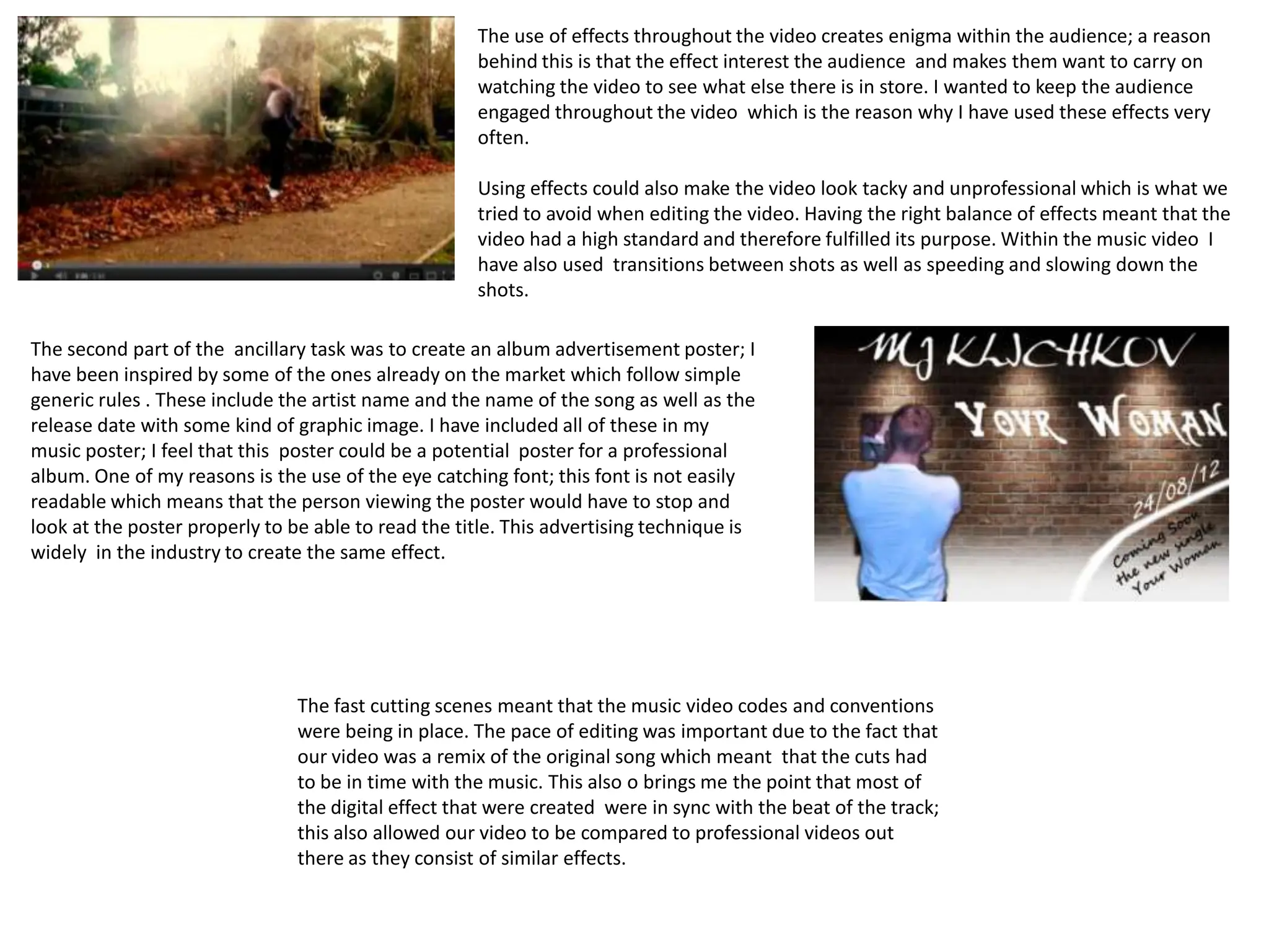
The use ofeffects throughout the video creates enigma within the audience; a reason
behind this is that the effect interest the audience and makes them want to carry on
watching the video to see what else there is in store. I wanted to keep the audience
engaged throughout the video which is the reason why I have used these effects very
often.
Using effects could also make the video look tacky and unprofessional which is what we
tried to avoid when editing the video. Having the right balance of effects meant that the
video had a high standard and therefore fulfilled its purpose. Within the music video I
have also used transitions between shots as well as speeding and slowing down the
shots.
The second part of the ancillary task was to create an album advertisement poster; I
have been inspired by some of the ones already on the market which follow simple
generic rules . These include the artist name and the name of the song as well as the
release date with some kind of graphic image. I have included all of these in my
music poster; I feel that this poster could be a potential poster for a professional
album. One of my reasons is the use of the eye catching font; this font is not easily
readable which means that the person viewing the poster would have to stop and
look at the poster properly to be able to read the title. This advertising technique is
widely in the industry to create the same effect.
The fast cutting scenes meant that the music video codes and conventions
were being in place. The pace of editing was important due to the fact that
our video was a remix of the original song which meant that the cuts had
to be in time with the music. This also o brings me the point that most of
the digital effect that were created were in sync with the beat of the track;
this also allowed our video to be compared to professional videos out
there as they consist of similar effects.