Analysis of an existing magazine
Front Cover The cover image is aimed at females as it is of Zac Efron showing off his body (something males won’t want to see). It is the first thing you look at when you see the front cover as the image stands out against the text.The masthead doesn’t really stand out on this edition as the ‘stone’ is covered by his head and part of the ‘rolling’ is covered by a text box. This really isn’t effective as the name of the magazine is what helps it stand out and be memorable to the readerThe text is laid out really well as it follows the silhouette of the cover image instead of being over the top of it. So it doesn’t take focus away from the cover image but still stands out.
Contents page The contents page doesn’t really follow on from the front cover as the font and layout is totally different. I don’t think that this makes the magazine as effective as it could be, because I think that if the front cover and contents page links it makes the magazine more memorable and recognisable for the reader.I really like the straightness of the contents page. As it makes it easy to follow and read. Its almost set out like a menu. With the central alignment and the breaks. I also really like the fact that the images have their own number that corresponds to the page they are on which helps to create a link between the contents page and the articles featured.
Double page spread I also like how the pictures are separate from the text as this makes it clearer and easier to follow.I like the fact that the title on this page is different in the fact that it has a different font size and colour for part of it. This helps to draw attention to ‘The Best MCR’.There is also the red white and black that is continued through the whole article which is also good.It also has a separate tab down the side where there is text that isn’t related to the main article. This makes it easier for the reader to understand and followThe larger image is that of the lead singer. This draws attention to him rather than the other band members

Analysis of an existing magazine

  • 1.
    Analysis of anexisting magazine
  • 2.
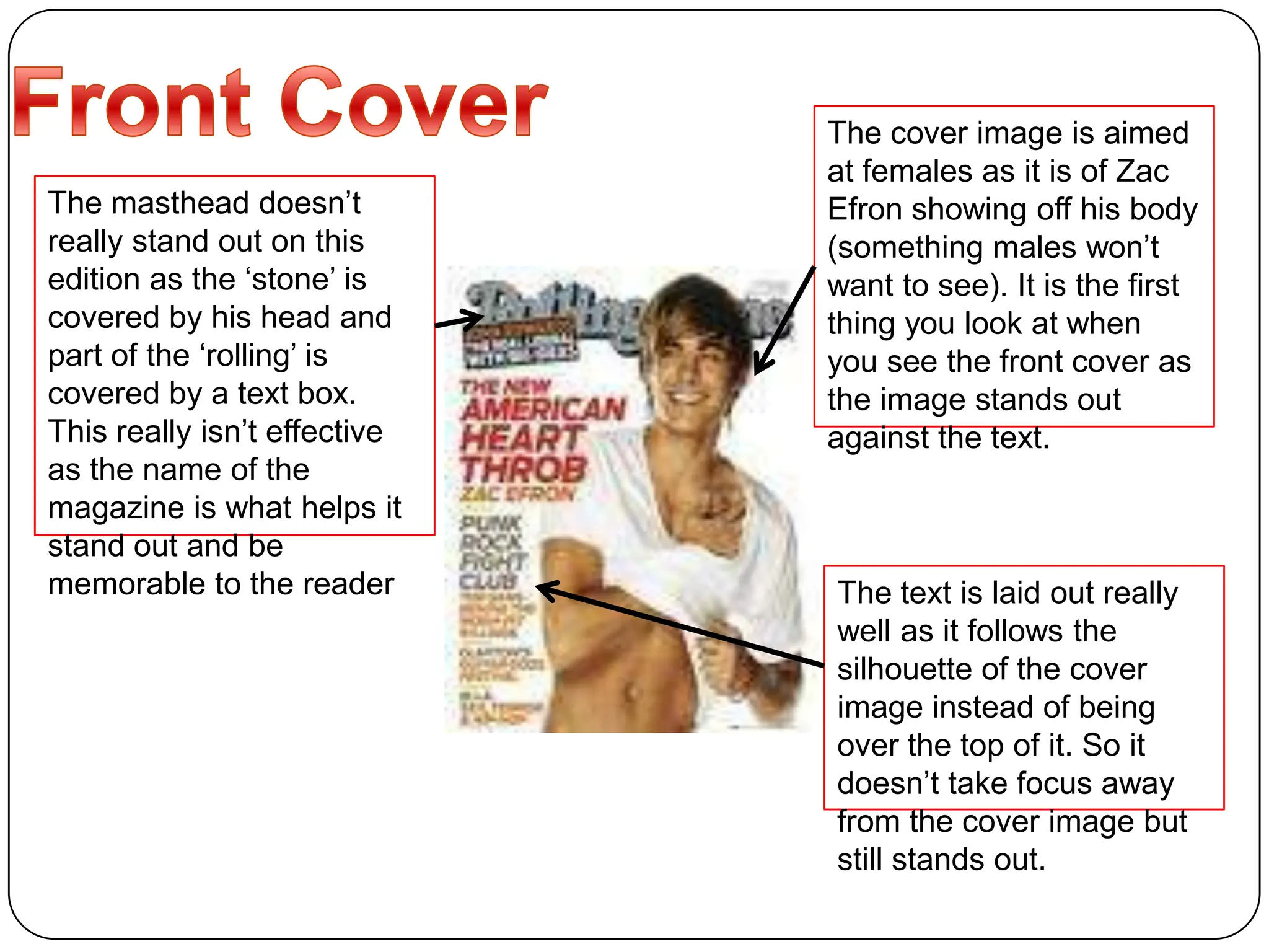
    Front Cover Thecover image is aimed at females as it is of Zac Efron showing off his body (something males won’t want to see). It is the first thing you look at when you see the front cover as the image stands out against the text.The masthead doesn’t really stand out on this edition as the ‘stone’ is covered by his head and part of the ‘rolling’ is covered by a text box. This really isn’t effective as the name of the magazine is what helps it stand out and be memorable to the readerThe text is laid out really well as it follows the silhouette of the cover image instead of being over the top of it. So it doesn’t take focus away from the cover image but still stands out.
  • 3.
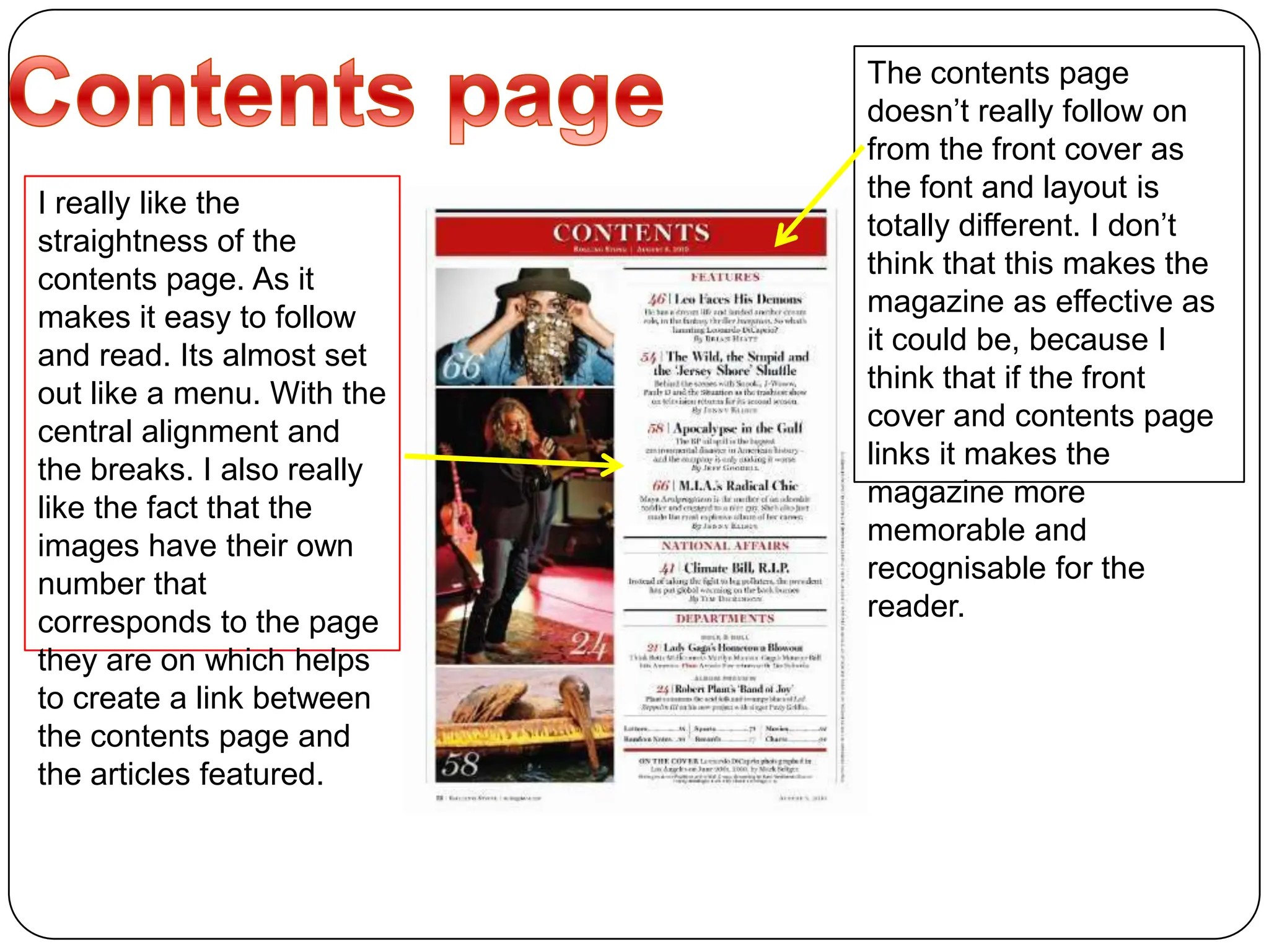
    Contents page Thecontents page doesn’t really follow on from the front cover as the font and layout is totally different. I don’t think that this makes the magazine as effective as it could be, because I think that if the front cover and contents page links it makes the magazine more memorable and recognisable for the reader.I really like the straightness of the contents page. As it makes it easy to follow and read. Its almost set out like a menu. With the central alignment and the breaks. I also really like the fact that the images have their own number that corresponds to the page they are on which helps to create a link between the contents page and the articles featured.
  • 4.
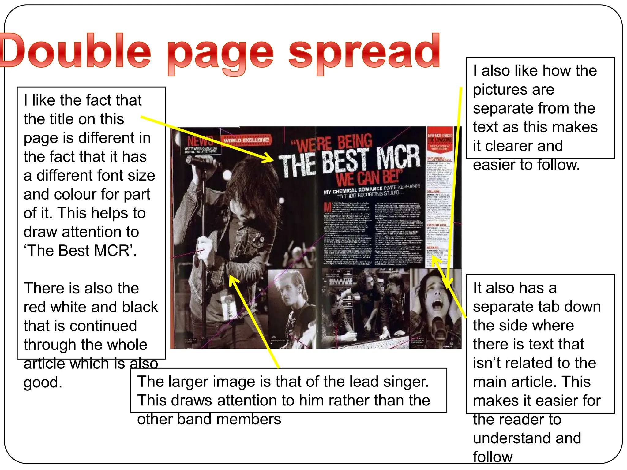
    Double page spreadI also like how the pictures are separate from the text as this makes it clearer and easier to follow.I like the fact that the title on this page is different in the fact that it has a different font size and colour for part of it. This helps to draw attention to ‘The Best MCR’.There is also the red white and black that is continued through the whole article which is also good.It also has a separate tab down the side where there is text that isn’t related to the main article. This makes it easier for the reader to understand and followThe larger image is that of the lead singer. This draws attention to him rather than the other band members