A2 Construction: The Woods Movie Poster
•Download as PPTX, PDF•
0 likes•290 views
Report
Share
Report
Share

Recommended
CALL GIRLS IN GOA & ESCORTS SERVICE 9316020077 Door Step Delivery We Offering You 100% Genuine Completed Body And Mind Relaxation With Happy Ending ServiCe Done By Most Attractive Charming Soft Spoken Bold Beautiful Full Cooperative Independent Escort Girls ServiCe In All Star Hotel And Home ServiCe In All Over North Goa-Baga , Calangute , Anjuna , Candolim , Arpora , Vagator , Morjim , Arambol , Mandrem , Mapusa , Siolim , Porvorim , Panaji , Miramar , Dona Paula ,Etc. Goa Also …,
I Have Extremely Beautiful Broad Minded Cute Sexy & Hot Call Girls and Escorts, We Are Located in 3* 4* 5* Hotels in GOA. Safe & Secure High Class Services Affordable Rate 100% Satisfaction, Unlimited Enjoyment. Any Time for Model/Teens Escort in GOA High Class luxury and Premium Escorts ServiCe.
★ CALL US High Class Luxury and Premium Escorts ServiCe We Provide Well Educated, Royal Class Female, High-Class Escorts Offering a Top High Class Escorts Service In the & Several Nearby All Places Of .
★ Get The High Profile, Bollywood Queens , Well Educated , Good Looking , Full Cooperative Model Services. You Can See Me at My Comfortable Hotels or I Can Visit You In hotel Our Service Available IN All SERVICE, 3/4/5 STAR HOTEL , In Call /Out Call Services.24 hrs ,
★ To Enjoy With Hot and Sexy Girls .
★ We Are Providing :-
• Models
• Vip Models
• Russian Models
• Foreigner Models
• TV Actress and Celebrities
• Receptionist
• Air Hostess
• Call Center Working Girls/Women
• Hi-Tech Co. Girls/Women
• Housewife
• Collage Going Girls.
• Travelling Escorts.
• Ramp-Models
• Foreigner And Many More.. Incall & Outcall Available…
• INDEPENDENT GIRLS / HOUSE WIFES
Russian ℂall gIRLS In Goa 9316020077 ℂall gIRLS Service In Goa
Russian ℂall gIRLS In Goa 9316020077 ℂall gIRLS Service In Goarussian goa call girl and escorts service
Model Call Girl Services in Delhi reach out to us at 🔝 9953056974 🔝✔️✔️
Our agency presents a selection of young, charming call girls available for bookings at Oyo Hotels. Experience high-class escort services at pocket-friendly rates, with our female escorts exuding both beauty and a delightful personality, ready to meet your desires. Whether it's Housewives, College girls, Russian girls, Muslim girls, or any other preference, we offer a diverse range of options to cater to your tastes.
We provide both in-call and out-call services for your convenience. Our in-call location in Delhi ensures cleanliness, hygiene, and 100% safety, while our out-call services offer doorstep delivery for added ease.
We value your time and money, hence we kindly request pic collectors, time-passers, and bargain hunters to refrain from contacting us.
Our services feature various packages at competitive rates:
One shot: ₹2000/in-call, ₹5000/out-call
Two shots with one girl: ₹3500/in-call, ₹6000/out-call
Body to body massage with sex: ₹3000/in-call
Full night for one person: ₹7000/in-call, ₹10000/out-call
Full night for more than 1 person: Contact us at 🔝 9953056974 🔝. for details
Operating 24/7, we serve various locations in Delhi, including Green Park, Lajpat Nagar, Saket, and Hauz Khas near metro stations.
For premium call girl services in Delhi 🔝 9953056974 🔝. Thank you for considering us!CHEAP Call Girls in Malviya Nagar, (-DELHI )🔝 9953056974🔝(=)/CALL GIRLS SERVICE
CHEAP Call Girls in Malviya Nagar, (-DELHI )🔝 9953056974🔝(=)/CALL GIRLS SERVICE9953056974 Low Rate Call Girls In Saket, Delhi NCR
Top Rated Pune Call Girls Dhayari ⟟ 6297143586 ⟟ Call Me For Genuine Sex Service At Affordable Rate
Booking Contact Details
WhatsApp Chat: +91-6297143586
pune Escort Service includes providing maximum physical satisfaction to their clients as well as engaging conversation that keeps your time enjoyable and entertaining. Plus they look fabulously elegant; making an impressionable.
Independent Escorts pune understands the value of confidentiality and discretion - they will go the extra mile to meet your needs. Simply contact them via text messaging or through their online profiles; they'd be more than delighted to accommodate any request or arrange a romantic date or fun-filled night together.
We provide -
01-may-2024(v.n)
Top Rated Pune Call Girls Dhayari ⟟ 6297143586 ⟟ Call Me For Genuine Sex Ser...
Top Rated Pune Call Girls Dhayari ⟟ 6297143586 ⟟ Call Me For Genuine Sex Ser...Call Girls in Nagpur High Profile
More Related Content
Recently uploaded
CALL GIRLS IN GOA & ESCORTS SERVICE 9316020077 Door Step Delivery We Offering You 100% Genuine Completed Body And Mind Relaxation With Happy Ending ServiCe Done By Most Attractive Charming Soft Spoken Bold Beautiful Full Cooperative Independent Escort Girls ServiCe In All Star Hotel And Home ServiCe In All Over North Goa-Baga , Calangute , Anjuna , Candolim , Arpora , Vagator , Morjim , Arambol , Mandrem , Mapusa , Siolim , Porvorim , Panaji , Miramar , Dona Paula ,Etc. Goa Also …,
I Have Extremely Beautiful Broad Minded Cute Sexy & Hot Call Girls and Escorts, We Are Located in 3* 4* 5* Hotels in GOA. Safe & Secure High Class Services Affordable Rate 100% Satisfaction, Unlimited Enjoyment. Any Time for Model/Teens Escort in GOA High Class luxury and Premium Escorts ServiCe.
★ CALL US High Class Luxury and Premium Escorts ServiCe We Provide Well Educated, Royal Class Female, High-Class Escorts Offering a Top High Class Escorts Service In the & Several Nearby All Places Of .
★ Get The High Profile, Bollywood Queens , Well Educated , Good Looking , Full Cooperative Model Services. You Can See Me at My Comfortable Hotels or I Can Visit You In hotel Our Service Available IN All SERVICE, 3/4/5 STAR HOTEL , In Call /Out Call Services.24 hrs ,
★ To Enjoy With Hot and Sexy Girls .
★ We Are Providing :-
• Models
• Vip Models
• Russian Models
• Foreigner Models
• TV Actress and Celebrities
• Receptionist
• Air Hostess
• Call Center Working Girls/Women
• Hi-Tech Co. Girls/Women
• Housewife
• Collage Going Girls.
• Travelling Escorts.
• Ramp-Models
• Foreigner And Many More.. Incall & Outcall Available…
• INDEPENDENT GIRLS / HOUSE WIFES
Russian ℂall gIRLS In Goa 9316020077 ℂall gIRLS Service In Goa
Russian ℂall gIRLS In Goa 9316020077 ℂall gIRLS Service In Goarussian goa call girl and escorts service
Model Call Girl Services in Delhi reach out to us at 🔝 9953056974 🔝✔️✔️
Our agency presents a selection of young, charming call girls available for bookings at Oyo Hotels. Experience high-class escort services at pocket-friendly rates, with our female escorts exuding both beauty and a delightful personality, ready to meet your desires. Whether it's Housewives, College girls, Russian girls, Muslim girls, or any other preference, we offer a diverse range of options to cater to your tastes.
We provide both in-call and out-call services for your convenience. Our in-call location in Delhi ensures cleanliness, hygiene, and 100% safety, while our out-call services offer doorstep delivery for added ease.
We value your time and money, hence we kindly request pic collectors, time-passers, and bargain hunters to refrain from contacting us.
Our services feature various packages at competitive rates:
One shot: ₹2000/in-call, ₹5000/out-call
Two shots with one girl: ₹3500/in-call, ₹6000/out-call
Body to body massage with sex: ₹3000/in-call
Full night for one person: ₹7000/in-call, ₹10000/out-call
Full night for more than 1 person: Contact us at 🔝 9953056974 🔝. for details
Operating 24/7, we serve various locations in Delhi, including Green Park, Lajpat Nagar, Saket, and Hauz Khas near metro stations.
For premium call girl services in Delhi 🔝 9953056974 🔝. Thank you for considering us!CHEAP Call Girls in Malviya Nagar, (-DELHI )🔝 9953056974🔝(=)/CALL GIRLS SERVICE
CHEAP Call Girls in Malviya Nagar, (-DELHI )🔝 9953056974🔝(=)/CALL GIRLS SERVICE9953056974 Low Rate Call Girls In Saket, Delhi NCR
Top Rated Pune Call Girls Dhayari ⟟ 6297143586 ⟟ Call Me For Genuine Sex Service At Affordable Rate
Booking Contact Details
WhatsApp Chat: +91-6297143586
pune Escort Service includes providing maximum physical satisfaction to their clients as well as engaging conversation that keeps your time enjoyable and entertaining. Plus they look fabulously elegant; making an impressionable.
Independent Escorts pune understands the value of confidentiality and discretion - they will go the extra mile to meet your needs. Simply contact them via text messaging or through their online profiles; they'd be more than delighted to accommodate any request or arrange a romantic date or fun-filled night together.
We provide -
01-may-2024(v.n)
Top Rated Pune Call Girls Dhayari ⟟ 6297143586 ⟟ Call Me For Genuine Sex Ser...
Top Rated Pune Call Girls Dhayari ⟟ 6297143586 ⟟ Call Me For Genuine Sex Ser...Call Girls in Nagpur High Profile
Recently uploaded (20)
Model Call Girls In Pazhavanthangal WhatsApp Booking 7427069034 call girl ser...
Model Call Girls In Pazhavanthangal WhatsApp Booking 7427069034 call girl ser...
Dakshineswar Call Girls ✔ 8005736733 ✔ Hot Model With Sexy Bhabi Ready For Se...
Dakshineswar Call Girls ✔ 8005736733 ✔ Hot Model With Sexy Bhabi Ready For Se...
(TOP CLASS) Call Girls In Nungambakkam Phone 7427069034 Call Girls Model With...
(TOP CLASS) Call Girls In Nungambakkam Phone 7427069034 Call Girls Model With...
Model Call Girls In Velappanchavadi WhatsApp Booking 7427069034 call girl ser...
Model Call Girls In Velappanchavadi WhatsApp Booking 7427069034 call girl ser...
Hotel And Home Service Available Kolkata Call Girls Sonagachi ✔ 6297143586 ✔C...
Hotel And Home Service Available Kolkata Call Girls Sonagachi ✔ 6297143586 ✔C...
Independent Sonagachi Escorts ✔ 9332606886✔ Full Night With Room Online Booki...
Independent Sonagachi Escorts ✔ 9332606886✔ Full Night With Room Online Booki...
Science City Kolkata ( Call Girls ) Kolkata ✔ 6297143586 ✔ Hot Model With Sex...
Science City Kolkata ( Call Girls ) Kolkata ✔ 6297143586 ✔ Hot Model With Sex...
Independent Garulia Escorts ✔ 9332606886✔ Full Night With Room Online Booking...
Independent Garulia Escorts ✔ 9332606886✔ Full Night With Room Online Booking...
Top Rated Kolkata Call Girls Dum Dum ⟟ 6297143586 ⟟ Call Me For Genuine Sex S...
Top Rated Kolkata Call Girls Dum Dum ⟟ 6297143586 ⟟ Call Me For Genuine Sex S...
Tikiapara Call Girls ✔ 8005736733 ✔ Hot Model With Sexy Bhabi Ready For Sex A...
Tikiapara Call Girls ✔ 8005736733 ✔ Hot Model With Sexy Bhabi Ready For Sex A...
Call Girls Manjri Call Me 7737669865 Budget Friendly No Advance Booking
Call Girls Manjri Call Me 7737669865 Budget Friendly No Advance Booking
📞 Contact Number 8617697112 VIP Ganderbal Call Girls
📞 Contact Number 8617697112 VIP Ganderbal Call Girls
Russian ℂall gIRLS In Goa 9316020077 ℂall gIRLS Service In Goa
Russian ℂall gIRLS In Goa 9316020077 ℂall gIRLS Service In Goa
VIP Model Call Girls Budhwar Peth ( Pune ) Call ON 8005736733 Starting From 5...
VIP Model Call Girls Budhwar Peth ( Pune ) Call ON 8005736733 Starting From 5...
Zirakpur Call Girls👧 Book Now📱8146719683 📞👉Mohali Call Girl Service No Advanc...
Zirakpur Call Girls👧 Book Now📱8146719683 📞👉Mohali Call Girl Service No Advanc...
❤Personal Whatsapp Number Keylong Call Girls 8617697112 💦✅.
❤Personal Whatsapp Number Keylong Call Girls 8617697112 💦✅.
Hotel And Home Service Available Kolkata Call Girls South End Park ✔ 62971435...
Hotel And Home Service Available Kolkata Call Girls South End Park ✔ 62971435...
CHEAP Call Girls in Malviya Nagar, (-DELHI )🔝 9953056974🔝(=)/CALL GIRLS SERVICE
CHEAP Call Girls in Malviya Nagar, (-DELHI )🔝 9953056974🔝(=)/CALL GIRLS SERVICE
Top Rated Pune Call Girls Dhayari ⟟ 6297143586 ⟟ Call Me For Genuine Sex Ser...
Top Rated Pune Call Girls Dhayari ⟟ 6297143586 ⟟ Call Me For Genuine Sex Ser...
Featured
Featured (20)
Product Design Trends in 2024 | Teenage Engineerings
Product Design Trends in 2024 | Teenage Engineerings
How Race, Age and Gender Shape Attitudes Towards Mental Health
How Race, Age and Gender Shape Attitudes Towards Mental Health
AI Trends in Creative Operations 2024 by Artwork Flow.pdf
AI Trends in Creative Operations 2024 by Artwork Flow.pdf
Content Methodology: A Best Practices Report (Webinar)
Content Methodology: A Best Practices Report (Webinar)
How to Prepare For a Successful Job Search for 2024
How to Prepare For a Successful Job Search for 2024
Social Media Marketing Trends 2024 // The Global Indie Insights
Social Media Marketing Trends 2024 // The Global Indie Insights
Trends In Paid Search: Navigating The Digital Landscape In 2024
Trends In Paid Search: Navigating The Digital Landscape In 2024
5 Public speaking tips from TED - Visualized summary
5 Public speaking tips from TED - Visualized summary
Google's Just Not That Into You: Understanding Core Updates & Search Intent
Google's Just Not That Into You: Understanding Core Updates & Search Intent
The six step guide to practical project management
The six step guide to practical project management
Beginners Guide to TikTok for Search - Rachel Pearson - We are Tilt __ Bright...
Beginners Guide to TikTok for Search - Rachel Pearson - We are Tilt __ Bright...
A2 Construction: The Woods Movie Poster
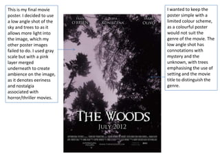
- 1. This is my final movie I wanted to keep the poster. I decided to use poster simple with a a low angle shot of the limited colour scheme, sky and trees to as it as a colourful poster allows more light into would not suit the the image, which my genre of the movie. The other poster images low angle shot has failed to do. I used gray connotations with scale but with a pink mystery and the layer merged unknown, with trees underneath to create emphasising the use of ambience on the image, setting and the movie as it denotes eeriness title to distinguish the and nostalgia genre. associated with horror/thriller movies.
- 2. The actor’s names at the top of the poster are in a Trajan Pro font. In this respect my poster sticks to the conventions of a typical movie poster. Actors I used the ‘Requiem’ names are the top of font for my movie title posters are used to as it creates a subtle attract consumers into blood splattering effect watching movies if an which again shows that actor included is a big the film is a name. I used a white horror/thriller. font and drop shadow ‘Requiem’ is also a so that the names stand signifier for a funeral of out against the one or more people, background. possibly alluding to the outcome of the film. I used to a white font and drop shadow and inner glow to contrast against the gray scale background so that it is easily readable.
- 3. The two things I would change on my poster is the width of the text. I would change it so the title goes across the page to make it look bolder. Another thing I could change is the font size for my credit lines as I think they’re slightly too big. For the two lines of credits I used the Steel The release date I’ve Tongs font, which kept relatively typically used on film ambiguous. This is a posters. This gives my common characteristic poster a polished and of posters released professional effect. I several months before a used a grey font as it is specific release date. It less noticeable than the is a Trajan Pro font to other writing, but it is compliment the actor less important so it name text and is white doesn’t need to stand to contrast against the out. dark background.