
Recommended
Recommended
More Related Content
Recently uploaded
Recently uploaded (20)
Featured
Featured (20)
Semioti Analysis On 4 Alcohol Advertisements
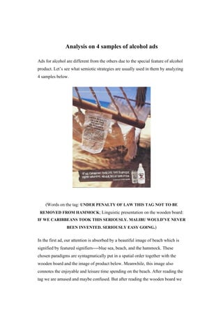
- 1. Analysis on 4 samples of alcohol ads Ads for alcohol are different from the others due to the special feature of alcohol product. Let’s see what semiotic strategies are usually used in them by analyzing 4 samples below. (Words on the tag: UNDER PENALTY OF LAW THIS TAG NOT TO BE REMOVED FROM HAMMOCK; Linguistic presentation on the wooden board: IF WE CARIBBEANS TOOK THIS SERIOUSLY. MALIBU WOULD’VE NEVER BEEN INVENTED. SERIOUSLY EASY GOING.) In the first ad, our attention is absorbed by a beautiful image of beach which is signified by featured signifiers----blue sea, beach, and the hammock. These chosen paradigms are syntagmatically put in a spatial order together with the wooden board and the image of product below. Meanwhile, this image also connotes the enjoyable and leisure time spending on the beach. After reading the tag we are amused and maybe confused. But after reading the wooden board we
- 2. know its connotative humor and we’re amused by it----both the beauty of the sea, the enjoyable time it offers to us; the Caribbean humor, and of course this alcohol----Malibu, which is ‘invented’ by them. In such a way, we naturally link this product with the mythic meanings of ‘leisure, humor and enjoyment’ which are favored by us ideologically. In the second one, it is covered by several images of people’s smiling faces in different angles. Their smiling, friendly expressions, relaxed postures under orange light connote friendship and enjoyable time spending with friends. They are syntagmatically put together in a spatial order with an obvious large image of a man and a woman as the main protagonists. The alcohol in their hands denotes that they’re spending pleasing time with this product; in a deep sense, it connotes that this brand of alcohol----Paul Mansson Brandy, can be shared with friends and it can offer you pleasure as good friends can bring to you----in this case, it is reiterated by the projected words above the images and beside the bottle----‘Good friends. Smooth times’ ‘Aged longer. Tastes smoother’, and it is also conveyed in another code----the unified colors being applied in both images and design of the bottle of this product----black and orange, which connote good and classic quality, comfortable atmosphere, and memorable time. In such a way, they allow 2
- 3. us to form our emotional associations with this brand----‘good quality, friendly atmosphere, memorable time’, which we are willing to enjoy in a mythic sense. (Linguistic presentation in the middle part: Every Jack Daniel’s barrelhouse has 20,000 barrels inside. And one serious padlock outside.) The third advert consists of two photos and linguistic presentation between them, which are syntagmatically combined in a spatial order. In the image above, it’s a set of barrels which are taken in a close shot. Comparatively, it’s an image of white buildings locating on hills which is taken in a distant shot. A plausible relationship has been constructed between these two photos by the linguistic presentation and the logo of this brand which allow us to know that this brand of alcohol----Jack Daniel’s is double protected by the barrel and the barrelhouse. Fatherly, it connotes that its high quality is guaranteed through the whole process of production in strict regulations. Besides, there’s no image of the product in this ad; but the wooden barrels which are put neatly allows us to form a natural feature with it. And the lack of image of product also has a sense that its good 3
- 4. quality needs no saying more than is needed as the logo of the brand is convincing enough. In the fourth ad, our attention is firstly absorbed by the large green bottle with its projection which has the same appearance on the left, and then the linguistic presentation on the right. These two images of the same bottle provide a sense that it is put under the flash lamps and it connotes that its authentic popular and good quality can be verified even under public inspection. An irony is used here----‘If the bottle didn’t get your attention. The awards should.’ As the applying of contrastive colors, its large size, and the two images of the bottle can’t be ignored undoubtedly. The awards here connote high quality which is reiterated by a set of signifiers which are syntagmatically put together on the body of the bottle----a geometric shape and a silver lid which come together connote scientific technology and solemnity. The relief of a medal with a red medallion and white ribbons on the body connote honor and authority. In this way, the images and the linguistic presentation allow the recipient to form emotional associations with this product which are highly accepted by our ideology. 4