More Related Content Similar to U.S. Sector Strategy: Is Now the Time to Buy Silver Similar to U.S. Sector Strategy: Is Now the Time to Buy Silver (20) 1. U.S. SECTOR STRATEGY
Ned Davis
Research
Group
PUBLISHED MONTHLY AUGUST 22, 2014
John LaForge Commodity Strategist
Warren Pies, ERP Senior Commodity Analyst
Bill Russell, PhD Information Architecture Strategist
Sawyer Lambert, Commodity Intern
COMMODITY CORNER FOCUS
Please see important disclosures at the end of this report. www.ndr.com | Periodical | Issue #COMF2014082211
E-mail Us
Silver - Hope Is Not a Good Strategy
BOTTOM LINE
$19/oz. is a nice base for silver,
but don’t buy yet.
The secular story sits at a
critical juncture, and defects
remain.
KEY COMMODITY PRICES
Gold . . . . . . . . . . . . . .$1291/oz.
Copper . . . . . . . . . . . . .$3.20/lb.
Oil . . . . . . . . . . . .$102.23/barrel
Natural Gas . . . . $3.83/MMbtu
Few commodities stir the specula-
tive imagination like silver. Three years
ago, in April 2011, silver climbed above
$50/oz. (intra-day). This new all-time
high was partly due to the re-emerging
commodity super-cycle, but mainly it
was a silver-specific run. Stupendous
stories, fueled by hope, swept silver up
in a historic run. During the 12 months
leading up to its $50/oz. peak, silver
gained 165%. No other major commod-
ity came close to such gains over that
one-year period.
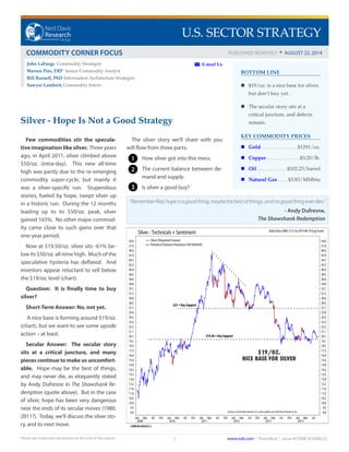
Now at $19.50/oz. silver sits -61% be-
low its $50/oz. all-time high. Much of the
speculative hysteria has deflated. And
investors appear reluctant to sell below
the $19/oz. level (chart).
Question: It is finally time to buy
silver?
Short-Term Answer: No, not yet.
A nice base is forming around $19/oz.
(chart), but we want to see some upside
action – at least.
Secular Answer: The secular story
sits at a critical juncture, and many
pieces continue to make us uncomfort-
able. Hope may be the best of things,
and may never die, as eloquently stated
by Andy Dufresne in The Shawshank Re-
demption (quote above). But in the case
of silver, hope has been very dangerous
near the ends of its secular moves (1980,
2011?). Today, we’ll discuss the silver sto-
ry, and its next move. COMF201205301E_C
© Copyright 2014 Ned Davis Research, Inc. Further distribution prohibited without prior permission. All Rights Reserved.
See NDR Disclaimer at www.ndr.com/copyright.html For data vendor disclaimers refer to www.ndr.com/vendorinfo/
Silver - Technicals + Sentiment DailyData2008-12-31to2014-08-19(LogScale)
COMF201205301E_C
© Copyright 2014 Ned Davis Research, Inc. Further distribution prohibited without prior permission. All Rights Reserved.
See NDR Disclaimer at www.ndr.com/copyright.html For data vendor disclaimers refer to www.ndr.com/vendorinfo/
Silver - Technicals + Sentiment DailyData2008-12-31to2014-08-19(LogScale)
2009
Jan Apr Jul Oct
2010
Jan Apr Jul Oct
2011
Jan Apr Jul Oct
2012
Jan Apr Jul Oct
2013
Jan Apr Jul Oct
2014
Jan Apr Jul
9.0
9.5
10.0
10.5
11.0
11.6
12.2
12.8
13.5
14.2
14.9
15.6
16.4
17.3
18.2
19.1
20.1
21.1
22.2
23.3
24.5
25.8
27.1
28.5
30.0
31.5
33.1
34.8
36.6
38.5
40.4
42.5
44.7
47.0
49.4
51.9
54.6
9.0
9.5
10.0
10.5
11.0
11.6
12.2
12.8
13.5
14.2
14.9
15.6
16.4
17.3
18.2
19.1
20.1
21.1
22.2
23.3
24.5
25.8
27.1
28.5
30.0
31.5
33.1
34.8
36.6
38.5
40.4
42.5
44.7
47.0
49.4
51.9
54.6Silver (Perpetual Futures)
Periods of Extreme Pessimism (SIX160543A)
Sources:CommoditySystems,Inc.www.csidata.com;NedDavisResearch,Inc.
$27 = Key Support
$19.50 = Key Support
The silver story we’ll share with you
will flow from three parts:
1. How silver got into this mess.
2. The current balance between de-
mand and supply.
3. Is silver a good buy?
“RememberRed,hopeisagoodthing,maybethebestofthings,andnogoodthingeverdies.”
- Andy Dufresne,
The Shawshank Redemption
1
2
3
$19/OZ.
NICE BASE FOR SILVER
2. Please see important disclosures at the end of this report.
NED DAVIS RESEARCH GROUP U.S. Sector Strategy: Commodity Corner Focus | AUGUST 22, 2014
www.ndr.com | Periodical | Issue #COMF2014082212
HOW SILVER GOT INTO THIS MESS
To set the stage, we need to begin with how we got here, starting with the hyperbole of 2011.
Daily 6/26/2006 - 8/19/2014
(TNT11_08A_C)
4
5
6
7
8
9
10
4
5
6
7
8
9
10Ratio of Gold ETF (GLD) / Silver ETF (SLV) Market Caps ( ) 8/19/2014=5.20
Gold vs. Silver ETF Market Caps
10
15
20
25
30
35
40
45
50
55
60
65
70
75
80
10
15
20
25
30
35
40
45
50
55
60
65
70
75
80Gold ETF (GLD) Market Cap ($billions) ( ) 8/19/2014=33.29
2
4
6
8
10
12
14
16
18
2
4
6
8
10
12
14
16
18Silver ETF (SLV) Market Cap ($billions) ( ) 8/19/2014=6.41
S D
2007
M J S D
2008
M J S D
2009
M J S D
2010
M J S D
2011
M J S D
2012
M J S D
2013
M J S D
2014
M J
Copyright 2014 Ned Davis Research, Inc. Further distribution prohibited without prior permission. All Rights Reserved.
.www.ndr.com/vendorinfo/. For data vendor disclaimers refer towww.ndr.com/copyright.htmlSee NDR Disclaimer at
©
Behind the 165% run were two fantastical claims that set
the blogosphere on fire. The first had to do with depletion;
the second was silver’s cheap value vs. gold. Nearly a day did
not go by in early 2011 when we did not field a question on one
of these topics. During the 12 months leading up to the $50/
oz. peak, the largest physical silver ETF, SLV, jumped from $5.3bn
to $17.1bn. This is shown in the bottom clip of the chart. To-
day, SLV assets sit around $6.4bn – above pre-2010 levels, but far
from $17.1bn.
The top clip highlights the extreme silver run from the per-
spective of gold’s largest physical ETF, GLD. The blue line is the
ratio of assets in GLD vs. SLV. In early 2010, GLD had nearly ten
times the assets of SLV. By April 2011, GLD had only four times
the assets of SLV. And it was not like GLD was bleeding funds.
The middle clip shows GLD assets growing over this period too.
Today, GLD has just over five times the assets of SLV. Five
times is on the low side historically, and if anything, is prob-
ably a positive for gold, not silver.
1
SILVER HITS
$50/OZ.
GLD ASSETS
SLV ASSETS
3. Please see important disclosures at the end of this report.
NED DAVIS RESEARCH GROUP U.S. Sector Strategy: Commodity Corner Focus | AUGUST 22, 2014
www.ndr.com | Periodical | Issue #COMF2014082213
SILVER BULL CLAIM #1 - SILVER EXTINCTION
The most fantastical story we heard in 2011 was that the
earth’s crust would run out of silver by 2020. We poked
holes in this myth, and others, in a publication called Debunk-
ing Silver Myths, released the day before silver hit $50/oz.
Talk about your lucky timing. Fast forward to 2014, we remain
skeptical that the earth is running out of its silver stores. Keep
in mind, of course, that we are not geologists. Below we show
our evidence.
The genesis of the story (as best we can tell) started around
2000, whenproductionofsilverintheU.S.began to fall (chart,
solid blue line). By the mid-2000s it was being speculated that
U.S. silver production was in “irreversible decline”. It is true
that U.S. production is in decline – and has been for about 17
years now. This is not the case in the rest of the world, how-
ever. Worldwide silver production has increased virtually
every year since 1947 (chart, dashed red line).
Yearly 12/31/1900 - 12/31/2013 (Log Scale)
(TNT
11_08B_C)
Source: U.S. Geological Survey, 2010 Silver statistics, Data Series 140, accessed 4/20/2011, at http://pubs.usgs.gov/ds/2005/140/.25
28
31
34
38
42
46
51
57
63
70
77
85
94
104
115
127
141
155
172
190
210
232
256
283
313
346
382
422
466
515
569
629
695
768
848
937
1035
25
28
31
34
38
42
46
51
57
63
70
77
85
94
104
115
127
141
155
172
190
210
232
256
283
313
346
382
422
466
515
569
629
695
768
848
937
1035U.S. Silver Mine Production ( ) 12/31/2013=35.0 million ounces
World Silver Mine Production ( ) 12/31/2013=835.9 million ounces
1900
1905
1910
1915
1920
1925
1930
1935
1940
1945
1950
1955
1960
1965
1970
1975
1980
1985
1990
1995
2000
2005
2010
Silver Mine Production
Copyright 2014 Ned Davis Research, Inc. Further distribution prohibited without prior permission. All Rights Reserved.
.www.ndr.com/vendorinfo/. For data vendor disclaimers refer towww.ndr.com/copyright.htmlSee NDR Disclaimer at
©
WORLD SILVER
PRODUCTION
U.S. SILVER
PRODUCTION
4. Please see important disclosures at the end of this report.
NED DAVIS RESEARCH GROUP U.S. Sector Strategy: Commodity Corner Focus | AUGUST 22, 2014
www.ndr.com | Periodical | Issue #COMF2014082214
83% of worldwide mine production came from ten countries
in 2013 (table). Versus 2012, seven countries reported produc-
tion gains, two were down, and one was flat. The point being,
extinction cannot exist if production hasn’t peaked.
Extinction is also a function of supply (reserves). If new
supplies are not found, then continued production will eat away
at the reserve base, leaving a commodity vulnerable to deple-
tion. In 2013, the worldwide reserve base for silver did decrease
by -3.7%, according to the USGS (table below). All of the year/
year reserve decline was due to Peru, which declined a hefty
-28%. If this is the stat that has silver bulls excited, then they
have a point. Losing the world’s third-largest silver producer
could be very bullish for silver.
Extinction Bottom Line: The U.S. is producing less silver, but
the rest of the world is not. Silver extinction by 2020 is highly
unlikely. Peru’s recent reserve losses, however, could be bullish
for silver.
SILVER EXTINCTION STATS
(IN MILLIONS OF OUNCES)
Country Mine Production Reserves Reserve % Change
--------------------- 2011 2012 2013 2011 2012 2013 2011 to 2012 to 2013
US 36.010 34.100 35.040 803.77 803.77 803.77 0% 0%
Australia 55.620 55.620 54.656 2,218.40 2,218.40 2,829.30 0% 27.5%
Bolivia 38.902 38.902 38.580 707.32 707.32 707.32 0% 0%
Canada 18.390 8.000 23.143 225.1 225.1 225.1 0% 0%
Chile 41.200 38.259 38.850 2,250.60 2,475.60 2,475.60 10% 0%
China 118.957 125.387 128.602 1,348.50 1,348.50 1,348.50 0% 0%
Mexico 133.425 172.320 173.614 1,189.60 1,189.60 1,189.60 0% 0%
Peru 109.634 111.880 112.527 3,858.10 3,858.10 2,797.10 0% -27.5%
Poland 37.616 37.005 36.970 2,732.80 2,732.80 2,732.80 0% 0%
Russia 43.400 48.220 54.656 NA NA NA NA NA
Other Countries 115.740 135.990 138.240 1,607.50 1,607.50 1,607.50 0 0
Totals 749.110 819.840 835.919 17,039.90 17,361.40 16,718.40 1.9% -3.7%
USGS Tons converted to troy ounces. 1 ton = 32150.7466
Source: U.S. Geological Survey
Ned Davis Research Group T_COMF201408221.1
COULD BE
SILVER
BULLISH
5. Please see important disclosures at the end of this report.
NED DAVIS RESEARCH GROUP U.S. Sector Strategy: Commodity Corner Focus | AUGUST 22, 2014
www.ndr.com | Periodical | Issue #COMF2014082215
As for why silver is susceptible to storytelling, we do not know for sure, but cheap relative cost is a likely culprit. Silver is
the poor man’s gold at 1.5% the cost of gold. In fact, it is the penny stock of precious metals, with platinum at $1440/oz. (chart, 3rd
clip) and palladium at $881/oz. (chart, 4th
clip). Silver at $19.50/oz. (2nd
clip) is an easier retail buy, and the audience is more suscep-
tible to a good story.
Daily Data 12/31/1996 - 8/19/2014 (Log Scale)
(E794)
Gold 8/19/2014 = 1296.4All in U.S. $/oz
292
365
457
571
715
894
1118
1399
1750
2189
292
365
457
571
715
894
1118
1399
1750
2189
Silver 8/19/2014 = 19.5
5
6
8
11
15
19
25
33
44
58
5
6
8
11
15
19
25
33
44
58
Platinum 8/19/2014 = 1440.0
384
476
589
728
902
1116
1381
1710
2116
2619
384
476
589
728
902
1116
1381
1710
2116
2619
Palladium 8/19/2014 = 881.4
Source: Commodity Systems, Inc. (CSI) www.csidata.com106
140
183
241
316
416
546
717
942
1238
106
140
183
241
316
416
546
717
942
1238
1997
M J S D
1998
M J S D
1999
M J S D
2000
M J S D
2001
M J S D
2002
M J S D
2003
M J S D
2004
M J S D
2005
M J S D
2006
M J S D
2007
M J S D
2008
M J S D
2009
M J S D
2010
M J S D
2011
M J S D
2012
M J S D
2013
M J S D
2014
M J
Precious Metals Prices
Copyright 2014 Ned Davis Research, Inc. Further distribution prohibited without prior permission. All Rights Reserved.
And in case you were wondering, yes, precious metals do tend to trade as a group. The correlation matrix shows their intercon-
nectedness. Of all the connections shown, silver and gold are the closest (light blue highlight).
PRECIOUS METALS CORRELATION MATRIX
Gold Silver Platinum Palladium
Gold 1 0.72 0.49 0.66
Silver 0.72 1 0.52 0.61
Platinum 0.49 0.52 1 0.66
Palladium 0.66 0.61 0.66 1
Date Range: 1/12/1979 to 8/8/2014. Rate-of-change: 1-week returns. Source: Commodity Systems, Inc. (CSI) www.csi.com
Ned Davis Research Group T_COMF201408221.2
6. Please see important disclosures at the end of this report.
NED DAVIS RESEARCH GROUP U.S. Sector Strategy: Commodity Corner Focus | AUGUST 22, 2014
www.ndr.com | Periodical | Issue #COMF2014082216
SILVER BULL CLAIM #2 – THE GOLD/SILVER RATIO SHOULD BE 15:1 (SILVER IS SUPER CHEAP ARGUMENT)
Silver bulls regularly claim that silver is too cheap versus
gold, and the gold/silver ratio should revert to its historical
norm of 15:1. Today the ratio stands at 66:1. If the ratio was to re-
vert to 15:1, and gold stayed at $1300/oz., silver would be trading
at $87/oz. We’re skeptical that 15:1 is the right ratio.
Search for articles related to the historical gold/silver ratio and
you’ll find incessant quoting of 15:1.The problem is that this is not
the historical norm. Since1833,therealgold/silverratiohasav-
eraged 36:1 (top clip, horizontal dashed green line), not 15:1.
In fact, 15:1 better represents the extremes, not the norms.
The discrepancy has to do with time. In the decades prior to
1870, the ratio of gold to silver was routinely fixed around 15:1
(even lower centuries earlier), when money was defined as a cer-
tain quantity of gold and silver (bimetallism). This was not a free
market rate – it was set by governments, primarily in the Western
world. The U.S. adopted this system from Europe in 1792, shortly
after its independence was declared. In the early 1870s, however,
the U.S. joined major powers in Europe and moved chiefly to a
gold standard (mono-metallism). Silver bugs have since fought
for the return of bimetallism, but with very limited success. Per-
sistently high gold/silver ratios, since the 1870s, reflect the prefer-
ence for gold as the premier global monetary metal. Unless silver
comes back as a primary monetary metal, a 15:1 gold/silver
ratio seems unrealistic.
Yearly 12/31/1833 - 12/31/2013 (Log Scale)
Mean = 36.7
Annual gold and silver prices are average London fixes until 1975 and 1968
respectively, then average New York fixes thereafter.
(TNT
11_08C_C)
8
9
10
12
14
16
18
21
24
27
31
36
41
47
54
62
70
81
92
8
9
10
12
14
16
18
21
24
27
31
36
41
47
54
62
70
81
92Gold / Silver Ratio ( ) 12/31/2013=59.26
Gold vs. Silver Since 1833
Sources: Kitco Metals, www.kitco.com & Commodity Systems, Inc. (CSI) http://www.csidata.com15
19
25
32
42
54
70
90
116
150
194
250
322
415
534
688
887
1142
1471 Gold Spot (US$/oz) (Left Scale ) 12/31/2013=1409.02
Sources: Kitco Metals, www.kitco.com & Commodity Systems, Inc. (CSI) http://www.csidata.com
0
1
2
3
4
6
9
14
20
30
Silver Spot (US$/oz) (Right Scale ) 12/31/2013=23.78
1835
1840
1845
1850
1855
1860
1865
1870
1875
1880
1885
1890
1895
1900
1905
1910
1915
1920
1925
1930
1935
1940
1945
1950
1955
1960
1965
1970
1975
1980
1985
1990
1995
2000
2005
2010
Copyright 2014 Ned Davis Research, Inc. Further distribution prohibited without prior permission. All Rights Reserved.
.www.ndr.com/vendorinfo/. For data vendor disclaimers refer towww.ndr.com/copyright.htmlSee NDR Disclaimer at
©
36:1 GOLD/SILVER RATIO
AVG. SINCE 1833
SILVER
DOING
BETTER
GOLD
DOING
BETTER
7. Please see important disclosures at the end of this report.
NED DAVIS RESEARCH GROUP U.S. Sector Strategy: Commodity Corner Focus | AUGUST 22, 2014
www.ndr.com | Periodical | Issue #COMF2014082217
Q:Why did governments set the gold/silver ratio at 15:1?
A: Silver was produced at fifteen times the rate of gold. At
least that is the story we hear. We cannot confirm nor dispel this
claim prior to 1900 as we do not have the production data. Us-
ing the data we do have post-1900, however, says fifteen times is
too much. In fact, silver production fifteen times that of gold
has rarely been seen since 1900. The dashed red line in the
chart shows silver being produced at roughly ten times that of
gold today.Ten times is also the average over the last 114 years.
In all fairness to the bulls, the production ratio exiting the
1800s was close to 17:1, so it may well have averaged 15:1 in
prior centuries. Also in defense that a 15:1 production ratio may
be sound historically - silver’s abundance in the Earth’s crust is 19
times that of gold, according to the USGS.
Q: Is there a direct connection between silver and gold
production levels, and the level of the gold/silver price ra-
tio?
A: No. Silver production has averaged ten times that of gold,
since 1900, while the gold/silver ratio has averaged 48:1. State-
ments that contend today’s 66:1 gold/silver ratio should
drop to 15:1 based on production levels should be looked
at skeptically.
A: Production growth rates, however, do seem to tie-in
nicely with the gold/silver ratio. Meaning, if silver production
growth outpaces gold production growth for multiple years
(trend), higher gold/silver ratios tend to follow, as investors see
gold as a better value (too much silver supply). The reverse also
appears to be the case when gold production growth rates ex-
ceed silver production growth rates for multiple years. Produc-
tion growth rates tend to lead the gold/ silver ratio by mul-
tiple years (11-14 years). The blue line in the chart backs up
the gold/silver price ratio 14 years, so we can see its connection
to the silver/gold production rate in the red line. This chart says
that the gold/silver price ratio may be setting up to trend
lower a few years from now.
Yearly 12/31/1900 - 12/31/2013
Annual gold and silver prices are average
London fixes until 1975 and 1968 respectively,
then average New York fixes thereafter.
(JL-TNT
11_08D_C)
Source: Commodity Systems, Inc. (CSI) http://www.csidata.com, Kitco Metals, www.kitco.com, & U.S. Geological Survey, 2010 Gold and Silver statistics, Data Series 140, accessed 4/20/2011,
at http://pubs.usgs.gov/ds/2005/140/
14
16
18
20
22
24
26
28
30
32
34
36
38
40
42
44
46
48
50
52
54
56
58
60
62
64
66
68
70
72
74
76
78
80
82
84
86
88
90
92
94
96
98
100
102 Gold / Silver Price Ratio Moved Back 14 Years (Left Scale ) 12/31/1999=59.26
Annual gold and silver prices are average
London fixes until 1975 and 1968 respectively,
then average New York fixes thereafter.
(JL-TNT
11_08D_C)
5.4
5.7
6.0
6.3
6.6
6.9
7.2
7.5
7.8
8.1
8.4
8.7
9.0
9.3
9.6
9.9
10.2
10.5
10.8
11.1
11.4
11.7
12.0
12.3
12.6
12.9
13.2
13.5
13.8
14.1
14.4
14.7
15.0
15.3
15.6
15.9
16.2
16.5
16.8
17.1
17.4
Silver / Gold World Mine Production (Right Scale ) 12/31/2013=9.39
1900
1905
1910
1915
1920
1925
1930
1935
1940
1945
1950
1955
1960
1965
1970
1975
1980
1985
1990
1995
2000
2005
2010
Gold vs. Silver Pricing and Production
Copyright 2014 Ned Davis Research, Inc. Further distribution prohibited without prior permission. All Rights Reserved.
.www.ndr.com/vendorinfo/. For data vendor disclaimers refer towww.ndr.com/copyright.htmlSee NDR Disclaimer at
©
GOLD/SILVER
RATIO MAY
STAY HIGH FOR
A FEW MORE
YEARS
SILVER PRODUCTION GROWTH
HIGHER THAN
GOLD PRODUCTION GROWTH
8. Please see important disclosures at the end of this report.
NED DAVIS RESEARCH GROUP U.S. Sector Strategy: Commodity Corner Focus | AUGUST 22, 2014
www.ndr.com | Periodical | Issue #COMF2014082218
Q: But, isn’t 66:1 a crazy extreme number?
A: Yes and no. Through most of the history we can track, yes,
66:1 is a high number. But, the answer is no if we are looking at
the last 35 years. The bottom clip in the chart tracks the gold/
silver ratio from 1979 to present. The average ratio over this
35 year period was 61:1. And ratios higher than 70:1 are not
unheard of.
Gold Silver Ratio Bottom Line: Unless silver comes back as
a primary monetary metal, a 15:1 gold/silver ratio seems unre-
alistic. Gold/silver ratios between the 40s and 50s may be more
credible guideposts over the next few years. At 66:1 today, sil-
ver does looks cheap, but we’ve seen higher ratios.
AA424A
© Copyright 2014 Ned Davis Research, Inc. Further distribution prohibited without prior permission. All Rights Reserved.
See NDR Disclaimer at www.ndr.com/copyright.html For data vendor disclaimers refer to www.ndr.com/vendorinfo/
Gold vs. Silver DailyData1979-01-02to2014-08-19(LogScale)
AA424A
© Copyright 2014 Ned Davis Research, Inc. Further distribution prohibited without prior permission. All Rights Reserved.
See NDR Disclaimer at www.ndr.com/copyright.html For data vendor disclaimers refer to www.ndr.com/vendorinfo/
Gold vs. Silver DailyData1979-01-02to2014-08-19(LogScale)
1979
1980
1981
1982
1983
1984
1985
1986
1987
1988
1989
1990
1991
1992
1993
1994
1995
1996
1997
1998
1999
2000
2001
2002
2003
2004
2005
2006
2007
2008
2009
2010
2011
2012
2013
2014
245
314
403
518
665
854
1,097
1,408
1,808
3
4
6
7
9
12
16
20
26
33
43
Gold Perpetual Futures (08/19/2014 = $1296.4/oz., Left Scale)
Silver Perpetual Futures (08/19/2014 = $19.5/oz. Right Scale)
Source:CommoditySystems,Inc.(CSI),www.csidata.com
18
20
22
25
27
30
33
37
40
45
49
55
60
67
74
81
90
99
110
18
20
22
25
27
30
33
37
40
45
49
55
60
67
74
81
90
99
110Gold/Silver Relative Strength (08/19/2014 = 66.6)
35.7-Year Average (08/19/2014 = 60.9)
SILVER
DOING BETTER
GOLD
DOING
BETTER
61:1 GOLD/SILVER RATIO
AVG. SINCE 1979
66:1
GOLD/SILVER
RATIO
TODAY
9. Please see important disclosures at the end of this report.
NED DAVIS RESEARCH GROUP U.S. Sector Strategy: Commodity Corner Focus | AUGUST 22, 2014
www.ndr.com | Periodical | Issue #COMF2014082219
THE BALANCE BETWEEN DEMAND & SUPPLY
DEMAND
Q:What drives the price of silver – industrial or investment
demand?
A: Investment demand.
The chart shows silver demand, on a percentage basis, sliced
between the industrial (blue line) and investment (red dashed
line) groups. The industrial segment has been the largest user of
silver since 1988. At one point in the early 1990s, the industrial
component amounted to more than 86% of silver use. Today,
61% of silver demand is industrial.
The price of silver is largely driven by investment demand,
however. Look closely and you’ll see that it was investment de-
mand that began growing at two critically positive times for the
price of silver: 1978 and 1993. From 1978 to 1980, investment
demand grew from 20% to 65%. This period coincided with
silver’s greatest two-year price run ever, at 876%! Silver started
1978 under $5/oz., making its way to $48/oz. by January 1980.
After January 1980, investment demand collapsed with the price
of silver, until 1993. Starting around 1993, investment demand
began to climb again. 1993 was the year that the price of silver
finally bottomed at $3.50/oz., after its 1980s pasting.
Shifts in investment demand also coincided with the two criti-
cal price peaks in 1980 and 2011.
COMF201408191A_C
© Copyright 2014 Ned Davis Research, Inc. Further distribution prohibited without prior permission. All Rights Reserved.
Silver Demand - Industrial vs. Investment Yearly Data 1977-12-31 to 2013-12-31
COMF201408191A_C
© Copyright 2014 Ned Davis Research, Inc. Further distribution prohibited without prior permission. All Rights Reserved.
Silver Demand - Industrial vs. Investment Yearly Data 1977-12-31 to 2013-12-31
1978 1980 1982 1984 1986 1988 1990 1992 1994 1996 1998 2000 2002 2004 2006 2008 2010 2012
7.5
10.0
12.5
15.0
17.5
20.0
22.5
25.0
27.5
30.0
32.5
35.0
37.5
40.0
42.5
45.0
47.5
50.0
52.5
55.0
57.5
60.0
62.5
65.0
67.5
70.0
72.5
75.0
77.5
80.0
82.5
85.0
87.5
90.0
92.5
7.5
10.0
12.5
15.0
17.5
20.0
22.5
25.0
27.5
30.0
32.5
35.0
37.5
40.0
42.5
45.0
47.5
50.0
52.5
55.0
57.5
60.0
62.5
65.0
67.5
70.0
72.5
75.0
77.5
80.0
82.5
85.0
87.5
90.0
92.5Silver Demand - Industrial Uses (% of World Total)
Silver Demand - Investment Uses (% of World Total)
Sources: CPM
2
INDUSTRIAL
DEMAND
(%)
INVESTMENT
DEMAND
(%)
1978 SILVER PRICE
BOTTOM
1993 SILVER PRICE
BOTTOM
2011 SILVER PRICE
PEAK
1980 SILVER PRICE
PEAK
10. Please see important disclosures at the end of this report.
NED DAVIS RESEARCH GROUP U.S. Sector Strategy: Commodity Corner Focus | AUGUST 22, 2014
www.ndr.com | Periodical | Issue #COMF20140822110
The chart shows the same point from the angle of demand
growth. (When you see a chart that starts at 100 in the scale,
we’re measuring growth.) The most interesting point in this
chart has to do with silver’s current secular run. Investment
demand, the red dashed line, has been the clear driver
since 2005.
This jibes well with the fantastical claims discussed earlier.
It is the investor who appears susceptible to such stories, driv-
ing up and down the price of silver wildly, not necessarily the
industrial user. Importantly, investment demand has been the
critical component at major price turns for silver (1978, 1980,
1993, and 2011).
COMF201408191D_C
© Copyright 2014 Ned Davis Research, Inc. Further distribution prohibited without prior permission. All Rights Reserved.
Silver Demand - Industrial vs. Investment YearlyData1977-12-31to2013-12-31
COMF201408191D_C
© Copyright 2014 Ned Davis Research, Inc. Further distribution prohibited without prior permission. All Rights Reserved.
Silver Demand - Industrial vs. Investment YearlyData1977-12-31to2013-12-31
1978 1980 1982 1984 1986 1988 1990 1992 1994 1996 1998 2000 2002 2004 2006 2008 2010 2012
75
100
125
150
175
200
225
250
275
300
325
350
375
400
425
450
475
500
525
550
575
600
625
650
675
700
725
750
775
800
825
850
875
900
925
75
100
125
150
175
200
225
250
275
300
325
350
375
400
425
450
475
500
525
550
575
600
625
650
675
700
725
750
775
800
825
850
875
900
925Silver Demand - Industrial Uses
Silver Demand - Investment Uses
*Seriesallcoatedto100on1977-12-31.
Sources:CPM
INVESTMENT
DEMAND
GROWTH
1978 SILVER PRICE
BOTTOM
1993 SILVER PRICE
BOTTOM
2011 SILVER PRICE
PEAK
1980 SILVER PRICE
PEAK
11. Please see important disclosures at the end of this report.
NED DAVIS RESEARCH GROUP U.S. Sector Strategy: Commodity Corner Focus | AUGUST 22, 2014
www.ndr.com | Periodical | Issue #COMF20140822111
Q: What if we strip photography from industrial de-
mand? Does industrial demand track more closely with
silver prices then?
A: Yes.
Barry Bannister, a client and thoughtful investor, brought
this idea to my attention a few months back. His point was
that photography was masking otherwise decent growth in
industrial demand. Photography demand has been under
extreme pressure over the last decade, thanks to new tech-
nologies. At its peak in 1989 (start of the chart), photography
accounted for 41% of total silver demand, according to CPM
Group. Today, photography accounts for only 11%. This can
be seen by adding the top three bars (blue, black, and red) in
the chart.
On the following page, we’ll show you the impact to indus-
trial demand growth by nixing photography.
COMF201408191I_C
© Copyright 2014 Ned Davis Research, Inc. Further distribution prohibited without prior permission. All Rights Reserved.
See NDR Disclaimer at www.ndr.com/copyright.html For data vendor disclaimers refer to www.ndr.com/vendorinfo/
Silver Demand Sources - Millions of Ounces Annually YearlyData1989-12-31to2013-12-31
1990 1992 1994 1996 1998 2000 2002 2004 2006 2008 2010 2012
0
100
200
300
400
500
600
700
800
900
1,000
1,100
1,200
0
100
200
300
400
500
600
700
800
900
1,000
1,100
1,200
Source: CPMGroup
Photography - Basic
Photography - X-Ray
Photography - Graphics
Jewelry & Silverware
Solar Technology
Coins
Bullion Purchases
Biocides
Super Conductors
Electronics
Other Countries
Other Uses
12. Please see important disclosures at the end of this report.
NED DAVIS RESEARCH GROUP U.S. Sector Strategy: Commodity Corner Focus | AUGUST 22, 2014
www.ndr.com | Periodical | Issue #COMF20140822112
The top chart plots growth in silver demand for investment (red
dashed line) against total industrial demand (blue line). The bottom
chart is the same chart, but we’ve subtracted photography from the
industrial component. Both charts begin in 1989, so we can see the
impact photography had on growth. The differences in industrial
growth (blue lines) are vastly different. 60% industrial growth from
1989 to 2013 (top chart, blue line) became 200% growth ex-pho-
tography (bottom chart, blue line). And importantly, the new look
tracks more closely to the price of silver. Thank you, Barry - indus-
trial growth ex-photography will be a useful trend to track.
COMF201408191D_C
© Copyright 2014 Ned Davis Research, Inc. Further distribution prohibited without prior permission. All Rights Reserved.
See NDR Disclaimer at www.ndr.com/copyright.html For data vendor disclaimers refer to www.ndr.com/vendorinfo/
Silver Demand - Industrial vs. Investment Yearly Data 1989-12-31 to 2013-12-31
1990 1992 1994 1996 1998 2000 2002 2004 2006 2008 2010 2012
50
60
70
80
90
100
110
120
130
140
150
160
170
180
190
200
210
220
230
240
250
260
270
50
60
70
80
90
100
110
120
130
140
150
160
170
180
190
200
210
220
230
240
250
260
270
Silver Demand - Industrial Uses
Silver Demand - Investment Uses
*Series allocated to 100 on 1989-12-31.
Sources: CPM Group
COMF201408191E_C
© Copyright 2014 Ned Davis Research, Inc. Further distribution prohibited without prior permission. All Rights Reserved.
See NDR Disclaimer at www.ndr.com/copyright.html For data vendor disclaimers refer to www.ndr.com/vendorinfo/
Silver Demand - Industrial (Ex-Photography) vs. Investment Yearly Data 1989-12-31 to 2013-12-31
1990 1992 1994 1996 1998 2000 2002 2004 2006 2008 2010 2012
50
60
70
80
90
100
110
120
130
140
150
160
170
180
190
200
210
220
230
240
250
260
270
280
290
300
310
320
330
340
350
360
50
60
70
80
90
100
110
120
130
140
150
160
170
180
190
200
210
220
230
240
250
260
270
280
290
300
310
320
330
340
350
360
Silver Demand - Industrial Uses (Ex-Photography)
Silver Demand - Investment Uses
*Series allocated to 100 on 1989-12-31.
Sources: CPM Group
INVESTMENT
DEMAND
GROWTH
INDUSTRIAL
DEMAND
GROWTH
INDUSTRIAL
DEMAND
GROWTH
(EX-PHOTOGRAPHY)
INVESTMENT
DEMAND
GROWTH
13. Please see important disclosures at the end of this report.
NED DAVIS RESEARCH GROUP U.S. Sector Strategy: Commodity Corner Focus | AUGUST 22, 2014
www.ndr.com | Periodical | Issue #COMF20140822113
Even after the analysis shown on the prior page, we find
investment demand to be the most consistent swing factor
historically for the price of silver. To emphasize this point,
we created the chart below. It maps the price of silver (blue
line), against net investment demand (red line) since 1968. Net
investment demand is the combination of bars and coins. The
year/year connection is not perfect, but the longer trends
are obvious – investment demand swings with the price
of silver. Substitute investment demand in the chart with in-
dustrial demand, or even industrial demand (ex-photography),
and the connection is not as dependable.
COMF201408191B_C
© Copyright 2014 Ned Davis Research, Inc. Further distribution prohibited without prior permission. All Rights Reserved.
See NDR Disclaimer at www.ndr.com/copyright.html For data vendor disclaimers refer to www.ndr.com/vendorinfo/
Silver Prices vs. Net Investment Demand YearlyData1968-12-31to2013-12-31
1969 1971 1973 1975 1977 1979 1981 1983 1985 1987 1989 1991 1993 1995 1997 1999 2001 2003 2005 2007 2009 2011 2013
-200
-175
-150
-125
-100
-75
-50
-25
0
25
50
75
100
125
150
175
200
225
1
2
3
4
5
6
7
8
9
10
11
12
13
14
15
16
17
18
19
20
21
22
23
24
25
26
27
28
29
30
31
Source: CPM,CommoditySystems,Inc.(CSI)www.csidata.com
Silver (Spot) - $/Oz. (right scale)
Silver - Net Investment Demand (left scale)
NET INVESTMENT
DEMAND
SILVER PRICE
14. Please see important disclosures at the end of this report.
NED DAVIS RESEARCH GROUP U.S. Sector Strategy: Commodity Corner Focus | AUGUST 22, 2014
www.ndr.com | Periodical | Issue #COMF20140822114
SUPPLY
The yearly supply of silver nearly doubled from 1989 to 2013,
to 1 billion ounces. This compares to total gold supplies at
roughly 141 million ounces in 2013 (World Gold Council).
Silver supply components are separated in the chart below.
Mining (red bars) and scrap (black bars) are the most com-
mon forms of supply, but in select years governments (blue
bars) can be seen selling decent amounts too. In 2014, it is hard
to find governments that hold silver stockpiles. Gold stockpiles
yes, silver stockpiles no.
As a side note, bullion sales (green bars), is a fudge factor to
make sure supply and demand match in a given year. The chart
captures data for 2014, but keep in mind that this is an estimate
provided by CPM Group.
COMF201408191J_C
© Copyright 2014 Ned Davis Research, Inc. Further distribution prohibited without prior permission. All Rights Reserved.
See NDR Disclaimer at www.ndr.com/copyright.html For data vendor disclaimers refer to www.ndr.com/vendorinfo/
Silver Supply Sources - Millions of Ounces Annually YearlyData1950-12-31to2013-12-31
1950 1955 1960 1965 1970 1975 1980 1985 1990 1995 2000 2005 2010
0
100
200
300
400
500
600
700
800
900
1,000
1,100
1,200
0
100
200
300
400
500
600
700
800
900
1,000
1,100
1,200
Source: CPMGroup
Net Exports
Government
Bullion Sales
Scrap
Mining
2013-12-31 = 0
2013-12-31 = 0
2013-12-31 = 31
2013-12-31 = 230
2013-12-31 = 741
15. Please see important disclosures at the end of this report.
NED DAVIS RESEARCH GROUP U.S. Sector Strategy: Commodity Corner Focus | AUGUST 22, 2014
www.ndr.com | Periodical | Issue #COMF20140822115
FUTURE SUPPLIES
Q: Any idea on what future supplies may look like?
A: We do not project supplies at NDR, but miners’ ris-
ing cash costs may be signaling slow or contracting fu-
ture supplies.
The chart below plots the price of silver (blue line) against
miners’ cash costs (solid red line). For ten of the last eleven
years, cash costs have increased. The bottom clip of the
chart shows cash costs as a percentage of the price of silver.
Miner cash costs today amount to roughly 50% of the price
of silver – one of the highest levels in a decade. As costs
move higher, miners must be increasingly picky on which
mines to open. If cash costs keep rising as they have since
2003, silver supply growth seems destined to slow or
even contract.
This angle is not a slam-dunk positive for silver’s secu-
lar story, though. The chart shows that cash costs are pro-
jected to fall from 2013 to 2014. A year/year decline has not
happened since 2003. Is this the beginning of a new trend
in lower cash costs? We doubt it, but if it is, it would be one
more sign that silver’s secular story was near its end. It is
hard to imagine persistently falling cash costs, but we don’t
want to discount the possibility entirely.
COMF201408191C_C
© Copyright 2014 Ned Davis Research, Inc. Further distribution prohibited without prior permission. All Rights Reserved.
See NDR Disclaimer at www.ndr.com/copyright.html For data vendor disclaimers refer to www.ndr.com/vendorinfo/
Silver Prices vs. Cash Costs Daily Data 2001-12-31 to 2014-08-15 (Log Scale)
2002 2003 2004 2005 2006 2007 2008 2009 2010 2011 2012 2013 2014
2.3
2.7
3.0
3.3
3.7
4.1
4.5
5.0
5.5
6.0
6.7
7.4
8.2
9.0
10.0
11.0
3
4
6
7
9
12
16
20
26
33
43
55
Silver (Spot) - $/Oz. (right scale)
Silver Cash Costs - $/Oz. (left scale)
0.2
0.3
0.4
0.5
0.6
0.7
0.8
0.2
0.3
0.4
0.5
0.6
0.7
0.8
Source: CPM, Commodity Systems, Inc. (CSI) www.csidata.com
Cash Costs as % of Silver Price
Average Percentage
SILVER PRICE
CASH COSTS MAKE UP
50% OF SILVER PRICE
MINERS' CASH COSTS
16. Please see important disclosures at the end of this report.
NED DAVIS RESEARCH GROUP U.S. Sector Strategy: Commodity Corner Focus | AUGUST 22, 2014
www.ndr.com | Periodical | Issue #COMF20140822116
INVENTORIES
Inventories also factor into the
supply/demand balance. Cliff-
diving global inventory balances
(top chart, red line) are also fre-
quently discussed by silver bugs
as a reason to own silver. CPM
Group estimated that 2.65 billion
ounces of silver were held in inven-
tory in 1989 by investors, industries,
dealers, and governments. Today,
inventories have contracted below
900 million ounces - even with the
explosion in ETF-related products.
The blue line, by the way, is the
price of silver.
The chart on the bottom shows
inventory depletions through the
angle of months of demand (red
line). In other words, how many
months of demand would it take
to deplete inventories? The answer
is about ten months today. That
number was consistently north of
50 in the 1980s and 1990s. Once
again, the blue line is the price of
silver.
Overall, we side with the silver
bulls when it comes to invento-
ries. Cliff-diving inventories should
be, and likely have been bullish
for silver over the last 25 years. In-
ventories began falling in the early
1990s, about the same time silver
set its $3.50-$4.00/oz. floor (blue
line). The uninterrupted scale-
down of inventory levels through
the 2000s looks to have been a nice
tailwind for silver prices.
However, like some of the ear-
lier charts we featured, we must
question the secular story here.
The uptick in inventories since 2008
is bothersome. Is it the beginning
of a new secular trend toward high-
er inventory levels? It is too early to
tell, but it is worth watching.
COMF201408191G_C
© Copyright 2014 Ned Davis Research, Inc. Further distribution prohibited without prior permission. All Rights Reserved.
See NDR Disclaimer at www.ndr.com/copyright.html For data vendor disclaimers refer to www.ndr.com/vendorinfo/
Silver Prices vs. Inventories Yearly Data 1968-12-31 to 2013-12-31
1969 1971 1973 1975 1977 1979 1981 1983 1985 1987 1989 1991 1993 1995 1997 1999 2001 2003 2005 2007 2009 2011 2013
800
900
1,000
1,100
1,200
1,300
1,400
1,500
1,600
1,700
1,800
1,900
2,000
2,100
2,200
2,300
2,400
2,500
2,600
2,700
2,800
2,900
1.6
1.9
2.3
2.7
3.0
3.3
3.7
4.1
4.5
5.0
5.5
6.0
6.7
7.4
8.2
9.0
10.0
11.0
12.2
13.5
14.9
16.4
18.2
20.1
22.2
24.5
27.1
30.0
33.1
Source: CPM, Commodity Systems, Inc. (CSI) www.csidata.com
Silver (Spot) - $/Oz. (right scale)
Silver Inventories - Millions of Oz (left scale)
COMF201408191H_C
© Copyright 2014 Ned Davis Research, Inc. Further distribution prohibited without prior permission. All Rights Reserved.
See NDR Disclaimer at www.ndr.com/copyright.html For data vendor disclaimers refer to www.ndr.com/vendorinfo/
Silver Prices vs. Inventories (Months of Demand) Yearly Data 1968-12-31 to 2013-12-31
1969 1971 1973 1975 1977 1979 1981 1983 1985 1987 1989 1991 1993 1995 1997 1999 2001 2003 2005 2007 2009 2011 2013
10.0
12.5
15.0
17.5
20.0
22.5
25.0
27.5
30.0
32.5
35.0
37.5
40.0
42.5
45.0
47.5
50.0
52.5
55.0
57.5
60.0
62.5
65.0
67.5
70.0
72.5
75.0
77.5
80.0
82.5
1.6
1.9
2.3
2.7
3.0
3.3
3.7
4.1
4.5
5.0
5.5
6.0
6.7
7.4
8.2
9.0
10.0
11.0
12.2
13.5
14.9
16.4
18.2
20.1
22.2
24.5
27.1
30.0
33.1
Source: CPM, Commodity Systems, Inc. (CSI) www.csidata.com
Silver (Spot) - $/Oz. (right scale)
Silver - Inventory Measured in Months of Demand (left scale)
SILVER PRICE
SILVER
INVENTORIES
10 MONTHS OF
INVENTORIES BASED
ON DEMANDSILVER PRICE
17. Please see important disclosures at the end of this report.
NED DAVIS RESEARCH GROUP U.S. Sector Strategy: Commodity Corner Focus | AUGUST 22, 2014
www.ndr.com | Periodical | Issue #COMF20140822117
SUPPLY/DEMAND BALANCE
The yearly supply/demand balance is the perspective be-
low. The black bars plot the annual difference between supply
and demand. Its scale is on the right. A number above zero
means that there is more total supply than fabrication demand.
A number below zero means that there is more fabrication de-
mand than total supply. The blue line is the price of silver. The
chart may seem, at first blush, counterintuitive. Extra silver de-
mand in the 1990s, yet prices were relatively stagnant. Extra
supplies from 2006-2011, yet prices hit new highs.
What the chart seems to imply is that supply/demand
cycles take time to impact price – probably more time than
most would think. Multiple years of extra demand in the 1990s
eventually led to higher prices, but not instantly. Probably be-
cause the 1990s were still working off the extra silver produced
in the 1980s.
Q: If supply/demand cycles do in fact take multiple years
to affect price, what does this tell us about silver’s current
secular run?
A: It may be another ominous sign that silver’s secular run
is near its end. Supply has outstripped demand in seven of the
last eight years.
COMF201408191F_C
© Copyright 2014 Ned Davis Research, Inc. Further distribution prohibited without prior permission. All Rights Reserved.
See NDR Disclaimer at www.ndr.com/copyright.html For data vendor disclaimers refer to www.ndr.com/vendorinfo/
Annual Net Silver Supply v Demand Surplus Yearly Data 1989-12-31 to 2013-12-31 (Log Scale)
1990 1992 1994 1996 1998 2000 2002 2004 2006 2008 2010 2012
3.7
4.1
4.5
5.0
5.5
6.0
6.7
7.4
8.2
9.0
10.0
11.0
12.2
13.5
14.9
16.4
18.2
20.1
22.2
24.5
27.1
30.0
33.1
-180
-170
-160
-150
-140
-130
-120
-110
-100
-90
-80
-70
-60
-50
-40
-30
-20
-10
0
10
20
30
40
50
60
70
80Silver Supply Minus Demand (millions of ounces - right scale)
Price $/Oz (left scale)
Sources: CPM
SILVER PRICE
SUPPLY/DEMAND BALANCE
Supply greater than Demand
Demand greater than Supply
18. Please see important disclosures at the end of this report.
NED DAVIS RESEARCH GROUP U.S. Sector Strategy: Commodity Corner Focus | AUGUST 22, 2014
www.ndr.com | Periodical | Issue #COMF20140822118
OUR SHORT-TERM CALL
Don’tbuyityet. Thetrendinthechart
at right is underwhelming. SLV has been
trending lower for the last six weeks, and
trades below its 21-day, 50-day, and 100-
day moving averages. Until we see some
reversals, we’d steer clear of silver.
Daily Data 8/14/2013 - 8/19/2014
18.0
18.5
19.0
19.5
20.0
20.5
21.0
21.5
22.0
22.5
23.0
23.5
18.0
18.5
19.0
19.5
20.0
20.5
21.0
21.5
22.0
22.5
23.0
23.5
21-Day 50-Day 100-Day EMA
Last: 18.70, Change: -0.17 (-0.90%)
50
100
150
200
250
300
50
100
150
200
250
300
SEP OCT NOV DEC JAN
2014
FEB MAR APR MAY JUN JUL AUG
iShares Silver Trust [ SLV]
Volume as % of 10-Day Average
Copyright 2014 Ned Davis Research, Inc. Further distribution prohibited without prior permission. All Rights Reserved.
.www.ndr.com/vendorinfo/. For data vendor disclaimers refer towww.ndr.com/copyright.htmlSee NDR Disclaimer at
©
Daily Data 8/19/2009 - 8/20/2014 (Log Scale)
(MEANR_SLV)
Current Mean Reversion Rating = 3
Current Rating Began 4/04/2014
(Ratings are updated weekly)
ETF/ETN inception 4/28/2006 NDR estimates prior to inception
14
15
17
19
21
23
26
29
32
36
40
44
49
55
14
15
17
19
21
23
26
29
32
36
40
44
49
55
Moving5-YrZ-Score
30-Day Moving Average (----) Overbought Extremes
Oversold Extremes 8/20/2014 = -0.7
-1
0
1
2
3
-1
0
1
2
3
Mean Reversion
Explanation:
NDR's mean reversion indicator is used to identify those ETFs that have reached extremes based on a 5-year Z-score of yr/yr ROC.
Scores range from one to five, with (5) identifying extreme oversold conditions, and (1) identifying extreme overbought conditions.
(3) is an ETF that is neither overbought nor oversold.(2) & (4) are used for an ETF that is nearing overbought or oversold extremes.
5 = Z-score below -2 and has moved .1 above its 30-day MA (bullish)
4 or 2 = Z-score below/above -1 / +1 (get ready)
3 = Z-score between -1 and +1 (neutral)
1 = Z-score above +2 and has moved .1 below its 30-day MA (bearish)
iShares Silver Trust (SLV) - Total Return Data Used
Momentum Mean Reversion (Z-Score) of Year/Year Rate-of-Change
S N J
2010
M M J S N J
2011
M M J S N J
2012
M M J S N J
2013
M M J S N J
2014
M M J
Copyright 2014 Ned Davis Research, Inc. Further distribution prohibited without prior permission. All Rights Reserved.
.www.ndr.com/vendorinfo/. For data vendor disclaimers refer towww.ndr.com/copyright.htmlSee NDR Disclaimer at
©
Q: But isn’t silver oversold?
A: Yes, but it has been for the better
part of two years.
The bottom clip of the chart shows
that silver is oversold, but it has been
since late 2011. Its persistent downward
trend has not allowed it to shake free of
its oversold condition.
3
SILVER TRENDS
STILL DOWN
SLV OVERSOLD, BUT
NOT EXTREME
19. Please see important disclosures at the end of this report.
NED DAVIS RESEARCH GROUP U.S. Sector Strategy: Commodity Corner Focus | AUGUST 22, 2014
www.ndr.com | Periodical | Issue #COMF20140822119
Investors seem to be the group to watch at major turns in
silver, so we’ll be tracking money flows into SLV. SLV flows on
a weekly basis are shown in the 2nd
clip, and on a monthly basis
in the 3rd
clip. What we are ultimately looking for are much larger
flows, combined with upward price trends. This would tell us
investors are back.
ETF_8.RPT_SLV
©Copyright2014NedDavisResearch,Inc.Furtherdistributionprohibitedwithoutpriorpermission.AllRightsReserved.
SeeNDRDisclaimerat www.ndr.com/copyright.html Fordatavendordisclaimersreferto www.ndr.com/vendorinfo/
iSharesSilverTrust(SLV) DailyData2012-08-01to2014-08-20(LogScale)
ETF_8.RPT_SLV
©Copyright2014NedDavisResearch,Inc.Furtherdistributionprohibitedwithoutpriorpermission.AllRightsReserved.
SeeNDRDisclaimerat www.ndr.com/copyright.html Fordatavendordisclaimersreferto www.ndr.com/vendorinfo/
iSharesSilverTrust(SLV) DailyData2012-08-01to2014-08-20(LogScale)
35
30
25
20
35
30
25
20
-200
-100
0
100
200
300
400
500
600
700
-200
-100
0
100
200
300
400
500
600
700
Week-to-DateTotalFlows($Millons)2014-08-20=88.5
WeeklySeries
2012
Aug Sep Oct Nov Dec
2013
Jan Feb Mar Apr May Jun Jul Aug Sep Oct Nov Dec
2014
Jan Feb Mar Apr May Jun Jul Aug
-300
-200
-100
0
100
200
300
400
-300
-200
-100
0
100
200
300
400
Month-to-DateTotalFlows($Millons)2014-08-20=167.0 MonthlySeries
SLV WEEKLY FLOWS
(WANT THEM STRONGER)
SLV MONTHLY FLOWS
(WANT THEM STRONGER)
20. Please see important disclosures at the end of this report.
NED DAVIS RESEARCH GROUP U.S. Sector Strategy: Commodity Corner Focus | AUGUST 22, 2014
www.ndr.com | Periodical | Issue #COMF20140822120
Daily Data 8/14/2013 - 8/19/2014
10.5
11.0
11.5
12.0
12.5
13.0
13.5
14.0
14.5
15.0
15.5
16.0
16.5
10.5
11.0
11.5
12.0
12.5
13.0
13.5
14.0
14.5
15.0
15.5
16.0
16.5
21-Day 50-Day 100-Day EMA
Last: 13.86, Change: -0.23 (-1.64%)
60
120
180
240
300
360
60
120
180
240
300
360
SEP OCT NOV DEC JAN
2014
FEB MAR APR MAY JUN JUL AUG
Global X Silver Miners ETF [ SIL]
Volume as % of 10-Day Average
Copyright 2014 Ned Davis Research, Inc. Further distribution prohibited without prior permission. All Rights Reserved.
.www.ndr.com/vendorinfo/. For data vendor disclaimers refer towww.ndr.com/copyright.htmlSee NDR Disclaimer at
©
Daily Data 8/19/2009 - 8/20/2014 (Log Scale)
(MEANR_SIL)
Current Mean Reversion Rating = 3
Current Rating Began 1/17/2014
(Ratings are updated weekly)
ETF/ETN inception 4/20/2010 NDR estimates prior to inception9.4
10.1
10.9
11.8
12.8
13.8
14.9
16.1
17.4
18.9
20.4
22.0
23.8
25.7
27.8
30.1
32.5
35.2
9.4
10.1
10.9
11.8
12.8
13.8
14.9
16.1
17.4
18.9
20.4
22.0
23.8
25.7
27.8
30.1
32.5
35.2
Moving5-YrZ-Score
30-Day Moving Average (----) Overbought Extremes
Oversold Extremes 8/20/2014 = -0.6-1.2
-1.0
-0.8
-0.6
-0.4
-0.2
0.0
0.2
0.4
0.6
0.8
1.0
1.2
-1.2
-1.0
-0.8
-0.6
-0.4
-0.2
0.0
0.2
0.4
0.6
0.8
1.0
1.2
Mean Reversion
Explanation:
NDR's mean reversion indicator is used to identify those ETFs that have reached extremes based on a 5-year Z-score of yr/yr ROC.
Scores range from one to five, with (5) identifying extreme oversold conditions, and (1) identifying extreme overbought conditions.
(3) is an ETF that is neither overbought nor oversold.(2) & (4) are used for an ETF that is nearing overbought or oversold extremes.
5 = Z-score below -2 and has moved .1 above its 30-day MA (bullish)
4 or 2 = Z-score below/above -1 / +1 (get ready)
3 = Z-score between -1 and +1 (neutral)
1 = Z-score above +2 and has moved .1 below its 30-day MA (bearish)
Global X Silver Miners ETF (SIL) - Total Return Data Used
Momentum Mean Reversion (Z-Score) of Year/Year Rate-of-Change
S N J
2010
M M J S N J
2011
M M J S N J
2012
M M J S N J
2013
M M J S N J
2014
M M J
Copyright 2014 Ned Davis Research, Inc. Further distribution prohibited without prior permission. All Rights Reserved.
.www.ndr.com/vendorinfo/. For data vendor disclaimers refer towww.ndr.com/copyright.htmlSee NDR Disclaimer at
©
Q: What about silver miners?
A: The trends look better, but with-
out participation by physical silver, it
does not seem worth the risk of buying
(top chart).
A: On a mean reversion basis, silver
miners look to be in no-man’s land.
The ETF SIL is oversold, but by no means
is it extreme (bottom chart, bottom clip).
SILVER MINERS HAVE
BETTER TRENDS
SILVER MINERS
OVERSOLD, BUT NOT
EXTREME
21. Please see important disclosures at the end of this report.
NED DAVIS RESEARCH GROUP U.S. Sector Strategy: Commodity Corner Focus | AUGUST 22, 2014
www.ndr.com | Periodical | Issue #COMF20140822121
SHORT-TERM CONCLUSIONS
Don’t buy yet.
1. A base appears to be forming around $19/oz. Before buying, though, we would like to see some discernible upside trend
(Page 1).
2. SLV is in a downtrend, and sits below its 21-day, 50-day, and 100 day moving averages (Page 18).
3. SLV is not oversold enough to buy (Page 18).
1
2
3
COMF201205301E_C
© Copyright 2014 Ned Davis Research, Inc. Further distribution prohibited without prior permission. All Rights Reserved.
See NDR Disclaimer at www.ndr.com/copyright.html For data vendor disclaimers refer to www.ndr.com/vendorinfo/
Silver - Technicals + Sentiment DailyData2008-12-31to2014-08-19(LogScale)
2009
Jan Apr Jul Oct
2010
Jan Apr Jul Oct
2011
Jan Apr Jul Oct
2012
Jan Apr Jul Oct
2013
Jan Apr Jul Oct
2014
Jan Apr Jul
9.0
9.5
10.0
10.5
11.0
11.6
12.2
12.8
13.5
14.2
14.9
15.6
16.4
17.3
18.2
19.1
20.1
21.1
22.2
23.3
24.5
25.8
27.1
28.5
30.0
31.5
33.1
34.8
36.6
38.5
40.4
42.5
44.7
47.0
49.4
51.9
54.6
9.0
9.5
10.0
10.5
11.0
11.6
12.2
12.8
13.5
14.2
14.9
15.6
16.4
17.3
18.2
19.1
20.1
21.1
22.2
23.3
24.5
25.8
27.1
28.5
30.0
31.5
33.1
34.8
36.6
38.5
40.4
42.5
44.7
47.0
49.4
51.9
54.6Silver (Perpetual Futures)
Periods of Extreme Pessimism (SIX160543A)
Sources:CommoditySystems,Inc.www.csidata.com;NedDavisResearch,Inc.
$27 = Key Support
$19.50 = Key Support
$19/OZ.
NICE BASE FOR SILVER
BULLISH NEUTRAL BEARISH
22. Please see important disclosures at the end of this report.
NED DAVIS RESEARCH GROUP U.S. Sector Strategy: Commodity Corner Focus | AUGUST 22, 2014
www.ndr.com | Periodical | Issue #COMF20140822122
COMF201206191F_C
Silver's Correlation To The CCI Daily Data 1979-09-11 to 2014-08-20
COMF201206191F_C
Silver's Correlation To The CCI Daily Data 1979-09-11 to 2014-08-20
1980 1982 1984 1986 1988 1990 1992 1994 1996 1998 2000 2002 2004 2006 2008 2010 2012 2014
0.125
0.150
0.175
0.200
0.225
0.250
0.275
0.300
0.325
0.350
0.375
0.400
0.425
0.450
0.475
0.500
0.525
0.550
0.575
0.600
0.625
0.650
0.675
0.700
0.725
0.750
0.775
0.800
0.825
0.125
0.150
0.175
0.200
0.225
0.250
0.275
0.300
0.325
0.350
0.375
0.400
0.425
0.450
0.475
0.500
0.525
0.550
0.575
0.600
0.625
0.650
0.675
0.700
0.725
0.750
0.775
0.800
0.825Six-Month Rolling Correlation Of Silver To The CCI (50-Day SMA)*
+1 SD
+2 SD
-1 SD
-2 SD
Mean
Sources: Commodity Research Bureau, www.crbtrader.com; Commodity Systems Inc., www.csidata.com
*Correlations based on daily returns.
SILVER
DISCONNECTING
FROM OTHER
COMMODITIES
COULD BE BAD
SECULAR SIGN
SECULAR CONCLUSIONS
A mixed bag, but tilting negative, due to the lack of investor interest.
Silver secular stats that bother us most
1. Worldwide silver production continues to grow (Page 3).
a. Peru’s reserve declines could eventually be bullish,
though.
2. Investors, the key buyers, have started to walk away (Page
12).
3. Silver is breaking ranks with other commodities – a sign in
the past of a flagging super-cycle (Page 22).
Silver secular stats that look good
1. Gold/silver ratio at 66:1 - not super-cheap for the last 35 years,
but cheap (Page 8).
2. Rising miners’cash costs could slow supply growth (Page 15).
3. Inventories near multi-decade lows (Page 16).
a. Although, inventory levels have been rising since 2008.
4. Industrial demand is better than it appears on the surface,
once stripped of photography (Page 12).
11
a
a
2
2 3
4
3
In the end, silver’s fundamentals control much of its des-
tiny, but not all. The commodity super-cycle also has an im-
pact, and it has been struggling. The chart above looks at the
correlation between silver and the rest of the commodity com-
plex. Notice the rising connection with other commodities from
2003 to 2013. This positive connection appears to be waning,
though, in 2014. We’re seeing the same from other commodi-
ties. The waning connection was a sign in the early 1980s of a
dying super-cycle. We could be witnessing the same sign today.
It appears that silver is not only fighting some of its own fun-
damentals, but the overall commodity super-cycle too.
23. DISCLAIMER
NDRG EDITORIAL BOARD
VENICE
600 Bird Bay Drive West
Venice, FL 34285
(941) 412-2300
BOSTON
50 Federal Street
2nd
Floor
Boston, MA 02110
(617) 279-4860
ATLANTA
2100 RiverEdge Parkway
Suite 750
Atlanta, GA 30328
(770) 308-1128
SAN FRANCISCO
50 California Street
Suite 1500
San Francisco, CA 94111
(415) 277-5477
LONDON
Nestor House
Playhouse Yard
London EC4V 5EX
+44 (0)20 7779 8579
NED DAVIS RESEARCH GROUP
sales @ndr.com
www.ndr.com
(800) 241-0621
The data and analysis contained herein are provided “as is” and without warranty of any kind, either
expressed or implied. Ned Davis Research, Inc. (NDR), d.b.a. Ned Davis Research Group (NDRG), any NDRG
affiliates or employees, or any third-party data provider, shall not have any liability for any loss sustained
by anyone who has relied on the information contained in any NDRG publication. NDRG disclaims any
and all express or implied warranties, including, but not limited to, any warranties of merchantability,
suitability or fitness for a particular purpose or use.
NDRG’s past recommendations and model results are not a guarantee of future results. This
communication reflects our analysts’ opinions as of the date of this communication and will
not necessarily be updated as views or information change. All opinions expressed herein are
subject to change without notice. NDRG or its affiliated companies or their respective shareholders,
directors, officers and/or employees, may have long or short positions in the securities discussed
herein and may purchase or sell such securities without notice.
Using any graph, chart, formula or other device to assist in deciding which securities to trade or when to trade
thempresentsmanydifficultiesandtheireffectivenesshassignificantlimitations,includingthatpriorpatterns
may not repeat themselves continuously or on any particular occasion. In addition, market participants using
such devices can impact the market in a way that changes the effectiveness of such device.
Further distribution prohibited without prior permission. For data vendor disclaimers, refer to
www.ndr.com/vendorinfo.
Copyright 2014 (c) Ned Davis Research, Inc. All rights reserved.
Ned Davis
Senior Investment Strategist
Tim Hayes, CMT
Chief Global Investment Strategist
Joseph Kalish
Chief Global Macro Strategist
Lance Stonecypher, CFA
Chief U.S. Equity Sector Strategist
Ed Clissold, CFA
U.S. Market Strategist
Brian Sanborn, CFA
Global Quantitative Equity Strategist
Neil Leeson
ETF Strategist
Founded in 1980, Ned Davis Research Group is a leading
independent research firm with over 1,100 institutional
clients in over three dozen countries. With a
range of products and services utilizing a 360°
methodology, we deliver award-winning
solutions to the world’s leading investment
management companies. Our clients include
professionals from global investment firms,
banks, insurance companies, mutual funds, hedge
funds, pension and endowment funds, and registered
investment advisors.
Generate alpha. Identify risk. Choose Ned Davis Research.
Macro
Sentiment
Fundamental
Technical
Idea
360° APP
ROACH