SlideShare a Scribd company logo
1 of 3
Contents Page Analysis By Namibia Mclean
COLOUR IMAGE HIP HOP CONNECTION The main colours on this page are red and white, the white being relevant to the colour scheme presented on the first page whereas the red is a new colour introduced into the theme. However the colour red is relevant to the genre of the music as the colour red signifies connotations such as danger, dominance and love and Hip Hop artists express freely the topic of love such as the love for the rap game and the love for another person. Nevertheless they express the dangers that they may have experienced in their life and how they have overcome it or ask the audience themselves how to overcome it. It also expresses dominance as every rapper wants to become successful within the music industry. However white is used on the contents page which shows continuity and the white is maybe to soften the dominance of the red colour. The colour white usually signifies innocence and purity so it contrasts against the red  colour stereotypes. Both colours are used effectively on the page however most text is used in white which shows that white is dominating the red which can be seen as unusual. The graphic shown is  of two men which we  can assume our two Hip Hop artists. They have been placed form the top of the page to the middle and the graphic itself takes up just over a ½ of the page which could convey that the magazine company want the audience to focus on these artists first before they look at the actual content. The camera shot used for this graphic is a medium close up which shows that they again for the audience to focus on the men and not on the content. This shot may have specifically been chosen as this magazine is very male dominated so by having a medium close up it shows the expression of the face which in this shot the two men show dominance and power which reflects on the whole magazine altogether as the magazine has the same characteristics.  The clothing that the men are wearing kind of matches with the colour scheme shown on the front cover as they are wearing white and black.  The angle of gaze for the celebrities is facing the audience which  engages the reader more. LAYOUT TEXT The layout for this magazine is quite unusual there would be more than one graphic displayed with this type of magazine. However the graphic is the background of the page  with the faces of the celebrities in full frontal view. The text has been layered over the graphic which is normal for music magazines.  Under the  main titles for the articles displayed  there is brief information on what the article is about. Nevertheless the article has no complex layering and all in all looks quite simple and basic which could reflect on the magazine itself or the celebrities featured. The font displayed looks different from the font that was shown on the front cover which makes the contents page seem unconventional. The main titles of the articles are in white and bold so that this would grab the attention of the reader .The titles are also put in a bigger font in comparison to the brief description of the article below each title. The numbering is in red to give the magazine a bit of contrast and individuality. Also the banner is red and the date is in white , this  shows that they used the colour white  to highlight the main parts on the page.
COLOUR IMAGE HIP HOP WEEKLY The main colours displayed on this contents pages are red and black which was shown on the front cover which shows that the contents page shows continuity and that the contents page is conventional. However there is another colours introduced which looks like a tan colour  or a light shade brown which is and odd choice however it works because the writing and the other colours portrayed  stand out from it. Even though this is a good  use of colour choice this colour is not used for the front cover at all so this could be seen as being unconventional. Nevertheless they may have introduced this new colour into the colour scheme for the specific reason to be different from competitor  magazines  which goes with the whole outlook of the artists themselves. The main colour used for this contents page is black which is a good choice as it stands out the most amongst the light coloured background. The numbers are in red which in comparison to the magazine ‘Hip Hop Connection’ both numbering have been put in red so having the colour red in magazines is a popular choice.  There are two graphic s displayed on this contents page, one being at the top centre of the contents page and the other has been aligned to the bottom right.  Both  graphics shows the man presented in red /black clothing which goes along with the colour scheme of the magazine making this conventional although this may not have been intentional. Also the person  presented in the graphics(Mack Maine) is  in featured on the front page with thy ‘Young  Money’ group so can make the magazine be considered as conventional. It is usual for a content s page to have more than one graphic as the graphics attract the reader as they want to know more about the person displayed within the graphic. Nevertheless the fact that the two graphic show the same person would  again make the reader want to know more about who the person and why is he so important that he gets  two graphics displayed of him. TEXT LAYOUT The font displayed for the storylines looks similar to the text shown on the front cover which shows continuity on he two pages. Which doesn’t lead the reader into confusion. However the storylines are in black  and are bold which has been deliberately done so that the reader pays attention to the names of the articles rather than focus on the brief description of the article.  The text dominates the graphic as there is an overload of information to read on the contents page however this doesn’t deter the reader from skipping the page altogether it just could have been made shorter so that the reader can quickly read the contents page and go to the article that interests them. The text for the brief description looks like ‘time new romans’ font which show that the magazine want to  stay plain for particular parts. The layout for this magazine as it is known for the information /text on the contents page to go around the images displayed.  The article names  and their brief description have fit into two columns which is a surprising factor as the information didn’t  have to be long at all. The company have been constructive with their layout as by placing certain things in certain places this smeans that the reader will focus on the conventions that the are suppose to see first such as the graphics and storylines/

More Related Content

More from NamibiaM

My music magazine contents page flat plan: analysis
My music magazine contents page flat plan: analysisMy music magazine contents page flat plan: analysis
My music magazine contents page flat plan: analysis
NamibiaM
 
My music magazine contents page flat plan analysis
My music magazine contents page flat plan analysisMy music magazine contents page flat plan analysis
My music magazine contents page flat plan analysis
NamibiaM
 
Contents analysis
Contents analysisContents analysis
Contents analysis
NamibiaM
 
Double page spreads
Double page spreadsDouble page spreads
Double page spreads
NamibiaM
 
Music magazine cover_analysis
Music magazine cover_analysisMusic magazine cover_analysis
Music magazine cover_analysis
NamibiaM
 
Vibe magazine
Vibe magazineVibe magazine
Vibe magazine
NamibiaM
 

More from NamibiaM (6)

My music magazine contents page flat plan: analysis
My music magazine contents page flat plan: analysisMy music magazine contents page flat plan: analysis
My music magazine contents page flat plan: analysis
 
My music magazine contents page flat plan analysis
My music magazine contents page flat plan analysisMy music magazine contents page flat plan analysis
My music magazine contents page flat plan analysis
 
Contents analysis
Contents analysisContents analysis
Contents analysis
 
Double page spreads
Double page spreadsDouble page spreads
Double page spreads
 
Music magazine cover_analysis
Music magazine cover_analysisMusic magazine cover_analysis
Music magazine cover_analysis
 
Vibe magazine
Vibe magazineVibe magazine
Vibe magazine
 

Contents analysis

  • 1. Contents Page Analysis By Namibia Mclean
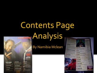
  • 2. COLOUR IMAGE HIP HOP CONNECTION The main colours on this page are red and white, the white being relevant to the colour scheme presented on the first page whereas the red is a new colour introduced into the theme. However the colour red is relevant to the genre of the music as the colour red signifies connotations such as danger, dominance and love and Hip Hop artists express freely the topic of love such as the love for the rap game and the love for another person. Nevertheless they express the dangers that they may have experienced in their life and how they have overcome it or ask the audience themselves how to overcome it. It also expresses dominance as every rapper wants to become successful within the music industry. However white is used on the contents page which shows continuity and the white is maybe to soften the dominance of the red colour. The colour white usually signifies innocence and purity so it contrasts against the red colour stereotypes. Both colours are used effectively on the page however most text is used in white which shows that white is dominating the red which can be seen as unusual. The graphic shown is of two men which we can assume our two Hip Hop artists. They have been placed form the top of the page to the middle and the graphic itself takes up just over a ½ of the page which could convey that the magazine company want the audience to focus on these artists first before they look at the actual content. The camera shot used for this graphic is a medium close up which shows that they again for the audience to focus on the men and not on the content. This shot may have specifically been chosen as this magazine is very male dominated so by having a medium close up it shows the expression of the face which in this shot the two men show dominance and power which reflects on the whole magazine altogether as the magazine has the same characteristics. The clothing that the men are wearing kind of matches with the colour scheme shown on the front cover as they are wearing white and black. The angle of gaze for the celebrities is facing the audience which engages the reader more. LAYOUT TEXT The layout for this magazine is quite unusual there would be more than one graphic displayed with this type of magazine. However the graphic is the background of the page with the faces of the celebrities in full frontal view. The text has been layered over the graphic which is normal for music magazines. Under the main titles for the articles displayed there is brief information on what the article is about. Nevertheless the article has no complex layering and all in all looks quite simple and basic which could reflect on the magazine itself or the celebrities featured. The font displayed looks different from the font that was shown on the front cover which makes the contents page seem unconventional. The main titles of the articles are in white and bold so that this would grab the attention of the reader .The titles are also put in a bigger font in comparison to the brief description of the article below each title. The numbering is in red to give the magazine a bit of contrast and individuality. Also the banner is red and the date is in white , this shows that they used the colour white to highlight the main parts on the page.
  • 3. COLOUR IMAGE HIP HOP WEEKLY The main colours displayed on this contents pages are red and black which was shown on the front cover which shows that the contents page shows continuity and that the contents page is conventional. However there is another colours introduced which looks like a tan colour or a light shade brown which is and odd choice however it works because the writing and the other colours portrayed stand out from it. Even though this is a good use of colour choice this colour is not used for the front cover at all so this could be seen as being unconventional. Nevertheless they may have introduced this new colour into the colour scheme for the specific reason to be different from competitor magazines which goes with the whole outlook of the artists themselves. The main colour used for this contents page is black which is a good choice as it stands out the most amongst the light coloured background. The numbers are in red which in comparison to the magazine ‘Hip Hop Connection’ both numbering have been put in red so having the colour red in magazines is a popular choice. There are two graphic s displayed on this contents page, one being at the top centre of the contents page and the other has been aligned to the bottom right. Both graphics shows the man presented in red /black clothing which goes along with the colour scheme of the magazine making this conventional although this may not have been intentional. Also the person presented in the graphics(Mack Maine) is in featured on the front page with thy ‘Young Money’ group so can make the magazine be considered as conventional. It is usual for a content s page to have more than one graphic as the graphics attract the reader as they want to know more about the person displayed within the graphic. Nevertheless the fact that the two graphic show the same person would again make the reader want to know more about who the person and why is he so important that he gets two graphics displayed of him. TEXT LAYOUT The font displayed for the storylines looks similar to the text shown on the front cover which shows continuity on he two pages. Which doesn’t lead the reader into confusion. However the storylines are in black and are bold which has been deliberately done so that the reader pays attention to the names of the articles rather than focus on the brief description of the article. The text dominates the graphic as there is an overload of information to read on the contents page however this doesn’t deter the reader from skipping the page altogether it just could have been made shorter so that the reader can quickly read the contents page and go to the article that interests them. The text for the brief description looks like ‘time new romans’ font which show that the magazine want to stay plain for particular parts. The layout for this magazine as it is known for the information /text on the contents page to go around the images displayed. The article names and their brief description have fit into two columns which is a surprising factor as the information didn’t have to be long at all. The company have been constructive with their layout as by placing certain things in certain places this smeans that the reader will focus on the conventions that the are suppose to see first such as the graphics and storylines/