Mobile Website Friendliness Report
•Download as PPTX, PDF•
0 likes•312 views

READY TO GO MO? Did you know 80% of customers abandon a mobile site if they have a bad user experience?* Does your business have a mobile-friendly site? If not—or if you’re not sure—you’ve come to the right place to get started.

Recommended
Recommended
More Related Content
Viewers also liked
Recently uploaded
Recently uploaded (20)
Mobile Website Friendliness Report
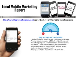
- 1. http://www.thegrovecafemarket.com/ scored 1 out of 4 on the mobile-friendliness scale. YOUR SITE LOADED IN 3.042 SECONDS. Not bad. That’s fast enough to make most mobile users happy. This is crucial, because close to 50% will wait just 5 seconds or less before giving up on a site*. Remember, mobile consumers are often in a hurry, and become frustrated when they can’t complete a task quickly. Keep reading to see other ways to make your site more mobile-friendly. * Compuware, “What Users Want from Mobile”, 2011
- 2. TIPS FOR LEAD GENERATION BUSINESSES As a lead generation business, your focus is customer acquisition. Your mobile site should make it as easy as possible for potential customers to contact you or find your physical location. These items are very important for your business: Keep your phone number and address visible. If you have multiple locations, use geo-location to provide the address of the location closest to the user. Click-to-call dialing and location-based features to help your customers find and connect directly to your business right from their phones. Reduce steps, simplify forms and make data entry simple with checkboxes and scroll menus.
- 3. PERSONALIZED ADVICE FOR YOUR SITE HANDLING IMAGES FOCUSING ON TEXT Your site’s images are not appearing properly. To avoid broken or Your site’s text is not visible without pinching or zooming. missing items when you build your mobile site, check to be sure It is crucial to make your mobile site’s text easy to read. Remember that mobile devices support all of the technology you used to build your mobile users aren’t always in the best situation to do extensive reading. site. Programs like Flash and JavaScript don’t work on some Use an appropriate font size and lay out text so users don’t have to zoom phones, resulting in pages that won’t load or missing content. or scroll. If scrolling can’t be avoided, keep it to a single direction — vertical. Large images can take a long time to load, sometimes causing mobile browsers to stall or crash. Don’t be afraid to have pictures Mobile devices have small screens, so it’s important to make on your site, just keep images small and properly compressed so information on your site easy to read and scan by using bullet points and they load quickly. dividing content into small chunks. Think carefully about which information and features your mobile customers need most. DESIGN FOR THUMBS Your links and buttons are not thumb-friendly. If you’re having For lead generation businesses like yours this could include: trouble navigating your site with your fingers, it’s time to put some • Store locator thought into mobile design. Remember that human fingers and • Directions and maps thumbs are not precise instruments. Tiny buttons and links can be • Phone number or email address difficult to click. Design with thumbs in mind: use wide buttons and • Request Information forms give them breathing room so users don’t hit the wrong one by mistake. LET CUSTOMERS KNOW WHERE TO FIND YOU This is also important to remember for lead generation on mobile Your location and phone number are not visible. Since your business relies sites. If you use online forms to schedule appointments or accept on a direct relationship with your clients, it is very important to make your questions and requests, ask for the minimum information required. contact info easy to find. Offer your location address and phone number No one wants to fill out a lot of tiny form fields with fingers and on your homepage—it could be all it takes to get customers to call or you can always get more details by phone or in-person. come in. When available, you can also use a phone’s internal GPS to provide AND MAKE IT EASY FOR CLIENTS TO CALL. personalized maps and directions for your users. Make it easy Your phone number cannot be clicked to initiate a call. for customers to find you! Since your customers already have their phone in hand—why not take advantage? Prominently display your phone number and use Click-to-Call functionality, a simple way to take advantage of the natural capabilities of mobile phones that allows users to dial with a single tap. It couldn’t be easier to contact you.
- 4. 10 MOBILE BEST PRACTICES 1. KEEP IT QUICK Mobile users are often short on time, squeezing in online tasks as they go about their day. To help them, design your site to load fast and make copy easy to scan. Prioritize the content and features that mobile users need most. Use your desktop site analytics to see what mobile users are doing. Reduce large blocks of text and use bullet points for easy reading. Compress images to keep them small for faster site loading. 2. SIMPLIFY NAVIGATION No one likes to be confused. Clear navigation and, on large or complex sites, search functionality will help your customers easily find what they need. Minimize scrolling and keep it vertical only. Use a clear hierarchy in menus and avoid rollovers. Help users navigate between levels with clear back and home buttons. Use seven links or fewer per page of navigation. Have a search box prominently available on complex sites. 3. BE THUMB-FRIENDLY People use their fingers to operate mobile devices—especially their thumbs. Design your site so even large hands can easily interact with it. Use large, centered buttons and give them breathing room to reduce accidental clicks. Pad smaller buttons to increase the clickable area. Pad check boxes by making the text clickable. 4. DESIGN FOR VISIBILITY A mobile-friendly site gets its message across without causing eyestrain. Make it easy for your customers to read—remember, they may be in a place with low light. Create contrast between background and text. Make sure content fits onscreen and can be read without pinching and zooming. Use plenty of negative space. Use size and color to indicate link/button priority. Use 3D effects and shadowing for buttons.
- 5. 5. MAKE IT ACCESSIBLE Ideally, your mobile site should work across all mobile devices and all handset orientations. Find alternatives to Flash—it does not work on some devices. Use HTML5 for interactivity and animation. Adapt your site for both vertical and horizontal orientations. Keep users in the same place when they change orientation. 6. MAKE IT EASY TO CONVERT No matter what your site’s objective is, your customers need to be able to do it with a virtual keyboard and no mouse. Make it easy to buy something or contact you! Focus on information that will aid conversion (i.e., product details). Reduce the number of steps needed to complete a transaction. Keep forms short and use the fewest number of fields possible. Use check boxes, lists and scroll menus to make data entry easier. 7. MAKE IT LOCAL Consumers look for local info on their phones all the time—from locating the nearest gas station to finding an open pizza place. Include functionality that helps people find and get to you. have your address or store locator on the landing page. Include maps and directions. Use GPS to personalize when possible. Allow users to check stock at nearby stores. 8. MAKE IT SEAMLESS People now use multiple screens throughout the day. Convert as much of the functionality of your desktop site to mobile as you can to create a seamless experience. Allow users to save popular searches and shopping cart contents. Maintain key features of site across all channels as much as possible. Display the same information for products/services.
- 6. 9. USE MOBILE SITE REDIRECTS A mobile site redirect is code that can automatically tell if visitors are using a mobile device and send them to the mobile-friendly version of your site. Have your site developer implement this redirect code so your customers get the best version of your site for their needs. Give users a choice to go back to the desktop site, but make it easy to return to the mobile site. Let users choose which version they prefer to see for later visits. Include key information, such as your address or a store locator, on the redirect page. 10. LISTEN, LEARN AND ITERATE Good mobile sites are user-centric, which means they’re built with input from your audience. Ask your desktop site users what they want in a mobile website and make testing and optimization an ongoing process. Use analytics to understand how people use your site. If possible, especially for complex sites, do user testing before implementation and collect user feedback after launch. Iterate often and continuously improve your site based on your research. Next Step….Build a Mobile Website! Call or email me to set up a free consultation for The Grove. Sheriece Strickland 505-352-4437 info@NewLocalMobileMartketing.com