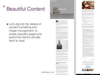
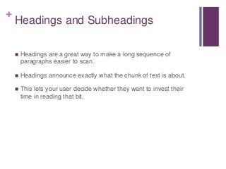
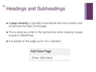
This session takes you beyond the cut and paste addition of content to your WordPress site, and digs into the details of content formatting and image management to create beautiful pages and posts visitors actually want to read. You’ll learn:
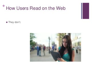
- Best practices to make your content feel easy, fast, and interesting to read
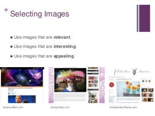
- Tips on working with images to attract attention and keep page load speed fast
- Visual considerations the best content designers take into account that give their site design and content presentation an edge
Presented by Dawn Pedersen at WordCamp Sacramento 2015 #wcsac