SlideShare a Scribd company logo
1 of 9
Download to read offline
The photo taken of Simon Cowell is a professional photo and looks
very crisp and clear; NME made sure the image taken is a very good
one as it is one of the main aspects to catch the eye of a customer.
The photo is a close up. This is to catch the facial expression of
Simon Cowell. The reason they want to catch Simon Cowells
expression so badly and want to show his face very clearly is
because he’s known to be a powerful man through his TV show X
Factor. He’s also very well known from this show, so who ever
passes this magazine will instantly notice it. He's grinning and
seems to be looking right at you. This catches costumers eyes
making them wonder why he's looking so cunning, tempting
costumers to buy the magazine.
The information is arranged like this to give it importance. As half of
the page is used for text and the other half for the image is shows
they are just as important as each other.
We know what’s in the magazine from looking at the articles shown
on the front cover. The text aren't very detailed. This is called a
taster, as it gives the customer a taste of what's inside this issue of
NME. If they like what they see they will most likely purchase it.
There are iconic signs. For example the NME sign is instantly
recognisable. Symbolic signs are also involved. The Christmas
bobbles are used to show us it’s a Christmas edition of the
magazine. There is a snow effect on the top of the masthead. This
also gives a Christmas feel to the magazine.
The colours of the masthead are white and gold. This is significant
as it gives us a Christmas feel to the magazine. (Goes with the
theme).
There’s a website for this issue of NME magazine.
http://www.nme-
magazine.com/?T=1289316221&JTID=164414014&OGID=183&net
work=MSN.
This is done to advertise the magazine through NMEs online
website. This was free of charge as they dont need to pay to
advertise on their own page as it’s already theirs. Costumers would
look at this website to gain some more information about the
magazine before a purchase, purchases can be taken online. This is
a good way of business as some NME fans may not have time to go
to their local news agent so they can get it deliverd at home once
purchased. NME can also advertise on their own radio station, this
is also a good way to advertise their magazine as most cars have a
radio, so the message would spread to many drivers or even people
at home who have a radio. This is a good use of cross media.
The magazine cost £2.30 This is shown on the barcode. The barcode
is found on the bottom left hand corner of the front cover. The
price isn’t to expensive. This is done so anyone passing by with
loose change in their pockets can easily just pick up the magazine
and purchase it. If the magazine was expensive business will not be
good. The price can also relate to young fans of NME as it is cheap
so young NME fans wouldnt struggle purchasing this magazine due
to the cheap price it is sold at. The price is also great value for the
christmas edition, knowing it comes with free posters and is a
double issue it is definately worth every penny.
NME are good at using representational issues. For example on the
front cover they show Simon Cowell. He is a very successful
dominant male in the image. Normally it’s a young male but this
time it’s an old one. This is different and is a powerful way to
represent the front cover of the magazine.
The magazine is in English. The use of language has sense of
humour involved “The Grinch speaks” this gives viewers interest
into reading it. The language of colour shows that the magazine is
aimed at a young audience. They use a bright red colour and a
paper white colour. This adds affect to the magazine instantly
attracting customers who come across this magazine.
Looking at the contents page I instantly noticed the big picture in
the middle of the page. This image relates to the article under it. An
image of a band is used as the main image. They look like they are
practising a performance; this image is used as it links up with the
article under it.“Kasabian got romantic in a church” this heading is a
good way to attract readers as it’s in bold righting and a large font
making it very hard to miss. It also makes a reader want to know
what they mean by Kasbian getting romantic; it has some sense of
humour as the location of this is in a church.
On the left side of the page it has an index. The page looks very well
organised and put in a simple format helping the reader know
where everything is. The index is in a red font with the title in black.
This is done as it’s the NME theme colours and it also stands out as
the page is plain white.
On the bottom of the page I noticed NME advertisement. The
advertisement is advertising NME music magazines. They did not
have to pay for this advertisement as its of the same company and
same producers so it’s a smart way of advertisement as they arn’t
losing money to put it there yet it will attract customers to buy
those issues of the magazine. This is a very good and easy way to
promote their selves as it does not cost them to do it and is very
effective as everyone who reads NME has some sort of liking to it to
read it in the first place, so advertising there new issues to NME
fans definately makes these costumers want to purchase the new
issues. The font is in a bright yellow; this is smart as it instantly
stands out. Normally the use of colours are black and red but by
using a bright and different colour like yellow it instantly makes the
reader look their as the yellow instantly attracts eyes. The yellow
can also represent uniqueness as it’s not a colour normally seen in
the NME magazine.
The header on this page is the basic NME logo as expected. In red
and black.
On the bottom right hand corner there is a red arrow with white
font inserted inside of it. It says “The UK’S no1 gig guide starts p58”
this shows the reader a exclusive page in this Christmas special
edition on the magazine. Many costumers probably bought the
magazine for this one feature. The red arrow stands out as it’s on
top of a plain white background.
Many fonts are used and many are in big sizes and are bold. This is
a good way to make the important information stand out from the
less important
• The background is white so the reader’s attention is just on the text
and the picture.
• The picture of Lily Allen covers the whole of the right hand side of
the page, leaving the left page for all of the text. This makes Lily
Allen look very dominant and powerful as she takes up half the
page on a double page spread.
• Lily Allen’s clothes match the colour scheme oh NMEs theme colour
(Red) her shirt shows masculinity and that she is more masculine
than any normal feminine, this gives the impression that she is
boss. She is looking directly at the reader showing that she’s strong
and demanding attention.
• The title of the double spread sheet is very appealing. “People think
I'm an attention seeker, but I'm just honest” I spoke about her body
language being strong and demanding attention. This adds some
humour as she says she isn’t attention seeking while her body
language says she is. The font of the title is very big and is very
unusual font. This goes back to the ‘attention seeking’ as the title is
definitely seeking customer’s attention.
• Four columns of text are used, and seem to be in a small and
simple font (most probably italic.)
• Some of the important words are highlighted in red. This brings
attention to them right away. Red is used as it stands out and is also
one of NMEs theme colour.
• The title is in a big font which is impossible to miss. It also has a very
thick black outline. This gives each word a lot of power.
I noticed that the magazine is aimed at teenagers and young adults
around the ages 16 -23
NME are good at using cross media to advertise and promote their
magazine. They do this through radio/television and their own
magazines.
They are good at attracting costumers by using bright colours and
big bold fonts. They’re also good at using eye candy and iconic
signs.
They stick to their theme colours of black and red. So most text are
in those colours.
The magazines are very cheap as they are aimed at the younger
audience, allowing teenagers to purchase without problem.

More Related Content

Viewers also liked (11)

Car buying[1]
Car buying[1]Car buying[1]
Car buying[1]
 
My evaluation
My evaluationMy evaluation
My evaluation
 
My evaluation
My evaluationMy evaluation
My evaluation
 
My evaluation
My evaluationMy evaluation
My evaluation
 
My evaluation
My evaluationMy evaluation
My evaluation
 
My power point presentation on a music magazine
My power point presentation on a music magazineMy power point presentation on a music magazine
My power point presentation on a music magazine
 
ABWA Simplifying Social Media 1010
ABWA Simplifying Social Media 1010ABWA Simplifying Social Media 1010
ABWA Simplifying Social Media 1010
 
CPPC Presentation 1011
CPPC Presentation 1011CPPC Presentation 1011
CPPC Presentation 1011
 
GetSocialBrevard 071411
GetSocialBrevard 071411GetSocialBrevard 071411
GetSocialBrevard 071411
 
Social Media for Architects, Engineers & Contractors
Social Media for Architects, Engineers & ContractorsSocial Media for Architects, Engineers & Contractors
Social Media for Architects, Engineers & Contractors
 
My power point presentation on a music magazine
My power point presentation on a music magazineMy power point presentation on a music magazine
My power point presentation on a music magazine
 

Extra writing

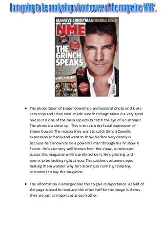
  • 1. The photo taken of Simon Cowell is a professional photo and looks very crisp and clear; NME made sure the image taken is a very good one as it is one of the main aspects to catch the eye of a customer. The photo is a close up. This is to catch the facial expression of Simon Cowell. The reason they want to catch Simon Cowells expression so badly and want to show his face very clearly is because he’s known to be a powerful man through his TV show X Factor. He’s also very well known from this show, so who ever passes this magazine will instantly notice it. He's grinning and seems to be looking right at you. This catches costumers eyes making them wonder why he's looking so cunning, tempting costumers to buy the magazine. The information is arranged like this to give it importance. As half of the page is used for text and the other half for the image is shows they are just as important as each other.
  • 2. We know what’s in the magazine from looking at the articles shown on the front cover. The text aren't very detailed. This is called a taster, as it gives the customer a taste of what's inside this issue of NME. If they like what they see they will most likely purchase it. There are iconic signs. For example the NME sign is instantly recognisable. Symbolic signs are also involved. The Christmas bobbles are used to show us it’s a Christmas edition of the magazine. There is a snow effect on the top of the masthead. This also gives a Christmas feel to the magazine. The colours of the masthead are white and gold. This is significant as it gives us a Christmas feel to the magazine. (Goes with the theme). There’s a website for this issue of NME magazine. http://www.nme- magazine.com/?T=1289316221&JTID=164414014&OGID=183&net work=MSN. This is done to advertise the magazine through NMEs online website. This was free of charge as they dont need to pay to advertise on their own page as it’s already theirs. Costumers would look at this website to gain some more information about the magazine before a purchase, purchases can be taken online. This is a good way of business as some NME fans may not have time to go to their local news agent so they can get it deliverd at home once purchased. NME can also advertise on their own radio station, this is also a good way to advertise their magazine as most cars have a radio, so the message would spread to many drivers or even people at home who have a radio. This is a good use of cross media.
  • 3. The magazine cost £2.30 This is shown on the barcode. The barcode is found on the bottom left hand corner of the front cover. The price isn’t to expensive. This is done so anyone passing by with loose change in their pockets can easily just pick up the magazine and purchase it. If the magazine was expensive business will not be good. The price can also relate to young fans of NME as it is cheap so young NME fans wouldnt struggle purchasing this magazine due to the cheap price it is sold at. The price is also great value for the christmas edition, knowing it comes with free posters and is a double issue it is definately worth every penny. NME are good at using representational issues. For example on the front cover they show Simon Cowell. He is a very successful dominant male in the image. Normally it’s a young male but this time it’s an old one. This is different and is a powerful way to represent the front cover of the magazine. The magazine is in English. The use of language has sense of humour involved “The Grinch speaks” this gives viewers interest into reading it. The language of colour shows that the magazine is aimed at a young audience. They use a bright red colour and a paper white colour. This adds affect to the magazine instantly attracting customers who come across this magazine.
  • 4.
  • 5. Looking at the contents page I instantly noticed the big picture in the middle of the page. This image relates to the article under it. An image of a band is used as the main image. They look like they are practising a performance; this image is used as it links up with the article under it.“Kasabian got romantic in a church” this heading is a good way to attract readers as it’s in bold righting and a large font making it very hard to miss. It also makes a reader want to know what they mean by Kasbian getting romantic; it has some sense of humour as the location of this is in a church. On the left side of the page it has an index. The page looks very well organised and put in a simple format helping the reader know where everything is. The index is in a red font with the title in black. This is done as it’s the NME theme colours and it also stands out as the page is plain white. On the bottom of the page I noticed NME advertisement. The advertisement is advertising NME music magazines. They did not have to pay for this advertisement as its of the same company and same producers so it’s a smart way of advertisement as they arn’t losing money to put it there yet it will attract customers to buy those issues of the magazine. This is a very good and easy way to promote their selves as it does not cost them to do it and is very effective as everyone who reads NME has some sort of liking to it to read it in the first place, so advertising there new issues to NME fans definately makes these costumers want to purchase the new issues. The font is in a bright yellow; this is smart as it instantly stands out. Normally the use of colours are black and red but by using a bright and different colour like yellow it instantly makes the reader look their as the yellow instantly attracts eyes. The yellow can also represent uniqueness as it’s not a colour normally seen in the NME magazine.
  • 6. The header on this page is the basic NME logo as expected. In red and black. On the bottom right hand corner there is a red arrow with white font inserted inside of it. It says “The UK’S no1 gig guide starts p58” this shows the reader a exclusive page in this Christmas special edition on the magazine. Many costumers probably bought the magazine for this one feature. The red arrow stands out as it’s on top of a plain white background. Many fonts are used and many are in big sizes and are bold. This is a good way to make the important information stand out from the less important
  • 7. • The background is white so the reader’s attention is just on the text and the picture. • The picture of Lily Allen covers the whole of the right hand side of the page, leaving the left page for all of the text. This makes Lily Allen look very dominant and powerful as she takes up half the page on a double page spread. • Lily Allen’s clothes match the colour scheme oh NMEs theme colour (Red) her shirt shows masculinity and that she is more masculine than any normal feminine, this gives the impression that she is boss. She is looking directly at the reader showing that she’s strong and demanding attention.
  • 8. • The title of the double spread sheet is very appealing. “People think I'm an attention seeker, but I'm just honest” I spoke about her body language being strong and demanding attention. This adds some humour as she says she isn’t attention seeking while her body language says she is. The font of the title is very big and is very unusual font. This goes back to the ‘attention seeking’ as the title is definitely seeking customer’s attention. • Four columns of text are used, and seem to be in a small and simple font (most probably italic.) • Some of the important words are highlighted in red. This brings attention to them right away. Red is used as it stands out and is also one of NMEs theme colour. • The title is in a big font which is impossible to miss. It also has a very thick black outline. This gives each word a lot of power. I noticed that the magazine is aimed at teenagers and young adults around the ages 16 -23 NME are good at using cross media to advertise and promote their magazine. They do this through radio/television and their own magazines.
  • 9. They are good at attracting costumers by using bright colours and big bold fonts. They’re also good at using eye candy and iconic signs. They stick to their theme colours of black and red. So most text are in those colours. The magazines are very cheap as they are aimed at the younger audience, allowing teenagers to purchase without problem.