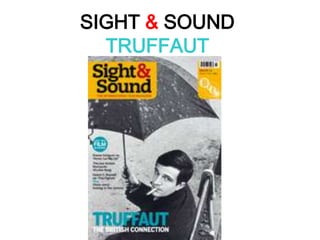
2. TEXT & TITLES -The title, ‘Sight & Sound’,has been placed at the top left hand side of the cover as the eye naturally draws to the left and the text is the boldest out of everything else written. The title connotes to the senses which we highly value in our lives to let us see the world in the way we want, therefore the magazine is appealing to our own senses. -The British Film Institute (BFI) logo is in the top right corner, encased by a box like the title, which lets the reader know that it is a well-respected magazine belonging to a good organisation. The bar code and pricing there also gives a signal to the price to attract the reader immediately. -The capitalised ‘TRUFFAUT’ stands out at the bottom as it is highlighting the importance of Truffaut, an influential French filmmaker. His name at the bottom of the page, and the sub text, can signify the foundations of the magazine’s issue being on him, grounding the reader’s knowledge of the magazine’s contents. -The smaller text in the middle of the page informs of the magazine’s other features such as ‘Blow by blow’ about ‘The Fighter’ movie and ‘Remaining Days’ about ‘Never Let Me Go’. The cleverly crafted phrases create intrigue, making the reader want to find out more inside. -OVERVIEW: Short, capitalised words in large typography, small phrases followed by a bit of information, large titles and logos to create the brand identity and an aesthetically pleasing layout for the eye.
3. IMAGE The cover image is of François Truffaut, a film critic who became a filmmaker and was a major force in international cinema over 25 years, directing 21 features in total. A high angle shot of Truffaut places him in the lower half of the magazine cover with his face almost in the centre. This puts an emphasis on his expression, stressing its possible importance and encouraging the reader’s eye to be drawn to it. A high angle shot also suggests a vulnerability and as Truffaut’s eyes are raised to look up at the reader, this implies the reader holds the power. This is correct as the cover feature advertises an article on Truffaut’s work which the reader is encouraged to analyse and criticise, giving them a higher authority. The black and white photograph reminds me of the film noir genre which Truffaut alluded to in some of his films (Confidentially yours, 1983). The lighter areas also emphasise his expression which is solemn.
4. COLOUR -This cover of Sight & Sound has a limited palette of colour and an impacting contrast between the greyscale image and bright titles surrounding the central photograph. Despite the bright, eye catching use of colour for the title of the magazine and issue focus, the viewers attention is still brought to the image that makes the majority of the cover compared to the momentary attention that we give the titles. Rather the lack of colour is what draws our attention to the image, which is representative of the genre of film François Truffaut was known for and also by creating the atmosphere associated with timeless, artistic films which use this same style. The use of a black and white cover also gives Truffaut an air of mystery which gives a the viewers a sense of intrigue to discover more about his work and character. -The use of black and white for the image is associated with a sense of age but also timelessness, indicating that Truffaut ‘s work has the same quality and effect on the film industry. Some viewers may associate the colouring with a sense of maturity and seriousness which is a frequent theme in similarly styled French films. The use of vivid, solid colours for the magazine titles on the other hand may indicate a sense of modernity, contrasting with the photograph and reminding the viewers that this is a retrospective viewof his work, which is part of the past and that the magazine embodies future perspective.