SlideShare a Scribd company logo
1 of 77
Download to read offline
WITH   DAVE   FLETCHER   :: JUNE 10, 2002
:: JUNE 10, 2002


                   BOOK I
FLETCHER
DAVE
WITH


                   WHERE BAD D3SIGN
                     COMES FROM
1. LEGAL RED TAPE.
:: JUNE 10, 2002


                     • When corporate lawyers get involved with
                       contracts, problems arise.
FLETCHER
DAVE
WITH
1. LEGAL RED TAPE.
:: JUNE 10, 2002


                   11. FOCUS GROUPS
                     • Testing proves how the audience feels at
                       that moment.
FLETCHER
DAVE
WITH
1. LEGAL RED TAPE.
:: JUNE 10, 2002


                   11. FOCUS GROUPS
                   111. TOO MANY COOKS IN THE KITCHEN
FLETCHER


                     • How many design team members does it
DAVE


                       take to screw in a lightbulb?
WITH
1. LEGAL RED TAPE.
:: JUNE 10, 2002


                   11. FOCUS GROUPS
                   111. TOO MANY COOKS IN THE KITCHEN
FLETCHER


                   1v. LACK OF INFORMATION
DAVE


                     • Get as much from a client as possible
WITH


                       before starting a project.
1. LEGAL RED TAPE.
:: JUNE 10, 2002


                   11. FOCUS GROUPS
                   111. TOO MANY COOKS IN THE KITCHEN
FLETCHER


                   1v. LACK OF INFORMATION
DAVE


                   v. TOO MUCH INFORMATION
WITH


                     • Loading up an advertisement with words
                       will not make a client read it.
1. LEGAL RED TAPE.
:: JUNE 10, 2002


                   11. FOCUS GROUPS
                   111. TOO MANY COOKS IN THE KITCHEN
FLETCHER


                   1v. LACK OF INFORMATION
DAVE


                   v. TOO MUCH INFORMATION
WITH


                   v1. BAD CHOICES
                     • Fonts, Colors and Legibility must be
                       consistent with a targeted audience.
1. LEGAL RED TAPE.
:: JUNE 10, 2002


                   11. FOCUS GROUPS
                   111. TOO MANY COOKS IN THE KITCHEN
FLETCHER


                   1v. LACK OF INFORMATION
DAVE


                   v. TOO MUCH INFORMATION
WITH


                   v1. BAD CHOICES
                   v11. FEAR OF FAILURE
                     • Never be afraid to fail. It happens to
                       everyone, and you'll learn from it.
:: JUNE 10, 2002


                    BOOK II
FLETCHER
DAVE
WITH


                     IN THE BEGINNING
                     THERE WAS A PAST
                   1.THE CODE OF HAMMURABI
“If a builder builds a house
:: JUNE 10, 2002


                           and does not make
                         its Construction firm,
FLETCHER
DAVE
WITH


                   and the house which he has built collapse
                   and cause the death of the owner of that house,
                   that builder shall be put to death.”
:: JUNE 10, 2002


                   BOOK II
FLETCHER
DAVE
WITH


                   IN THE BEGINNING
                   THERE WAS A PAST
                    2.FAILED DESIGN
:: JUNE 10, 2002


                    BOOK II
FLETCHER
DAVE
WITH


                    IN THE BEGINNING
                    THERE WAS A PAST
                   3.WHAT IS BAD WAS GOOD
THE DEVIL'S IN THE DETAILS
:: JUNE 10, 2002


                   Here's how to smoke all you want-
                   If you really enjoy smoking, yet feel you smoke
                   too much, you don't have to cut down and
                   deprive yourself of smoking pleasure!
FLETCHER


                   Follow the lead of thousands of others - switch
                   to new Julep Cigarettes. Smoke all you want
DAVE


                   without unpleasant symptoms of oversmoking! A
                   smoking miracle? Yes, it's the triple miracle of
WITH


                   mint.

                   (1) Your mouth doesn't get smoke-weary!

                   (2) Your throat doesn't get that harsh, hacking
                   feeling!

                   (3) Your breath avoids tobacco-taint!

                   Get Juleps today - get more joy out of smoking!
:: JUNE 10, 2002


                   “That         Design
                      is for the Birds.”
FLETCHER
DAVE
WITH


                   PAUL RAND
                   (1914–1996)
:: JUNE 10, 2002


                   BOOK III
FLETCHER
DAVE
WITH


                    FAST FORWARD
                    TO THE PRESENT
                     1.WEBSLIGHTS
WITH   DAVE   FLETCHER   :: JUNE 10, 2002


where did it all go wrong?
iDNA
   intelligent dynamic network aesthetic


   European Business Forum
   iDNA prototype v1.0

iDNA ARTIFACT IS ©2k METHODFIVE, ALL RIGHTS RESERVED
The increasing level of competition in virtually every industry has forced company decision-makers to
  pinpoint new methods of gaining a market advantage. As a result, more businesses understand the value
  of integrating strategic design decisions with their products, marketing efforts and identities.
  Communication design is becoming as important a competitive business edge as manufacturing, product
  selection, quality, pricing or distribution channels.

  Effectively designed communication establishes vital links between a company and its target audience. As
  technology progresses and becomes more infused in the everyday world, businesses are presented with a
  growing number of options for developing these links. Because of all the media available, and the surplus
  of messages aimed at every audience, it is crucial that communication be effectively designed.

  As a leading design agency, methodfive determines a client’s message and chooses the most effective way
  to transmit that message. Whether spoken, felt, heard or read, it is a matter of transforming intangible
  ideas into tangible objects. Interactive media, the Internet in particular, is exciting because it allows for the
  creation of lush environments, which encourage and reward participation. The objects of these
  environments are more than just a lexicon of sounds, colours, forms and spatial arrangements that define
  the circumstances surrounding the individual - they are the vehicles for encounters and confrontations.
  Understanding this is crucial to the success of designing in the digital age.

  The media thinker and author, Marshall McLuhan explains in his seminal book, The Medium is the
  Message, that: “the vested interests of acquired knowledge and conventional wisdom have always been
  by-passed and engulfed by new media.” This observation strikes to the heart of the designer’s
  contemporary dilemma. One who is trained in the correct methods of professional photography,
  illustration, graphic and typographic design but who lacks the experience of applying design principles to
  an interactive environment is continually ambushed as technological innovations and new creative
  directions challenge conventional wisdom.

  All too often, switched-on designers focus too heavily on exploring design as it relates to an interactive
  environment such as the Internet. It is imperative that new media designers understand that man is the
  actual medium of expression, not the tool he elects to use as a means. Results alone should be appraised;
  the way in which these are achieved is of importance only to the designer. To the extent that the completed
  design realizes depth of understanding, uniqueness of viewpoint and vitality of presentation, will the user
  respond and participate in the experience.

  from
  DesiGn in the DigItal Age                          -by anthony shafto, art director:methodfive UK


            iDNA
   intelligent dynamic network aesthetic


iDNA ARTIFACT IS ©2k METHODFIVE, ALL RIGHTS RESERVED
Page layout
  Establish Visual Hierarchy

  Internet users seek clarity, order, and trustworthiness in a websites diverse information
  sources. The spatial organization of graphics and text on an a Web page can engage the
  user with graphic impact, direct the user's attention, prioritise information, and make the
  user's interactions with the website more enjoyable and more efficient.

  The primary task of graphic design is to create a strong, consistent visual hierarchy, where
  important elements are emphasized, and content is organized logically and predictably.
  Graphic design is visual information management using the tools of layout, typography, and
  illustration to lead the eye through the page. Visitors see pages first as large masses of
  shape and colour with foreground elements contrasted against the background field. Only
  secondarily do they begin to pick out specific information, first from graphics if they are
  present, and only afterward do they start parsing the "harder" medium of text and begin to
  read individual words and phrases.

  Thus the overall graphic balance and organization of the page is crucial to drawing the
  visitor into your content. A dull page of solid text will repel the eye as a mass of
  undifferentiated grey, but a page dominated by poorly designed or overly bold graphics or
  type will also repel sophisticated users looking for substantive content. website design
  demands an appropriate balance that attracts the eye with visual contrast.


                                                                                                 organized


             iDNA
   intelligent dynamic network aesthetic


iDNA ARTIFACT IS ©2k METHODFIVE, ALL RIGHTS RESERVED
Page layout
  Create Visual Balance

  Graphic design creates visual logic, an optimal balance between visual sensation and
  graphic or text information. Without the visual impact of shape, colour, and contrast, pages
  are often graphically boring and will not motivate the viewer to investigate their contents.
  Dense text documents without the contrast and visual relief offered by graphics and careful
  page layout and typography are also more difficult to read, particularly on the relatively
  low-resolution screens of current personal computers. However, without the depth and
  complexity of text, highly graphic pages risk disappointing the user by offering a poor
  balance between visual sensation, text information, and hyperlinks.

  In seeking this ideal balance, the primary graphic design constraints in Web pages are the
  vertical, list-oriented structure of HTML as seen in current Web browsers, and the practical
  bandwidth limitations on user access rates which runs the gamut from 14.4 to T1 (a
  connection speed of 28.8 has been identified as the standard against which all design and
  build will be measured). Visual and functional continuity in EBF's site organization,
  graphic design, and typography is essential to convince users that the site offers them
  timely, accurate, and useful information.

  A careful, systematic approach to page design will simplify navigation, reduce errors, and
  make it much easier for users to take full advantage of the information and features of the
  EBF site and will also make it much easier for the maintenance team to manage and update
  the site.


                                                                                                 organized
                                                                                                 balance


             iDNA
   intelligent dynamic network aesthetic


iDNA ARTIFACT IS ©2k METHODFIVE, ALL RIGHTS RESERVED
Page layout
  Direct the Eye

  In the West readers of English read from left to right, and from the top of the page to the
  bottom. This fundamental visual axis dominates most design decisions, and is the basis for
  most conventional graphic design of print publications. In page layout the top of the page is
  always the most dominant location, but on Web pages the upper page is especially
  important, because the top four inches of the page is all that is visible on the typical 14 to 16
  inch monitor.


  Avoid Graphic Distractions

  The EBF design must avoid complex graphic embellishments. Horizontal rules, graphic
  bullets, icons, and other visual markers have appropriate uses, but should be applied
  sparingly to avoid a patchy and confusing layout. The tools of graphic emphasis are
  powerful, and should be used only in small doses for maximum effect.


                                                                                                      organized
                                                                                                      balance
                                                                                                      direction


             iDNA
   intelligent dynamic network aesthetic


iDNA ARTIFACT IS ©2k METHODFIVE, ALL RIGHTS RESERVED
Page layout
  Be Consistent

  EBF's design should establish a layout grid and a style for handling text and graphics and
  then stick with it to build a consistent rhythm and unity across all pages of the site.
  Repetition with purposeful intent is not boring; it will give the website a consistent graphic
  identity that reinforces a distinct sense of "place," which makes the visitors’ experience
  more memorable. A consistent approach to layout and navigation will allow visitors to
  quickly adapt to the design, and to confidently predict the location of information and
  navigation controls across the pages of the site.

  There is no single design grid system that is appropriate for the EBF site. The first
  consideration in the project is to establish the basic layout grid for the site’s pages. With this
  graphic "backbone" design establishes how the major blocks of type and illustrations will
  regularly occur in the pages, and set the placement and style guidelines for major screen
  titles, subtitles, and navigation links or buttons. It isn't possible to predict how every
  particular combination of text and graphics will interact on the screen, but it is important to
  examine layout "sketches" against both the most complex and least complex pages.

  The goal is to quickly establish a consistent, logical screen layout, and one that allows the
  site’s editorial staff to quickly "plug in" text and graphics for each page. Without a firm
  underlying design grid, page layout will be driven by the problems of the moment, and the
  overall design of the site will look patchy and visually confusing.


                                                                                                       organized
                                                                                                       balance
                                                                                                       direction


             iDNA
                                                                                                       rhythm


   intelligent dynamic network aesthetic


iDNA ARTIFACT IS ©2k METHODFIVE, ALL RIGHTS RESERVED
eBf
                                                       "The European Business Forum is an influential,
                                                       Euro-centric source of debate, knowledge and
                                                       information, which enable senior and aspiring
                                                       (business) decision takers worldwide to gain
                                                       competitive edge in the emerging global
                                                       marketplace."


                                                                                  ...and it is more >>


                                                               iDNA
                                                       intelligent dynamic network aesthetic


iDNA ARTIFACT IS ©2k METHODFIVE, ALL RIGHTS RESERVED
The publishing vertical is perhaps the most difficult and dangerous online venture. Nicholas Negroponte,
  head of the MIT Media Lab, has reasoned that the internet is causing a shift from atoms to bits. As digital
  information separates itself from various media and begins to disseminate across networks in its purest
  form, we find that the economic model for the entire publishing industry no longer applies. Information
  was once valued in part because of the media to which it was bound. The digitization of information has


                                                                                                                           iDNA
  liberated it, and consequently left us in the disoriented state of questioning how to value information alone.

  The challenge of publishing online revolves around providing information that is more relevant and
  concise. Inevitably, the question of interface arises. No other element of an application can more
  powerfully assist or impede a user’s attempt to not merely receive, but absorb information. Finding an           intelligent dynamic network aesthetic
  equilibrium between minimizing a user’s attention and time, and maximizing the precision and quantity of
  the information is the key to successful online publishing.


  State oF the enVIronMent


                                                                                                                           authority
                                                                                                                           intelligence


iDNA ARTIFACT IS ©2k METHODFIVE, ALL RIGHTS RESERVED
"competitors are never enemies. They
                      "competitors are never enemies. They
                                are unknowing educators.”
                          are unknowing educators.”                                     D@ve Fletcher, Creative Director:methodfive


   methodfive believes the key to any online initiative is a detailed analysis of our
   client’s competition. It is the valuable data gathered from this research,
   including detailed color palettes, common navigational elements, and industry
   trends, that steer our methodology in the creation of something that exceeds
   our clients' expectations.


           iDNA
   intelligent dynamic network aesthetic


iDNA DOCUMENT IS ©2K METHODFIVE, ALL RIGHTS RESERVED
FORRESTER
  • Forrester is a leading independent research firm
  that analyzes the future of technology change and
  its impact on businesses, consumers, and society.
  The website uses a standard left-side navigational
  structure with an emphasis on both client and guest
  logins.
  • The homepage features a very compartmentalized
  content area area which is graphically and
  structurally powerful. Important links are easily
  identified and persuasive in their subtlety. Adding to
  the persuasiveness of the homepage is the calm
  color palette. The user enters the site and is
  immediately not overcome by the amount of
  information that is available.
  • Essentially, Forrester is a site which requires
  subscriptions for most of the available content. A
  guest login account will remain active for 90 days to
  allow the visitor to discover the relevance of the
  content before subscribing. ( see gravity well )
  The large, organic circle frames links to research
  polls and visitor input. The circular image breaks up
  the strict division of space with an organic touch.


                                                           primary   secondary


                                                                          palette                     [primary]

                                                                             The primary color palette for the Forrester
                                                                             site combines natural, casual pastels with a


              iDNA
                                                                             touch of vibrant orange highlight. The
                                                                             mood created is very calming and skillfully
                                                                             creates a balance between tasteful and
                                                                             inviting.


   intelligent dynamic network aesthetic


iDNA DOCUMENT IS ©2K METHODFIVE, ALL RIGHTS RESERVED
page title
                                                              LOGO                     headline                  date             LOGO


  FORRESTER                                                   login                                                               login
                                                                                          advert                 join                               content            advert


                                                         navigation
                                                                                                                                secondary
                                                                                                                                          nav
  • The elements of the secondary pages remain
                                                                                          news                 information
  relatively consistent. All navigational elements
  remain, with the addition of secondary navigation


                                                                                                                             navigation
                                                                                                               interaction

  which appears directly under the chosen section.                    join
  • Content is spaced out appropriately, and the white                       timely info             mission
  empty space to the right creates a more direct focus
                                                                                                                                      join
  to the secondary navigational elements.                                       join                                                                         upcoming events
  • The headline from the homepage is replaced with                           employment            search
  a section header, simply giving another point of
  focus of location to the visitor.                                           statement

  • A most interesting point is that the number of                                               copyright


  navigational elements and repetition of links is
  understated by the simple spacious nature of the
  site. The site never feels crowded to the eye, yet                                                                                                            inquiries

  features plenty of worthwhile content.

                                                                                                                                                                contact


                                                             primary                                                             secondary


                                                                                                                                                palette                          [secondary]

                                                                                                                                                               The secondary palette follows the
                                                                                                                                                               homepage colors with a minor shift. White


              iDNA
                                                                                                                                                               is introduced as a main background color to
                                                                                                                                                               first, support printing of information, and
                                                                                                                                                               second, to allow the eye to focus on the
                                                                                                                                                               appearance of secondary navigation at the
                                                                                                                                                               left. The overall feel of the site remains
                                                                                                                                                               consistent.
   intelligent dynamic network aesthetic


iDNA DOCUMENT IS ©2K METHODFIVE, ALL RIGHTS RESERVED
TheStreet.com
  • TheStreet.com: Sly, irreverent, to the point.
  TheStreet is a site which features plenty of
  content which is valuable to the Wall Street
  Banker, CEO or casual day trader.
  • Immediate focus is given to the number of
  images used to represent regular columns.
  And available links to content are rendered in
  a high contrast color for secondary focus.
  • The navigation forces the audience to scroll,
  yet the content is incredibly dense and without
  focus. There are too many hyperlinks, making
  it difficult to pinpoint pertinent information.


                                                    primary   secondary


                                                                          palette                          [main]
                                                                          The same palette is used throughout the
                                                                          site, whether the visitor is at the homepage
                                                                          or within interior pages. Simple colour


            iDNA
                                                                          shifts would have given the visitor a clearer
                                                                          picture the different areas. Perhaps even a
                                                                          subtle colour shift between paid and free
                                                                          areas would have been appropriate.

                                                                          The palette is made of neutral, non-
   intelligent dynamic network aesthetic                                  offensive tones. The main highlight is the
                                                                          green colour within the navigation playing
                                                                          off of the logo. Dull, tans/yellows fill the
                                                                          background and subsequent content
                                                                          navigation areas. They give the site a
                                                                          simple, implied dignity. The green alludes
                                                                          to money and the red is a nice complement
                                                                          to highlight the subscription area.


iDNA DOCUMENT IS ©2k METHODFIVE, ALL RIGHTS RESERVED
advert


  TheStreet.com
                                                                                                                                subscription                                       logo                            subscription
                                                                                      logo                                        inquiry                                                                            inquiry
                                                                                  date                                                 phone                                   date                                      phone


                                                                               paid                           main                                                          paid
                                                                            navigation                       story                                                       navigation

  • Advertising is kept to a minimum and is                                                                                           toolbox/                                                                           toolbox/
                                                                                                                                                                                                                          quotes
                                                                                            markets                                    quotes
  mostly restricted to the right column. Both self                                         [free content]

  and outside advertising co-exist, creating color


                                                     top-level navigation


                                                                                                                                                  top-level navigation
                                                                               free                                                                                         free
                                                                            navigation                                                                                   navigation

  harmony between the advertising and the                                                                                               self-
                                                                                                                                       advert

  content.                                                                   search
                                                                                                                   featured
                                                                                                                                                                          search                                          advert


  • The use of a columnar layout, in combination                                          breaking news
                                                                                           [free content]
                                                                                                                  commentary
                                                                                                                     [paid content]    advert                                                                              self-
  with the density of information creates a                                 sponsored
                                                                               area
                                                                                                                                                                         sponsored
                                                                                                                                                                            area
                                                                                                                                                                                                                          advert


  cascade, assisting the user's attention in
  moving down the page. Noting immediately                                  subscribe
                                                                                                                                      community
                                                                                                                                                                         subscribe
                                                                                                                                                                                                                           FAQ


  what content is free and what is premium is                                                                                                                                             community content                self-
  also extraordinarily useful to the user and a                                                                                        advert
                                                                                                                                                                         legal/info/
                                                                                                                                                                                                                          advert


  good use of information to pull the user into a                           legal/info/
                                                                             policies
                                                                                                                                                                          policies


  relationship.                                                                                                                        advert                                                                             advert


  • The frameset at the bottom of the page,                                                                                             self-
                                                                                          news & analysis
  which contains a stock ticker, visible                                                                                               advert                                                                           community
                                                                                            [paid content]                                                                                                                chat

  throughout the experience at TheStreet.com is                                                                                        advert

  an appropriate use of frames to give the user a                                                                                      advert

  consistency of needed content.
                                                                                                                                                                                                                          advert


                                                                                              finance              featured
                                                                                            [free content]       commentator
                                                                                                                     [paid content]


                                                                                                                   featured
                                                                                                                commentary list
                                                                                                                     [paid content]


                                                                                                      main stocks in frameset                                                                main stocks in frameset


                                                                             primary                                                                                      secondary


                                                                                                                                                                                                palette                             [main]
                                                                                                                                                                                                The same palette is used throughout the
                                                                                                                                                                                                site, whether the visitor is at the homepage
                                                                                                                                                                                                or within interior pages. Simple color shifts


             iDNA
                                                                                                                                                                                                would of given the visitor a clearer picture
                                                                                                                                                                                                the different areas. Perhaps even a subtle
                                                                                                                                                                                                color shift between paid and free areas
                                                                                                                                                                                                would have been appropriate.

                                                                                                                                                                                                The palette is made of neutral, non-
   intelligent dynamic network aesthetic                                                                                                                                                        offensive tones. The main highlight is the
                                                                                                                                                                                                green color within the navigation playing
                                                                                                                                                                                                off of the logo. Dull, tans/yellows fill the
                                                                                                                                                                                                background and subsequent content
                                                                                                                                                                                                navigation areas. They give the site a
                                                                                                                                                                                                simple, implied dignity. The green alludes
                                                                                                                                                                                                to money and the red is a nice complement
                                                                                                                                                                                                to highlight the subscription area.


iDNA DOCUMENT IS ©2k METHODFIVE, ALL RIGHTS RESERVED
FASTCOMPANY
  • FastCompany is an online companion to the
  printed publication. The magazine writes
  about the new economy and workplace for
  people who believe in fusing tough-minded
  performance with human values.
  • Confusion of interface values is apparent
  with a sloppy, double navigation structure
  which follows neither a decided order or
  reasonable repetition. Some elements are
  carried into the left and right navigation are
  also available at the top. The inconsistency of
  available navigational elements causes a level
  of confusion. Additionally, as graphical
  elements, the navigation suffers from
  inconsistent implementation as well.
  • The absence of a banner on the homepage is
  refreshing, with both internal and external
  advertising placed on the left and right side in
  small, unobtrusive boxes.
  • Content is organized in a compartmentalized
  newspaper format; the main story leads at the
  top with features and community cascading
  into links and quotes. The links help to
  differentiate the online product from the
  printed publication. The separation of orange
  to white columns creates focus on the content.
                                                     primary   secondary


                                                                    palette                     [primary]

                                                                       FastCompany online follows the color
                                                                       palettes defined by the printed publication.


             iDNA
                                                                       The serious, deep red creates a dynamic to
                                                                       the lighthearted combination orange and
                                                                       whites. The orange and red stick to the
                                                                       warm side of the tonal scales. The colors of
                                                                       the navigational elements (see top
                                                                       navigation) are so severely in competition
                                                                       with the color palette, they create
   intelligent dynamic network aesthetic
                                                                       distraction. Sticking with variances of the
                                                                       initial palette would be more appropriate.


iDNA DOCUMENT IS ©2K METHODFIVE, ALL RIGHTS RESERVED
LOGO               NAVIGATION                              BANNER AD

                                                                                                           LOGO         NAVIGATION


  FASTCOMPANY                                           INTERNAL
                                                         ADVERT


                                                                         MAIN
                                                                                             INTERNAL
                                                                                              ADVERT


                                                                       FEATURE
  • The secondary pages of fastcompany lose the        NAVIGATION
                                                       NAVIGATION
                                                                                             NAVIGATION
                                                                                             NAVIGATION
                                                                                                           PRINT   SECTION CONTENT
  left and right navigation of the homepage and        NAVIGATION
                                                       NAVIGATION
                                                                                             NAVIGATION
                                                                                             NAVIGATION
                                                                                                           INFO
  divide into a two column format. The left
  section is reserved for placeholding more             ADVERT                                 ADVERT


                                                                                COMMUNITY
  advertising and confusing imagery.                    INTERNAL                              INTERNAL
  • Colors change to match the colors associated         ADVERT                                ADVERT


  with the top navigation in every instance with        INTERNAL
                                                         ADVERT

  the exception of << THEMES >>. Consistency


                                                                                DISCUSSION
                                                         EMAIL      FEATURES
  is overlooked and sets the tone of "amateur"


                                                                                  ONLINE
                                                        CAPTURE


  throughout the experience.
  • The use of white within content areas in
  secondary pages continues the "white signifies                    ARCHIVE
                                                                    FEATURE
  content" theme throughout the site.
  • Stylized artwork mixed with photographic
                                                                        LINKS
  elements looks unprofessional in the
  secondary pages.
  • Frequently Asked Questions are buried
  within the legal footer hyperlinks, and feel like
                                                                       QUOTES
  an afterthought.

                                                                                                                      PRINT OPTION
                                                        LOGO               NAVIGATION
                                                                             LEGAL                         LOGO         NAVIGATION
                                                                                                                          LEGAL


                                                      primary                                             secondary


                                                                                                             palette                  [secondary]

                                                                                                                    The variance of color from page to page at
                                                                                                                    the secondary level is worth noting,


             iDNA
                                                                                                                    because when implemented properly, can
                                                                                                                    be successful in branding pages unto
                                                                                                                    themselves. When the user returns, they
                                                                                                                    become familiar with a particular color
                                                                                                                    combination of a navigational element. No
                                                                                                                    matter how large the site becomes in the
                                                                                                                    future with addition of other navigational
   intelligent dynamic network aesthetic
                                                                                                                    elements, the user can intuitively define
                                                                                                                    where they want to go with minimum
                                                                                                                    effort.


iDNA DOCUMENT IS ©2K METHODFIVE, ALL RIGHTS RESERVED
thestandard.com
  • TheStandard is the online version of the
  Industry Standard publication, and functions as
  an up-to-date news resource for the internet
  business community.
  • Curved boxes serve as a departure point from
  the strict-edged column structure of the printed
  publication. However, this "organic" approach
  fights with the angular online logo (upper left of
  page), leaving the logo feeling like a secondary
  thought. This becomes a barrier to the realization
  of a well branded site.
  • The use of a subdued yellow (a color choice
  from the actual publication) within the logo
  creates an accent that should be reiterated as an
  accent to important articles or sections. Again,
  this is a lack of branding consistency, and a
  failure to relate the site to the print magazine.
  • Content may or may not be organized by
  immediate relevance due to the lack of date or
  time of posting for individual articles.
  • Advertising is carefully separated with self-
  advertising located below the main navigation
  and industry relevant advertising located to the
  right.


                                                       primary   secondary


                                                                      palette                     [primary]

                                                                         TheStandard's color palette is a reflection
                                                                         of the magazine. Casual, classic colors with


             iDNA
                                                                         a cerebral gray background denotes
                                                                         intelligence mixed with a laid-back
                                                                         comfortable atmosphere. The soft yellow,
                                                                         used as an occasional accent to articles
                                                                         within the printed publication is present
                                                                         only in the online version of the logo. The
                                                                         which displays compartmentalization
   intelligent dynamic network aesthetic
                                                                         without a focus on its relevance to the
                                                                         internet economy.


iDNA DOCUMENT IS ©2k METHODFIVE, ALL RIGHTS RESERVED
logo                        advertising                    logo                    advertising


  thestandard.com                                                             search
                                                                      personalized navigation
                                                                                             date
                                                                                                                                       search
                                                                                                                               personalized navigation
                                                                                                                                                      date


  • The navigation, expanded at the homepage                                                                      main
  level, becomes condensed at the secondary                                      top                   advert    navigation
                                                                                                                                       top                    advert
                                                                                news                            [condensed]
                                                                                                                                      news/
                                                                                                                                     articles
  levels showing only select elements of the
  subsection menu. It would seem that a color         main
  coding of individual sections would have           navigation

  allowed the secondary levels to be present at                      opinion
                                                                                                                                                  posts
                                                                                          special                 self-
  all interior levels. DHTML may have been                                                reports      advert    advert
                                                                                                                [subscribe]
                                                                                                                                                              advert

  utilized to shorten the main navigation with
  pull-out subsections if space was an issue.
  • The color choices at interior levels is                         directory            job
                                                                                     recruitment
                                                                                                                                              opinions/
                                                                                                                                            Related Links
  inconsistent. Some subsections feature the
  same colors, while others feature radical shifts                                                                self-
                                                                                                                 advert
                                                       self-
  in secondary colors.                                advert
                                                     [subscribe]     events
                                                                                          special
                                                                                          reports
  • The intelligent Industry Standard charts are
  missed at the homepage level. While too many
  charts become an unecessary distraction,
                                                                                                                                             daily metric
  TheStandard online missed an opportunity to
  highlight the Metrics which are a major point        self-
                                                      advert
  of interest in the printed publication.
  • The Personalized navigation takes the visitor
  to an inconsistent series of pages. They lack
  the main navigation areas of the content pages
  located within the left column                                                advert                                                 advert


                                                                                footer                                                 footer


                                                     primary                                                    secondary


                                                                                                                               palette                         [secondary]

                                                                                                                                      TheStandard's secondary palettes become
                                                                                                                                      inconsistent as the visitor explores the


             iDNA
                                                                                                                                      sections. Some sections feature a radical
                                                                                                                                      color shift (see events section). Others
                                                                                                                                      feature the same palettes as the homepage
                                                                                                                                      while others have a slight variance in color
                                                                                                                                      (purple to blue). The most alarming
                                                                                                                                      inconsistency within the palettes is the
                                                                                                                                      varied colors within single sections. In
   intelligent dynamic network aesthetic
                                                                                                                                      companies, for example, green is the
                                                                                                                                      highlight for one subsection, while blue is
                                                                                                                                      the highlight for another subsection.
                                                                                                                                      It is this lack of coordination between
                                                                                                                                      sections which, ultimately, will confuse the
                                                                                                                                      visitor to TheStandard.


iDNA DOCUMENT IS ©2k METHODFIVE, ALL RIGHTS RESERVED
:: JUNE 10, 2002


                   Marketing Misfires
FLETCHER


                   Coors translated its slogan,
DAVE


                      "Turn it loose," into Spanish,
WITH


                                 where it was read as

                                  "Suffer from diarrhea."
:: JUNE 10, 2002


                   irritating information architecture.
FLETCHER
DAVE
WITH


                                            Step 1.
                                         : enter the site.
:: JUNE 10, 2002


                   irritating information architecture.
FLETCHER
DAVE
WITH


                                            Step 2.
                                            : navigate.
1. Don't assume that an underaged drinker
                   will not figure out a date that will give them
:: JUNE 10, 2002


                   access to your site.

                   irritating information architecture.
FLETCHER


                   2. What “secret” drinking information could be
                   provided on coors.com that an underaged kid
DAVE


                   could find out?
WITH


                                                   Step 3.
                                           : re-verify your age?
:: JUNE 10, 2002
FLETCHER
DAVE
WITH


                           Step 4.
                          : Read an ad about
                   the dangers of underage drinking.
:: JUNE 10, 2002
FLETCHER
DAVE


                   http://www.johnsonandjohnson.com
WITH
WITH   DAVE   FLETCHER   :: JUNE 10, 2002
“It is our job as designers
                     to create effective representations
:: JUNE 10, 2002


                   of information
                            for human consumption.”
FLETCHER


                                      JEF RASKIN (INVENTOR OF THE MACINTOSH)
DAVE
WITH
WITH   DAVE   FLETCHER   :: JUNE 10, 2002
WITH   DAVE     FLETCHER   :: JUNE 10, 2002


 Top Half of Site.
WITH   DAVE   FLETCHER   :: JUNE 10, 2002


 (navigation)
Bottom of Site.
WITH   DAVE   FLETCHER   :: JUNE 10, 2002


Et Tu, Dio?
:: JUNE 10, 2002


                   BOOK III
FLETCHER
DAVE
WITH


                      FAST FORWARD
                      TO THE PRESENT
                   2.TOO MUCH INFORMATION
WITH   DAVE   FLETCHER   :: JUNE 10, 2002


                     36 Cars.
1 3 #12 Jeremy Mayfield Ford Mobil 1 185/10 200 Running $111,580

                            2 1 #24 Jeff Gordon Chevrolet DuPont 175/5 200 Running $79,500

                            3 9 #88 Dale Jarrett Ford Quality Care/ Ford Credit 170/5 200 Running

                            $62,220

                            4 28 #99 Jeff Burton Ford Exide Batteries 165/5 200 Running $49,080

                            5 6 #6 Mark Martin Ford Valvoline 160/5 200 Running $40,645

                            6 18 #1 Darrell Waltrip Chevrolet Pennzoil 155/5 200 Running $28,725
:: JUNE 10, 2002


                            7 14 #50 Wally Dallenbach Chevrolet Budweiser 151/5 200 Running $34,575

                            8 11 #3 Dale Earnhardt Chevrolet GM Goodwrench Service Plus 147/5 200

                            Running $34,625

                            9 15 #40 Sterling Marlin Chevrolet Coors Light 138/0 200 Running $23,825

                            10 34 #23 Jimmy Spencer Ford Winston 134/0 200 Running $41,975

                            11 36 #28 Kenny Irwin * Ford Texaco/ Havoline 130/0 200 Running $33,175

                            12 12 #5 Terry Labonte Chevrolet Kellogg's Corn Flakes 127/0 200 Running

                            $32,025
FLETCHER


                            13 19 #43 John Andretti Pontiac STP 124/0 200 Running $31,425

                            14 29 #21 Michael Waltrip Chevrolet Citgo 121/0 200 Running $27,575

                            15 23 #18 Bobby Labonte Pontiac Interstate Batteries 123/5 200 Running

                            $31,675
DAVE


                            16 32 #77 Robert Pressley Ford Jasper Engine's/Federal-Mogul 120/5 200

                            Running $20,275
WITH


                            17 8 #16 Ted Musgrave Ford PRIMESTAR 112/0 200 Running $25,825

                            18 35 #11 Brett Bodine Ford Paychex 114/5 200 Running $25,525


                   117.801 mph
WITH   DAVE   FLETCHER   :: JUNE 10, 2002


Cheap Beer.
:: JUNE 10, 2002
FLETCHER
DAVE
WITH


                    Cheap Beer.
                   (sorry Anheuser-Busch...)
WITH   DAVE   FLETCHER   :: JUNE 10, 2002


Too much information.
Coast Guard
:: JUNE 10, 2002
FLETCHER
DAVE
WITH


                                 Too much information.
Coast Guard      3M
:: JUNE 10, 2002
FLETCHER
DAVE
WITH


                                 Too much information.
Coast Guard      3M   Penzoil
:: JUNE 10, 2002
FLETCHER
DAVE
WITH


                                 Too much information.
Coast Guard      3M   Penzoil   Prestone
:: JUNE 10, 2002
FLETCHER
DAVE
WITH


                                 Too much information.
Coast Guard      3M   Penzoil   Prestone   GoodYear
:: JUNE 10, 2002
FLETCHER
DAVE
WITH


                                 Too much information.
Coast Guard      3M   Penzoil   Prestone   GoodYear
:: JUNE 10, 2002


                       76
FLETCHER
DAVE
WITH


                                 Too much information.
Coast Guard      3M    Penzoil   Prestone   GoodYear
:: JUNE 10, 2002


                       76          Moog
FLETCHER
DAVE
WITH


                                 Too much information.
Coast Guard      3M      Penzoil      Prestone   GoodYear
:: JUNE 10, 2002


                       76          Moog   Quaker State
FLETCHER
DAVE
WITH


                                 Too much information.
Coast Guard      3M      Penzoil      Prestone     GoodYear
:: JUNE 10, 2002


                       76          Moog   Quaker State   True Value
FLETCHER
DAVE
WITH


                                 Too much information.
Coast Guard      3M      Penzoil      Prestone     GoodYear
:: JUNE 10, 2002


                       76          Moog   Quaker State   True Value    GMAC
FLETCHER
DAVE
WITH


                                 Too much information.
Coast Guard      3M      Penzoil      Prestone     GoodYear
:: JUNE 10, 2002


                       76          Moog   Quaker State   True Value    GMAC


                      Blah
FLETCHER
DAVE
WITH


                                 Too much information.
Coast Guard      3M       Penzoil      Prestone     GoodYear
:: JUNE 10, 2002


                       76          Moog    Quaker State   True Value    GMAC


                      Blah          Blah
FLETCHER
DAVE
WITH


                                 Too much information.
Coast Guard      3M       Penzoil      Prestone     GoodYear
:: JUNE 10, 2002


                       76          Moog    Quaker State   True Value    GMAC


                      Blah          Blah      Blah
FLETCHER
DAVE
WITH


                                 Too much information.
Coast Guard      3M       Penzoil      Prestone     GoodYear
:: JUNE 10, 2002


                       76          Moog    Quaker State   True Value    GMAC


                      Blah          Blah      Blah          Blah
FLETCHER
DAVE
WITH


                                 Too much information.
Coast Guard      3M       Penzoil      Prestone     GoodYear
:: JUNE 10, 2002


                       76          Moog    Quaker State   True Value    GMAC


                      Blah          Blah      Blah          Blah         Blah
FLETCHER
DAVE


                      Blah
WITH


                                 Too much information.
Coast Guard      3M       Penzoil      Prestone     GoodYear
:: JUNE 10, 2002


                       76          Moog    Quaker State   True Value    GMAC


                      Blah          Blah      Blah          Blah         Blah
FLETCHER
DAVE


                      Blah          Blah
WITH


                                 Too much information.
WITH   DAVE   FLETCHER   :: JUNE 10, 2002


Designed for confusion.
WITH   DAVE   FLETCHER   :: JUNE 10, 2002


Designed for confusion.
WITH        DAVE    FLETCHER   :: JUNE 10, 2002


The Land of Confusion.
WITH   DAVE   FLETCHER   :: JUNE 10, 2002

More Related Content

Featured

2024 State of Marketing Report – by Hubspot
2024 State of Marketing Report – by Hubspot2024 State of Marketing Report – by Hubspot
2024 State of Marketing Report – by HubspotMarius Sescu
 
Everything You Need To Know About ChatGPT
Everything You Need To Know About ChatGPTEverything You Need To Know About ChatGPT
Everything You Need To Know About ChatGPTExpeed Software
 
Product Design Trends in 2024 | Teenage Engineerings
Product Design Trends in 2024 | Teenage EngineeringsProduct Design Trends in 2024 | Teenage Engineerings
Product Design Trends in 2024 | Teenage EngineeringsPixeldarts
 
How Race, Age and Gender Shape Attitudes Towards Mental Health
How Race, Age and Gender Shape Attitudes Towards Mental HealthHow Race, Age and Gender Shape Attitudes Towards Mental Health
How Race, Age and Gender Shape Attitudes Towards Mental HealthThinkNow
 
AI Trends in Creative Operations 2024 by Artwork Flow.pdf
AI Trends in Creative Operations 2024 by Artwork Flow.pdfAI Trends in Creative Operations 2024 by Artwork Flow.pdf
AI Trends in Creative Operations 2024 by Artwork Flow.pdfmarketingartwork
 
PEPSICO Presentation to CAGNY Conference Feb 2024
PEPSICO Presentation to CAGNY Conference Feb 2024PEPSICO Presentation to CAGNY Conference Feb 2024
PEPSICO Presentation to CAGNY Conference Feb 2024Neil Kimberley
 
Content Methodology: A Best Practices Report (Webinar)
Content Methodology: A Best Practices Report (Webinar)Content Methodology: A Best Practices Report (Webinar)
Content Methodology: A Best Practices Report (Webinar)contently
 
How to Prepare For a Successful Job Search for 2024
How to Prepare For a Successful Job Search for 2024How to Prepare For a Successful Job Search for 2024
How to Prepare For a Successful Job Search for 2024Albert Qian
 
Social Media Marketing Trends 2024 // The Global Indie Insights
Social Media Marketing Trends 2024 // The Global Indie InsightsSocial Media Marketing Trends 2024 // The Global Indie Insights
Social Media Marketing Trends 2024 // The Global Indie InsightsKurio // The Social Media Age(ncy)
 
Trends In Paid Search: Navigating The Digital Landscape In 2024
Trends In Paid Search: Navigating The Digital Landscape In 2024Trends In Paid Search: Navigating The Digital Landscape In 2024
Trends In Paid Search: Navigating The Digital Landscape In 2024Search Engine Journal
 
5 Public speaking tips from TED - Visualized summary
5 Public speaking tips from TED - Visualized summary5 Public speaking tips from TED - Visualized summary
5 Public speaking tips from TED - Visualized summarySpeakerHub
 
ChatGPT and the Future of Work - Clark Boyd
ChatGPT and the Future of Work - Clark Boyd ChatGPT and the Future of Work - Clark Boyd
ChatGPT and the Future of Work - Clark Boyd Clark Boyd
 
Getting into the tech field. what next
Getting into the tech field. what next Getting into the tech field. what next
Getting into the tech field. what next Tessa Mero
 
Google's Just Not That Into You: Understanding Core Updates & Search Intent
Google's Just Not That Into You: Understanding Core Updates & Search IntentGoogle's Just Not That Into You: Understanding Core Updates & Search Intent
Google's Just Not That Into You: Understanding Core Updates & Search IntentLily Ray
 
Time Management & Productivity - Best Practices
Time Management & Productivity -  Best PracticesTime Management & Productivity -  Best Practices
Time Management & Productivity - Best PracticesVit Horky
 
The six step guide to practical project management
The six step guide to practical project managementThe six step guide to practical project management
The six step guide to practical project managementMindGenius
 
Beginners Guide to TikTok for Search - Rachel Pearson - We are Tilt __ Bright...
Beginners Guide to TikTok for Search - Rachel Pearson - We are Tilt __ Bright...Beginners Guide to TikTok for Search - Rachel Pearson - We are Tilt __ Bright...
Beginners Guide to TikTok for Search - Rachel Pearson - We are Tilt __ Bright...RachelPearson36
 

Featured (20)

2024 State of Marketing Report – by Hubspot
2024 State of Marketing Report – by Hubspot2024 State of Marketing Report – by Hubspot
2024 State of Marketing Report – by Hubspot
 
Everything You Need To Know About ChatGPT
Everything You Need To Know About ChatGPTEverything You Need To Know About ChatGPT
Everything You Need To Know About ChatGPT
 
Product Design Trends in 2024 | Teenage Engineerings
Product Design Trends in 2024 | Teenage EngineeringsProduct Design Trends in 2024 | Teenage Engineerings
Product Design Trends in 2024 | Teenage Engineerings
 
How Race, Age and Gender Shape Attitudes Towards Mental Health
How Race, Age and Gender Shape Attitudes Towards Mental HealthHow Race, Age and Gender Shape Attitudes Towards Mental Health
How Race, Age and Gender Shape Attitudes Towards Mental Health
 
AI Trends in Creative Operations 2024 by Artwork Flow.pdf
AI Trends in Creative Operations 2024 by Artwork Flow.pdfAI Trends in Creative Operations 2024 by Artwork Flow.pdf
AI Trends in Creative Operations 2024 by Artwork Flow.pdf
 
Skeleton Culture Code
Skeleton Culture CodeSkeleton Culture Code
Skeleton Culture Code
 
PEPSICO Presentation to CAGNY Conference Feb 2024
PEPSICO Presentation to CAGNY Conference Feb 2024PEPSICO Presentation to CAGNY Conference Feb 2024
PEPSICO Presentation to CAGNY Conference Feb 2024
 
Content Methodology: A Best Practices Report (Webinar)
Content Methodology: A Best Practices Report (Webinar)Content Methodology: A Best Practices Report (Webinar)
Content Methodology: A Best Practices Report (Webinar)
 
How to Prepare For a Successful Job Search for 2024
How to Prepare For a Successful Job Search for 2024How to Prepare For a Successful Job Search for 2024
How to Prepare For a Successful Job Search for 2024
 
Social Media Marketing Trends 2024 // The Global Indie Insights
Social Media Marketing Trends 2024 // The Global Indie InsightsSocial Media Marketing Trends 2024 // The Global Indie Insights
Social Media Marketing Trends 2024 // The Global Indie Insights
 
Trends In Paid Search: Navigating The Digital Landscape In 2024
Trends In Paid Search: Navigating The Digital Landscape In 2024Trends In Paid Search: Navigating The Digital Landscape In 2024
Trends In Paid Search: Navigating The Digital Landscape In 2024
 
5 Public speaking tips from TED - Visualized summary
5 Public speaking tips from TED - Visualized summary5 Public speaking tips from TED - Visualized summary
5 Public speaking tips from TED - Visualized summary
 
ChatGPT and the Future of Work - Clark Boyd
ChatGPT and the Future of Work - Clark Boyd ChatGPT and the Future of Work - Clark Boyd
ChatGPT and the Future of Work - Clark Boyd
 
Getting into the tech field. what next
Getting into the tech field. what next Getting into the tech field. what next
Getting into the tech field. what next
 
Google's Just Not That Into You: Understanding Core Updates & Search Intent
Google's Just Not That Into You: Understanding Core Updates & Search IntentGoogle's Just Not That Into You: Understanding Core Updates & Search Intent
Google's Just Not That Into You: Understanding Core Updates & Search Intent
 
How to have difficult conversations
How to have difficult conversations How to have difficult conversations
How to have difficult conversations
 
Introduction to Data Science
Introduction to Data ScienceIntroduction to Data Science
Introduction to Data Science
 
Time Management & Productivity - Best Practices
Time Management & Productivity -  Best PracticesTime Management & Productivity -  Best Practices
Time Management & Productivity - Best Practices
 
The six step guide to practical project management
The six step guide to practical project managementThe six step guide to practical project management
The six step guide to practical project management
 
Beginners Guide to TikTok for Search - Rachel Pearson - We are Tilt __ Bright...
Beginners Guide to TikTok for Search - Rachel Pearson - We are Tilt __ Bright...Beginners Guide to TikTok for Search - Rachel Pearson - We are Tilt __ Bright...
Beginners Guide to TikTok for Search - Rachel Pearson - We are Tilt __ Bright...
 

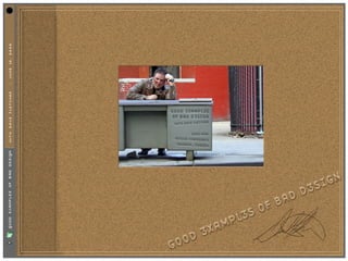
Good Examples of Bad Design

  • 1. WITH DAVE FLETCHER :: JUNE 10, 2002
  • 2. :: JUNE 10, 2002 BOOK I FLETCHER DAVE WITH WHERE BAD D3SIGN COMES FROM
  • 3. 1. LEGAL RED TAPE. :: JUNE 10, 2002 • When corporate lawyers get involved with contracts, problems arise. FLETCHER DAVE WITH
  • 4. 1. LEGAL RED TAPE. :: JUNE 10, 2002 11. FOCUS GROUPS • Testing proves how the audience feels at that moment. FLETCHER DAVE WITH
  • 5. 1. LEGAL RED TAPE. :: JUNE 10, 2002 11. FOCUS GROUPS 111. TOO MANY COOKS IN THE KITCHEN FLETCHER • How many design team members does it DAVE take to screw in a lightbulb? WITH
  • 6. 1. LEGAL RED TAPE. :: JUNE 10, 2002 11. FOCUS GROUPS 111. TOO MANY COOKS IN THE KITCHEN FLETCHER 1v. LACK OF INFORMATION DAVE • Get as much from a client as possible WITH before starting a project.
  • 7. 1. LEGAL RED TAPE. :: JUNE 10, 2002 11. FOCUS GROUPS 111. TOO MANY COOKS IN THE KITCHEN FLETCHER 1v. LACK OF INFORMATION DAVE v. TOO MUCH INFORMATION WITH • Loading up an advertisement with words will not make a client read it.
  • 8. 1. LEGAL RED TAPE. :: JUNE 10, 2002 11. FOCUS GROUPS 111. TOO MANY COOKS IN THE KITCHEN FLETCHER 1v. LACK OF INFORMATION DAVE v. TOO MUCH INFORMATION WITH v1. BAD CHOICES • Fonts, Colors and Legibility must be consistent with a targeted audience.
  • 9. 1. LEGAL RED TAPE. :: JUNE 10, 2002 11. FOCUS GROUPS 111. TOO MANY COOKS IN THE KITCHEN FLETCHER 1v. LACK OF INFORMATION DAVE v. TOO MUCH INFORMATION WITH v1. BAD CHOICES v11. FEAR OF FAILURE • Never be afraid to fail. It happens to everyone, and you'll learn from it.
  • 10. :: JUNE 10, 2002 BOOK II FLETCHER DAVE WITH IN THE BEGINNING THERE WAS A PAST 1.THE CODE OF HAMMURABI
  • 11. “If a builder builds a house :: JUNE 10, 2002 and does not make its Construction firm, FLETCHER DAVE WITH and the house which he has built collapse and cause the death of the owner of that house, that builder shall be put to death.”
  • 12. :: JUNE 10, 2002 BOOK II FLETCHER DAVE WITH IN THE BEGINNING THERE WAS A PAST 2.FAILED DESIGN
  • 13. :: JUNE 10, 2002 BOOK II FLETCHER DAVE WITH IN THE BEGINNING THERE WAS A PAST 3.WHAT IS BAD WAS GOOD
  • 14. THE DEVIL'S IN THE DETAILS :: JUNE 10, 2002 Here's how to smoke all you want- If you really enjoy smoking, yet feel you smoke too much, you don't have to cut down and deprive yourself of smoking pleasure! FLETCHER Follow the lead of thousands of others - switch to new Julep Cigarettes. Smoke all you want DAVE without unpleasant symptoms of oversmoking! A smoking miracle? Yes, it's the triple miracle of WITH mint. (1) Your mouth doesn't get smoke-weary! (2) Your throat doesn't get that harsh, hacking feeling! (3) Your breath avoids tobacco-taint! Get Juleps today - get more joy out of smoking!
  • 15. :: JUNE 10, 2002 “That Design is for the Birds.” FLETCHER DAVE WITH PAUL RAND (1914–1996)
  • 16. :: JUNE 10, 2002 BOOK III FLETCHER DAVE WITH FAST FORWARD TO THE PRESENT 1.WEBSLIGHTS
  • 17. WITH DAVE FLETCHER :: JUNE 10, 2002 where did it all go wrong?
  • 18. iDNA intelligent dynamic network aesthetic European Business Forum iDNA prototype v1.0 iDNA ARTIFACT IS ©2k METHODFIVE, ALL RIGHTS RESERVED
  • 19. The increasing level of competition in virtually every industry has forced company decision-makers to pinpoint new methods of gaining a market advantage. As a result, more businesses understand the value of integrating strategic design decisions with their products, marketing efforts and identities. Communication design is becoming as important a competitive business edge as manufacturing, product selection, quality, pricing or distribution channels. Effectively designed communication establishes vital links between a company and its target audience. As technology progresses and becomes more infused in the everyday world, businesses are presented with a growing number of options for developing these links. Because of all the media available, and the surplus of messages aimed at every audience, it is crucial that communication be effectively designed. As a leading design agency, methodfive determines a client’s message and chooses the most effective way to transmit that message. Whether spoken, felt, heard or read, it is a matter of transforming intangible ideas into tangible objects. Interactive media, the Internet in particular, is exciting because it allows for the creation of lush environments, which encourage and reward participation. The objects of these environments are more than just a lexicon of sounds, colours, forms and spatial arrangements that define the circumstances surrounding the individual - they are the vehicles for encounters and confrontations. Understanding this is crucial to the success of designing in the digital age. The media thinker and author, Marshall McLuhan explains in his seminal book, The Medium is the Message, that: “the vested interests of acquired knowledge and conventional wisdom have always been by-passed and engulfed by new media.” This observation strikes to the heart of the designer’s contemporary dilemma. One who is trained in the correct methods of professional photography, illustration, graphic and typographic design but who lacks the experience of applying design principles to an interactive environment is continually ambushed as technological innovations and new creative directions challenge conventional wisdom. All too often, switched-on designers focus too heavily on exploring design as it relates to an interactive environment such as the Internet. It is imperative that new media designers understand that man is the actual medium of expression, not the tool he elects to use as a means. Results alone should be appraised; the way in which these are achieved is of importance only to the designer. To the extent that the completed design realizes depth of understanding, uniqueness of viewpoint and vitality of presentation, will the user respond and participate in the experience. from DesiGn in the DigItal Age -by anthony shafto, art director:methodfive UK iDNA intelligent dynamic network aesthetic iDNA ARTIFACT IS ©2k METHODFIVE, ALL RIGHTS RESERVED
  • 20. Page layout Establish Visual Hierarchy Internet users seek clarity, order, and trustworthiness in a websites diverse information sources. The spatial organization of graphics and text on an a Web page can engage the user with graphic impact, direct the user's attention, prioritise information, and make the user's interactions with the website more enjoyable and more efficient. The primary task of graphic design is to create a strong, consistent visual hierarchy, where important elements are emphasized, and content is organized logically and predictably. Graphic design is visual information management using the tools of layout, typography, and illustration to lead the eye through the page. Visitors see pages first as large masses of shape and colour with foreground elements contrasted against the background field. Only secondarily do they begin to pick out specific information, first from graphics if they are present, and only afterward do they start parsing the "harder" medium of text and begin to read individual words and phrases. Thus the overall graphic balance and organization of the page is crucial to drawing the visitor into your content. A dull page of solid text will repel the eye as a mass of undifferentiated grey, but a page dominated by poorly designed or overly bold graphics or type will also repel sophisticated users looking for substantive content. website design demands an appropriate balance that attracts the eye with visual contrast. organized iDNA intelligent dynamic network aesthetic iDNA ARTIFACT IS ©2k METHODFIVE, ALL RIGHTS RESERVED
  • 21. Page layout Create Visual Balance Graphic design creates visual logic, an optimal balance between visual sensation and graphic or text information. Without the visual impact of shape, colour, and contrast, pages are often graphically boring and will not motivate the viewer to investigate their contents. Dense text documents without the contrast and visual relief offered by graphics and careful page layout and typography are also more difficult to read, particularly on the relatively low-resolution screens of current personal computers. However, without the depth and complexity of text, highly graphic pages risk disappointing the user by offering a poor balance between visual sensation, text information, and hyperlinks. In seeking this ideal balance, the primary graphic design constraints in Web pages are the vertical, list-oriented structure of HTML as seen in current Web browsers, and the practical bandwidth limitations on user access rates which runs the gamut from 14.4 to T1 (a connection speed of 28.8 has been identified as the standard against which all design and build will be measured). Visual and functional continuity in EBF's site organization, graphic design, and typography is essential to convince users that the site offers them timely, accurate, and useful information. A careful, systematic approach to page design will simplify navigation, reduce errors, and make it much easier for users to take full advantage of the information and features of the EBF site and will also make it much easier for the maintenance team to manage and update the site. organized balance iDNA intelligent dynamic network aesthetic iDNA ARTIFACT IS ©2k METHODFIVE, ALL RIGHTS RESERVED
  • 22. Page layout Direct the Eye In the West readers of English read from left to right, and from the top of the page to the bottom. This fundamental visual axis dominates most design decisions, and is the basis for most conventional graphic design of print publications. In page layout the top of the page is always the most dominant location, but on Web pages the upper page is especially important, because the top four inches of the page is all that is visible on the typical 14 to 16 inch monitor. Avoid Graphic Distractions The EBF design must avoid complex graphic embellishments. Horizontal rules, graphic bullets, icons, and other visual markers have appropriate uses, but should be applied sparingly to avoid a patchy and confusing layout. The tools of graphic emphasis are powerful, and should be used only in small doses for maximum effect. organized balance direction iDNA intelligent dynamic network aesthetic iDNA ARTIFACT IS ©2k METHODFIVE, ALL RIGHTS RESERVED
  • 23. Page layout Be Consistent EBF's design should establish a layout grid and a style for handling text and graphics and then stick with it to build a consistent rhythm and unity across all pages of the site. Repetition with purposeful intent is not boring; it will give the website a consistent graphic identity that reinforces a distinct sense of "place," which makes the visitors’ experience more memorable. A consistent approach to layout and navigation will allow visitors to quickly adapt to the design, and to confidently predict the location of information and navigation controls across the pages of the site. There is no single design grid system that is appropriate for the EBF site. The first consideration in the project is to establish the basic layout grid for the site’s pages. With this graphic "backbone" design establishes how the major blocks of type and illustrations will regularly occur in the pages, and set the placement and style guidelines for major screen titles, subtitles, and navigation links or buttons. It isn't possible to predict how every particular combination of text and graphics will interact on the screen, but it is important to examine layout "sketches" against both the most complex and least complex pages. The goal is to quickly establish a consistent, logical screen layout, and one that allows the site’s editorial staff to quickly "plug in" text and graphics for each page. Without a firm underlying design grid, page layout will be driven by the problems of the moment, and the overall design of the site will look patchy and visually confusing. organized balance direction iDNA rhythm intelligent dynamic network aesthetic iDNA ARTIFACT IS ©2k METHODFIVE, ALL RIGHTS RESERVED
  • 24. eBf "The European Business Forum is an influential, Euro-centric source of debate, knowledge and information, which enable senior and aspiring (business) decision takers worldwide to gain competitive edge in the emerging global marketplace." ...and it is more >> iDNA intelligent dynamic network aesthetic iDNA ARTIFACT IS ©2k METHODFIVE, ALL RIGHTS RESERVED
  • 25. The publishing vertical is perhaps the most difficult and dangerous online venture. Nicholas Negroponte, head of the MIT Media Lab, has reasoned that the internet is causing a shift from atoms to bits. As digital information separates itself from various media and begins to disseminate across networks in its purest form, we find that the economic model for the entire publishing industry no longer applies. Information was once valued in part because of the media to which it was bound. The digitization of information has iDNA liberated it, and consequently left us in the disoriented state of questioning how to value information alone. The challenge of publishing online revolves around providing information that is more relevant and concise. Inevitably, the question of interface arises. No other element of an application can more powerfully assist or impede a user’s attempt to not merely receive, but absorb information. Finding an intelligent dynamic network aesthetic equilibrium between minimizing a user’s attention and time, and maximizing the precision and quantity of the information is the key to successful online publishing. State oF the enVIronMent authority intelligence iDNA ARTIFACT IS ©2k METHODFIVE, ALL RIGHTS RESERVED
  • 26. "competitors are never enemies. They "competitors are never enemies. They are unknowing educators.” are unknowing educators.” D@ve Fletcher, Creative Director:methodfive methodfive believes the key to any online initiative is a detailed analysis of our client’s competition. It is the valuable data gathered from this research, including detailed color palettes, common navigational elements, and industry trends, that steer our methodology in the creation of something that exceeds our clients' expectations. iDNA intelligent dynamic network aesthetic iDNA DOCUMENT IS ©2K METHODFIVE, ALL RIGHTS RESERVED
  • 27. FORRESTER • Forrester is a leading independent research firm that analyzes the future of technology change and its impact on businesses, consumers, and society. The website uses a standard left-side navigational structure with an emphasis on both client and guest logins. • The homepage features a very compartmentalized content area area which is graphically and structurally powerful. Important links are easily identified and persuasive in their subtlety. Adding to the persuasiveness of the homepage is the calm color palette. The user enters the site and is immediately not overcome by the amount of information that is available. • Essentially, Forrester is a site which requires subscriptions for most of the available content. A guest login account will remain active for 90 days to allow the visitor to discover the relevance of the content before subscribing. ( see gravity well ) The large, organic circle frames links to research polls and visitor input. The circular image breaks up the strict division of space with an organic touch. primary secondary palette [primary] The primary color palette for the Forrester site combines natural, casual pastels with a iDNA touch of vibrant orange highlight. The mood created is very calming and skillfully creates a balance between tasteful and inviting. intelligent dynamic network aesthetic iDNA DOCUMENT IS ©2K METHODFIVE, ALL RIGHTS RESERVED
  • 28. page title LOGO headline date LOGO FORRESTER login login advert join content advert navigation secondary nav • The elements of the secondary pages remain news information relatively consistent. All navigational elements remain, with the addition of secondary navigation navigation interaction which appears directly under the chosen section. join • Content is spaced out appropriately, and the white timely info mission empty space to the right creates a more direct focus join to the secondary navigational elements. join upcoming events • The headline from the homepage is replaced with employment search a section header, simply giving another point of focus of location to the visitor. statement • A most interesting point is that the number of copyright navigational elements and repetition of links is understated by the simple spacious nature of the site. The site never feels crowded to the eye, yet inquiries features plenty of worthwhile content. contact primary secondary palette [secondary] The secondary palette follows the homepage colors with a minor shift. White iDNA is introduced as a main background color to first, support printing of information, and second, to allow the eye to focus on the appearance of secondary navigation at the left. The overall feel of the site remains consistent. intelligent dynamic network aesthetic iDNA DOCUMENT IS ©2K METHODFIVE, ALL RIGHTS RESERVED
  • 29. TheStreet.com • TheStreet.com: Sly, irreverent, to the point. TheStreet is a site which features plenty of content which is valuable to the Wall Street Banker, CEO or casual day trader. • Immediate focus is given to the number of images used to represent regular columns. And available links to content are rendered in a high contrast color for secondary focus. • The navigation forces the audience to scroll, yet the content is incredibly dense and without focus. There are too many hyperlinks, making it difficult to pinpoint pertinent information. primary secondary palette [main] The same palette is used throughout the site, whether the visitor is at the homepage or within interior pages. Simple colour iDNA shifts would have given the visitor a clearer picture the different areas. Perhaps even a subtle colour shift between paid and free areas would have been appropriate. The palette is made of neutral, non- intelligent dynamic network aesthetic offensive tones. The main highlight is the green colour within the navigation playing off of the logo. Dull, tans/yellows fill the background and subsequent content navigation areas. They give the site a simple, implied dignity. The green alludes to money and the red is a nice complement to highlight the subscription area. iDNA DOCUMENT IS ©2k METHODFIVE, ALL RIGHTS RESERVED
  • 30. advert TheStreet.com subscription logo subscription logo inquiry inquiry date phone date phone paid main paid navigation story navigation • Advertising is kept to a minimum and is toolbox/ toolbox/ quotes markets quotes mostly restricted to the right column. Both self [free content] and outside advertising co-exist, creating color top-level navigation top-level navigation free free navigation navigation harmony between the advertising and the self- advert content. search featured search advert • The use of a columnar layout, in combination breaking news [free content] commentary [paid content] advert self- with the density of information creates a sponsored area sponsored area advert cascade, assisting the user's attention in moving down the page. Noting immediately subscribe community subscribe FAQ what content is free and what is premium is community content self- also extraordinarily useful to the user and a advert legal/info/ advert good use of information to pull the user into a legal/info/ policies policies relationship. advert advert • The frameset at the bottom of the page, self- news & analysis which contains a stock ticker, visible advert community [paid content] chat throughout the experience at TheStreet.com is advert an appropriate use of frames to give the user a advert consistency of needed content. advert finance featured [free content] commentator [paid content] featured commentary list [paid content] main stocks in frameset main stocks in frameset primary secondary palette [main] The same palette is used throughout the site, whether the visitor is at the homepage or within interior pages. Simple color shifts iDNA would of given the visitor a clearer picture the different areas. Perhaps even a subtle color shift between paid and free areas would have been appropriate. The palette is made of neutral, non- intelligent dynamic network aesthetic offensive tones. The main highlight is the green color within the navigation playing off of the logo. Dull, tans/yellows fill the background and subsequent content navigation areas. They give the site a simple, implied dignity. The green alludes to money and the red is a nice complement to highlight the subscription area. iDNA DOCUMENT IS ©2k METHODFIVE, ALL RIGHTS RESERVED
  • 31. FASTCOMPANY • FastCompany is an online companion to the printed publication. The magazine writes about the new economy and workplace for people who believe in fusing tough-minded performance with human values. • Confusion of interface values is apparent with a sloppy, double navigation structure which follows neither a decided order or reasonable repetition. Some elements are carried into the left and right navigation are also available at the top. The inconsistency of available navigational elements causes a level of confusion. Additionally, as graphical elements, the navigation suffers from inconsistent implementation as well. • The absence of a banner on the homepage is refreshing, with both internal and external advertising placed on the left and right side in small, unobtrusive boxes. • Content is organized in a compartmentalized newspaper format; the main story leads at the top with features and community cascading into links and quotes. The links help to differentiate the online product from the printed publication. The separation of orange to white columns creates focus on the content. primary secondary palette [primary] FastCompany online follows the color palettes defined by the printed publication. iDNA The serious, deep red creates a dynamic to the lighthearted combination orange and whites. The orange and red stick to the warm side of the tonal scales. The colors of the navigational elements (see top navigation) are so severely in competition with the color palette, they create intelligent dynamic network aesthetic distraction. Sticking with variances of the initial palette would be more appropriate. iDNA DOCUMENT IS ©2K METHODFIVE, ALL RIGHTS RESERVED
  • 32. LOGO NAVIGATION BANNER AD LOGO NAVIGATION FASTCOMPANY INTERNAL ADVERT MAIN INTERNAL ADVERT FEATURE • The secondary pages of fastcompany lose the NAVIGATION NAVIGATION NAVIGATION NAVIGATION PRINT SECTION CONTENT left and right navigation of the homepage and NAVIGATION NAVIGATION NAVIGATION NAVIGATION INFO divide into a two column format. The left section is reserved for placeholding more ADVERT ADVERT COMMUNITY advertising and confusing imagery. INTERNAL INTERNAL • Colors change to match the colors associated ADVERT ADVERT with the top navigation in every instance with INTERNAL ADVERT the exception of << THEMES >>. Consistency DISCUSSION EMAIL FEATURES is overlooked and sets the tone of "amateur" ONLINE CAPTURE throughout the experience. • The use of white within content areas in secondary pages continues the "white signifies ARCHIVE FEATURE content" theme throughout the site. • Stylized artwork mixed with photographic LINKS elements looks unprofessional in the secondary pages. • Frequently Asked Questions are buried within the legal footer hyperlinks, and feel like QUOTES an afterthought. PRINT OPTION LOGO NAVIGATION LEGAL LOGO NAVIGATION LEGAL primary secondary palette [secondary] The variance of color from page to page at the secondary level is worth noting, iDNA because when implemented properly, can be successful in branding pages unto themselves. When the user returns, they become familiar with a particular color combination of a navigational element. No matter how large the site becomes in the future with addition of other navigational intelligent dynamic network aesthetic elements, the user can intuitively define where they want to go with minimum effort. iDNA DOCUMENT IS ©2K METHODFIVE, ALL RIGHTS RESERVED
  • 33. thestandard.com • TheStandard is the online version of the Industry Standard publication, and functions as an up-to-date news resource for the internet business community. • Curved boxes serve as a departure point from the strict-edged column structure of the printed publication. However, this "organic" approach fights with the angular online logo (upper left of page), leaving the logo feeling like a secondary thought. This becomes a barrier to the realization of a well branded site. • The use of a subdued yellow (a color choice from the actual publication) within the logo creates an accent that should be reiterated as an accent to important articles or sections. Again, this is a lack of branding consistency, and a failure to relate the site to the print magazine. • Content may or may not be organized by immediate relevance due to the lack of date or time of posting for individual articles. • Advertising is carefully separated with self- advertising located below the main navigation and industry relevant advertising located to the right. primary secondary palette [primary] TheStandard's color palette is a reflection of the magazine. Casual, classic colors with iDNA a cerebral gray background denotes intelligence mixed with a laid-back comfortable atmosphere. The soft yellow, used as an occasional accent to articles within the printed publication is present only in the online version of the logo. The which displays compartmentalization intelligent dynamic network aesthetic without a focus on its relevance to the internet economy. iDNA DOCUMENT IS ©2k METHODFIVE, ALL RIGHTS RESERVED
  • 34. logo advertising logo advertising thestandard.com search personalized navigation date search personalized navigation date • The navigation, expanded at the homepage main level, becomes condensed at the secondary top advert navigation top advert news [condensed] news/ articles levels showing only select elements of the subsection menu. It would seem that a color main coding of individual sections would have navigation allowed the secondary levels to be present at opinion posts special self- all interior levels. DHTML may have been reports advert advert [subscribe] advert utilized to shorten the main navigation with pull-out subsections if space was an issue. • The color choices at interior levels is directory job recruitment opinions/ Related Links inconsistent. Some subsections feature the same colors, while others feature radical shifts self- advert self- in secondary colors. advert [subscribe] events special reports • The intelligent Industry Standard charts are missed at the homepage level. While too many charts become an unecessary distraction, daily metric TheStandard online missed an opportunity to highlight the Metrics which are a major point self- advert of interest in the printed publication. • The Personalized navigation takes the visitor to an inconsistent series of pages. They lack the main navigation areas of the content pages located within the left column advert advert footer footer primary secondary palette [secondary] TheStandard's secondary palettes become inconsistent as the visitor explores the iDNA sections. Some sections feature a radical color shift (see events section). Others feature the same palettes as the homepage while others have a slight variance in color (purple to blue). The most alarming inconsistency within the palettes is the varied colors within single sections. In intelligent dynamic network aesthetic companies, for example, green is the highlight for one subsection, while blue is the highlight for another subsection. It is this lack of coordination between sections which, ultimately, will confuse the visitor to TheStandard. iDNA DOCUMENT IS ©2k METHODFIVE, ALL RIGHTS RESERVED
  • 35. :: JUNE 10, 2002 Marketing Misfires FLETCHER Coors translated its slogan, DAVE "Turn it loose," into Spanish, WITH where it was read as "Suffer from diarrhea."
  • 36. :: JUNE 10, 2002 irritating information architecture. FLETCHER DAVE WITH Step 1. : enter the site.
  • 37. :: JUNE 10, 2002 irritating information architecture. FLETCHER DAVE WITH Step 2. : navigate.
  • 38. 1. Don't assume that an underaged drinker will not figure out a date that will give them :: JUNE 10, 2002 access to your site. irritating information architecture. FLETCHER 2. What “secret” drinking information could be provided on coors.com that an underaged kid DAVE could find out? WITH Step 3. : re-verify your age?
  • 39. :: JUNE 10, 2002 FLETCHER DAVE WITH Step 4. : Read an ad about the dangers of underage drinking.
  • 40. :: JUNE 10, 2002 FLETCHER DAVE http://www.johnsonandjohnson.com WITH
  • 41. WITH DAVE FLETCHER :: JUNE 10, 2002
  • 42. WITH DAVE FLETCHER :: JUNE 10, 2002
  • 43. “It is our job as designers to create effective representations :: JUNE 10, 2002 of information for human consumption.” FLETCHER JEF RASKIN (INVENTOR OF THE MACINTOSH) DAVE WITH
  • 44. WITH DAVE FLETCHER :: JUNE 10, 2002
  • 45. WITH DAVE FLETCHER :: JUNE 10, 2002 Top Half of Site.
  • 46. WITH DAVE FLETCHER :: JUNE 10, 2002 (navigation) Bottom of Site.
  • 47. WITH DAVE FLETCHER :: JUNE 10, 2002 Et Tu, Dio?
  • 48. :: JUNE 10, 2002 BOOK III FLETCHER DAVE WITH FAST FORWARD TO THE PRESENT 2.TOO MUCH INFORMATION
  • 49. WITH DAVE FLETCHER :: JUNE 10, 2002 36 Cars.
  • 50. 1 3 #12 Jeremy Mayfield Ford Mobil 1 185/10 200 Running $111,580 2 1 #24 Jeff Gordon Chevrolet DuPont 175/5 200 Running $79,500 3 9 #88 Dale Jarrett Ford Quality Care/ Ford Credit 170/5 200 Running $62,220 4 28 #99 Jeff Burton Ford Exide Batteries 165/5 200 Running $49,080 5 6 #6 Mark Martin Ford Valvoline 160/5 200 Running $40,645 6 18 #1 Darrell Waltrip Chevrolet Pennzoil 155/5 200 Running $28,725 :: JUNE 10, 2002 7 14 #50 Wally Dallenbach Chevrolet Budweiser 151/5 200 Running $34,575 8 11 #3 Dale Earnhardt Chevrolet GM Goodwrench Service Plus 147/5 200 Running $34,625 9 15 #40 Sterling Marlin Chevrolet Coors Light 138/0 200 Running $23,825 10 34 #23 Jimmy Spencer Ford Winston 134/0 200 Running $41,975 11 36 #28 Kenny Irwin * Ford Texaco/ Havoline 130/0 200 Running $33,175 12 12 #5 Terry Labonte Chevrolet Kellogg's Corn Flakes 127/0 200 Running $32,025 FLETCHER 13 19 #43 John Andretti Pontiac STP 124/0 200 Running $31,425 14 29 #21 Michael Waltrip Chevrolet Citgo 121/0 200 Running $27,575 15 23 #18 Bobby Labonte Pontiac Interstate Batteries 123/5 200 Running $31,675 DAVE 16 32 #77 Robert Pressley Ford Jasper Engine's/Federal-Mogul 120/5 200 Running $20,275 WITH 17 8 #16 Ted Musgrave Ford PRIMESTAR 112/0 200 Running $25,825 18 35 #11 Brett Bodine Ford Paychex 114/5 200 Running $25,525 117.801 mph
  • 51. WITH DAVE FLETCHER :: JUNE 10, 2002 Cheap Beer.
  • 52. :: JUNE 10, 2002 FLETCHER DAVE WITH Cheap Beer. (sorry Anheuser-Busch...)
  • 53. WITH DAVE FLETCHER :: JUNE 10, 2002 Too much information.
  • 54. Coast Guard :: JUNE 10, 2002 FLETCHER DAVE WITH Too much information.
  • 55. Coast Guard 3M :: JUNE 10, 2002 FLETCHER DAVE WITH Too much information.
  • 56. Coast Guard 3M Penzoil :: JUNE 10, 2002 FLETCHER DAVE WITH Too much information.
  • 57. Coast Guard 3M Penzoil Prestone :: JUNE 10, 2002 FLETCHER DAVE WITH Too much information.
  • 58. Coast Guard 3M Penzoil Prestone GoodYear :: JUNE 10, 2002 FLETCHER DAVE WITH Too much information.
  • 59. Coast Guard 3M Penzoil Prestone GoodYear :: JUNE 10, 2002 76 FLETCHER DAVE WITH Too much information.
  • 60. Coast Guard 3M Penzoil Prestone GoodYear :: JUNE 10, 2002 76 Moog FLETCHER DAVE WITH Too much information.
  • 61. Coast Guard 3M Penzoil Prestone GoodYear :: JUNE 10, 2002 76 Moog Quaker State FLETCHER DAVE WITH Too much information.
  • 62. Coast Guard 3M Penzoil Prestone GoodYear :: JUNE 10, 2002 76 Moog Quaker State True Value FLETCHER DAVE WITH Too much information.
  • 63. Coast Guard 3M Penzoil Prestone GoodYear :: JUNE 10, 2002 76 Moog Quaker State True Value GMAC FLETCHER DAVE WITH Too much information.
  • 64. Coast Guard 3M Penzoil Prestone GoodYear :: JUNE 10, 2002 76 Moog Quaker State True Value GMAC Blah FLETCHER DAVE WITH Too much information.
  • 65. Coast Guard 3M Penzoil Prestone GoodYear :: JUNE 10, 2002 76 Moog Quaker State True Value GMAC Blah Blah FLETCHER DAVE WITH Too much information.
  • 66. Coast Guard 3M Penzoil Prestone GoodYear :: JUNE 10, 2002 76 Moog Quaker State True Value GMAC Blah Blah Blah FLETCHER DAVE WITH Too much information.
  • 67. Coast Guard 3M Penzoil Prestone GoodYear :: JUNE 10, 2002 76 Moog Quaker State True Value GMAC Blah Blah Blah Blah FLETCHER DAVE WITH Too much information.
  • 68. Coast Guard 3M Penzoil Prestone GoodYear :: JUNE 10, 2002 76 Moog Quaker State True Value GMAC Blah Blah Blah Blah Blah FLETCHER DAVE WITH Too much information.
  • 69. Coast Guard 3M Penzoil Prestone GoodYear :: JUNE 10, 2002 76 Moog Quaker State True Value GMAC Blah Blah Blah Blah Blah FLETCHER DAVE Blah WITH Too much information.
  • 70. Coast Guard 3M Penzoil Prestone GoodYear :: JUNE 10, 2002 76 Moog Quaker State True Value GMAC Blah Blah Blah Blah Blah FLETCHER DAVE Blah Blah WITH Too much information.
  • 71. WITH DAVE FLETCHER :: JUNE 10, 2002
  • 72. WITH DAVE FLETCHER :: JUNE 10, 2002
  • 73. WITH DAVE FLETCHER :: JUNE 10, 2002 Designed for confusion.
  • 74. WITH DAVE FLETCHER :: JUNE 10, 2002 Designed for confusion.
  • 75. WITH DAVE FLETCHER :: JUNE 10, 2002 The Land of Confusion.
  • 76. WITH DAVE FLETCHER :: JUNE 10, 2002
  • 77. WITH DAVE FLETCHER :: JUNE 10, 2002