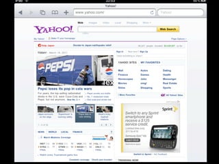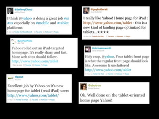

yahoo.com/tablet
   Matt Seeley, @innerhtml
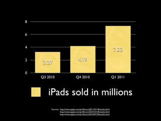
8


6


4
                                                                           7.33
2                                    4.19
    3.27
0
    Q3 2010                        Q4 2010                                 Q1 2011


       iPads sold in millions
         Sources: http://www.apple.com/pr/library/2011/01/18results.html
                  http://www.apple.com/pr/library/2010/10/18results.html
                  http://www.apple.com/pr/library/2010/07/20results.html
Text
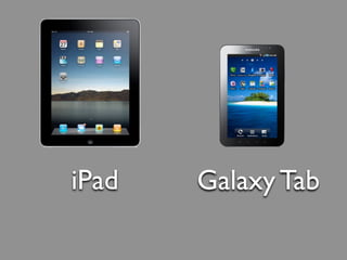
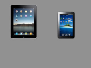
iPad   Galaxy Tab
topics:


today module
@font-face
viewport
today module
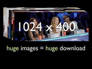
1024 x 400
huge images = huge download
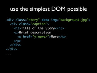
use the simplest DOM possible
<div class="story" data-img="background.jpg">
  <div class="caption">
    <h3>Title of the Story</h3>
    <p>Brief description
       <a href="y!news/">More</a>
    </p>
  </div>
</div>
...
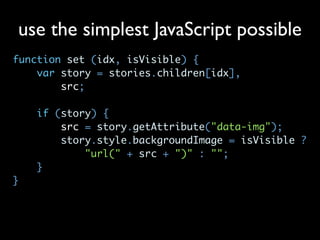
use the simplest JavaScript possible
function set (idx, isVisible) {
    var story = stories.children[idx],
        src;

    if (story) {
        src = story.getAttribute("data-img");
        story.style.backgroundImage = isVisible ?
            "url(" + src + ")" : "";
    }
}
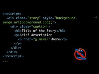
<noscript>
  <div class="story" style="background-
image:url(background.jpg);">
    <div class="caption">
      <h3>Title of the Story</h3>
      <p>Brief description
         <a href="y!news/">More</a>
      </p>
    </div>
  </div>
</noscript>
...
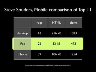
Steve Souders, Mobile comparison of Top 11

                                 reqs                        HTML                           elems


      desktop                      42                       216 kB                           1013


       iPad                        22                         33 kB                              473


      iPhone                       39                       106 kB                           1254


              Source: http://www.stevesouders.com/blog/2011/03/14/mobile-comparison-of-top-11/
@font-face
@angry-face
SVG for iPad
Truetype for Android
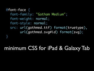
@font-face {
  font-family: "Gotham Medium";
  font-weight: normal;
  font-style: normal;
  src: url(gothmed.ttf) format(truetype),
       url(gothmed.svg#id) format(svg);
}


minimum CSS for iPad & Galaxy Tab
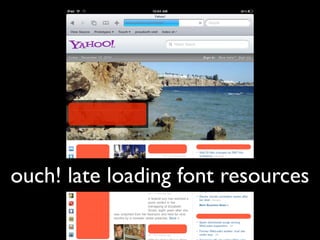
ouch! late loading font resources
<9
   "GET /gothmmed.ttf)
   %20format(truetype),
%20url(gothmmed.svg HTTP/
          1.1" 404
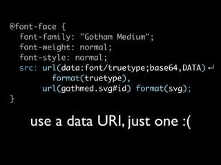
@font-face {
  font-family: "Gotham Medium";
  font-weight: normal;
  font-style: normal;
  src: url(data:font/truetype;base64,DATA)
         format(truetype),
       url(gothmed.svg#id) format(svg);
}


    use a data URI, just one :(
most SVG data URIs
   are too long
data:image/svg+xml;charset=utf-8,
<URI_ENCODED>


     SVG as a data URI
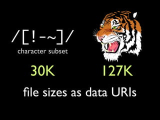
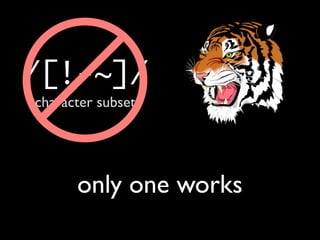
/[!-~]/
character subset

    30K            127K
 file sizes as data URIs
/[!-~]/
character subset


      only one works
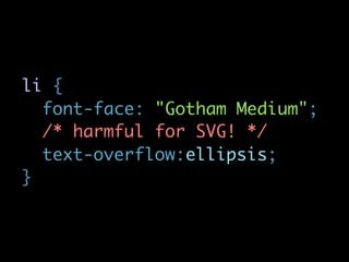
li {
  font-face: "Gotham Medium";
  /* harmful for SVG! */
  text-overflow:ellipsis;
}
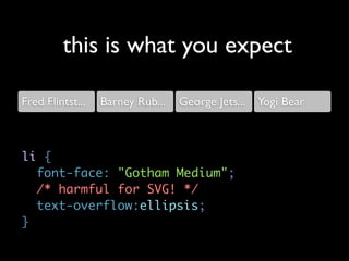
this is what you expect

Fred Flintst...   Barney Rub...   George Jets... Yogi Bear


li {
  font-face: "Gotham Medium";
  /* harmful for SVG! */
  text-overflow:ellipsis;
}
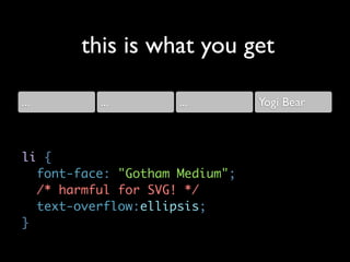
this is what you get

...       ...        ...        Yogi Bear


li {
  font-face: "Gotham Medium";
  /* harmful for SVG! */
  text-overflow:ellipsis;
}
Think twice really-really-long
  before using @font-face
viewport


Source: http://www.flickr.com/photos/dahlstroms/4083220012/
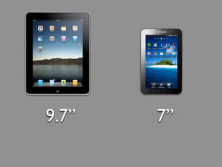
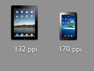
9.7”   7”
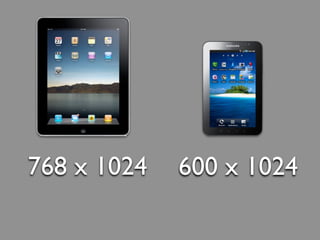
768 x 1024   600 x 1024
132 ppi   170 ppi
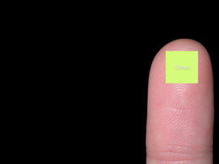
10mm
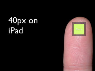
40px on
iPad      10mm
           8mm
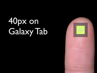
40px on
Galaxy Tab   10mm
              6mm
dots are too
           small to touch!


size input controls
   to be touched
fitting the viewport


    Source: http://www.flickr.com/photos/midorisyu/3124671617/
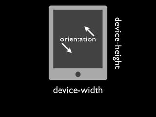
device-height
 orientation


device-width
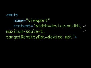
<meta
   name="viewport"
   content="width=device-width,
maximum-scale=1,
targetDensityDpi=device-dpi">
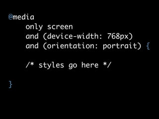
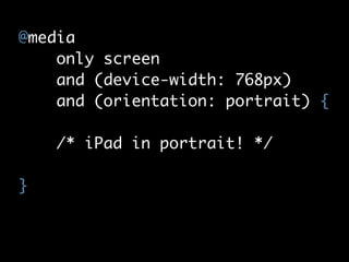
@media
    only screen
    and (device-width: 768px)
    and (orientation: portrait) {

    /* styles go here */

}
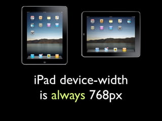
iPad device-width
 is always 768px
@media
    only screen
    and (device-width: 768px)
    and (orientation: portrait) {

    /* iPad in portrait! */

}
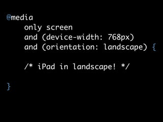
@media
    only screen
    and (device-width: 768px)
    and (orientation: landscape) {

    /* iPad in landscape! */

}
Galaxy Tab device-width is
    600px or 1024px
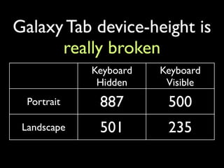
Galaxy Tab device-height is
      really broken
             Keyboard   Keyboard
              Hidden     Visible
  Portrait    887        500
 Landscape    501        235
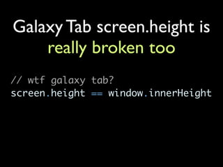
Galaxy Tab screen.height is
    really broken too
// wtf galaxy tab?
screen.height == window.innerHeight
Source: http://www.flickr.com/photos/krupptastic/4988425044/
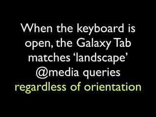
When the keyboard is
  open, the Galaxy Tab
  matches ‘landscape’
    @media queries
regardless of orientation
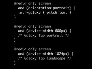
@media only screen
  and (orientation:portrait) {
  .wtf-galaxy { pitch:low; }
}

@media only screen
  and (device-width:600px) {
  /* Galaxy Tab portrait */
}

@media only screen
  and (device-width:1024px) {
  /* Galaxy Tab landscape */
}
#deepbreath
@innerhtml
Galaxy Tab tests & notes   SlideShare
http://goo.gl/I2pkN        http://goo.gl/wAMal
http://goo.gl/DJDME