Does Microsoft have a
lesson to learn about
UX?
Windows 8 is
finally here
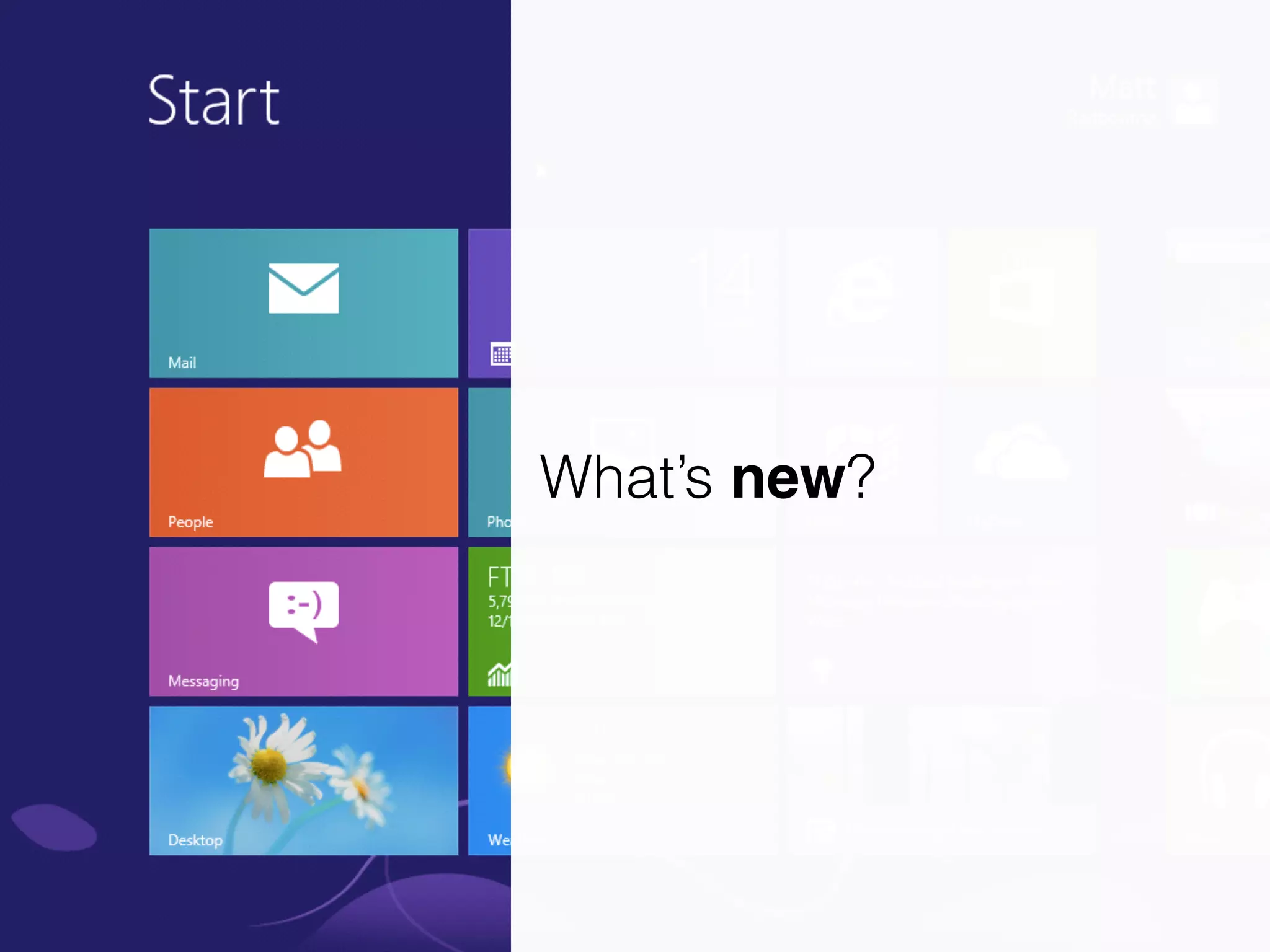
What’s new?
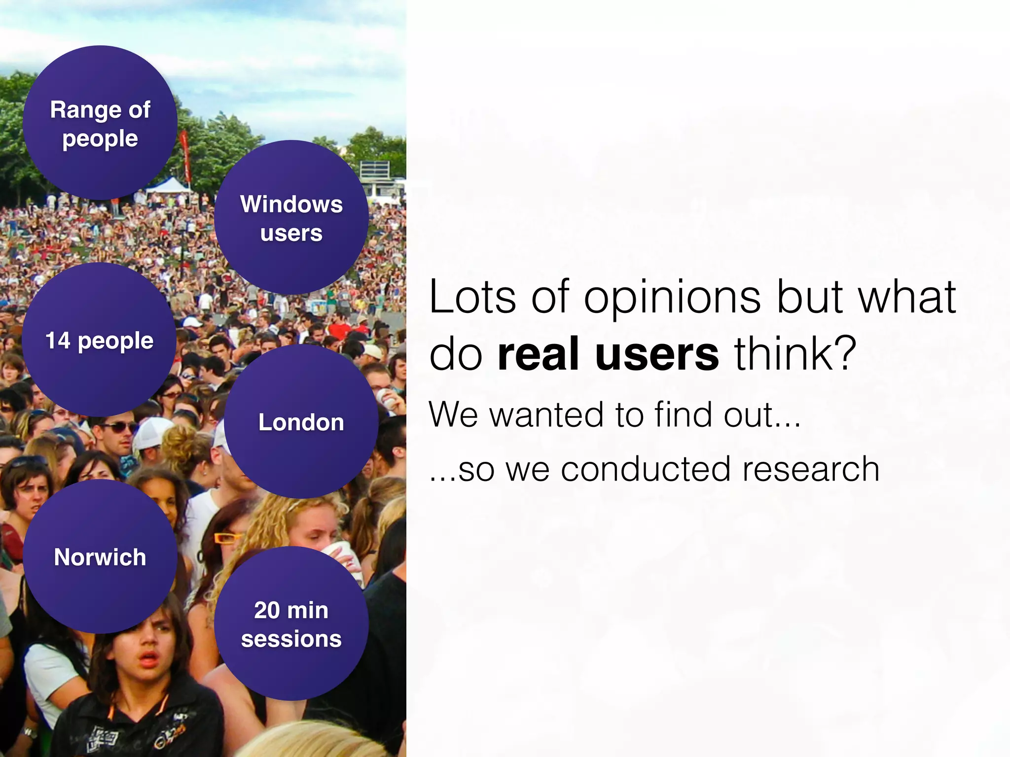
14 people
London
Norwich
20 min

sessions
Range of
people
Windows
users
Lots of opinions but what
do real users think?
We wanted to find out...
...so we conducted research
Not your traditional
usability test
Go: Navigating freely
Do: Completing common tasks
React: Initial impressions
Reflect: Opinions
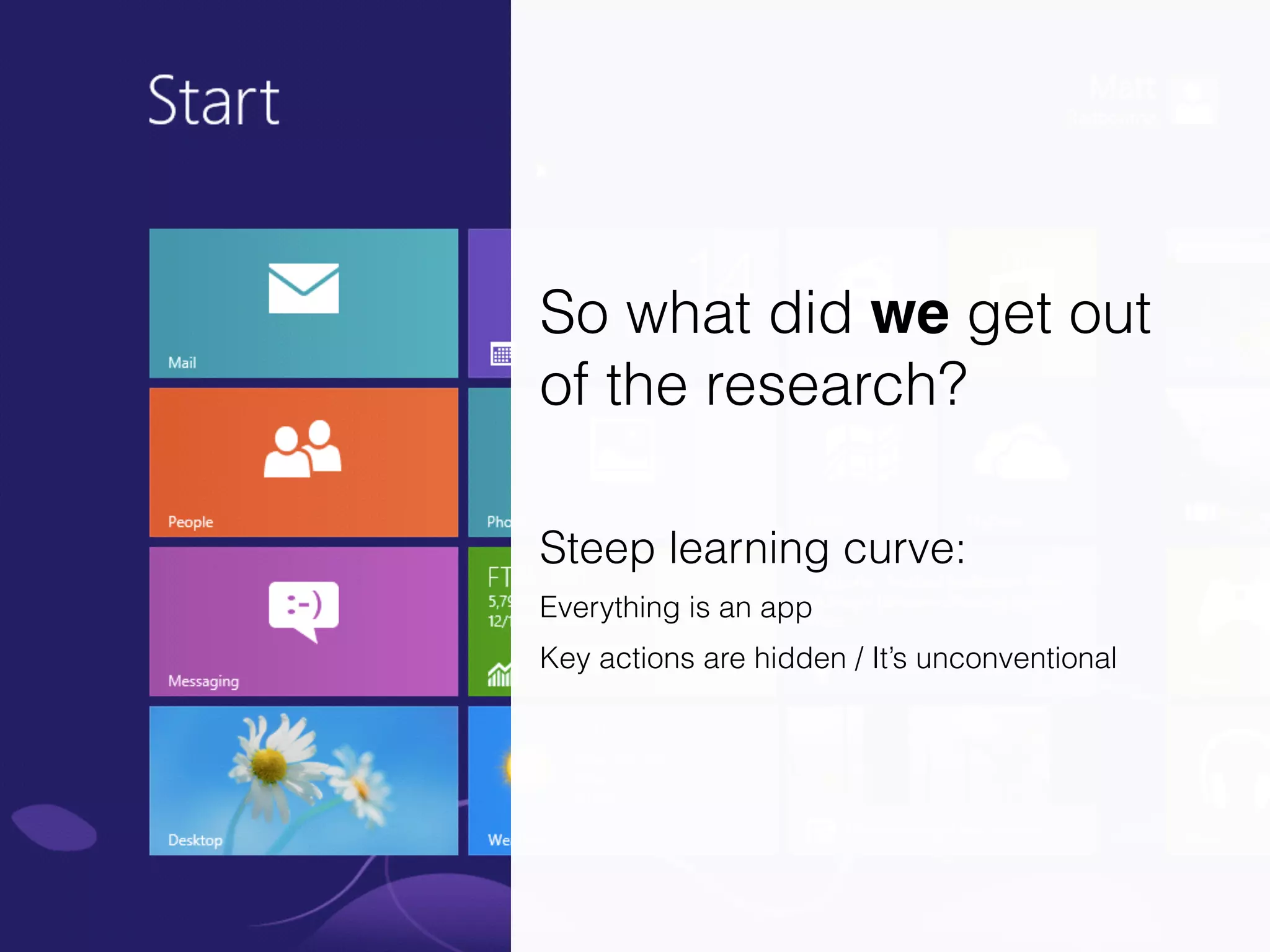
So what did we get out
of the research?
!
Steep learning curve:
Everything is an app
Key actions are hidden / It’s unconventional
Initial reactions
were mixed
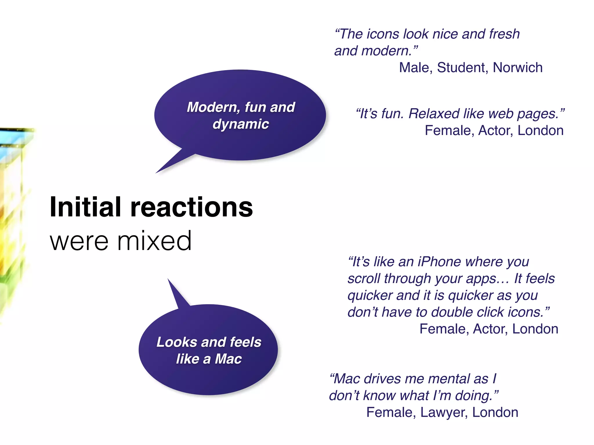
Initial reactions
were mixed
Modern, fun and
dynamic
Looks and feels
like a Mac
“It’s fun. Relaxed like web pages.”!
Female, Actor, London
“The icons look nice and fresh
and modern.”!
Male, Student, Norwich
“It’s like an iPhone where you
scroll through your apps… It feels
quicker and it is quicker as you
don’t have to double click icons.”!
Female, Actor, London
“Mac drives me mental as I
don’t know what I’m doing.”!
Female, Lawyer, London
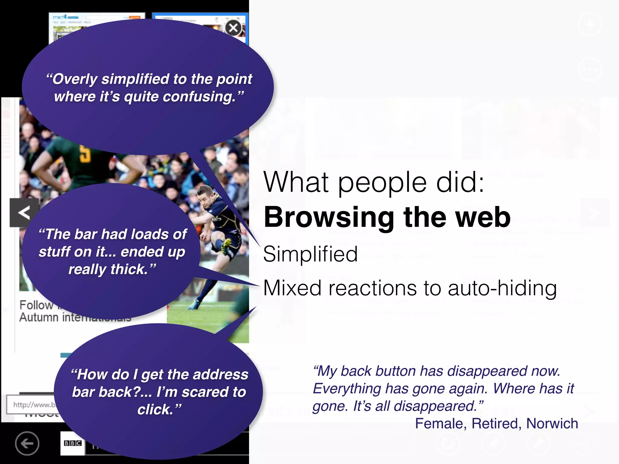
“The bar had loads of
stuff on it... ended up
really thick.”
“How do I get the address
bar back?... I’m scared to
click.”
“My back button has disappeared now.
Everything has gone again. Where has it
gone. It’s all disappeared.”!
Female, Retired, Norwich
“Overly simplified to the point
where it’s quite confusing.”
What people did:
Browsing the web
!Simplified
Mixed reactions to auto-hiding
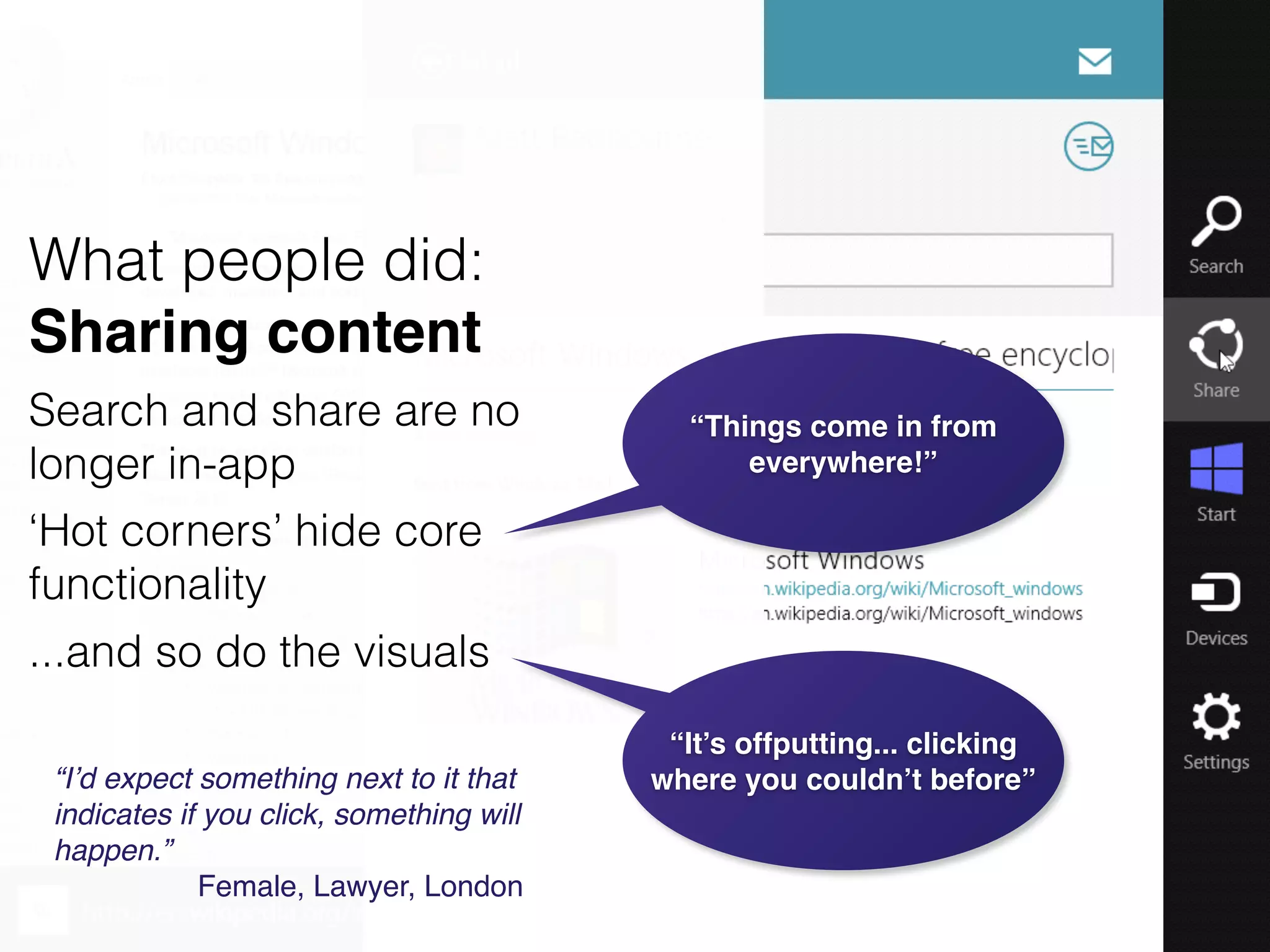
“It’s offputting... clicking
where you couldn’t before”“I’d expect something next to it that
indicates if you click, something will
happen.”!
Female, Lawyer, London
What people did:
Sharing content
Search and share are no
longer in-app
‘Hot corners’ hide core
functionality
...and so do the visuals
“Things come in from
everywhere!”
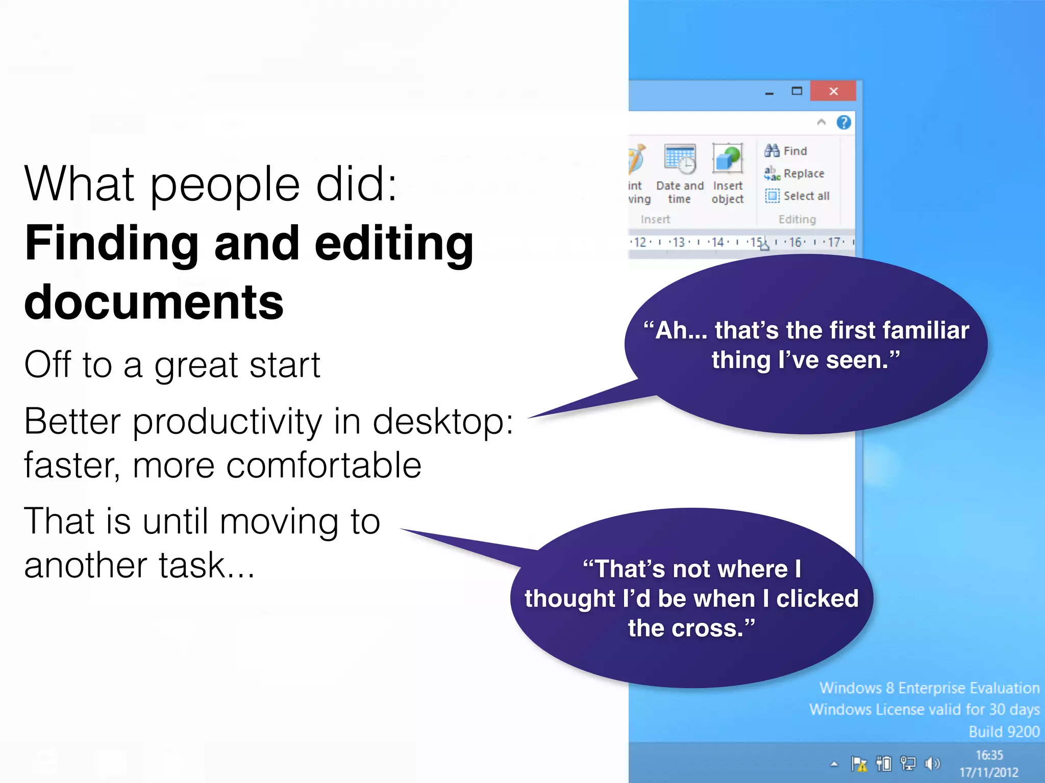
What people did:
Finding and editing
documents
Off to a great start
Better productivity in desktop:
faster, more comfortable
That is until moving to
another task...
“Ah... that’s the first familiar
thing I’ve seen.”
“That’s not where I
thought I’d be when I clicked
the cross.”
“I feel like a baby”"
!
“...can’t even do simple
things...”
“...can’t launch IE...”"
!
“...can’t type in the address...”"
“...can’t use tabs...”
The user journey starts
on the migration path"
!
Overall UX? The jury is still out
We thought it was all about the UX
We discovered it was all about the learning
“...really bad...”"
“...not clear at all...”"
!
“... XP to 7 was really clear...”
Thank you
!
Matt Radbourne
@mradbourne
radbourne.me
foolproof.co.uk
http://www.flickr.com/photos/anirudhkoul/3786725982/
http://www.flickr.com/photos/bvdkruk/5744257462/
http://www.flickr.com/photos/zoharma/115438434/

Windows 8: Does Microsoft have a lesson to learn about UX?

  • 1.
    Does Microsoft havea lesson to learn about UX?
  • 2.
  • 3.
  • 4.
    14 people London Norwich 20 min
 sessions Rangeof people Windows users Lots of opinions but what do real users think? We wanted to find out... ...so we conducted research
  • 5.
    Not your traditional usabilitytest Go: Navigating freely Do: Completing common tasks React: Initial impressions Reflect: Opinions
  • 6.
    So what didwe get out of the research? ! Steep learning curve: Everything is an app Key actions are hidden / It’s unconventional
  • 7.
  • 8.
    Initial reactions were mixed Modern,fun and dynamic Looks and feels like a Mac “It’s fun. Relaxed like web pages.”! Female, Actor, London “The icons look nice and fresh and modern.”! Male, Student, Norwich “It’s like an iPhone where you scroll through your apps… It feels quicker and it is quicker as you don’t have to double click icons.”! Female, Actor, London “Mac drives me mental as I don’t know what I’m doing.”! Female, Lawyer, London
  • 9.
    “The bar hadloads of stuff on it... ended up really thick.” “How do I get the address bar back?... I’m scared to click.” “My back button has disappeared now. Everything has gone again. Where has it gone. It’s all disappeared.”! Female, Retired, Norwich “Overly simplified to the point where it’s quite confusing.” What people did: Browsing the web !Simplified Mixed reactions to auto-hiding
  • 10.
    “It’s offputting... clicking whereyou couldn’t before”“I’d expect something next to it that indicates if you click, something will happen.”! Female, Lawyer, London What people did: Sharing content Search and share are no longer in-app ‘Hot corners’ hide core functionality ...and so do the visuals “Things come in from everywhere!”
  • 11.
    What people did: Findingand editing documents Off to a great start Better productivity in desktop: faster, more comfortable That is until moving to another task... “Ah... that’s the first familiar thing I’ve seen.” “That’s not where I thought I’d be when I clicked the cross.”
  • 12.
    “I feel likea baby”" ! “...can’t even do simple things...” “...can’t launch IE...”" ! “...can’t type in the address...”" “...can’t use tabs...” The user journey starts on the migration path" ! Overall UX? The jury is still out We thought it was all about the UX We discovered it was all about the learning “...really bad...”" “...not clear at all...”" ! “... XP to 7 was really clear...”
  • 13.