Wachovia.com Redesign

An Exploration of Redesign Challenges
ASIST IA Summit
March 22, 2003
Samantha Bailey, VP Information Architecture
Wachovia Corporation
whoami
•

•
•
•

Samantha Bailey, VP Information
Architecture, Wachovia Corporation (2
yrs)
Former Argonaut (5 years)
Generalist by choice, taxonomy & CV
fanatic by nature
MILS, University of Michigan, 1996
Overview
•
•
•
•

Origins of the “site dilemma”
The battle for the homepage
Access to online banking
UCD methodology…user-centered
site?
Background
• Consolidation (Sun Trust)
• Merger vs. acquisition &“Merger of
equals”
• The new Wachovia would dominate
retail banking on east coast, 1/3
business market, significant wealth
clientele
What does this have to do with web design?
The Site “ Dilemma”
• Merge two robust, fully branded
websites (with loyal customer bases)
• 24-month, multi-product, multi-state
conversion (9/01-8/03)
• Geographically agnostic medium
• Maintain channel parity with branches
and call centers
• Minimize customer impact
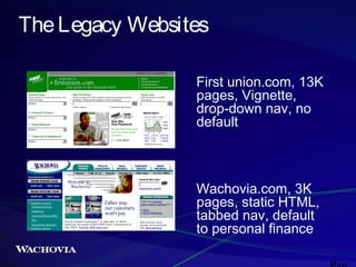
The Legacy Websites
First union.com, 13K
pages, Vignette,
drop-down nav, no
default

Wachovia.com, 3K
pages, static HTML,
tabbed nav, default
to personal finance
Options
•
•
•
•

“Ostrich” (keep both legacy sites)
“Two-step” (move to legacy blue)
“Compromise” (split logo)
“White Lightening” (new brand)

Profound impacts on IA dev (time,
flexibility)
Shifting Ground
• eCommerce group’s role: lead or
follow?
• Channel parity
• National vs. regional brand campaigns
• A new approach to consumer deposits
emerged, with an 11/22/02 launch date
The Site Solution
• Maintain both legacy sites 9/1/0211/22/02
• Move line of business content to
“surviving” platform, branded legacy
Wachovia, with pre-11/22 conversions
• Launch a new, fully branded and
redesigned Wachovia.com website
11/22/02 (deposits)
Site Solution Rationale
• Wachovia.Com surviving domain name
• Maximum promotion of brand with
minimum confusion
• Customer experience consistent with
LOB conversion(s)
• Mirrors LOB conversion
communications
The Battle for the Homepage
• Does anyone use “public space” on a
banking website?
• LOB assumption flatly: NO
• “My content must be on the homepage
or it won’t be seen!”
At what point in the IA
development process
should the homepage be
designed?
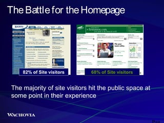
The Battle for the Homepage

82% of Site visitors

68% of Site visitors

The majority of site visitors hit the public space at
some point in their experience
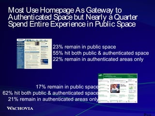
Most Use Homepage As Gateway to
Authenticated Space but Nearly a Quarter
Spend Entire Experience in Public Space
23% remain in public space
55% hit both public & authenticated space
22% remain in authenticated areas only

17% remain in public space
62% hit both public & authenticated space
21% remain in authenticated areas only
PHEW!
But how to get our business partners to
believe the research?
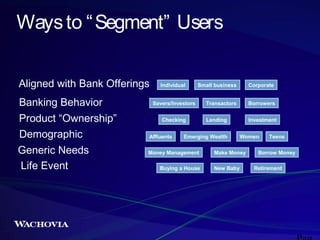
Ways to “ Segment” Users
Aligned with Bank Offerings
Banking Behavior
Product “Ownership”
Demographic
Generic Needs
Life Event

Individual

Small business

Corporate

Transactors

Borrowers

Lending

Investment

Savers/Investors
Checking
Affluents

Emerging Wealth

Money Management
Buying a House

Women

Make Money
New Baby

Teens

Borrow Money
Retirement
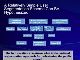
A Relatively Simple User
Segmentation Scheme Can Be
Hypothesized
Non-bank
customers

Wealth

Bank customer/
no online banking

Corporate

Women

Investors

College
“Life Event”
Spanishlanguage
Prospective
Employees

Online banking
customer

Personal
Finance

Small Business

Teens

Press/PR

The key question remains… what is the optimal
segmentation approach for redesigning the public
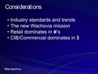
Considerations
• Industry standards and trends
• The new Wachovia mission
• Retail dominates in #’s
• CIB/Commercial dominates in $
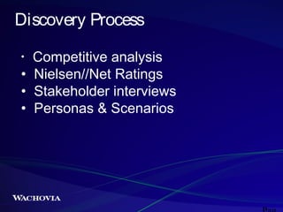
Discovery Process
Competitive analysis
• Nielsen//Net Ratings
• Stakeholder interviews
• Personas & Scenarios
•
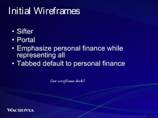
Initial Wireframes
• Sifter
• Portal
• Emphasize personal finance while
representing all
• Tabbed default to personal finance
(see wireframe deck)
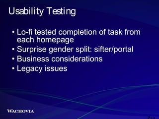
Usability Testing
• Lo-fi tested completion of task from
each homepage
• Surprise gender split: sifter/portal
• Business considerations
• Legacy issues
Inconclusive Results
• "A compromise is the art of dividing
a cake in such a way that everyone
believes that he has got the biggest
piece." - Ludwig Erhard
vs.
• A compromise leaves everyone
equally dissatisfied.
So We Made the Decision With A
Coin Toss
(just kidding)
• Selected emphasis on personal
finance
• Customer volume
• Demand for corporate presence on
homepage
• Wealth Management continues to
be an issue
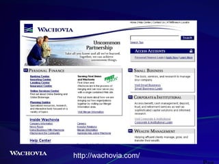
http://wachovia.com/
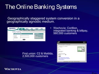
The Online Banking Systems
Geographically staggered system conversion in a
geographically agnostic medium.
• Wachovia: Corillion,
integrated banking & billpay,
560,000 customers

First union: C2 & Matilda,
2,500,000 customers
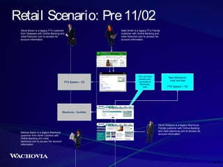
Retail Scenario: Pre 11/02
Steve Brown is a legacy FTU customer
from Delaware with Online Banking and
visits firstunion.com to access his
account information

FTU System – C2

Sally Smith is a legacy FTU Florida
customer with Online Banking and
visits firstunion.com to access her
account information

You can now
access your
accounts at
Wachovia.
com

New Wachovia
look and feel
FTU System – C2

Wachovia - Corillian

Melissa Baker is a legacy Wachovia
customer from North Carolina with
Online Banking and visits
wachovia.com to access her account
information

David Williams is a legacy Wachovia
Florida customer with Online Banking
and visits wachovia.com to access his
account information

Page 26
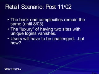
Retail Scenario: Post 11/02
• The back-end complexities remain the
same (until 8/03)
• The “luxury” of having two sites with
unique logins vanishes.
• Users will have to be challenged…but
how?
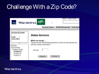
Challenge With a Zip Code?
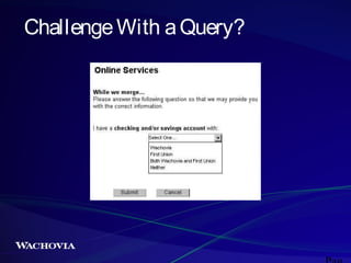
Challenge With a Query?
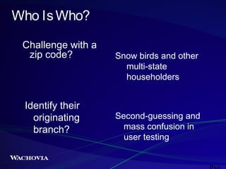
Who Is Who?
Challenge with a
zip code?

Identify their
originating
branch?

Snow birds and other
multi-state
householders

Second-guessing and
mass confusion in
user testing
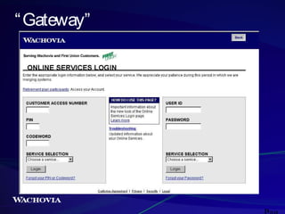
“ Gateway”
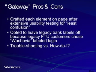
“ Gateway” Pros & Cons
• Crafted each element on page after
extensive usability testing for “least
confusion”
• Opted to leave legacy bank labels off
because legacy FTU customers chose
“Wachovia” labeled login
• Trouble-shooting vs. How-do-I?
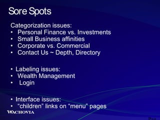
Sore Spots
Categorization issues:
• Personal Finance vs. Investments
• Small Business affinities
• Corporate vs. Commercial
• Contact Us ~ Depth, Directory
• Labeling issues:
• Wealth Management
• Login
• Interface issues:
• “children” links on “menu” pages
•
Lessons Learned
• The nature of buy-in
• Relationship between IA,
marketing, interface
• Documentation (and the nature of
stamina)
Feedback
• Bank Monitor: “ The design of the public
homepage is effective in that it presents
users with a snapshot of the main sections of
the new site and provides key links to areas
within each section in an organized and noncongestive fashion. ”
Feedback
• “ Within the first few moments of traversing this
new site, I was hit by a plethora of usability nono's.  Take this services login page for instance.  This
[collection] of form fields is so confusing that the
designers had to add a "How to use this page"
help file in the middle of the page....here's a clue, if
you have to explain how to do a login...then I'm
thinking the page probably needs a tad more
work.  Multiple logins on the same page?  Requesting
the user choose the services for which they're logging
into?  WTF...why not have the services assigned to
the login?  Wow, how incredibly useful...specially if
people decide to bookmark this login page. (insert
eye roll)” -Dan Beauchamp, RedCricket
Feedback
• “I was just browsing your site and wanted to drop you
a line to say what a great job you and your team did
on the redesign of the Wachovia site. I am a
Wachovia customer and as an information architect I
was very interested to see how the site would change
[for good or bad]. I love the new look and the
deviation from a standard site navigation on the
home page, I think, was a great idea. It is very similar
to the BBC approach. If you need any user feedback
at this point I would love to participate. Again, great
job.” -Jeremy Miller
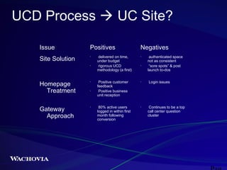
UCD Process  UC Site?
Issue
Site Solution

Positives
•

•

Homepage
Treatment
Gateway
Approach

•

•

•

delivered on time,
under budget
rigorous UCD
methodology (a first)
Positive customer
feedback
Positive business
unit reception
80% active users
logged in within first
month following
conversion

Negatives
•

•

•

•

authenticated space
not as consistent
“sore spots” & post
launch to-dos
Login issues

Continues to be a top
call center question
cluster
Conclusion
•

Questions?

• Contact information:
• samantha.bailey@wachovia.com,
samantha@baileysorts.com
References
• All wireframes developed by Wachovia Corp Customer
Interaction Group (Samantha Bailey, David Barbin, Courtney
Crowell, Michelle Downie)
• Wachovia web graphic designs by Wachovia Corp Interactive
Design Group (Max Nelson, Brian Williams, Ben Rubeck)
• Slides 8-11, images created by Kevin Hill (Modem Media)
• Slide 20, images created by Kristen Zaks (Accenture)
• Slide 29, Bank Monitor magazine, Dec 2002
• Slide 30, RedCricket (Dan Beauchamp’s blog)
http://www.redcricket.com/txt/archive/archive112002.htm
• Slide 31, from email to Samantha Bailey 2/5/2003 by
jeremy@jeremymiller.us
Wachovia Redesign: An Exploration of Challenges 2003