Copyright © 2015 by UXPin Inc.
All rights reserved. No part of this publication text may be uploaded
or posted online without the prior written permission of the publisher.
For permission requests, write to the publisher, addressed “Attention:
Permissions Request,” to hello@uxpin.com.
Index
0. Introduction 6
1. Uncovering User Expectations Before Design  8
Why You Need to Think About Consistency First  9
Testing Before Design 11
Takeaway 17
2. Practical Approach to Visual Consistency 18
Why Visual Consistency Matters for UI Design 19
Areas of Visual Consistency 23
Putting It All Together 29
Takeaway 32
3. Mastering UI Patterns for Visual Consistency 33
Affordances  Signifiers: The Foundation of UI Patterns 34
Pattern Classifications 35
Implementing UI Patterns 37
Selecting the Right UI Pattern for You 43
UI Pattern Libraries  Resources 47
Takeaway 49
Jerry Cao is a content strategist at UXPin where he gets to put
his overly active imagination to paper every day. In a past life, he
developed content strategies for clients at Brafton and worked in
traditional advertising at DDB San Francisco. In his spare time he
enjoys playing electric guitar, watching foreign horror films, and
expanding his knowledge of random facts.
Follow me on Twitter
Krzysztof is a graphic designer at UXPin. He is also a typography
enthusiast and a founder of the global Typeseeing Project. Since
2014, he has been an instructor at the Academy of Fine Arts in
Gdansk, where he teaches his students about design theory and
design software. In his free time, he enjoys playing and inventing
board games. Follow me on Behance
With a passion for writing and an interest in everything anything
related to design or technology, Matt Ellis found freelance writ-
ing best suited his skills and allowed him to be paid for his curi-
osity. Having worked with various design and tech companies in
the past, he feels quite at home at UXPin as the go-to writer, re-
searcher, and editor. When he’s not writing, Matt loves to travel,
another byproduct of curiosity.
Co-founder and head of product, Kamil previously worked as a
UX/UI Designer at Grupa Nokaut. He studied software engineer-
ing in university, but design and psychology have always been
his greatest passions. Follow me on Twitter @ziebak
Introduction
Since vision is the strongest human sense, your design must reflect
a sense of order and logic – otherwise users will just go to your
competitors instead.
Visual consistency doesn’t just make your interface easier to use and
learn, it also creates trust. Designs which are inconsistent with user
expectations will feel foreign and difficult to use. Designs which are
inconsistent from page to page will feel illogical and chaotic.
Like we’ve stated before, consistency does not equate to uniformi-
ty. Design is not a formula of drag-and-drop templates. You need
to know when to follow best practices and when to bend the rules.
The balance between familiarity and originality is undoubtedly one
of the most difficult decisions in design. To help you exercise the
best creative judgment, we’ve analyzed examples of visual consis-
tency from companies like Squarespace, Redhat, Jukely, Wunder-
list, and more. We’ll also discuss topics ranging from conducting
7Introduction
research to discover user expectations, reviewing important areas
of visual consistency, and applying affordances  UI patterns to
create familiarity.
If you find this book helpful, feel free to share with anyone else
who might enjoy it.
For the love of UI design,
Jerry Cao
co-written by Kamil Zieba, Krzysztof Stryjewski, and Matt Ellis
Uncovering User Expectations
Before Design
As information-age artists, designers enjoy their creative freedom.
But concepts like “consistency” and “following patterns” don’t nec-
essarily restrict this freedom. Instead, they provide a foundation of
familiarity upon which to layer creative nuances.
Originality helps you cross the chasm into emotional design, but that
will all be meaningless unless your design works the way users expect.
Source: “Design Patterns vs. Users’ Expectations...” visualpun.ch. Creative Commons.
Uncovering User Expectations Before Design 9
In this chapter, we’ll talk about how to approach user expectations
in terms of consistency, how usability testing can reveal what your
users think, and how the use of patterns and clear labels can give
your user that feeling of satisfaction.
Consistency creates a foundation of familiarity
for designers to layer creative nuances.
Why You Need to Think About Consistency First
Why is it so important that you think about user expectations – and
therefore consistency – before even creating a single mockup? Be-
cause otherwise you’re going to be biased.
If you’ve already envisioned an interface by the time you start ask-
ing yourself, “what does the user expect?” then it’s going to be hard-
er to correct your mistakes – if you’re even able to notice them. By
that point, you’ll already have a rough idea of the visual design
patterns, so it’ll be harder to look at them from a fresh perspective.
You’ll be desensitized to what a new user might think about during
the first interaction with your design.
Empathizing with your user is at the heart of interaction design,
and this is a more difficult task with an existing design than one
still being formulated. Sure, you could track the behavioral patterns
Uncovering User Expectations Before Design 10
and modify your UI based on user interactions. But even so, you’re
better off putting thought into it beforehand so that the later mod-
ifications are less extreme.
Source: “Listening (the extended research dept)” Xavier Vergés. Creative Commons.
The time to consider user expectations and consistency is right at
the start, when you’re working with the team on the rough feature
set. At that time, you’re closest to the user’s mindsets: the design is
new to you both.
You must consider user expectations and consistency
from the very beginning of design projects.
This applies to both external and internal consistency. Since user ex-
pectations carry over from previous experiences, even new designs
must follow standard conventions (external consistency). But you
also need to keep internal pages consistent with each other, because
your users will develop new expectations as they use your site or app.
While intuition might get you part of the way, it’s best to build your
designs on solid, concrete evidence.
Uncovering User Expectations Before Design 11
Testing Before Design
Usability testing can help you understand user expectations and
validate your assumptions. To ensure consistency in your design,
we recommend running usability tests both before and during the
design process.
We’ll focus here on the tests that you’d want to run before designing,
since these can be a little lesser known. Below, we’ll talk about the
three most helpful pre-design tests: card sorting, user interviews,
and heuristics reviews.
While intuition might get you part of the way, it’s best
to build your designs on solid, concrete evidence.
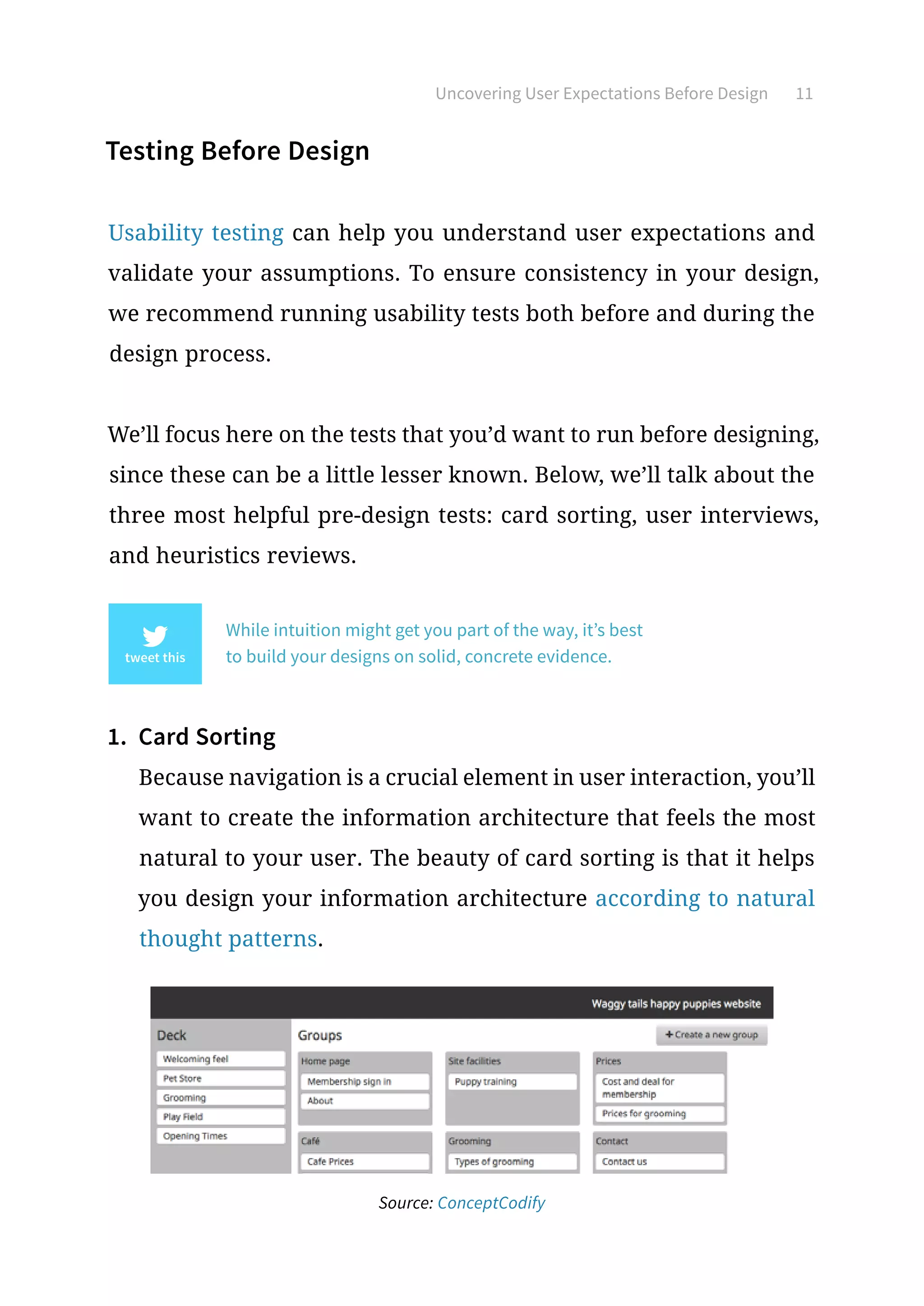
1.	 Card Sorting
Because navigation is a crucial element in user interaction, you’ll
want to create the information architecture that feels the most
natural to your user. The beauty of card sorting is that it helps
you design your information architecture according to natural
thought patterns.
Source: ConceptCodify
Uncovering User Expectations Before Design 12
There are two types of card sorts:
•	 Open Sorting: Users are provided only with the labels, and
are left to group them however they see fit. Once grouped,
users are asked to give names to the groups themselves. This
is recommended for generating new ideas since you can work
backwards from users’ natural thought processes.
•	 Closed Sorting: As with open sorting, users are given the la-
bels; however, they are asked to categorize them into existing
groups. This is recommended if you’re updating a finalized
website structure.
We found closed card sorting to be extremely helpful when re-
designing Yelp (as an exercise) to better match user expectations.
After we ran the test, we learned that important search filters
weren’t immediately available, which of course increased fric-
tion. For example, users determined that filtering for meals (like
“Serves Dinner”) should be immediately available, yet the current
design buried it under another layer of filters.
2.	 User Interviews
User interviews can be as elaborate or cost-effective as you’d
like, whether they come to you, you go to them (or you simply
talk through Skype).
Before transitioning UXPin from a paper notepad to a cloud de-
sign app, we actually interviewed more than 50 designers. Be-
Uncovering User Expectations Before Design 13
cause the design market is such a saturated space, we wanted to
speak with as many designers as possible so that we could learn
about their workflow, processes, inspirations, and expectations
from good design tools.
Once we started designing the current UXPin, we frequently re-
ferred back to the notes from our interviews to make sure our
concepts and mockups aligned with the expectations our users
developed from other tools.
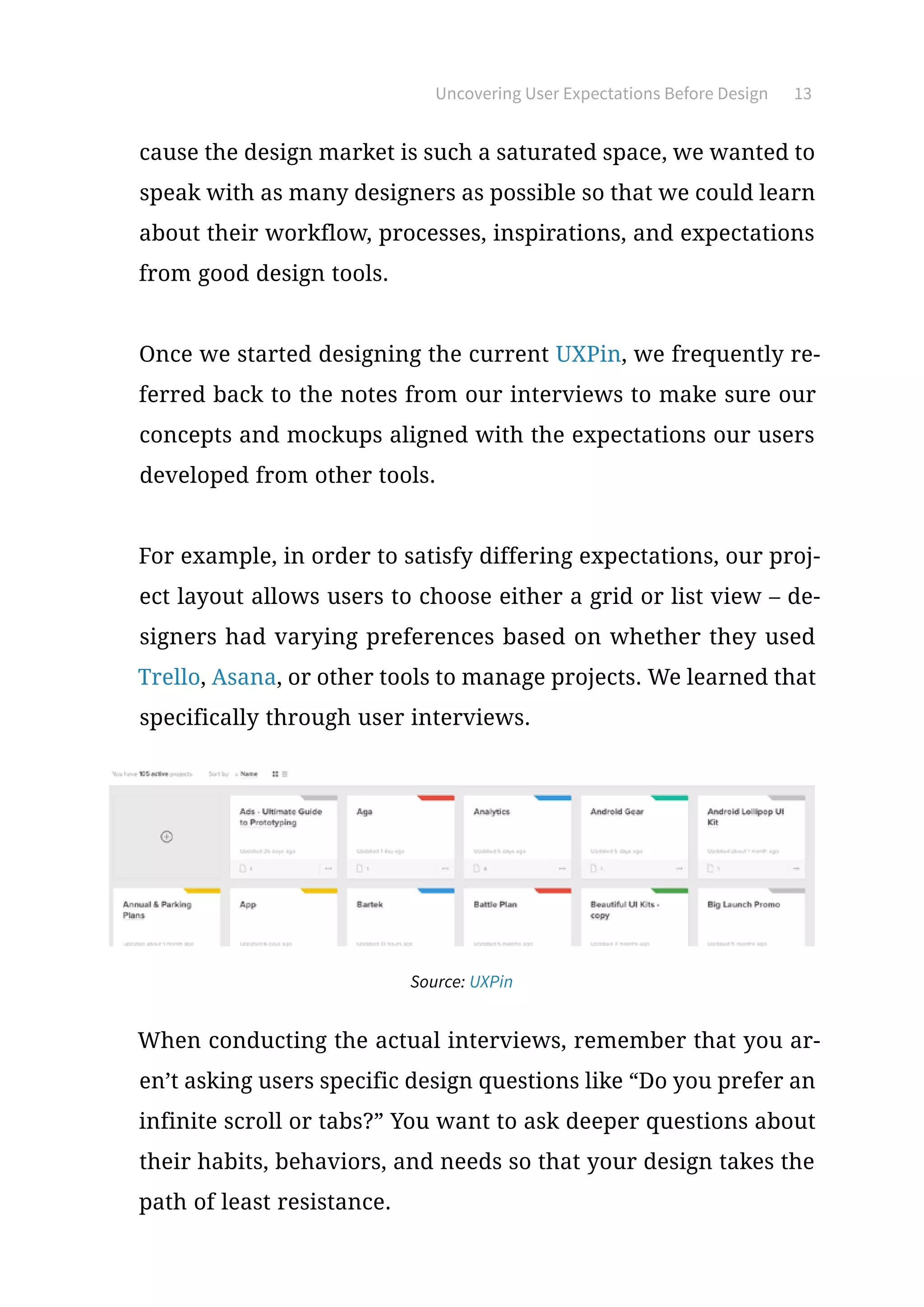
For example, in order to satisfy differing expectations, our proj-
ect layout allows users to choose either a grid or list view – de-
signers had varying preferences based on whether they used
Trello, Asana, or other tools to manage projects. We learned that
specifically through user interviews.
Source: UXPin
When conducting the actual interviews, remember that you ar-
en’t asking users specific design questions like “Do you prefer an
infinite scroll or tabs?” You want to ask deeper questions about
their habits, behaviors, and needs so that your design takes the
path of least resistance.
Uncovering User Expectations Before Design 14
Let’s say you’re designing a new blog CMS. By asking something
like, “What do you like about your current blog CMS?” you might
learn that users enjoy Wordpress’s “distraction free” mode be-
cause it helps them better focus on writing. You can then infer,
for the design of your own blog CMS, that you should give users
an option to toggle the appearance of the interface. The inter-
view has therefore revealed that users really enjoy a current
design works, so you should keep that preference in mind when
designing for consistency.
There are a lot of different strategies to consider for user in-
terviews that we don’t have space to cover here, but if you’re
interested, take a look at these excellent resources:
●	User Interview Techniques, Liz Danzico
●	15 Interview Questions for Creating Personas, Steve Mulder
●	Ask and Ask Again: Critical Interviewing Is an Essential Com-
ponent of Usability Testing, Kate Lawrence
●	Getting Better Data from User Studies, Michael Margolis
For some low-cost approaches to user research, we recommend
reading Patrick Neeman’s advice on creating lightweight perso-
nas. All of the tactics he lists will help you uncover the insights
you need to deduce the expectations of users.
Uncovering User Expectations Before Design 15
3.	 Heuristic Evaluation
Heuristic evaluations are great for ensuring external consistency
since you’re focusing on competitor designs. While traditionally
heuristic evaluations are used to test usability problems or fea-
ture audits, before the design they can outline the current state
of the market you’re getting into.
The process just needs to be modified slightly:
1.	Determine what fields to evaluate.
In other words, in what fields will you be competing with your
rivals, or in which areas is it possible to excel compared to them?
These could be ease of use, how you satisfy user goals, the visual
style and atmosphere, and the target users themselves.
You might include the following areas for critique:
•	 Visual hierarchy
•	 Visual impact
•	 Effectiveness of system feedback
•	 Clarity of copy
•	 Ease of navigation
•	 Simplicity of user input
2.	Conduct the evaluation with the above criteria.
If you can spare the manpower, try to get 5 people to go through
your competitor’s interface and assign them scores in the fields
Uncovering User Expectations Before Design 16
you previously listed. Sometimes it helps to have your evaluators
complete the same tasks to keep them focused. If conducting ac-
tual moderated tests is outside your means, you can also draw
up simple questionnaires or – as a last resort – go through your
competitor’s sites yourself and give them your own ratings.
3.	Diagram the results.
The clearest way to understand the results of the evaluation is
to see them. Plotting them out of a graph is the most efficient
way to organize the data. Michael Hawley uses a very effective
“spider-web” method, as you can see in this post. We recommend
his method because it’s conducive to the final step: comparing.
4.	Compare the results for consistencies and inconsistencies.
Looking at your top competitors’ scores side-by-side – or even
better, overlapping – will give you a solid understanding of your
space and what your users may come to expect. You could create
them according to this overlapping format created by designer
Leigh Howells.
But remember the most important thing: the heuristic evalua-
tions will reveal the consistencies and inconsistencies in your
niche, but it’s up to you to know when to break away from the
norm, and when to fall in line.
For example, let’s say none of your competitors use ads. If you
choose to break the external consistency and feature ads on your
Uncovering User Expectations Before Design 17
site, this may irritate users. They are expecting an ad-free expe-
rience when using sites or apps of your genre, and not meeting
this expectation may worsen their experience.
On the other hand, let’s say almost all of your competitors only
offer one way to complete a given task. This is the status quo,
and what your users would expect... but if you choose to break
this consistency and offer multiple ways to complete a given task,
you might impress some users and win them over.
In this way, the heuristic review comparison can show you possi-
bilities for getting the better of your competitors, and not simply
meeting user expectations, but exceeding them.
Takeaway
Consistency isn’t something you add once the design is finished, it’s
something you incorporate on the ground level and build around.
Consistency will always be tied to user expectations, which is the
core to all aspects of design.
Remember that usability tests can help you pinpoint exactly what
kind of consistencies your users want and expect most. Scope out
the competition, listen to your users, then test early and often.
Practical Approach
to Visual Consistency
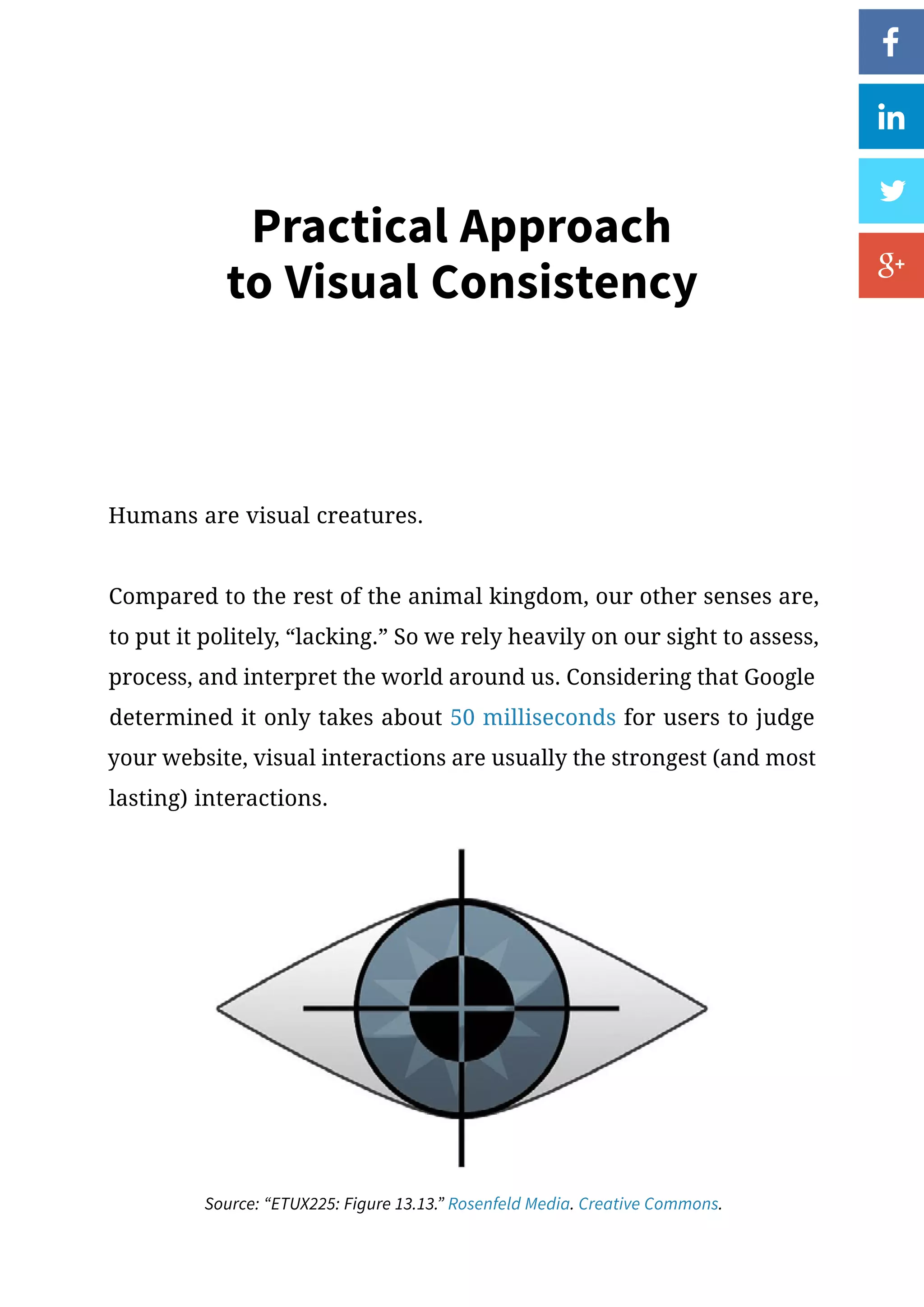
Humans are visual creatures.
Compared to the rest of the animal kingdom, our other senses are,
to put it politely, “lacking.” So we rely heavily on our sight to assess,
process, and interpret the world around us. Considering that Google
determined it only takes about 50 milliseconds for users to judge
your website, visual interactions are usually the strongest (and most
lasting) interactions.
Source: “ETUX225: Figure 13.13.” Rosenfeld Media. Creative Commons.
Practical Approach to Visual Consistency 19
In this chapter we’ll explain exactly why visual consistency is so
important, outline a couple criteria for consistency, and tie it all
together with live design examples.
Why Visual Consistency Matters for UI Design
Because vision is our dominant sense, the visuals on your interface
will have the biggest impact on interaction. Just how much bigger
might surprise you. To reiterate some points from Interaction De-
sign Best Practices, David McCandless, Data Journalist, explains in
a compelling TED Talk that a vast majority of our brain-power goes
into sight, though nearly all of it is subconscious.
“Your sense of sight is the fastest. It has the same bandwidth
as a computer network. Then you have touch, which is about
the speed of a USB key. And then you have hearing and smell,
which has the throughput of a hard disk. And then you
have poor old taste, which is like barely the throughput of
a pocket calculator. And [then the] naught .7 percent, that’s
the amount we’re actually aware of. So a lot of your vision –
the bulk of it is visual, and it’s pouring in – it’s unconscious.”
Why does this matter for web UI design?
Because so much of visual design affects the user on a subconscious
level, your site must first feel familiar. When users encounter a new
design, they are armed only with their prior experiences as they
Practical Approach to Visual Consistency 20
make a snap judgment. As Google’s original research suggests, this
gut feeling is influenced exclusively by the visual design: hierarchy,
symmetry, line spacing, fonts, etc.
Because vision is our dominant sense, the visuals on your interface have
the greatest impact on interaction.
Google found that simpler, familiar websites persuaded users to
stay. As the design became more complex, users felt it looked less
beautiful, even if the design felt familiar. Likewise, if the design was
simple and clean but unfamiliar, users felt the site was also ugli-
er. Externally consistent design helps you pass the user’s “gut test”
since you meet their expectations. Meanwhile, internal consistency
then provides logic to your interface, while slight inconsistencies
keeps users curious and engaged.
A clean, visually consistent site gives users feelings of comfort, con-
trol, and familiarity, whether consciously or not. Some designers
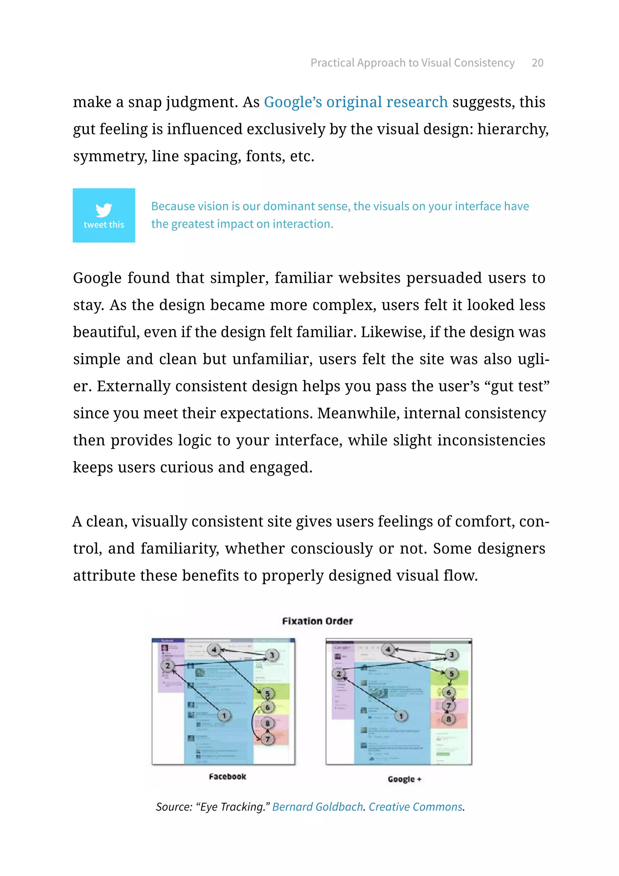
attribute these benefits to properly designed visual flow.
Source: “Eye Tracking.” Bernard Goldbach. Creative Commons.
Practical Approach to Visual Consistency 21
In terms of interaction design, visual flow is the path your users’
eyes take as they interact with your site or app. Experienced de-
signers know how to manipulate their users’ visual flow through
eye-pattern strategies, contrasting colors, varying sizes, and other
methods (outlined in our free ebooks, Web UI Design for the Human
Eye I  II).
A clean, visually consistent site gives users
feelings of comfort, control, and familiarity.
The goal of visual flow is creating a harmony and rhythm to all the
on-screen UI elements. Laura McGuigan, VP of Design at Track-
Maven, explains that repeating elements create a pleasant visual
pattern – a rhythm – that you can break up with smart variations
to capture user interest. This reflects what we said in the previous
Consistency in IxD book about knowing when to be inconsistent.
But if you’ll remember, the potency of inconsistency relies on a
pre-established, overarching consistency.
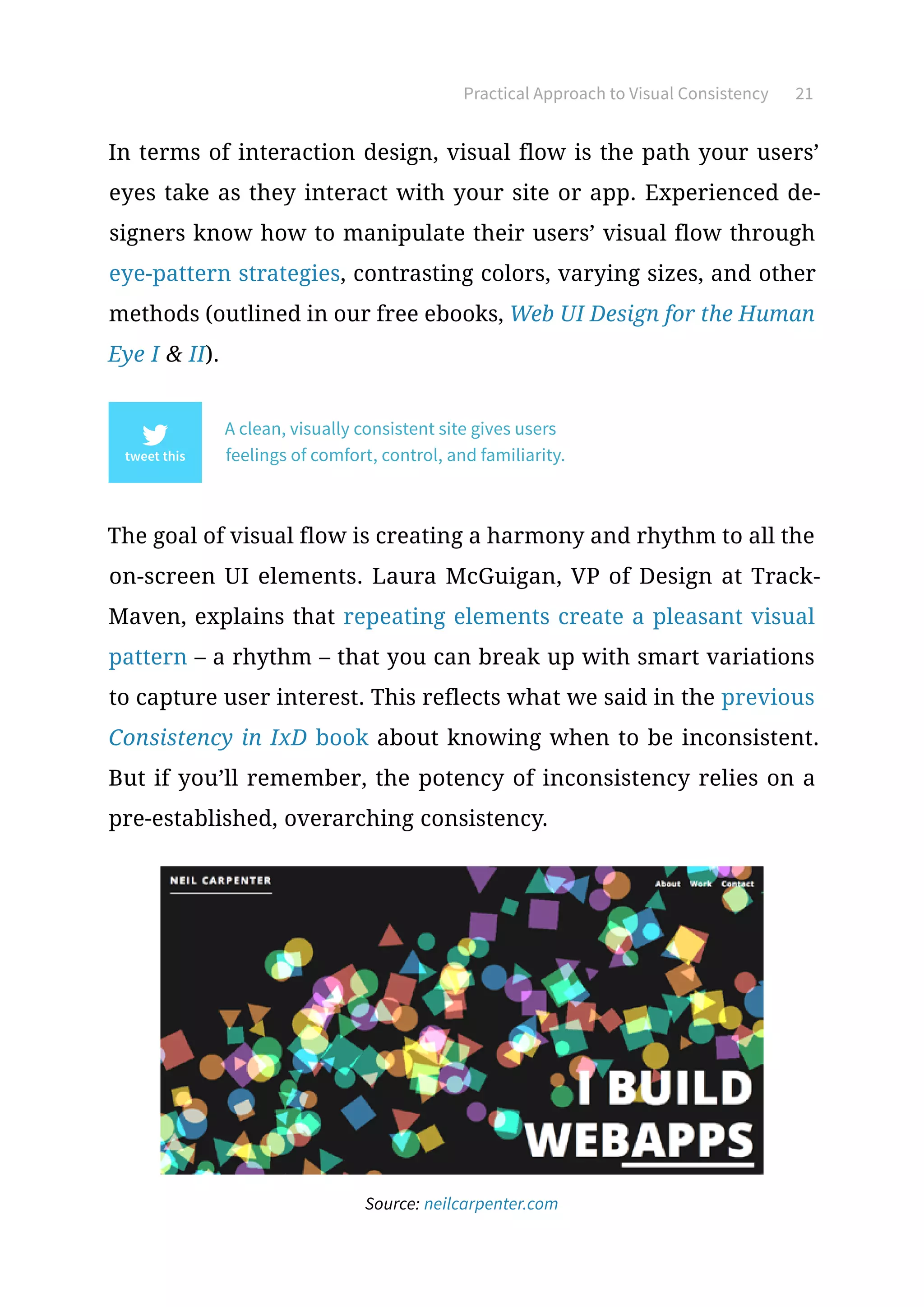
Source: neilcarpenter.com
Practical Approach to Visual Consistency 22
Take, for example, web designer Neil Carpenter’s site. You can’t tell
from the screenshot above, but the colored shapes are in motion
from the top-right corner to the bottom-left – literally creating a
visual flow for the page. This colorful animation is a deviation from
the norm (making it externally inconsistent), which actually sets
Carpenter apart.
Take note, though, that he remains externally consistent where nec-
essary. He keeps a top, horizontal navigation bar with the standard
“About,” “Work,” and “Contact” pages you’d expect from a portfolio
site. His “brand,” in this case his name, is in the upper-left.
Internally, the white text stands out against the black background
and color of the animation. This breaking of internal consistency
allows the importance message of the text, including links, to be
clearly visible even amidst a visually competitive landscape. Other
pages retain this black background/white text color scheme, and
even play on the basic shape theme with the site’s loading icons.
Practical Approach to Visual Consistency 23
Areas of Visual Consistency
When it comes to visual consistency, there are certain areas war-
ranting extra attention. We can divide them into typography, UI
elements, and color.
1.	Typography
Feel free to experiment with different fonts and styles – but don’t
go overboard.
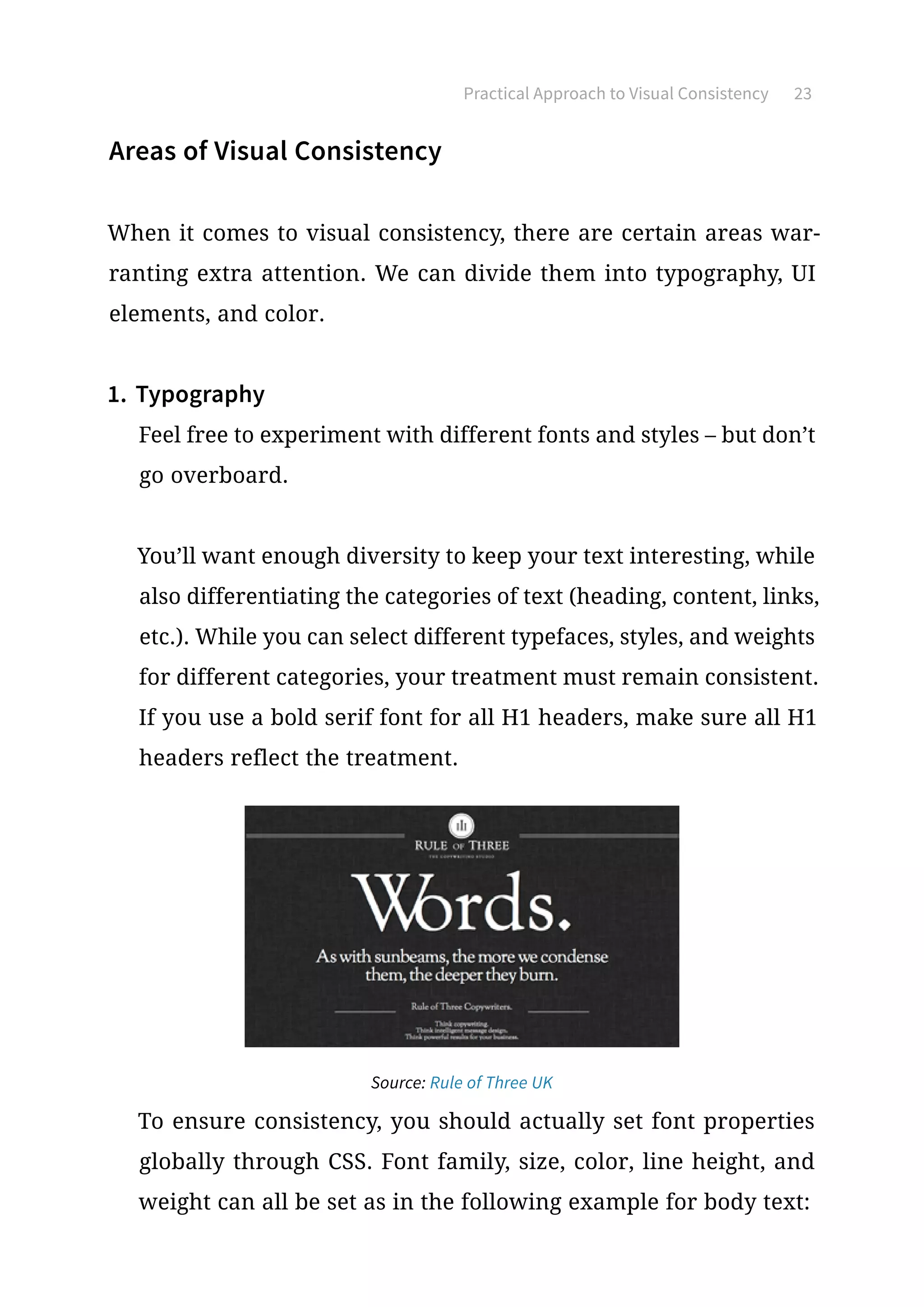
You’ll want enough diversity to keep your text interesting, while
also differentiating the categories of text (heading, content, links,
etc.). While you can select different typefaces, styles, and weights
for different categories, your treatment must remain consistent.
If you use a bold serif font for all H1 headers, make sure all H1
headers reflect the treatment.
Source: Rule of Three UK
To ensure consistency, you should actually set font properties
globally through CSS. Font family, size, color, line height, and
weight can all be set as in the following example for body text:
Practical Approach to Visual Consistency 24
body { font: 1em/1.5em Cambria, Arial, serif; color: #151; }
Beyond consistent typefaces, make sure the alignment is con-
sistent and that you’ve set proper line spacing (roughly 1.4-1.6x
your font size). Creating this vertical rhythm instills harmony
between all your content, improving readability and familiarity.
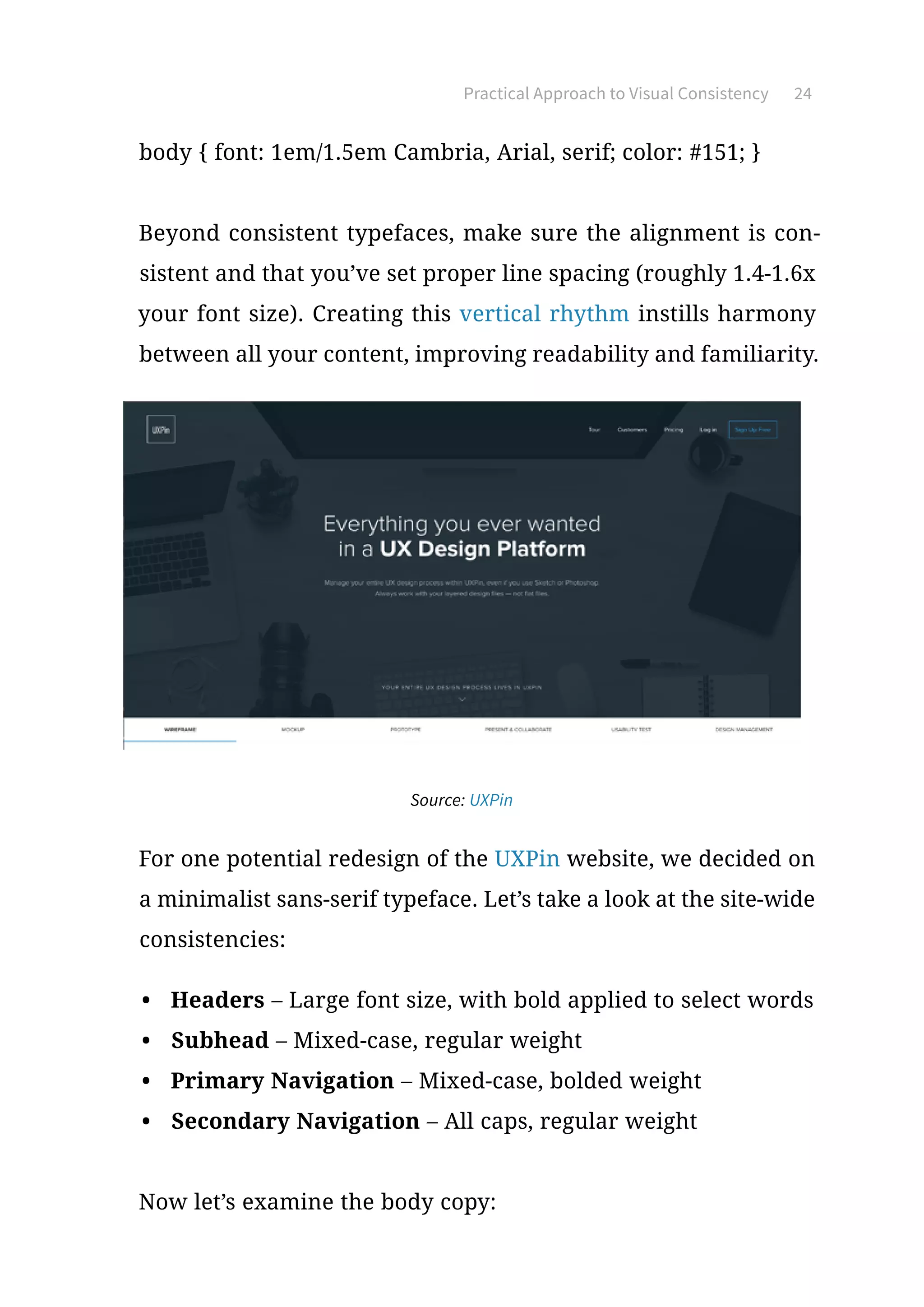
Source: UXPin
For one potential redesign of the UXPin website, we decided on
a minimalist sans-serif typeface. Let’s take a look at the site-wide
consistencies:
•	 Headers – Large font size, with bold applied to select words
•	 Subhead – Mixed-case, regular weight
•	 Primary Navigation – Mixed-case, bolded weight
•	 Secondary Navigation – All caps, regular weight
Now let’s examine the body copy:
Practical Approach to Visual Consistency 25
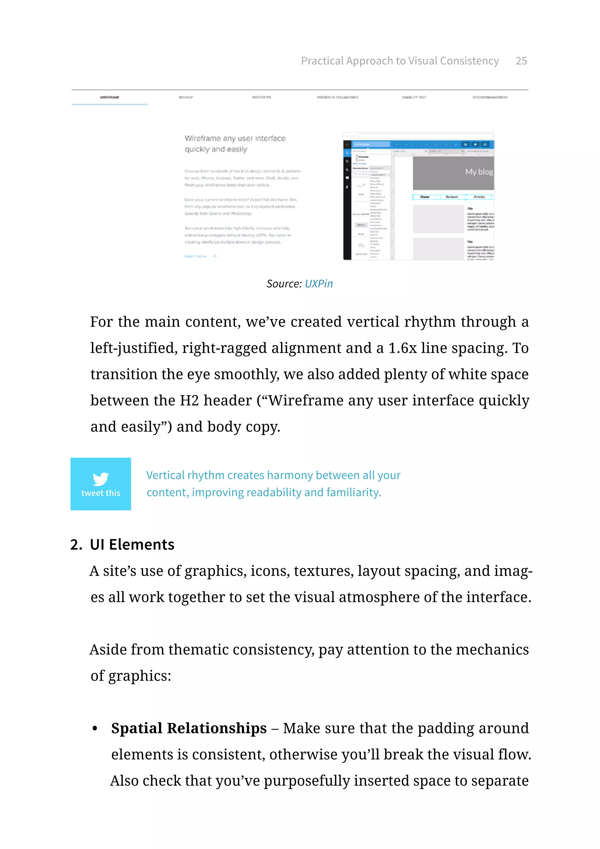
Source: UXPin
For the main content, we’ve created vertical rhythm through a
left-justified, right-ragged alignment and a 1.6x line spacing. To
transition the eye smoothly, we also added plenty of white space
between the H2 header (“Wireframe any user interface quickly
and easily”) and body copy.
Vertical rhythm creates harmony between all your
content, improving readability and familiarity.
2.	 UI Elements
A site’s use of graphics, icons, textures, layout spacing, and imag-
es all work together to set the visual atmosphere of the interface.
Aside from thematic consistency, pay attention to the mechanics
of graphics:
•	 Spatial Relationships – Make sure that the padding around
elements is consistent, otherwise you’ll break the visual flow.
Also check that you’ve purposefully inserted space to separate
Practical Approach to Visual Consistency 26
elements with different functions (Fitts’ Law as described in
Interaction Design Best Practices).
•	 Images – Visually, your images should reflect the same look,
feel, and texture. In terms of implementation, make sure that
you don’t make some images open in new tabs while others
appear in lightboxes. Pick a style and stick with it.
•	 Size – Related elements should be the same size and look
similar (i.e., all circular or all square). According to Gestalt
Principles, any variation in appearance will suggest a different
function. Larger elements appear more important, so if two
elements are related, they should be closer in size.
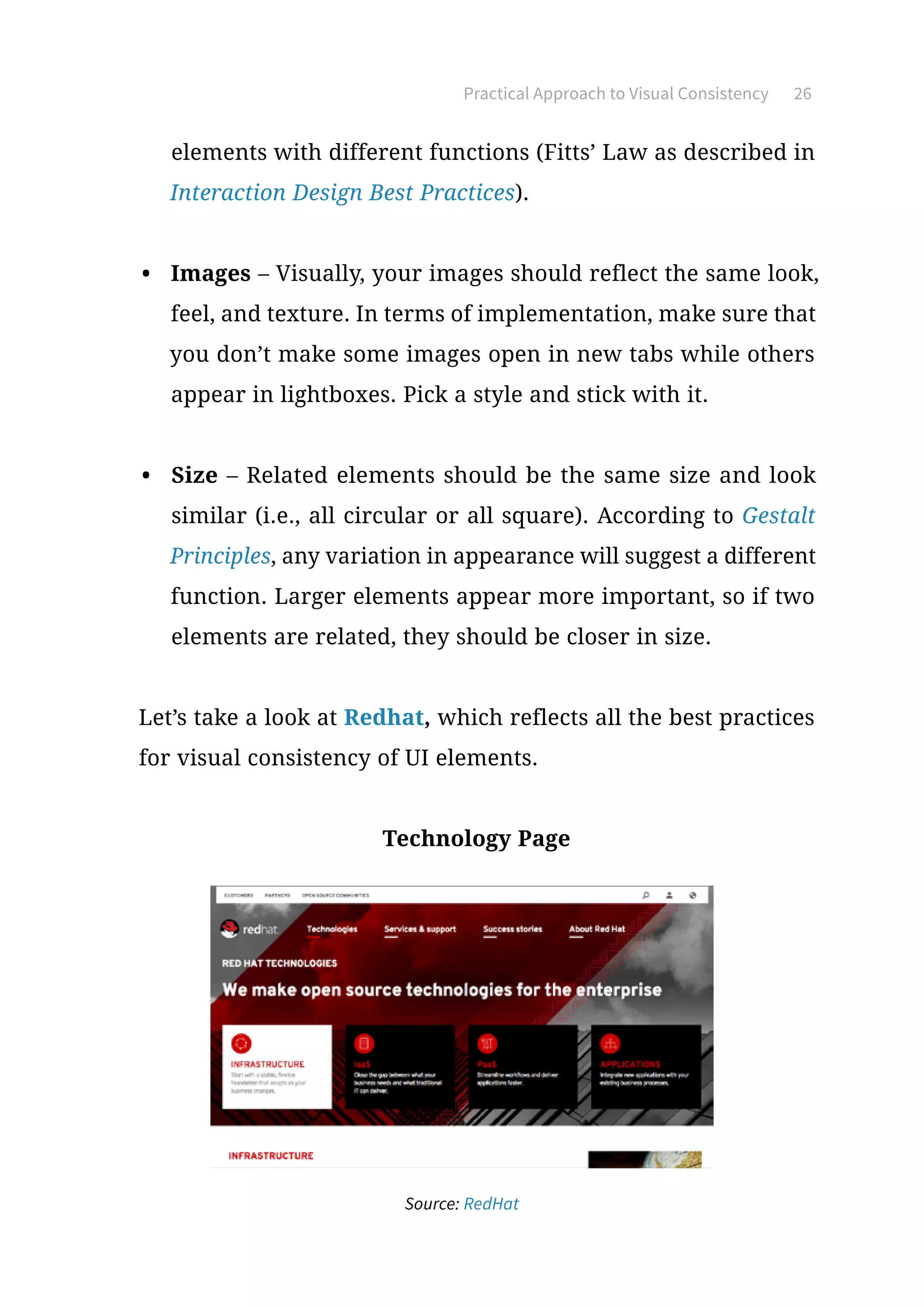
Let’s take a look at Redhat, which reflects all the best practices
for visual consistency of UI elements.
Technology Page
Source: RedHat
Practical Approach to Visual Consistency 27
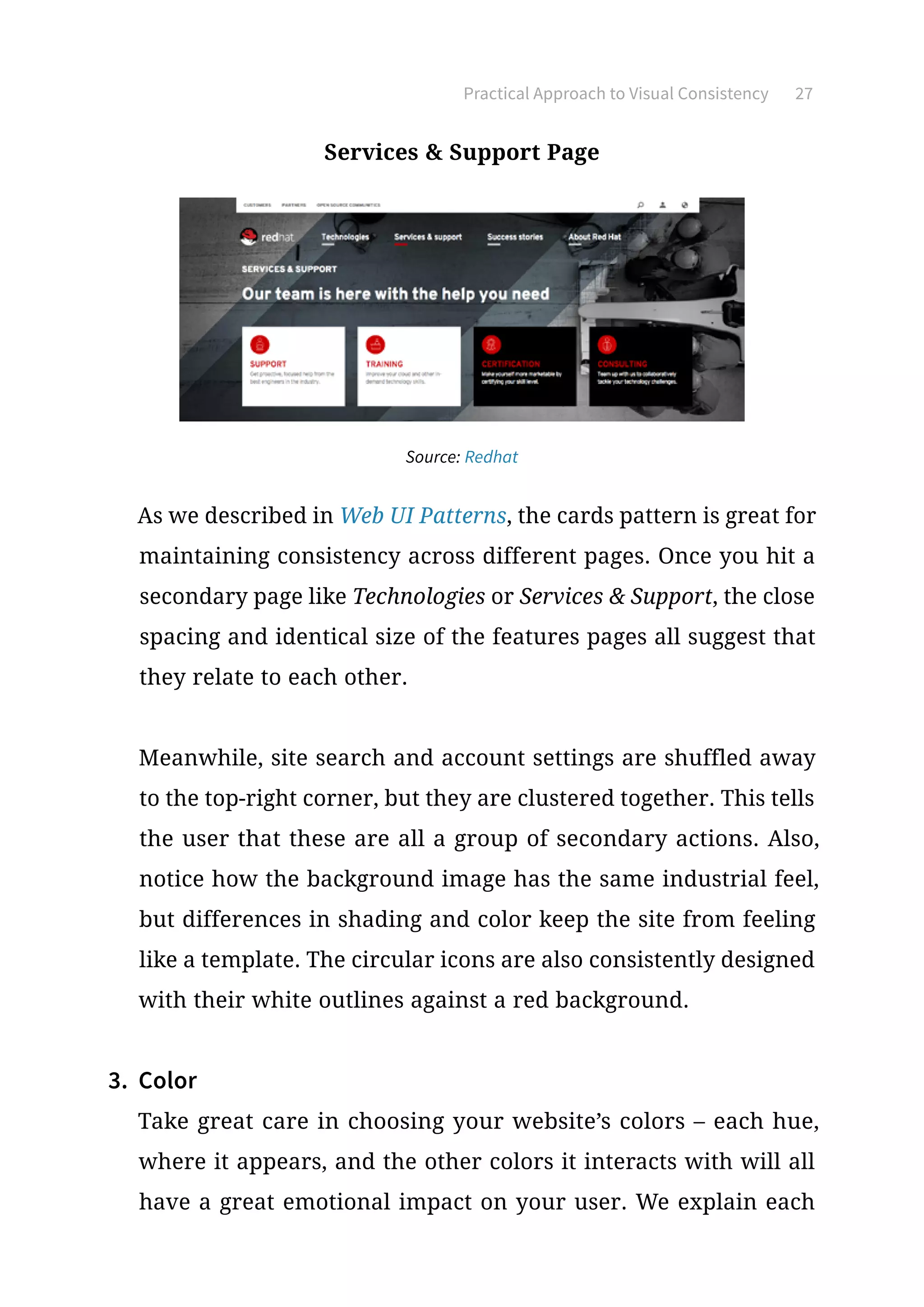
Services  Support Page
Source: Redhat
As we described in Web UI Patterns, the cards pattern is great for
maintaining consistency across different pages. Once you hit a
secondary page like Technologies or Services  Support, the close
spacing and identical size of the features pages all suggest that
they relate to each other.
Meanwhile, site search and account settings are shuffled away
to the top-right corner, but they are clustered together. This tells
the user that these are all a group of secondary actions. Also,
notice how the background image has the same industrial feel,
but differences in shading and color keep the site from feeling
like a template. The circular icons are also consistently designed
with their white outlines against a red background.
3.	 Color
Take great care in choosing your website’s colors – each hue,
where it appears, and the other colors it interacts with will all
have a great emotional impact on your user. We explain each
Practical Approach to Visual Consistency 28
color and their psychological significance in our Web UI Design
for the Human Eye I, but suffice to say, different colors evoke
different emotions in your users (green suggests prosperity and
serenity, blue suggests trust, red suggests passion, etc.).
Select a fixed palette of colors for your site and stay consistent.
Which colors you choose are up to you, based on the mood you’d
like to set. Unless you’re highlighting specific elements, the colors
on each page should complement each other.
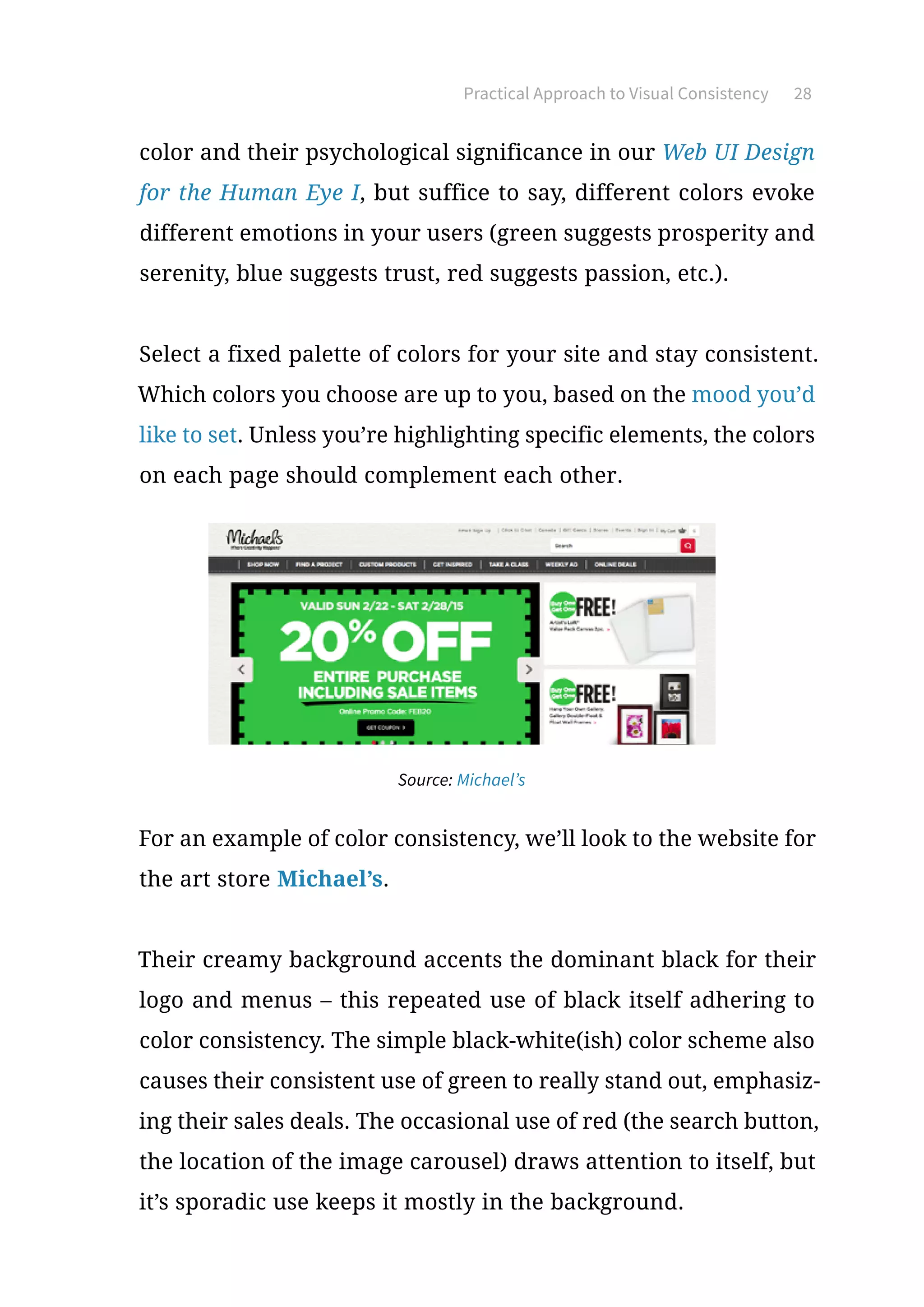
Source: Michael’s
For an example of color consistency, we’ll look to the website for
the art store Michael’s.
Their creamy background accents the dominant black for their
logo and menus – this repeated use of black itself adhering to
color consistency. The simple black-white(ish) color scheme also
causes their consistent use of green to really stand out, emphasiz-
ing their sales deals. The occasional use of red (the search button,
the location of the image carousel) draws attention to itself, but
it’s sporadic use keeps it mostly in the background.
Practical Approach to Visual Consistency 29
Putting It All Together
Let’s take a look at a site that uses visual consistency well across
the board. With their fine eye for visuals, the landing page for the
website-building firm Squarespace flaunts their skills on the very
face of their site.
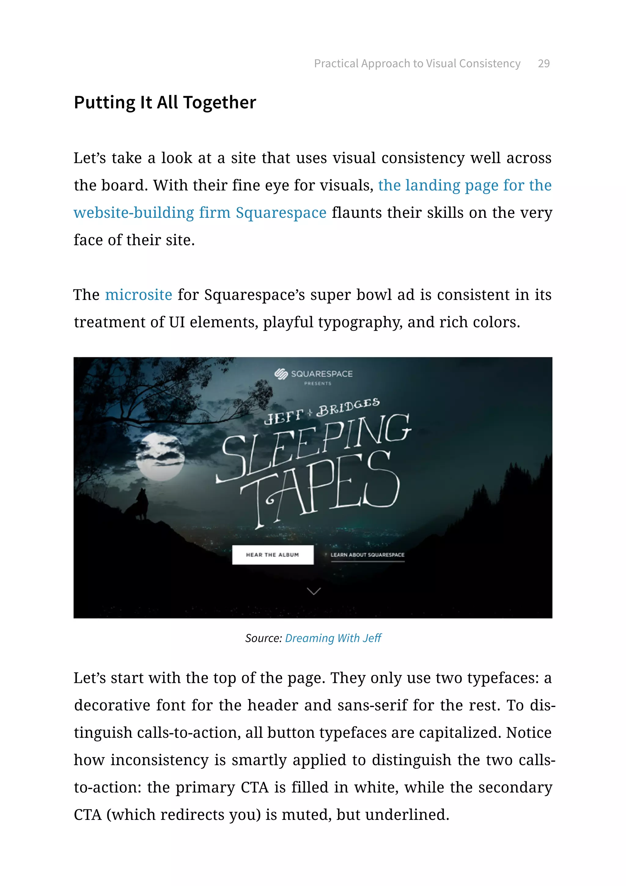
The microsite for Squarespace’s super bowl ad is consistent in its
treatment of UI elements, playful typography, and rich colors.
Source: Dreaming With Jeff
Let’s start with the top of the page. They only use two typefaces: a
decorative font for the header and sans-serif for the rest. To dis-
tinguish calls-to-action, all button typefaces are capitalized. Notice
how inconsistency is smartly applied to distinguish the two calls-
to-action: the primary CTA is filled in white, while the secondary
CTA (which redirects you) is muted, but underlined.
Practical Approach to Visual Consistency 30
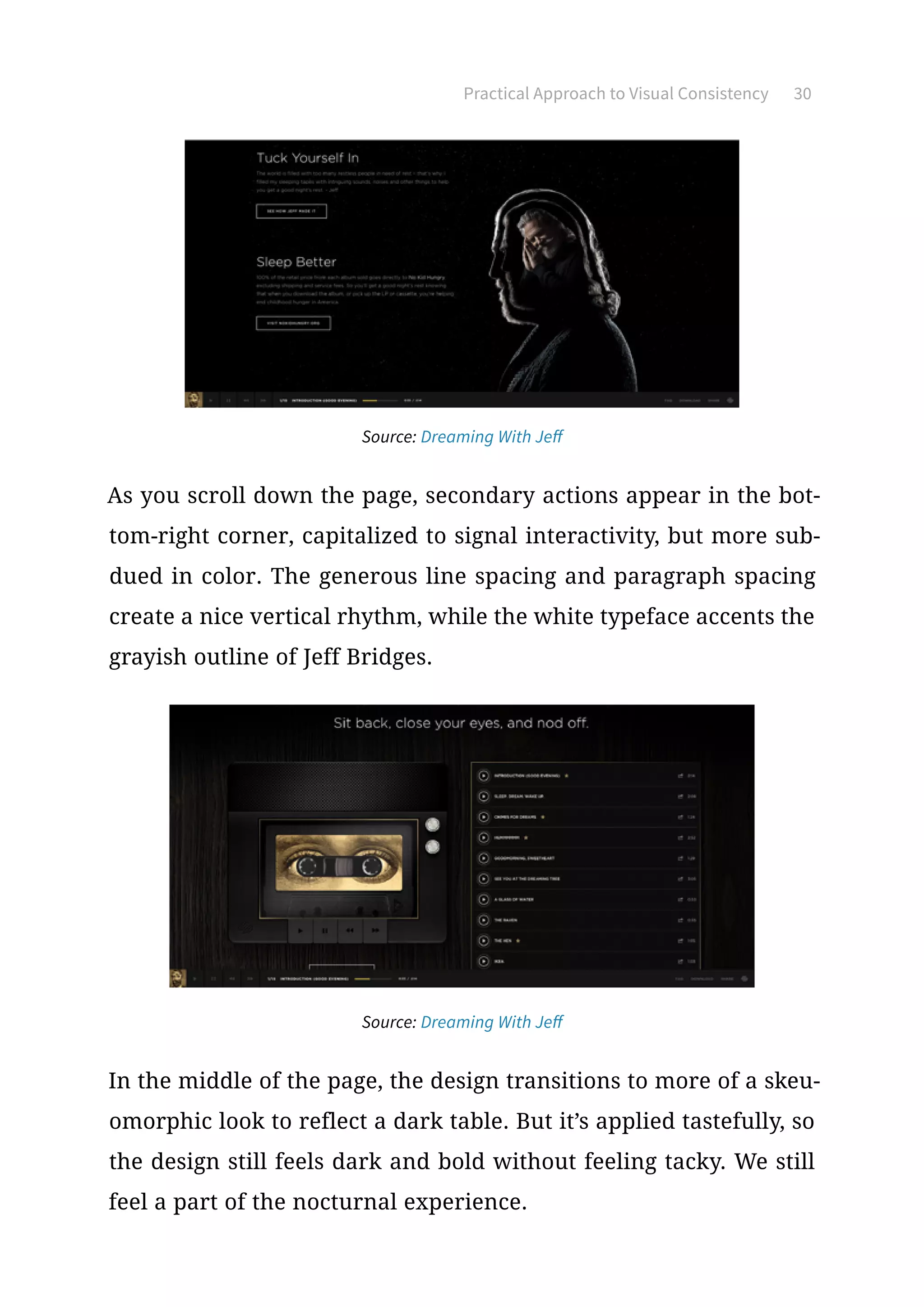
Source: Dreaming With Jeff
As you scroll down the page, secondary actions appear in the bot-
tom-right corner, capitalized to signal interactivity, but more sub-
dued in color. The generous line spacing and paragraph spacing
create a nice vertical rhythm, while the white typeface accents the
grayish outline of Jeff Bridges.
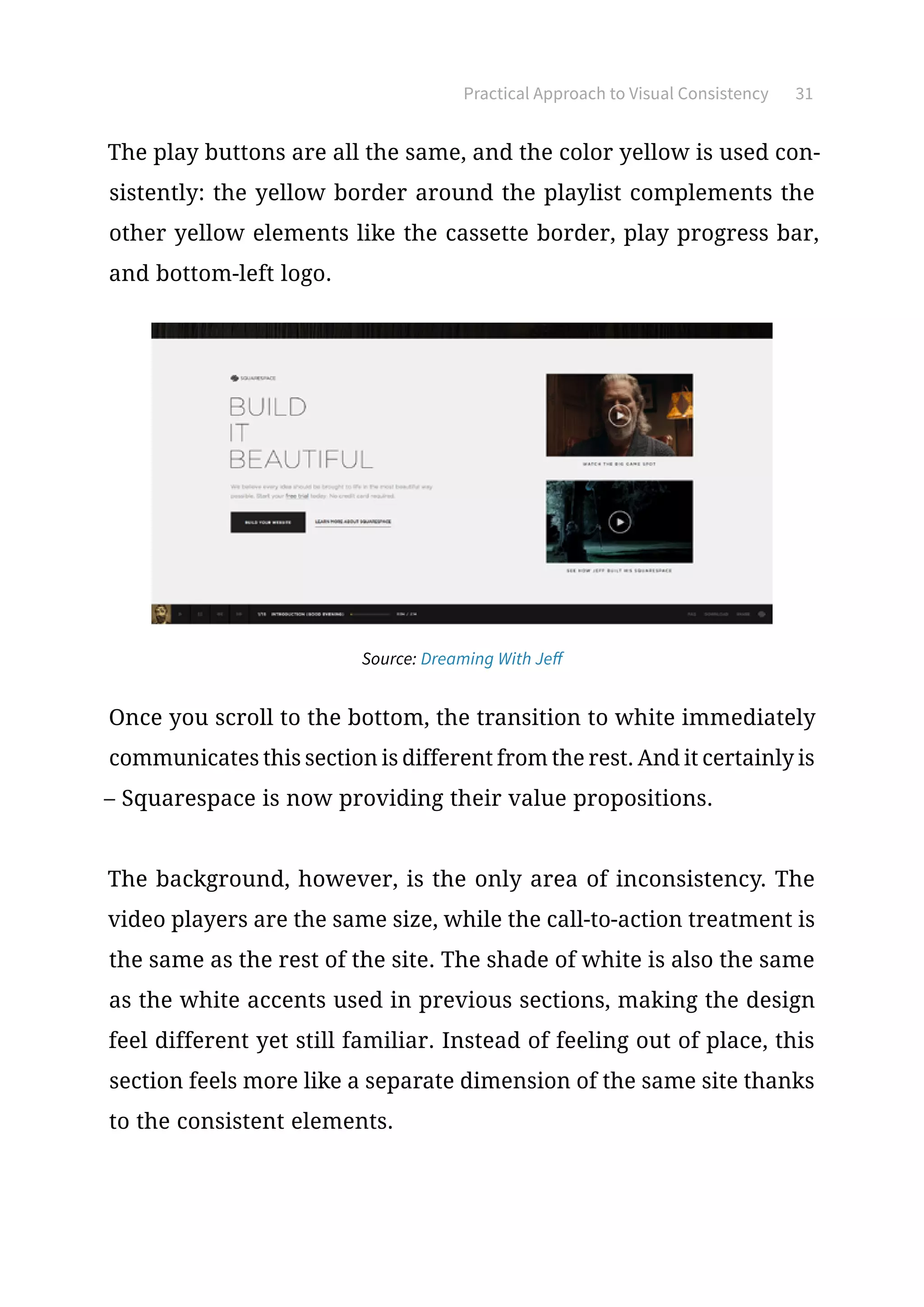
Source: Dreaming With Jeff
In the middle of the page, the design transitions to more of a skeu-
omorphic look to reflect a dark table. But it’s applied tastefully, so
the design still feels dark and bold without feeling tacky. We still
feel a part of the nocturnal experience.
Practical Approach to Visual Consistency 31
The play buttons are all the same, and the color yellow is used con-
sistently: the yellow border around the playlist complements the
other yellow elements like the cassette border, play progress bar,
and bottom-left logo.
Source: Dreaming With Jeff
Once you scroll to the bottom, the transition to white immediately
communicates this section is different from the rest. And it certainly is
– Squarespace is now providing their value propositions.
The background, however, is the only area of inconsistency. The
video players are the same size, while the call-to-action treatment is
the same as the rest of the site. The shade of white is also the same
as the white accents used in previous sections, making the design
feel different yet still familiar. Instead of feeling out of place, this
section feels more like a separate dimension of the same site thanks
to the consistent elements.
Practical Approach to Visual Consistency 32
Takeaway
As we explained, the sense of sight largely governs how humans
interact with their world, even more-so on a subconscious level.
Any interaction design that hopes to be successful must prioritize
visual interaction, especially in the three main fields we outlined.
Just because a user isn’t clicking on your site elements doesn’t mean
they aren’t interacting. Run through the visual consistency checklist
– typography, UI elements, and colors – to give your interactions a
visible sensibility that your users will appreciate, whether they’re
aware of it or not.
Mastering UI Patterns
for Visual Consistency
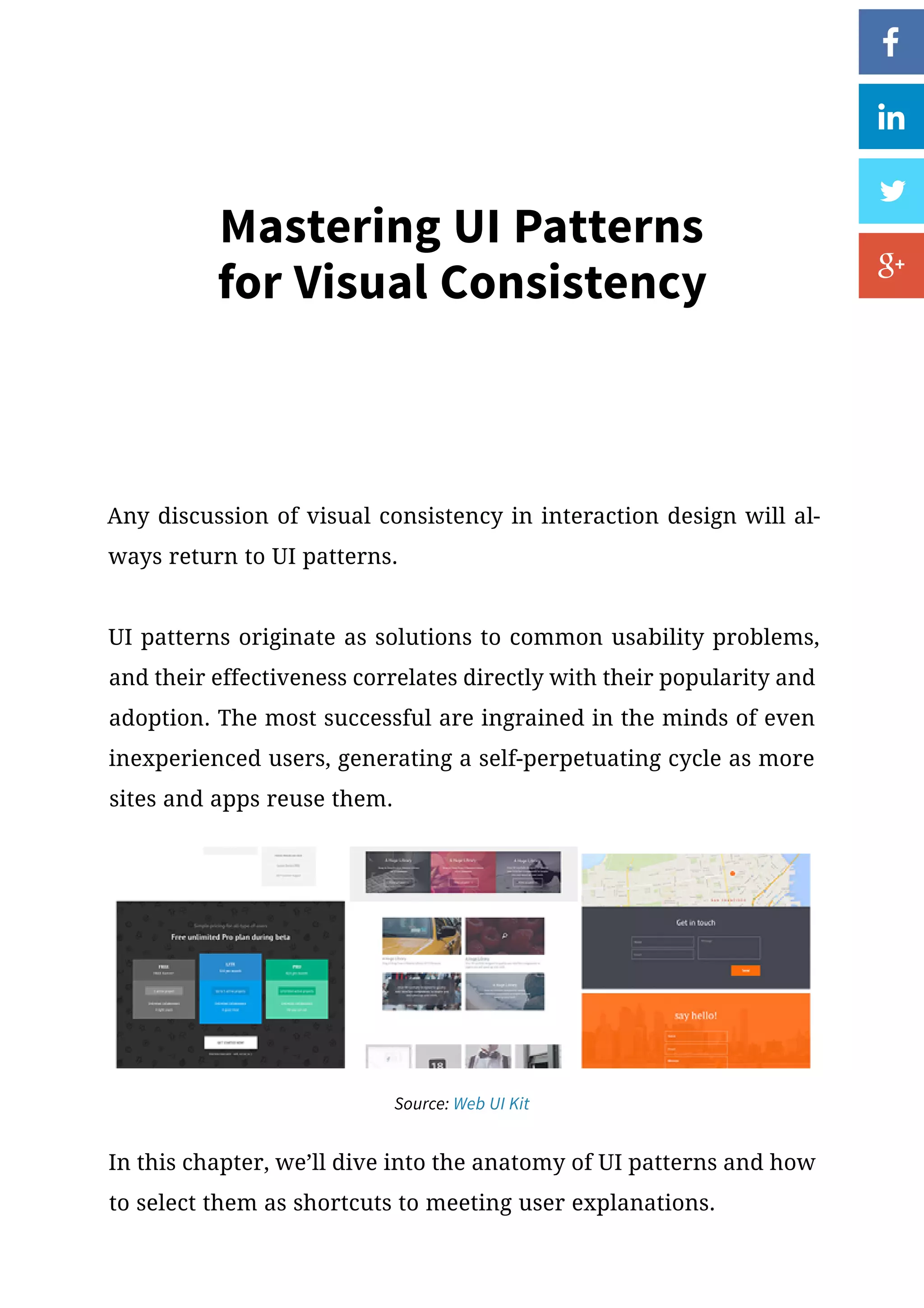
Any discussion of visual consistency in interaction design will al-
ways return to UI patterns.
UI patterns originate as solutions to common usability problems,
and their effectiveness correlates directly with their popularity and
adoption. The most successful are ingrained in the minds of even
inexperienced users, generating a self-perpetuating cycle as more
sites and apps reuse them.
Source: Web UI Kit
In this chapter, we’ll dive into the anatomy of UI patterns and how
to select them as shortcuts to meeting user explanations.
Mastering UI Patterns for Visual Consistency 34
Affordances  Signifiers: The Foundation of UI Patterns
Affordances are what a product can do. Signifiers are the visual cues
that hint at the function. At its most atomic level, all UI patterns
are composed of signifiers that hint at the interface’s affordances.
For instance, an email service affords sending messages back-and-
forth online. But how does the user know that function is possible?
A perceived affordance is therefore how the user thinks the inter-
face object might work, which of course should match the actual
affordance. This perceived affordance is judged based on signifiers
– small hints or cues that signify what the product might be used for.
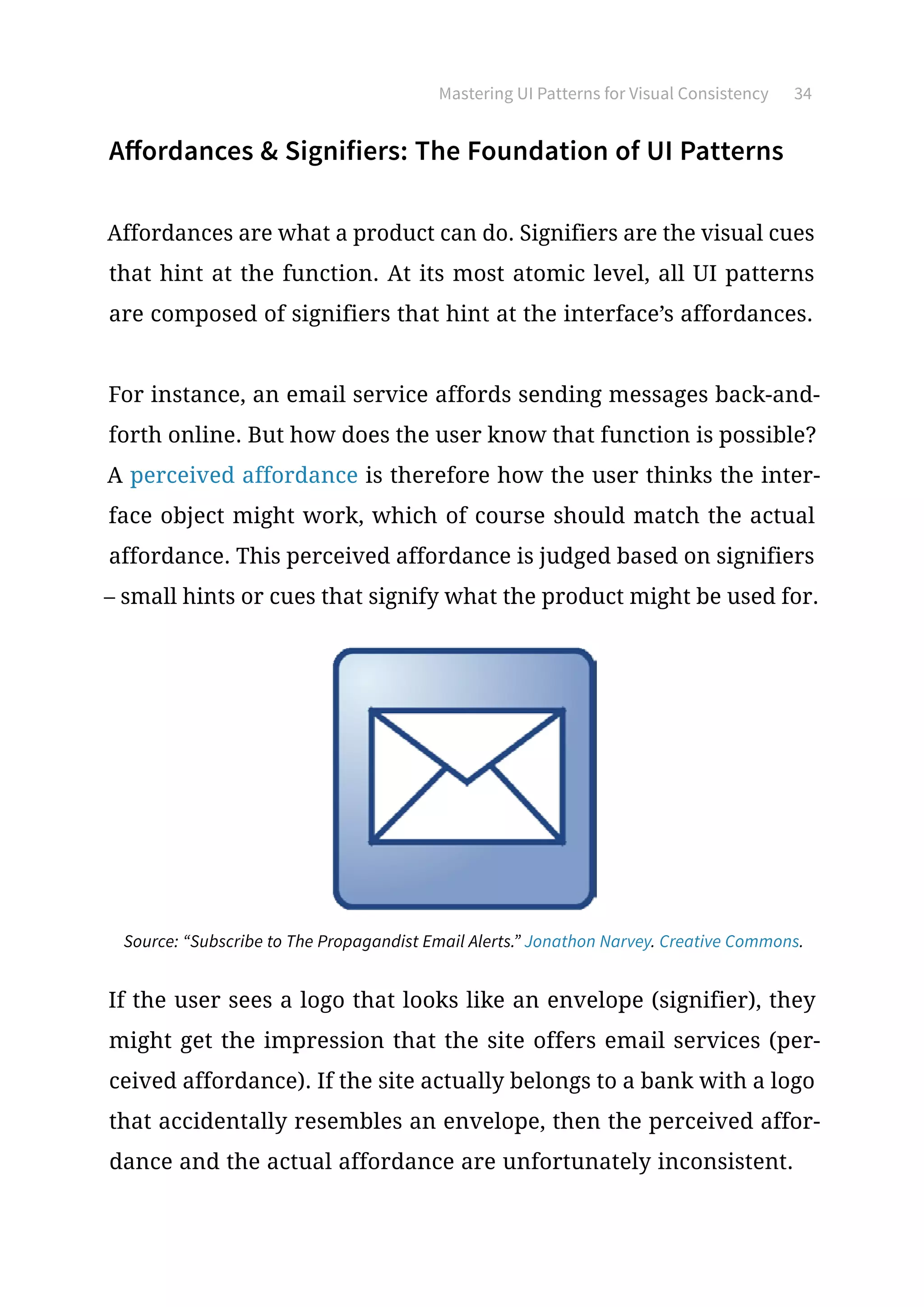
Source: “Subscribe to The Propagandist Email Alerts.” Jonathon Narvey. Creative Commons.
If the user sees a logo that looks like an envelope (signifier), they
might get the impression that the site offers email services (per-
ceived affordance). If the site actually belongs to a bank with a logo
that accidentally resembles an envelope, then the perceived affor-
dance and the actual affordance are unfortunately inconsistent.
Mastering UI Patterns for Visual Consistency 35
When signifiers are used properly, the product feels intuitive and
familiar, as if the user already knows what the feature is for. A
signifier can be anything that suggests meaning, whether a word,
a shape, a color, or a movement.
The important benefit about signifiers that we’d like to shine some
light on here is that consistently used signifiers from other sites
and apps will cut down on your own explaining. Using signifiers
that are consistent with other sites will streamline your own design.
To learn more about the categories of affordances and signifiers, we
recommend this article on Smashing Magazine as one of the most
comprehensive pieces we’ve read.
Pattern Classifications
Patterns come in a lot of forms and serve an assortment of uses. As
a good first step to keep you from being overwhelmed, it helps to
classify them into six main categories based on their core site func-
tions (which you can actually see on the excellent site UI Patterns):
•	 Input and Output – These patterns deal with how the user in-
teracts with or submits input to the site, and likewise of how the
site responds, or submits feedback.
•	 Navigating – These help guide the user around the site, ensuring
they are properly oriented and know how to find their way if lost.
Mastering UI Patterns for Visual Consistency 36
•	 Content Structuring – Is your content accessible and easy to
access? These patterns help you organize your content in a way
that reflects logic and hierarchy.
•	 Reducing Friction – How does your site present content without
friction or cognitive load? As described in Interaction Design Best
Practices, these patterns help you guide users through your site
at a comfortable pace.
•	 Incentivizing – These are the patterns that motivate your users
to interact, like progress bars or other methods of gamification.
These design patterns exploit the brain’s habit loop to hook users
onto the product.
•	 Social Sharing – These are the patterns that allow, promote, and
facilitate the sharing of your site on any social media venue you
prefer. You could also use social proof patterns to increase trust
with users.
Of course, design patterns are just blueprints for your creativity.
Because they represent popular interaction design best practices,
starting with a UI pattern allows you to be innovative without alien-
ating users.
Treat UI patterns as blueprints for your own creativity.
Mastering UI Patterns for Visual Consistency 37
Implementing UI Patterns
Beyond their function, patterns can further be classified by how
they’re used on a site. As we’ll discuss below, some patterns can be
interpretive and used different ways, while others are very precise
and keep only one method of implementation. We define patterns
as tactical, strategic, and site-specific, based upon Anders Toxboe’s
UI Pattern Pyramid.
1.	Tactical
Tactical patterns are the most direct and strict patterns, and the
rules tend to be black-and-white: the logo remains in the upper-
-left on every page, all textual links use a blue font color, etc.
Tactical implementation relies heavily on both external and in-
ternal consistency: external because, as patterns, their strength
comes from the familiarity of their use on other sites; internal
because their implementation remains the same on every page
within your site. For example, you’d want to place the search
bar in the top right since it’s become so commonplace (external
consistency). Once you’ve done so on one page, you’d want to
make that search bar a pattern so that it happens on all pages
(internal consistency).
Mastering UI Patterns for Visual Consistency 38
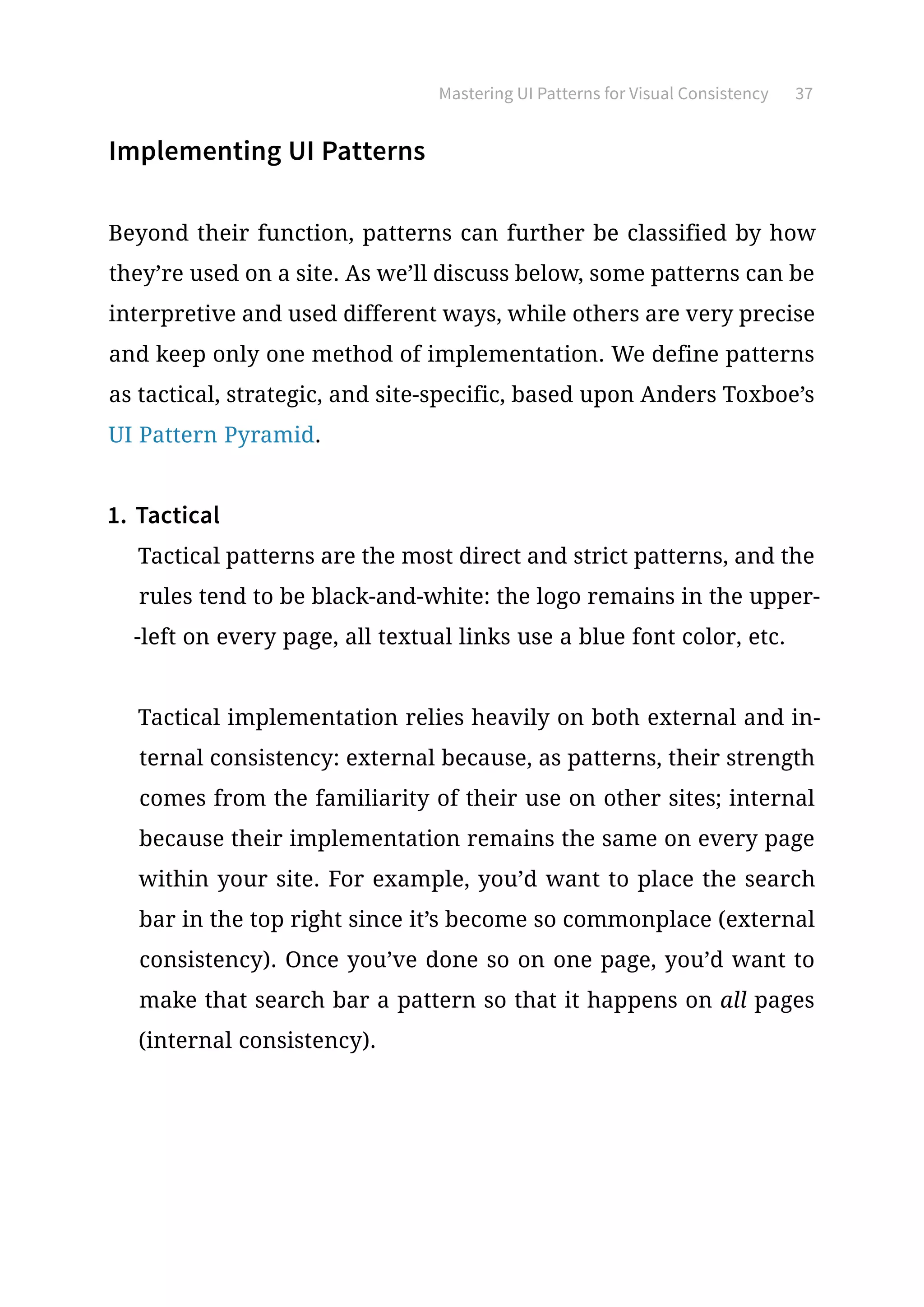
Source: Yelp Style Guide
Front-end style guides document mostly implementation pat-
terns, since these atomic details affect how developers code de-
signs and how designs are reproduced sitewide.
2.	 Strategic
A step above tactical patterns are patterns that are chosen as part
of the UX strategy. At this level, patterns become more advanced,
and are concerned with how they help the user move through
the site to achieve their goals.
Would a Jump-To or Sticky Navigation work better to help users
access additional content? Given your user and the type of web-
site, what’s the best way to ask for input without overwhelming
the user?
Strategic choices later lead to tactical choices.
Mastering UI Patterns for Visual Consistency 39
For example, you might select a single-page site instead of tabs
or multiple pages because you want to craft a stronger narra-
tive – that’s a strategic implementation of a pattern. Once you’ve
made that decision, you need to then make a series of tactical
decisions, such as what kind of scroll bar you’ll use, how the text
is broken up, etc.
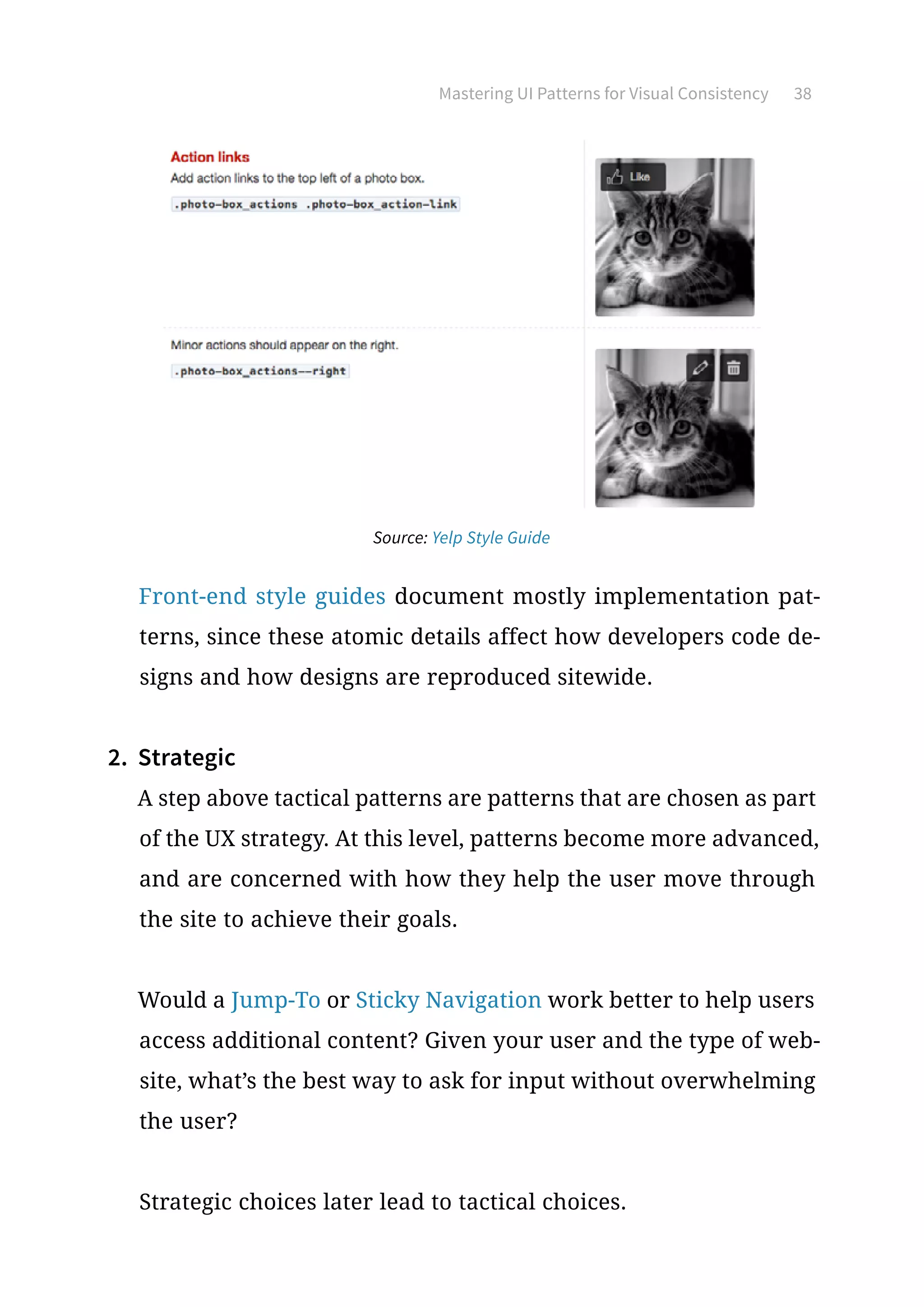
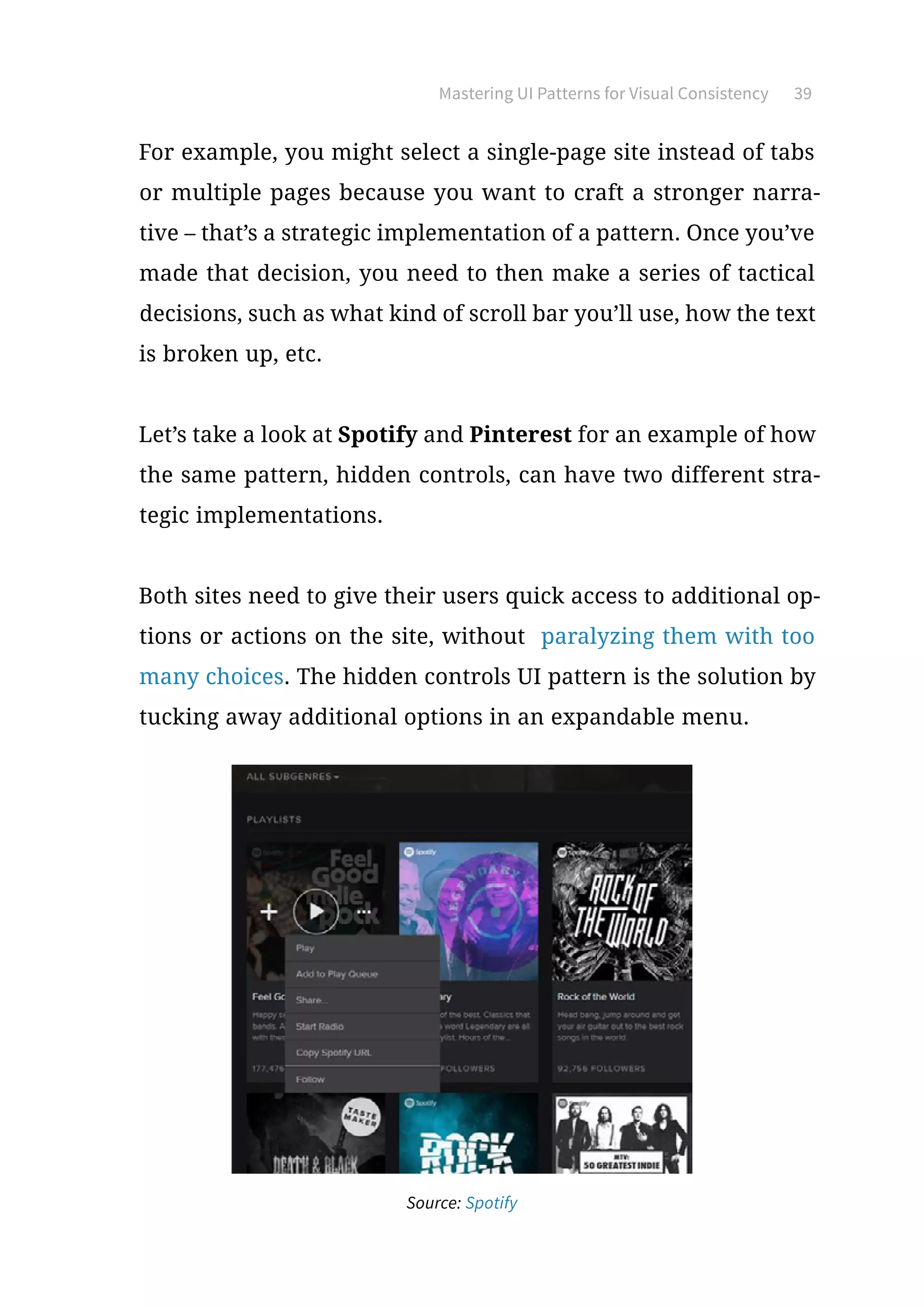
Let’s take a look at Spotify and Pinterest for an example of how
the same pattern, hidden controls, can have two different stra-
tegic implementations.
Both sites need to give their users quick access to additional op-
tions or actions on the site, without paralyzing them with too
many choices. The hidden controls UI pattern is the solution by
tucking away additional options in an expandable menu.
Source: Spotify
Mastering UI Patterns for Visual Consistency 40
Source: Pinterest
But the difference isn’t in the what, it’s in the how. Spotify has
a short-and-sweet menu that appears over the selection, while
Pinterest has an all-inclusive menu that’s hidden inside of a ham-
burger icon (another pattern in and of itself).
Strategic patterns are influenced by external consistency. You
can see in the example that the overflow menu is not a ground-
breaking UI pattern. Most designers will follow the spirit of the
pattern, then apply different visual or interactive elements to
make the pattern consistent with the look/feel of the site.
Mastering UI Patterns for Visual Consistency 41
3.	 Site-specific
Some patterns only work on certain types of sites, or have differ-
ent versions depending on the site. These distinctions are made
first and foremost, before either strategic and tactical implemen-
tations are decided.
For example, let’s say you’re building a site for a design agency:
you know you’ll need to create pages for a portfolio, gallery, bi-
ographies, and testimonials or social proof. You know that you
need to include these pages because of the type of site – these
are the patterns the typical user expects based on the type of
site they’re on. Only afterwards do you decide the strategy for
implementing them, and then the tactics.
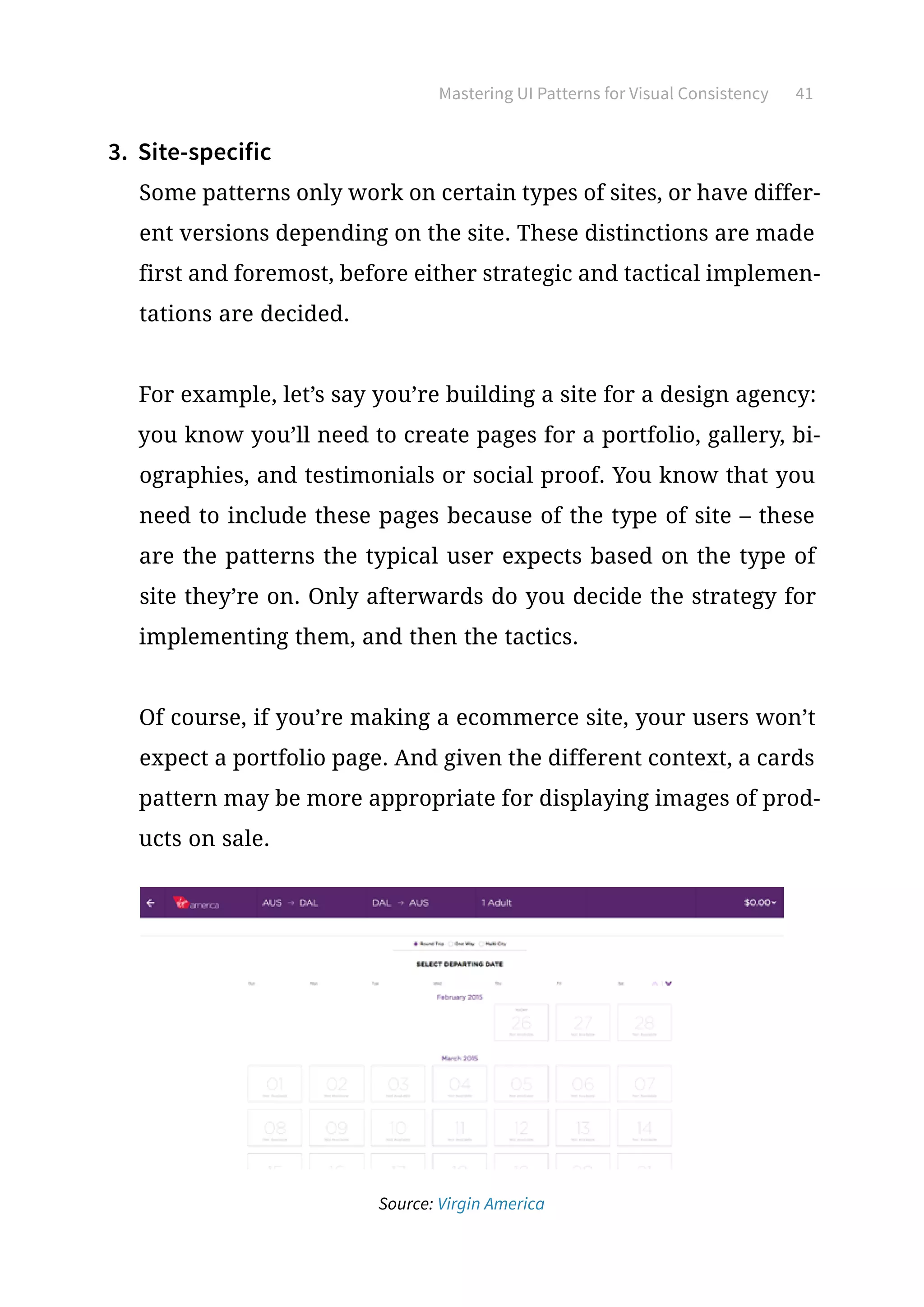
Of course, if you’re making a ecommerce site, your users won’t
expect a portfolio page. And given the different context, a cards
pattern may be more appropriate for displaying images of prod-
ucts on sale.
Source: Virgin America
Mastering UI Patterns for Visual Consistency 42
Virgin America requires a UI pattern for its booking form (an
advanced user input pattern) because it’s in the airline business.
Obviously, users would never expect this type of pattern on a
site like Netflix or CNN.
Because users expect specific functionalities from certain types
of sites, site-specific patterns are influenced purely by external
consistency.
4.	 Bringing It All Together
Let’s say you’re a photographer, and you’re building a website to
promote yourself, specifically the homepage. You’ll select your
patterns by following the three steps we outlined above.
First, you’ll decide which site-specific patterns your users are
expecting. Because you’re a photographer, you’ll need to show-
case your samples.
Next you decide the how to showcase them – this is a question of
strategy. You could use an old fashioned grid view, but instead
you opt for an image carousel.
Last, you decide which tactics to use for the image carousel.
Foregoing the dot locators at the bottom, you take a minimalist
approach with only two very basic arrows on each end. Finally,
you implement this pattern consistently across the entire site.
Mastering UI Patterns for Visual Consistency 43
Selecting the Right UI Pattern for You
There are thousands of established patterns, with more and more
being created everyday – but not all of them will work for you.
Source: UXPorn
The selection process for UI patterns can be simplified to four basic
steps:
1.	 Determine the problems that need to be solved.
2.	 Explore how others have solved the same problem.
3.	 Examine the solution’s use on other sites.
4.	 Detail the patterns proper usage so you can recreate it.
Let’s see the process at work with an example: you notice that a lot
of your users aren’t signing in when browsing your site.
1.	 Determine the problems that need to be solved. Because the us-
ers are still coming to your page and spending an appropriate
amount of time there, you can deduce that the problem stems
Mastering UI Patterns for Visual Consistency 44
from the login and signup processes. The solution, then, would
be a way to simplify both processes so that your users don’t
mind doing them.
2.	 Explore how others have solved the same problem. You decide to
do a little detective work and visit some popular sites similar
to yours. Some use a lazy signup, but that doesn’t solve your
problem of enticing your users to signup or login. Some oth-
ers use incentives like extra features or more content, but that
doesn’t fit in with the style of your particular site.
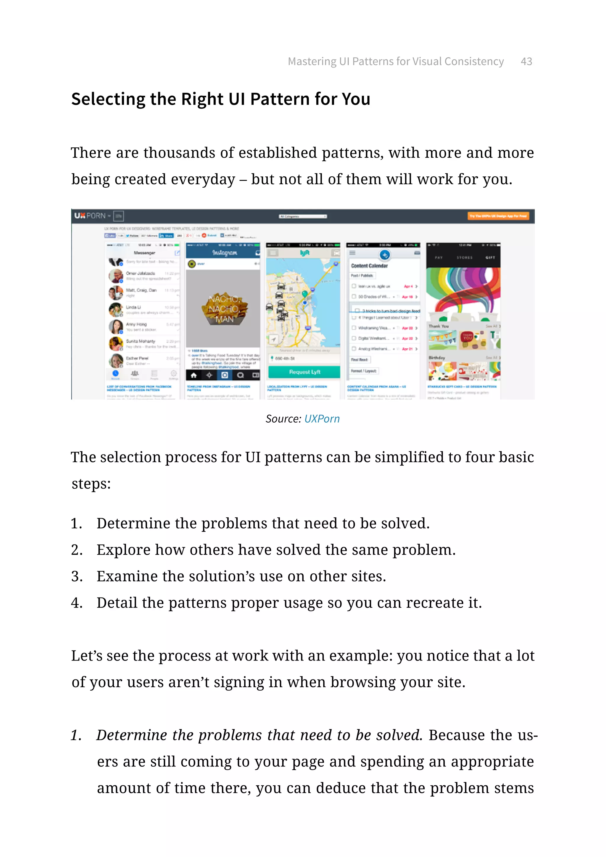
Finally, you notice that some sites use a social login, which al-
lows them to login or signup with their preexisting social media
accounts. This sounds like a good solution for your problem and
fits the site’s easygoing style.
Source: Jukely
Mastering UI Patterns for Visual Consistency 45
(Notice that lazy signup, signup incentives, and social login are
all different patterns. Which you choose will depend on your
site’s specific needs.)
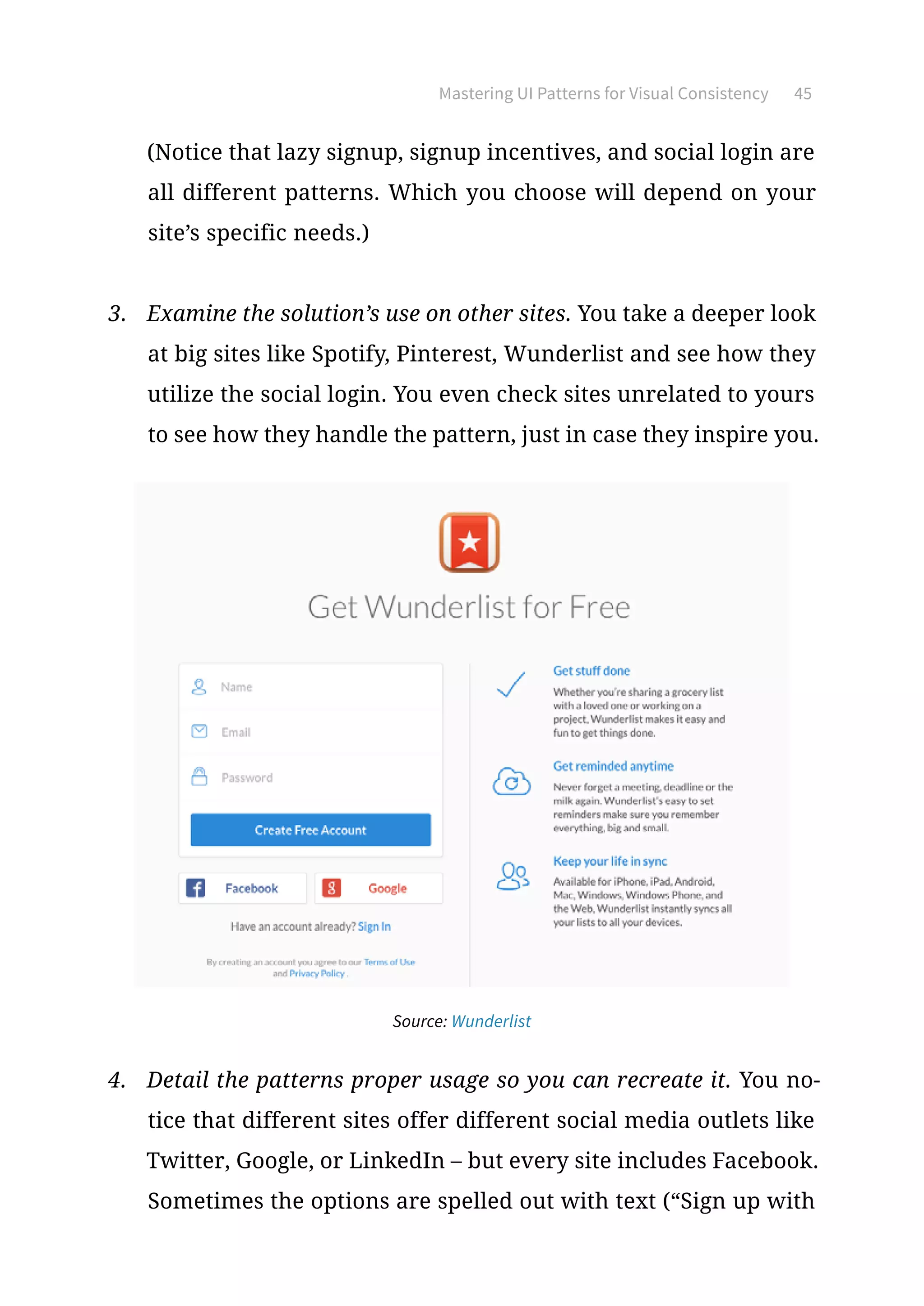
3.	 Examine the solution’s use on other sites. You take a deeper look
at big sites like Spotify, Pinterest, Wunderlist and see how they
utilize the social login. You even check sites unrelated to yours
to see how they handle the pattern, just in case they inspire you.
Source: Wunderlist
4.	 Detail the patterns proper usage so you can recreate it. You no-
tice that different sites offer different social media outlets like
Twitter, Google, or LinkedIn – but every site includes Facebook.
Sometimes the options are spelled out with text (“Sign up with
Mastering UI Patterns for Visual Consistency 46
Facebook”) while other times they just have the social media’s
icon situated nearby the login form so you know its purpose.
Remembering the Gestalt principle about how proximity sug-
gests function (which you learned from our Web UI Design for
the Human Eye), you decide only a button with an icon is enough
– after all, social login is a popular pattern and your users will
likely know these buttons mean they can login with their social
media accounts. You decide to include Facebook, Twitter, and
Google because those were the most frequent on the sites you
checked, and you put Facebook in the top position as the most
popular option.
Once you’ve found an effective UI pattern, don’t feel too at-
tached. While UI patterns are great for consistency, you don’t
want to be stuck in your local maximum. For example, you
might be designing a viral content site and decide that infinite
scroll is the best way to make all your content accessible. After
all, you’ve seen plenty of other sites use it to great success.
While infinite scroll may produce a better experience than forc-
ing users to click “Next Page” every ten entries, it may not be the
best solution. You can only determine that through free-minded
brainstorming, wireframing, prototyping, and testing.
Treat UI patterns as a “safe zone” for consistency, then venture
outside it one creative step at a time. Know the patterns, respect
Mastering UI Patterns for Visual Consistency 47
the patterns, but start your design with a fresh outlook each
time. That will ensure your design remains familiar, but still
has room to blossom into something new.
Know the UI patterns, respect the UI patterns,
but start your design with a fresh outlook each time.
UI Pattern Libraries  Resources
Even if you’re a hardened UI designer with years of experience, it’s
hard to keep track of all the patterns at your disposal. Below are
several resources that collect and compile all the latest and most
useful patterns. These will help you stay up-to-date, and can help
you improve upon the patterns with your own creativity.
•	 UI Patterns – One of the most comprehensive pattern libraries
featuring a highly logical layout for easy browsing. Fun fact: it
was just recently redesigned and restructured.
•	 UXPorn – See low-fi to hi-fi transformations of designs from top
companies like Lyft, Uber, Pinterest, and others. Click on the
patterns to use them for free in UXPin.
•	 Pattern Tap – This designer community from ZURB posts and
updates lots of helpful resources for web design education.
•	 Patternry – While this is a subscription-based app, it provides a
comprehensive library of UI patterns for CSS and HTML. It also
Mastering UI Patterns for Visual Consistency 48
lets you customize them as needed to build your own library.
•	 Capptivate – An exhaustively thorough collection of mobile UI
patterns. Almost all of them are animated, so you can see how
to layer interactions on top of popular patterns.
•	 UseYourInterface – A fantastic infinitely-scrolling library of GIFs
that show the interactive power of UI patterns.
•	 Web UI Design Patterns – Our own compilation of effective UI
patterns, in which we explain the proper application of the 63
best web UI patterns from sites like Amazon, Facebook, and Pin-
terest, and many more.
•	 Mobile UI Design Patterns – The companion piece to our compila-
tion of web patterns, this ebook features 46 of the most successful
UI patterns for mobile devices.
For even more detailed listings on UI pattern collections, Smashing
Magazine posted a list of over 40 online pattern libraries.
Mastering UI Patterns for Visual Consistency 49
Takeaway
Throughout this ebook we’ve discussed the proper ways to maintain
consistency, but all that knowledge is useless unless you remember
why consistency is important. Good design makes your users happy
and eager-to-return, gives a feeling of familiarity, and can be used
mostly by intuition.
These seemingly natural aspects are anything but – they must be
crafted with effort and know-how to give them that “natural” feel-
ing. Maintaining consistency (and knowing when to break it) is the
key to creating this feeling and satisfying your users’ expectations.
Create an interface in UXPin (7-30 day free trial)
Principles of visual consistency

Principles of visual consistency

  • 3.
    Copyright © 2015by UXPin Inc. All rights reserved. No part of this publication text may be uploaded or posted online without the prior written permission of the publisher. For permission requests, write to the publisher, addressed “Attention: Permissions Request,” to hello@uxpin.com.
  • 4.
    Index 0. Introduction 6 1.Uncovering User Expectations Before Design 8 Why You Need to Think About Consistency First 9 Testing Before Design 11 Takeaway 17 2. Practical Approach to Visual Consistency 18 Why Visual Consistency Matters for UI Design 19 Areas of Visual Consistency 23 Putting It All Together 29 Takeaway 32 3. Mastering UI Patterns for Visual Consistency 33 Affordances Signifiers: The Foundation of UI Patterns 34 Pattern Classifications 35 Implementing UI Patterns 37 Selecting the Right UI Pattern for You 43 UI Pattern Libraries Resources 47 Takeaway 49
  • 5.
    Jerry Cao isa content strategist at UXPin where he gets to put his overly active imagination to paper every day. In a past life, he developed content strategies for clients at Brafton and worked in traditional advertising at DDB San Francisco. In his spare time he enjoys playing electric guitar, watching foreign horror films, and expanding his knowledge of random facts. Follow me on Twitter Krzysztof is a graphic designer at UXPin. He is also a typography enthusiast and a founder of the global Typeseeing Project. Since 2014, he has been an instructor at the Academy of Fine Arts in Gdansk, where he teaches his students about design theory and design software. In his free time, he enjoys playing and inventing board games. Follow me on Behance With a passion for writing and an interest in everything anything related to design or technology, Matt Ellis found freelance writ- ing best suited his skills and allowed him to be paid for his curi- osity. Having worked with various design and tech companies in the past, he feels quite at home at UXPin as the go-to writer, re- searcher, and editor. When he’s not writing, Matt loves to travel, another byproduct of curiosity. Co-founder and head of product, Kamil previously worked as a UX/UI Designer at Grupa Nokaut. He studied software engineer- ing in university, but design and psychology have always been his greatest passions. Follow me on Twitter @ziebak
  • 6.
    Introduction Since vision isthe strongest human sense, your design must reflect a sense of order and logic – otherwise users will just go to your competitors instead. Visual consistency doesn’t just make your interface easier to use and learn, it also creates trust. Designs which are inconsistent with user expectations will feel foreign and difficult to use. Designs which are inconsistent from page to page will feel illogical and chaotic. Like we’ve stated before, consistency does not equate to uniformi- ty. Design is not a formula of drag-and-drop templates. You need to know when to follow best practices and when to bend the rules. The balance between familiarity and originality is undoubtedly one of the most difficult decisions in design. To help you exercise the best creative judgment, we’ve analyzed examples of visual consis- tency from companies like Squarespace, Redhat, Jukely, Wunder- list, and more. We’ll also discuss topics ranging from conducting
  • 7.
    7Introduction research to discoveruser expectations, reviewing important areas of visual consistency, and applying affordances UI patterns to create familiarity. If you find this book helpful, feel free to share with anyone else who might enjoy it. For the love of UI design, Jerry Cao co-written by Kamil Zieba, Krzysztof Stryjewski, and Matt Ellis
  • 8.
    Uncovering User Expectations BeforeDesign As information-age artists, designers enjoy their creative freedom. But concepts like “consistency” and “following patterns” don’t nec- essarily restrict this freedom. Instead, they provide a foundation of familiarity upon which to layer creative nuances. Originality helps you cross the chasm into emotional design, but that will all be meaningless unless your design works the way users expect. Source: “Design Patterns vs. Users’ Expectations...” visualpun.ch. Creative Commons.
  • 9.
    Uncovering User ExpectationsBefore Design 9 In this chapter, we’ll talk about how to approach user expectations in terms of consistency, how usability testing can reveal what your users think, and how the use of patterns and clear labels can give your user that feeling of satisfaction. Consistency creates a foundation of familiarity for designers to layer creative nuances. Why You Need to Think About Consistency First Why is it so important that you think about user expectations – and therefore consistency – before even creating a single mockup? Be- cause otherwise you’re going to be biased. If you’ve already envisioned an interface by the time you start ask- ing yourself, “what does the user expect?” then it’s going to be hard- er to correct your mistakes – if you’re even able to notice them. By that point, you’ll already have a rough idea of the visual design patterns, so it’ll be harder to look at them from a fresh perspective. You’ll be desensitized to what a new user might think about during the first interaction with your design. Empathizing with your user is at the heart of interaction design, and this is a more difficult task with an existing design than one still being formulated. Sure, you could track the behavioral patterns
  • 10.
    Uncovering User ExpectationsBefore Design 10 and modify your UI based on user interactions. But even so, you’re better off putting thought into it beforehand so that the later mod- ifications are less extreme. Source: “Listening (the extended research dept)” Xavier Vergés. Creative Commons. The time to consider user expectations and consistency is right at the start, when you’re working with the team on the rough feature set. At that time, you’re closest to the user’s mindsets: the design is new to you both. You must consider user expectations and consistency from the very beginning of design projects. This applies to both external and internal consistency. Since user ex- pectations carry over from previous experiences, even new designs must follow standard conventions (external consistency). But you also need to keep internal pages consistent with each other, because your users will develop new expectations as they use your site or app. While intuition might get you part of the way, it’s best to build your designs on solid, concrete evidence.
  • 11.
    Uncovering User ExpectationsBefore Design 11 Testing Before Design Usability testing can help you understand user expectations and validate your assumptions. To ensure consistency in your design, we recommend running usability tests both before and during the design process. We’ll focus here on the tests that you’d want to run before designing, since these can be a little lesser known. Below, we’ll talk about the three most helpful pre-design tests: card sorting, user interviews, and heuristics reviews. While intuition might get you part of the way, it’s best to build your designs on solid, concrete evidence. 1. Card Sorting Because navigation is a crucial element in user interaction, you’ll want to create the information architecture that feels the most natural to your user. The beauty of card sorting is that it helps you design your information architecture according to natural thought patterns. Source: ConceptCodify
  • 12.
    Uncovering User ExpectationsBefore Design 12 There are two types of card sorts: • Open Sorting: Users are provided only with the labels, and are left to group them however they see fit. Once grouped, users are asked to give names to the groups themselves. This is recommended for generating new ideas since you can work backwards from users’ natural thought processes. • Closed Sorting: As with open sorting, users are given the la- bels; however, they are asked to categorize them into existing groups. This is recommended if you’re updating a finalized website structure. We found closed card sorting to be extremely helpful when re- designing Yelp (as an exercise) to better match user expectations. After we ran the test, we learned that important search filters weren’t immediately available, which of course increased fric- tion. For example, users determined that filtering for meals (like “Serves Dinner”) should be immediately available, yet the current design buried it under another layer of filters. 2. User Interviews User interviews can be as elaborate or cost-effective as you’d like, whether they come to you, you go to them (or you simply talk through Skype). Before transitioning UXPin from a paper notepad to a cloud de- sign app, we actually interviewed more than 50 designers. Be-
  • 13.
    Uncovering User ExpectationsBefore Design 13 cause the design market is such a saturated space, we wanted to speak with as many designers as possible so that we could learn about their workflow, processes, inspirations, and expectations from good design tools. Once we started designing the current UXPin, we frequently re- ferred back to the notes from our interviews to make sure our concepts and mockups aligned with the expectations our users developed from other tools. For example, in order to satisfy differing expectations, our proj- ect layout allows users to choose either a grid or list view – de- signers had varying preferences based on whether they used Trello, Asana, or other tools to manage projects. We learned that specifically through user interviews. Source: UXPin When conducting the actual interviews, remember that you ar- en’t asking users specific design questions like “Do you prefer an infinite scroll or tabs?” You want to ask deeper questions about their habits, behaviors, and needs so that your design takes the path of least resistance.
  • 14.
    Uncovering User ExpectationsBefore Design 14 Let’s say you’re designing a new blog CMS. By asking something like, “What do you like about your current blog CMS?” you might learn that users enjoy Wordpress’s “distraction free” mode be- cause it helps them better focus on writing. You can then infer, for the design of your own blog CMS, that you should give users an option to toggle the appearance of the interface. The inter- view has therefore revealed that users really enjoy a current design works, so you should keep that preference in mind when designing for consistency. There are a lot of different strategies to consider for user in- terviews that we don’t have space to cover here, but if you’re interested, take a look at these excellent resources: ● User Interview Techniques, Liz Danzico ● 15 Interview Questions for Creating Personas, Steve Mulder ● Ask and Ask Again: Critical Interviewing Is an Essential Com- ponent of Usability Testing, Kate Lawrence ● Getting Better Data from User Studies, Michael Margolis For some low-cost approaches to user research, we recommend reading Patrick Neeman’s advice on creating lightweight perso- nas. All of the tactics he lists will help you uncover the insights you need to deduce the expectations of users.
  • 15.
    Uncovering User ExpectationsBefore Design 15 3. Heuristic Evaluation Heuristic evaluations are great for ensuring external consistency since you’re focusing on competitor designs. While traditionally heuristic evaluations are used to test usability problems or fea- ture audits, before the design they can outline the current state of the market you’re getting into. The process just needs to be modified slightly: 1. Determine what fields to evaluate. In other words, in what fields will you be competing with your rivals, or in which areas is it possible to excel compared to them? These could be ease of use, how you satisfy user goals, the visual style and atmosphere, and the target users themselves. You might include the following areas for critique: • Visual hierarchy • Visual impact • Effectiveness of system feedback • Clarity of copy • Ease of navigation • Simplicity of user input 2. Conduct the evaluation with the above criteria. If you can spare the manpower, try to get 5 people to go through your competitor’s interface and assign them scores in the fields
  • 16.
    Uncovering User ExpectationsBefore Design 16 you previously listed. Sometimes it helps to have your evaluators complete the same tasks to keep them focused. If conducting ac- tual moderated tests is outside your means, you can also draw up simple questionnaires or – as a last resort – go through your competitor’s sites yourself and give them your own ratings. 3. Diagram the results. The clearest way to understand the results of the evaluation is to see them. Plotting them out of a graph is the most efficient way to organize the data. Michael Hawley uses a very effective “spider-web” method, as you can see in this post. We recommend his method because it’s conducive to the final step: comparing. 4. Compare the results for consistencies and inconsistencies. Looking at your top competitors’ scores side-by-side – or even better, overlapping – will give you a solid understanding of your space and what your users may come to expect. You could create them according to this overlapping format created by designer Leigh Howells. But remember the most important thing: the heuristic evalua- tions will reveal the consistencies and inconsistencies in your niche, but it’s up to you to know when to break away from the norm, and when to fall in line. For example, let’s say none of your competitors use ads. If you choose to break the external consistency and feature ads on your
  • 17.
    Uncovering User ExpectationsBefore Design 17 site, this may irritate users. They are expecting an ad-free expe- rience when using sites or apps of your genre, and not meeting this expectation may worsen their experience. On the other hand, let’s say almost all of your competitors only offer one way to complete a given task. This is the status quo, and what your users would expect... but if you choose to break this consistency and offer multiple ways to complete a given task, you might impress some users and win them over. In this way, the heuristic review comparison can show you possi- bilities for getting the better of your competitors, and not simply meeting user expectations, but exceeding them. Takeaway Consistency isn’t something you add once the design is finished, it’s something you incorporate on the ground level and build around. Consistency will always be tied to user expectations, which is the core to all aspects of design. Remember that usability tests can help you pinpoint exactly what kind of consistencies your users want and expect most. Scope out the competition, listen to your users, then test early and often.
  • 18.
    Practical Approach to VisualConsistency Humans are visual creatures. Compared to the rest of the animal kingdom, our other senses are, to put it politely, “lacking.” So we rely heavily on our sight to assess, process, and interpret the world around us. Considering that Google determined it only takes about 50 milliseconds for users to judge your website, visual interactions are usually the strongest (and most lasting) interactions. Source: “ETUX225: Figure 13.13.” Rosenfeld Media. Creative Commons.
  • 19.
    Practical Approach toVisual Consistency 19 In this chapter we’ll explain exactly why visual consistency is so important, outline a couple criteria for consistency, and tie it all together with live design examples. Why Visual Consistency Matters for UI Design Because vision is our dominant sense, the visuals on your interface will have the biggest impact on interaction. Just how much bigger might surprise you. To reiterate some points from Interaction De- sign Best Practices, David McCandless, Data Journalist, explains in a compelling TED Talk that a vast majority of our brain-power goes into sight, though nearly all of it is subconscious. “Your sense of sight is the fastest. It has the same bandwidth as a computer network. Then you have touch, which is about the speed of a USB key. And then you have hearing and smell, which has the throughput of a hard disk. And then you have poor old taste, which is like barely the throughput of a pocket calculator. And [then the] naught .7 percent, that’s the amount we’re actually aware of. So a lot of your vision – the bulk of it is visual, and it’s pouring in – it’s unconscious.” Why does this matter for web UI design? Because so much of visual design affects the user on a subconscious level, your site must first feel familiar. When users encounter a new design, they are armed only with their prior experiences as they
  • 20.
    Practical Approach toVisual Consistency 20 make a snap judgment. As Google’s original research suggests, this gut feeling is influenced exclusively by the visual design: hierarchy, symmetry, line spacing, fonts, etc. Because vision is our dominant sense, the visuals on your interface have the greatest impact on interaction. Google found that simpler, familiar websites persuaded users to stay. As the design became more complex, users felt it looked less beautiful, even if the design felt familiar. Likewise, if the design was simple and clean but unfamiliar, users felt the site was also ugli- er. Externally consistent design helps you pass the user’s “gut test” since you meet their expectations. Meanwhile, internal consistency then provides logic to your interface, while slight inconsistencies keeps users curious and engaged. A clean, visually consistent site gives users feelings of comfort, con- trol, and familiarity, whether consciously or not. Some designers attribute these benefits to properly designed visual flow. Source: “Eye Tracking.” Bernard Goldbach. Creative Commons.
  • 21.
    Practical Approach toVisual Consistency 21 In terms of interaction design, visual flow is the path your users’ eyes take as they interact with your site or app. Experienced de- signers know how to manipulate their users’ visual flow through eye-pattern strategies, contrasting colors, varying sizes, and other methods (outlined in our free ebooks, Web UI Design for the Human Eye I II). A clean, visually consistent site gives users feelings of comfort, control, and familiarity. The goal of visual flow is creating a harmony and rhythm to all the on-screen UI elements. Laura McGuigan, VP of Design at Track- Maven, explains that repeating elements create a pleasant visual pattern – a rhythm – that you can break up with smart variations to capture user interest. This reflects what we said in the previous Consistency in IxD book about knowing when to be inconsistent. But if you’ll remember, the potency of inconsistency relies on a pre-established, overarching consistency. Source: neilcarpenter.com
  • 22.
    Practical Approach toVisual Consistency 22 Take, for example, web designer Neil Carpenter’s site. You can’t tell from the screenshot above, but the colored shapes are in motion from the top-right corner to the bottom-left – literally creating a visual flow for the page. This colorful animation is a deviation from the norm (making it externally inconsistent), which actually sets Carpenter apart. Take note, though, that he remains externally consistent where nec- essary. He keeps a top, horizontal navigation bar with the standard “About,” “Work,” and “Contact” pages you’d expect from a portfolio site. His “brand,” in this case his name, is in the upper-left. Internally, the white text stands out against the black background and color of the animation. This breaking of internal consistency allows the importance message of the text, including links, to be clearly visible even amidst a visually competitive landscape. Other pages retain this black background/white text color scheme, and even play on the basic shape theme with the site’s loading icons.
  • 23.
    Practical Approach toVisual Consistency 23 Areas of Visual Consistency When it comes to visual consistency, there are certain areas war- ranting extra attention. We can divide them into typography, UI elements, and color. 1. Typography Feel free to experiment with different fonts and styles – but don’t go overboard. You’ll want enough diversity to keep your text interesting, while also differentiating the categories of text (heading, content, links, etc.). While you can select different typefaces, styles, and weights for different categories, your treatment must remain consistent. If you use a bold serif font for all H1 headers, make sure all H1 headers reflect the treatment. Source: Rule of Three UK To ensure consistency, you should actually set font properties globally through CSS. Font family, size, color, line height, and weight can all be set as in the following example for body text:
  • 24.
    Practical Approach toVisual Consistency 24 body { font: 1em/1.5em Cambria, Arial, serif; color: #151; } Beyond consistent typefaces, make sure the alignment is con- sistent and that you’ve set proper line spacing (roughly 1.4-1.6x your font size). Creating this vertical rhythm instills harmony between all your content, improving readability and familiarity. Source: UXPin For one potential redesign of the UXPin website, we decided on a minimalist sans-serif typeface. Let’s take a look at the site-wide consistencies: • Headers – Large font size, with bold applied to select words • Subhead – Mixed-case, regular weight • Primary Navigation – Mixed-case, bolded weight • Secondary Navigation – All caps, regular weight Now let’s examine the body copy:
  • 25.
    Practical Approach toVisual Consistency 25 Source: UXPin For the main content, we’ve created vertical rhythm through a left-justified, right-ragged alignment and a 1.6x line spacing. To transition the eye smoothly, we also added plenty of white space between the H2 header (“Wireframe any user interface quickly and easily”) and body copy. Vertical rhythm creates harmony between all your content, improving readability and familiarity. 2. UI Elements A site’s use of graphics, icons, textures, layout spacing, and imag- es all work together to set the visual atmosphere of the interface. Aside from thematic consistency, pay attention to the mechanics of graphics: • Spatial Relationships – Make sure that the padding around elements is consistent, otherwise you’ll break the visual flow. Also check that you’ve purposefully inserted space to separate
  • 26.
    Practical Approach toVisual Consistency 26 elements with different functions (Fitts’ Law as described in Interaction Design Best Practices). • Images – Visually, your images should reflect the same look, feel, and texture. In terms of implementation, make sure that you don’t make some images open in new tabs while others appear in lightboxes. Pick a style and stick with it. • Size – Related elements should be the same size and look similar (i.e., all circular or all square). According to Gestalt Principles, any variation in appearance will suggest a different function. Larger elements appear more important, so if two elements are related, they should be closer in size. Let’s take a look at Redhat, which reflects all the best practices for visual consistency of UI elements. Technology Page Source: RedHat
  • 27.
    Practical Approach toVisual Consistency 27 Services Support Page Source: Redhat As we described in Web UI Patterns, the cards pattern is great for maintaining consistency across different pages. Once you hit a secondary page like Technologies or Services Support, the close spacing and identical size of the features pages all suggest that they relate to each other. Meanwhile, site search and account settings are shuffled away to the top-right corner, but they are clustered together. This tells the user that these are all a group of secondary actions. Also, notice how the background image has the same industrial feel, but differences in shading and color keep the site from feeling like a template. The circular icons are also consistently designed with their white outlines against a red background. 3. Color Take great care in choosing your website’s colors – each hue, where it appears, and the other colors it interacts with will all have a great emotional impact on your user. We explain each
  • 28.
    Practical Approach toVisual Consistency 28 color and their psychological significance in our Web UI Design for the Human Eye I, but suffice to say, different colors evoke different emotions in your users (green suggests prosperity and serenity, blue suggests trust, red suggests passion, etc.). Select a fixed palette of colors for your site and stay consistent. Which colors you choose are up to you, based on the mood you’d like to set. Unless you’re highlighting specific elements, the colors on each page should complement each other. Source: Michael’s For an example of color consistency, we’ll look to the website for the art store Michael’s. Their creamy background accents the dominant black for their logo and menus – this repeated use of black itself adhering to color consistency. The simple black-white(ish) color scheme also causes their consistent use of green to really stand out, emphasiz- ing their sales deals. The occasional use of red (the search button, the location of the image carousel) draws attention to itself, but it’s sporadic use keeps it mostly in the background.
  • 29.
    Practical Approach toVisual Consistency 29 Putting It All Together Let’s take a look at a site that uses visual consistency well across the board. With their fine eye for visuals, the landing page for the website-building firm Squarespace flaunts their skills on the very face of their site. The microsite for Squarespace’s super bowl ad is consistent in its treatment of UI elements, playful typography, and rich colors. Source: Dreaming With Jeff Let’s start with the top of the page. They only use two typefaces: a decorative font for the header and sans-serif for the rest. To dis- tinguish calls-to-action, all button typefaces are capitalized. Notice how inconsistency is smartly applied to distinguish the two calls- to-action: the primary CTA is filled in white, while the secondary CTA (which redirects you) is muted, but underlined.
  • 30.
    Practical Approach toVisual Consistency 30 Source: Dreaming With Jeff As you scroll down the page, secondary actions appear in the bot- tom-right corner, capitalized to signal interactivity, but more sub- dued in color. The generous line spacing and paragraph spacing create a nice vertical rhythm, while the white typeface accents the grayish outline of Jeff Bridges. Source: Dreaming With Jeff In the middle of the page, the design transitions to more of a skeu- omorphic look to reflect a dark table. But it’s applied tastefully, so the design still feels dark and bold without feeling tacky. We still feel a part of the nocturnal experience.
  • 31.
    Practical Approach toVisual Consistency 31 The play buttons are all the same, and the color yellow is used con- sistently: the yellow border around the playlist complements the other yellow elements like the cassette border, play progress bar, and bottom-left logo. Source: Dreaming With Jeff Once you scroll to the bottom, the transition to white immediately communicates this section is different from the rest. And it certainly is – Squarespace is now providing their value propositions. The background, however, is the only area of inconsistency. The video players are the same size, while the call-to-action treatment is the same as the rest of the site. The shade of white is also the same as the white accents used in previous sections, making the design feel different yet still familiar. Instead of feeling out of place, this section feels more like a separate dimension of the same site thanks to the consistent elements.
  • 32.
    Practical Approach toVisual Consistency 32 Takeaway As we explained, the sense of sight largely governs how humans interact with their world, even more-so on a subconscious level. Any interaction design that hopes to be successful must prioritize visual interaction, especially in the three main fields we outlined. Just because a user isn’t clicking on your site elements doesn’t mean they aren’t interacting. Run through the visual consistency checklist – typography, UI elements, and colors – to give your interactions a visible sensibility that your users will appreciate, whether they’re aware of it or not.
  • 33.
    Mastering UI Patterns forVisual Consistency Any discussion of visual consistency in interaction design will al- ways return to UI patterns. UI patterns originate as solutions to common usability problems, and their effectiveness correlates directly with their popularity and adoption. The most successful are ingrained in the minds of even inexperienced users, generating a self-perpetuating cycle as more sites and apps reuse them. Source: Web UI Kit In this chapter, we’ll dive into the anatomy of UI patterns and how to select them as shortcuts to meeting user explanations.
  • 34.
    Mastering UI Patternsfor Visual Consistency 34 Affordances Signifiers: The Foundation of UI Patterns Affordances are what a product can do. Signifiers are the visual cues that hint at the function. At its most atomic level, all UI patterns are composed of signifiers that hint at the interface’s affordances. For instance, an email service affords sending messages back-and- forth online. But how does the user know that function is possible? A perceived affordance is therefore how the user thinks the inter- face object might work, which of course should match the actual affordance. This perceived affordance is judged based on signifiers – small hints or cues that signify what the product might be used for. Source: “Subscribe to The Propagandist Email Alerts.” Jonathon Narvey. Creative Commons. If the user sees a logo that looks like an envelope (signifier), they might get the impression that the site offers email services (per- ceived affordance). If the site actually belongs to a bank with a logo that accidentally resembles an envelope, then the perceived affor- dance and the actual affordance are unfortunately inconsistent.
  • 35.
    Mastering UI Patternsfor Visual Consistency 35 When signifiers are used properly, the product feels intuitive and familiar, as if the user already knows what the feature is for. A signifier can be anything that suggests meaning, whether a word, a shape, a color, or a movement. The important benefit about signifiers that we’d like to shine some light on here is that consistently used signifiers from other sites and apps will cut down on your own explaining. Using signifiers that are consistent with other sites will streamline your own design. To learn more about the categories of affordances and signifiers, we recommend this article on Smashing Magazine as one of the most comprehensive pieces we’ve read. Pattern Classifications Patterns come in a lot of forms and serve an assortment of uses. As a good first step to keep you from being overwhelmed, it helps to classify them into six main categories based on their core site func- tions (which you can actually see on the excellent site UI Patterns): • Input and Output – These patterns deal with how the user in- teracts with or submits input to the site, and likewise of how the site responds, or submits feedback. • Navigating – These help guide the user around the site, ensuring they are properly oriented and know how to find their way if lost.
  • 36.
    Mastering UI Patternsfor Visual Consistency 36 • Content Structuring – Is your content accessible and easy to access? These patterns help you organize your content in a way that reflects logic and hierarchy. • Reducing Friction – How does your site present content without friction or cognitive load? As described in Interaction Design Best Practices, these patterns help you guide users through your site at a comfortable pace. • Incentivizing – These are the patterns that motivate your users to interact, like progress bars or other methods of gamification. These design patterns exploit the brain’s habit loop to hook users onto the product. • Social Sharing – These are the patterns that allow, promote, and facilitate the sharing of your site on any social media venue you prefer. You could also use social proof patterns to increase trust with users. Of course, design patterns are just blueprints for your creativity. Because they represent popular interaction design best practices, starting with a UI pattern allows you to be innovative without alien- ating users. Treat UI patterns as blueprints for your own creativity.
  • 37.
    Mastering UI Patternsfor Visual Consistency 37 Implementing UI Patterns Beyond their function, patterns can further be classified by how they’re used on a site. As we’ll discuss below, some patterns can be interpretive and used different ways, while others are very precise and keep only one method of implementation. We define patterns as tactical, strategic, and site-specific, based upon Anders Toxboe’s UI Pattern Pyramid. 1. Tactical Tactical patterns are the most direct and strict patterns, and the rules tend to be black-and-white: the logo remains in the upper- -left on every page, all textual links use a blue font color, etc. Tactical implementation relies heavily on both external and in- ternal consistency: external because, as patterns, their strength comes from the familiarity of their use on other sites; internal because their implementation remains the same on every page within your site. For example, you’d want to place the search bar in the top right since it’s become so commonplace (external consistency). Once you’ve done so on one page, you’d want to make that search bar a pattern so that it happens on all pages (internal consistency).
  • 38.
    Mastering UI Patternsfor Visual Consistency 38 Source: Yelp Style Guide Front-end style guides document mostly implementation pat- terns, since these atomic details affect how developers code de- signs and how designs are reproduced sitewide. 2. Strategic A step above tactical patterns are patterns that are chosen as part of the UX strategy. At this level, patterns become more advanced, and are concerned with how they help the user move through the site to achieve their goals. Would a Jump-To or Sticky Navigation work better to help users access additional content? Given your user and the type of web- site, what’s the best way to ask for input without overwhelming the user? Strategic choices later lead to tactical choices.
  • 39.
    Mastering UI Patternsfor Visual Consistency 39 For example, you might select a single-page site instead of tabs or multiple pages because you want to craft a stronger narra- tive – that’s a strategic implementation of a pattern. Once you’ve made that decision, you need to then make a series of tactical decisions, such as what kind of scroll bar you’ll use, how the text is broken up, etc. Let’s take a look at Spotify and Pinterest for an example of how the same pattern, hidden controls, can have two different stra- tegic implementations. Both sites need to give their users quick access to additional op- tions or actions on the site, without paralyzing them with too many choices. The hidden controls UI pattern is the solution by tucking away additional options in an expandable menu. Source: Spotify
  • 40.
    Mastering UI Patternsfor Visual Consistency 40 Source: Pinterest But the difference isn’t in the what, it’s in the how. Spotify has a short-and-sweet menu that appears over the selection, while Pinterest has an all-inclusive menu that’s hidden inside of a ham- burger icon (another pattern in and of itself). Strategic patterns are influenced by external consistency. You can see in the example that the overflow menu is not a ground- breaking UI pattern. Most designers will follow the spirit of the pattern, then apply different visual or interactive elements to make the pattern consistent with the look/feel of the site.
  • 41.
    Mastering UI Patternsfor Visual Consistency 41 3. Site-specific Some patterns only work on certain types of sites, or have differ- ent versions depending on the site. These distinctions are made first and foremost, before either strategic and tactical implemen- tations are decided. For example, let’s say you’re building a site for a design agency: you know you’ll need to create pages for a portfolio, gallery, bi- ographies, and testimonials or social proof. You know that you need to include these pages because of the type of site – these are the patterns the typical user expects based on the type of site they’re on. Only afterwards do you decide the strategy for implementing them, and then the tactics. Of course, if you’re making a ecommerce site, your users won’t expect a portfolio page. And given the different context, a cards pattern may be more appropriate for displaying images of prod- ucts on sale. Source: Virgin America
  • 42.
    Mastering UI Patternsfor Visual Consistency 42 Virgin America requires a UI pattern for its booking form (an advanced user input pattern) because it’s in the airline business. Obviously, users would never expect this type of pattern on a site like Netflix or CNN. Because users expect specific functionalities from certain types of sites, site-specific patterns are influenced purely by external consistency. 4. Bringing It All Together Let’s say you’re a photographer, and you’re building a website to promote yourself, specifically the homepage. You’ll select your patterns by following the three steps we outlined above. First, you’ll decide which site-specific patterns your users are expecting. Because you’re a photographer, you’ll need to show- case your samples. Next you decide the how to showcase them – this is a question of strategy. You could use an old fashioned grid view, but instead you opt for an image carousel. Last, you decide which tactics to use for the image carousel. Foregoing the dot locators at the bottom, you take a minimalist approach with only two very basic arrows on each end. Finally, you implement this pattern consistently across the entire site.
  • 43.
    Mastering UI Patternsfor Visual Consistency 43 Selecting the Right UI Pattern for You There are thousands of established patterns, with more and more being created everyday – but not all of them will work for you. Source: UXPorn The selection process for UI patterns can be simplified to four basic steps: 1. Determine the problems that need to be solved. 2. Explore how others have solved the same problem. 3. Examine the solution’s use on other sites. 4. Detail the patterns proper usage so you can recreate it. Let’s see the process at work with an example: you notice that a lot of your users aren’t signing in when browsing your site. 1. Determine the problems that need to be solved. Because the us- ers are still coming to your page and spending an appropriate amount of time there, you can deduce that the problem stems
  • 44.
    Mastering UI Patternsfor Visual Consistency 44 from the login and signup processes. The solution, then, would be a way to simplify both processes so that your users don’t mind doing them. 2. Explore how others have solved the same problem. You decide to do a little detective work and visit some popular sites similar to yours. Some use a lazy signup, but that doesn’t solve your problem of enticing your users to signup or login. Some oth- ers use incentives like extra features or more content, but that doesn’t fit in with the style of your particular site. Finally, you notice that some sites use a social login, which al- lows them to login or signup with their preexisting social media accounts. This sounds like a good solution for your problem and fits the site’s easygoing style. Source: Jukely
  • 45.
    Mastering UI Patternsfor Visual Consistency 45 (Notice that lazy signup, signup incentives, and social login are all different patterns. Which you choose will depend on your site’s specific needs.) 3. Examine the solution’s use on other sites. You take a deeper look at big sites like Spotify, Pinterest, Wunderlist and see how they utilize the social login. You even check sites unrelated to yours to see how they handle the pattern, just in case they inspire you. Source: Wunderlist 4. Detail the patterns proper usage so you can recreate it. You no- tice that different sites offer different social media outlets like Twitter, Google, or LinkedIn – but every site includes Facebook. Sometimes the options are spelled out with text (“Sign up with
  • 46.
    Mastering UI Patternsfor Visual Consistency 46 Facebook”) while other times they just have the social media’s icon situated nearby the login form so you know its purpose. Remembering the Gestalt principle about how proximity sug- gests function (which you learned from our Web UI Design for the Human Eye), you decide only a button with an icon is enough – after all, social login is a popular pattern and your users will likely know these buttons mean they can login with their social media accounts. You decide to include Facebook, Twitter, and Google because those were the most frequent on the sites you checked, and you put Facebook in the top position as the most popular option. Once you’ve found an effective UI pattern, don’t feel too at- tached. While UI patterns are great for consistency, you don’t want to be stuck in your local maximum. For example, you might be designing a viral content site and decide that infinite scroll is the best way to make all your content accessible. After all, you’ve seen plenty of other sites use it to great success. While infinite scroll may produce a better experience than forc- ing users to click “Next Page” every ten entries, it may not be the best solution. You can only determine that through free-minded brainstorming, wireframing, prototyping, and testing. Treat UI patterns as a “safe zone” for consistency, then venture outside it one creative step at a time. Know the patterns, respect
  • 47.
    Mastering UI Patternsfor Visual Consistency 47 the patterns, but start your design with a fresh outlook each time. That will ensure your design remains familiar, but still has room to blossom into something new. Know the UI patterns, respect the UI patterns, but start your design with a fresh outlook each time. UI Pattern Libraries Resources Even if you’re a hardened UI designer with years of experience, it’s hard to keep track of all the patterns at your disposal. Below are several resources that collect and compile all the latest and most useful patterns. These will help you stay up-to-date, and can help you improve upon the patterns with your own creativity. • UI Patterns – One of the most comprehensive pattern libraries featuring a highly logical layout for easy browsing. Fun fact: it was just recently redesigned and restructured. • UXPorn – See low-fi to hi-fi transformations of designs from top companies like Lyft, Uber, Pinterest, and others. Click on the patterns to use them for free in UXPin. • Pattern Tap – This designer community from ZURB posts and updates lots of helpful resources for web design education. • Patternry – While this is a subscription-based app, it provides a comprehensive library of UI patterns for CSS and HTML. It also
  • 48.
    Mastering UI Patternsfor Visual Consistency 48 lets you customize them as needed to build your own library. • Capptivate – An exhaustively thorough collection of mobile UI patterns. Almost all of them are animated, so you can see how to layer interactions on top of popular patterns. • UseYourInterface – A fantastic infinitely-scrolling library of GIFs that show the interactive power of UI patterns. • Web UI Design Patterns – Our own compilation of effective UI patterns, in which we explain the proper application of the 63 best web UI patterns from sites like Amazon, Facebook, and Pin- terest, and many more. • Mobile UI Design Patterns – The companion piece to our compila- tion of web patterns, this ebook features 46 of the most successful UI patterns for mobile devices. For even more detailed listings on UI pattern collections, Smashing Magazine posted a list of over 40 online pattern libraries.
  • 49.
    Mastering UI Patternsfor Visual Consistency 49 Takeaway Throughout this ebook we’ve discussed the proper ways to maintain consistency, but all that knowledge is useless unless you remember why consistency is important. Good design makes your users happy and eager-to-return, gives a feeling of familiarity, and can be used mostly by intuition. These seemingly natural aspects are anything but – they must be crafted with effort and know-how to give them that “natural” feel- ing. Maintaining consistency (and knowing when to break it) is the key to creating this feeling and satisfying your users’ expectations. Create an interface in UXPin (7-30 day free trial)