Mining Gems from the
Data Visualization Literature
Nils Gehlenborg, PhD
Department of Biomedical Informatics
Harvard Medical School
http://gehlenborglab.org | nils@hms.harvard.edu | @ngehlenborg
Snow White and the Seven Dwarfs, Walt Disney Productions (1937)

Data Visualization Literature
Snow White and the Seven Dwarfs, Walt Disney Productions (1937)
Publication Venues for Data Visualization
Conferences
- IEEE VIS (Information Visualization, Scientific Visualization, Visual Analytics)
- EuroVis
- ACM SIGCHI
- IEEE Pacific Vis
Journals
- Transactions on Visualization and Computer Graphics (IEEE) - MEDLINE indexed
- Computer Graphics and Applications (IEEE) - MEDLINE indexed
- Computer Graphics Forum (Wiley)
- Information Visualization (Sage)
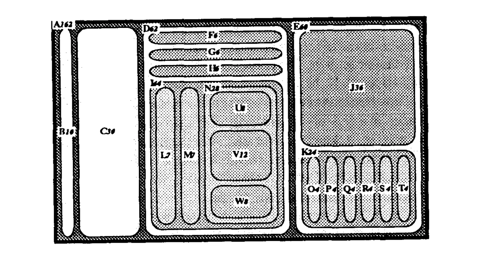
Diamonds are Forever
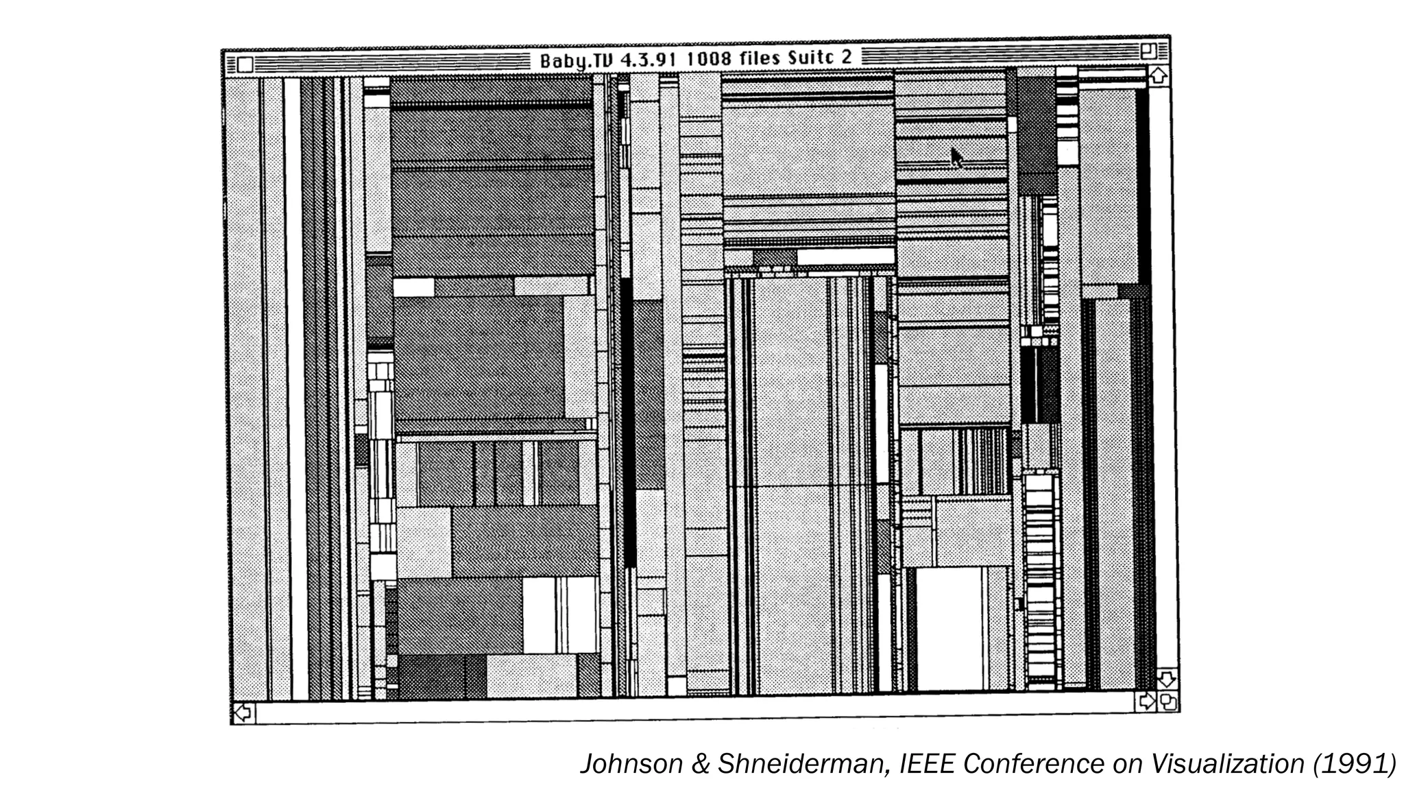
Johnson & Shneiderman, IEEE Conference on Visualization (1991)
Tree-Maps: A Space-Filling Approach to the Visualization of Hierarchical
Information Structures
Brian Johnson Ben Shneiderman
ben@cs.umd.edubrianj@cs.umd.edu
Department of Computer Science & Human-ComputerInteractionLaboratory
University of Maryland, CollegePark, MD 20742
Abstract
Thispaper describes a novel methodfor the visualization
of hierarchically structured information. The Tree-Map
visualization technique makes 100% use of the available
display space,mapping thefull hierarchy onto a rectangular
region in a space-filling manner. Thisefficient use of space
allows very large hierarchies to be displayed in theirentirety
andfacilitates the presentation of semantic information.
1 Introduction
A large quantity of the world’s information is hierarchi-
cally structured: manuals, outlines, corporate organizations,
family trees,directory structures, intemet addressing, library
cataloging, computerprograms... and the listgoes on. Most
people come to understand the content and organization of
these structures easily if they are small, but have great
difficulty if the structures are large.
We propose an interactive visualization method for pre-
which are less important to the specific taskat hand can be
allocated less space [9,101.
Tree-Mapspartitionthedisplay space into a collectionof
rectangular bounding boxes representing the tree structure
[20]. The drawing of nodes within their bounding boxes is
entirely dependent on the content of the nodes, and can be
interactively controlled. Since the display size is user con-
mlled, the drawing size of each node varies inversely with
the size of the tree (i.e., # of nodes). Trees with many nodes
(lo00or more) can be displayed and manipulated in a fixed
display space.
The main objectives of our design are:
Efficient Space Utilization
Efficient use of space isessential for thepresentation
of large information structures.
Interactive control over the presentation of informa-
tion and real time feedback are essential.
The presentation method and itsinteractive feedback
Interactivity
Comprehension
Johnson & Shneiderman, IEEE Conference on Visualization (1991)
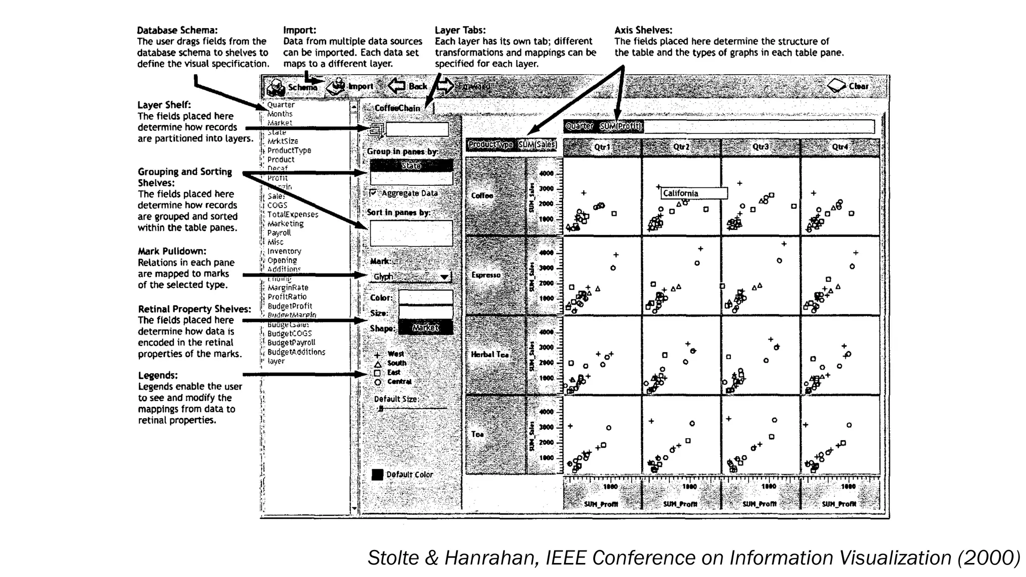
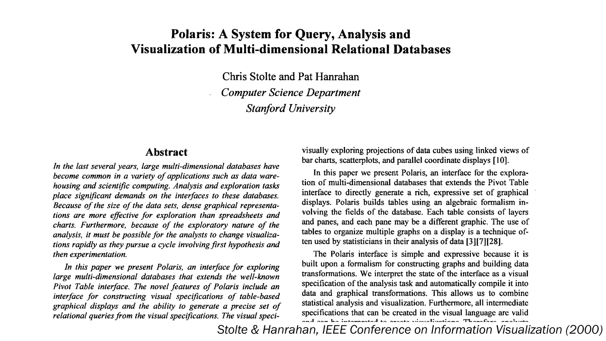
Stolte & Hanrahan, IEEE Conference on Information Visualization (2000)
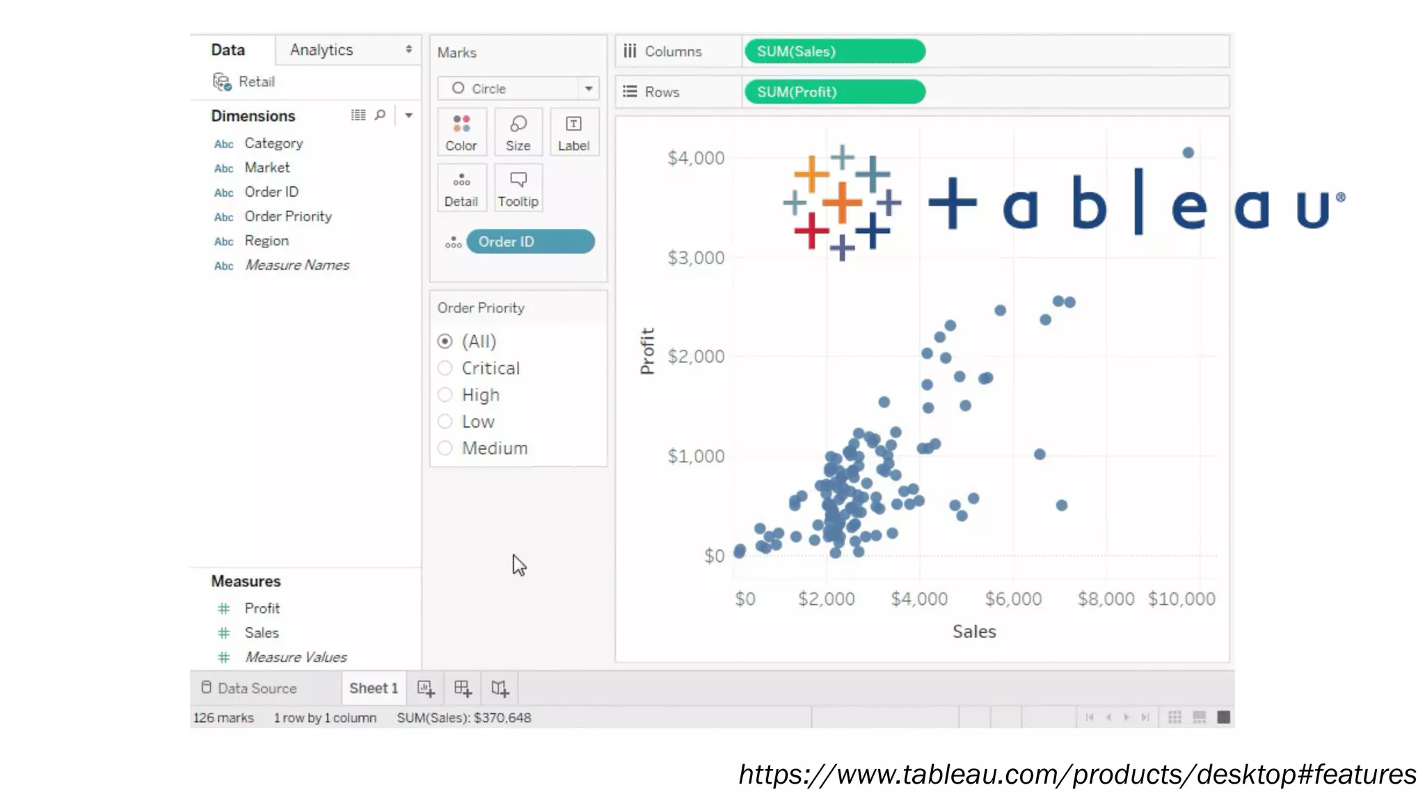
https://www.tableau.com/products/desktop#features
Stolte & Hanrahan, IEEE Conference on Information Visualization (2000)
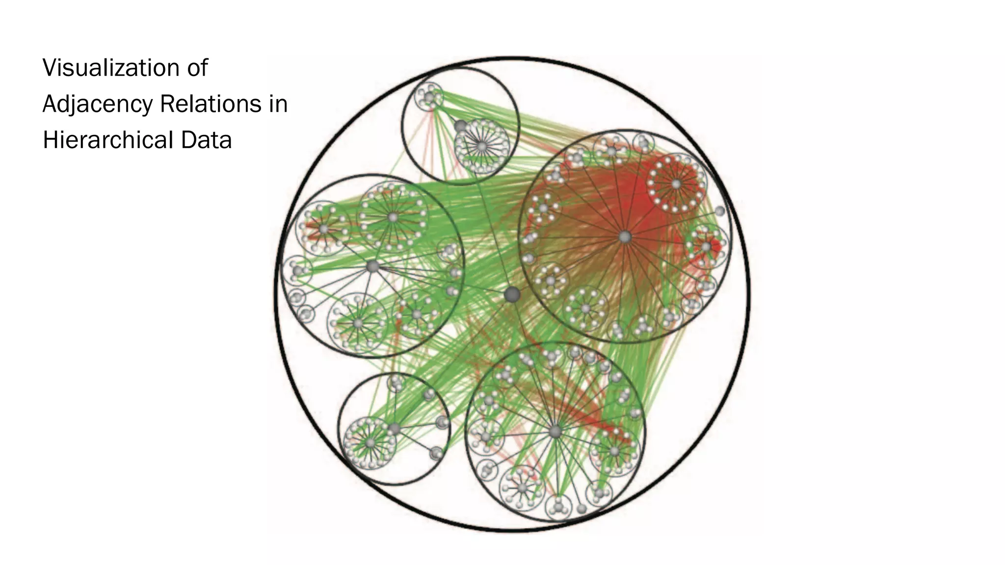
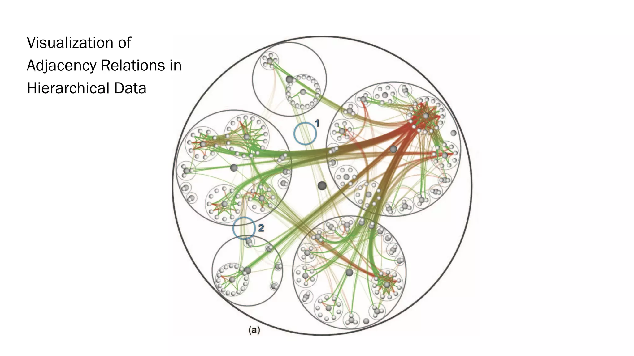
Visualization of
Adjacency Relations in
Hierarchical Data
Visualization of
Adjacency Relations in
Hierarchical Data
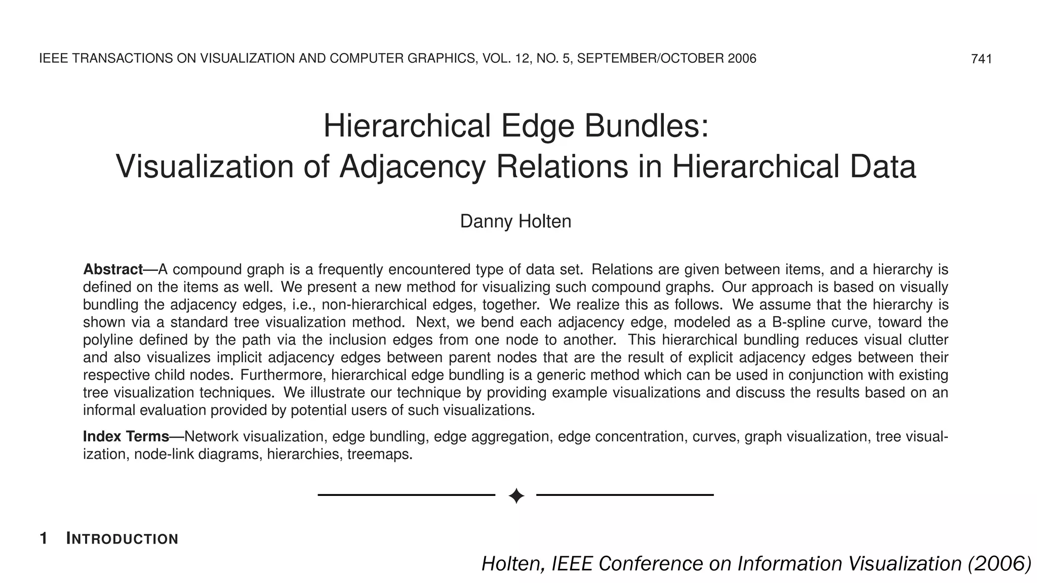
IEEE TRANSACTIONS ON VISUALIZATION AND COMPUTER GRAPHICS, VOL. 12, NO. 5, SEPTEMBER/OCTOBER 2006
Hierarchical Edge Bundles:
Visualization of Adjacency Relations in Hierarchical Data
Danny Holten
Abstract—A compound graph is a frequently encountered type of data set. Relations are given between items, and a hierarchy is
defined on the items as well. We present a new method for visualizing such compound graphs. Our approach is based on visually
bundling the adjacency edges, i.e., non-hierarchical edges, together. We realize this as follows. We assume that the hierarchy is
shown via a standard tree visualization method. Next, we bend each adjacency edge, modeled as a B-spline curve, toward the
polyline defined by the path via the inclusion edges from one node to another. This hierarchical bundling reduces visual clutter
and also visualizes implicit adjacency edges between parent nodes that are the result of explicit adjacency edges between their
respective child nodes. Furthermore, hierarchical edge bundling is a generic method which can be used in conjunction with existing
tree visualization techniques. We illustrate our technique by providing example visualizations and discuss the results based on an
informal evaluation provided by potential users of such visualizations.
Index Terms—Network visualization, edge bundling, edge aggregation, edge concentration, curves, graph visualization, tree visual-
ization, node-link diagrams, hierarchies, treemaps.
✦
1 INTRODUCTION
There is a large class of data sets that contain both hierarchical and adjacency edges become intertwined, which can make it difficult
741
Holten, IEEE Conference on Information Visualization (2006)
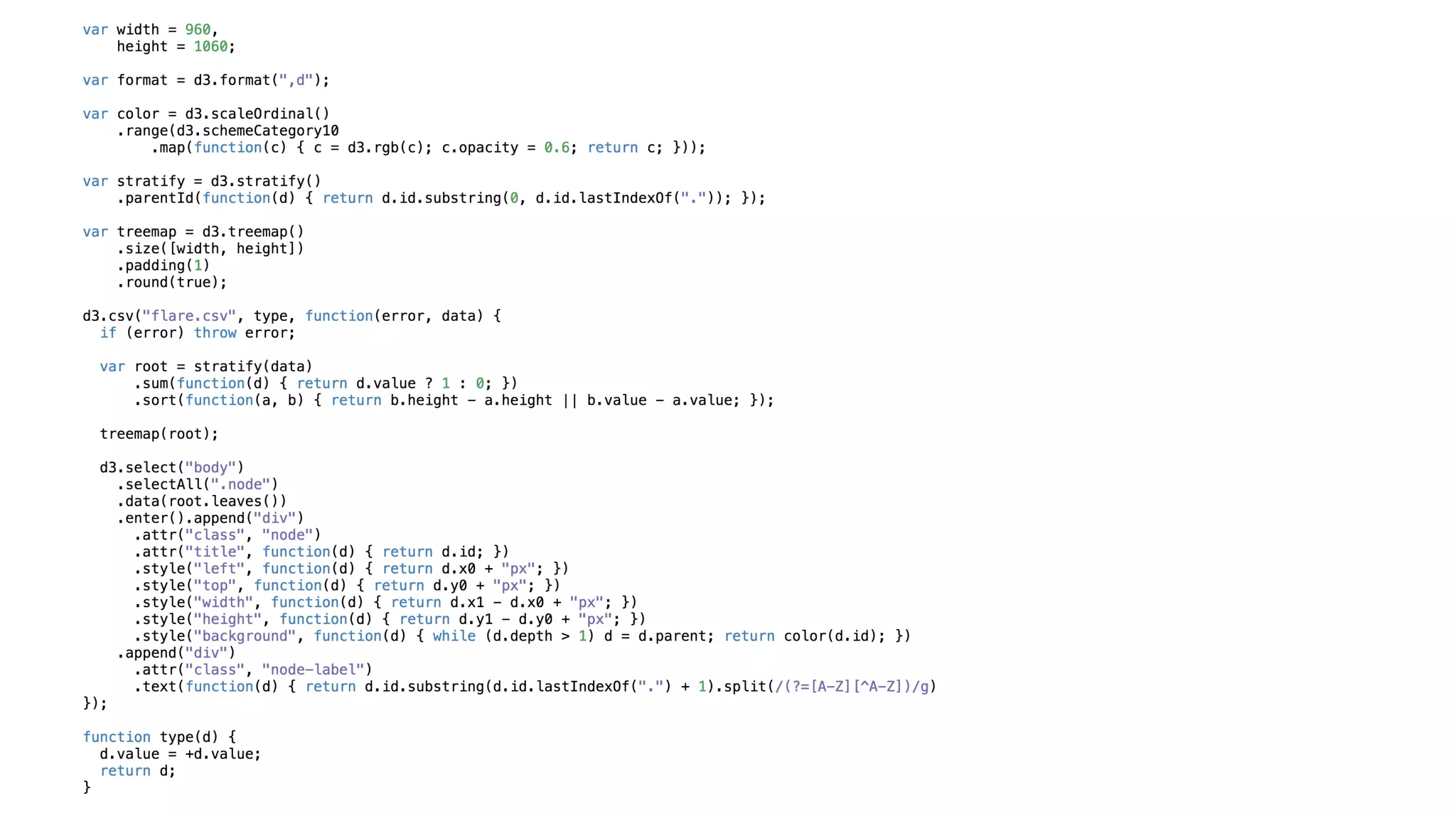
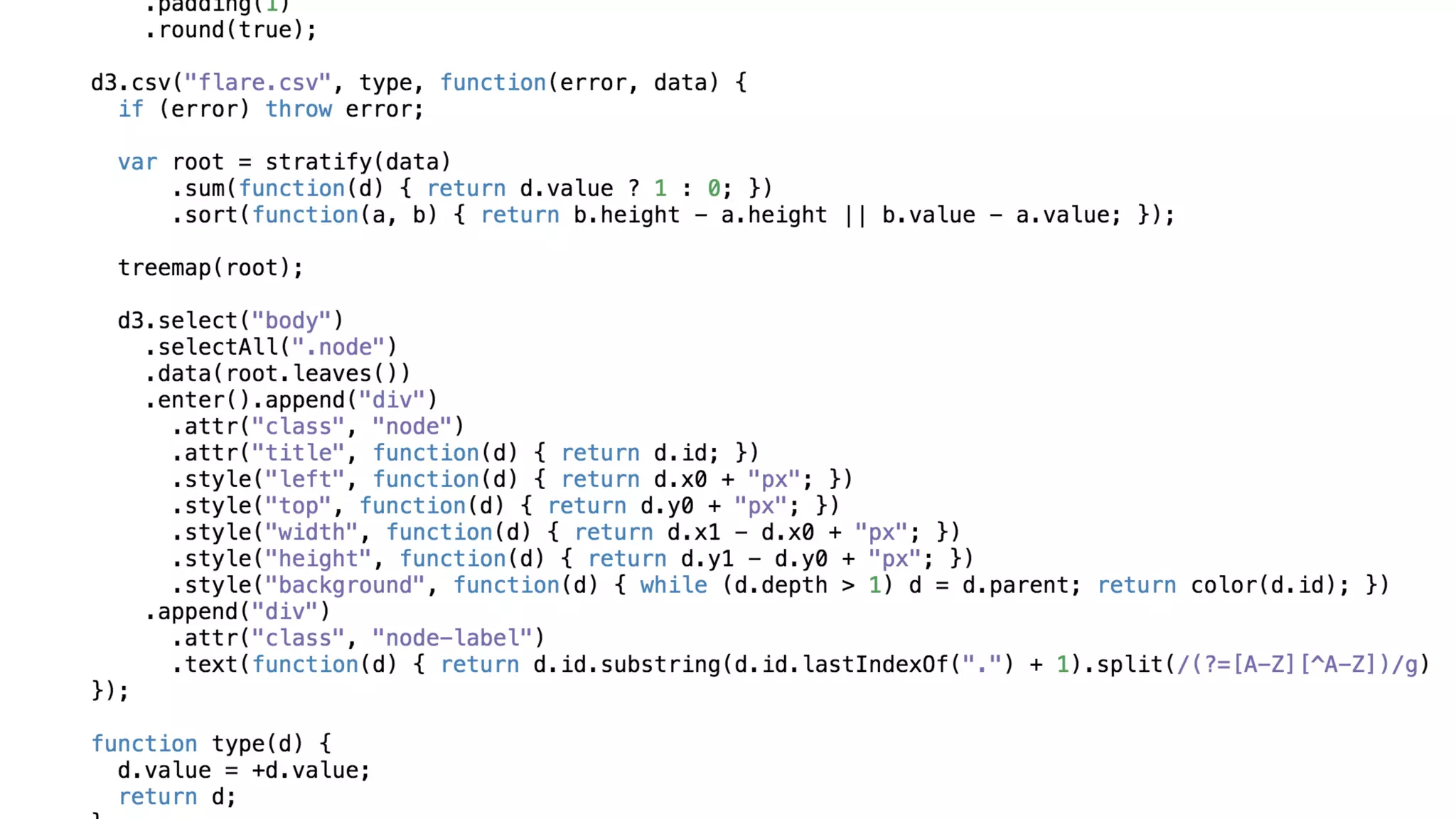
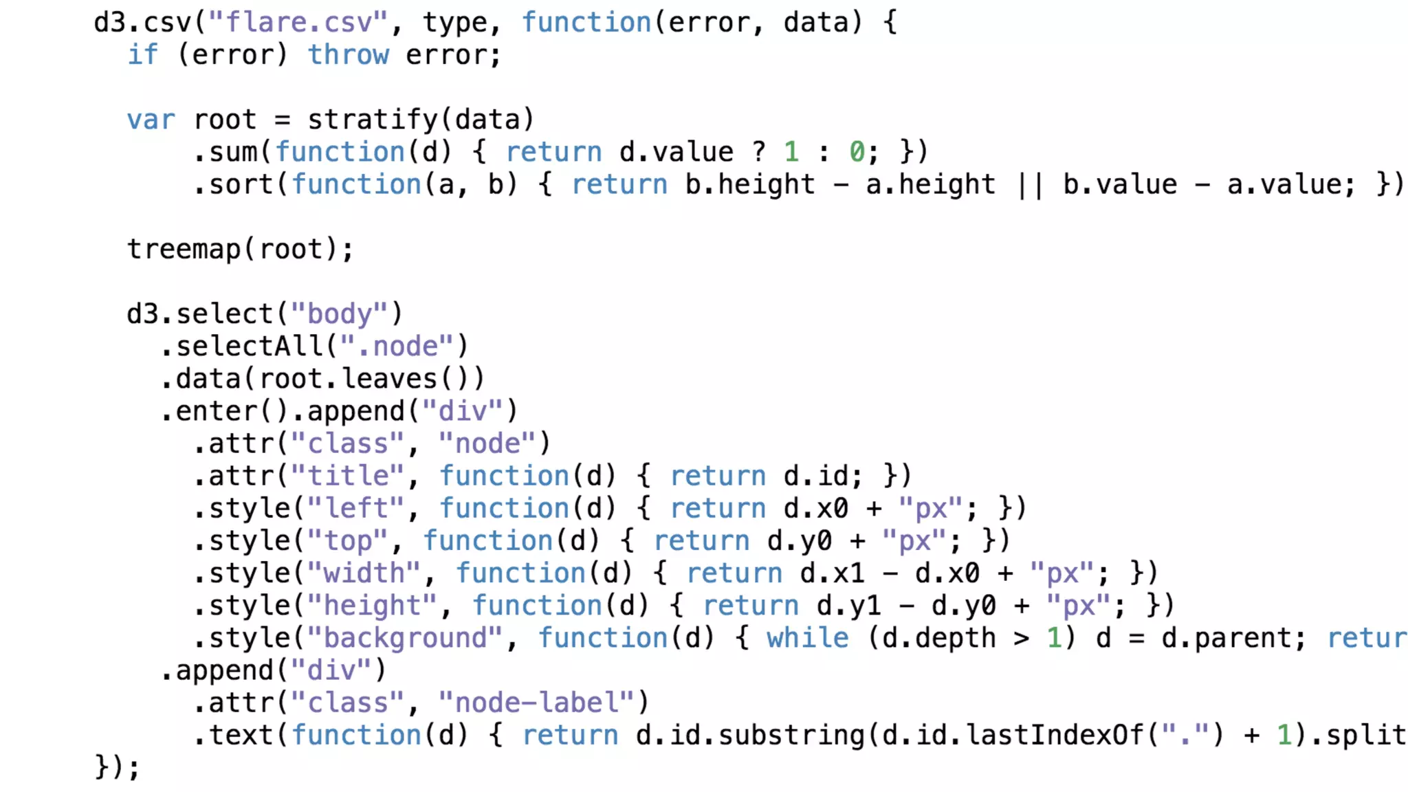
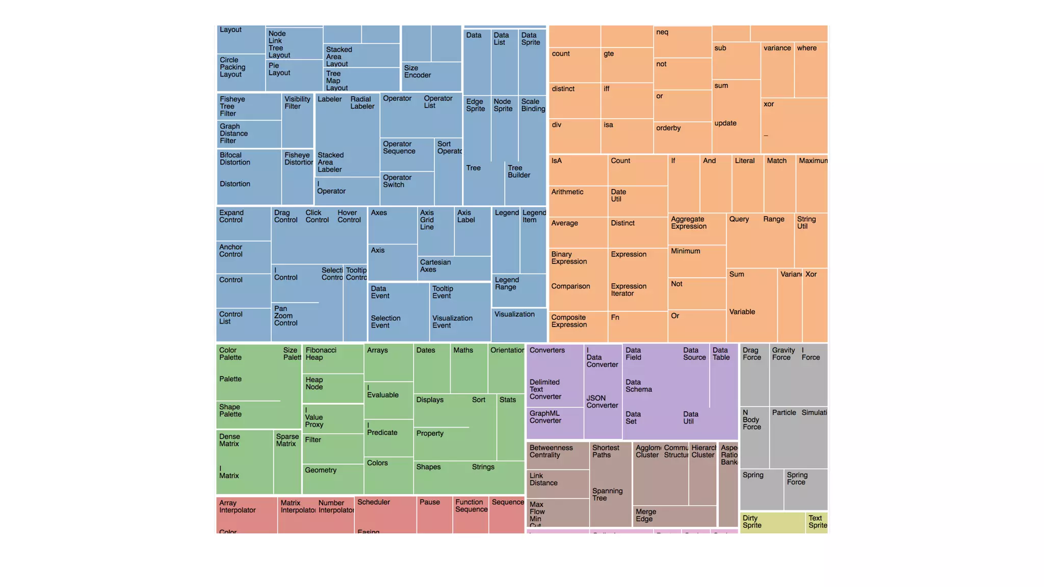
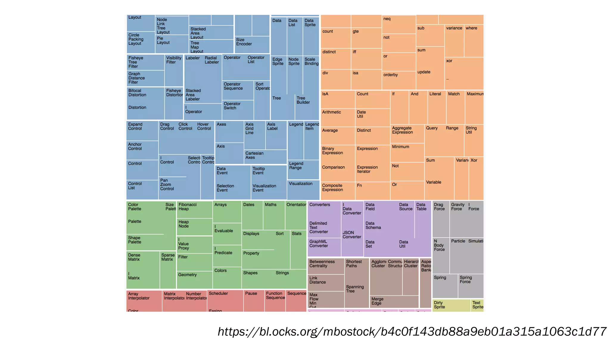
https://bl.ocks.org/mbostock/b4c0f143db88a9eb01a315a1063c1d77
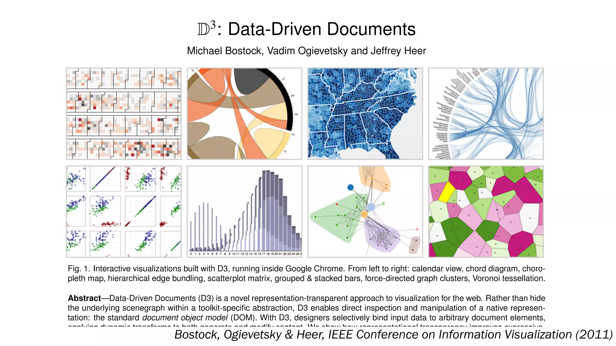
D3
: Data-Driven Documents
Michael Bostock, Vadim Ogievetsky and Jeffrey Heer
Fig. 1. Interactive visualizations built with D3, running inside Google Chrome. From left to right: calendar view, chord diagram, choro-
pleth map, hierarchical edge bundling, scatterplot matrix, grouped & stacked bars, force-directed graph clusters, Voronoi tessellation.
Abstract—Data-Driven Documents (D3) is a novel representation-transparent approach to visualization for the web. Rather than hide
the underlying scenegraph within a toolkit-specific abstraction, D3 enables direct inspection and manipulation of a native represen-
tation: the standard document object model (DOM). With D3, designers selectively bind input data to arbitrary document elements,
applying dynamic transforms to both generate and modify content. We show how representational transparency improves expressive-
ness and better integrates with developer tools than prior approaches, while offering comparable notational efficiency and retainingBostock, Ogievetsky & Heer, IEEE Conference on Information Visualization (2011)
Diamonds are a
Bioinformaticians's Best Friend
GeneaQuilts: A System for Exploring Large Genealogies
Anastasia Bezerianos, Pierre Dragicevic, Jean-Daniel Fekete, Member, IEEE,
Juhee Bae, and Ben Watson, Member, IEEE
C
haos
G
aea
U
ranus
O
ceanus
Thethys
Pontus
R
hea
C
ronus
C
oeus
Phoebe
C
rius
H
yperion
Iapetus
Thea
Them
is
M
nem
osyne
D
oris
N
eures
D
ionne
D
em
eter
H
ades
H
era
Alcm
ene
Zeus
Eris
Leto
Am
phitrite
M
edusa
Poseidon
H
estia
Thetis
Peleus
Anchises
Adonis
Aphrodite
Persephone
Ares
H
ephaestus
H
ebe
H
ercules
M
egara
D
eianira
Eileithya
Ate
Leda
Athena
Apollo
Artem
is
Triton
Pegasus
O
rion
Polyphem
us
D
eidam
ia
Achilles
C
reusa
Aeneas
Lavinia
Eros
H
elen
M
enelaus
Polydueces
Androm
ache
N
eoptolem
us
Aeneas
Pom
pilius
Iulus
H
erm
ione
F
F
F
F
F
F
F
F
F
F
F
F
F
F
F
F
F
F
F
F
F
F
F
F
F
F
F
F
F
F
F
F
F
F
F
F
F
F
F
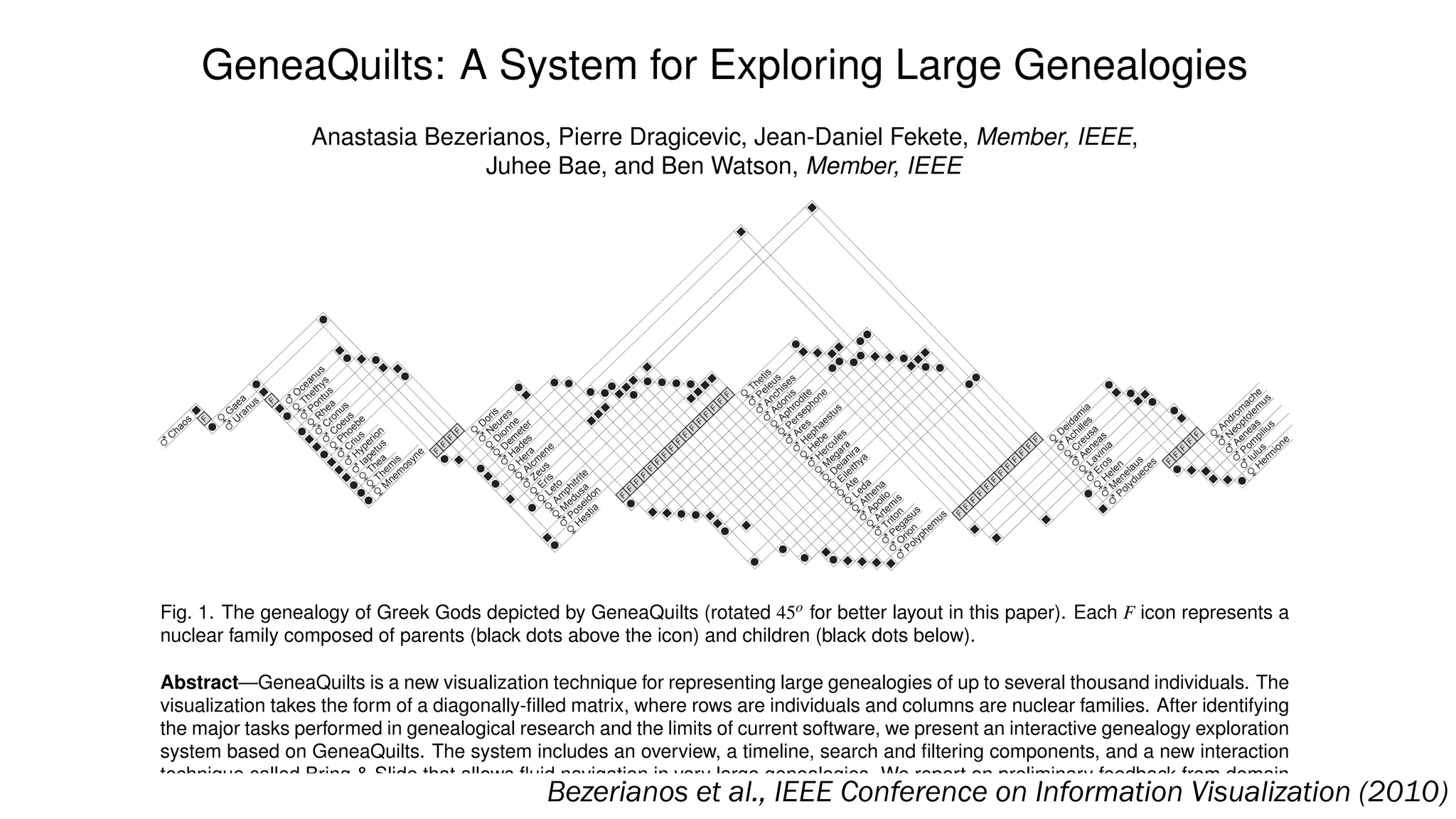
Fig. 1. The genealogy of Greek Gods depicted by GeneaQuilts (rotated 45o for better layout in this paper). Each F icon represents a
nuclear family composed of parents (black dots above the icon) and children (black dots below).
Abstract—GeneaQuilts is a new visualization technique for representing large genealogies of up to several thousand individuals. The
visualization takes the form of a diagonally-filled matrix, where rows are individuals and columns are nuclear families. After identifying
the major tasks performed in genealogical research and the limits of current software, we present an interactive genealogy exploration
system based on GeneaQuilts. The system includes an overview, a timeline, search and filtering components, and a new interaction
technique called Bring & Slide that allows fluid navigation in very large genealogies. We report on preliminary feedback from domain
experts and show how our system supports a number of their tasks.Bezerianos et al., IEEE Conference on Information Visualization (2010)
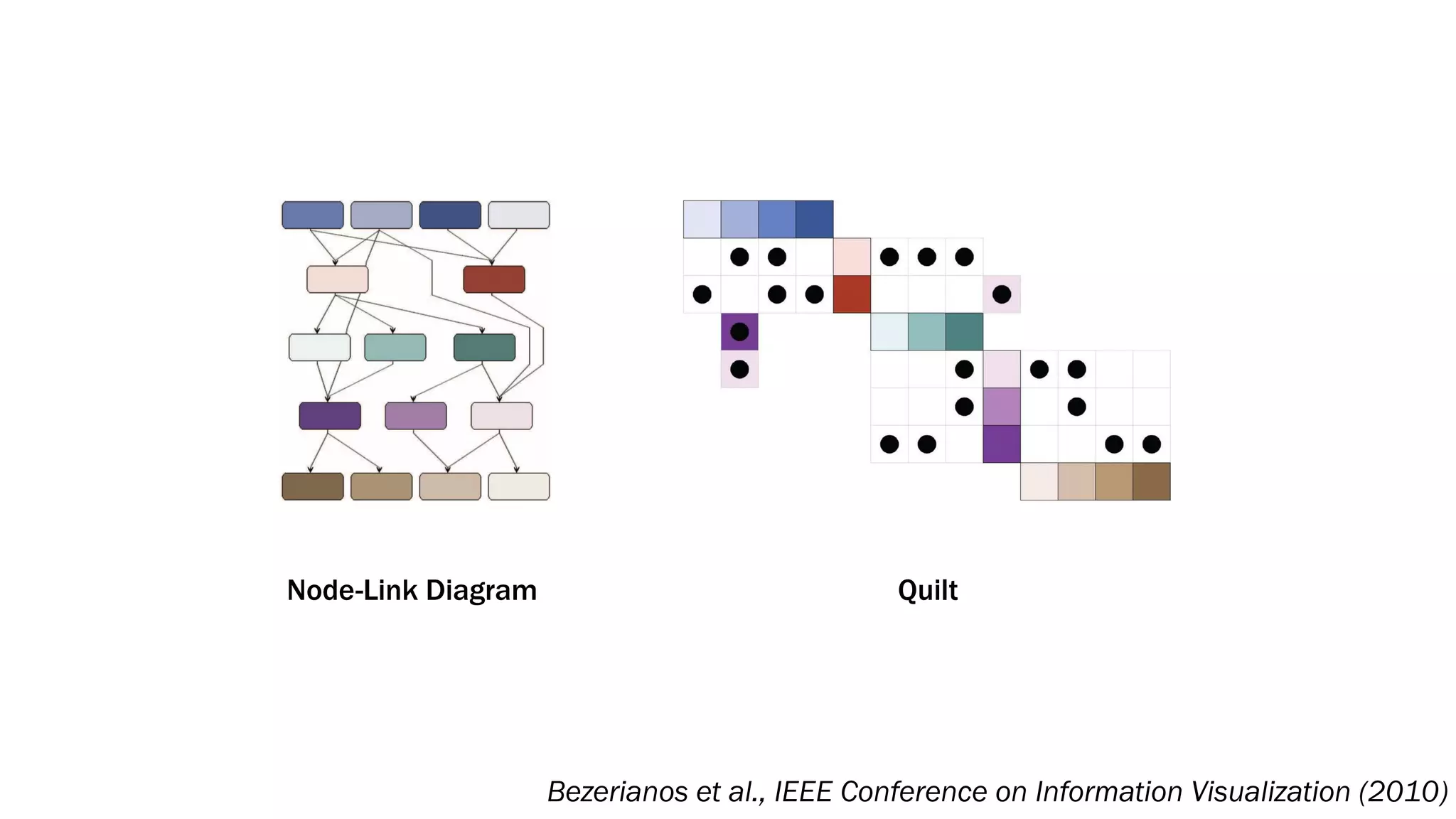
Node-Link Diagram Quilt
Bezerianos et al., IEEE Conference on Information Visualization (2010)
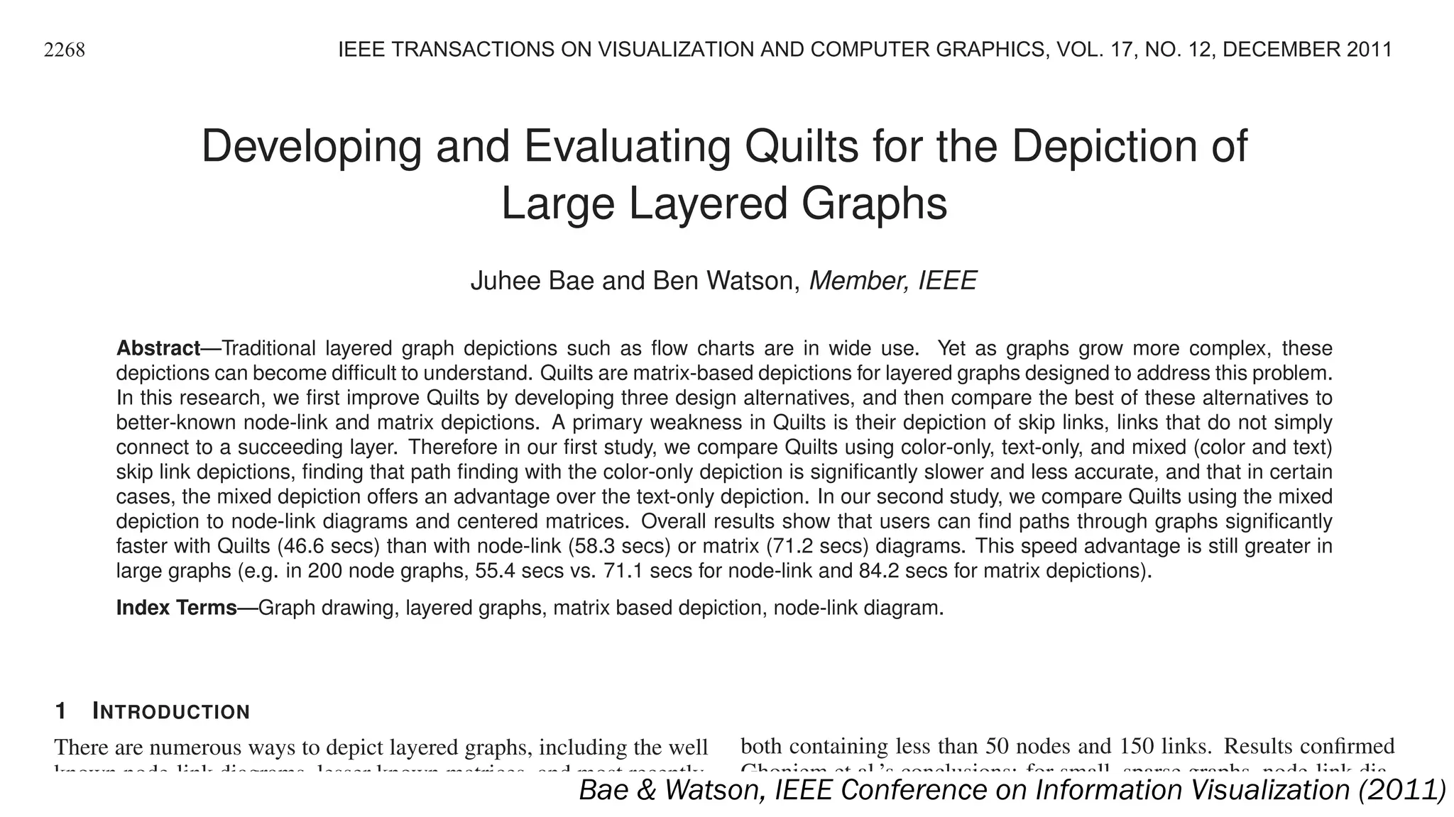
Developing and Evaluating Quilts for the Depiction of
Large Layered Graphs
Juhee Bae and Ben Watson, Member, IEEE
Abstract—Traditional layered graph depictions such as flow charts are in wide use. Yet as graphs grow more complex, these
depictions can become difficult to understand. Quilts are matrix-based depictions for layered graphs designed to address this problem.
In this research, we first improve Quilts by developing three design alternatives, and then compare the best of these alternatives to
better-known node-link and matrix depictions. A primary weakness in Quilts is their depiction of skip links, links that do not simply
connect to a succeeding layer. Therefore in our first study, we compare Quilts using color-only, text-only, and mixed (color and text)
skip link depictions, finding that path finding with the color-only depiction is significantly slower and less accurate, and that in certain
cases, the mixed depiction offers an advantage over the text-only depiction. In our second study, we compare Quilts using the mixed
depiction to node-link diagrams and centered matrices. Overall results show that users can find paths through graphs significantly
faster with Quilts (46.6 secs) than with node-link (58.3 secs) or matrix (71.2 secs) diagrams. This speed advantage is still greater in
large graphs (e.g. in 200 node graphs, 55.4 secs vs. 71.1 secs for node-link and 84.2 secs for matrix depictions).
Index Terms—Graph drawing, layered graphs, matrix based depiction, node-link diagram.
1 INTRODUCTION
There are numerous ways to depict layered graphs, including the well
known node-link diagrams, lesser known matrices, and most recently,
Quilts. Node-link diagrams (Figure 1(a)) are easy to read and un-
both containing less than 50 nodes and 150 links. Results confirmed
Ghoniem et al.’s conclusions: for small, sparse graphs, node-link dia-
grams are easier to read; while for more complex graphs, matrix depic-
2268 IEEE TRANSACTIONS ON VISUALIZATION AND COMPUTER GRAPHICS, VOL. 17, NO. 12, DECEMBER 2011
Bae & Watson, IEEE Conference on Information Visualization (2011)
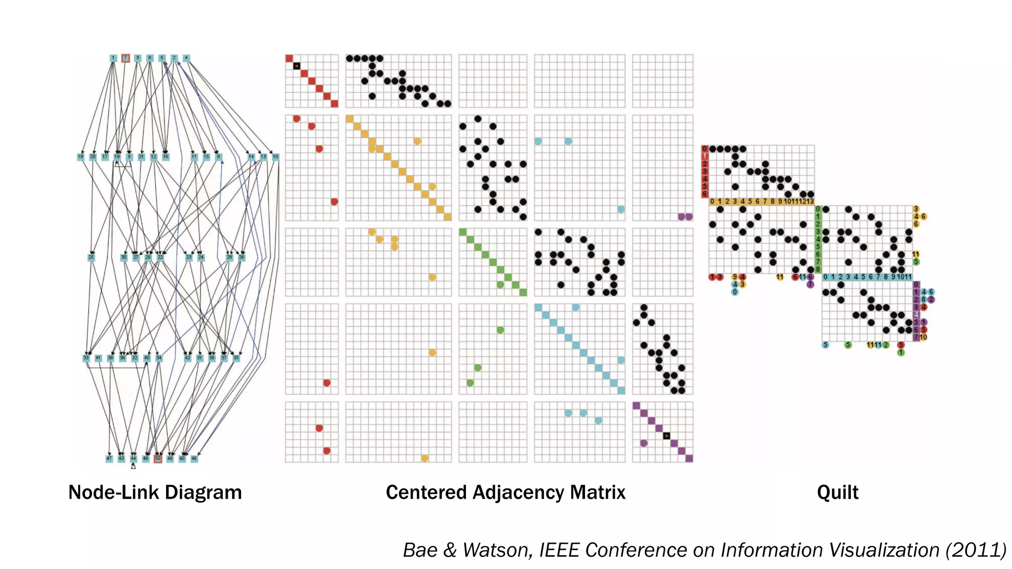
Node-Link Diagram Quilt
Bae & Watson, IEEE Conference on Information Visualization (2011)
Centered Adjacency Matrix
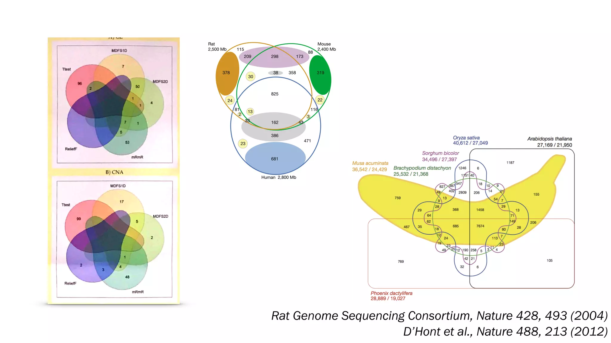
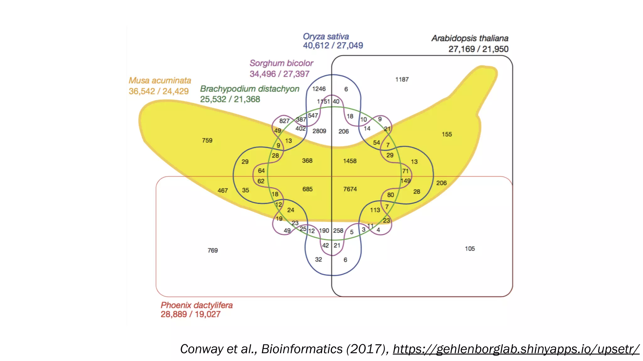
Rat Genome Sequencing Consortium, Nature 428, 493 (2004)
D’Hont et al., Nature 488, 213 (2012)
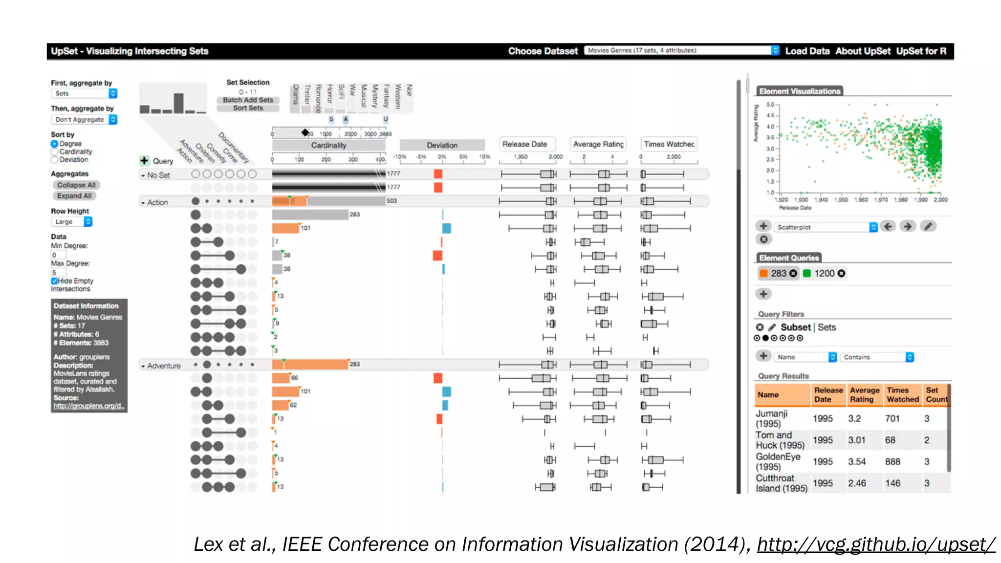
Lex et al., IEEE Conference on Information Visualization (2014), http://vcg.github.io/upset/
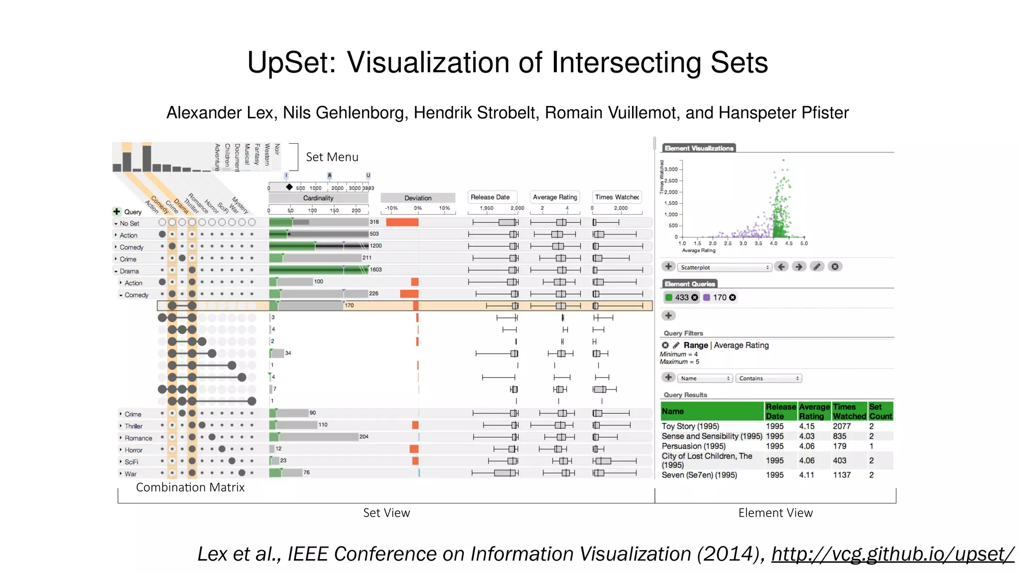
UpSet: Visualization of Intersecting Sets
Alexander Lex, Nils Gehlenborg, Hendrik Strobelt, Romain Vuillemot, and Hanspeter Pfister
Set$Menu
Set$View Element$View
Combina2on$Matrix
Fig. 1. UpSet showing relationships of movie genres. The set view visualizes intersections and their aggregates, the number ofLex et al., IEEE Conference on Information Visualization (2014), http://vcg.github.io/upset/
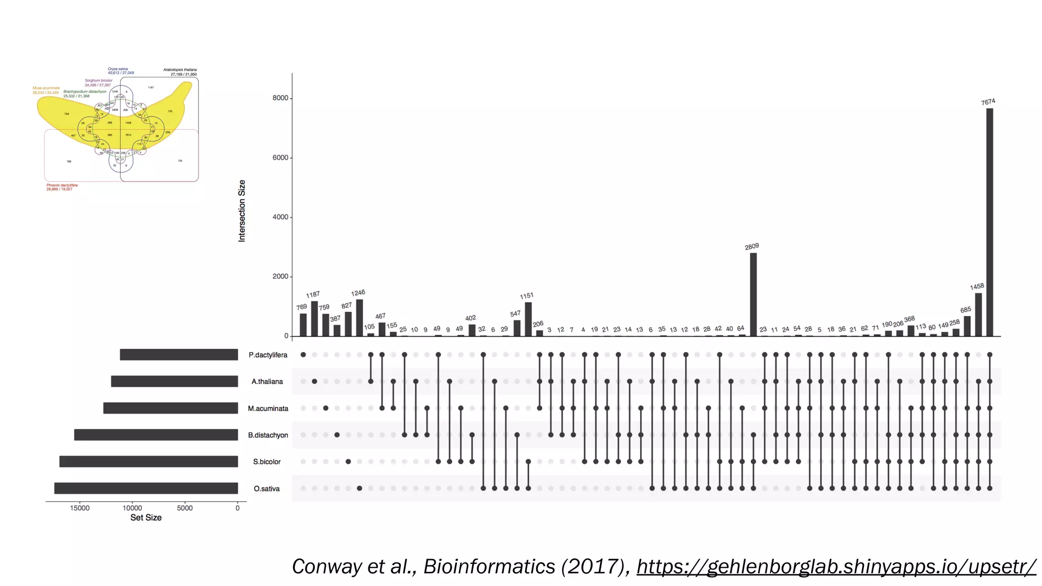
Conway et al., Bioinformatics (2017), https://gehlenborglab.shinyapps.io/upsetr/
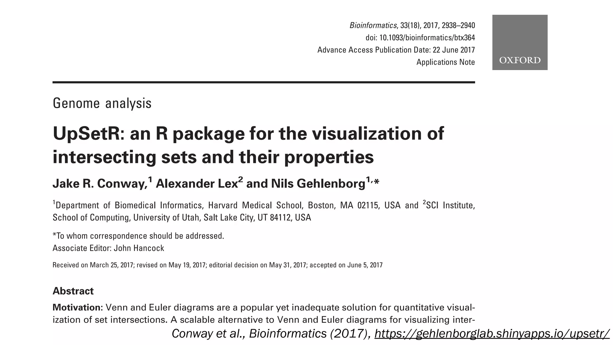
Genome analysis
UpSetR: an R package for the visualization of
intersecting sets and their properties
Jake R. Conway,1
Alexander Lex2
and Nils Gehlenborg1,
*
1
Department of Biomedical Informatics, Harvard Medical School, Boston, MA 02115, USA and 2
SCI Institute,
School of Computing, University of Utah, Salt Lake City, UT 84112, USA
*To whom correspondence should be addressed.
Associate Editor: John Hancock
Received on March 25, 2017; revised on May 19, 2017; editorial decision on May 31, 2017; accepted on June 5, 2017
Abstract
Motivation: Venn and Euler diagrams are a popular yet inadequate solution for quantitative visual-
ization of set intersections. A scalable alternative to Venn and Euler diagrams for visualizing inter-
secting sets and their properties is needed.
Bioinformatics, 33(18), 2017, 2938–2940
doi: 10.1093/bioinformatics/btx364
Advance Access Publication Date: 22 June 2017
Applications Note
Conway et al., Bioinformatics (2017), https://gehlenborglab.shinyapps.io/upsetr/
Digging Deeper
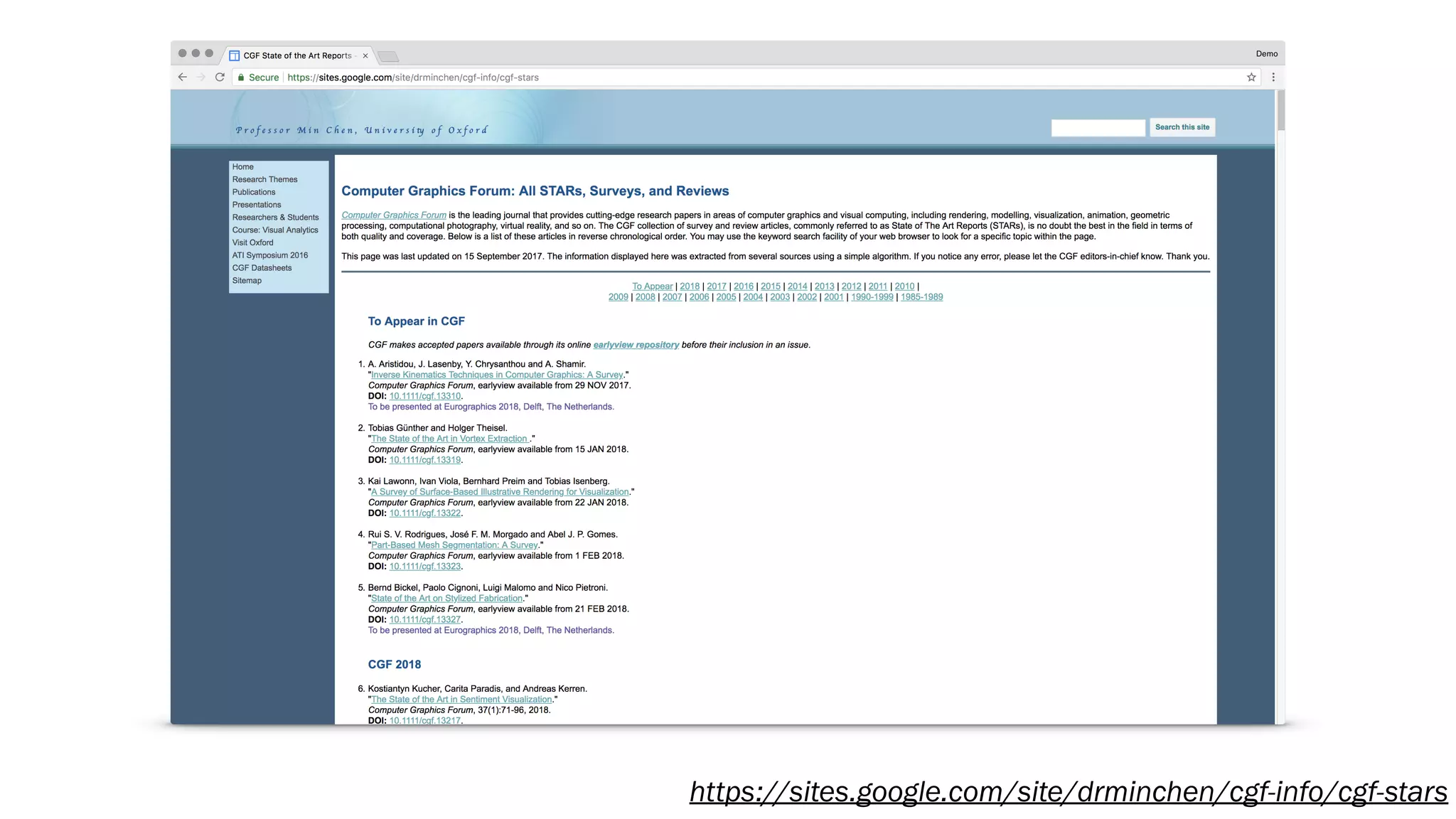
State-of-the-Art Reports (STARs)
- “State-of-the-Art Reports (STARs) are intended to provide up-to-date and
comprehensive surveys on topics of interest to the visualization research
community.”
- Presented at EuroVis and published in Computer Graphics Forum
https://sites.google.com/site/drminchen/cgf-info/cgf-stars
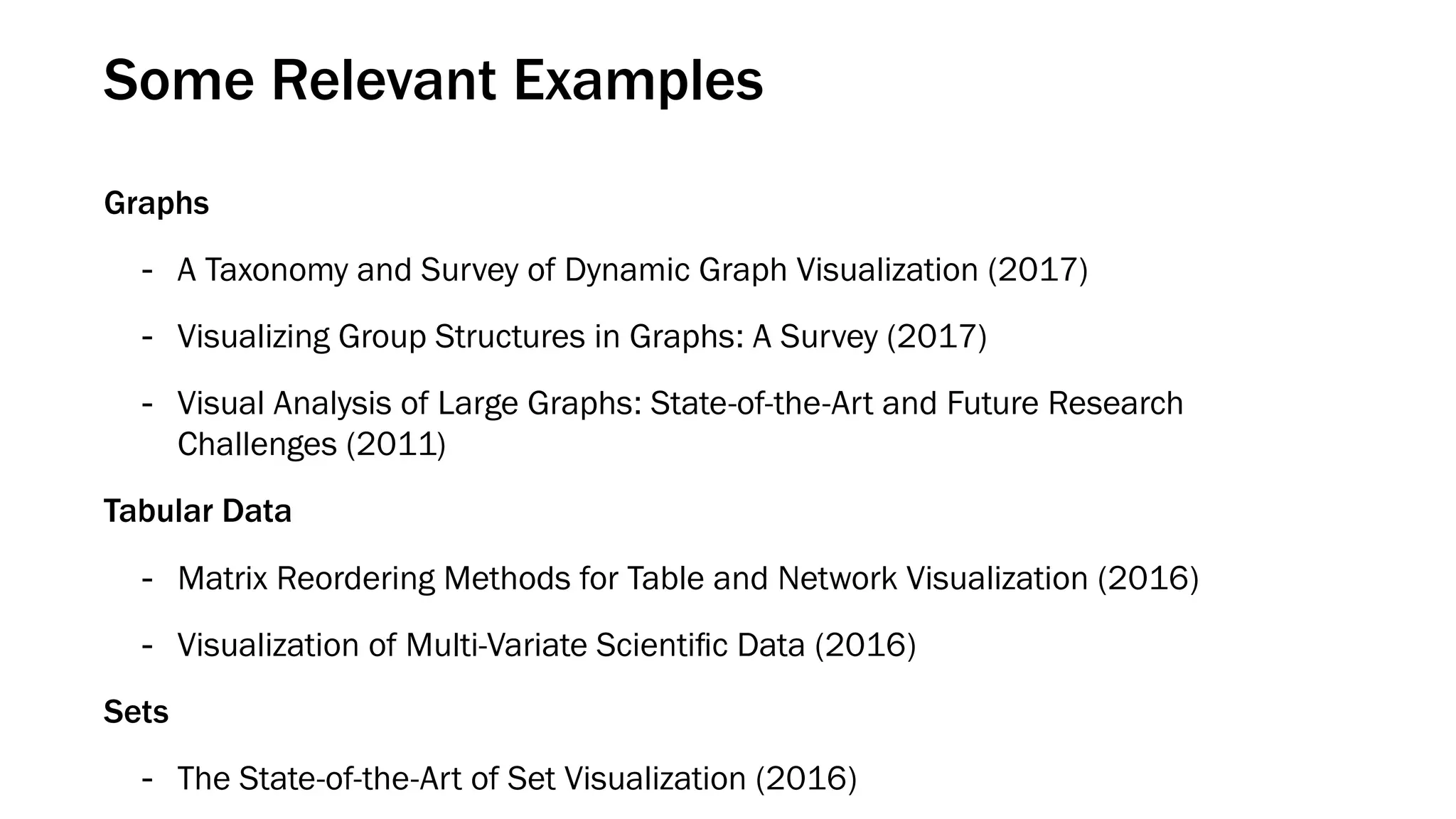
Some Relevant Examples
Graphs
- A Taxonomy and Survey of Dynamic Graph Visualization (2017)
- Visualizing Group Structures in Graphs: A Survey (2017)
- Visual Analysis of Large Graphs: State-of-the-Art and Future Research
Challenges (2011)
Tabular Data
- Matrix Reordering Methods for Table and Network Visualization (2016)
- Visualization of Multi-Variate Scientific Data (2016)
Sets
- The State-of-the-Art of Set Visualization (2016)
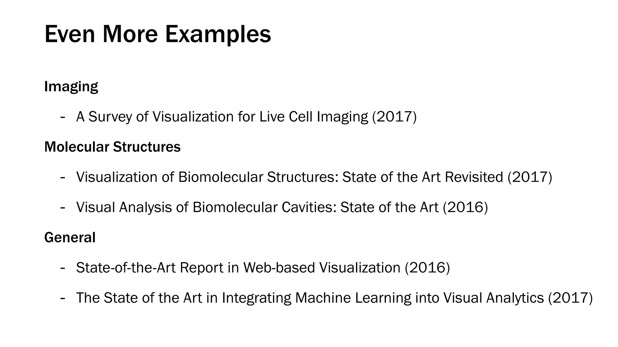
Even More Examples
Imaging
- A Survey of Visualization for Live Cell Imaging (2017)
Molecular Structures
- Visualization of Biomolecular Structures: State of the Art Revisited (2017)
- Visual Analysis of Biomolecular Cavities: State of the Art (2016)
General
- State-of-the-Art Report in Web-based Visualization (2016)
- The State of the Art in Integrating Machine Learning into Visual Analytics (2017)
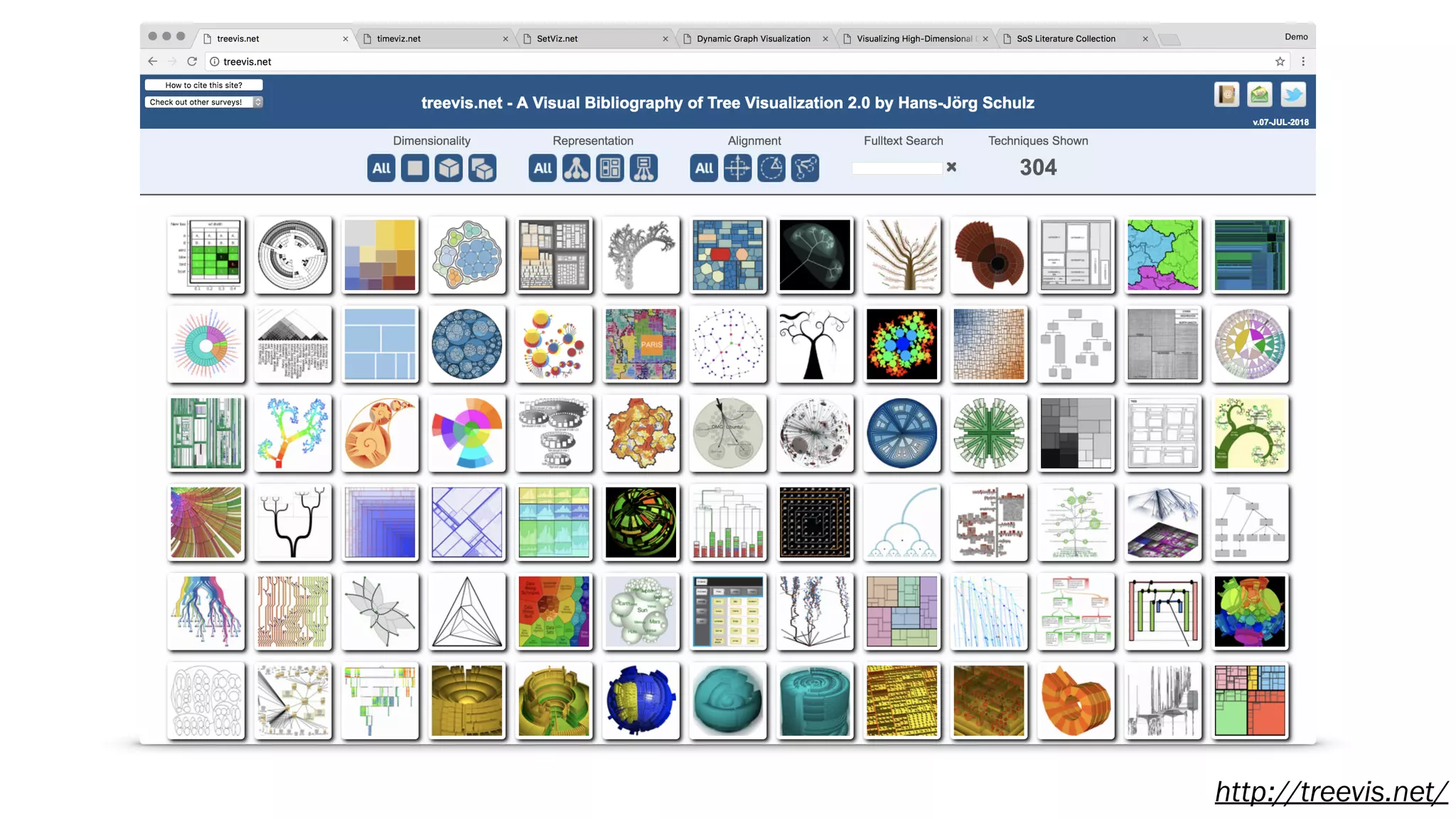
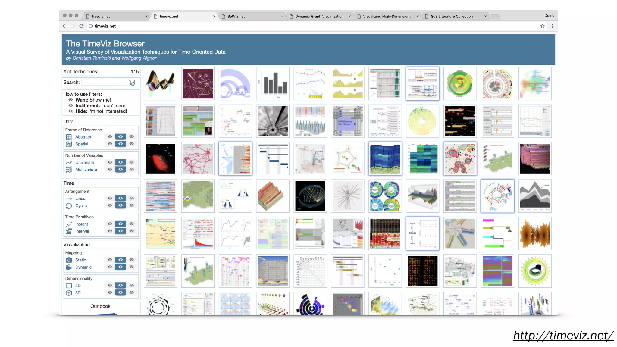
http://treevis.net/
http://timeviz.net/
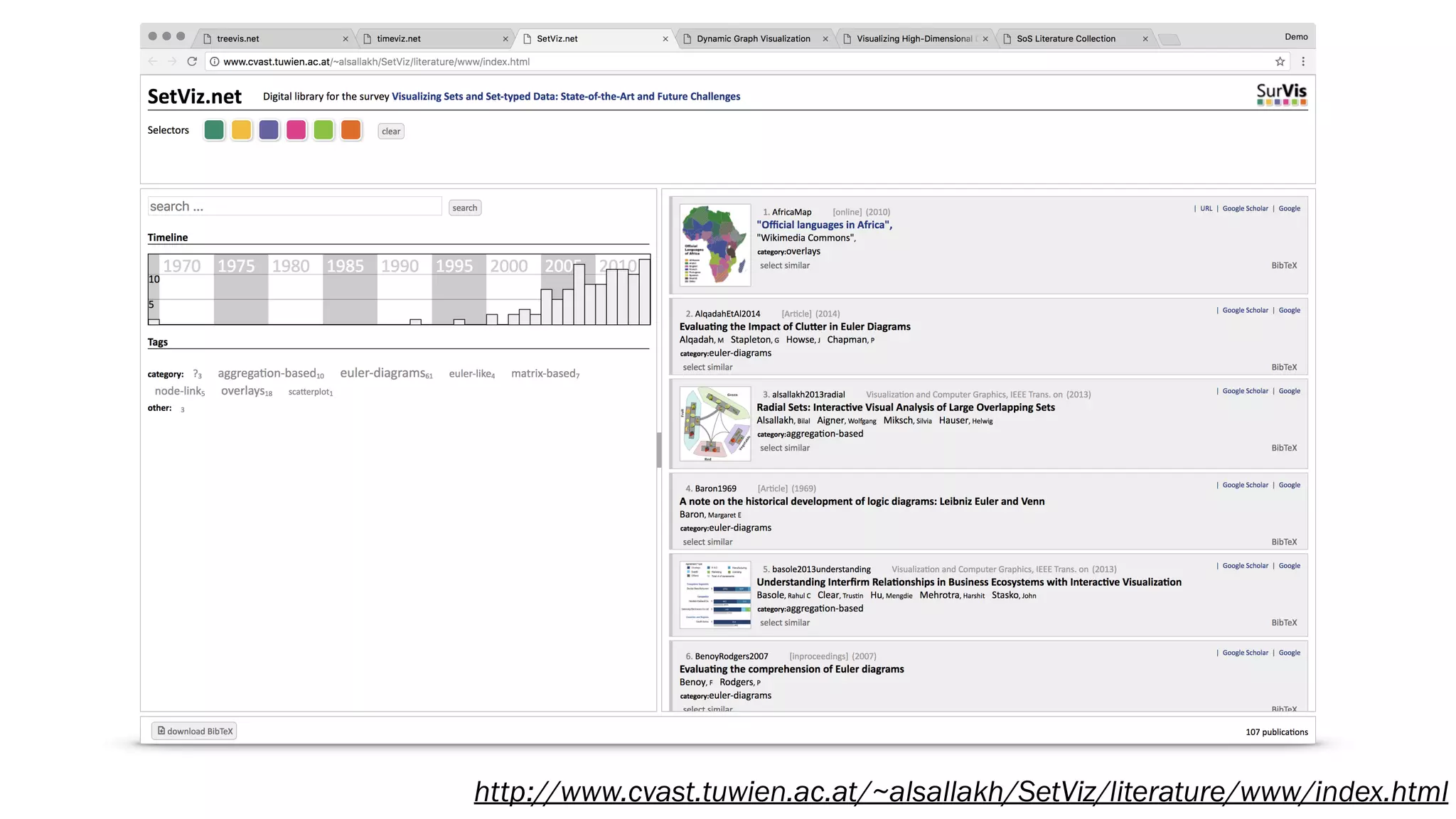
http://www.cvast.tuwien.ac.at/~alsallakh/SetViz/literature/www/index.html
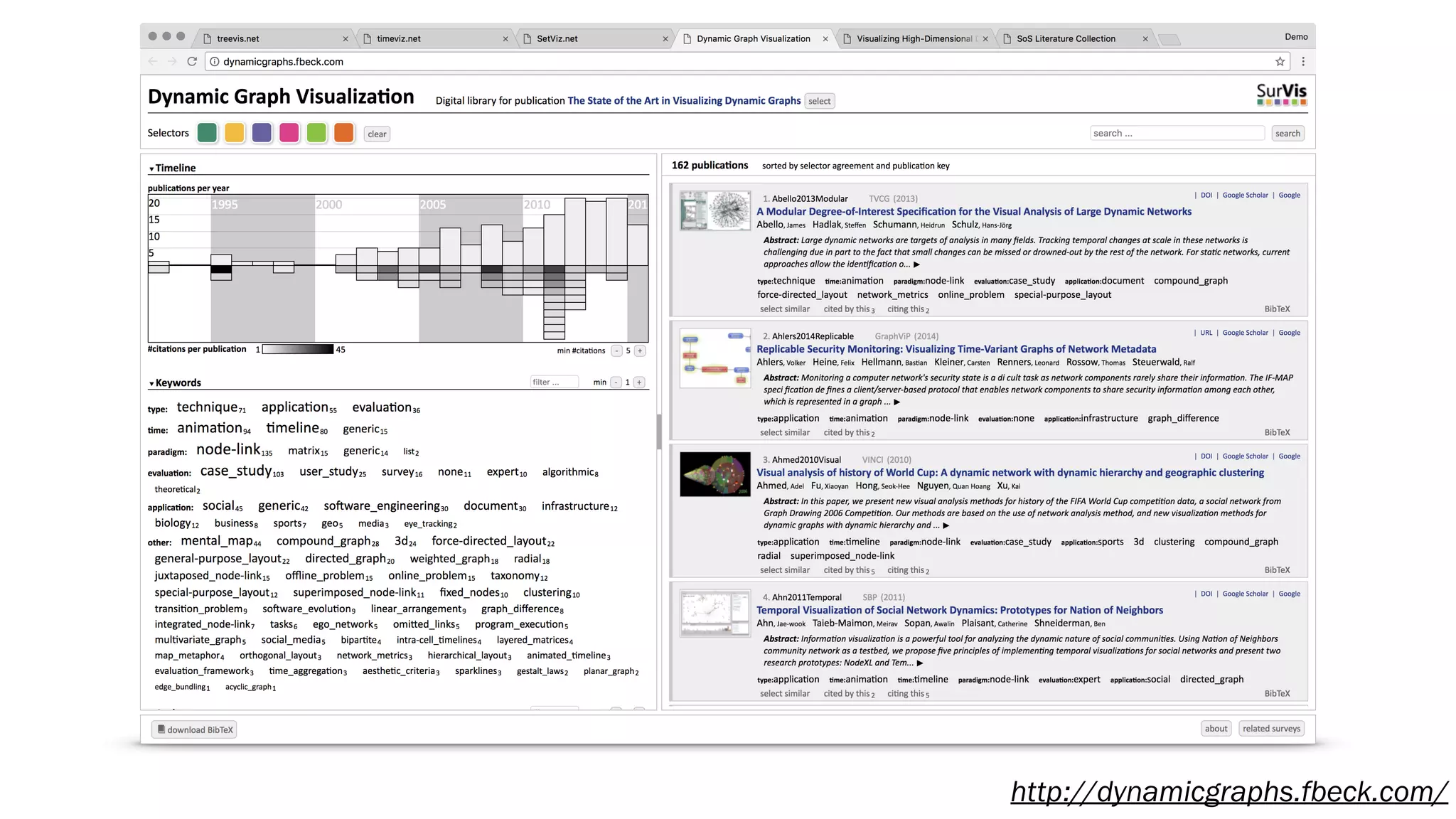
http://dynamicgraphs.fbeck.com/
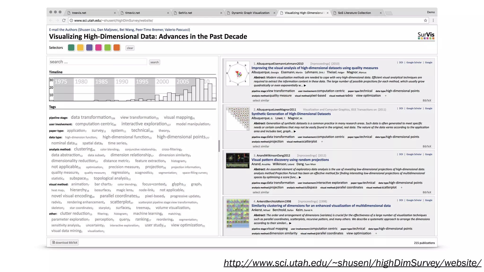
http://www.sci.utah.edu/~shusenl/highDimSurvey/website/
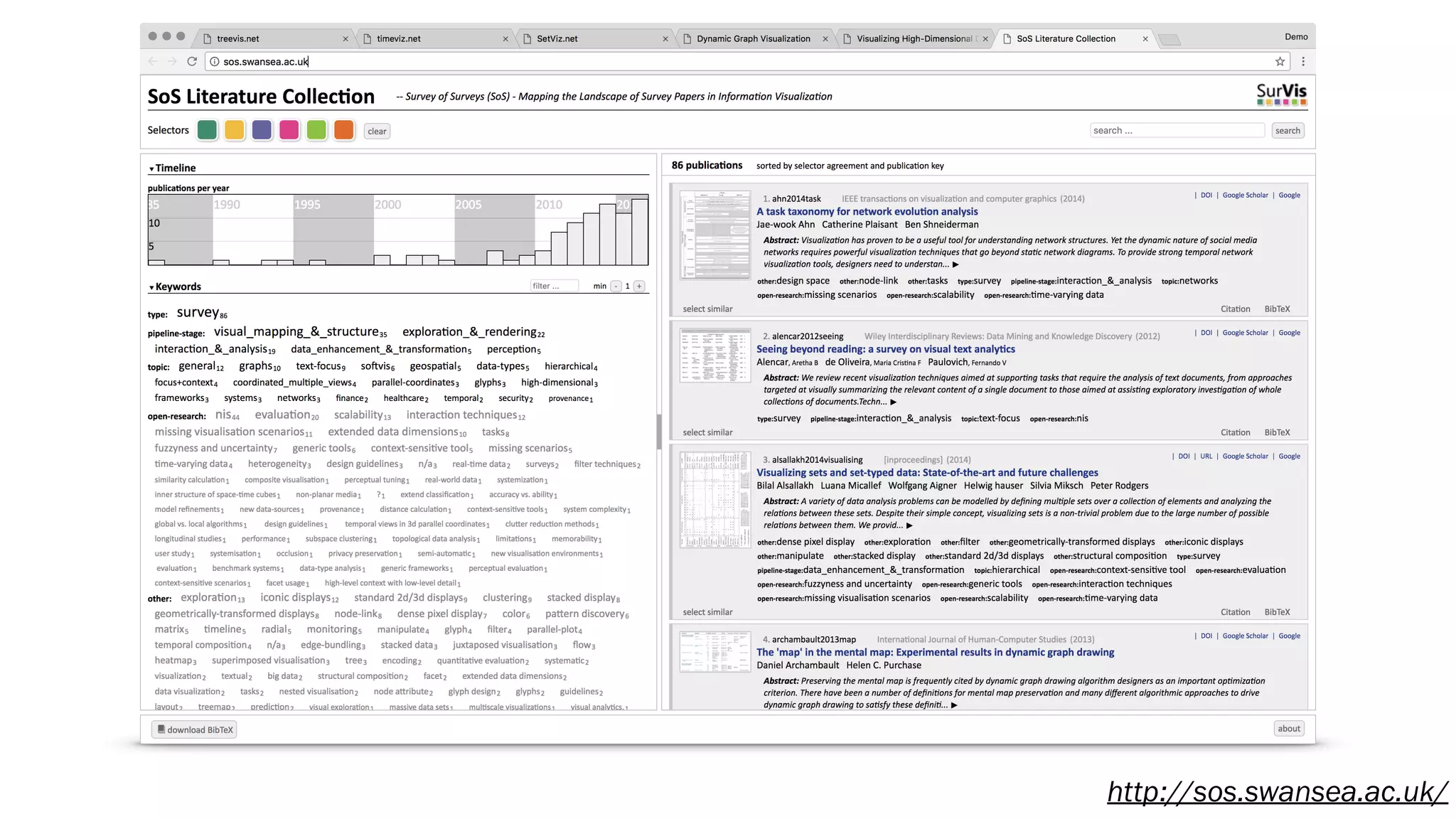
http://sos.swansea.ac.uk/
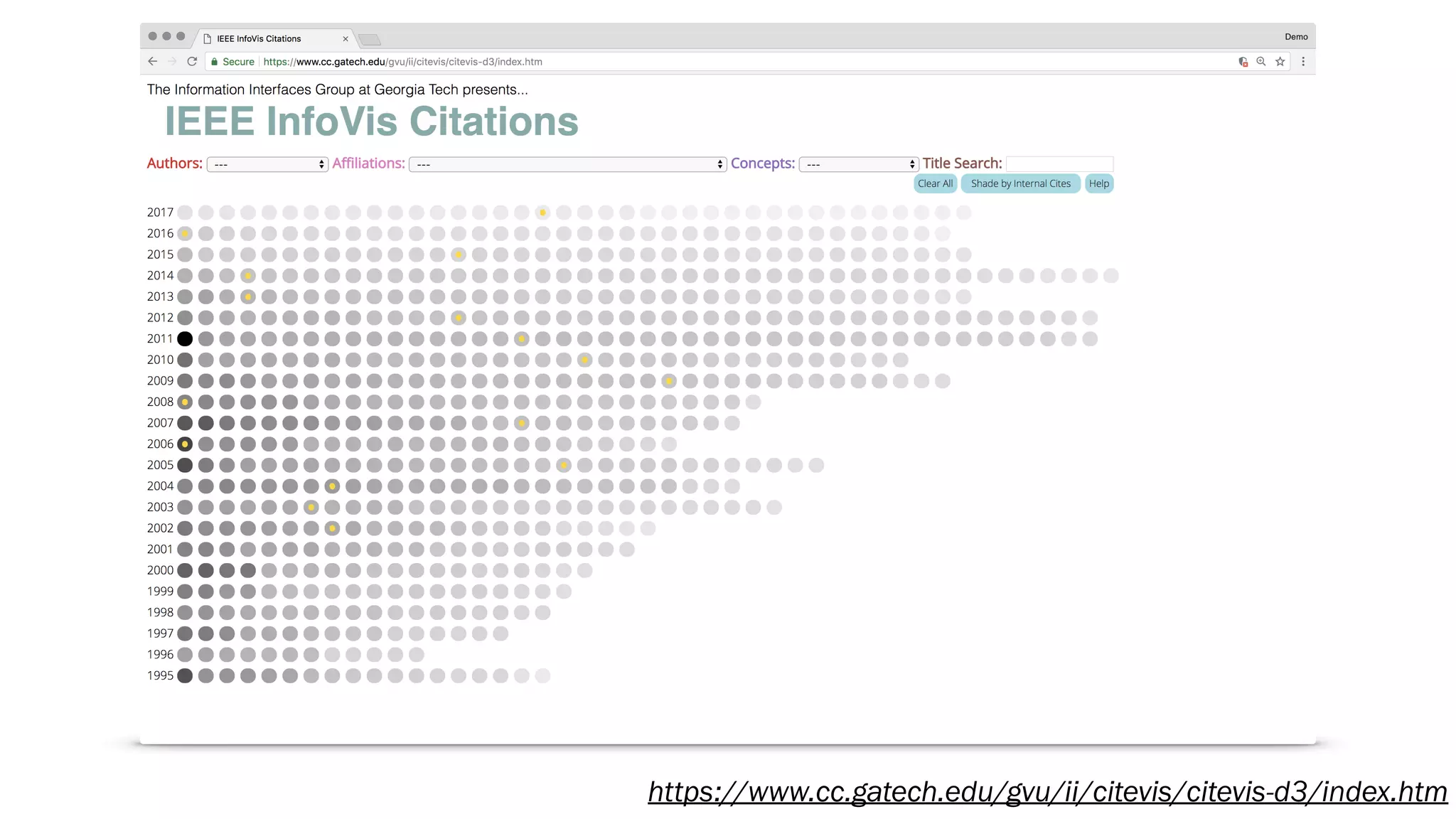
https://www.cc.gatech.edu/gvu/ii/citevis/citevis-d3/index.htm
Diamonds or Rhinestones?
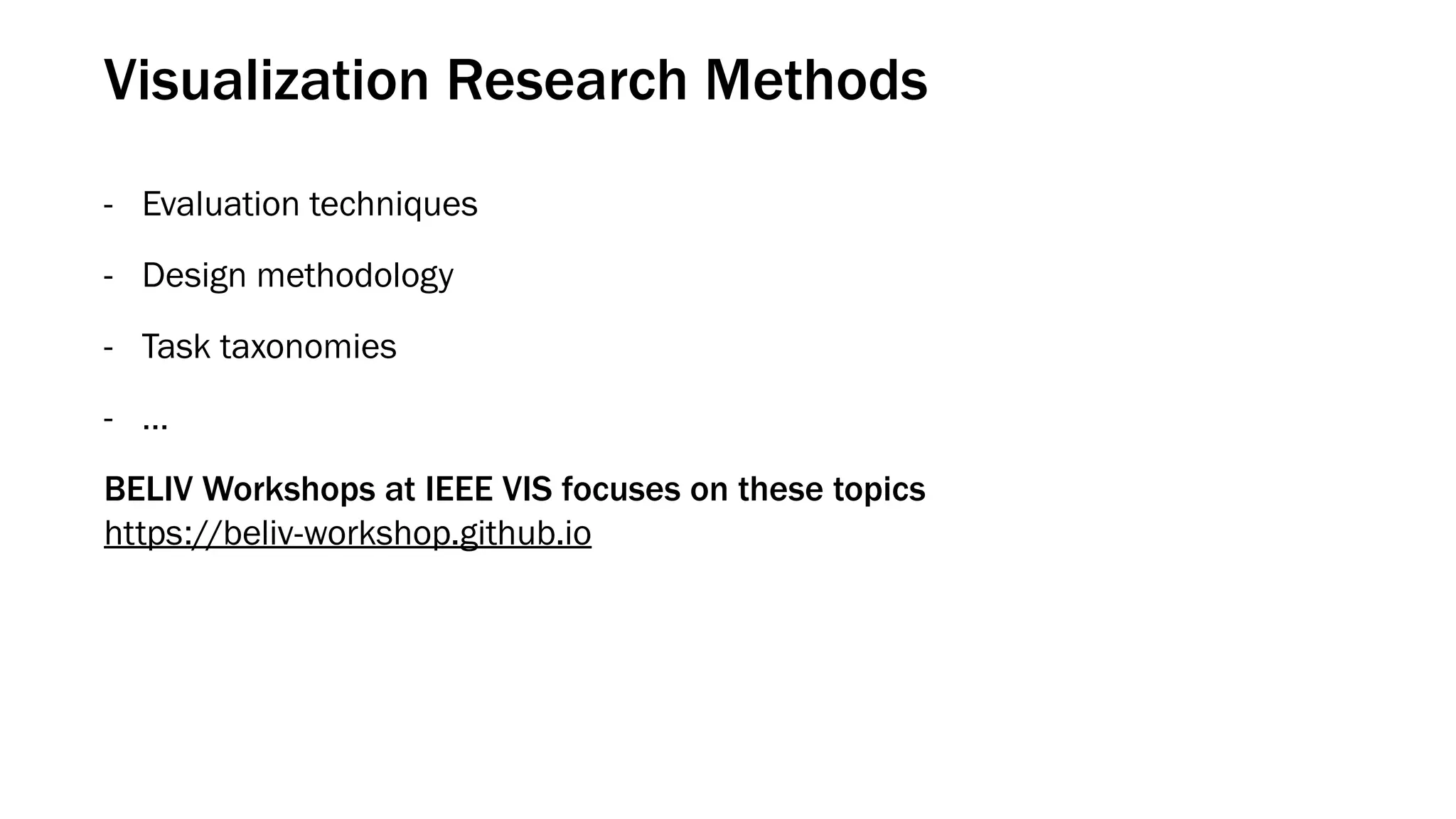
Visualization Research Methods
- Evaluation techniques
- Design methodology
- Task taxonomies
- …
BELIV Workshops at IEEE VIS focuses on these topics

https://beliv-workshop.github.io
Diamonds in the Rough
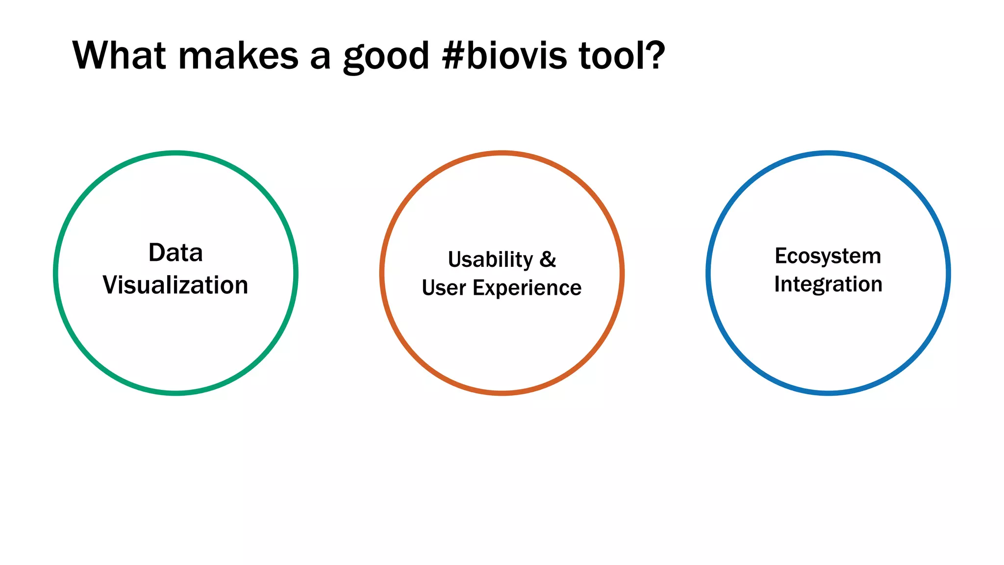
What makes a good #biovis tool?
Data
Visualization
Usability &
User Experience
Ecosystem
Integration
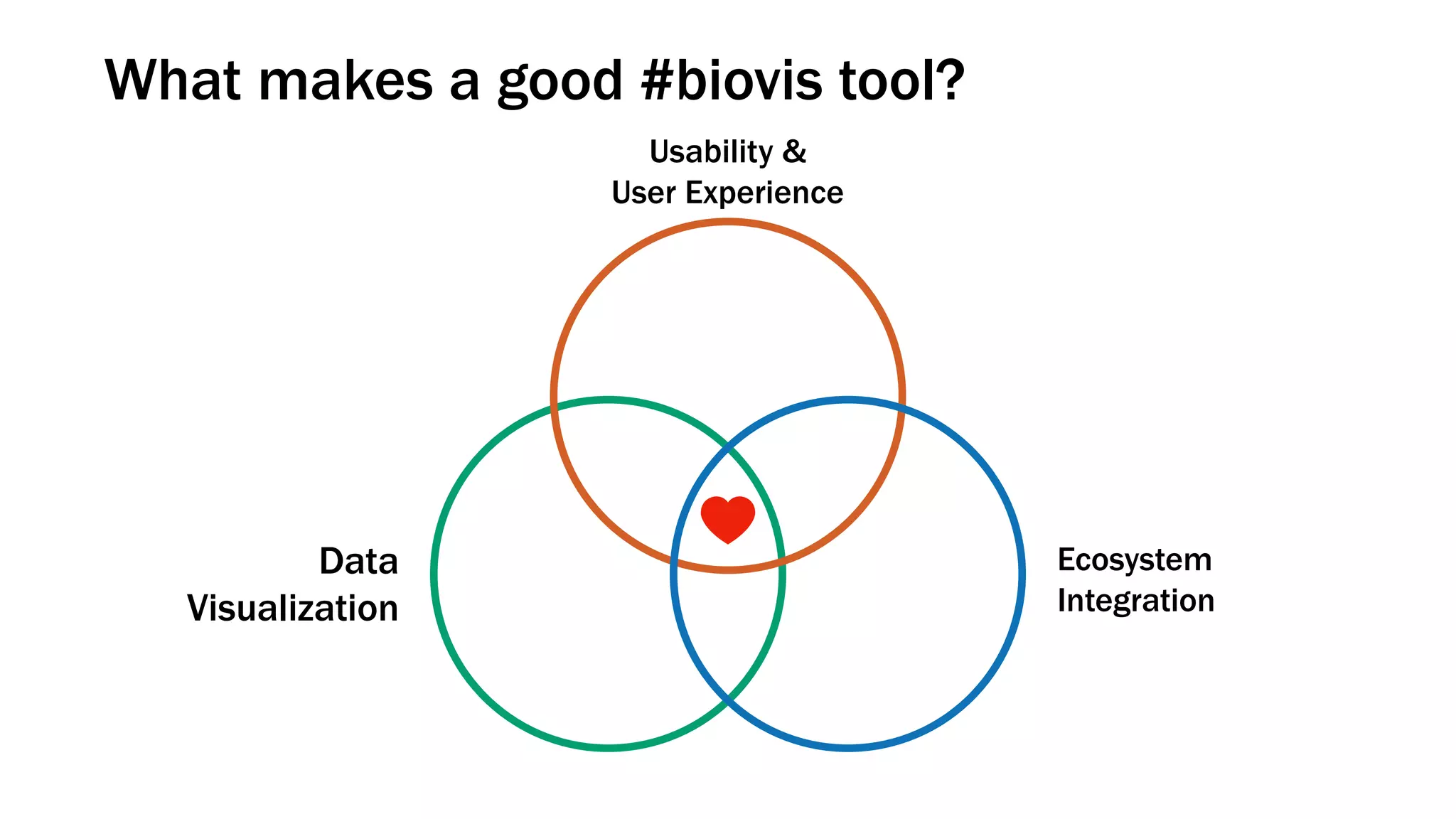
What makes a good #biovis tool?
Data
Visualization
Usability &
User Experience
Ecosystem
Integration
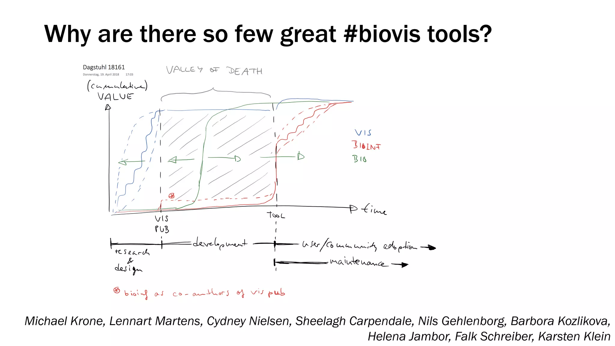
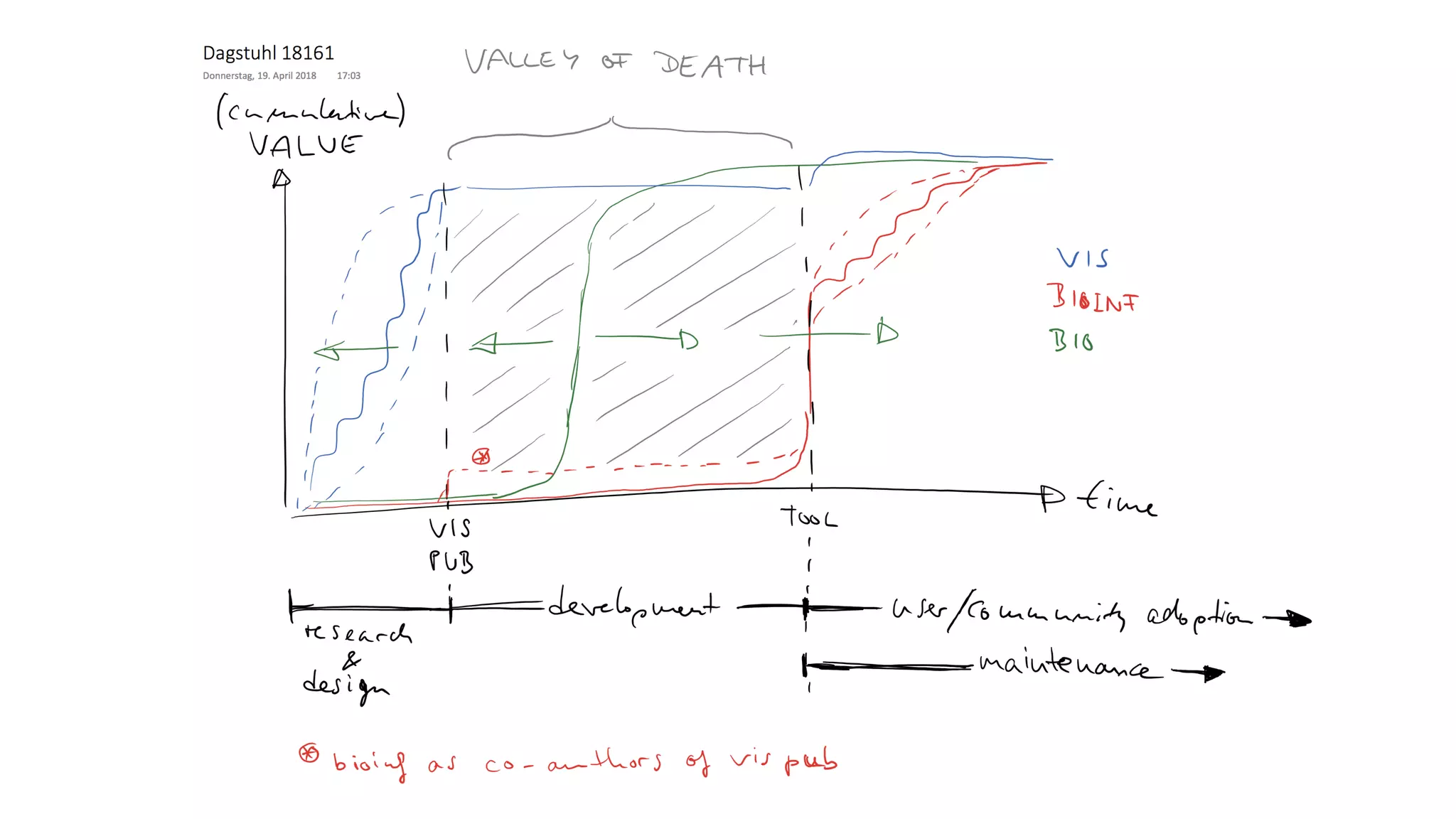
Why are there so few great #biovis tools?
Michael Krone, Lennart Martens, Cydney Nielsen, Sheelagh Carpendale, Nils Gehlenborg, Barbora Kozlikova,
Helena Jambor, Falk Schreiber, Karsten Klein
Snow White and the Seven Dwarfs, Walt Disney Productions (1937)
What can you do?
Become more aware of the visualization literature
- Don’t rely only on PubMed for literature searches
Attend a data visualization conference
- IEEE VIS in Berlin will be great and there’ll also be a BioVis Challenge Workshop
Plan collaborations with an understanding of the different reward systems
- Request resources for software engineering needs
- Think about usability and user experience in addition to data visualization
Write about your design approaches in your bioinformatics visualization papers
Nothing, sorry. !

Mining Gems from the Data Visualization Literature

  • 1.
    Mining Gems fromthe Data Visualization Literature Nils Gehlenborg, PhD Department of Biomedical Informatics Harvard Medical School http://gehlenborglab.org | nils@hms.harvard.edu | @ngehlenborg
  • 2.
    Snow White andthe Seven Dwarfs, Walt Disney Productions (1937)
  • 3.
    Snow White andthe Seven Dwarfs, Walt Disney Productions (1937)
  • 4.
  • 5.
    Snow White andthe Seven Dwarfs, Walt Disney Productions (1937)
  • 6.
    Snow White andthe Seven Dwarfs, Walt Disney Productions (1937)
  • 7.
    Publication Venues forData Visualization Conferences - IEEE VIS (Information Visualization, Scientific Visualization, Visual Analytics) - EuroVis - ACM SIGCHI - IEEE Pacific Vis Journals - Transactions on Visualization and Computer Graphics (IEEE) - MEDLINE indexed - Computer Graphics and Applications (IEEE) - MEDLINE indexed - Computer Graphics Forum (Wiley) - Information Visualization (Sage)
  • 8.
  • 10.
    Johnson & Shneiderman,IEEE Conference on Visualization (1991)
  • 11.
    Tree-Maps: A Space-FillingApproach to the Visualization of Hierarchical Information Structures Brian Johnson Ben Shneiderman ben@cs.umd.edubrianj@cs.umd.edu Department of Computer Science & Human-ComputerInteractionLaboratory University of Maryland, CollegePark, MD 20742 Abstract Thispaper describes a novel methodfor the visualization of hierarchically structured information. The Tree-Map visualization technique makes 100% use of the available display space,mapping thefull hierarchy onto a rectangular region in a space-filling manner. Thisefficient use of space allows very large hierarchies to be displayed in theirentirety andfacilitates the presentation of semantic information. 1 Introduction A large quantity of the world’s information is hierarchi- cally structured: manuals, outlines, corporate organizations, family trees,directory structures, intemet addressing, library cataloging, computerprograms... and the listgoes on. Most people come to understand the content and organization of these structures easily if they are small, but have great difficulty if the structures are large. We propose an interactive visualization method for pre- which are less important to the specific taskat hand can be allocated less space [9,101. Tree-Mapspartitionthedisplay space into a collectionof rectangular bounding boxes representing the tree structure [20]. The drawing of nodes within their bounding boxes is entirely dependent on the content of the nodes, and can be interactively controlled. Since the display size is user con- mlled, the drawing size of each node varies inversely with the size of the tree (i.e., # of nodes). Trees with many nodes (lo00or more) can be displayed and manipulated in a fixed display space. The main objectives of our design are: Efficient Space Utilization Efficient use of space isessential for thepresentation of large information structures. Interactive control over the presentation of informa- tion and real time feedback are essential. The presentation method and itsinteractive feedback Interactivity Comprehension Johnson & Shneiderman, IEEE Conference on Visualization (1991)
  • 12.
    Stolte & Hanrahan,IEEE Conference on Information Visualization (2000)
  • 13.
  • 14.
    Stolte & Hanrahan,IEEE Conference on Information Visualization (2000)
  • 15.
  • 16.
  • 17.
    IEEE TRANSACTIONS ONVISUALIZATION AND COMPUTER GRAPHICS, VOL. 12, NO. 5, SEPTEMBER/OCTOBER 2006 Hierarchical Edge Bundles: Visualization of Adjacency Relations in Hierarchical Data Danny Holten Abstract—A compound graph is a frequently encountered type of data set. Relations are given between items, and a hierarchy is defined on the items as well. We present a new method for visualizing such compound graphs. Our approach is based on visually bundling the adjacency edges, i.e., non-hierarchical edges, together. We realize this as follows. We assume that the hierarchy is shown via a standard tree visualization method. Next, we bend each adjacency edge, modeled as a B-spline curve, toward the polyline defined by the path via the inclusion edges from one node to another. This hierarchical bundling reduces visual clutter and also visualizes implicit adjacency edges between parent nodes that are the result of explicit adjacency edges between their respective child nodes. Furthermore, hierarchical edge bundling is a generic method which can be used in conjunction with existing tree visualization techniques. We illustrate our technique by providing example visualizations and discuss the results based on an informal evaluation provided by potential users of such visualizations. Index Terms—Network visualization, edge bundling, edge aggregation, edge concentration, curves, graph visualization, tree visual- ization, node-link diagrams, hierarchies, treemaps. ✦ 1 INTRODUCTION There is a large class of data sets that contain both hierarchical and adjacency edges become intertwined, which can make it difficult 741 Holten, IEEE Conference on Information Visualization (2006)
  • 22.
  • 23.
    D3 : Data-Driven Documents MichaelBostock, Vadim Ogievetsky and Jeffrey Heer Fig. 1. Interactive visualizations built with D3, running inside Google Chrome. From left to right: calendar view, chord diagram, choro- pleth map, hierarchical edge bundling, scatterplot matrix, grouped & stacked bars, force-directed graph clusters, Voronoi tessellation. Abstract—Data-Driven Documents (D3) is a novel representation-transparent approach to visualization for the web. Rather than hide the underlying scenegraph within a toolkit-specific abstraction, D3 enables direct inspection and manipulation of a native represen- tation: the standard document object model (DOM). With D3, designers selectively bind input data to arbitrary document elements, applying dynamic transforms to both generate and modify content. We show how representational transparency improves expressive- ness and better integrates with developer tools than prior approaches, while offering comparable notational efficiency and retainingBostock, Ogievetsky & Heer, IEEE Conference on Information Visualization (2011)
  • 24.
  • 25.
    GeneaQuilts: A Systemfor Exploring Large Genealogies Anastasia Bezerianos, Pierre Dragicevic, Jean-Daniel Fekete, Member, IEEE, Juhee Bae, and Ben Watson, Member, IEEE C haos G aea U ranus O ceanus Thethys Pontus R hea C ronus C oeus Phoebe C rius H yperion Iapetus Thea Them is M nem osyne D oris N eures D ionne D em eter H ades H era Alcm ene Zeus Eris Leto Am phitrite M edusa Poseidon H estia Thetis Peleus Anchises Adonis Aphrodite Persephone Ares H ephaestus H ebe H ercules M egara D eianira Eileithya Ate Leda Athena Apollo Artem is Triton Pegasus O rion Polyphem us D eidam ia Achilles C reusa Aeneas Lavinia Eros H elen M enelaus Polydueces Androm ache N eoptolem us Aeneas Pom pilius Iulus H erm ione F F F F F F F F F F F F F F F F F F F F F F F F F F F F F F F F F F F F F F F Fig. 1. The genealogy of Greek Gods depicted by GeneaQuilts (rotated 45o for better layout in this paper). Each F icon represents a nuclear family composed of parents (black dots above the icon) and children (black dots below). Abstract—GeneaQuilts is a new visualization technique for representing large genealogies of up to several thousand individuals. The visualization takes the form of a diagonally-filled matrix, where rows are individuals and columns are nuclear families. After identifying the major tasks performed in genealogical research and the limits of current software, we present an interactive genealogy exploration system based on GeneaQuilts. The system includes an overview, a timeline, search and filtering components, and a new interaction technique called Bring & Slide that allows fluid navigation in very large genealogies. We report on preliminary feedback from domain experts and show how our system supports a number of their tasks.Bezerianos et al., IEEE Conference on Information Visualization (2010)
  • 26.
    Node-Link Diagram Quilt Bezerianoset al., IEEE Conference on Information Visualization (2010)
  • 27.
    Developing and EvaluatingQuilts for the Depiction of Large Layered Graphs Juhee Bae and Ben Watson, Member, IEEE Abstract—Traditional layered graph depictions such as flow charts are in wide use. Yet as graphs grow more complex, these depictions can become difficult to understand. Quilts are matrix-based depictions for layered graphs designed to address this problem. In this research, we first improve Quilts by developing three design alternatives, and then compare the best of these alternatives to better-known node-link and matrix depictions. A primary weakness in Quilts is their depiction of skip links, links that do not simply connect to a succeeding layer. Therefore in our first study, we compare Quilts using color-only, text-only, and mixed (color and text) skip link depictions, finding that path finding with the color-only depiction is significantly slower and less accurate, and that in certain cases, the mixed depiction offers an advantage over the text-only depiction. In our second study, we compare Quilts using the mixed depiction to node-link diagrams and centered matrices. Overall results show that users can find paths through graphs significantly faster with Quilts (46.6 secs) than with node-link (58.3 secs) or matrix (71.2 secs) diagrams. This speed advantage is still greater in large graphs (e.g. in 200 node graphs, 55.4 secs vs. 71.1 secs for node-link and 84.2 secs for matrix depictions). Index Terms—Graph drawing, layered graphs, matrix based depiction, node-link diagram. 1 INTRODUCTION There are numerous ways to depict layered graphs, including the well known node-link diagrams, lesser known matrices, and most recently, Quilts. Node-link diagrams (Figure 1(a)) are easy to read and un- both containing less than 50 nodes and 150 links. Results confirmed Ghoniem et al.’s conclusions: for small, sparse graphs, node-link dia- grams are easier to read; while for more complex graphs, matrix depic- 2268 IEEE TRANSACTIONS ON VISUALIZATION AND COMPUTER GRAPHICS, VOL. 17, NO. 12, DECEMBER 2011 Bae & Watson, IEEE Conference on Information Visualization (2011)
  • 28.
    Node-Link Diagram Quilt Bae& Watson, IEEE Conference on Information Visualization (2011) Centered Adjacency Matrix
  • 30.
    Rat Genome SequencingConsortium, Nature 428, 493 (2004) D’Hont et al., Nature 488, 213 (2012)
  • 31.
    Lex et al.,IEEE Conference on Information Visualization (2014), http://vcg.github.io/upset/
  • 32.
    UpSet: Visualization ofIntersecting Sets Alexander Lex, Nils Gehlenborg, Hendrik Strobelt, Romain Vuillemot, and Hanspeter Pfister Set$Menu Set$View Element$View Combina2on$Matrix Fig. 1. UpSet showing relationships of movie genres. The set view visualizes intersections and their aggregates, the number ofLex et al., IEEE Conference on Information Visualization (2014), http://vcg.github.io/upset/
  • 33.
    Conway et al.,Bioinformatics (2017), https://gehlenborglab.shinyapps.io/upsetr/
  • 34.
    Conway et al.,Bioinformatics (2017), https://gehlenborglab.shinyapps.io/upsetr/
  • 35.
    Genome analysis UpSetR: anR package for the visualization of intersecting sets and their properties Jake R. Conway,1 Alexander Lex2 and Nils Gehlenborg1, * 1 Department of Biomedical Informatics, Harvard Medical School, Boston, MA 02115, USA and 2 SCI Institute, School of Computing, University of Utah, Salt Lake City, UT 84112, USA *To whom correspondence should be addressed. Associate Editor: John Hancock Received on March 25, 2017; revised on May 19, 2017; editorial decision on May 31, 2017; accepted on June 5, 2017 Abstract Motivation: Venn and Euler diagrams are a popular yet inadequate solution for quantitative visual- ization of set intersections. A scalable alternative to Venn and Euler diagrams for visualizing inter- secting sets and their properties is needed. Bioinformatics, 33(18), 2017, 2938–2940 doi: 10.1093/bioinformatics/btx364 Advance Access Publication Date: 22 June 2017 Applications Note Conway et al., Bioinformatics (2017), https://gehlenborglab.shinyapps.io/upsetr/
  • 36.
  • 37.
    State-of-the-Art Reports (STARs) -“State-of-the-Art Reports (STARs) are intended to provide up-to-date and comprehensive surveys on topics of interest to the visualization research community.” - Presented at EuroVis and published in Computer Graphics Forum
  • 38.
  • 39.
    Some Relevant Examples Graphs -A Taxonomy and Survey of Dynamic Graph Visualization (2017) - Visualizing Group Structures in Graphs: A Survey (2017) - Visual Analysis of Large Graphs: State-of-the-Art and Future Research Challenges (2011) Tabular Data - Matrix Reordering Methods for Table and Network Visualization (2016) - Visualization of Multi-Variate Scientific Data (2016) Sets - The State-of-the-Art of Set Visualization (2016)
  • 40.
    Even More Examples Imaging -A Survey of Visualization for Live Cell Imaging (2017) Molecular Structures - Visualization of Biomolecular Structures: State of the Art Revisited (2017) - Visual Analysis of Biomolecular Cavities: State of the Art (2016) General - State-of-the-Art Report in Web-based Visualization (2016) - The State of the Art in Integrating Machine Learning into Visual Analytics (2017)
  • 41.
  • 42.
  • 43.
  • 44.
  • 45.
  • 46.
  • 47.
  • 48.
  • 49.
    Visualization Research Methods -Evaluation techniques - Design methodology - Task taxonomies - … BELIV Workshops at IEEE VIS focuses on these topics
 https://beliv-workshop.github.io
  • 50.
  • 51.
    What makes agood #biovis tool? Data Visualization Usability & User Experience Ecosystem Integration
  • 52.
    What makes agood #biovis tool? Data Visualization Usability & User Experience Ecosystem Integration
  • 53.
    Why are thereso few great #biovis tools? Michael Krone, Lennart Martens, Cydney Nielsen, Sheelagh Carpendale, Nils Gehlenborg, Barbora Kozlikova, Helena Jambor, Falk Schreiber, Karsten Klein
  • 55.
    Snow White andthe Seven Dwarfs, Walt Disney Productions (1937)
  • 56.
    What can youdo? Become more aware of the visualization literature - Don’t rely only on PubMed for literature searches Attend a data visualization conference - IEEE VIS in Berlin will be great and there’ll also be a BioVis Challenge Workshop Plan collaborations with an understanding of the different reward systems - Request resources for software engineering needs - Think about usability and user experience in addition to data visualization Write about your design approaches in your bioinformatics visualization papers
  • 58.