Typography
Charles Nix
Choose well. Use well.
Don’t be a stupid designer.
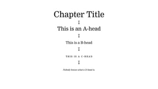
Chapter Title
↧
This is an A-head
↧
This is a B-head
↧
This is a C -head
↧
Nobody knows what a D-head is.
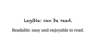
Legible: can be read.
Readable: easy and enjoyable to read.
Read D.B. Updike
[ Then go here: tdc.org/helpful-resources ]
Read new fonts.
[ Start here: type-foundries-archive.com ]
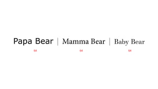
Papa Bear | Mamma Bear | Baby Bear
64 64 64
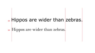
Hippos are wider than zebras.
64
64
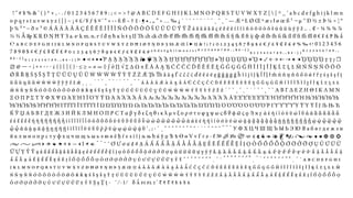
� � � � � � � � � � � � � � � � � � � � � � � � � � � � � � � � � � � � � � � � � � � � � � � � � � � � � � � � � � � � � � � � � � � � � � � � � � � � � � �
� � � � � � � � � � � � � � � � � � � � � � � � � � � � � � � � � � � � � � � � � � � � � � � � � � � � � � � � � � � � � � � � � � � � � � � � � � � � � � � � � �
� � � � � � � � � � � � � � � � � � � � � � � � � � � � � � � � � � � � � � � � � � � � � � � � � � � � � � � � � � � � � � � � � � � � � � � � � � �
� � � � � � � � � � � � � � � � � � � � � � � � � � � � � � � � � � � � � � � � � � � � � � � � � � � � � � � � � � � � � � � �
� � � � � � � � � � � � � � � � � � � � � � � � � � � � � � � � � � � � � � � � � � � � � � � � � � � � � � � � � � � � � � � � � � � � � � � � � � � � �
� � � � � � � � � � � � � � � � � � � � � � � � � � � � � � � � � � � � � � � � � � � � � � � � � � � � � � � � � � � � � � � � � � � � � � � � � � � � � � � � � � � � � � � � � � � � � � �
� � � � � � � � � � � � � � � � � � � � � � � � � � � � � � � � � � � � � � � � � � � � � � � � � � � � � � � � � � � � � � � � � � � � � � � �
� � � � � � � � � � � � � � � � � � � � � � � � � � � � � � � � � � � � � � � � � � � � � � � � � � � � � � � � � � � � � � � � � � � � � � � �
� � � � � � � � � � � � � � � � � � � � � � � � � � � � � � � � � � � � � � � � � � � � � � � � � � � � � � � � � � � � � � � � � � � � � � � � � � � �
� � � � � � � � � � � � � � � � � � � � � � � � � � � � � � � � � � � � � � � � � � � � � � � � � � � � � � � � � � � � � � � � � � � � � � � � � � � � � � � �
� � � � � � � � � � � � � � � � � � � � � � � � � � � � � � � � � � � � � � � � � � � � � � � � � � � � � � � � � � � � � � � � � � � � � � � � � �
� � � � � � � � � � � � � � � � � � � � � � � � � � � � � � � � � � � � � � � � � � � � � � � � � � � � � � � � � � � �
� � � � � � � � � � � � � � � � � � � � � � � � � � � � � � � � � � � � � � � � � � � � � � � � � � � � � � � � � � � � � �
� � � � � � � � � � � � � � � � � � � � � � � � � � � � � � � � � � � � � � � � � � � � � � � � � � � � � � � � � � � � � � � � � � � � � � � � � �
� � � � � � � � � � � � � � � � � � � � � � � � � � � � � � � � � � � � � � � � � � � � � � � � � � � � � � � � � � � � � � � � � � � � � � � � � � � � � � � �
� � � � � � � � � � � � � � � � � � � � � � � � � � � � � � � � � � � � � � � � � � � � � � � � � � � � � � � � � � � � � � � � � � � � � � � � � � � � � � � �
� � � � � � � � � � � � � � � � � � � � � � � � � � � � � � � � � � � � � � � � � � � � � � � � � � � � � � � � � � � � � � � � � � �
� � � � � � � � � � � � � � � � � � � � � � � � � � � � � � � � � � � � � � � � � � � � � � � � � � � � � � � � � � � � � � �
� � � � � � � � � � � � � � � � � � � � � � � � � � � � � � � � � � � � � � � � � � � � � � � � � � � � � � � � � � � � � � � � � � � � � � � � � � � �
� � � � � � � � � � � � � � � � � � � � � � � � � � � � � � � � � � � � � � � � � � � � � � � � � � � � � � � � � � � � � � � � � � � � � � � � � � � � � � � � �
� � � � � � � � � � � � � � � � � � � � � � � � � � � � � � � � � � � � � � � � � � � � � � � � � � � � � � � � � � � � � � � � � � � � � � � � � � � � �
� � � � � � � � � � � � � � � � � � � � � � � � � � � � � � � � � � � � � � � � � � � � � � � � � � � � � � � � � � � � � � � � � � � � � � � � � �
� � � � � � � � � � � � � � � � � � � � � � � � � � � � � � � � � � � � � � � � � � � � �
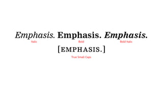
Emphasis. Emphasis. Emphasis.
[emphasis.]
Italic Bold
True Small Caps
Bold Italic
OTF + WOFF
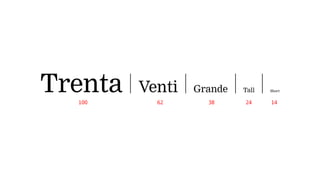
Trenta | Venti | Grande | Tall | Short
62100 38 24 14
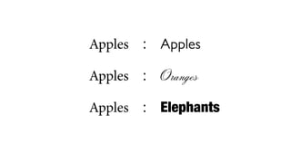
Apples	 :	 Apples
	Apples	 :	 Oranges
	Apples	 :	 Elephants
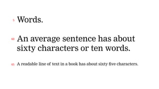
Words.
An average sentence has about
sixty characters or ten words.
A readable line of text in a book has about sixty five characters.
5
60
65
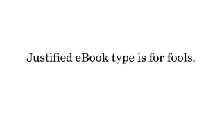
Justified eBook type is for fools.
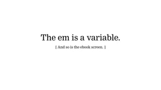
The em is a variable.
[ And so is the ebook screen. ]
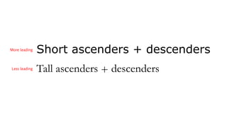
Short ascenders + descenders
Tall ascenders + descenders
More leading
Less leading
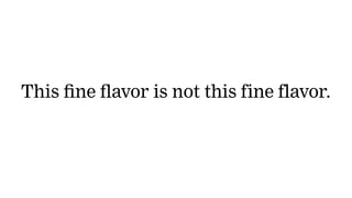
This fine flavor is not this fine flavor.
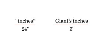
“inches”
24"
Giant’s inches
3'
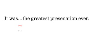
It was…the greatest presenation ever.
It was...
[not]
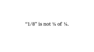
“1/8” is not 1/2 of 1/4.
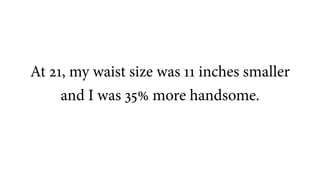
At 21, my waist size was 11 inches smaller
and I was 35% more handsome.
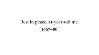
Rest in peace, 21-year-old me.
[ 1967–88 ]
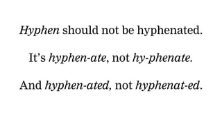
Hyphen should not be hyphenated.
It’s hyphen-ate, not hy-phenate.
And hyphen-ated, not hyphenat-ed.
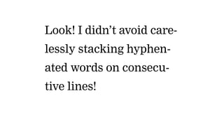
Look! I didn’t avoid care-
lessly stacking hyphen-
ated words on consecu-
tive lines!
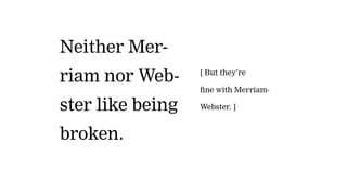
Neither Mer-
riam nor Web-
ster like being
broken.
[ But they’re
fine with Merriam-
Webster. ]
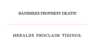
BANSHEES PROPHESY DEATH!
HERALDS  PROCLAIM  TIDINGS.
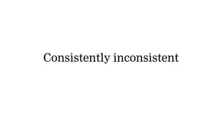
Consistently inconsistent
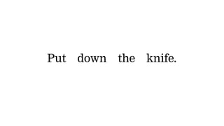
Put down the knife.
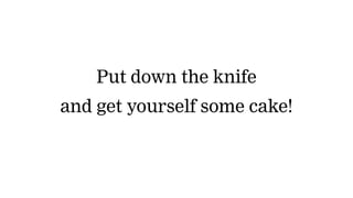
Put down the knife
and get yourself some cake!
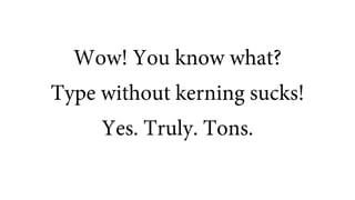
Wow! You know what?
Type without kerning sucks!
Yes. Truly. Tons.
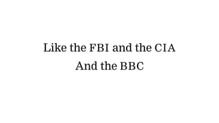
Like the FBI and the CIA
And the BBC
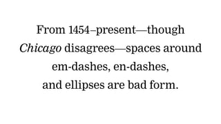
From 1454–present—though
Chicago disagrees—spaces around
em-dashes, en-dashes,
and ellipses are bad form.
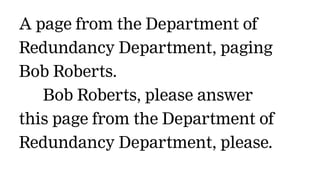
A page from the Department of
Redundancy Department, paging
Bob Roberts.
   Bob Roberts, please answer
this page from the Department of
Redundancy Department, please.
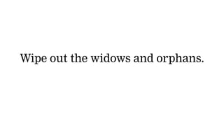
Wipe out the widows and orphans.