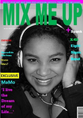
Cover and contents page for slideshare
•Download as DOCX, PDF•
0 likes•320 views
Report
Share
Report
Share

Recommended
Plano sala de sistemas diego
El plano muestra la distribución de una sala de sistemas con equipos de cómputo, estaciones de trabajo, cables y mobiliario. Se aprecian filas ordenadas de escritorios, gabinetes de servidores, racks de cableado y paneles de distribución eléctrica.
Deapos !!
El documento habla sobre los expedientes electrónicos judiciales. Explica que un expediente electrónico es el conjunto de información generada durante un proceso judicial que está en formato electrónico e integrada en el sistema de información de las oficinas judiciales. Esto permite que los documentos aportados por las partes lleguen de forma digital y se incorporen al expediente de manera natural. Los expedientes electrónicos tienen ventajas como la agilización de los procesos y el acceso remoto a la información.
Xamarin.iOS中引用自製Objective-C的Class Library
The document discusses how to use a custom Objective-C class library in a Xamarin.iOS application. It involves:
1. Creating a static library project in Xcode containing the Objective-C classes.
2. Using Objective Sharpie to generate C# bindings.
3. Creating an iOS binding project in Xamarin.
4. Referencing the binding project from a Xamarin.iOS app to use the Objective-C classes.
Edward Kearns' CV
Edward Kearns has over 10 years of experience as a freelance copywriter, editor, and content creator. He has worked remotely for many large hotel and marketing companies, producing websites, blogs, social media content, and other materials. He is skilled at integrating SEO keywords into engaging content and has extensive experience using content management systems. He holds a Bachelor's degree in Creative Writing and has published several short stories.
Title cards
This document discusses a plan to reveal the title of a product midway through its presentation. The title will fade in and out over a heartbeat sound effect to match the tension of the character. Cutting from the action to the title also builds suspense by preventing the audience from immediately seeing what happens with the characters.
Campamento de semana santa 2015 compromiso ampa
El documento describe un campamento de Semana Santa en el CEIP Enrique Segura Covarsí del 30 de marzo al 6 de abril de 2015. La AMPA del centro ofrecerá becas para que los estudiantes puedan asistir al campamento y así los padres puedan conciliar su vida laboral y familiar. Las becas se darán a familias con necesidades socioeconómicas especiales y cuyos dos padres/tutores trabajen de 9:00 a 14:00 horas, según se justifique antes del 27 de marzo.
Evaluation Question 2 (Media A2)
The document evaluates how effective the combination of a main product and ancillary texts are. It discusses two posters and a magazine cover created for a marketing campaign that link the products together through the use of consistent typography, characters, settings, logos and blogs. The same mise-en-scene is also used across the posters and teaser trailer to further connect the pieces. Overall, the use of identical typography, characters and their roles across all the products is meant to make the title and characters recognizable and demonstrate continuity within the marketing campaign.
Heart Beat Storyboard 3
This document provides a shot-by-shot summary of a movie trailer. It introduces the two main characters as teenagers who fall in love but then face difficulties testing their relationship. Various scenes show the couple spending time together happily at first, but then arguing as problems arise. Their friend groups are also introduced. The trailer builds tension through intertitle cards and a party scene is described to depict an atmosphere that may further challenge their romance. It concludes by revealing the movie's title and February 2013 release date, aimed at appealing to audiences interested in romantic stories around Valentine's Day.
Storyboard 2
This document analyzes the techniques used in a movie trailer. It summarizes each scene or element of the trailer, including the use of logos to establish quality, title frames to set the romantic genre, shots that introduce the protagonists and setting, dialogue and music to convey the relationship, and scenes depicting the breakup accompanied by sad music to create narrative tension. The overall purpose is to introduce the audience to the story and main characters while hinting at conflict and leaving some mystery through the final scene and promotional date in February.
Focus group moodboard
This short document discusses two different types of endings - a "bad ending" which is mentioned twice, and a "happy ending" which is only mentioned once. The repetition of the "bad ending" suggests that may be the focus or preferred ending according to the document. Overall, the document presents a contrast between an unhappy conclusion and a positive resolution.
Storyboard 1
The document provides a breakdown of various elements that appear in a romantic comedy film, including institution logos at the beginning to establish quality, intertitles that inform the genre and plot, establishing shots that introduce settings and characters, and interactions between characters through body language and facial expressions that advance the story. It describes how the film establishes an equilibrium, shows a disruption when the main couple breaks up, and sets up attempts to repair the disruption, before ending on an open note at school to create intrigue for the audience.
Questionnaire
This document is a questionnaire for a media studies course asking about preferences in romantic comedy films. It asks about gender and age of the respondent, whether they enjoy rom coms and where they like to watch them. It also asks whether they prefer happy or sad endings, a male or female protagonist, and if they want either gender portrayed negatively. The answers will provide ideas for a romantic comedy movie trailer, poster, and magazine cover the student is producing.
The grown ups poster analysis
The poster summarizes the film "Grown Ups" by featuring the main protagonists names along the top. Their performances in the film indicate that they enjoy playing like children even as adults. The title is placed below the main image of the actors on water slides. The release date is colored red to connote the danger of growing up. Overall the poster represents the film's comedic genre by depicting the main characters acting in childish ways despite being adults.
1st draft of question 1 part2
The document provides details on the design of a mock music magazine cover and contents page. Key elements included are a skyline with magazine contents, a prominent masthead, a cover model portrayed as a young female artist, cover lines in varied colors/fonts about magazine contents, a main cover line with the word "exclusive" and a pull quote from the cover model's interview. Other elements are a flash button advertising a competition to win the cover model's new album, a barcode and month indicating monthly publication, and varied formatting of images, subheadings and text on the contents page to highlight information and engage readers.
Evaluation question 6
Through creating their media product, the author learned about various technologies. They became proficient in Microsoft Office programs like Word and PowerPoint by using them to write documents, analyze other products, and create presentations. The author also learned how to use WordPress to easily create blogs, Slideshare to publish documents, and Prezi and YouTube to create presentations and upload videos. Additional programs like AVS video converter helped the author combine multimedia elements, while Google, PicMonkey and their camera supported research, image editing, and content capture. The process highlighted their growing dependence on internet technologies.
My final final final magazine
This document contains a cover page, contents page, and a double page spread. It has basic sections like a cover and contents page as well as a spread that takes up two facing pages. The summary captures the key sections and layout elements mentioned in the short document.
1st draft of question 1
The document describes the design elements used in a mock music magazine cover and contents page. Key elements include a skyline and masthead on the cover to identify the publication, a cover model to appeal to readers, and cover lines advertising articles. Inside, the contents page uses images and subheadings to preview articles, and a double-page spread features an interview with the cover model using a large lead photo, secondary photos, and pull quotes. Colors, fonts and layout are designed to attract readers and highlight important information.
Final music magazine draft
This short document is a draft for a music magazine. It contains a front cover page, contents page, and double page spread which provide the basic structure and sections for the magazine.
Pictures
Pictures are visual representations of people, places, things, or ideas. They can be created through photography, drawing, or other artistic means. Pictures allow us to capture and share moments and experiences in a way that transcends language and time.
Mix me up magazine 1 draft
Mix Me Up Magazine is a new publication focused on music discovery. It aims to introduce readers to new and emerging artists across various genres through artist profiles, reviews of new albums and singles, and recommendations of local shows and festivals. The magazine's goal is to help readers expand their musical tastes by exposing them to sounds outside their normal playlists.
Making the pictures that are going to be in my music magazine
The document discusses the benefits of exercise for mental health. Regular physical activity can help reduce anxiety and depression and improve mood and cognitive function. Exercise causes chemical changes in the brain that may help protect against mental illness and improve symptoms.
Pp for pictures
This document contains instructions for creating a book cover and contents page with pictures. It includes directions for a cover page, contents page, and double page spread layout. The document gives formatting guidelines for presenting visual elements on book design pages.
Final questionnaire
This document contains a 9 question questionnaire about a media coursework PowerPoint presentation. The questions ask about magazines, titles, fonts, colors, front covers, contents pages, double page spreads, and photo ideas to gather feedback on how to improve the presentation. Responses will be published anonymously to help the student strengthen their work.
Focus group
The document discusses ideas for a new music magazine, including potential titles, colors, front cover designs, and photo ideas. Participants in a focus group are asked for their preferences on the title, colors they would like to see used, whether the front cover should feature a band or single artist, and what they like or dislike about sample cover, contents, and double page spread designs. They are thanked for participating in the focus group discussion.
More Related Content
More from marinmou07
Evaluation Question 2 (Media A2)
The document evaluates how effective the combination of a main product and ancillary texts are. It discusses two posters and a magazine cover created for a marketing campaign that link the products together through the use of consistent typography, characters, settings, logos and blogs. The same mise-en-scene is also used across the posters and teaser trailer to further connect the pieces. Overall, the use of identical typography, characters and their roles across all the products is meant to make the title and characters recognizable and demonstrate continuity within the marketing campaign.
Heart Beat Storyboard 3
This document provides a shot-by-shot summary of a movie trailer. It introduces the two main characters as teenagers who fall in love but then face difficulties testing their relationship. Various scenes show the couple spending time together happily at first, but then arguing as problems arise. Their friend groups are also introduced. The trailer builds tension through intertitle cards and a party scene is described to depict an atmosphere that may further challenge their romance. It concludes by revealing the movie's title and February 2013 release date, aimed at appealing to audiences interested in romantic stories around Valentine's Day.
Storyboard 2
This document analyzes the techniques used in a movie trailer. It summarizes each scene or element of the trailer, including the use of logos to establish quality, title frames to set the romantic genre, shots that introduce the protagonists and setting, dialogue and music to convey the relationship, and scenes depicting the breakup accompanied by sad music to create narrative tension. The overall purpose is to introduce the audience to the story and main characters while hinting at conflict and leaving some mystery through the final scene and promotional date in February.
Focus group moodboard
This short document discusses two different types of endings - a "bad ending" which is mentioned twice, and a "happy ending" which is only mentioned once. The repetition of the "bad ending" suggests that may be the focus or preferred ending according to the document. Overall, the document presents a contrast between an unhappy conclusion and a positive resolution.
Storyboard 1
The document provides a breakdown of various elements that appear in a romantic comedy film, including institution logos at the beginning to establish quality, intertitles that inform the genre and plot, establishing shots that introduce settings and characters, and interactions between characters through body language and facial expressions that advance the story. It describes how the film establishes an equilibrium, shows a disruption when the main couple breaks up, and sets up attempts to repair the disruption, before ending on an open note at school to create intrigue for the audience.
Questionnaire
This document is a questionnaire for a media studies course asking about preferences in romantic comedy films. It asks about gender and age of the respondent, whether they enjoy rom coms and where they like to watch them. It also asks whether they prefer happy or sad endings, a male or female protagonist, and if they want either gender portrayed negatively. The answers will provide ideas for a romantic comedy movie trailer, poster, and magazine cover the student is producing.
The grown ups poster analysis
The poster summarizes the film "Grown Ups" by featuring the main protagonists names along the top. Their performances in the film indicate that they enjoy playing like children even as adults. The title is placed below the main image of the actors on water slides. The release date is colored red to connote the danger of growing up. Overall the poster represents the film's comedic genre by depicting the main characters acting in childish ways despite being adults.
1st draft of question 1 part2
The document provides details on the design of a mock music magazine cover and contents page. Key elements included are a skyline with magazine contents, a prominent masthead, a cover model portrayed as a young female artist, cover lines in varied colors/fonts about magazine contents, a main cover line with the word "exclusive" and a pull quote from the cover model's interview. Other elements are a flash button advertising a competition to win the cover model's new album, a barcode and month indicating monthly publication, and varied formatting of images, subheadings and text on the contents page to highlight information and engage readers.
Evaluation question 6
Through creating their media product, the author learned about various technologies. They became proficient in Microsoft Office programs like Word and PowerPoint by using them to write documents, analyze other products, and create presentations. The author also learned how to use WordPress to easily create blogs, Slideshare to publish documents, and Prezi and YouTube to create presentations and upload videos. Additional programs like AVS video converter helped the author combine multimedia elements, while Google, PicMonkey and their camera supported research, image editing, and content capture. The process highlighted their growing dependence on internet technologies.
My final final final magazine
This document contains a cover page, contents page, and a double page spread. It has basic sections like a cover and contents page as well as a spread that takes up two facing pages. The summary captures the key sections and layout elements mentioned in the short document.
1st draft of question 1
The document describes the design elements used in a mock music magazine cover and contents page. Key elements include a skyline and masthead on the cover to identify the publication, a cover model to appeal to readers, and cover lines advertising articles. Inside, the contents page uses images and subheadings to preview articles, and a double-page spread features an interview with the cover model using a large lead photo, secondary photos, and pull quotes. Colors, fonts and layout are designed to attract readers and highlight important information.
Final music magazine draft
This short document is a draft for a music magazine. It contains a front cover page, contents page, and double page spread which provide the basic structure and sections for the magazine.
Pictures
Pictures are visual representations of people, places, things, or ideas. They can be created through photography, drawing, or other artistic means. Pictures allow us to capture and share moments and experiences in a way that transcends language and time.
Mix me up magazine 1 draft
Mix Me Up Magazine is a new publication focused on music discovery. It aims to introduce readers to new and emerging artists across various genres through artist profiles, reviews of new albums and singles, and recommendations of local shows and festivals. The magazine's goal is to help readers expand their musical tastes by exposing them to sounds outside their normal playlists.
Making the pictures that are going to be in my music magazine
The document discusses the benefits of exercise for mental health. Regular physical activity can help reduce anxiety and depression and improve mood and cognitive function. Exercise causes chemical changes in the brain that may help protect against mental illness and improve symptoms.
Pp for pictures
This document contains instructions for creating a book cover and contents page with pictures. It includes directions for a cover page, contents page, and double page spread layout. The document gives formatting guidelines for presenting visual elements on book design pages.
Final questionnaire
This document contains a 9 question questionnaire about a media coursework PowerPoint presentation. The questions ask about magazines, titles, fonts, colors, front covers, contents pages, double page spreads, and photo ideas to gather feedback on how to improve the presentation. Responses will be published anonymously to help the student strengthen their work.
Focus group
The document discusses ideas for a new music magazine, including potential titles, colors, front cover designs, and photo ideas. Participants in a focus group are asked for their preferences on the title, colors they would like to see used, whether the front cover should feature a band or single artist, and what they like or dislike about sample cover, contents, and double page spread designs. They are thanked for participating in the focus group discussion.
More from marinmou07 (20)
Making the pictures that are going to be in my music magazine
Making the pictures that are going to be in my music magazine