Comprehensive Guide to Graphic Design and Branding for Social Impact
Explore fundamental graphic design elements, branding strategies, layout principles, typography, and color theory to create impactful visual communications and strong brand identities.
what is a
Graphic
Design?
GraphicDesign is a process in which we use
typography, image, colors, icons and other
illustrations to communicate visually.
Graphic Design is the art or skill of
combining text and pictures in
advertisements, magazines, or books.
3.
Graphic
Designer
• A personwho combines text
and pictures in
advertisements, magazines,
or books.
• Is a professional within the
graphic design and graphic
arts industry who assembles
together images,
typography, or motion
graphics to create a piece of
design.
4.
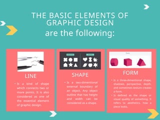
THE BASIC ELEMENTSOF
GRAPHIC DESIGN
are the following:
LINE
• Is a kind of shape
which connects two or
more points. It is also
considered as one of
the essential element
of graphic design.
SHAPE
• Is a two-dimentional
external boundary of
an object. Any object
outline that has height
and width can be
considered as a shape.
FORM
• Is a three-dimentional shape,
shadows, perspective, depth,
and sometimes texture creates
a form.
• Is defined as the shape or
visual quality of something. It
refers to aesthetics, how a
piece looks.
5.
THE BASIC ELEMENTSOF
GRAPHIC DESIGN
are the following:
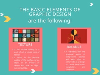
TEXTURE
• Is the surface quality in a
work of art or visual tone of
design.
• It refers to the physical
quality of the surface of an
object in an artwork or
design and how an object
look or feel like.
BALANCE
• Is offsetting how the
graphical weight of
components balance
with each other on
either side of a design
to create satisfaction,
completion, and
cohension.
6.
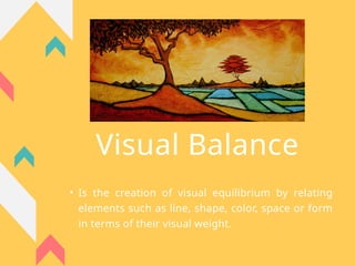
Visual Balance
• Isthe creation of visual equilibrium by relating
elements such as line, shape, color, space or form
in terms of their visual weight.
7.
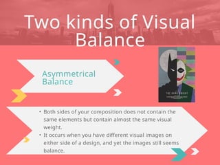
• Both sidesof your composition does not contain the
same elements but contain almost the same visual
weight.
• It occurs when you have different visual images on
either side of a design, and yet the images still seems
balance.
Two kinds of Visual
Balance
Asymmetrical
Balance
8.
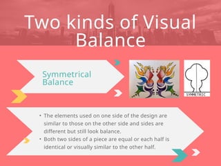
• The elementsused on one side of the design are
similar to those on the other side and sides are
different but still look balance.
• Both two sides of a piece are equal or each half is
identical or visually similar to the other half.
Two kinds of Visual
Balance
Symmetrical
Balance
What is
Branding?
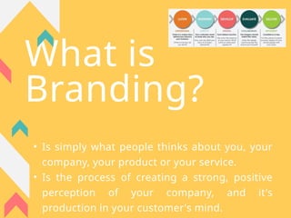
• Issimply what people thinks about you, your
company, your product or your service.
• Is the process of creating a strong, positive
perception of your company, and it's
production in your customer's mind.
11.
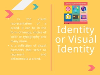
• Is thevisual
representation of a
brand. It can be in the
form of image, choice of
color or typography and
many more.
• is a collection of visual
elements that serve to
represent and
differentiate a brand.
Identity
or Visual
Identity
12.
T
S
E
P
S
1. ESTABLISH CLEARPURPOSE AND
POSITIONING.
Recall why you or your company exists, who your target audience
are, and what makes you or your service unique from your
competitors.
3. GET A PERSONALITY.
Based on your research, determine your brand’s personality.
Brand personality make a huge impact on the visuals of your
marketing materials.
2. CONDUCT THOROUGH MARKET
RESEARCH.
Having a deep analysis on your target audience on what their
personalities are which will lead you to the next steps.
SEVEN
IN CREATING A BRAND IDENTITY DESIGN
(LUCIDPRESS(2018)
13.
T
S
E
P
S
4. CREATE APOLISHED LOGO.
In creating your logo, it should be simple, scalable, and
memorable. Observe the logos of famous companies like
Amazon, Google, and IBM. What do these logos have in common?
5. CREATE AN ATTRACTIVE COLOR
PALLETE.
Your color pallete should be simple and contain one to three
primary colors. Once you have established your color pallete, you
may play with their color family. For example, if you choose blue
as you primary color, you may use sky blue, baby blue, and other
colors under the blue family to support your primary color.
SEVEN
IN CREATING A BRAND IDENTITY DESIGN
(LUCIDPRESS(2018)
14.
T
S
E
P
S
6. SELECT PROFESSIONALTYPOGRAPHY.
When selecting fonts, it is important to consider these things:
a. Do not make it fancy. Fancy typefaces only make your text
confusing.
b. Don’t mix fonts/typefaces. Do not mix fonts or typefaces in a
word or sentence as it may give mixed interpretations to your
audience.
c. Mix contrasting fonts/typefaces. This is not similar to
the above item. This means you may use serif typefaces for your
product title and sans serif for the subtitle.
7. CHOOSE ON-BRAND
SUPPORTING GRAPHICS.
Your brand identity should have a visual library that include
icons, images/photographs, design assets, and other supporting
graphics.
SEVEN
IN CREATING A BRAND IDENTITY DESIGN
(LUCIDPRESS(2018)
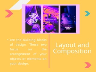
• are thebuilding blocks
of design. These two
focus on the
arrangement of your
objects or elements on
your design.
Layout and
Composition
17.
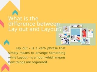
What is the
differencebetween
Lay out and Layout?
Lay out - is a verb phrase that
simply means to arrange something
while Layout - is a noun which means
how things are organized.
18.
FIVE BASIC PRINCIPLESOF
LAYOUT AND
COMPOSITION
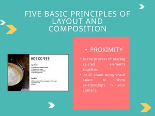
• PROXIMITY
• Is the process of placing
related elements
together.
• is all about using visual
space to show
relationships in your
content.
19.
FIVE BASIC PRINCIPLESOF
LAYOUT AND
COMPOSITION
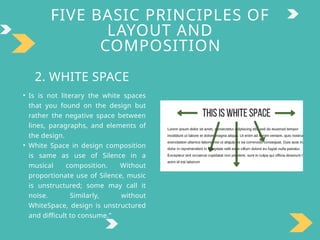
2. WHITE SPACE
• Is is not literary the white spaces
that you found on the design but
rather the negative space between
lines, paragraphs, and elements of
the design.
• White Space in design composition
is same as use of Silence in a
musical composition. Without
proportionate use of Silence, music
is unstructured; some may call it
noise. Similarly, without
WhiteSpace, design is unstructured
and difficult to consume.”
20.
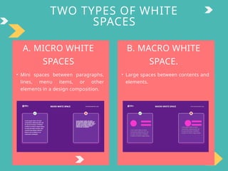
TWO TYPES OFWHITE
SPACES
A. MICRO WHITE
SPACES
• Mini spaces between paragraphs,
lines, menu items, or other
elements in a design composition.
B. MACRO WHITE
SPACE.
• Large spaces between contents and
elements.
21.
M
I
P
O
T
• IMPROVED COMPREHENSION
Spacesbetween lines in a paragraph makes the content legible and
easily scanable to the readers/viewers.
3. INCREASED INTERACTION RATE
If used wisely, white space in design helps the viewer to get the
message quickly even without looking at the instructions. T
4. GUIDE THE USER THROUGH
LOCAL GROUPING
White space helps you to achieve the proximity of your design.
2. FOCUS AND ATTENTION
Macro white spaces help guide the viewers to the focus area in the
design.
R
A
N
C
E
OF WHITE SPACE IN DESIGN
(HEDGE(2017)
22.
M
I
P
O
T
5. BRANDING ANDDESIGN
TONE
Let us look back at the steps of brand identity design, the
way how are you going to apply white spaces in your
design helps you create your own brand’s personality.
6. CREATING A BREATHING
SPACE FOR USERS
A lot of people believe that in design, one must maximize
the space by putting contents on it.
R
A
N
C
E
OF WHITE SPACE IN DESIGN
(HEDGE(2017)
23.
FIVE BASIC PRINCIPLESOF
LAYOUT AND
COMPOSITION
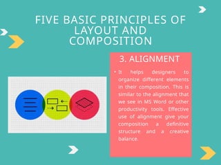
3. ALIGNMENT
• It helps designers to
organize different elements
in their composition. This is
similar to the alignment that
we see in MS Word or other
productivity tools. Effective
use of alignment give your
composition a definitive
structure and a creative
balance.
24.
FIVE BASIC PRINCIPLESOF
LAYOUT AND
COMPOSITION
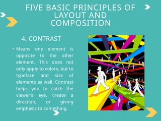
4. CONTRAST
• Means one element is
opposite to the other
element. This does not
only apply to colors, but to
typeface and size of
elements as well. Contrast
helps you to catch the
viewer’s eye, create a
direction, or giving
emphasis to something.
25.
FIVE BASIC PRINCIPLESOF
LAYOUT AND
COMPOSITION
5. REPETITION
• Simply means to use of the same
typefaces, color palettes, or
other elements to achieve
consistency in your
composition. This create unity
in your composition or make
your projects connected to each
other. For example, if you create
a PowerPoint presentation, you
should use only the same color
palette or text style in all of your
slides.
Typography
• is theart of arranging texts that makes it readable
and appealing to the viewer. It involves font style,
typeface, and text structure.
• Is the art of arranging letters and text in a way that
makes the copy legible, clear, and visually appealing to
the reader.
28.
What is the
differencebetween
Font and Typeface?
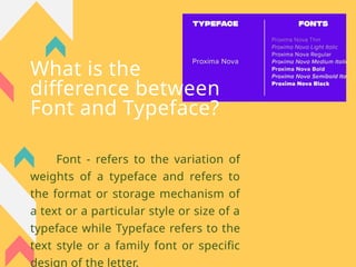
Font - refers to the variation of
weights of a typeface and refers to
the format or storage mechanism of
a text or a particular style or size of a
typeface while Typeface refers to the
text style or a family font or specific
design of the letter.
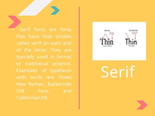
• Serif fontsare fonts
that have little strokes
called serif on each end
of the letter. They are
typically used in formal
or traditional projects.
Examples of typefaces
with serifs are Times
New Roman, Baskerville
Old Face, and
Californian FB.
Serif
31.
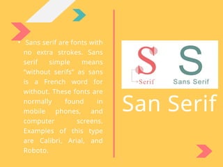
• Sans serifare fonts with
no extra strokes. Sans
serif simple means
“without serifs” as sans
is a French word for
without. These fonts are
normally found in
mobile phones, and
computer screens.
Examples of this type
are Calibri, Arial, and
Roboto.
San Serif
32.
Display
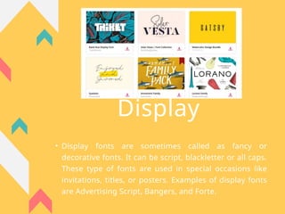
• Display fontsare sometimes called as fancy or
decorative fonts. It can be script, blackletter or all caps.
These type of fonts are used in special occasions like
invitations, titles, or posters. Examples of display fonts
are Advertising Script, Bangers, and Forte.
Color
and Color
theory
• Colorsare very essential to
your compositions. One may
use a combination or one or
more colors.
• It may be our instinct to
choose color but there is a
science behind it, called
Color Theory. Color
• Theory describes how
different colors contribute to
each other and how they
appear as they are
• mixed into other color
schemes.
35.
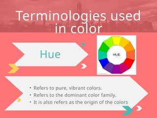
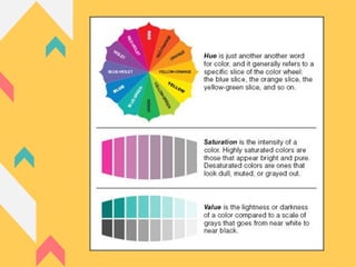
• Refers topure, vibrant colors.
• Refers to the dominant color family.
• It is also refers as the origin of the colors
Terminologies used
in color
Hue
36.
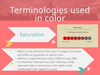
• Refers tothe intensity of the color. It ranges from black
and white (or grayscale) to vibrant color.
• defines a range from pure color (100%) to gray (0%).
• is sometimes referred to as color intensity, a fully
saturated color is one of pure color while a fully
desaturated color appears as grey.
Terminologies used
in color
Saturation
37.
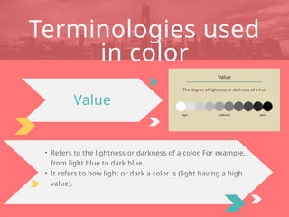
• Refers tothe lightness or darkness of a color. For example,
from light blue to dark blue.
• It refers to how light or dark a color is (light having a high
value).
Terminologies used
in color
Value
39.
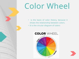
Color Wheel
• isthe basis of color theory, because it
shows the relationship between colors.
• It is the circular diagram of colors
40.
O
C
L
O
R
SCHEMES
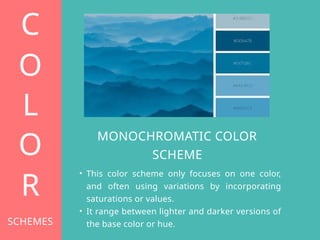
MONOCHROMATIC COLOR
SCHEME
• Thiscolor scheme only focuses on one color,
and often using variations by incorporating
saturations or values.
• It range between lighter and darker versions of
the base color or hue.
41.
O
C
L
O
R
SCHEMES
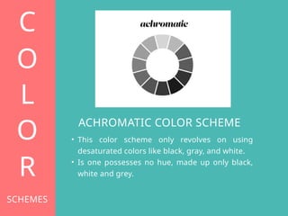
ACHROMATIC COLOR SCHEME
•This color scheme only revolves on using
desaturated colors like black, gray, and white.
• Is one possesses no hue, made up only black,
white and grey.
O
C
L
O
R
SCHEMES
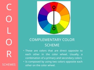
COMPLEMENTARY COLOR
SCHEME
• Theseare colors that are direct opposite to
each other in the color wheel. Usually, a
combination of a primary and secondary colors
• Is composed by using two colors opposite each
other on the color wheel.