
Recommended
More Related Content
What's hot
What's hot (19)
Viewers also liked
Similar to Final Draft Evaluation
Similar to Final Draft Evaluation (20)
Final Draft Evaluation
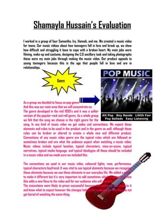
- 1. Shamayla Hussain’s Evaluation I worked in a group of four Samantha, Ivy, Hannah, and me. We created a music video for teens. Our music videos about how teenagers fall in love and break up, we show how difficult and struggling it bees to cope with a broken heart. My main jobs were filming, make-up and costume, designing the C.D ancillary task and taking photographs these were my main jobs through making the music video. Our product appeals to young teenagers because this is the age that people fall in love and are in relationships. Genre As a group we decided to focus on pop genre And this was our main area that we will concentrate on. The genre developed in the mid 1950’s and it was a softer version of the popular rock and roll genre. As a whole group we felt that the song we choose is the right genre for the song. In any kind of music video we get codes and conventions. We expect these elements and rules to be used in the product and in the genre as well, although these rules can be broken or altered to create a whole new and different product. Conventions of any music video genre are the typical rules which are followed or sometimes broken and are what the audience expect when watching a music video. Music videos include typical location, typical characters, mise-en-scene, typical narratives, typical media language, and typical ideologies all these should be included in a music video and we made sure we included this. The conventions we used in our music video, coloured lights, rose, performance, typical characters boyfriend. It was vital to use typical elements because we recognise these elements because we use these elements in our everyday life. We added a guitar to make it different but it’s very important to add sometimes which is something new this adds a new flava to the video and for our audience who will watch it. The innovations were likely to prove successful because the audience was used to it and knew what to expect however the changes helped the audience so that they do not get bored of watching the same thing.
- 2. Branding The brand image for our music video is a sweet, innocent and a talented young female musician. The logo we created is a very girly, elegant and has simplicity to it which helps you focus on the image instead of the photo. Our logo is maintained and used throughout, the colour of the logo is white back, front (brush stoke). The editing that we did of the photocopy and it’s effects for the front and back for Eloise makes it stand out a lot which makes it a classy, elegant, and bold look to the whole image that we want to put across to our young audience. Also the magazine advertisement we worked on included cartoon filter on photo shop so that the album is not abscured by photo. This will make the CD stand out and make it different (Sony BMG focuses on pop music). This was the font we choose to use for our logo This is the website what we used for the logo. www.dafont.com
- 3. Brand image examples we used to create our product – The C.D cover we produced separately in two groups, I worked with Samantha and firstly researched on different C.D covers to see what would look best on our image. So we looked at Beyonce, Erica Shine and Taylor Swift to see how they put together their C.D cover so that gave us our ideas. Firstly we got a piece of paper and we drew all our ideas and decided what kind of structure we would use on our cover. The first idea we did was going to be the artist face and put a large image of the face of the artist in the middle then I gave an idea that we should divide the face into half and one half should be black and white and the other half should be in colour. The black and white resembles how her heart has been broken and how the colours in her life have faded away and this shows a negative side to her life, and the colour side resembles the positive side to her life when she was with her boyfriend and was happy and shows two sides of her life which my partner said was a very good idea to do. Then we came up with another idea for the front cover which would be the eye which would have a
- 4. flower in the middle of her eye which would show a girly and elegant side to her and it would be simple which gives that special touch to it. So we decided on the simple look which would fit with our music video and our artist. Our C.D is very colourful and shows glimpses our product and shows the strong relationship between the song and the idea we tried to put across to our audience. I loved working on my ancillary task which was great fun and great to work aside with Samantha. We worked as a team and we got the best our potential which we have shown in our work that we have produced. Audience The main areas we wanted to target were teenagers, the fact that teenagers end up in deep relationships which are hard to get out from or forget and this is a very delicate age where they fall in love and become into a relationship with the opposite sex. This is a very good target audience that we choose to become of the large mass and a large audience which listens to music. Which will be rock, hip pop, romantic songs and also keeping in consideration teenagers are financially beneficial because of the lack of responsibilities they have no bills to pay for they are provided with everything and will likely to spend it on money on music so this target audience is a very good choice. Throughout our work we used a variety of technologies which are: Apple Mac, Digital Camera, Jamendo, Blogger, Slide share, You tube, Word lyrics, I tunes, Video camera, In Design, Final Cut, Moodle, Risk assessment form, phone and Da font. These are the technologies we used throughout our work. The most effective and the most creative technology for me was Photoshop. It was my first time using it which I found really excited. In Photoshop I could almost create what ever I wanted which was fantastic because on some programs you can’t even get the tools. I used Photoshop when I was working on my ancillary task. I used all the effects, the tools to create the perfect tool. Firstly you have to make a copy of the image to do this I had to use the command + j key once I did this we see a copy of the background of the image which is called layer one. Before the cutting out of the image then I had to turn off the background layer. After I had reached this point then I had to click on the eye. It seemed nothing had happened to the image at all but secondly I had to cut the image I had to click from the left side and click around the whole image and put the last click point where I started from thirdly I had to save the image after I had done this then a created a background in – Design then I had to place out the cut-out image from Photoshop and resize the image that I wanted and lastly just added text that I need to. It did influence us into creating different construction to produce final product.
- 5. http://www.youtube.com/watch?vRuJusPDfMmA We got a really positive outcome and we will keep in consideration to improve our product as our audience has said. Audience’s feedback is very important to keep in consideration to make improvements and to consider what they are looking for. Creative Technologies And Skills that I have learned I gained a lot of different skills using different sites and used it effectively for our work. We did a lot of research and planning to get the perfect product that we needed for our music video. There were a lot of advantages when we used the Photoshop because we create the image that we wanted and had all the tools needed to do this but the disadvantage was when I cutted the image and couldn’t get in to the deep bits it got really frustrated but got there in the end. It was new to me and it was challenging to new programs that I never used before, but it got easier once I was in training and started to use it often. I found slide share to be fantastic because it gave our work that boost to show it differently and it looked better. The programmes such as Blogger, slide share, you tube we found it was better to use and easier as well, in design was quiet confusing at first but did not limit on creativity and produced our logo.
- 6. It advanced my skills on my project and made me even more confident on my work so I could work efficiently outside of college when I was set to do a job. It also created a professional product at the end. Conclusion The end product that we produced was the music video that we had planned. I am very happy at the outcome and to the response we got for our audience. We had to work really hard to get to where we are now and the confidence and the skill to work in group has worked for me as a person. We did a lot of research and planning before we went there to film. The best part of our project was filming and creating our image. I really enjoyed working in a group. This was my best piece of work that I have produced & shown new skills which have been improved. I think working in a group is better because we all get different ideas and put them altogether to make a really good product in the end.
- 7. Working in a group has got its disadvantages but still u have to make it work. The websites were really useful during our project especially www.google.com this was the best one of them all.