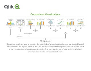
Comparison Visualizations
Comparison chartsare used to compare the magnitude of values to each other and can be used to easily
find the lowest and highest values in the data. It can also be used to compare current values versus old
to see if the values are increasing or decreasing. Common questions are “what products sells best”
and “how are our sales compared to last year”.
Variable width
chart
Two variables
per item
Table or tables with
embedded charts
Many
categories
Bar chart horizontal Circular area chart
Cyclical data
Line chart
Many categories
Many periodsFew categories Few periods
Over timeOne variable per item
Among items
Line chart
Non-cyclical data
Comparison
Bar chart vertical Bar chart vertical
Single or few categories
3.
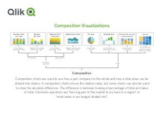
Composition Visualizations
Composition chartsare used to see how a part compares to the whole and how a total value can be
divided into shares. A composition charts shows the relative value, but some charts can also be used
to show the absolute difference. The difference is between looking at percentage of total and value
of total. Commons questions are “how big part of the market to we have in a region” or
“what areas is our budget divided into”.
Composition
Pie chart
Simple share
of total
Stacked 100%
area chart
Only relative
differences matter
Stacked area chart
Relative and absolute
differences matter
Stacked 100%
bar chart
Only relative
differences matter
Stacked
bar chart
Relative and absolute
differences matter
Few periods Many periods
Changing
over time
Static
Waterfall chart
Accumulation or
subtraction to total
Stacked 100% bar chart
w/subcomponents
Components of
components
Tree map
Accumulation to
total & absolute
difference matters
4.
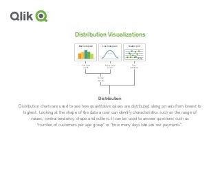
Distribution Visualizations
Distribution chartsare used to see how quantitative values are distributed along an axis from lowest to
highest. Looking at the shape of the data a user can identify characteristics such as the range of
values, central tendency, shape and outliers. It can be used to answer questions such as
“number of customers per age group” or “how many days late are our payments”.
Distribution
Bar histogram Line histogram Scatter plot
Two
variables
Few data
points
Many data
points
Single
variable
5.
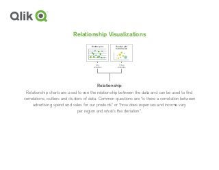
Relationship Visualizations
Relationship chartsare used to see the relationship between the data and can be used to find
correlations, outliers and clusters of data. Common questions are “is there a correlation between
advertising spend and sales for our products” or “how does expenses and income vary
per region and what’s the deviation”.
Relationship
Two
variables
Three
variables
Scatter plot
bubble size
Scatter plot