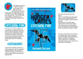
1. The spots of blood tie
in with the stained,
printed style of the
cover as well as
symbolizing the violence
of the story. The bright spots of red
contrast off the sky blue background
and really pop out. This also fits with
the practically universally colour
scheme of the Hunger Games; Red
and blue.
The text has a printed graffiti look,
with the letters weathered and worn
which shows the dystopic nature of
the story. It can also be part of the
revolutionary themes of the story,
with the words looking like street art.
It also looks somewhat military,
especially the font on the authors
name.
It looks like something printed on a
military weapons case or something
along those lines. This shows the
combat and warfare of the story, as
well as linking with the uprising and
potential war.
The black bird could mean two
things:
First, Itʼ a bird flying free with spread
wings, which could symbolize the
characters struggle to uprise and find
freedom.
But Second, itʼs jet black colour
evokes death and the grim reaper.
This second case is really brought
out by the black logo and the spots of
blood, all building an image of death.
Like other covers this one is focused
on symbols rather then characters;
the “HG” emblem, and the bird flying.
Whilst it is based on symbols it
doesnʼt feature the “mockingJay”
symbol like other covers, trying to do
something a bit different.