What I Talk About When I Talk About Composition
•
1 like•281 views

A talk about UI, React, Composition and Front-end engineering at Autopilot.

Recommended
More Related Content
Similar to What I Talk About When I Talk About Composition
Similar to What I Talk About When I Talk About Composition (20)
Recently uploaded
Recently uploaded (20)
What I Talk About When I Talk About Composition
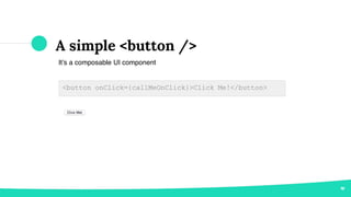
- 1. A simple <button /> It’s a composable UI component <button onClick={callMeOnClick}>Click Me!</button>
- 2. Composition, Good old days <button class=”btn btn--tarmac btn--large”> Click Me! </button>
- 3. <Button /> An enhanced <button /> component <Button text="Click Me!" color="tarmac" /> ◉ Uses the <button /> under the hood ◉ Enhances the <button /> via “color” field
- 4. <Button /> with icon <Button /> version 1.1 <Button color="yellow" icon="edit" text="Edit" /> ◉ Uses the <Icon /> under the hood ◉ Configure the icon via “icon” field
- 5. <Button /> with colored icon <Button /> version 1.2 <Button color="yellow" icon="edit" iconColor="black" text="Edit" /> ◉ Icon color via the “iconColor” field
- 6. That’s Exactly What We Should Not Do !
- 7. Why not to do? ◉ Lack of composition via consumer developer ◉ Lack of separation of concerns ◉ Code duplication ◉ Maintenance overhead ◉ Test overhead
- 8. What I Talk About When I Talk About Composition
- 9. I am Mehdi Software Engineer at Autopilot @mehdivk hi@mv.id.au Hello!
- 10. “ Front-end development at Autopilot is the process of building sophisticated user interfaces consisting of thousands of small, focused, testable and composable components.
- 11. <Button />, revised To compose <Icon /> <Button> <Icon size="small" color="black" symbol="edit" /> Edit </Button>
- 12. What composition actually offers? ◉ Maximum flexibility ◉ Minimum coupling ◉ Maintainable components ◉ Testable components
- 13. Showcase Time
- 14. <Modal />
- 15. <Modal /> <Modal size={modalSize} type={modalType}> <ModalHeader></ModalHeader> <ModalContent></ModalContent> <ModalFooter></ModalFooter> <ModalClose></ModalClose> </Modal>
- 16. <Modal /> Overlays the other elements on page
- 17. <Modal /> <Position xAxis="center" yAxis="center"> <Overlay> <Modal> <ModalHeader /> <ModalContent /> <ModalFooter /> </Modal> </Overlay> </Position> Overlays the other elements on page
- 19. <FolderExplorer /> <Position anchor="someElement"> <FolderExplorer /> </Position>
- 20. <ContextMenu />
- 21. <ContextMenu /> <Position anchor="someElement"> <DropDownMenu> <DropDownMenuOption icon="edit" onClick={onEditClick}>Edit</DropDownMenuOption> <DropDownMenuOption icon="trash" onClick={onTrash}>Trash</DropDownMenuOption> <DropDownMenuOption icon="folder" disabled>Move to folder</DropDownMenuOption> </DropDownMenu> </Position>
- 22. <ContextMenu />
- 23. Forms
- 24. Forms <Form labelOn="top" size="large" ref={this.setFormReference}> <Element id="goalName"> <Label text="Goal name" /> <TextBox placeholder="Type what people become who complete the goal, e.g. customer" /> <Validator> <Required /> </Validator> </Element> <Elements> <Label text="Conversion target" /> <Element id="conversionTarget" className="goal-form__conversion-target"> <TextBox placeholder="10" /> <Validator> <Required /> { this.state.conversionType ? <ValidConversionTarget type={this.state.conversionType} /> : null } </Validator> </Element> <Element id="conversionTargetType"> <ComboBox placeholder="Please select" options={conversionTargetTypes} onChange={this.onConversionTypeChange} /> <Validator> <Required /> </Validator> </Element> </Elements> </Form>
- 25. Forms <Form labelOn="top" size="large" ref={this.setFormReference}> <Element id="goalName"> <Label text="Goal name" /> <TextBox placeholder="Type what people become who complete the goal, e.g. customer" /> <Validator> <Required /> </Validator> </Element> <Elements> <Label text="Conversion target" /> <Element id="conversionTarget" className="goal-form__conversion-target"> <TextBox placeholder="10" /> <Validator> <Required /> { this.state.conversionType ? <ValidConversionTarget type={this.state.conversionType} /> : null } </Validator> </Element> <Element id="conversionTargetType"> <ComboBox placeholder="Please select" options={conversionTargetTypes} onChange={this.onConversionTypeChange} /> <Validator> <Required /> </Validator> </Element> </Elements> </Form>
- 26. Forms <Form labelOn="top" size="large" ref={this.setFormReference}> <Element id="goalName"> <Label text="Goal name" /> <TextBox placeholder="Type what people become who complete the goal, e.g. customer" /> <Validator> <Required /> </Validator> </Element> <Elements> <Label text="Conversion target" /> <Element id="conversionTarget" className="goal-form__conversion-target"> <TextBox placeholder="10" /> <Validator> <Required /> { this.state.conversionType ? <ValidConversionTarget type={this.state.conversionType} /> : null } </Validator> </Element> <Element id="conversionTargetType"> <ComboBox placeholder="Please select" options={conversionTargetTypes} onChange={this.onConversionTypeChange} /> <Validator> <Required /> </Validator> </Element> </Elements> </Form>
- 27. Forms <Form labelOn="top" size="large" ref={this.setFormReference}> <Element id="goalName"> <Label text="Goal name" /> <TextBox placeholder="Type what people become who complete the goal, e.g. customer" /> <Validator> <Required /> </Validator> </Element> <Elements> <Label text="Conversion target" /> <Element id="conversionTarget" className="goal-form__conversion-target"> <TextBox placeholder="10" /> <Validator> <Required /> { this.state.conversionType ? <ValidConversionTarget type={this.state.conversionType} /> : null } </Validator> </Element> <Element id="conversionTargetType"> <ComboBox placeholder="Please select" options={conversionTargetTypes} onChange={this.onConversionTypeChange} /> <Validator> <Required /> </Validator> </Element> </Elements> </Form>
- 28. Forms <Form labelOn="top" size="large" ref={this.setFormReference}> <Element id="goalName"> <Label text="Goal name" /> <TextBox placeholder="Type what people become who complete the goal, e.g. customer" /> <Validator> <Required /> </Validator> </Element> <Elements> <Label text="Conversion target" /> <Element id="conversionTarget" className="goal-form__conversion-target"> <TextBox placeholder="10" /> <Validator> <Required /> { this.state.conversionType ? <ValidConversionTarget type={this.state.conversionType} /> : null } </Validator> </Element> <Element id="conversionTargetType"> <ComboBox placeholder="Please select" options={conversionTargetTypes} onChange={this.onConversionTypeChange} /> <Validator> <Required /> </Validator> </Element> </Elements> </Form>
- 30. Forms
- 31. <Table />
- 32. <Table /> <Table dataSource={this.props.assets} className="asset-manager__table"> <TableCell header="Status"> <TableRowStatus field="status" valueToColorMap={valueToColorMap} /> </TableCell> <TableCell header="Name"> <TableCellValue field="name" /> </TableCell> <TableCell header="In Journeys"> <TableCellValue field="inJourneys" /> </TableCell> <TableCell header="Type"> <TableCellValue format="camel-case" field="type" /> </TableCell> <TableCell header="Created By"> <TableCellValue field="createdBy" /> </TableCell> <TableCell header="Edited"> <TableCellValue format="date" field="edited" /> </TableCell> <TableCell header="Published"> <TableCellValue format="date" field="published" /> </TableCell> </Table>
- 33. Any questions ? You can find me at ◉ @mehdivk ◉ hi@mv.id.au Thanks!