
Recommended
More Related Content
What's hot
What's hot (18)
Viewers also liked
Viewers also liked (19)
Similar to Targeted Titles: Music Magazines for Girls and Alternative Fans
Similar to Targeted Titles: Music Magazines for Girls and Alternative Fans (20)
Targeted Titles: Music Magazines for Girls and Alternative Fans
- 1. MUSIC MAGAZINE PRESENTATION TASK. BY MEG ALLARD
- 2. WHAT DO YOU THINK THE CORE TARGET AUDIENCE IS FOR THIS PROJECT? The target audience for this magazine would be young girls, I know this from looking at it because of the colours, the layout, the stories and the people on the front. For example they have used colours like pink because this is stereotypically a girls favourite colour which for this reason would draw their attention straight to it. The layout is very spaced out but with big font so that it looks like there are lots of stories but they don‟t look boring to read about by having lots of writing in small font. By putting Pink and Avril Lavigne on the front cover will attract the target audience because these are big pop stars that they will idolise and who they will be into at the time. I think that the age range for this magazine would be between 8 and 14 years old.
- 3. WHAT INFORMATION CAN YOU LEARN ABOUT THE LIFESTYLE PROFILE/INTEREST OF THE CORE TARGET AUDIENCE FROM THE FRONT COVER? Young girls would like to read these stories because of many reasons, one of the main reasons is because all the articles in this magazine are pretty much gossip about pop stars that they look up to and like their music, so therefore that would interest them to buy it as they would want to read about them and know everything about them. The sort of stories that are on there that include gossip are „Snogging Madonna was cool” Britney confesses everything to Smash Hits‟ this would make them want to read it because Madonna and Britney would be in the charts so they would know who they are, by reading this they would be able to talk to their friends about it and know all the gossip because that‟s what girls that age like to do. Another main thing that they have included in this magazine to attract the target audience to buy it is by giving away free gifts, from reading what the gifts are they don‟t sound very good and they are clearly not expensive to make, however young girls don‟t have much money and for them to get a magazine and free things as well is an extra and would make them want to buy it again because at that age it is exciting to get a poster to put in your room or a free sweet
- 4. WHAT MUSIC MAGAZINE GENRE CODES AND CONVENTIONS CAN YOU IDENTIFY? The genre for this magazine is pop, many conventions of pop are being showed in this magazine by having pop stars on the front looking pretty and glammed up. For example on the front of this Smash Hits are Avril Lavigne and Pink, these are two very powerful pop icons, they wear fashionable clothes that can be relatable to the audience and they are also heavily stylised, from all of these elements young girls that would read this would want to be like them and dress the same as them. They also look like they are having a good time, they aren't posing, they are just jumping up and down and having a good time, which is the mood that pop conveys; happy, bubbly and most of it is censored.
- 5. WHAT ELEMENTS OF THE HOUSE STYLE CAN YOU IDENTIFY? The elements of the house style that occur throughout this magazine and most young pop magazines are the colours. The main thing that occurs is the colour pink and this is because most people that buy these magazine are young girls wanting to read about their idols, and pink is normally a girls favourite colour so therefore they will be more likely to buy this magazine rather than the same sort of one with blue on the front. Another thing that they use throughout is big font size and a simple front, this is because if it was small and there was lots to read girls wouldn‟t want to read it because it looks too much and boring, where as with bigger writing it looks less boring and when they read it they will be happy with themselves for reading an article and will want to read more, also if the font is simple it also looks easier to read.
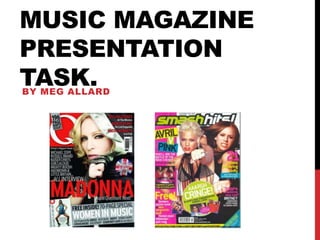
- 6. SIMILARITIES AND DIFFERENCES BETWEEN MISE-EN-SCENE In the magazine „Q‟ it has Madonna on the front, the image of her is a medium close up. This is affective because it means the full concentration is on her and this is what the publishers would want. She is wearing a black silk jacket with the hood up, on the hood there is a strip of gold which shows how classy she is, the jacket looks as if it is in the style of a boxing robe. She is holding the hood with her right hand which has a glove on it, but the glove is very unusual as it has her first two fingers in it then her ring finger and her little finger out of it, this is very unusual but it is very Madonna because she is trying to make a fashion statement. The back ground is black, this is looks good because it is quite plain which means that your concentration is not taken away from Madonna and also it blends in with her robe so it looks very sophisticated. She's also wearing big hoop earrings that you can really see but they are again Madonna setting one of her fashion statements. She has quite a sexy pose which sums up Madonna, this goes with the theme of the magazine because it is also sophisticated. On the smash hits magazine it has Pink and Avril Lavigne on the front, there images are medium long shot. This is good for this style magazine because it means you can see more of there body, so therefore you can then see more of what they are wearing which is important for this magazine because the young readers would prefer to see what they are wearing as they are a fashion icon for them. Pink is in front of Avril Lavigne and she has her hair scraped back, she has her fist out and has a very punk rock ring and bracelet on, she is also wearing a bikini top with a necklace that has tassels coming down to her waist. Avril Lavigne is jumping up and down, her hair is swinging and she has one hand up in the air and one in a fist shape like pink. I think how they have set them out is very clever because this is how you would expect to see them in their music videos. These two magazines don‟t have much in common, they have many more difference because of the style of magazine they are. The main things that they have in similar are that they both give away free gifts. And another thing is that they both have quite a simple font style, however these are for different reasons, smash hits reason is so that it doesn‟t look too much for the young readers to read and „Q‟ magazine have it to carry on their sophisticated look. Their main differences are their colour scheme, Smash Hits have loads of different colours that stand out like; pink, green, yellow and blue. Where „Q‟ tries to keep it simple with classy colours like; red, black, silver and white.
- 7. LAYOUT AND STYLE OF LANGUAGE The layout for „Smash Hits‟ is very busy and all over the place, this is because they want the magazine to look like there is loads in it and there is loads to read about, they also want to look young for the readers because they are young and if it was plain and boring they wouldn‟t want to read it. They have some of their writing in shapes like; rectangles, squares and circles, this is good because it sections them off and makes it look less confusing and more simple for them so they can read the stories individually. Their language is very relatable to the target audience because they don‟t use big words as they are young, and they say things like „cringe‟ this is clever because it is a common word that young girls would say and therefore they will like to read what is „cringe‟ in the magazine. „Q‟ magazines layout is really simple but classy. They may have wanted it to be this simple because they wouldn‟t want to over do it and make it look messy because by having it simple it also makes it look neat and not messy which is what adult would want. The language that they use in it is much more mature and adult like because that is their target audience, they don‟t use words like „cringe‟ because they would not like that as it looks really young and inexperienced.
- 8. MUSIC GENRE CONVENTIONS „Smash Hits‟ has many pop music genre conventions, the main one is the colours they have picked, in this case they have chosen very bold colours that stand out and that would also appeal to the target audience; pink, yellow, green, blue and white. Another convention is the pop stars that they have on the front, Pink and Avril Lavigne, at the time these two stars were the biggest and best in the chart so by putting them on the front they will get more sales than if they put someone not even in the charts on there. Pop music is quite bubbly so this is why they have lots going on in the front cover to convey the mood. „Q‟ has many alternative pop genre conventions, for example the colours, red, black and silver are the type of colours you would see on the front of alternative pop albums. They have listed lots of names and famous people on the front of the magazine which shows the interesting interviews that will be in it with people from this genre. They have got Madonna on the front which is effective because she is the queen of alternative pop and this will be a strong selling point.
- 9. MUSIC ARTISTS FEATURED AND THE AUDIENCE THEY APPEAL TO „Smash Hits‟ have the two biggest pop icons at the time on the front of this magazine and this is good because the audience which is young girls will know of them and be into them so therefore will buy the magazine to be able to read about them as well as listen to their music. They also have the Sugababes on the who are also big fashionable and glammed up pop stars. Then there‟s a small photo of Gareth Gates which is clever and not uncommon on this sort of magazine, young girls could fancy him so this is a very big selling point whenever the target audience is young girls. „Q‟ only have two photos on the front and only one of the images is really an important one for the audience and that is the main one of Madonna, however the fact that they only have one photo isn't a bad thing, for this magazine it‟s a good thing because they want it to look smart and sophisticated. Although they only have one image they still have many names on the front of people that are in the magazine and they still stand out just as much, maybe even more. The fact that they are in writing and not images will stand out more to the target audience because they are adults and they will buy the magazine more to read it then look at pictures unlike young girls.
- 10. SPECIAL FEATURES AND ARTICLES IN BOTH EDITIONS. „Smash Hits‟ has quite a few special features on the front, but the main one that stands out is the free things it is giving away, they are giving away 3 free things and although they aren't big or expensive things they will still draw buyers attention and give it the edge on other magazines. They have loads of „interesting articles‟ that are made to look good on the front, for examples „most embarrassing stories ever‟ they have photos to try and show how embarrassing they are supposed to be but I doubt they will be the most embarrassing stories ever. „Q‟ has more special features than „Smash Hits‟ in my opinion. It has a great special feature that says „THE 50 BEST BRITISH ALBUMS AS VOTED BY YOU!‟ this sounds interesting because you want to find out who voted for what the most and especially as it involves the audience by letting them chose. The main article is about an interview with Madonna, this is huge because she is such a big star, also there is a quote from her interview that says „Stupid question! Next!‟ from this you can tell that she has an odd personality but you want to read about it to see if she says anything else like that in it.
- 11. WHAT OVERALL TECHNIQUES ARE USED TO MAKE YOU READ THE COMPLETE MAGAZINE. The main technique that they have used to make you read the complete magazine is the house style, this is important because it contains many important things that attract the target audience. „Smash Hits‟ have used the same colours throughout the magazine to keep the buyers wanting to read and still feeling like it is a girly pop magazine. Another thing is the bubbliness of the front cover with things scattered all over the front because they wouldn‟t want blocks of articles with lots of writing they would want a lot going on. Another thing they would have used to make them read the complete magazine is using young slangy language throughout so the girls still relate to it and have it on their level. „Q‟ magazine has kept the same level of sophistication through out because the target audience would have brought the magazine because of the cover so would like it to carry on all the way through the magazine.
- 12. MODE OF ADDRESS The mode of address normally used in language, for example it might say „you‟ or „do you want‟ it involves the reader. „Smash Hits‟ has only two modes of address, the first one is when it says “Who‟ll win the battle of the rock chicks?” this would make the girls want to read it because its like asking them so they would want to get involved. The second one is how Pink and Avril Levigne are looking into the camera and sticking their fists out. I think the reason that they haven‟t included many is because young readers don‟t really understand or even notice them, so its more about the colours, who is in it and if they are giving anything away for free. And in this case the editors have done all of those things to the full extent by using stereotypical girl colours, big pop stars and three free gifts away, and for this magazine that works. „Q‟ is slightly different, they involve one direct mode of address, and that it when they say „THE 50 BEST BRITISH ALBUMS AS VOTED BY YOU!‟ and the „you‟ part is the important bit and this is because it is about the reader or possible buyer, this is effective because it makes them feel involved and noticed by the magazine publisher and everyone involved in it. However the reason that they have only used it once is because they want them to feel involved but they don‟t want to change the sophistication or classiness of the magazine.