4.18.24 Movement Legacies, Reflection, and Review.pptx
Analisation of magazine
1. For my course work I want to create a music magazine, that covers soundtracks. Sadly I can’t find
any good music magazines that cover sound tracks. Actually that’s one of the reason why I want to
do it: Its a gap in the market. Because I couldn’t find any good examples I analyzed one music
magazine, one movie magazine and a covers of a soundtracks so I can pull out the best of every
three to create my music magazine for Soundtracks.
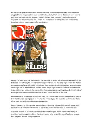
Layout: The mast head is at the left top of the magazine so we see it first (because we read from top
to bottom and left to right). Is has two skylines (under the Q and above it). Right next to it is the first
announcement of an article that is in this issue. Right next to this is the title picture which covers the
whole right side of the front cover. There is a flash button right under the chin of Brandon Flowers
image. At the right bottom is the main article, the one acompanioning the picture. On the left side of
the magazine is the announcment of a special of U2 that is featured in this issue.
Camera angles: A direct mode of address is used. The camera angle is under the eye level to make it
look like Flowers is looking down on you. He also points at you. This is used to underline the theme
of the main article (Brandon Flowers makes a point).
Genre: The genre of this magazine seems to be rock. Both the killers and U2 are rock bands. But it
seems to “neat” for hard rock or metal so it probably covers “normal” rock to alternative rock.
Audience: It seems to be for an audience 21+ because teenagers mostly prefer either flashy or
rebellious looking magazines. Other than that it seems to be for a wide roam of audience because
rock is a genre that has a very wide roam.
2. Photos: There are only two photos on the front cover. The main picture is much bigger than the
other one.
Articles: Beside the two main articles it also announces four other articles that are in this issue at the
bottom of the magazine.
Mise en scene: Main picture: Brandon Flower, the man in the picture wears a Tuxedo. He uses a
direct mode of address but his body is turned away. He points his finger at the audience and has a
rather patronizing expression. The background is white. The Second picture: Is one of the band U2.
It shows the whole band but the man in the front seems to be the most important one because he’s
the only one we can see as a whole (the others are cut off on each frame, the fourth is partly
covered by the front man). They use direct mode of address and the camera angle is on the eye
level.
Mise-en-scene: The main picture of the front cover is one of Harry Potter. He uses a direct mode of
address and his glasses are broken and he’s got mud, blood and therefore wounds on his face. The
background is a rather dark one (dark blue). This is all used to give you an idea what the “new”
movie will all be about.
Layout: The mast head is in read (the normal color of the empire magazine. Because of it it also
“springs” you into the eye). The fellow articles to the main article are on the left side. The biggest
one is not a flash button but has the use of one. The Mast Head is over the whole top of the
magazine. The article announcement to the title photo is in the right site of the magazine away from
the other articles (although there is also HP6 on the left site ut there is a * that refers to the one on
3. the right site). There are also some article announcements on the bottom of the magazine to show
what else is in the magazine.
Camera angles: They used a direct mode of address for the title picture. The camera is on eye-level.
It gives you the feeling that Harry is “speaking” to you directly and also, that he is on the same level
as you but has to endure much (the blood on his face and broken glasses).
Genre: The genre of the magazine mainly covers action movies (as a bigger genre) and of those
mainly the “mainstream” movies.
Audience: Its mostly for a younger audience because action movies are mostly watched by younger
people (although its relatively. Lots of people over 40, 45 love to watch action movies and this
magazine would still be suitable for them because it doesn’t seem too flashy. It still has the “aura” of
a professional magazine (the masthead is kept in a simple format, the articles as well).
Photos: Despite the main picture of Harry Potter there is also a smaller one which is clearly not one
whole pictures but three characters from three different movies put together. Two men and one
woman who all use direct mode of address. The Pictures are not taken by a photographer of the
magazine because those are clearly promotional pictures of the movies themselves (you can see that
in how they hold themselves, their pose and body language). There all put on a background which I
can’t clearly recognize but it has blue and black colours.
Articles: The main article is announced at the left side of the magazine, three other articles are
announced at the bottom of the magazine. There is a * at the main article which leads you to a line
out of the Harry Potter movies on the right side right under Harrys Face.