Getting Started with Locly Native
•
2 likes•1,090 views

Locly Native is an easy-to-use app builder for Android and iOS, with in-built proximity (beacon) and location (GPS) support. This guide introduces the platform and helps you get started with your Demo Account and App.

Recommended
More Related Content
Recently uploaded
Recently uploaded (20)
Featured
Featured (20)
Getting Started with Locly Native
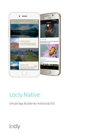
- 1. Locly Native Simple App Builder for Android & iOS
- 2. Quick Getting Started Guide Locly Native is a feature-rich app creation platform with in-built proximity and location support. This document is a quick guide on how to get started with your Locly Native demo account and use it with your demo App. Your first steps couldn’t be easier…. Login Preview Login to the Locly Native platform from your web browser using your free demo account. Download the free Locly Preview app on your Android or iOS device to view the demo app content. Create Play with the pre-loaded demo content online and then have a go at creating your own. See your changes instantly in the demo app. Nearby Link to some beacon devices - the nearest collection or card will be at the top. Add some GPS coordinates to see content ordered by a wider location boundary. Contact By now we hope you’re hooked! Contact us to get your own customised app template. locly.com | @locly | youtube/thelocly | sales@locly.com | + 44 (0)3333 44 00 50 s 5 m X i
- 3. Locly Native Demo Account & App How to Get your Demo Account You can request your demo account by contacting the Locly team via the website or sales@locly.com. Your demo account includes an app which you can use on Android and iOS devices to view your pre-loaded sample content, which you can edit. Features for you to try in the demo app include: ✓ Content Editing: Change existing text and other assets ✓ Content creation: add new collections and cards ✓ Multimedia support: upload photos, audio, video and widgets ✓ Enter iBeacon details and assign to cards and collections ✓ Enter GPS details and assign to cards and collections ✓ Blanket push notifications ✓ Beacon triggered notifications ✓ Visibility rules Locly Native features available on custom apps but not in the demo include: • Custom fonts, colours and layouts, intro video and app icon • Template customisations • Reward/Loyalty schemes • Project bundle downloads • Slack integration module for ‘Tour Bot’ and other conversational tools • Social network feeds • Multi-user editing • Customised app behaviours & more… Please email the Locly team to discuss adding any of these options to your account.
- 4. How to Login to your Demo Account 1. Open your web browser and go to locly.com/login 2. Enter your email and password 3. From the Your Apps page, select Manage Locly Native Demo. This will take you to the App Home screen: How to View your Demo App 1. From the App Home screen, tap on the QR Code icon in the Navigator Icon Bar. This will bring up a QR code for your demo app 2. Install the Locly Preview App on your device: • On your iOS device, open Safari and type: app.locly.com/ios • On your Android device, open Google Chrome and type: app.locly.com/android 3. Once installed open the app and scan the QR code 4. The demo app will then appear on your device. Menu Bar Editing Tabs Tap to view the app content editor App Home screen
- 5. Guide to the ‘App Home’ Screen Options Navigator Icon Bar Options App Home Editing Tab Options Auto Save Status Changes are saved every few seconds & shows green App Navigate back to the App Home screen Collections List all collections in the app. Search & create collections Cards List all cards in the app. Search and create cards Assets List all assets in the app. Search and upload assets Templates View the QR code for the app Push Notifications Publish updates to the live app Apple Submission Info Add an app description and screenshots Google Submission Info Add an app description and screenshots Scan App QR Code Bring up the QR code for previewing in Locly Native app Publish Update Publish updates to the live app About Navigate back to the App Home screen Available Drawer Edit contents of the app drawer (sidebar menu) Available Theme Make changes to the app template Available Location Edit beacon and GPS configuration Available Features Link to Google Analytics and set caching options Not available in demo Notifications Manage notifications Available
- 6. Editing the App Drawer The app drawer is the menu that appears when you tap on the Menu icon. You can change what’s listed here under the Drawer tab. You can include any collections, cards, weblink and emails, plus a link to the App Settings screen (for Bluetooth & Location services) and another other languages. Guide to the ‘Collection Editing’ Screen From the App Home screen tap on Locly Native Demo: English. This will take you to the Editing screen where you will see 5 items listed. This is the top level collection which will be visible when the app opens. This collection has been created to showcase the different card types and styles supported by the editor. Menu icon Publish status Editing Tabs List of collections and cards (visible in the Welcome menu on app opening) Icon Bar
- 7. Icon Bar Options Editing Tab Options Publish Status Options These options are shown in all collections and on all cards. Item Name The name of the collection or card you are editing About Dropdown of options in the Editing Tabs & more advanced editing features Template Create a template from this Collection Duplicate icon Used to duplicate any collection or card. You can duplicate just the card or collection, or everything that it links to as well Delete icon Deletes the collection or card. You will be asked to confirm the action These are different to the options on the Home screen. These are shown when editing collections & cards. About Basic info about the collection or card you’re editing, such as name and publish mode – Cover Upload an image for the collection or card and add a description Available Location Edit beacon and GPS information Available Visibility Edit content visibility rules Available These options are shown in all collections and on all cards. Draft Content is private and not available in the app Preview Content only shows in the preview version of the app Published Content will be pushed out to the live app the next time it is published
- 8. Add Card: List of Card Types Audio Opens and plays an audio file, optionally showing an image Available Before/After Swipe between two images Available Content Simple card showing text, images, video & audio Available Discovery Grid Create a 6 picture tour. Link to any card or collection No editor currently HTML Upload your own HTML files and assets Available Image Opens an image that can be tapped and zoomed in on Zoom in iOS only Link Opens up a website in the device’s default browser Available Loyalty Create a loyalty card for repeat visitors/users No editor currently PDF Opens a PDF within the app, which can be zoomed in on Available Panorama Upload 360 panorama photos, add tappable POI Available Points of Interest Upload a photo/image and add labels Available Selfie Upload a transparent photo frame for social sharing Available Website Opens up a website inside the app. Available YouTube Plays a YouTube video within the app Available Video Plays a video file within the app Available Widget Opens a bookry.com widget within the app Available Poll Card Live voting card No editor currently
- 9. Guide to the ‘Card Editing’ Screen The contents of this screen will depend on what card type it is, so feel free to explore the different cards in the demo to see how they vary. Most are self-explanatory, but lets focus on the Content Card editing screen to get you started: Content Cards are built in sections by adding ‘blocks’ of content e.g. Title, Subtitle, Paragraph, Image, Image Carousel, Audio and Video. The styles for these different content blocks are held in the app Theme. A member of our design team will have carefully created these to ensure they work perfectly across Android and iOS tablets and phones. We don’t recommend you change these or add new ones without consulting us, as a change that looks acceptable on one format may not work well in another. Card name Will appear in the title bar of your app Add a block by selecting + to show the content block options This is an image carousel Reference Nickname for your card for internal use only Bookmarks Enable users to bookmark the card.
- 10. Advanced Mode You may have noticed an Advanced Mode toggle on this screen. Basic mode provides the most common building blocks that you’ll need to create content. However, if you need more customisation you can switch to Advanced Mode to see more options appear for the content blocks you already have. For example what was a ‘heading’ in basic mode has now become a ‘text’ block with the ‘h1’ and ‘gutter’ styles applied to it. If you tap on the add block symbol (+) you’ll see different types of content that you can add to create the best layout possible. Advanced Mode toggle ‘on’ Image carousel style revealed Advanced Mode brings up some extra Content BlocksText paragraph style revealed
- 11. Advanced Mode: Adding a Map When in Advanced Mode you also have the option to add a map by selecting ‘Map’ in the content block dropdown. Just add your Longitude / Latitude coordinates and set the Delta (the opening map view - the higher the number, the wider the view). Simple! Advanced Mode: Adding Links and Buttons To add a link or button, first add a new Link content block when in Advanced Mode. You have the option to link to a URL (website, email or phone number), or a collection / card within the app. Links already have a style assigned to them in the template. If you want the link to be a button, you can just add ‘Button’ to the styles. Add ‘Button’ to the styles
- 12. Customising the Template If you’re not a web designer/developer, we advise against making changes to your app template yourself (under Themes), as it is very easy to break your app this way. If you need customisation, just contact us and we can make the changes for you. Here’s what you can change: ✓ Intro video and messages ✓ App icon ✓ Colour of the app drawer (side-menu) ✓ Font styles & colours ✓ Colour of the title bar ✓ Card cover layout and styles or you can go for a bespoke design, unique to you! Ready to get your own template? Great! Contact sales@locly.com
- 13. Uploading Content You can upload images, audio, videos, widgets, PDF files and more. When you upload your files to our platform we will convert them to the correct format. Remember to keep your audio and video files short - around 30 seconds long if possible, and only include what you really need. Try and not go overboard on uploading images and widgets too! All these files can balloon the size of your final app! Previewing Your Changes in the Locly Native App Seeing the changes you’ve made using the editing screens is easy. The system automatically saves any changes for you, so when you’re ready to preview your new content, just go to the app and tap the Hamburger button (bottom-right). Then tap on ‘Redload’. You should see your changes immediately. You can also just long-press on the Hamburger menu button to reload your changes. Hide for 30 seconds: useful when testing Selfies and for taking demo screenshots. Cache all Assets : download all your assets to the device. Useful when testing/demoing an app when there is no internet connection. Main menu : back to the Locly Native main menu screen (scan QR code). Reload : tap this icon to reload content to your device. use to preview any content changes in the CMS. Hamburger : Bring up the Locly Native preview app menu.
- 14. Cover Settings All collections and cards need a Cover Type. Using covers creatively can transform the look of your app. The demo app has 4 options to choose from in the drop down list. There is also another option, Image (as used in the ‘Features’ collection of the demo app), which isn’t in the drop-down yet, but will be added soon. Available Cover Types Full bleed Edge to edge image, with title overlay Available Full bleed info Edge to edge image, with title overlay, plus room for an icon above the text and location details below the text. Available Info Card Image with title and description Available Avatar Thumbnail image with title and description Available List Item No image, just title and description Available Info Card coverFull bleed cover List cover Avatar cover
- 15. Finally… In the grey ‘Title Bar’ on Collection and Card screens there is an About dropdown which includes a link to the app JSON files. It’s best not to make changes to this code unless you know what you’re doing, as it’s easy to break the app from here! For this reason a friendly warning message is shown the first time you select this option, asking you to confirm that you’re happy to edit this code. Selecting ‘I’m an Astronaut, I know what I’m doing’ tells the system that you’re a confident coder and the message will not be shown again. If you want to do some custom coding, or access the Locly API, then we’d love to hear from you! One last thing… We are constantly updating and improving the editing screens, so it’s worth remembering to Logout after each session. This ensures that the next time you Login, you will be using the very latest version of the platform. Further Help Files…. We hope you enjoy playing with your demo account and app. But there is so much more to the system than what’s in this document. You can also find tutorials in these places: locly.com | @locly | youtube/thelocly | sales@locly.com | + 44 (0)3333 44 00 50 Blog: How-To Guides > Blog: Tutorials > YouTube Videos > Slideshare >