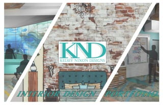
Kelsey Nixon Interior Design Student Portfolio
•
5 likes•1,033 views

This portfolio highlights projects from the various design studios, and my senior thesis, that I completed while earning my Bachelor of Interior Design from RCC Institute of Technology in Toronto (The Academy of Design).

Recommended
More Related Content
What's hot
What's hot (20)
Viewers also liked
Viewers also liked (10)
Similar to Kelsey Nixon Interior Design Student Portfolio
Similar to Kelsey Nixon Interior Design Student Portfolio (20)
Recently uploaded
Recently uploaded (20)
Kelsey Nixon Interior Design Student Portfolio
- 2. 2 Hello, and thank you for taking the time to view my portfolio! MynameisKelseyNixon,Iamarecentinteriordesigngraduatebased out of Toronto, Canada. After earning my BID with Honours from RCC Academy of Design, I am excited to continue my journey toward becoming a certified interior designer. My ultimate goal is to enrich lives through universal design, while integrating sustainable and ethical design practices, new technologies and design innovations.
- 3. 3 ART & D.I.Y. Personal Interior Decorating & D.I.Y. Projects Watercolours & Hand Renderings 47 CONTENTS TABLE OF MIXED-USE 4Patchwork Community Art Centre & Private Residence Urban Nourishment Nutrition & Education Centre Historic Loft HOSPITALITY 3 Reveal Hotel & Lounge OFFICE 8Whole Foods Corporate Office SHELTER 5 Harbour Haven Refuge EXTRA-CURRICULAR RCC Student Lounge RCC Film School Stdio RETAIL Loose Leaf Cafe Gallery 3 RESIDENTIAL 2Downtown Condo Loft 3D Model Internship with Heather McGregor of McQUAT Partnership 46 INTERNSHIP 4 2 84 6 3 6 6
- 4. 4 Community Art Centre & Private Residence Project Type: Individual / Length: 36 weeks / Size: 200,000 sq./ft.(+/-) / Senior Thesis / Winter - Fall 2015 Software/Skills Demonstrated: AutoCAD, SketchUp, PhotoShop MIXED-USE
- 5. 5 OBJECTIVE This senior thesis project was required to be mix-use, with at least one of the occupancies being commercial in nature. The project also required a social element, and therefore needed to benefit the city or a particular community within Toronto. The building and AutoCAD floor plans were not provided by RCC Academy of Design, but rather by the architecture firm (Turner Fleischer Architects) upon request. This project seeks to combine art, community and living under a single roof in downtown Toronto, and is located at 156 Portland Street in the vibrant Queen Street West area. The project is universally design and is intended to benefit all members of the community, but most especially those from the disabled and aging communities. The project consists of a community art centre with an attached residential condominium designed for families, as well as aging residents and/or those with disabilities. Each aspect of the project is meant to enhance the other; the residents can volunteer/work at the art centre, and have access to a portion of each floor of the art centre after-hours. The services and amenities offered in the art centre, along with the supermarket and walk-in clinic on the ground floor, make independent living easier for those in the private residence. CONCEPT Inspiration for this project was drawn from the Sochi 2014 Winter Olympics patchwork quilt. This modern interpretation of a patchwork quilt symbolizes unity, while the Olympics, Special Olympics and Paralympics celebrate human achievement and focus on people’s abilities rather than their disabilities. Traditional ideas about patchwork quilts turned this inspiration into a design concept. Patchwork quilts are typically comprised of patches made by different members of the community, and as the patches are sewn together a unique and beautiful story begins to unfold. Therefore, a patchwork quilt can be seen as an embodiment of community spirit, as its very structure depends on the unification of its smaller and independent parts to complete its larger whole. This structural dependency is both intimate and beautiful, and parallels can be drawn when trying to create a community hub for art, living, culture, and creativity among a diversified group of people. Patchwork Community Art Centre & Private ResidenceTHE OLYMPIC PATCHWORK QUILT I SOCHI 2014 CONCEPT IMAGE strives to create a network for artists from the disabled and aging communities, and seeks to eliminate barriers that these groups face when accessing art and community services. Like each unique patches of a patchwork quilt, this project celebrates each person’s unique abilities, and creates an environment of acceptance that helps to strengthens the urban fabric of the city and bridge the gap between the public and members of these communities. The concept of the patchwork quilt comes through in the design by the way in which people interact and move through the various spaces of the building. Geometric forms, bright colours, bold patterns and layered textures, as well as unique intersections of finishes and materials create a visually stimulating and tactile environment that encourages users to interact with both the space and people around them.
- 6. 6 SECOND FLOOR OF BUILDING (FIRST LEVEL OF TWO-LEVEL OF ART CENTRE) NOT TO SCALE (APPROX. 45,000 sq./ft) THIRD FLOOR OF BUILDING (SECOND LEVEL OF TWO-LEVEL OF ART CENTRE) NOT TO SCALE (APPROX. 45,000 sq./ft) Patchwork Community Art Centre The art centre takes up the second and third floors of the building, with an entrance off the ground level. Aside from the entrances to Patchwork Community Art Centre and Patchwork Private Residence, the ground floor was not designed as part of this project, as it was decided early on that the existing supermarket would remain in the building, as it benefits both the residents and broader community. Therefore, the existing supermarket has been moved from the second to the ground floor, making the second and third floors available for Patchwork Community Art Centre, as can be seen in the floor plans below. Patchwork Private Residence is located above the art centre, on floors 4 - 7. The second floor of the building (and first level of the two-level art centre), is dedicated to musical and theatrical arts, and includes the main reception, a large performance space, and various studios/workshops (among other spaces). The third floor (and second level of the two-level art centre), is dedicated to the visual arts, and includes an open art area with individual ‘art pods’, a large gallery/exhibition space, and various visual art studios/workshops (among other spaces as well).
- 7. 7 MAIN RECEPTION & INTERACTIVE MAPPING AREA (SECOND FLOOR) The main reception and interactive mapping areas are the first spaces people are greeted into upon entering the art centre. The large, custom, dual height reception desk can support up to three administrative staff, and has built in lighting and seating. Custom Corian (solid-surface) and reclaimed wood bulkheads define these spaces and aid with way-finding. LCD panels create a digital and customizable feature wall behind the reception area. Multicoloured porcelain tiles set in a layer of poured concrete create a uniform floor that playfully guide people through the space.
- 8. 8 PERFORMANCE THEATRE (SECOND FLOOR) The performance theatre is the heart of the second floor, and the ramp leading to the main entrance has been treated as a beautiful feature rather than an obstacle to overcome. The custom-patterned frosted glass railings and painted stair risers add visual interest, while also helping those with visual impairments to better navigate through the space. The interior walls of the theatre are reminiscent of laser-cut wood lanterns, and each panel is meant to be unique, representing the individual patches of a patchwork quilt. A piece of frosted Plexiglass would be directly behind each laser-cut panel, eliminating glare and ensuring an even distribution of light from programmable, colour-changing LED lights hidden within.
- 9. 9 ART GALLERY/EXHIBITION SPACE (THIRD FLOOR) The art gallery/exhibition space is the main event space on the third floor of the building/upper level or the art centre. The floor-to-ceiling glass windows, white walls and polished concrete floors give the space a cool and modern look, while the wood-framed, waffle ceilings and wood- clad columns add a rustic warmth that help to make the space intimate and inviting. A flexible wire track lighting system, installed through the waffle ceiling, along with movable partitions, platforms and displays allow the space to transform as needed.
- 10. 10
- 11. 11 OPEN ART & ‘ART POD’ AREAS (THIRD FLOOR) On the third floor there is a large open art area that can be used for organized groups, art lessons, after-school programming, or by the general public. This area has stacking chairs and movable, height-adjustable tables, as well as accessible sinks and storage areas. Directly beside the open art area is the semi-private ‘art pods’ that can be used by individuals or pairs. These ‘pods’ feature three-way adjustable, white board tables, height-adjustable easels, and movable storage carts (as seen can be seen in the image below). Not only do these ‘art pods’ create great workspaces, they also provide seating and a place to display art. Ample distance between the pods make it easy to manoeuvre between them, creating a dynamic and interactive combined work and gallery environment.
- 12. 12 SHARED AFTER-HOURS SPACES (SECOND FLOOR) One of the best features of living in the attached condominium (Patchwork Private Residence), it that the residents have access to a portion of each floor of the art centre after-hours. These shared spaces (second floor shown here), are sectioned off from the rest of the art centre by this large tunnel-like space. Recessed linear LED lights illuminate and indicate the direction of travel through the ‘tunnel’. Built-in metal doors swing closed to isolate this section of the building when the art centre is closed. On the second floor (as shown), the shared spaces include the large music practice room, four of the six individual music practice rooms, the instrument storage room (electronic key accessed), and the spacious games/party lounge with universal washrooms. The third floor of the building (not shown) is sectioned off with a similar ‘tunnel’, and provides access to two private art studios.
- 13. 13 Patchwork Private Residence Apart from the entrance/condo lobby on the ground floor, and the shared after-hours spaces of the art centre, Patchwork Private Residence begins on the fourth floor, and occupies floors 4 - 7 of the building. Floors 4 - 7 are smaller; they are slightly less than half of the size art centre floors. A large rooftop patio sits above the northern half of the third floor of the art centre, and can be accessed either by elevator no. 9 (from the art centre), or from the fourth floor lounge of Patchwork Private Residence. In order to suit the new programming, for families, and for the aging and disabled communities, residential units were removed on each of floors 4 - 7 to create space for additional amenities. On the fourth floor, as shown here, seven residential units were removed to create the demonstration kitchen and lounge area, the gym with yoga/meditation room, the spa with jacuzzi, sauna & steam room, and the dog wash room. On floors 5 -7 only two residential units were removed on each floor to create: the business centre, entertainment centre/kids lounge and the ‘living lounge’ (as detailed on the following pages). FOURTH FLOOR OF BUILDING (FIRST LEVEL OF FOUR-LEVEL OF CONDOMINIUM). NOT TO SCALE (APPROX. 20,000 sq./ft) The rooftop patio includes areas for dining, entertaining and relaxing, vegetable gardens, a fenced-in dog ‘park’, a sheltered out theatre, and a sectioned off area fur use by Patchwork Community Art Centre. ROOFTOP PATIO (FOURTH FLOOR) ROOFTOP PATIO - ART CENTRE AREA
- 14. 14 One of the larger, two-bedroom residential units was designed to show how the space could be modified to suit a wheelchair user. Porcelain tiles add character and durability to high traffic zones, and mix seamlessly with Maple to create a transition-free floor that is reminiscent of the floor in the reception area of the art centre. Low appliances and height- adjustable counters and cabinets make the kitchen ergonomic and area easy to work in. RESIDENTIAL UNIT (FOURTH FLOOR)
- 15. 15 DEMONSTRATION KITCHEN & LOUNGE AREA (FOURTH FLOOR) The demonstration kitchen and lounge is one large, open area that is fully accessible and overlooks the rooftop patio below. Height-adjustable cabinets and counters, that include the sink, cook, and food-prep areas make this kitchen fully accessible for wheelchair users. Mixed seating and the double-sided fireplace make this the perfect space to relax or entertain.
- 16. 16 BUSINESS CENTRE (FIFTH FLOOR) KIDS LOUNGE (SIXTH FLOOR) ADDITIONAL AMENITY SPACES Two residential units were removed on each of the remaining floors of the condominium (floors 5 - 7). On the fifth floor there is a business centre with a shared workspace and computer terminals (as shown on the left), as well as three private offices, a meeting room and photocopying area. The fifth floor is all about entertainment and features a small movie theatre, video games room and kids lounge (as seen below). The seventh floor is all about relaxing in the ‘living lounge’, with the large peaked skylight, living wall, and built-in bird cages for real, live birds (to be cared for by condo staff and/or residents).
- 17. 17 ‘LIVING LOUNGE’ (SEVENTH FLOOR)
- 18. 18 Urban Nourishment Nutrition & Education Centre Project Type: Team / Length: 12 weeks / Size: 8,000 sq./ft.(+/-) / Design Studio V / Winter 2014 Design Team: Kelsey Nixon, Tiffany Piotrowski, Aram Vakili Software/Skills Demonstrated: AutoCAD, Illustrator, SketchUp, Hand Rendering MIXED-USE
- 19. 19 OBJECTIVE This project asked students to adaptively reuse an existing building, located at 107 King Street East in Toronto, ON. Based on demographic and market research, our design team decided a nutrition and education centre would be the perfect use for the building and would add value to the neighbourhood. This three-storey building + basement and rooftop patio consists of a restaurant, space for nutrition seminars and cooking classes, nutrition consultation and examination rooms, administrative offices, a yoga studio, and a rooftop greenhouse and garden. CONCEPT Like an x-ray revealing the interconnected workings within the body, this design gives a transparent and unconcealed view of the building as a whole. Interconnected spaces expose the systems and structures that feed the building, while providing a clear view into the world of full body health and nutrition. CONCEPT IMAGE NORTH FACADE ELEVATION NOT TO SCALE WEST FACADE ELEVATION NOT TO SCALE
- 20. 20 Rooftop: Greenhouse, vegetable garden & patio Third floor: Nutrition consultation & administrative offices Second floor: Demonstration kitchen, cooking stations & dining area Ground floor: Building reception & Urban Appetite restaurant Basement: Yoga studio, change rooms & staff area EXTERIOR SKETCHUP MODEL (BY ARAM VAKILI)
- 21. 21 URBAN APPETITE RESTAURANT & MAIN RECEPTION (GROUND FLOOR) There are two entrances off the ground floor, one that leads into the double-height reception area, and another from the patio of Urban Appetite that leads to a host station, waiting area and bar. Black picture-frame windows separate the restaurant from the reception, while keeping sight lines open throughout the space. Original wood beams and exposed brick walls contrast with bright pops of orange and modern furniture and finishes. MAIN RECEPTION (SKETCHED & RENDERED BY TIFFANY PIOTROWSKI)
- 22. 22 URBAN NOURISHMENT DEMONSTRATION KITCHEN AND COOKING CLASS AREA (SECOND FLOOR) The second floor is dedicated to the demonstration kitchen and cooking class areas. This space has a strong connections to the main reception, as a portion of the floor has been removed to create the double-height space below. There is a sleek glass railing where people can look down over the entrance, reception and waiting areas. Four custom designed islands with cook-tops, prep-sinks and built-in storage face the larger demonstration kitchen, while the adjacent wall houses all of the larger kitchen appliances, such as fridges, sinks, ovens and dishwashers. Ingredients can be loaded up on carts from the large, open pantry at the back of the space. The large dining table can accommodate up to fourteen people, while the nearby lounge can comfortable seat eight.
- 23. 23 DEMONSTRATION KITCHEN AND COOKING CLASS AREA (SKETCHED & RENDERED BY TIFFANY PIOTROWSKI)
- 24. 24 Historic Loft Project Type: Individual / Length: 12 weeks / Size: 4,000 Sq./Ft. / Design Studio VIII / Fall 2014 Software/Skills Demonstrated: AutoCAD, Photoshop, Hand Rendering MIXED-USE
- 25. 25 OBJECTIVE This project required a single level, 4,000 square- foot loft to be converted into a mixed use space for business and residential occupancies. This project includes the primary residence for the building owner, three rental suites inspired by the Micro-Lofts in Vancouver, and a small graphic design office. Common areas create a sense of connection between these three occupancies, and the 20-foot ceilings allowed for the addition of several mezzanine levels, including one in each of the residential spaces (both in the private residence and in the three micro-lofts, and another for the gym in the open corridor (part of the ‘public space’). CONCEPT The design of the St. Lawrence Loft honours the 150+ year history of the building with a rustic and weathered-looking interior that brings people back into an era gone by. Rusted metals, timeless patinas, worn stones and reclaimed woods create the shell of the space, while recycled, re-purposed, and custom made furnishings make up the rest of the interior. The aged look of the raw space is made modern with contemporary, open-concept space planning and multi-functional design elements. CONCEPT IMAGE Kitchen Breakfast Area Dining Master Bathroom Master Bedroom Walk-in Closet Office Guest Room Storage Room Gym Dog Wash Area Laundry Utility Room Kitchen Dining Living Bedroom Work Area Kitchen Work Area Meeting Bathroom Break Area Library LEGEND Private residence Income propery Graphic design office High adjacency Medium adjacency Low adjacency Shared by all occupants Powder Room Living Overlapping spaces indicate shared spaces. The 3 major occupancies are divided with black dashed lines, and the areas in yellow indicate common areas that are to be shared and accessed equally by all of the occupancies. Direct access to utility room not required by any of the occupants. Proposing 3 income properties (as shown in blue), each unit is seperated by a dashed red line. The 3 units will have different layouts but similar adjacencies and square footages within each unit. Bathroom Storage Kitchen Dining Living Bedroom Work Area Bathroom Storage Kitchen Dining Living Bedroom Work Area Bathroom Storage Storage Business Centre BUBBLE DIAGRAMS - PLANNING PHASE I
- 26. 26 Office/guest bedroom Living KitchenDining Storage Kitchen Work Area Bathroom Break Area Storage Business Centre Storage Room Laundry Dog Wash Area Meeting Library Powder Room Breakfast Area Rental unit 1 Rental unit 2 Rental unit 3 Space Square Footage Accoustical Privacy Public Access Storage Daylight Views Special Equipment Plumbing Growth Considerations Additional Considerations Kitchen 50 +/-‐ X Yes Yes Medium X Fridge, mircowave, sink, dish washer, cook top, ventilation Yes X Convection mircowave that can be used as an oven Dining Area 50 +/-‐ X Yes X Medium Yes Collapsible table and chairs X X Living Area 70 +/-‐ X Yes X High Yes Sofa bed, TV, fireplace X Yes Consider guest space in living room Bedroom 50 +/-‐ Yes X Yes Medium Yes Murphy bed or moveable bed X Yes Consider space that can adapt to 2 bedrooms, maybe bunk beds Bathroom 30 +/-‐ Yes X Yes High X Toilet, sink, shower, ventilation Yes X Work Area 20 +/-‐ Yes X Yes High Yes Computer work area X X Storage 20 +/-‐ X X Yes Low X X X Work Stations 200 +/-‐ (approx. 50 +/-‐ per person) X Yes Yes High Yes Computer work area for laptop and large monitor, ergonomic chairs, desks, 4 power outlets per person X Yes Must be able to add 2-‐4 more work stations if the company grows Meeting Area 80 +/-‐ Yes Yes X Medium Yes Large table, projection screen, AV equipment with TV, internet and speaks all together X Yes Expandable table for more staff and clients Business Centre Area 30 +/-‐ X Yes Yes Low X Fax machine, laser copier and printer, paper and printer supply storage X X Should be away from work stations and have some ventilation Table Area (for laying out projects) 40 +/-‐ X Yes X High X Large adjustable height table for standing or sitting positions X X Kitchenette 50 +/-‐ X Yes Yes Low X Mini fridge, mircowave, espresso/coffee machine, sink, dish washer Yes X Eating area for 2-‐4 people Bathroom 80 +/-‐ Yes Yes X Low X Raised toilet (accessible), sink (open below), grab bars, ventilation Yes X Must be accessible, must consider hidden grab bars that can come out from wall) Break Area 50 +/-‐ Yes Yes X Medium Yes Sofa, chiars, TV X X Library 30 +/-‐ X Yes Yes (built-‐ins) Low X X X Storage 50 +/-‐ X X Yes Low X X X Income Property Graphic Design Office Space Square Footage Accoustical Privacy Public Access Storage Daylight Views Special Equipment Plumbing Growth Considerations Additional Considerations Kitchen/Breakfast Area 200 +/-‐ X Yes Yes High Yes Fridge, freezer, large sink, wine fridge, double ovens, cook top, range hood, microwave, espresso machine, dishwasher, mircowave Yes X Dining Area 150 +/-‐ X Yes Yes (hutch, bar and/or cradenza) Low Yes Seating for 8 people, large or expandable table Yes (if doing a wet bar) X Connection to liviing room for seamless entertaining Living Area 250 +/-‐ X Yes Yes (built-‐ins) Medium Yes TV, speakers, music player, fireplace X X Sofa bed for guests Master Bedroom 150 +/-‐ Yes X Yes Medium Yes TV, speakers, fireplace X X Master Bathroom 80 +/-‐ Yes X Yes High X Double vanity, shower, bath tub, toilet, ventilation Yes X Walk in Closet 50 +/-‐ X X Yes (built-‐ins) Low X X X Powder Room 30 +/-‐ Yes Yes X Low X Toilet, small vanity or sink, ventilation Yes X Office 60 +/-‐ Yes X Yes (built-‐ins) High Yes Computer, printer/fax machine, phone X X Guest Room 80 +/-‐ Yes Yes Yes Medium Yes Sofa bed or guest bed, storage X Yes Visual privacy, can beomce child's room in future Utility Room 60 +/-‐ Yes X Yes Low X Mechanical, electrical and telecommunications for building X X Already exists in plan, beside freight elevator Storage 60 +/-‐ X Yes Yes Low X Built-‐in storage X Yes Storage for items not used regularily (bikes and sports equipment, car tires, tools, etc.) Gym 230 +/-‐ Yes Yes Yes Low X Exercise machines and equipment (treadmill, elliptical, rowing machine, recumbent & upright bikes, weights, mats, balls, etc.) Yes X Storage, sink and/or drinking fountain, shared with rental and office tenants/employees Dog Wash Area 70 +/-‐ X Yes Yes Low X Dog sink & lift, hand-‐held shower head, special drain to catch dog hair, blow dryer and grooming equipment Yes X Private Residence BLOCK DIAGRAMS & SPACE PLANNING CHARTS - PLANNING PHASE II MAIN LEVEL OF LOFT NOT TO SCALE MEZZANINE LEVEL OF LOFT NOT TO SCALE Colour coding the occupancies in all stages of the design helped to keep the plans organized and the zones of the project distinct.
- 27. 27 MAIN LEVEL OF LOFT NOT TO SCALE MEZZANINE LEVEL OF LOFT NOT TO SCALE Kitchen Breakfast Area Dining Master Bathroom Master Bedroom Walk-in Closet Office Guest Room Storage Room Gym Dog Wash Area Laundry Utility Room Kitchen Dining Living Bedroom Work Area Kitchen Work Area Meeting Bathroom Break Area Library LEGEND Private residence Income propery Graphic design office High adjacency Medium adjacency Low adjacency Shared by all occupants Powder Room Living Overlapping spaces indicate shared spaces. The 3 major occupancies are divided with black dashed lines, and the areas in yellow indicate common areas that are to be shared and accessed equally by all of the occupancies. Direct access to utility room not required by any of the occupants. Proposing 3 income properties (as shown in blue), each unit is seperated by a dashed red line. The 3 units will have different layouts but similar adjacencies and square footages within each unit. Bathroom Storage Kitchen Dining Living Bedroom Work Area Bathroom Storage Kitchen Dining Living Bedroom Work Area Bathroom Storage Storage Business Centre PRIVATE RESIDENCE INTERIOR Owner’s Private ResidenceFINISHED FLOOR PLANS - PLANNING PHASE III CUSTOM DOUBLE-SIDED FIREPLACE
- 28. 28 MAIN LEVEL OF LOFT NOT TO SCALE MEZZANINE LEVEL OF LOFT NOT TO SCALE REFLECTED CEILING PLANS - PLANNING PHASE III CUSTOM MASON JAR CHANDELIER
- 29. 29 COLOUR BLOCKED CROSS SECTION 2 (LATERAL) NOT TO SCALE COLOUR BLOCKED CROSS SECTION 1 (HORIZONTAL) NOT TO SCALE ARCHED CORRIDOR TO MICRO-LOFTS CROSS SECTION KEY PLANS
- 30. 30 MICRO-LOFTS INTERIOR & CUSTOM FURNITURE Micro-Lofts MAIN LEVEL OF MICRO-LOFTS NOT TO SCALE MEZZANINE LEVEL OF MICRO-LOFTS NOT TO SCALEMEZZANINE LEVEL OF MICRO-LOFTS NOT TO SCALE
- 31. 31 GRAPHIC DESIGN OFFICE NOT TO SCALE Graphic Design Office WAITING/BREAK AREA & CUSTOM WINDOW GARAGE DOOR MEETING ROOM The graphic design studio/office has a unique feature in which a pair of adjacent garage doors can be electronically lowered to create a closed meeting room. When not in use, the garage doors can be left in the up position, making the office one large, open space. A custom, wood detailed, dropped ceiling houses the general and task lighting for the meeting area.
- 32. 32 HOSPITALITY Project Type: Team / Length: 12 weeks / Size: 20,000 sq./ft.(+/-) / Design Studio VII / Summer 2014 Design Team: Kelsey Nixon, Tiffany Piotrowski, Meaghan Tracey, Devin Deng Software/Skills Demonstrated: AutoCAD, Illustrator, SketchUp, Hand Rendering
- 33. 33 CONCEPT IMAGES OBJECTIVE This project asked students to create a new hotel using the existing, historic Isabella Hotel located at 556 Sherbourne Street East in Toronto, ON. The hotel consists of two buildings, the historic Edwardian-style mansion built in 1891, and the seven-storey tower that was added in 1914. Due to the rich history of the building and neighbourhood, as well as changing demographics, our design team decided to create a magic themed hotel that mixes old world charm with modern comforts. SOUTH FACADE ELEVATION (MAIN ENTRANCE) NOT TO SCALE EAST FACADE ELEVATION (SIDE ENTRANCE) NOT TO SCALE CONCEPT Step inside the Reveal Hotel & Lounge to experience the fantasy of conjuring, illusion, and magic, one of the world’s oldest forms of entertainment. The feeling of an old magic show and historic Speakeasy are incorporated with modern design to create a mysterious, enchanting and lively atmosphere, drawing people out of their rooms and into the public areas of the hotel. Hovering furniture, concealed elements and secrecy are built into the design, encouraging guests to visit time and time again to experience the mysterious magic of The Reveal Hotel & Lounge. CONCEPT IMAGES NEW CORNER SIGN
- 34. 34 RECEPTION AREA A custom reception desk made of faceted pieces of smoked mirror create a unique and intriguing first impression. Top hats are used as pendant lights above the reception desk and bar area. Funky furniture, brass accents, marble floors and tin ceilings add to the whimsy and charm of the space. RECEPTION AREA (SKETCHED BY DEVIN DENG) RECEPTION AREA (AUTOCAD RENDERING BY TIFFANY PIOTROWSKI)
- 35. 35 CAFE AREA (AUTOCAD RENDERING BY TIFFANY PIOTROWSKI) GROUND FLOOR PLAN NOT TO SCALE HOTEL LOBBY The lobby of the Reveal Hotel & Lounge is a space where guests can grab a cup of coffee or a glass of wine from the cafe, where they can interact with guests and staff, or where they can just peacefully relax in the lounge area. The layout of the spaces remain similar that of the existing Isabella Hotel, which was done to preserve as much of the original building as possible.
- 36. 36 SECOND FLOOR PLAN NOT TO SCALE THIRD FLOOR PLAN NOT TO SCALE BASEMENT PLAN NOT TO SCALE TOWER PLANS NOT TO SCALE
- 37. 37 GUEST ROOMS All of the guest rooms and suites have unique features, such as swinging bookcases between adjoining rooms, TVs that pop out of the foot of the bed, floating furniture and concealed objects. This sense of mystery encourages guests to stay in different rooms with each visit, giving them a unique experience each and every time. BOOKCASE DOOR (SKETCHED BY MEAGHAN TRACEY)
- 38. 38 Whole FoodsCorporate Office Project Type: Individual / Length: 12 weeks / Size: 10,000 sq./ft.(+/-) / Design Studio II / Summer 2013 Software/Skills Demonstrated: AutoCAD, Hand Drafting, Hand Sketching, Hand Rendering OFFICE
- 39. 39 OBJECTIVE The goal of this project was to design a single-level, 10,000 square- foot corporate office for Whole Food Markets in the financial district of downtown Toronto. The office occupies the entire second floor of a six-storey office building that is shared with other businesses. The scope of the project includes a reception, open office area, lunchroom with demonstration kitchen, conference and meeting rooms, lounges, and shared, private and semi-private offices. CONCEPT Whole Foods Markets strives for ethical and responsible business practices, and as leaders in environmental stewardship they have created a culture of sustainability that values the wellness and happiness of the planet. A holistic design that incorporates ethically sources products, natural and organic materials, and strives to reduce waste reflects these core values and corporate culture. Communal spaces and open workstations encourage interaction between employees, and help to create a sense of community. Employees can enjoy the benefits of nutritious food in the large staff/demonstration kitchen, while plants freshen the space and add to the overall health and quality of this unique office environment. CONCEPT IMAGES PHOTO OF DESIGN BOARD
- 40. 40 OPEN OFFICE AREA This partially rendered floor plan was created in AutoCAD and rendering by hand. The highlighted portion of the plan includes the reception area, staff lounge and demonstration kitchen, as well as the shared workspace. Private offices are located on the east side of the building to offer great light and views for senior management, as well as to reduce noise from the shared workspace and lounge areas. Flexible workstations and junction boxes have been included in the shared workspace to accommodate future growth. Moss tiles are suspended on cables to liven up the shared workspace and to create a degree of privacy between the work area and staff washrooms. SECOND FLOOR OF BUILDING (WHOLE FOOD OFFICE) NOT TO SCALE
- 41. 41 RECEPTION AREA The reception features a custom desk with a facade of re-used wine corks. A partition made of reclaimed wood beams (with sections removed) allow guests to experience framed views of the demonstration kitchen beyond, and create space to grow low maintenance plants and succulents.
- 42. 42 Project Type: Individual / Length: 12 weeks / Size: 1,600 sq./ft.(+/-) / Design Studio I / Winter 2012 Software/Skills Demonstrated: Hand Drafting, Hand Sketching, Hand Rendering DOWNTOWN CONDO RESIDENTIAL
- 43. 43 OBJECTIVE This first design studio asked students to design a three-level residential loft for a family member or friend. The ‘client’ for this project is a 28-year old law student who’s mother (Sharon Barr) is an artist, and who therefore wanted a neutral home with lots of wall space to showcase her art collection. CONCEPT A casual and playful design that mixes modern and traditional elements will create a comfortable first home for this 28-year old law student. Layered with natural textures, simple patterns, and neutral colours, this loft allows the client’s art, photos and books to become the foreground of the design. CONCEPT IMAGE (SHARON BARR PAINTING) FIRST FLOOR PLAN NOT TO SCALE SECOND FLOOR PLAN NOT TO SCALE THIRD FLOOR PLAN NOT TO SCALE THIRD FLOOR BEDROOM
- 44. 44 DINING ROOM The dining is located directly off the kitchen, and the large, custom designed chandelier makes great use of the double height ceilings in this space. Reclaimed wood has been added to the steel beam to make it look like an old, hand-hewn beam, while the glass railing from the mezzanine above keeps the space modern and open. Neutral colours are used throughout the space to allow for the artwork to pop and be at the centre of the design. OFFICE AND LIBRARY On the third floor, just off the bedroom, is the private office and library. This space uses dark woods and leathers to give it a scholarly feel, and open bookshelves proudly display the client’s large collection of books. A comfortable reading area with storage above and below make this the ideal spot to curl up with a blanket and read an afternoon away. FIRST FLOOR DINING ROOM THIRD FLOOR OFFICE AND LIBRARY
- 45. 45 CROSS SECTIONS The base building for this project was provided, and consisted of an old warehouse with a steeply pitched roof. The third floor of this condo features this amazing sloped ceiling, which provided an opportunity to create a beautiful, tall, white-washed brick wall in the master bedroom. This master suite also features a large walk- in closet and master en-suite bathroom, as well as the office/library and a small space for doing yoga and exercise. Since the third floor offers the most privacy, this is where the most intimate spaces were located (such as this master suite), while the first and second floors are more open, and therefore it made sense to allocate these areas to the more publicly use spaces. The first floor has a large entryway, laundry room and powder room, a full kitchen and dining room, and a small sitting area in front of the fireplace. The second floor overlooks the dining area below, and is the main living space in the condo. While the second floor is the smallest of the three levels, it features a full-sized washroom, a large pull- out sectional sofa, a dressing/storage area that could be used by guests, and a large workspace. This space is also intended to double as the second bedroom if needed, or as a guest room. HORIZONTAL CROSS SECTION (NTS) LATERAL CROSS SECTION (NTS)
- 46. 46 LOFT 3D MODELProject Type: Individual / Length: 1 week / Fundamentals of Space Planning / Fall 2012 Software/Skills Demonstrated: Space Planning, Physical Model Making RESIDENTIAL
- 47. 47 OBJECTIVE This was a first-term, space planning project, where the goal was to create a three-dimensional model of a loft based on hand- drawn floor plans. After the floor plans were drawn to scale, the model was created using foam, cardboard, plastic and paper. This was a good first exercise in the interior design program, as it increased spatial awareness, got students to think about designing in three-dimensions, and illustrated the importance of scale and fit when designing for small spaces.
- 48. 48 Project Type: Individual / Length: 12 weeks / Size: 3,000 sq./ft.(+/-) / Design Studio III / Summer 2013 Software/Skills Demonstrated: AutoCAD, Hand Sketching, Hand Rendering RETAIL THE LOOSE LEAF Cafe & Tea Shop
- 49. 49 CONCEPT A fluid design that embodies the gentle curves and contours of meandering rivers found throughout the world will support the concept of health, purity and tranquillity for this tea shop. By the same means that water has shaped our lands, it erodes cultural boundaries because it is the essence of life and is for everyone to share, and without it tea would not be possible. This fluidity will create a welcoming environment that nourishes people’s senses, allowing them to taste, smell, hear and touch their surroundings. The unique atmosphere of the store will be in contrast to the bustling city beyond its doors, offering a relaxing environment that promotes wellness and enhances the shopping experience. Shoppers will be encouraged to browse, and in doing so will be taken on a journey throughout the store, moving freely and flowing seamlessly from one space to another. Loose-leaf teas will be accessible for people to smell and enjoy, enhancing this sensual experience. Information about the teas and where they come from will educate and inform, inspiring people to learn, travel and try something new. Subtle curves that emulate the smooth rocks of a riverbed will be echoed in the shapes and uniform finishes of walls, stairs and furniture. Natural materials, such as wood and stone, will be used to express the beauty and simplicity of a river-scape. A cascading water feature will embrace the theme of the design, reinforcing the idea of fresh, rushing water, and elevating the ambience and sense of serenity the store offers to its guests. OBJECTIVE This project required students to use an existing space to create a new retail store of their choosing. In addition to designing the store, this project also required students to create a company and branding material. All aspects of the design needed to reflect the design concept and branding. FIRST FLOOR PLAN (NTS) BASEMENT PLAN (NTS)
- 50. 50 CROSS SECTIONS These two cross sections show how the two floor correlate to one another, and how they are connected via a large, curving staircase set against a curved wall that is actually a double-height water feature. This water feature is essentially a curved, stone wall in which water slowly trickles from the top to the bottom, drawing people into the lower portion of the store. The ground floor is wheelchair accessible, and is where tea sales and beverages are made. Counter-height seating is arranged around the water feature, while the lounge-style seating is located in the basement, which is where people would go if they wanted to stay longer. The basement also features a demonstration/seminar area that can be used for training purposes and for special occasions and workshops.
- 51. 51 PERSPECTIVES These perspectives of the demonstration area in the basement, and tea sales area on the ground level show the use of natural materials, including lots of stone and wood. A large, custom-designed wood cloud curves over the ceiling of the main floor retail space, concealing the sprinkler heads above and adding to the visual interest to the ceiling.
- 52. 52 RETAIL gallery 3 Project Type: Team / Length: 2 weeks / Size: 2,000 sq./ft.(+/-) / Lighting II / Winter 2014 Design Team: Kelsey Nixon, Tiffany Piotrowski, Aram Vakili Software/Skills Demonstrated: AutoCAD, PhotoShop, Hand Rendering
- 53. 53 CONCEPT The art scene has a new, hip venue at gallery 3, an exhibition space featuring beautiful works of art including photographs, small sculptures, and abstract paintings. This modern gallery space features a blank canvas for displaying art, with matte white walls that allow the art to pop. LED slot lighting runs along the main display walls, giving the illusion that the black ceiling and glossy cement floors are floating. While the bones of the space and flexible track lighting allow the works of art to shine, the state-of-the-art illuminated desk and back feature wall become masterpieces of their own, blurring the distinction between architecture and art. OBJECTIVE This project asked students to come up with a creative lighting scheme that was appropriate for an art gallery. Each team was also required to create a custom piece of furniture or piece of mill-work with built-in lighting, and to provide detail drawings for that piece. GALLERY 3 (SKETCHED & RENDERED BY TIFFANY PIOTROWSKI)
- 54. 54 FLOOR PLAN (GROUND LEVEL) - RENDERED (NTS) ENTRANCE EXHIBITION SPACE RECEPTION OFFICE STORAGE STORAGE REFLECTED CEILING PLAN (GROUND LEVEL) - (NTS) The effects of light are shown on this rendered floor plan. The moveable displays have built-in, battery-operatedLEDlights around the base, making them look as though they are floating above the floor. The effects of the LED slot lighting that runs the length of the two main walls can also be seen. Toward the back of the exhibition space, and near the reception desk, some purple light can be seen on the floor. This is from the custom light features (reception desk back wall) that are outlined on the following page.
- 55. 55 This page shows drawings of the custom mill- work, which consists of a colour-changing LED feature wall with a built-in bench, and a matching colour-changing reception desk. The magic triangle of light diagram was used to determine the location of all the spotlights. MAGIC TRIANGLE OF LIGHT DIAGRAMRECEPTION DESK DYNAMIC COLOUR-CHANGING LED FEATURE WALL WITH BUILT-IN BENCH ELEVATION OF DYNAMIC COLOUR-CHANGING LED FEATURE WALL (NTS)CROSS SECTION OF DYNAMIC COLOUR-CHANGING LED FEATURE WALL (NTS)
- 56. 56 Harbour Haven Refuge Emergency Shelter Project Type: Individual / Length: 12 weeks / Size: N/A / Design Studio VI / Spring 2014 Software/Skills Demonstrated: SketchUp, PhotoShop, Physical Model Making SHELTER
- 57. • Self-sustaining • Net-Zero Energy (all sourced on site) • Net-Zero Water (all collected and treated on site) • Naturally ventilated • Strong • Safe • Adaptable • Flexible • Floats • Sense of community • Sense of peace 57 OBJECTIVE This project required students to create an emergency shelter that could be deployed after some kind of natural or man-made disaster. The Harbour Haven Refuge is a fully self-sufficient shelter for 2-4 people, with customizable interior layouts built from dynamic modular components. The shelter is designed to help people after any kind of water-related disaster, such as a tsunami, hurricane, typhoon, heavy rain, flood, mudslide, or broken dam. CONCEPT DEVELOPMENT The design concept for this project was inspired by trees. CONCEPT Like a tree that provides habitat, shelter and safety for animals, the Harbour Haven Refuge provides emergency shelter for people during a time of need. The shelter has the ability to adapt to its environment, by being able to float in high water or rest flat on the ground after the water has retreated, and depending on the conditions of the site. And like a tree, the shelter is completely self-sustaining through the collection of solar energy and rainwater harvesting. PROMINENT DESIGN FEATURES TREE • Compact • Easy to transport • Demountable • Relocatable • Towable • Floats • Contains modular parts • Can be carried by 4 adults • Can be assembled by 2 adults • Has independent power supply (solar) • Has fresh water filtration & storage (rainwater harvesting) • Natural daylight (windows) • Artificial lights (LED) • Naturally ventilated • Adaptable to wet and dry environments
- 58. 58 MODEL MAKING & DESIGN DEVELOPMENT In order to get a better understanding of how this project was to be designed, two physical models were constructed. The first model was of an origami magic ball (as seen in the image directly right), which is constructed of a single piece of paper, folded hundreds of times and arranged in a particular way, but always with the ratio of 2:1. Once constructed, the magic ball is extremely flexible and versatile, and can be compacted into a small cylinder, or expanded into a sphere or wide doughnut shape. This model of the origami magic ball helped to illustrate how something so simple, like a single sheet of paper, could be turned into a complex network with form, structure and strength. This concept was used when designing the skin of the shelter, which has the ability to expand and contract, and to fold back on itself.
- 59. 59 Each of the triangles was glued together to form a specific pattern that ultimately creates the shape of the dome. Materials used: • Styrofoam (base) • Foam felt (used to cover the base) • Bristol board (triangles) • Electrical tape (inner tube) • Glue & paint (to finish) TOP VIEW The structure folds back on itself and gathers inward in order to collect rain water, which is filtered through the central support post of the shelter (that also doubles as the rain water collection tank). The second model builds on the previous model, as the first model was also comprised of a series of folded triangles, all arranged in a specific order. Framing & fabric cover Base & storage area Inner-tube for floatation & insulation The second model, which is that of a geodesic dome, built upon the first model, but the design shows a much better representation of the finished shelter. The idea to create a geodesic dome, with an inverted top, came from research into mobile structures. Geodesic domes and considered to be one of the strongest and most economical lightweight structures, constructed from a precise combination of isosceles and equilateral triangles. In this model, the top of the dome has been inverted to allow for rain water collection, which is better illustrated on the following two pages; Structural Components and Assembly. The upper triangles of the shelter, that are not inverted, are where the solar panels would be, made of lightweight solar material.
- 60. 60
- 61. 61
- 62. 62
- 63. 63 TRANSPORTATION & DELIVERY Deployment is one of the most important design considerations that must be addressed when designing a shelter such as this. Each Harbour Haven Refuge is 2-feet thick, and measures 8-feet in diameter. It has been designed to fit into standard sized shipping containers, which could then be transported around the world via truck, boat, train or plane. Standard 40-foot long shipping containers could, therefore, each hold up to twenty units. Upon arrival, the shelter can be rolled off the trucks and put onto trailers for individual transport, or could even be lifted by four adults (there are four built-in handles), as these shelters are designed to be lightweight and not weight more than 600 pounds.
- 64. This is just a small sample of the work I did during my internship with Heather McGregor. Some of this work includes space planning and creating digital design boards, material and furniture specifications, mill-work drawings, measuring and cataloguing furniture and equipment, and the physical staging of model show homes. One of the most exciting projects I got to work on was creating the construction drawings for a solid-surface reception desk, which ended up being built (as seen in the image above). 64 INTERNSHIP Interior Design Internship With Heather McGregor of McQUAT Partnership Thematic Design 1 Skyline Port McNicol DATE: April 21, 2014 SCALE: 3/16” = 1’ - 0” Drawn By:KN Checked By:HMM Legend Copyright by McOuat Partnership 2014 NO. DATE DESCRIPTION REVISIONS 1. DO NOT SCALE DRAWING 2. THE CONTRACTOR SHALL BE RESPONSIBLE FOR VERIFYING ALL SITE CONDITIONS AND MEASUREMENTS AND SHALL REPORT ALL DISCREPANCIES INWRITING TOTHE DESIGNER. 3. ALL DIMENSIONS ARE FOR QUOTE PURPOSES ONLY, NOT FOR CONSTRUCTION UNTILVERIFIED BY CONTRACTOR. 4. ALL DRAWINGS AND SPECS ARE INSTRUMENTS OF SERVICE REMAININGTHE PROPERTY OFTHE DESIGNER AND SHALL BE RETURNED UPON COMPLETION OFTHE PROJECT. THE DESIGNER RETAINS COPYRIGHT INTHESE DRAWINGS AND IN ALL CONTRACT DOCUMENTS. 56'-10 3/8" 6'-53/4"5'-0"7'-25/16" 21'-11 3/8"11'-9 9/16"8'-11 9/16"11'-11 3/8" 6'-2" 7'-25/16" 11'-9 9/16"8'-11 9/16"11'-11 3/8" 14'-9 3/8" 6'-2" EXISITING DECK S 3'-61/2" 1'-10 7/8" 4'-313/16"3'-07/16" TILE FLOOR EQ.EQ. EXTRACTION FAN EXTRACTION FAN T-BAR DROP CEILINGT-BAR DROP CEILING 2'-915/16" EXISTING WINDOW TO BE FROSTED 4 A03 2 A03 S 3 A03 1'-11 5/8" 1'-11 5/8" PRIVACY WD SCREEN WALL 08 03 02 04 05 07 06 09 10 3 SIM. MIRRORA02 7 A03 9 A03 ST-2 ST-2 ST-2 ST-2 ST-2 ST-1 6'-0"2'-2" EXTRACTION FAN EXISTING WINDOW TO BE FROSTED 6'-0" 6'-0" 10" DIA. SONO TUBE 2 A04 1-1/2" DECKING BOARDS 11 1 A03 PRIVACY WD SCREEN WALL 1 A04 ADMIN COUNTER WITH STORAGE UNDERNEATH NEW GLASS WALL HOARDING SIGN HOARDING SIGN LOGO WALL LIFESTYLE MANUAL ENTRY WALL - THE PAST & TOMORROW HISTORY MURAL LARGE SCREEN ALL SEASONS WALKWAY GLASS CUSTOM BIRCH TREE BENCHES 5’ AUDIO VISUAL ROOM NEW GLASS DOORS NEW SITE 3 x 7 TABLE storage below PORT McNICOLL SITE MAP MURAL (MASTERPLAN) FULL LENGTH OF WALL 7 TABLETS MOUNTED @ 42” AFF (FLOORPLANS) 60” TOUCH SCREEN 01 12 REMOVE EXISTING SLIDING GLASS DOORS NEW DOOR EXISTING HUTCH CEILING MOUNTED PROJECTOR 15” FROSTED PORTHOLE DIMMING LIGHTS MOUNTED @ 60” AFF NEW GLASS DOOR New Carpet Refinish Existing Wood Floor RECEPTION New Cathedral Ceiling Existing Wood Floor to Remain Wood Bollards and rope 2. Apr 21 - alter scale 12’10’ 6’23’ NEW GABLE SIGN DATA TEL copier NEW TRACK LIGHT 24”from walls NEW TRACK LIGHT 24”from walls AA A B New Pendant New Pendant NEW WC SIGN HOARDING SIGN Heather MacGregor, ARIDO Interior Designer 416 - 803 - 4600 Swan Island at Port McNicoll 311 Talbot St, Port McNicoll, Ontario, Canada. L0K 1R0 Custom birch tree benches with tree branch legs and cushioned seat Large Port McNicoll site plan mural (full length of wall) Fishing net and rope accents Boat shaped site table with industrial pedants lights Multicoloured nylon carpet Existing hardwood floor Dimming wall mounted porthole lights Crisp blue and white colour scheme with rustic, industrial and metallic accents Black tempered glass and wood computer desk Metal and leather accents chairs Sea inspired artwork Copper harbour pendant light Ship wheel clock Custom reception desk with glass and river stone top, reclaimed wood cladding Adjustable arm chandelier over reception desk
- 65. 65 Reception Desk Millwork A1 University Suites Kingston DATE: May 18, 2014 SCALE: 3/4” = 1’ - 0” File:McOuat Partnership Drawn by: Kelsey Nixon Legend Copyright by McOuat Partnership 2013 NO. DATE DESCRIPTION REVISIONS 1. DO NOT SCALE DRAWING 2. THE CONTRACTOR SHALL BE RESPONSIBLE FOR VERIFYING ALL SITE CONDITIONS AND MEASUREMENTS AND SHALL REPORT ALL DISCREPANCIES INWRITING TOTHE DESIGNER. 3. ALL DIMENSIONS ARE FOR QUOTE PURPOSES ONLY, NOT FOR CONSTRUCTION UNTILVERIFIED BY CONTRACTOR. 4. ALL DRAWINGS AND SPECS ARE INSTRUMENTS OF SERVICE REMAININGTHE PROPERTY OFTHE DESIGNER AND SHALL BE RETURNED UPON COMPLETION OFTHE PROJECT. THE DESIGNER RETAINS COPYRIGHT INTHESE DRAWINGS AND IN ALL CONTRACT DOCUMENTS. PODIUM DEVELOPEMENTS Heather MacGregor, ARIDO Interior Designer 416 - 803 - 4600 DESK TO BE CONSTRUCTED FROM TAFISA LAMINATE L477, TUXEDO SN FINISH WORK SURFACE 30” A.F.F. UNDERMOUNTED LED LIGHTS UNDERMOUNTED LED LIGHTS TO ILLUMINATE WORK SURFACE BELOW 3” THICK SOLID SURFACE WHITE MATTE FINISH 6” AND 12” DRAWERS, 20” DEPTH 3” THICK SOLID SURFACE WHITE MATTE FINISH 3” THICK SOLID SURFACE WHITE MATTE FINISH TAFISA LAMINATE L477, TUXEDO SN FINISH 4” BASE TAFISA LAMINATE L477, TUXEDO SN FINISH UNDERMOUNTED LED LIGHTS TO ILLUMINATE WORK SURFACE BELOW 3” THICK SOLID SURFACE WHITE MATTE FINISH WORK SURFACE 30” A.F.F. 3” THICK SOLID SURFACE WHITE MATTE FINISH 4 3/4” WIDE SUPPORT FROM FLOOR TO UNDERSIDE OF WORK SURFACE, AFISA LAMINATE L477, TUXEDO SN FINISH 4” RECESSED TOE KICK 6” AND 12” DRAWERS, 20” DEPTH
- 66. 66 EXTRA-CURRICULAR RCC Student Lounge Conceptual & Schematic Design Project Type: Team / Length: 10 weeks / Size: N/A / Spring 2013 Design Team: Kelsey Nixon, Ayesha Jinah, Tiffany Piotrowski Software/Skills Demonstrated: AutoCAD, Illustrator, PhotoShop, Hand Sketching, Hand Rendering
- 67. 67 OBJECTIVE This was a special project in which the design team was hand selected to come up with a new design for the cafeteria/student lounge at RCC Institute of Technology. The design needed to include floor plans and elevations, as well as FF&E specifications. After completing the project, our team presented it to the school (students & teachers), as well as to the board of directors for RCC. PICTURES OF EXISTING CAFETERIA/STUDENT LOUNGE (PRE DESIGN) CONCEPT Urban spaces filled with colour and texture. Energy and passionate creativity found in graffiti, the tough beauty found in reclaimed materials and industrial elements, allows students to feel connected to the urban centres that inspire them. The new student lounge will be a place with a hip, urban vibe that celebrates the industrial features already existing and showcases the best examples of our student body. It will act as the centre of student culture and be a space that lives up to the creativity we find within our own minds.
- 68. 68 PROPOSED FLOOR PLAN (NEW) NOT TO SCALE
- 69. 69 PROPOSED FLOOR PLAN (NEW) - BROKEN DOWN INTO ZONES NOT TO SCALE
- 70. 70 These elevations show how student works will be displayed in clear, acrylic cubes on the walls, as well as graffiti-style artwork mounted high above the touchdown zone. The touchdown zone is a space that allows students to quickly set down their laptops and/ or work, and is a place where phones and computers can be charged at the counter-height outlets. The media wall is a place for students to practice or give presentations, and there is a projection screen that can be pulled down from within the media wall unit. ENERGY & TOUCHDOWN ZONE - ELEVATION MEDIA WALL ZONE - ELEVATION CASUAL RELAXATION ZONE - ELEVATION
- 71. 71 In order to save costs and be practical with the new design, the space utilizes the existing exposed ceilings and concrete floors. The black and white wall mural (which can be seen in the pictures of the existing space, and which needed to be removed to make way for the glass wall for the new library), has been preserved and turned into acoustic ceiling clouds suspended at varying heights. The walls of the adjacent spaces have been brought up to meet the ceiling in order to reduce sound transmission to classrooms and other areas of the building. Flexible contract furniture, stacking chairs and tables on casters allow the space to transform for special events. The space also offers a variety of seating options that include lounge seating, harvest table seating for large groups and collaborative projects, tables of eating, sofas and benches. PROPOSED NEW STUDENT LOUNGE AT RCC INSTITUTE OF TECHNOLOGY (SKETCHED TIFFANY PIOTROWSKI, RENDERED BY KELSEY NIXON)
- 72. 72 RCC Film School Studio Toronto Film School Marketing Renderings Project Type: Team / Length: 1 week / Size: N/A / Summer 2014 Design Team: Kelsey Nixon, Tiffany Piotrowski Software/Skills Demonstrated: AutoCAD, PhotoShop EXTRA-CURRICULAR
- 73. 73 The renderings were constructed and rendered out with AutoCAD software, and were built from pictures alone (no floor plans provided). The exposed ceilings were modelled in AutoCAD, while post-production enhancements were done with PhotoShop. These renderings were used to promote the Toronto Film School at RCC Academy of Design. The renderings were printed at a large scale ad displayed on boards around the school. They were used to show how an existing classroom could be converted into an acting and filming studio.
- 74. 74 ART & D.I.Y. Personal Interior Decorating & D.I.Y. Projects This section shows a small section of some of the art and do-it-yourself projects that I have done more during my time at RCC Academy of Design. However, not all of the work shown was for school use, much it is personal projects that I worked on outside of school.
- 75. 75 IKEA DRESSER: BEFORE IKEA DRESSER: AFTER SERVING TRAY: BEFORE SERVING TRAY: AFTER SERVING TRAY: BEFORE SERVING TRAY: AFTER
- 76. 76 FLOATING ENTERTAINMENT UNIT THAT I DESIGNED AND BUILT FEATURE WALL: STEP 1 (PAINT GOLD & ADD TAPE) FEATURE WALL: STEP 2 (PAINT TOP COAT) FINISHED FEATURE WALL: STEP 3 (REMOVE TAPE)
- 77. 77 BAR CART This bar cart is a project that I am currently working on. The cart was custom designed in SketchUp, and all components were designed to scale. The actual cart is being constructed of plumbing pipes and fittings, and reclaimed wood will be used for the shelves. I look forward to finishing and showcasing the finished product!
- 78. 78 Watercolours & Hand Renderings ART & D.I.Y.
- 79. 79
- 80. 80
- 81. 81
- 82. 8282
- 83. Thanks again for taking the time to view my portfolio! If you would like to know more about any of these projects, or would like to see other works of mine, please visit my website at www.kelseynixondesign.com and/or email me at kelseynixondeisgns.com Thank-you and happy designing! 83