Layouts
of
digipaks
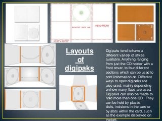
Digipaks tend tohave a
different variety of styles
available. Anything ranging
from just the CD holder with a
front cover, to four different
sections which can be used to
print information on. Different
ways to open digipaks are
also used, mainly depending
on how many flaps are used.
Digipaks can also be made to
hold more than one CD. They
can be held by plastic
slots, incisions in the card or
by slots within the card, such
as the example displayed on
the left.
3.
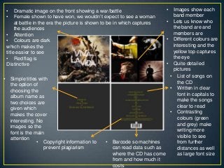
• List ofsongs on
the CD
• Written in clear
font in capitals to
make the songs
clear to read
• Contrasting
colours (green
and grey) make
writing more
visible to see
from further
distances as well
as large font size
• Barcode so machines
can read data such as
where the CD has come
from and how much it
costs
• Copyright information to
prevent plagiarism
• Simple titles with
the option of
choosing the
album name as
two choices are
given which
makes the cover
interesting. No
images so the
font is the main
attention
• Dramatic image on the front showing a war/battle
• Female shown to have won, we wouldn‟t expect to see a woman
at battle in the era the picture is shown to be in which captures
the audiences
• Attention
• Colours are dark
which makes the
title easier to see
• Red flag is
Distinctive
• Images show each
band member
• Lets us know who
the band are and
members are
• Different colours are
interesting and the
yellow top captures
the eye
• Quite detailed
pictures
4.
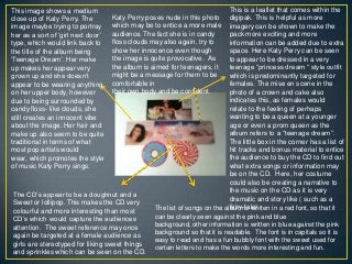
This is aleaflet that comes within the
digipak. This is helpful as more
imagery can be shown to make the
pack more exciting and more
information can be added due to extra
space. Here Katy Perry can be seen
to appear to be dressed in a very
teenage “princess dream “ style outfit
which is predominantly targeted for
females. The mise en scene in the
photo of a crown and cake also
indicates this, as females would
relate to the feeling of perhaps
wanting to be a queen at a younger
age or even a prom queen as the
album refers to a “teenage dream”.
The little box in the corner has a list of
hit tracks and bonus material to entice
the audience to buy the CD to find out
what extra songs or information may
be on the CD. Here, her costume
could also be creating a narrative to
the music on the CD as it is very
dramatic and story like ( such as a
fairy-tale).
This image shows a medium
close up of Katy Perry. The
image maybe trying to portray
her as a sort of „girl next door‟
type, which would link back to
the title of the album being
„Teenage Dream‟. Her make
up makes her appear very
grown up and she doesn‟t
appear to be wearing anything
on her upper body, however
due to being surrounded by
candy floss- like clouds, she
still creates an innocent vibe
about the image. Her hair and
make up also seem to be quite
traditional in terms of what
most pop artists would
wear, which promotes the style
of music Katy Perry sings.
The CD‟s appear to be a doughnut and a
Sweet or lollipop. This makes the CD very
colourful and more interesting than most
CD‟s which would capture the audiences
attention. The sweet reference may once
again be targeted at a female audience as
girls are stereotyped for liking sweet things
and sprinkles which can be seen on the CD.
Katy Perry poses nude in this photo
which may be to entice a more male
audience. The fact she is in candy
floss clouds may also again, try to
show her innocence even though
the image is quite provocative. As
the album is aimed for teenagers, it
might be a message for them to be
comfortable in
their own body and be confident.
The list of songs on the album is written in a red font, so that it
can be clearly seen against the pink and blue
background, other information is written in blue against the pink
background so that it is readable. The font is in capitals so it is
easy to read and has a fun bubbly font with the sweet used for
certain letters to make the words more interesting and fun.
5.
The bands nameis written in a
stylish swirly font which is used
almost as a logo style for the
bands name and recognition. It is
placed at the top so it can clearly
be seen. The image on the front
uses a lot of mise en scene such
as the costume the singer wears. It
is transparent so we can see a set
of lungs which resembles the
album name (which is lungs). The
background is very
mystical almost as in a forest, as
the colours are quite dark, the lead
singer stand out more because of
her white outfit. The genre of the
CD is indie pop, indie is quite
artistic and therefore so is the
images on the CD which are
creative. The album title is in a
different font from the bands name
and is written in a more simple font
so that it is easier to read and clear
against the image.
The image on the CD is of hands which are holding
something, however it is not clear to see what the object is.
This makes the audience wonder what it could be and may be
a reference to a song on the album. The colours are quite bright
on the CD compared to the rest of the colours on the digipak
which might be to signify the importance of the actual album
itself. The album name is written the same here as it was on
the front of the digipak, and this might be for continuity of
design and to make the album name more recognisable.
The back of the album is a
diagram of lungs with labels
coming out. Each part of the
lungs seems to represent a song
on the album as the number
labels list a song underneath the
image. The font is white to match
the black and white theme of the
back cover, the white writing is
also then clear to read and is
written in an unusual font but is
still easy to read. It adds character
to the writing as if it was almost
someone‟s handwriting. Such as
notes being taken of part of the
lungs in the form of songs.
Underneath the songs is a
website which is for the band so
more information can be accessed
about them. A barcode is
displayed so that the CD can be
recognised.
This is an image of the singer of the band. The image is quite
simple and uses sepia as an effect. This is more like an artistic
image to perhaps demonstrate the creativity in the album. Her
facial expression could be showing a certain emotion that the
album may relate to. The lake behind her creates a peaceful
setting. Her arms being wrapped around her chest may
represent her trying to protect her lungs.
6.
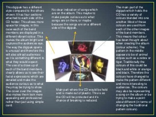
This digipak hasa different
style compared to the others
shown. It has four sections
attached to each side of the
CD holder. This allows more
space for images, in this
case each of the band
members are displayed in a
different vibrant colour. This
makes the album bright and
captures the audiences eye.
The way the digipak opens
is unusual and therefore this
will also attract audiences
as it is something different to
what they would expect.
The use of a close up of
each of the band members
clearly allows us to see their
facial expressions which are
detailed and make the
audience curious as to what
they may be trying to show.
The cover over the images
also makes them look more
appealing and professional
rather than just using simple
card.
The main part of the
digipak which holds the
CD has a variety of
colours blended into one
another. Most of these
colours are used from
each of the other images
of the band members.
This means that colour
has been thought about
when creating the album
(colour scheme). The
pattern in the middle
appears to be of animal
stripes such as a zebra or
tiger. Traditionally the
colours of this could be
black and white or orange
and black. Therefore the
colours have changed to
make the pattern different
and more interesting to
audiences. The colours
may also be representing
a song on the album or be
trying to make a point
about different (in terms of
changing the traditional
pattern colours).
Main part where the CD would be held
and is made out of plastic. This is so
the CD will be protected and it‟s
chance of breaking is reduced.
No clear indication of songs which
are on the album. This maybe to
make people curious as to what
songs are on there, or maybe
because the songs are on a different
side of the digipak.